Flutter for OpenHarmony: Flutter 跨平台点击事件详解
在移动应用中,**用户点击**是最基础、最频繁的交互方式。无论是按钮、图片还是空白区域,合理的点击响应直接决定用户体验。
一、引言:点击事件是交互的起点
在移动应用中,用户点击是最基础、最频繁的交互方式。无论是按钮、图片还是空白区域,合理的点击响应直接决定用户体验。
Flutter 作为高性能跨平台框架,提供了统一且灵活的点击事件处理机制,一套代码即可运行于 Android、iOS、Web、Windows、macOS 以及 华为鸿蒙(HarmonyOS) 设备。
💡 为什么这很重要?
在鸿蒙设备上,用户习惯与安卓/iOS略有不同(比如更强调分布式体验和流畅动效)。使用 Flutter 的标准点击组件,不仅能保证功能一致,还能自动适配鸿蒙系统的交互规范,避免“看起来像安卓 App”的尴尬。
二、无交互组件:不能响应点击
并非所有 Widget 都能响应点击。例如:
Text("这段文字无法点击");
Icon(Icons.home);
SizedBox(width: 80, height: 80);
这些组件默认不具备点击能力,即使包裹在 Column 或 Row 中,也无法触发任何点击回调。
✅ 原因:它们没有实现
RenderBox的手势检测逻辑。
❌ 常见误区:很多人以为只要加个onTap就行——但Text本身没有这个属性!必须用GestureDetector或InkWell包裹。
三、可点击组件:内置点击回调(推荐优先使用)
Flutter 为常用交互组件内置了点击事件属性,使用简单、语义清晰,强烈建议优先使用。
3.1 ElevatedButton / TextButton / OutlinedButton
ElevatedButton(
  onPressed: () {
    print("按钮被点击");
  },
  child: const Text("点击"),
)
- 关键属性:
onPressed - 行为:
- 若
onPressed != null,按钮可点击,样式为启用状态。 - 若
onPressed == null,按钮自动禁用(变灰、不可点)。
- 若
📌 这是最推荐的按钮点击写法,语义明确,无障碍支持好。
🔧 鸿蒙提示:在 HarmonyOS 设备上,按钮的按压反馈会自动匹配系统风格(如微动效、音效),无需额外配置。
3.2 IconButton
IconButton(
  icon: const Icon(Icons.favorite),
  onPressed: () {
    print("图标按钮被点击");
  },
)
- 同样使用
onPressed,适用于工具栏、操作图标等场景。 - 默认带有圆形水波纹,适合小面积点击区域。
3.3 ListTile(列表项)
ListTile(
  title: const Text("设置"),
  onTap: () {
    print("列表项被点击");
  },
)
- 使用
onTap属性,常用于ListView中的可点击行。 - 自带左右内边距、分割线、高亮反馈,符合 Material Design 规范。
✅ 优势:这些组件已内置水波纹(InkWell)、按压反馈、无障碍支持,无需额外封装。
🌐 跨平台一致性:在鸿蒙、iOS、Android 上表现一致,开发者无需为不同平台写两套逻辑。
四、通用点击容器:GestureDetector(万能方案)
当需要让任意 Widget 响应点击(如 Text、Image、Container),使用 GestureDetector。
4.1 基础点击:onTap
GestureDetector(
  onTap: () {
    print("单击事件");
  },
  child: Text("头部区域"),
)
onTap:轻触抬起(类似 Web 的click)。- 注意:
GestureDetector本身不可见,仅提供手势检测。
⚠️ 性能提示:
GestureDetector虽然灵活,但会增加一层渲染节点。如果只是想加点击,且在 Material 组件树中,优先考虑InkWell。
4.2 其他常用手势
GestureDetector(
  onTap: () => print("单击"),
  onDoubleTap: () => print("双击"),
  onLongPress: () => print("长按"),
)
⚠️ 注意:
onTap与onDoubleTap/onLongPress互斥。若同时注册,系统会延迟判断(约 300ms),可能导致单击响应变慢。
✅ 建议:除非真需要双击,否则只用onTap,保证响应速度。
五、带水波纹效果的点击:InkWell(Material 风格)
若希望点击时有墨水扩散动画(Material Design 效果),使用 InkWell。
InkWell(
  onTap: () {
    print("带水波纹的区域被点击");
  },
  child: Container(
    padding: const EdgeInsets.all(16),
    child: const Text("头部区域"),
  ),
)
- 要求:
InkWell必须位于Material组件(如Scaffold)的子树中,否则水波纹不显示。 - 对比
GestureDetector:InkWell=GestureDetector+ 水波纹反馈。
✅ 在鸿蒙设备上,水波纹效果会自动适配系统动效风格(比如更柔和的扩散动画),提升原生感。
六、禁用点击:三种方式
方式 1:设回调为 null(推荐)
ElevatedButton(
  onPressed: _isLoading ? null : () {
    // 点击逻辑
  },
  child: Text(_isLoading ? "加载中..." : "提交"),
)
- 组件自动变灰、不可点,符合 Material 规范。
- 无障碍友好:屏幕阅读器会自动识别为“禁用状态”。
方式 2:包裹 IgnorePointer
IgnorePointer(
  ignoring: true,
  child: GestureDetector(
    onTap: () => print("不会触发"),
    child: Text("被忽略的点击"),
  ),
)
ignoring: true时,完全屏蔽所有手势事件。- 布局影响:子组件仍占据空间,但无法点击。
方式 3:包裹 AbsorbPointer
AbsorbPointer(
  absorbing: true,
  child: GestureDetector(
    onTap: () => print("不会触发"),
    child: Text("被吸收的点击"),
  ),
)
- 与
IgnorePointer类似,但仍参与布局,只是不响应事件。 - 细微区别:
AbsorbPointer会“吃掉”事件,阻止冒泡;IgnorePointer则直接跳过该区域的手势检测。
📌 如何选?
- 按钮禁用 → 用
onPressed: null- 临时屏蔽整个区域 → 用
IgnorePointer- 需要保留布局但禁止交互 → 用
AbsorbPointer
七、点击事件写法对比总结
| 场景 | 推荐组件 | 关键属性 | 是否带反馈 | 鸿蒙适配 |
|---|---|---|---|---|
| 按钮 | ElevatedButton |
onPressed |
✅ 水波纹 | 原生级 |
| 图标操作 | IconButton |
onPressed |
✅ | 原生级 |
| 列表项 | ListTile |
onTap |
✅ | 原生级 |
| 任意 Widget | GestureDetector |
onTap |
❌ | 需手动优化 |
| 任意 Widget + 水波纹 | InkWell |
onTap |
✅ | 自动适配 |
✅ 黄金法则:
- 有语义的交互(按钮、列表)→ 用专用组件
- 普通区域需点击 + 动效 → 用
InkWell- 只需监听点击无反馈 → 用
GestureDetector
八、完整示例
8.1 基础点击实现:
import 'package:flutter/material.dart';
void main(List<String> args) {
runApp(MyApp());
}
// 主应用类,继承自StatefulWidget
class MyApp extends StatefulWidget {
const MyApp({Key? key}) : super(key: key);
_MyAppState createState() => _MyAppState();
}
// 状态管理类,负责管理数据和渲染视图
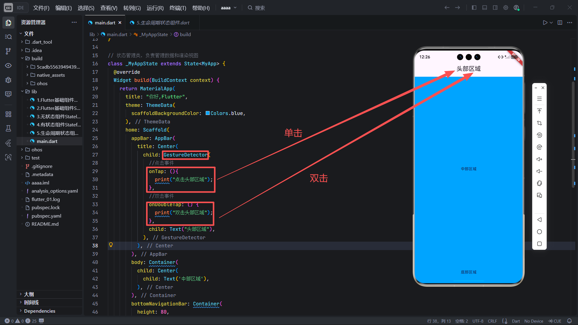
class _MyAppState extends State<MyApp> {
Widget build(BuildContext context) {
return MaterialApp(
title: "你好,Flutter",
theme: ThemeData(
scaffoldBackgroundColor: Colors.blue,
),
home: Scaffold(
appBar: AppBar(
title: Center(
child: GestureDetector(
//点击事件
onTap: (){
print("点击头部区域");
},
//双击事件
onDoubleTap: () {
print("双击头部区域");
},
child: Text("头部区域"),
),
),
),
body: Container(
child: Center(
child: Text('中部区域'),
),
),
bottomNavigationBar: Container(
height: 80,
child: Center(
child: Text('底部区域'),
),
),
),
);
}
}
💡 小技巧:在鸿蒙真机调试时,可通过 DevEco Studio 查看日志输出,验证点击是否生效。
8.2 基础按钮实现:
import 'package:flutter/material.dart';
void main(List<String> args) {
runApp(MyApp());
}
// 主应用类,继承自StatefulWidget
class MyApp extends StatefulWidget {
const MyApp({Key? key}) : super(key: key);
_MyAppState createState() => _MyAppState();
}
// 状态管理类,负责管理数据和渲染视图
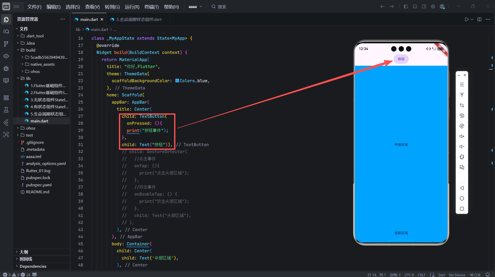
class _MyAppState extends State<MyApp> {
Widget build(BuildContext context) {
return MaterialApp(
title: "你好,Flutter",
theme: ThemeData(
scaffoldBackgroundColor: Colors.blue,
),
home: Scaffold(
appBar: AppBar(
title: Center(
child: TextButton(
onPressed: (){
print("按钮事件");
},
child: Text("按钮")),
body: Container(
child: Center(
child: Text('中部区域'),
),
),
bottomNavigationBar: Container(
height: 80,
child: Center(
child: Text('底部区域'),
),
),
),
);
}
}
✅ 此页面在鸿蒙手机、平板上均可获得一致且符合系统规范的点击体验。
🔧 部署提示:将 Flutter 项目打包为.hap文件后,可在 OpenHarmony 设备上直接安装运行。
九、结语
点击事件虽小,却是 Flutter 交互的基石。掌握 onPressed、onTap、GestureDetector 与 InkWell 的使用场景,能让你在跨平台开发中写出高效、可维护的代码。
而在鸿蒙生态中,合理利用 Flutter 的原生组件,不仅能保证功能正确,还能自动获得系统级的动效与无障碍支持。
🌟 未来展望:随着 OpenHarmony 与 Flutter 的深度集成(如通过 flutter_ohos 引擎),开发者将能更无缝地调用鸿蒙分布式能力(如跨设备点击同步、AI Kit 集成等)。
欢迎加入开源鸿蒙跨平台开发者社区
一起探索 Flutter + OpenHarmony 的无限可能!
👉 https://openharmonycrossplatform.csdn.net

开源鸿蒙跨平台开发社区汇聚开发者与厂商,共建“一次开发,多端部署”的开源生态,致力于降低跨端开发门槛,推动万物智联创新。
更多推荐

 29
29 0
0- 0


 已为社区贡献9条内容

所有评论(0)