Flutter for OpenHarmony移动数据使用监管助手App实战 - 主题设置实现
本文介绍了App主题设置页面的设计与实现。该页面包含深色/浅色模式切换、主题色选择等功能,通过实时预览和持久化设置提升用户体验。页面采用Scaffold框架,包含预览卡片、模式选择、主题色设置等区域。预览卡片使用Obx实现响应式更新,模拟App界面展示当前主题效果。迷你预览组件通过渐变背景、圆角设计等细节,直观呈现用户选择的主题风格。整体设计注重视觉一致性和交互反馈,帮助用户快速找到偏好的主题配置
主题设置页面让用户自定义App的外观,包括深色/浅色模式切换和主题色选择。良好的主题支持可以提升用户体验,满足不同用户的视觉偏好。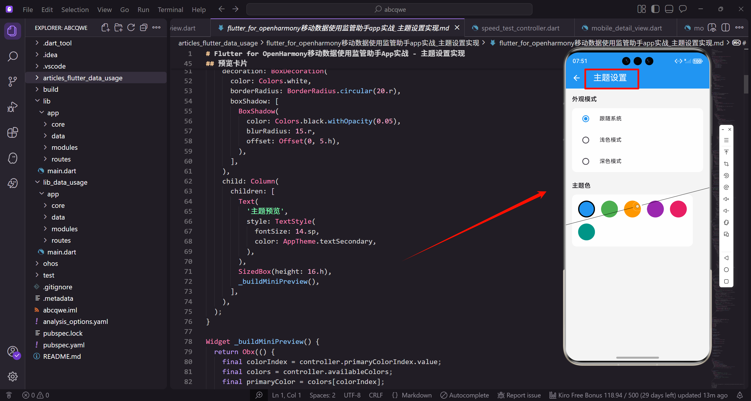
功能设计
主题设置页面需要实现:
- 外观模式选择(跟随系统、浅色、深色)
- 主题色选择
- 实时预览效果
- 设置持久化
页面整体结构
首先定义主题设置页面的基本框架:
class ThemeSettingsView extends GetView<ThemeSettingsController> {
const ThemeSettingsView({super.key});
Widget build(BuildContext context) {
继承GetView自动注入ThemeSettingsController。
const构造函数优化widget重建性能。
build方法返回页面的完整UI结构。
    return Scaffold(
      backgroundColor: AppTheme.backgroundColor,
      appBar: AppBar(title: const Text('主题设置')),
      body: SingleChildScrollView(
        padding: EdgeInsets.all(16.w),
Scaffold提供Material Design页面框架。
统一背景色保持视觉一致性。
SingleChildScrollView让内容可滚动。
        child: Column(
          crossAxisAlignment: CrossAxisAlignment.start,
          children: [
            _buildPreviewCard(),
            SizedBox(height: 24.h),
Column垂直排列四个设置区域。
crossAxisAlignment让标题左对齐。
24.h的间距比其他页面稍大。
            _buildThemeModeSection(),
            SizedBox(height: 24.h),
            _buildColorSection(),
            SizedBox(height: 24.h),
            _buildOtherSettings(),
          ],
        ),
      ),
    );
  }
}
四个区域:预览、外观模式、主题色、其他设置。
主题设置是视觉相关功能,需要更多呼吸空间。
预览卡片放在最上方,边调整边看效果。
预览卡片
实时预览主题效果的卡片:
Widget _buildPreviewCard() {
  return Container(
    padding: EdgeInsets.all(20.w),
    decoration: BoxDecoration(
      color: Colors.white,
      borderRadius: BorderRadius.circular(20.r),
Container作为预览卡片的容器。
20.w的内边距让内容更宽松。
20.r大圆角让卡片更圆润。
      boxShadow: [
        BoxShadow(
          color: Colors.black.withOpacity(0.05),
          blurRadius: 15.r,
          offset: Offset(0, 5.h),
        ),
      ],
    ),
轻微阴影让卡片有悬浮感。
透明度0.05比其他卡片稍深。
预览卡片需要更突出。
    child: Column(
      children: [
        Text(
          '主题预览',
          style: TextStyle(
            fontSize: 14.sp,
            color: AppTheme.textSecondary,
          ),
        ),
        SizedBox(height: 16.h),
        _buildMiniPreview(),
      ],
    ),
  );
}
标题"主题预览"用次要颜色。
间距16.h后显示迷你预览。
_buildMiniPreview构建预览内容。
迷你预览组件
模拟App界面的迷你预览:
Widget _buildMiniPreview() {
  return Obx(() {
    final colorIndex = controller.primaryColorIndex.value;
    final colors = controller.availableColors;
    final primaryColor = colors[colorIndex];
Obx监听primaryColorIndex实现响应式更新。
获取当前选中的主题色。
预览会根据选择实时变化。
    return Container(
      height: 160.h,
      decoration: BoxDecoration(
        color: Colors.grey.shade100,
        borderRadius: BorderRadius.circular(16.r),
      ),
固定高度160.h的预览容器。
灰色背景模拟页面背景。
16.r圆角让容器更圆润。
      child: Column(
        children: [
          Container(
            height: 44.h,
            decoration: BoxDecoration(
              color: primaryColor,
              borderRadius: BorderRadius.vertical(top: Radius.circular(16.r)),
            ),
Column垂直排列模拟AppBar和内容。
模拟AppBar高度44.h。
只有顶部有圆角,与下方内容衔接。
            child: Row(
              children: [
                SizedBox(width: 12.w),
                Icon(Icons.arrow_back, color: Colors.white, size: 20.sp),
                SizedBox(width: 12.w),
Row横向排列返回按钮和标题。
模拟真实AppBar的布局。
白色图标与主色背景对比。
                Text(
                  '流量监控',
                  style: TextStyle(
                    fontSize: 16.sp,
                    fontWeight: FontWeight.w600,
                    color: Colors.white,
                  ),
                ),
              ],
            ),
          ),
模拟页面标题"流量监控"。
白色文字与主色背景对比。
w600字重让标题稍微加粗。
          Expanded(
            child: Padding(
              padding: EdgeInsets.all(12.w),
              child: Row(
                children: [
                  Expanded(
                    child: Container(
Expanded让内容区域占据剩余空间。
Padding添加内边距。
Row横向排列两个模拟组件。
                      decoration: BoxDecoration(
                        gradient: LinearGradient(
                          colors: [primaryColor, primaryColor.withOpacity(0.7)],
                        ),
                        borderRadius: BorderRadius.circular(12.r),
                      ),
模拟流量卡片的渐变背景。
使用当前选中的主题色。
12.r圆角保持视觉一致。
                      child: Center(
                        child: Column(
                          mainAxisAlignment: MainAxisAlignment.center,
                          children: [
                            Text(
                              '1.5 GB',
                              style: TextStyle(
                                fontSize: 20.sp,
                                fontWeight: FontWeight.bold,
                                color: Colors.white,
                              ),
                            ),
模拟流量数值显示。
20.sp大字号突出显示。
白色文字与渐变背景对比。
                            Text(
                              '今日流量',
                              style: TextStyle(
                                fontSize: 10.sp,
                                color: Colors.white70,
                              ),
                            ),
                          ],
                        ),
                      ),
                    ),
                  ),
标签"今日流量"用小字号。
白色70%透明度作为次要信息。
整体模拟首页的流量卡片。
                  SizedBox(width: 8.w),
                  Expanded(
                    child: Column(
                      children: [
                        _buildMiniListItem(primaryColor),
                        SizedBox(height: 4.h),
                        _buildMiniListItem(primaryColor),
                        SizedBox(height: 4.h),
                        _buildMiniListItem(primaryColor),
                      ],
                    ),
                  ),
                ],
              ),
            ),
          ),
        ],
      ),
    );
  });
}
右侧模拟列表项。
三个列表项展示主题色的应用。
_buildMiniListItem构建单个列表项。
迷你列表项
预览中的模拟列表项:
Widget _buildMiniListItem(Color color) {
  return Container(
    height: 28.h,
    decoration: BoxDecoration(
      color: Colors.white,
      borderRadius: BorderRadius.circular(6.r),
    ),
固定高度28.h的列表项。
白色背景模拟真实列表项。
6.r小圆角让项目更精致。
    child: Row(
      children: [
        SizedBox(width: 6.w),
        Container(
          width: 16.w,
          height: 16.w,
          decoration: BoxDecoration(
            color: color.withOpacity(0.2),
            borderRadius: BorderRadius.circular(4.r),
          ),
        ),
Row横向排列图标和内容。
小方块模拟应用图标。
使用主题色的浅色版本。
        SizedBox(width: 6.w),
        Expanded(
          child: Container(
            height: 8.h,
            decoration: BoxDecoration(
              color: Colors.grey.shade300,
              borderRadius: BorderRadius.circular(4.r),
            ),
          ),
        ),
        SizedBox(width: 6.w),
      ],
    ),
  );
}
灰色条模拟文字内容。
简化预览但保留布局结构。
用户可以直观看到主题色效果。
外观模式选择
让用户选择深色/浅色模式:
Widget _buildThemeModeSection() {
  return Column(
    crossAxisAlignment: CrossAxisAlignment.start,
    children: [
      Text(
        '外观模式',
        style: TextStyle(
          fontSize: 18.sp,
          fontWeight: FontWeight.bold,
          color: AppTheme.textPrimary,
        ),
      ),
Column垂直排列标题和选项。
标题用18.sp大字号,加粗显示。
crossAxisAlignment让标题左对齐。
      SizedBox(height: 4.h),
      Text(
        '选择App的显示模式',
        style: TextStyle(fontSize: 13.sp, color: AppTheme.textSecondary),
      ),
      SizedBox(height: 16.h),
      _buildThemeModeOptions(),
    ],
  );
}
副标题说明功能用途。
间距16.h后显示选项列表。
_buildThemeModeOptions构建选项。
外观模式选项
三种外观模式的单选列表:
Widget _buildThemeModeOptions() {
  final modes = [
    {'name': '跟随系统', 'icon': Icons.brightness_auto, 'value': 0},
    {'name': '浅色模式', 'icon': Icons.light_mode, 'value': 1},
    {'name': '深色模式', 'icon': Icons.dark_mode, 'value': 2},
  ];
定义三种外观模式选项。
跟随系统会根据系统设置自动切换。
浅色和深色是固定模式。
  return Container(
    decoration: BoxDecoration(
      color: Colors.white,
      borderRadius: BorderRadius.circular(16.r),
    ),
    child: Column(
      children: modes.map((mode) {
白色背景容器包裹选项列表。
16.r圆角保持视觉一致。
map遍历modes生成选项。
        final index = modes.indexOf(mode);
        return Column(
          children: [
            Obx(() => ListTile(
              contentPadding: EdgeInsets.symmetric(horizontal: 16.w, vertical: 8.h),
获取当前选项的索引。
Column包裹ListTile和分隔线。
Obx监听选中状态。
              leading: Container(
                width: 44.w,
                height: 44.w,
                decoration: BoxDecoration(
                  color: controller.themeMode.value == mode['value']
                      ? AppTheme.primaryColor.withOpacity(0.1)
                      : Colors.grey.shade100,
                  borderRadius: BorderRadius.circular(12.r),
                ),
leading放置图标容器。
选中时用主色浅色背景。
未选中时用灰色背景。
                child: Icon(
                  mode['icon'] as IconData,
                  color: controller.themeMode.value == mode['value']
                      ? AppTheme.primaryColor
                      : Colors.grey,
                  size: 24.sp,
                ),
              ),
图标颜色也根据状态变化。
选中时用主色调。
未选中时用灰色。
              title: Text(
                mode['name'] as String,
                style: TextStyle(
                  fontSize: 15.sp,
                  fontWeight: FontWeight.w500,
                  color: AppTheme.textPrimary,
                ),
              ),
选项名称用15.sp字号。
w500字重让文字稍微加粗。
主要文字颜色确保可读性。
              trailing: Radio<int>(
                value: mode['value'] as int,
                groupValue: controller.themeMode.value,
                onChanged: (v) => controller.setThemeMode(v!),
                activeColor: AppTheme.primaryColor,
              ),
              onTap: () => controller.setThemeMode(mode['value'] as int),
            )),
            if (index < modes.length - 1) Divider(height: 1, indent: 72.w),
          ],
        );
      }).toList(),
    ),
  );
}
Radio单选按钮放在右侧。
onTap让整行可点击。
最后一项不显示分隔线。
主题色选择
让用户选择App的主题颜色:
Widget _buildColorSection() {
  return Column(
    crossAxisAlignment: CrossAxisAlignment.start,
    children: [
      Text(
        '主题色',
        style: TextStyle(
          fontSize: 18.sp,
          fontWeight: FontWeight.bold,
          color: AppTheme.textPrimary,
        ),
      ),
Column垂直排列标题和选项。
标题用18.sp大字号,加粗显示。
crossAxisAlignment让标题左对齐。
      SizedBox(height: 4.h),
      Text(
        '选择App的主题颜色',
        style: TextStyle(fontSize: 13.sp, color: AppTheme.textSecondary),
      ),
      SizedBox(height: 16.h),
      _buildColorOptions(),
    ],
  );
}
副标题说明功能用途。
间距16.h后显示颜色选项。
_buildColorOptions构建颜色网格。
颜色选项网格
六种主题色的选择网格:
Widget _buildColorOptions() {
  return Container(
    padding: EdgeInsets.all(20.w),
    decoration: BoxDecoration(
      color: Colors.white,
      borderRadius: BorderRadius.circular(16.r),
    ),
白色背景容器包裹颜色网格。
20.w内边距让内容更宽松。
16.r圆角保持视觉一致。
    child: Obx(() {
      final colors = controller.availableColors;
      final colorNames = ['蓝色', '绿色', '橙色', '紫色', '粉色', '青色'];

      return Wrap(
        spacing: 16.w,
        runSpacing: 16.h,
Obx监听primaryColorIndex实现响应式更新。
colorNames定义颜色的中文名称。
Wrap自动换行排列颜色选项。
        children: List.generate(colors.length, (index) {
          final isSelected = controller.primaryColorIndex.value == index;
          return GestureDetector(
            onTap: () => controller.setPrimaryColor(index),
List.generate生成六个颜色选项。
isSelected判断是否为当前选中。
GestureDetector处理点击事件。
            child: Column(
              children: [
                AnimatedContainer(
                  duration: const Duration(milliseconds: 200),
                  width: 52.w,
                  height: 52.w,
Column垂直排列颜色圆和名称。
AnimatedContainer实现选中动画。
200毫秒的动画时长适中。
                  decoration: BoxDecoration(
                    color: colors[index],
                    shape: BoxShape.circle,
                    border: isSelected
                        ? Border.all(color: Colors.black, width: 3)
                        : Border.all(color: Colors.white, width: 3),
圆形容器显示颜色。
选中时黑色边框,未选中时白色边框。
边框宽度3让选中效果更明显。
                    boxShadow: isSelected
                        ? [
                            BoxShadow(
                              color: colors[index].withOpacity(0.4),
                              blurRadius: 8.r,
                              offset: Offset(0, 4.h),
                            ),
                          ]
                        : null,
                  ),
选中时添加阴影发光效果。
阴影颜色与选中颜色一致。
未选中时没有阴影。
                  child: isSelected
                      ? Icon(Icons.check, color: Colors.white, size: 24.sp)
                      : null,
                ),
                SizedBox(height: 8.h),
选中时显示白色勾选图标。
未选中时不显示任何内容。
间距8.h后显示颜色名称。
                Text(
                  colorNames[index],
                  style: TextStyle(
                    fontSize: 12.sp,
                    color: isSelected ? colors[index] : AppTheme.textSecondary,
                    fontWeight: isSelected ? FontWeight.w600 : FontWeight.normal,
                  ),
                ),
              ],
            ),
          );
        }),
      );
    }),
  );
}
颜色名称在圆形下方显示。
选中时用对应颜色,未选中用次要颜色。
选中时加粗显示。
其他设置
其他主题相关的设置项:
Widget _buildOtherSettings() {
  return Column(
    crossAxisAlignment: CrossAxisAlignment.start,
    children: [
      Text(
        '其他设置',
        style: TextStyle(
          fontSize: 18.sp,
          fontWeight: FontWeight.bold,
          color: AppTheme.textPrimary,
        ),
      ),
Column垂直排列标题和设置项。
标题用18.sp大字号,加粗显示。
crossAxisAlignment让标题左对齐。
      SizedBox(height: 16.h),
      Container(
        decoration: BoxDecoration(
          color: Colors.white,
          borderRadius: BorderRadius.circular(16.r),
        ),
间距16.h后显示设置项列表。
白色背景容器包裹设置项。
16.r圆角保持视觉一致。
        child: Column(
          children: [
            Obx(() => SwitchListTile(
              title: Text('圆角卡片', style: TextStyle(fontSize: 15.sp)),
              subtitle: Text(
                '使用圆角样式的卡片',
                style: TextStyle(fontSize: 13.sp, color: AppTheme.textSecondary),
              ),
第一项:圆角卡片开关。
控制卡片是否使用圆角样式。
副标题说明功能用途。
              value: controller.roundedCards.value,
              onChanged: (v) => controller.roundedCards.value = v,
              activeColor: AppTheme.primaryColor,
            )),
            Divider(height: 1, indent: 16.w, endIndent: 16.w),
绑定roundedCards状态。
onChanged直接更新响应式变量。
分隔线两端留白。
            Obx(() => SwitchListTile(
              title: Text('动画效果', style: TextStyle(fontSize: 15.sp)),
              subtitle: Text(
                '启用页面切换动画',
                style: TextStyle(fontSize: 13.sp, color: AppTheme.textSecondary),
              ),
第二项:动画效果开关。
控制是否启用页面切换动画。
关闭可以提升性能。
              value: controller.animationsEnabled.value,
              onChanged: (v) => controller.animationsEnabled.value = v,
              activeColor: AppTheme.primaryColor,
            )),
            Divider(height: 1, indent: 16.w, endIndent: 16.w),
绑定animationsEnabled状态。
样式与上一项一致。
分隔线保持视觉一致。
            ListTile(
              title: Text('字体大小', style: TextStyle(fontSize: 15.sp)),
              subtitle: Text(
                '调整App的字体大小',
                style: TextStyle(fontSize: 13.sp, color: AppTheme.textSecondary),
              ),
第三项:字体大小选择。
使用ListTile而非SwitchListTile。
trailing放置下拉选择器。
              trailing: Obx(() => DropdownButton<int>(
                value: controller.fontSizeIndex.value,
                items: [
                  DropdownMenuItem(value: 0, child: Text('小')),
                  DropdownMenuItem(value: 1, child: Text('标准')),
                  DropdownMenuItem(value: 2, child: Text('大')),
                ],
DropdownButton提供三个字体大小选项。
value绑定当前选中的索引。
三个选项:小、标准、大。
                onChanged: (v) => controller.setFontSize(v!),
                underline: SizedBox(),
              )),
            ),
          ],
        ),
      ),
    ],
  );
}
onChanged更新字体大小设置。
underline设为空去掉下划线。
整体设计简洁直观。
Controller实现
控制器管理主题设置的状态:
class ThemeSettingsController extends GetxController {
  final themeMode = 0.obs;
  final primaryColorIndex = 0.obs;
  final roundedCards = true.obs;
  final animationsEnabled = true.obs;
  final fontSizeIndex = 1.obs;
themeMode控制外观模式,0跟随系统、1浅色、2深色。
primaryColorIndex记录当前选中的主题色索引。
其他变量控制UI细节设置。
  final availableColors = [
    Colors.blue,
    Colors.green,
    Colors.orange,
    Colors.purple,
    Colors.pink,
    Colors.teal,
  ];
定义六种可选的主题颜色。
都是Material Design的标准色。
用户可以根据喜好选择。
void onInit() {
super.onInit();
loadSettings();
}
void loadSettings() async {
// 从本地存储加载设置
}
onInit初始化时加载保存的设置。
loadSettings从本地存储读取设置。
实际项目中使用SharedPreferences。
  void setThemeMode(int mode) {
    themeMode.value = mode;
    _applyThemeMode();
    saveSettings();
  }

  void _applyThemeMode() {
    switch (themeMode.value) {
      case 0:
        Get.changeThemeMode(ThemeMode.system);
        break;
setThemeMode更新模式后应用到全局。
_applyThemeMode使用GetX切换主题模式。
case 0是跟随系统模式。
      case 1:
        Get.changeThemeMode(ThemeMode.light);
        break;
      case 2:
        Get.changeThemeMode(ThemeMode.dark);
        break;
    }
  }
case 1是浅色模式。
case 2是深色模式。
Get.changeThemeMode是GetX的主题切换方法。
  void setPrimaryColor(int index) {
    primaryColorIndex.value = index;
    _applyPrimaryColor();
    saveSettings();
  }

  void setFontSize(int index) {
    fontSizeIndex.value = index;
    saveSettings();
  }
setPrimaryColor更新主题色选择。
_applyPrimaryColor应用主题色到全局。
setFontSize更新字体大小设置。
  void saveSettings() async {
    // 保存设置到本地存储
  }
}
saveSettings将设置持久化到本地。
所有设置变更后都调用此方法。
确保用户设置不会丢失。
写在最后
主题设置页面让用户个性化定制App的外观。通过直观的预览、丰富的颜色选择、灵活的模式切换,满足不同用户的视觉偏好。
可以继续优化的方向:
- 支持自定义主题色
- 添加更多预设主题
- 支持主题导入导出
- 添加壁纸设置功能
欢迎加入开源鸿蒙跨平台社区:https://openharmonycrossplatform.csdn.net

开源鸿蒙跨平台开发社区汇聚开发者与厂商,共建“一次开发,多端部署”的开源生态,致力于降低跨端开发门槛,推动万物智联创新。
更多推荐

 14
14 0
0- 0


 已为社区贡献31条内容

所有评论(0)