鸿蒙跨端Flutter开发:Hero动画状态监听详解
Image Widget的高级应用模式展示了Flutter在图片处理方面的强大能力。通过合理组合各种技术,可以构建出功能丰富、用户体验优秀的图片相关功能。记住要根据实际需求选择合适的方案,在功能和性能之间找到最佳平衡。持续学习和实践是掌握这些高级模式的关键。
一、知识点概述
Hero动画状态监听是指在Hero动画执行过程中,实时监听和响应动画的各种状态变化,如开始、进行中、完成等。在实际应用中,合理使用动画状态监听可以实现更加丰富和智能的交互效果,如在动画开始时显示加载指示器、在动画进行中更新UI状态、在动画完成后执行后续操作等。
Hero动画的状态主要包括:等待状态(动画未开始)、进行中状态(动画正在执行)、完成状态(动画已完成)以及取消状态(动画被中断)。通过监听这些状态变化,开发者可以在适当的时机执行相应的操作,提升用户体验和应用的智能化程度。
Hero动画状态监听的实现方式主要包括:使用AnimatedBuilder监听动画值的变化、使用AnimationController的监听器、使用PageRouteBuilder的回调函数等。每种方式都有其适用的场景和优缺点,开发者需要根据具体需求选择合适的方式。
二、核心知识点
1. 动画状态的生命周期
Hero动画的生命周期可以分为几个关键阶段:初始化阶段、开始阶段、进行中阶段、完成阶段和清理阶段。理解这些阶段的特点和持续时间,对于实现精确的状态监听至关重要。
各阶段的特点:
| 阶段 | 状态描述 | 持续时间 | 可执行的操作 |
|---|---|---|---|
| 初始化 | Hero widget构建,等待用户交互 | 不定 | 初始化状态变量 |
| 开始 | 用户点击Hero,触发导航 | 即时 | 更新状态为"开始动画" |
| 进行中 | Hero执行飞行动画 | 通常300ms | 更新进度,显示动画中 |
| 完成 | 动画结束,目标页面完全显示 | 即时 | 更新状态为"动画完成" |
| 清理 | 资源释放,状态重置 | 即时 | 清理临时状态 |
2. StatefulWidget管理动画状态
使用StatefulWidget可以方便地管理Hero动画的状态。通过定义状态变量和setState方法,可以在动画的不同阶段更新UI,实时反映动画的状态。
class HeroAnimationStatusDemo extends StatefulWidget {
const HeroAnimationStatusDemo({super.key});
State<HeroAnimationStatusDemo> createState() => _HeroAnimationStatusDemoState();
}
class _HeroAnimationStatusDemoState extends State<HeroAnimationStatusDemo> {
String _statusMessage = '等待Hero动画...';
Widget build(BuildContext context) {
return Scaffold(
appBar: AppBar(title: const Text('动画状态监听')),
body: Column(
children: [
Container(
padding: const EdgeInsets.all(16),
color: Colors.purple.shade50,
width: double.infinity,
child: Text(
_statusMessage,
style: const TextStyle(
fontSize: 16,
fontWeight: FontWeight.bold,
),
textAlign: TextAlign.center,
),
),
Expanded(
child: GridView.builder(
padding: const EdgeInsets.all(16),
gridDelegate: const SliverGridDelegateWithFixedCrossAxisCount(
crossAxisCount: 2,
mainAxisSpacing: 16,
crossAxisSpacing: 16,
),
itemCount: 6,
itemBuilder: (context, index) {
return Hero(
tag: 'status_hero_$index',
child: GestureDetector(
onTap: () {
  setState(() {
    _statusMessage = '开始Hero动画: $index';
  });
  Navigator.push(
    context,
    MaterialPageRoute(
      builder: (context) => StatusDetailPage(
        index: index,
        onStatusChange: (status) {
          setState(() {
            _statusMessage = 'Hero状态: $status';
          });
        },
      ),
    ),
  );
},
child: Container(...),
),
);
},
),
),
],
),
);
}
}
状态管理的要点:
| 要点 | 说明 | 示例 |
|---|---|---|
| 状态变量 | 定义一个字符串变量存储状态 | String _statusMessage |
| 初始值 | 设置初始状态信息 | '等待Hero动画...' |
| setState | 在状态变化时更新UI | setState(() {...}) |
| 回调函数 | 通过回调更新父组件状态 | onStatusChange: (status) {...} |
3. 点击事件触发状态更新
当用户点击Hero widget时,首先更新状态为"开始Hero动画",然后执行导航操作。这样可以让用户立即获得反馈,知道操作已被响应。
onTap: () {
setState(() {
_statusMessage = '开始Hero动画: $index';
});
Navigator.push(
  context,
  MaterialPageRoute(
    builder: (context) => StatusDetailPage(
      index: index,
      onStatusChange: (status) {
        setState(() {
          _statusMessage = 'Hero状态: $status';
        });
      },
    ),
  ),
);
}
状态更新的时机:
| 时机 | 状态信息 | 作用 |
|---|---|---|
| 点击前 | ‘等待Hero动画…’ | 提示用户可以点击 |
| 点击时 | ‘开始Hero动画: X’ | 确认操作被响应 |
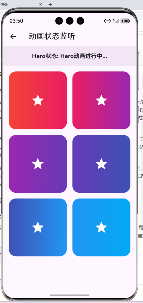
| 导航中 | ‘Hero动画进行中…’ | 显示动画进度 |
| 完成后 | ‘Hero动画完成’ | 提示操作完成 |
4. 回调函数传递状态变化
通过回调函数,子组件可以通知父组件状态的变化。在示例代码中,StatusDetailPage通过onStatusChange回调函数向父组件传递状态信息。
Navigator.push(
context,
MaterialPageRoute(
builder: (context) => StatusDetailPage(
index: index,
onStatusChange: (status) {
setState(() {
_statusMessage = 'Hero状态: $status';
});
},
),
),
);
回调函数的实现要点:
| 要点 | 说明 | 示例 |
|---|---|---|
| 定义参数 | 在子组件中定义回调参数 | final Function(String) onStatusChange; |
| 传递函数 | 在父组件中传递更新函数 | onStatusChange: (status) {...} |
| 调用回调 | 在子组件中调用回调 | onStatusChange('Hero动画进行中...'); |
| 更新状态 | 在回调中更新父组件状态 | setState(() {...}) |
5. addPostFrameCallback的使用
WidgetsBinding.instance.addPostFrameCallback是Flutter中常用的方法,它允许在当前帧绘制完成后执行回调函数。在Hero动画场景中,可以使用这个方法来检测动画的开始。
class StatusDetailPage extends StatelessWidget {
final int index;
final Function(String) onStatusChange;
const StatusDetailPage({
required this.index,
required this.onStatusChange,
super.key,
});
Widget build(BuildContext context) {
WidgetsBinding.instance.addPostFrameCallback((_) {
onStatusChange('Hero动画进行中...');
});
return Scaffold(
appBar: AppBar(title: const Text('状态详情')),
body: Center(
child: Hero(
tag: 'status_hero_$index',
child: Container(...),
),
),
);
}
}
addPostFrameCallback的使用场景:
| 场景 | 说明 | 示例 |
|---|---|---|
| 页面加载后执行 | 确保widget已完全构建 | 初始化数据 |
| 动画开始后通知 | 在第一帧绘制后更新状态 | 显示动画中 |
| 尺寸计算后操作 | 确保尺寸已确定 | 计算布局 |
| 上下文可用后操作 | 确保context可用 | 显示对话框 |
6. placeholderBuilder的应用
placeholderBuilder是Hero widget的一个重要参数,它允许开发者在Hero动画过程中显示占位widget,替代原始的child。这在需要显示加载状态或简化飞行内容时非常有用。
Hero(
  tag: 'status_hero_$index',
  placeholderBuilder: (context, heroSize, widget) {
    return Container(
      width: heroSize?.width ?? 0,
      height: heroSize?.height ?? 0,
      decoration: BoxDecoration(
        color: Colors.grey.shade300,
        borderRadius: BorderRadius.circular(20),
      ),
      child: const Center(
        child: Icon(Icons.hourglass_empty),
      ),
    );
  },
  child: GestureDetector(
    onTap: () {...},
    child: Container(...),
  ),
)
placeholderBuilder的参数说明:
| 参数 | 类型 | 说明 | 示例值 |
|---|---|---|---|
| context | BuildContext | 构建上下文 | 当前widget的context |
| heroSize | Size? | Hero的尺寸 | Size(100, 100) |
| widget | Widget | Hero的child | 原始widget |
placeholderBuilder的优势:
| 优势 | 说明 | 适用场景 |
|---|---|---|
| 性能优化 | 简化飞行widget | 复杂Hero |
| 视觉反馈 | 显示加载状态 | 长时间加载 |
| 风格统一 | 统一占位样式 | 多个Hero |
| 用户体验 | 提供过渡信息 | 动画较长 |
7. 状态显示UI的设计
状态显示UI应该清晰、明显,让用户能够快速了解当前的动画状态。在示例代码中,使用顶部的一个Container来显示状态信息,背景色为紫色浅色,文字加粗居中。
Container(
  padding: const EdgeInsets.all(16),
  color: Colors.purple.shade50,
  width: double.infinity,
  child: Text(
    _statusMessage,
    style: const TextStyle(
      fontSize: 16,
      fontWeight: FontWeight.bold,
    ),
    textAlign: TextAlign.center,
  ),
)
状态显示UI的设计要点:
| 设计要素 | 推荐值 | 说明 |
|---|---|---|
| 位置 | 页面顶部 | 醒目且不干扰主内容 |
| 背景色 | 浅色背景 | 明显但不刺眼 |
| 内边距 | 12-16px | 舒适的视觉空间 |
| 字体大小 | 14-18px | 清晰可读 |
| 字体粗细 | 粗体 | 强调重要性 |
| 对齐方式 | 居中对齐 | 视觉平衡 |
8. 示例代码展示
下面是一个展示Hero动画状态监听的完整示例代码,该代码来自example08_hero_animation_status.dart文件。这个示例展示了如何实时监听和显示Hero动画的状态变化。
import 'package:flutter/material.dart';
class HeroAnimationStatusDemo extends StatefulWidget {
const HeroAnimationStatusDemo({super.key});
State<HeroAnimationStatusDemo> createState() => _HeroAnimationStatusDemoState();
}
class _HeroAnimationStatusDemoState extends State<HeroAnimationStatusDemo> {
String _statusMessage = '等待Hero动画...';
Widget build(BuildContext context) {
return Scaffold(
appBar: AppBar(title: const Text('动画状态监听')),
body: Column(
children: [
Container(
padding: const EdgeInsets.all(16),
color: Colors.purple.shade50,
width: double.infinity,
child: Text(
_statusMessage,
style: const TextStyle(
fontSize: 16,
fontWeight: FontWeight.bold,
),
textAlign: TextAlign.center,
),
),
Expanded(
child: GridView.builder(
padding: const EdgeInsets.all(16),
gridDelegate: const SliverGridDelegateWithFixedCrossAxisCount(
crossAxisCount: 2,
mainAxisSpacing: 16,
crossAxisSpacing: 16,
),
itemCount: 6,
itemBuilder: (context, index) {
return Hero(
tag: 'status_hero_$index',
placeholderBuilder: (context, heroSize, widget) {
return Container(
width: heroSize?.width ?? 0,
height: heroSize?.height ?? 0,
decoration: BoxDecoration(
color: Colors.grey.shade300,
borderRadius: BorderRadius.circular(20),
),
child: const Center(
child: Icon(Icons.hourglass_empty),
),
);
},
child: GestureDetector(
onTap: () {
setState(() {
_statusMessage = '开始Hero动画: $index';
});
Navigator.push(
context,
MaterialPageRoute(
builder: (context) => StatusDetailPage(
index: index,
onStatusChange: (status) {
setState(() {
_statusMessage = 'Hero状态: $status';
});
},
),
),
);
},
child: Container(
decoration: BoxDecoration(
gradient: LinearGradient(
colors: [
Colors.primaries[index % Colors.primaries.length],
Colors.primaries[(index + 1) % Colors.primaries.length],
],
),
borderRadius: BorderRadius.circular(20),
),
child: Center(
child: Icon(
Icons.star,
color: Colors.white,
size: 40,
),
),
),
),
);
},
),
),
],
),
);
}
}
class StatusDetailPage extends StatelessWidget {
final int index;
final Function(String) onStatusChange;
const StatusDetailPage({
required this.index,
required this.onStatusChange,
super.key,
});
Widget build(BuildContext context) {
WidgetsBinding.instance.addPostFrameCallback((_) {
onStatusChange('Hero动画进行中...');
});
return Scaffold(
appBar: AppBar(title: const Text('状态详情')),
body: Center(
child: Hero(
tag: 'status_hero_$index',
child: Container(
width: 250,
height: 250,
decoration: BoxDecoration(
gradient: LinearGradient(
colors: [
Colors.primaries[index % Colors.primaries.length],
Colors.primaries[(index + 1) % Colors.primaries.length],
],
),
borderRadius: BorderRadius.circular(30),
),
child: const Center(
child: Icon(
Icons.star,
color: Colors.white,
size: 80,
),
),
),
),
);
}
}
代码分析:
- StatefulWidget: 使用StatefulWidget管理状态,定义
_statusMessage变量存储当前状态。 - 状态显示: 顶部Container显示当前状态,紫色浅色背景,白色加粗文字,居中对齐。
- 点击更新: 点击Hero时立即更新状态为"开始Hero动画: X",然后执行导航。
- 回调通知: 通过onStatusChange回调函数,StatusDetailPage向父组件传递状态变化。
- 占位widget: 使用placeholderBuilder在动画过程中显示灰色占位widget和沙漏图标。
- postFrameCallback: 使用addPostFrameCallback在页面构建完成后更新状态为"Hero动画进行中…"。
9. 动画状态监听的应用场景
动画状态监听在实际应用中有许多场景,以下是一些常见的应用案例:
场景1: 加载状态指示器
在Hero动画过程中显示加载指示器,提升用户体验。
onStatusChange: (status) {
  setState(() {
    if (status == 'Hero动画进行中...') {
      _showLoading = true;
    } else if (status == 'Hero动画完成') {
      _showLoading = false;
    }
  });
}
场景2: 进度显示
显示Hero动画的进度,让用户了解动画的完成情况。
AnimatedBuilder(
  animation: animation,
  builder: (context, child) {
    final progress = (animation.value * 100).toInt();
    setState(() {
      _statusMessage = 'Hero动画进度: $progress%';
    });
    return child;
  },
)
场景3: 数据加载
在Hero动画完成后加载相关数据,避免阻塞动画。
onStatusChange: (status) {
  if (status == 'Hero动画完成') {
    _loadDetailData();
  }
}
场景4: 分析和统计
记录Hero动画的状态变化,用于分析和统计用户行为。
onStatusChange: (status) {
  analytics.logEvent(
    name: 'hero_animation_status',
    parameters: {'status': status},
  );
}
下表总结了动画状态监听的应用场景:
| 应用场景 | 实现方式 | 效果 | 难度 |
|---|---|---|---|
| 加载指示器 | 显示/隐藏加载widget | 提升体验 | 低 |
| 进度显示 | 更新进度文字 | 增强反馈 | 中 |
| 数据加载 | 在完成后加载 | 优化性能 | 中 |
| 分析统计 | 记录状态日志 | 了解行为 | 低 |
10. 状态监听的最佳实践
总结实现Hero动画状态监听的最佳实践,帮助开发者构建高质量的交互体验。
实践1: 提供清晰的反馈
状态信息应该清晰、简洁,让用户能够快速理解当前的状态。
// 不推荐: 模糊的状态信息
_statusMessage = 'Something is happening...';

// 推荐: 清晰的状态信息
_statusMessage = 'Hero动画进行中...';
实践2: 及时更新状态
在适当的时机更新状态,让用户获得及时的反馈。
// 点击时立即更新
onTap: () {
  setState(() {
    _statusMessage = '开始Hero动画: $index';
  });
  Navigator.push(...);
}
实践3: 使用占位widget
对于复杂的Hero,使用placeholderBuilder提供占位widget,优化性能。
placeholderBuilder: (context, heroSize, widget) {
  return Container(
    width: heroSize?.width ?? 0,
    height: heroSize?.height ?? 0,
    decoration: BoxDecoration(color: Colors.grey),
  );
}
实践4: 避免过度更新
不要在动画的每一帧都更新状态,这会导致频繁的重建,影响性能。
// 不推荐: 每帧都更新
AnimatedBuilder(
  animation: animation,
  builder: (context, child) {
    setState(() {
      _statusMessage = 'Progress: ${animation.value}';
    });
    return child;
  },
)

// 推荐: 关键时刻更新
onStatusChange: (status) {
  setState(() {
    _statusMessage = status;
  });
}
三、总结
Hero动画状态监听通过实时监听和响应动画的状态变化,实现了更加丰富和智能的交互效果。本文深入讲解了10个核心知识点,包括动画状态的生命周期、StatefulWidget管理动画状态、点击事件触发状态更新、回调函数传递状态变化、addPostFrameCallback的使用、placeholderBuilder的应用、状态显示UI的设计、示例代码展示、动画状态监听的应用场景以及最佳实践。
通过example08_hero_animation_status.dart的实际代码,详细分析了如何实现Hero动画的状态监听,包括状态管理、回调传递、占位widget、状态显示等。掌握了这些知识点和技巧,开发者可以构建出反馈及时、交互智能的Hero动画体验。
状态监听不仅是技术实现的体现,更是用户体验的细节打磨。需要从用户的角度出发,提供清晰及时的状态反馈,让用户始终了解当前的操作状态。通过合理的状态管理和反馈机制,可以显著提升应用的用户体验和智能化程度。
欢迎加入开源鸿蒙跨平台社区:https://openharmonycrossplatform.csdn.net

开源鸿蒙跨平台开发社区汇聚开发者与厂商,共建“一次开发,多端部署”的开源生态,致力于降低跨端开发门槛,推动万物智联创新。
更多推荐
 3
3 0
0- 0


 已为社区贡献4条内容

所有评论(0)