Flutter for OpenHarmony移动数据使用监管助手App实战 - 周报告实现
周报告是流量监控应用中很实用的功能,它能帮助用户从更宏观的角度审视自己的流量使用习惯。相比日详情的细粒度数据,周报告更适合发现使用规律和趋势变化,帮助用户做出更合理的流量规划。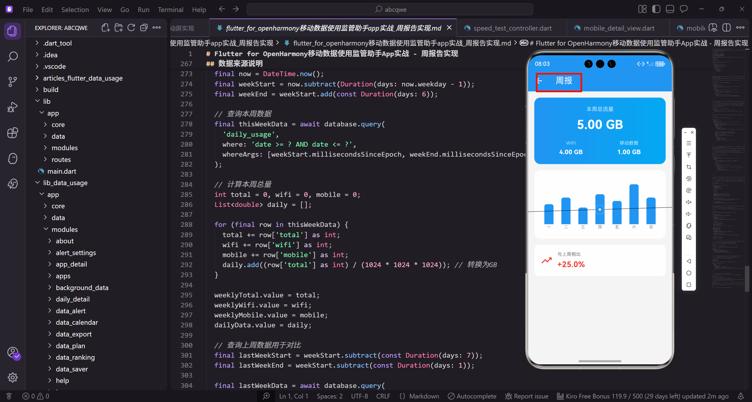
设计思路与功能规划
周报告页面需要回答用户几个核心问题:
- 这周总共用了多少流量,是否在预期范围内
- WiFi和移动数据各占多少,比例是否合理
- 每天的使用量分布如何,有没有异常的高峰
- 跟上周比是增加了还是减少了,趋势如何
围绕这些问题,页面分成三个模块:顶部汇总卡片展示本周总量、每日柱状图展示分布、周环比对比展示趋势。
页面框架搭建
先搭建页面的基础结构:
class WeeklyReportView extends GetView<WeeklyReportController> {
const WeeklyReportView({super.key});
Widget build(BuildContext context) {
return Scaffold(
继承GetView自动注入WeeklyReportController控制器。
const构造函数优化widget重建性能。
build方法返回页面的完整UI结构。
      backgroundColor: AppTheme.backgroundColor,
      appBar: AppBar(title: const Text('周报')),
      body: SingleChildScrollView(
        padding: EdgeInsets.all(16.w),
        child: Column(
Scaffold提供Material Design页面框架。
统一背景色保持视觉一致性。
SingleChildScrollView让内容可滚动。
          children: [
            _buildSummary(),
            SizedBox(height: 16.h),
            _buildChart(),
            SizedBox(height: 16.h),
            _buildComparison(),
Column垂直排列三个模块。
_buildSummary构建流量汇总卡片。
_buildChart构建每日流量柱状图。
          ],
        ),
      ),
    );
  }
}
_buildComparison构建周环比对比。
16.h间距让各模块视觉分隔清晰。
闭合所有括号完成页面结构。
流量汇总卡片
顶部卡片用渐变背景突出显示本周总流量:
Widget _buildSummary() {
  return Container(
    padding: EdgeInsets.all(20.w),
    decoration: BoxDecoration(
      gradient: const LinearGradient(
        colors: [AppTheme.primaryColor, AppTheme.secondaryColor],
      ),
Container作为汇总卡片的容器。
20.w内边距让内容更宽松。
LinearGradient创建渐变背景效果。
      borderRadius: BorderRadius.circular(16.r),
    ),
    child: Column(
      children: [
        Text('本周总流量', style: TextStyle(fontSize: 14.sp, color: Colors.white70)),
        SizedBox(height: 8.h),
16.r圆角让卡片更圆润。
Column垂直排列卡片内容。
标签用白色70%透明度作为次要信息。
        Obx(() => Text(
          controller.formatBytes(controller.weeklyTotal.value),
          style: TextStyle(fontSize: 32.sp, fontWeight: FontWeight.bold, color: Colors.white),
        )),
        SizedBox(height: 16.h),
Obx监听weeklyTotal实现响应式更新。
32.sp超大字号突出显示总流量。
白色加粗文字与渐变背景对比明显。
        Row(
          mainAxisAlignment: MainAxisAlignment.spaceAround,
          children: [
            _buildSummaryItem('WiFi', controller.formatBytes(controller.weeklyWifi.value)),
            _buildSummaryItem('移动数据', controller.formatBytes(controller.weeklyMobile.value)),
          ],
        ),
Row均匀分布WiFi和移动数据统计。
spaceAround让两项均匀分布。
_buildSummaryItem构建单个统计项。
      ],
    ),
  );
}
闭合Column和Container完成汇总卡片。
渐变背景让卡片更有视觉冲击力。
整体设计突出本周总流量这个核心数据。
汇总项组件
WiFi和移动数据的展示项:
Widget _buildSummaryItem(String label, String value) {
  return Column(
    children: [
      Text(label, style: TextStyle(fontSize: 12.sp, color: Colors.white70)),
      SizedBox(height: 4.h),
Column垂直排列标签和数值。
标签用12.sp小字号,白色70%透明度。
小间距4.h让标签和数值紧凑。
      Text(value, style: TextStyle(fontSize: 16.sp, fontWeight: FontWeight.w600, color: Colors.white)),
    ],
  );
}
数值用16.sp字号,w600加粗。
白色文字与渐变背景对比明显。
整体设计简洁直观。
每日流量柱状图
用柱状图展示一周七天的流量分布:
Widget _buildChart() {
  return Container(
    height: 180.h,
    padding: EdgeInsets.all(16.w),
    decoration: BoxDecoration(
      color: Colors.white,
      borderRadius: BorderRadius.circular(16.r),
    ),
固定高度180.h的图表容器。
白色背景与页面灰色背景对比。
16.r圆角保持视觉一致。
    child: Obx(() => BarChart(
      BarChartData(
        alignment: BarChartAlignment.spaceAround,
        maxY: controller.dailyData.isEmpty
            ? 1
            : controller.dailyData.reduce((a, b) => a > b ? a : b) * 1.2,
Obx监听dailyData实现响应式更新。
BarChart是fl_chart库的柱状图组件。
maxY根据数据最大值动态计算。
        barTouchData: BarTouchData(enabled: true),
        titlesData: FlTitlesData(
          show: true,
          bottomTitles: AxisTitles(
            sideTitles: SideTitles(
              showTitles: true,
barTouchData开启触摸交互。
titlesData配置坐标轴标签。
bottomTitles配置底部星期标签。
              getTitlesWidget: (value, meta) {
                final days = ['一', '二', '三', '四', '五', '六', '日'];
                return Text(
                  days[value.toInt() % 7],
                  style: TextStyle(fontSize: 10.sp, color: AppTheme.textSecondary),
                );
              },
days数组存储星期的中文简写。
value.toInt() % 7确保索引不越界。
10.sp小字号适合坐标轴标签。
            ),
          ),
          leftTitles: AxisTitles(sideTitles: SideTitles(showTitles: false)),
          topTitles: AxisTitles(sideTitles: SideTitles(showTitles: false)),
          rightTitles: AxisTitles(sideTitles: SideTitles(showTitles: false)),
        ),
隐藏左侧、顶部、右侧标签。
只显示底部星期标签让图表更简洁。
减少视觉干扰突出数据本身。
        borderData: FlBorderData(show: false),
        gridData: FlGridData(show: false),
        barGroups: List.generate(controller.dailyData.length, (index) {
          return BarChartGroupData(
            x: index,
隐藏边框和网格线让图表更简洁。
List.generate生成柱状图数据。
x是柱子的横坐标索引。
            barRods: [
              BarChartRodData(
                toY: controller.dailyData[index],
                color: AppTheme.primaryColor,
                width: 24.w,
                borderRadius: BorderRadius.vertical(top: Radius.circular(6.r)),
barRods定义柱子的数据。
toY是柱子的高度值。
24.w的宽度让柱子更饱满。
              ),
            ],
          );
        }),
      ),
    )),
  );
}
只有顶部有圆角,底部是平的。
6.r圆角让柱子顶部更圆润。
闭合所有组件完成图表构建。
周环比对比
展示与上周的对比情况:
Widget _buildComparison() {
  return Container(
    padding: EdgeInsets.all(16.w),
    decoration: BoxDecoration(
      color: Colors.white,
      borderRadius: BorderRadius.circular(12.r),
    ),
Container作为对比卡片的容器。
白色背景与页面灰色背景对比。
12.r圆角保持视觉一致。
    child: Row(
      children: [
        Icon(
          controller.changePercentage >= 0 ? Icons.trending_up : Icons.trending_down,
          color: controller.changePercentage >= 0 ? Colors.red : AppTheme.wifiColor,
          size: 32.sp,
        ),
Row横向排列图标和文字。
根据变化正负显示上升或下降图标。
增加用红色警示,减少用绿色表示节省。
        SizedBox(width: 12.w),
        Expanded(
          child: Column(
            crossAxisAlignment: CrossAxisAlignment.start,
            children: [
              Text('与上周相比', style: TextStyle(fontSize: 12.sp, color: AppTheme.textSecondary)),
间距12.w让图标和文字不挤。
Expanded让文字区域占据剩余空间。
标签用12.sp小字号作为说明。
              SizedBox(height: 4.h),
              Obx(() => Text(
                '${controller.changePercentage >= 0 ? '+' : ''}${controller.changePercentage.toStringAsFixed(1)}%',
                style: TextStyle(
                  fontSize: 20.sp,
小间距4.h后显示百分比。
正数前面加+号,负数自带-号。
toStringAsFixed(1)保留一位小数。
                  fontWeight: FontWeight.bold,
                  color: controller.changePercentage >= 0 ? Colors.red : AppTheme.wifiColor,
                ),
              )),
            ],
          ),
        ),
      ],
    ),
  );
}
20.sp大字号突出显示变化百分比。
颜色与图标一致,增加红色减少绿色。
整体设计让用户一眼看出趋势。
Controller层实现
Controller负责数据管理和业务逻辑:
class WeeklyReportController extends GetxController {
  final weeklyTotal = 0.obs;
  final weeklyWifi = 0.obs;
  final weeklyMobile = 0.obs;
  final lastWeekTotal = 0.obs;
  final dailyData = <double>[].obs;
weeklyTotal存储本周总流量。
weeklyWifi和weeklyMobile分别存储WiFi和移动数据。
dailyData存储每日流量数据用于图表。
void onInit() {
super.onInit();
loadData();
}
void loadData() {
weeklyTotal.value = 1024 * 1024 * 1024 * 5;
onInit在控制器初始化时调用。
loadData加载周报告数据。
模拟本周总流量5GB。
    weeklyWifi.value = 1024 * 1024 * 1024 * 4;
    weeklyMobile.value = 1024 * 1024 * 1024 * 1;
    lastWeekTotal.value = 1024 * 1024 * 1024 * 4;
    dailyData.value = [0.6, 0.8, 0.5, 0.9, 0.7, 1.2, 0.8];
  }
WiFi流量4GB,移动数据1GB。
上周总流量4GB用于计算环比。
dailyData是每日流量,单位GB。
  String formatBytes(int bytes) {
    if (bytes < 1024) return '$bytes B';
    if (bytes < 1024 * 1024) return '${(bytes / 1024).toStringAsFixed(1)} KB';
    if (bytes < 1024 * 1024 * 1024) return '${(bytes / (1024 * 1024)).toStringAsFixed(2)} MB';
formatBytes将字节数格式化为可读字符串。
根据大小选择合适的单位。
toStringAsFixed控制小数位数。
    return '${(bytes / (1024 * 1024 * 1024)).toStringAsFixed(2)} GB';
  }

  double get changePercentage {
    if (lastWeekTotal.value == 0) return 0;
    return ((weeklyTotal.value - lastWeekTotal.value) / lastWeekTotal.value) * 100;
  }
}
GB级别的数据保留两位小数。
changePercentage计算周环比变化百分比。
除零保护避免程序崩溃。
数据来源说明
实际项目中,周报告的数据需要从本地数据库或服务端获取:
Future<void> loadData() async {
  final now = DateTime.now();
  final weekStart = now.subtract(Duration(days: now.weekday - 1));
  final weekEnd = weekStart.add(const Duration(days: 6));
获取当前时间。
计算本周一的日期作为起点。
计算本周日的日期作为终点。
  final thisWeekData = await database.query(
    'daily_usage',
    where: 'date >= ? AND date <= ?',
    whereArgs: [weekStart.millisecondsSinceEpoch, weekEnd.millisecondsSinceEpoch],
  );
查询本周的每日流量数据。
使用毫秒时间戳作为查询条件。
比字符串比较更高效。
  int total = 0, wifi = 0, mobile = 0;
  List<double> daily = [];

  for (final row in thisWeekData) {
    total += row['total'] as int;
    wifi += row['wifi'] as int;
初始化累加变量。
遍历查询结果累加数据。
分别累加总流量和WiFi流量。
    mobile += row['mobile'] as int;
    daily.add((row['total'] as int) / (1024 * 1024 * 1024));
  }

  weeklyTotal.value = total;
  weeklyWifi.value = wifi;
累加移动数据流量。
每日流量转换为GB单位。
更新响应式变量触发UI更新。
  weeklyMobile.value = mobile;
  dailyData.value = daily;

  final lastWeekStart = weekStart.subtract(const Duration(days: 7));
  final lastWeekEnd = weekStart.subtract(const Duration(days: 1));
更新移动数据和每日数据。
计算上周的起止日期。
用于查询上周数据计算环比。
  final lastWeekData = await database.query(
    'daily_usage',
    where: 'date >= ? AND date <= ?',
    whereArgs: [lastWeekStart.millisecondsSinceEpoch, lastWeekEnd.millisecondsSinceEpoch],
  );
查询上周的流量数据。
使用相同的查询方式。
时间范围是上周一到上周日。
  int lastTotal = 0;
  for (final row in lastWeekData) {
    lastTotal += row['total'] as int;
  }
  lastWeekTotal.value = lastTotal;
}
累加上周总流量。
更新lastWeekTotal触发环比计算。
实际项目中替换模拟数据。
写在最后
周报告页面通过汇总卡片、柱状图和环比对比三个模块,帮助用户从宏观角度了解自己的流量使用情况。相比日详情的细粒度数据,周报告更适合发现使用规律和趋势变化。
可以继续优化的方向:
- 支持查看历史周报告
- 添加WiFi和移动数据的分别趋势图
- 支持导出周报告
- 添加流量使用建议
欢迎加入开源鸿蒙跨平台社区:https://openharmonycrossplatform.csdn.net

开源鸿蒙跨平台开发社区汇聚开发者与厂商,共建“一次开发,多端部署”的开源生态,致力于降低跨端开发门槛,推动万物智联创新。
更多推荐


 18
18 0
0- 0


 已为社区贡献30条内容

所有评论(0)