Flutter for OpenHarmony 个人理财管理App实战 - 搜索功能页面
本文介绍了理财应用中搜索功能的实现方案。该功能支持按分类名称和备注内容进行关键词搜索,并可筛选收入或支出类型。实现要点包括:实时搜索响应、状态管理、搜索结果排序及UI设计。通过TextEditingController监听输入变化,结合条件筛选逻辑快速匹配交易记录,并按时间倒序展示。界面采用简洁设计,搜索框集成在AppBar中,支持筛选条件提示和清除功能。该方案提升了用户在大量交易记录中快速定位特
搜索功能是理财应用中不可或缺的一部分,当交易记录越来越多时,用户需要一种快速定位特定记录的方式。本篇将实现一个功能完善的搜索页面,支持按分类名称和备注内容搜索,并可以按类型筛选结果。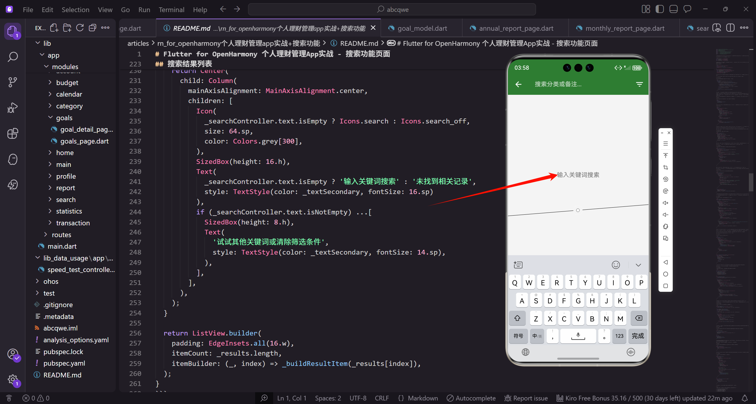
功能需求分析
在设计搜索功能之前,先想清楚用户的使用场景。用户可能想找某次具体的消费记录,比如上周在某家餐厅的消费,或者某个月的所有交通支出。基于这些场景,搜索功能需要满足以下需求:
- 支持关键词搜索,匹配分类名称和备注内容
- 支持按交易类型筛选,只看收入或只看支出
- 搜索结果按时间倒序排列,最新的在前面
- 实时搜索,输入即显示结果,不需要点击搜索按钮
- 点击结果可以跳转到交易详情页面
这些需求看起来简单,但实现起来有不少细节需要考虑。
页面状态设计
搜索页面需要管理几个状态:搜索关键词、筛选类型、搜索结果列表。使用 StatefulWidget 来管理这些状态:
import 'package:flutter/material.dart';
import 'package:flutter_screenutil/flutter_screenutil.dart';
import 'package:get/get.dart';
import 'package:intl/intl.dart';
import '../../core/services/transaction_service.dart';
import '../../core/services/category_service.dart';
import '../../core/services/storage_service.dart';
import '../../data/models/transaction_model.dart';
import '../../routes/app_pages.dart';
导入了必要的依赖,包括三个服务:TransactionService 用于获取交易数据,CategoryService 用于获取分类信息,StorageService 用于获取货币符号等配置。
定义颜色常量,保持和应用其他页面的视觉一致性:
const _primaryColor = Color(0xFF2E7D32);
const _incomeColor = Color(0xFF4CAF50);
const _expenseColor = Color(0xFFE53935);
const _textSecondary = Color(0xFF757575);
_primaryColor 是应用的主色调,用于强调元素。_incomeColor 和 _expenseColor 分别用于收入和支出金额的显示,让用户一眼就能区分。_textSecondary 用于次要文字,比如日期和备注。
页面类和状态定义:
class SearchPage extends StatefulWidget {
const SearchPage({super.key});
State<SearchPage> createState() => _SearchPageState();
}
class _SearchPageState extends State<SearchPage> {
final _searchController = TextEditingController();
final _transactionService = Get.find<TransactionService>();
final _categoryService = Get.find<CategoryService>();
final _storage = Get.find<StorageService>();
List<TransactionModel> _results = [];
TransactionType? _filterType;
_searchController 控制搜索输入框,可以获取和设置输入内容。_results 存储搜索结果,初始为空列表。_filterType 是筛选类型,null 表示不筛选,显示全部。
通过 Get.find 获取已注册的服务实例,这是 GetX 的依赖注入方式,服务在应用启动时已经注册好了。
搜索逻辑实现
搜索是这个页面的核心功能,需要同时匹配分类名称和备注内容:
  void _search() {
    final query = _searchController.text.toLowerCase();
    setState(() {
      _results = _transactionService.allTransactions.where((t) {
        final category = _categoryService.getCategoryById(t.categoryId);

        final matchesQuery = query.isEmpty ||
          (category?.name.toLowerCase().contains(query) ?? false) ||
          (t.note?.toLowerCase().contains(query) ?? false);

        final matchesType = _filterType == null || t.type == _filterType;

        return matchesQuery && matchesType;
      }).toList();

      _results.sort((a, b) => b.date.compareTo(a.date));
    });
  }
搜索逻辑分为几个步骤。首先把搜索关键词转成小写,这样搜索时不区分大小写,用户体验更好。
然后遍历所有交易记录,对每条记录做两个判断:是否匹配关键词、是否匹配筛选类型。只有两个条件都满足才会出现在结果中。
关键词匹配时,如果 query 为空,matchesQuery 直接为 true,显示所有记录。否则检查分类名称和备注是否包含关键词。用 ?. 和 ?? 处理可能为空的情况,避免空指针异常。
最后按日期倒序排列,最新的记录排在前面。compareTo 返回负数表示 a 在 b 前面,这里用 b.date.compareTo(a.date) 实现倒序。
资源释放
TextEditingController 需要在页面销毁时释放,否则会造成内存泄漏:
void dispose() {
_searchController.dispose();
super.dispose();
}
dispose 方法在 State 对象被永久移除时调用,这里释放 controller 占用的资源。super.dispose 要放在最后调用,这是 Flutter 的约定。
页面主体结构
Widget build(BuildContext context) {
return Scaffold(
appBar: AppBar(
title: TextField(
controller: _searchController,
autofocus: true,
style: const TextStyle(color: Colors.white),
decoration: const InputDecoration(
hintText: '搜索分类或备注...',
hintStyle: TextStyle(color: Colors.white70),
border: InputBorder.none
),
onChanged: (_) => _search(),
),
actions: [
IconButton(
icon: const Icon(Icons.filter_list),
onPressed: _showFilterDialog
),
],
),
body: Column(
children: [
if (_filterType != null) _buildFilterIndicator(),
Expanded(child: _buildResultList()),
],
),
);
}
搜索框直接放在 AppBar 的 title 位置,这是一种常见的设计模式,节省空间又直观。autofocus 设为 true,页面打开时自动弹出键盘,用户可以直接输入。
onChanged 回调在每次输入变化时触发搜索,实现实时搜索效果。右侧的筛选按钮点击后弹出筛选对话框。
body 部分用 Column 布局,顶部是筛选状态指示器(有筛选时才显示),下面是搜索结果列表。Expanded 让列表占据剩余空间。
搜索输入框样式
搜索框的样式需要和 AppBar 的绿色背景协调:
Widget _buildSearchField() {
  return TextField(
    controller: _searchController,
    autofocus: true,
    style: const TextStyle(color: Colors.white),
    cursorColor: Colors.white,
    decoration: InputDecoration(
      hintText: '搜索分类或备注...',
      hintStyle: const TextStyle(color: Colors.white70),
      border: InputBorder.none,
      prefixIcon: const Icon(Icons.search, color: Colors.white70),
    ),
    onChanged: (_) => _search(),
  );
}
文字颜色设为白色,和绿色背景形成对比。hintStyle 用 white70 稍微透明一点,区分于实际输入的文字。border 设为 none,去掉输入框的边框,看起来更简洁。
prefixIcon 添加一个搜索图标,让用户更明确这是搜索框。cursorColor 设为白色,保持视觉一致。
筛选状态指示器
当用户设置了筛选条件时,需要给出明确的提示,并提供清除筛选的入口:
Widget _buildFilterIndicator() {
  return Container(
    padding: EdgeInsets.symmetric(horizontal: 16.w, vertical: 8.h),
    color: _primaryColor.withOpacity(0.1),
    child: Row(
      children: [
        Icon(Icons.filter_alt, size: 16.sp, color: _primaryColor),
        SizedBox(width: 8.w),
        Text(
          _filterType == TransactionType.expense ? '仅显示支出' : '仅显示收入',
          style: TextStyle(fontSize: 12.sp, color: _primaryColor)
        ),
        const Spacer(),
        GestureDetector(
          onTap: () => setState(() {
            _filterType = null;
            _search();
          }),
          child: Row(
            children: [
              Icon(Icons.close, size: 14.sp, color: _primaryColor),
              SizedBox(width: 4.w),
              Text('清除', style: TextStyle(fontSize: 12.sp, color: _primaryColor)),
            ],
          ),
        ),
      ],
    ),
  );
}
指示器用浅绿色背景,和主色调呼应但不抢眼。左侧显示筛选图标和当前筛选条件的文字说明,右侧是清除按钮。
点击清除时,把 _filterType 设为 null,然后重新搜索。GestureDetector 包裹整个清除区域,增大点击范围,方便操作。
搜索结果列表
搜索结果用 ListView.builder 展示,支持大量数据的高效渲染:
Widget _buildResultList() {
  if (_results.isEmpty) {
    return Center(
      child: Column(
        mainAxisAlignment: MainAxisAlignment.center,
        children: [
          Icon(
            _searchController.text.isEmpty ? Icons.search : Icons.search_off,
            size: 64.sp,
            color: Colors.grey[300],
          ),
          SizedBox(height: 16.h),
          Text(
            _searchController.text.isEmpty ? '输入关键词搜索' : '未找到相关记录',
            style: TextStyle(color: _textSecondary, fontSize: 16.sp)
          ),
          if (_searchController.text.isNotEmpty) ...[
            SizedBox(height: 8.h),
            Text(
              '试试其他关键词或清除筛选条件',
              style: TextStyle(color: _textSecondary, fontSize: 14.sp),
            ),
          ],
        ],
      ),
    );
  }

  return ListView.builder(
    padding: EdgeInsets.all(16.w),
    itemCount: _results.length,
    itemBuilder: (_, index) => _buildResultItem(_results[index]),
  );
}
空状态分两种情况处理:还没输入关键词时,显示"输入关键词搜索"的提示;搜索后没有结果时,显示"未找到相关记录"并给出建议。
图标也根据状态变化,没输入时用 search 图标,搜索无结果时用 search_off 图标,细节上的区分让用户更容易理解当前状态。
结果项组件
每条搜索结果显示分类图标、分类名称、日期、备注和金额:
Widget _buildResultItem(TransactionModel t) {
  final category = _categoryService.getCategoryById(t.categoryId);

  return Card(
    margin: EdgeInsets.only(bottom: 8.h),
    child: ListTile(
      leading: CircleAvatar(
        backgroundColor: (category?.color ?? Colors.grey).withOpacity(0.2),
        child: Icon(
          category?.icon ?? Icons.help,
          color: category?.color ?? Colors.grey,
          size: 20.sp
        )
      ),
      title: Text(
        category?.name ?? '未知分类',
        style: TextStyle(fontSize: 14.sp, fontWeight: FontWeight.w500),
      ),
      subtitle: Column(
        crossAxisAlignment: CrossAxisAlignment.start,
        children: [
          SizedBox(height: 4.h),
          Text(
            DateFormat('yyyy-MM-dd HH:mm').format(t.date),
            style: TextStyle(fontSize: 12.sp, color: _textSecondary)
          ),
          if (t.note != null && t.note!.isNotEmpty) ...[
            SizedBox(height: 2.h),
            Text(
              t.note!,
              maxLines: 1,
              overflow: TextOverflow.ellipsis,
              style: TextStyle(fontSize: 12.sp, color: _textSecondary)
            ),
          ],
        ],
      ),
      trailing: Text(
        '${t.type == TransactionType.income ? '+' : '-'}${_storage.currency}${t.amount.toStringAsFixed(2)}',
        style: TextStyle(
          color: t.type == TransactionType.income ? _incomeColor : _expenseColor,
          fontWeight: FontWeight.w600,
          fontSize: 14.sp,
        ),
      ),
      onTap: () => Get.toNamed(Routes.transactionDetail, arguments: t),
    ),
  );
}
leading 用 CircleAvatar 包裹分类图标,背景是分类颜色的浅色版本,视觉上更柔和。如果分类不存在(可能被删除了),显示问号图标和灰色。
subtitle 用 Column 布局,显示日期和备注。备注可能为空,用条件判断决定是否显示。maxLines 和 overflow 处理备注过长的情况,超出部分显示省略号。
trailing 显示金额,收入用绿色加号,支出用红色减号,一目了然。金额保留两位小数,前面加上货币符号。
点击结果项跳转到交易详情页面,把交易对象作为参数传递过去。
筛选对话框
筛选对话框让用户选择只看收入或只看支出:
void _showFilterDialog() {
  Get.dialog(
    AlertDialog(
      title: const Text('筛选条件'),
      content: Column(
        mainAxisSize: MainAxisSize.min,
        crossAxisAlignment: CrossAxisAlignment.start,
        children: [
          Text('交易类型', style: TextStyle(fontSize: 14.sp, color: _textSecondary)),
          SizedBox(height: 12.h),
          Wrap(
            spacing: 8.w,
            children: [
              _buildFilterChip('全部', null),
              _buildFilterChip('支出', TransactionType.expense),
              _buildFilterChip('收入', TransactionType.income),
            ],
          ),
        ],
      ),
      actions: [
        TextButton(
          onPressed: () => Get.back(),
          child: const Text('关闭')
        ),
      ],
    ),
  );
}

Widget _buildFilterChip(String label, TransactionType? type) {
  final isSelected = _filterType == type;
  return ChoiceChip(
    label: Text(label),
    selected: isSelected,
    selectedColor: _primaryColor.withOpacity(0.2),
    onSelected: (_) {
      setState(() {
        _filterType = type;
      });
      Get.back();
      _search();
    },
  );
}
用 ChoiceChip 实现单选效果,选中的芯片有不同的背景色。点击后更新筛选条件,关闭对话框,重新搜索。
mainAxisSize 设为 min,让对话框内容区域只占用必要的高度,不会撑满整个屏幕。
搜索历史功能
为了提升用户体验,可以添加搜索历史功能,记录用户最近的搜索关键词:
final List<String> _searchHistory = [];

void _addToHistory(String query) {
  if (query.isEmpty) return;
  _searchHistory.remove(query);
  _searchHistory.insert(0, query);
  if (_searchHistory.length > 10) {
    _searchHistory.removeLast();
  }
}

Widget _buildSearchHistory() {
  if (_searchHistory.isEmpty || _searchController.text.isNotEmpty) {
    return const SizedBox.shrink();
  }

  return Column(
    crossAxisAlignment: CrossAxisAlignment.start,
    children: [
      Padding(
        padding: EdgeInsets.all(16.w),
        child: Row(
          mainAxisAlignment: MainAxisAlignment.spaceBetween,
          children: [
            Text('搜索历史', style: TextStyle(fontSize: 14.sp, color: _textSecondary)),
            GestureDetector(
              onTap: () => setState(() => _searchHistory.clear()),
              child: Text('清空', style: TextStyle(fontSize: 12.sp, color: _primaryColor)),
            ),
          ],
        ),
      ),
      Wrap(
        spacing: 8.w,
        runSpacing: 8.h,
        children: _searchHistory.map((query) => GestureDetector(
          onTap: () {
            _searchController.text = query;
            _search();
          },
          child: Chip(
            label: Text(query, style: TextStyle(fontSize: 12.sp)),
            deleteIcon: Icon(Icons.close, size: 14.sp),
            onDeleted: () => setState(() => _searchHistory.remove(query)),
          ),
        )).toList(),
      ),
    ],
  );
}
搜索历史最多保存 10 条,新的搜索会排在前面。如果搜索已存在的关键词,会把它移到最前面而不是重复添加。
每条历史记录显示为一个 Chip,点击可以快速填入搜索框,右侧的删除按钮可以单独删除某条记录。顶部有清空按钮,一键删除所有历史。
高亮搜索关键词
在搜索结果中高亮显示匹配的关键词,帮助用户快速定位:
Widget _buildHighlightedText(String text, String query) {
  if (query.isEmpty) {
    return Text(text, style: TextStyle(fontSize: 12.sp, color: _textSecondary));
  }

  final lowerText = text.toLowerCase();
  final lowerQuery = query.toLowerCase();
  final index = lowerText.indexOf(lowerQuery);

  if (index == -1) {
    return Text(text, style: TextStyle(fontSize: 12.sp, color: _textSecondary));
  }

  return RichText(
    text: TextSpan(
      style: TextStyle(fontSize: 12.sp, color: _textSecondary),
      children: [
        TextSpan(text: text.substring(0, index)),
        TextSpan(
          text: text.substring(index, index + query.length),
          style: TextStyle(
            color: _primaryColor,
            fontWeight: FontWeight.w600,
            backgroundColor: _primaryColor.withOpacity(0.1),
          ),
        ),
        TextSpan(text: text.substring(index + query.length)),
      ],
    ),
  );
}
用 RichText 和 TextSpan 实现部分文字的样式变化。找到关键词的位置后,把文字分成三段:关键词前面的、关键词本身、关键词后面的。关键词部分用主色调显示,并加上浅色背景。
防抖优化
实时搜索在每次输入时都会触发,如果用户输入很快,会产生大量无效的搜索操作。可以用防抖来优化:
Timer? _debounceTimer;
void _onSearchChanged(String query) {
_debounceTimer?.cancel();
_debounceTimer = Timer(const Duration(milliseconds: 300), () {
_search();
});
}
void dispose() {
_debounceTimer?.cancel();
_searchController.dispose();
super.dispose();
}
每次输入变化时,先取消之前的定时器,然后设置一个新的 300 毫秒后执行的定时器。如果用户在 300 毫秒内继续输入,定时器会被取消,搜索不会执行。只有用户停止输入 300 毫秒后,才会真正执行搜索。
记得在 dispose 中取消定时器,避免页面销毁后定时器还在执行导致的问题。
键盘处理
搜索完成后,用户可能想隐藏键盘查看结果。可以在点击结果列表时自动隐藏键盘:
Widget _buildResultList() {
  return GestureDetector(
    onTap: () => FocusScope.of(context).unfocus(),
    child: ListView.builder(
      // ...
    ),
  );
}
FocusScope.of(context).unfocus() 会取消当前的焦点,键盘自然就收起来了。用 GestureDetector 包裹列表,点击列表的任意位置都能触发。
空状态优化
空状态不只是显示文字,还可以提供一些快捷操作:
Widget _buildEmptyState() {
  return Center(
    child: Column(
      mainAxisAlignment: MainAxisAlignment.center,
      children: [
        Icon(
          Icons.search,
          size: 80.sp,
          color: Colors.grey[300],
        ),
        SizedBox(height: 16.h),
        Text(
          '搜索交易记录',
          style: TextStyle(
            fontSize: 18.sp,
            fontWeight: FontWeight.w500,
            color: _textSecondary,
          ),
        ),
        SizedBox(height: 8.h),
        Text(
          '输入分类名称或备注内容',
          style: TextStyle(fontSize: 14.sp, color: _textSecondary),
        ),
        SizedBox(height: 24.h),
        Wrap(
          spacing: 8.w,
          children: [
            _buildQuickSearchChip('餐饮'),
            _buildQuickSearchChip('交通'),
            _buildQuickSearchChip('购物'),
          ],
        ),
      ],
    ),
  );
}

Widget _buildQuickSearchChip(String label) {
  return ActionChip(
    label: Text(label),
    onPressed: () {
      _searchController.text = label;
      _search();
    },
  );
}
在空状态下显示几个常用的搜索词,用户点击就能快速搜索,降低使用门槛。
小结
搜索功能看起来简单,但要做好用户体验需要考虑很多细节。核心要点包括:
- 实时搜索配合防抖,响应快又不浪费资源
- 筛选条件可视化,状态清晰可控
- 空状态友好,给出明确的引导
- 搜索历史提升效率,减少重复输入
- 关键词高亮,帮助用户快速定位
这些细节加在一起,才能构成一个真正好用的搜索功能。下一篇将实现统计分析页面,展示更丰富的数据可视化效果。
欢迎加入开源鸿蒙跨平台社区:https://openharmonycrossplatform.csdn.net

开源鸿蒙跨平台开发社区汇聚开发者与厂商,共建“一次开发,多端部署”的开源生态,致力于降低跨端开发门槛,推动万物智联创新。
更多推荐

 19
19 0
0- 0


 已为社区贡献26条内容

所有评论(0)