不得不说Flutter水平进度条和圆形旋转指示器在鸿蒙也很流畅
Flutter提供了两种进度指示器组件:LinearProgressIndicator(线性进度条)和CircularProgressIndicator(圆形进度指示器)。前者适合展示文件下载等确定进度,后者常用于数据加载等不确定进度场景。开发者可通过value参数控制进度,并自定义颜色、高度/宽度等样式。实际应用包括文件下载进度展示、数据加载提示以及按钮加载状态等交互场景。这些组件能有效提升用户
·
📖 前言
进度指示器是移动应用中重要的用户反馈组件,可以向用户展示任务的执行进度,提升用户体验。Flutter 提供了两种类型的进度指示器:线性进度条和圆形进度指示器。
🎯 ProgressIndicator 组件概览
ProgressIndicator 是一个抽象类,有两个具体实现:
| 组件名 | 显示方式 | 适用场景 |
|---|---|---|
LinearProgressIndicator |
水平进度条 | 文件下载、上传进度 |
CircularProgressIndicator |
圆形旋转指示器 | 加载中、处理中 |
进度指示器可以显示确定进度(知道总进度)或不确定进度(不知道总进度)。
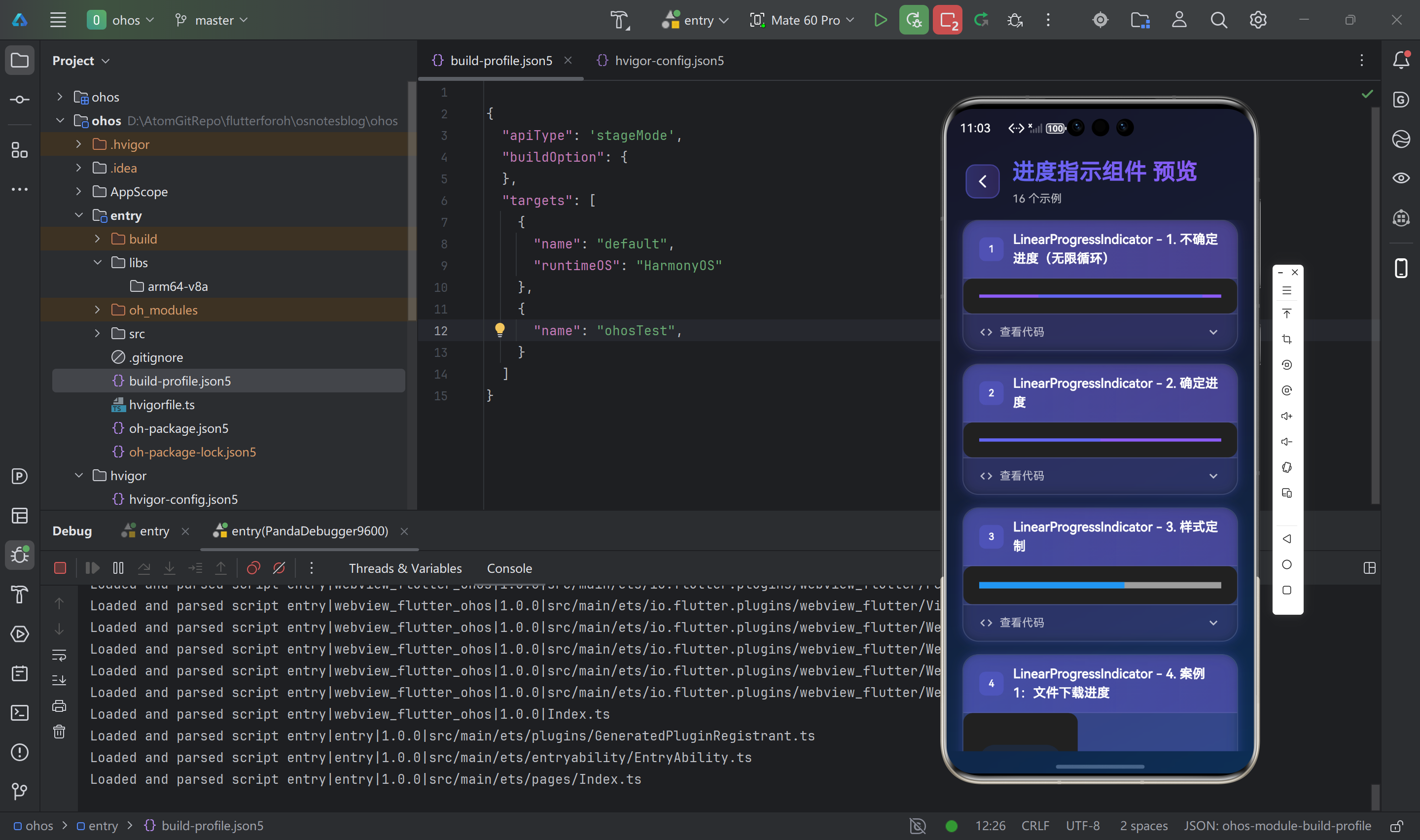
📊 LinearProgressIndicator(线性进度条)
基础用法
// 不确定进度(无限循环)
LinearProgressIndicator()

// 确定进度
LinearProgressIndicator(
  value: 0.5,  // 0.0 到 1.0
)
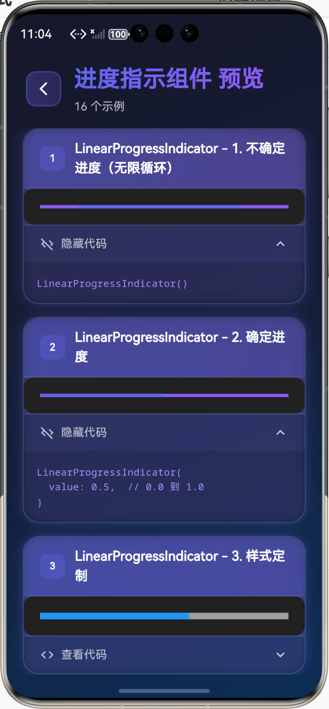
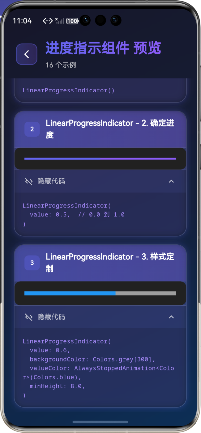
样式定制
LinearProgressIndicator(
  value: 0.6,
  backgroundColor: Colors.grey[300],
  valueColor: AlwaysStoppedAnimation<Color>(Colors.blue),
  minHeight: 8.0,
)
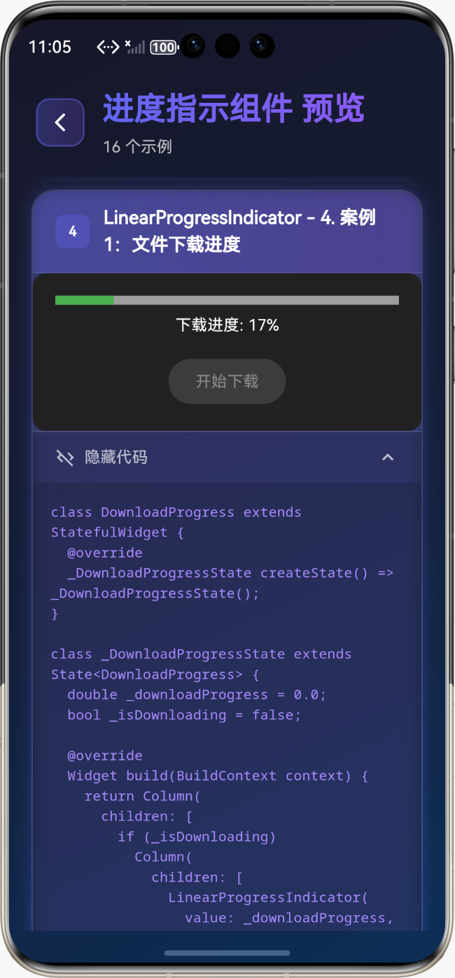
实际应用案例
案例1:文件下载进度
class DownloadProgress extends StatefulWidget {
_DownloadProgressState createState() => _DownloadProgressState();
}
class _DownloadProgressState extends State<DownloadProgress> {
double _downloadProgress = 0.0;
bool _isDownloading = false;
Widget build(BuildContext context) {
return Column(
children: [
if (_isDownloading)
Column(
children: [
LinearProgressIndicator(
value: _downloadProgress,
backgroundColor: Colors.grey[300],
valueColor: AlwaysStoppedAnimation<Color>(Colors.green),
minHeight: 8,
),
SizedBox(height: 8),
Text('下载进度: ${(_downloadProgress * 100).toInt()}%'),
],
),
ElevatedButton(
onPressed: _isDownloading ? null : _startDownload,
child: Text('开始下载'),
),
],
);
}
void _startDownload() {
setState(() {
_isDownloading = true;
_downloadProgress = 0.0;
});
// 模拟下载进度
Timer.periodic(Duration(milliseconds: 100), (timer) {
setState(() {
_downloadProgress += 0.01;
if (_downloadProgress >= 1.0) {
_downloadProgress = 1.0;
_isDownloading = false;
timer.cancel();
}
});
});
}
}
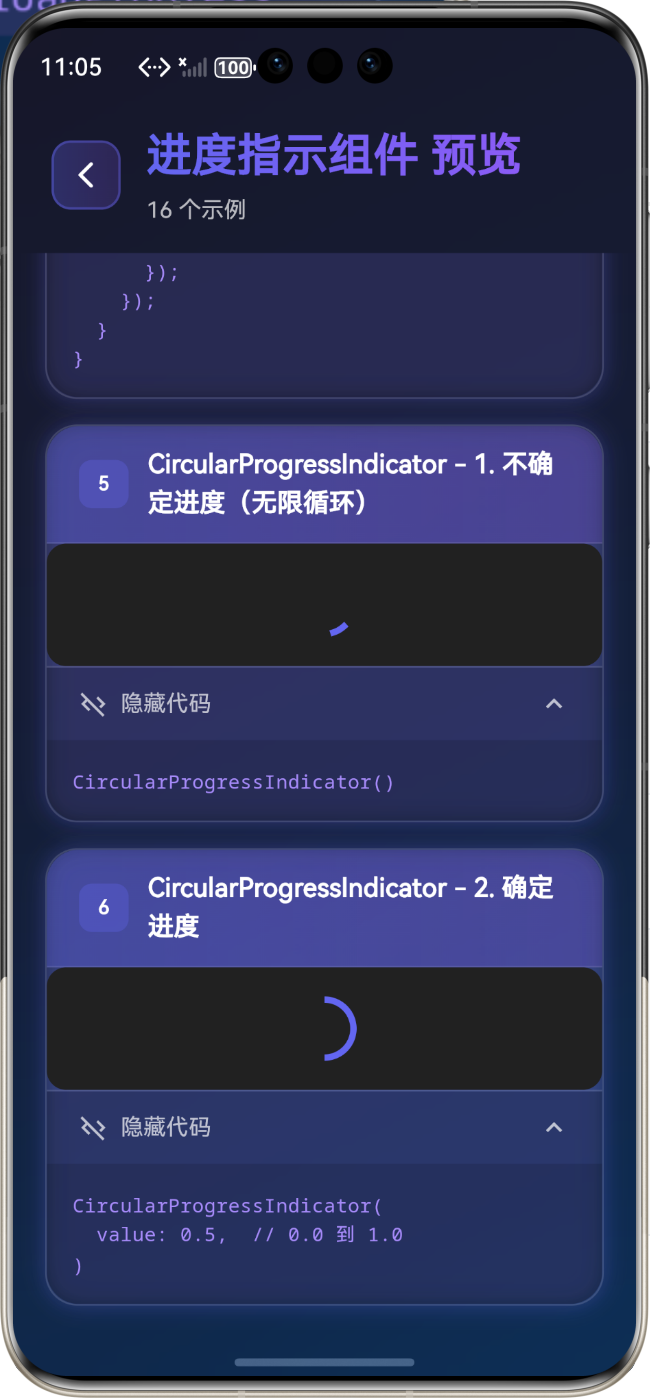
⭕ CircularProgressIndicator(圆形进度指示器)
基础用法
// 不确定进度(无限循环)
CircularProgressIndicator()

// 确定进度
CircularProgressIndicator(
  value: 0.5,  // 0.0 到 1.0
)
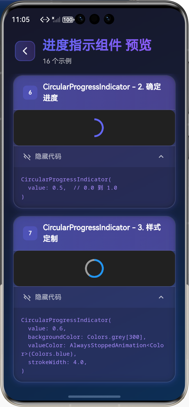
样式定制
CircularProgressIndicator(
  value: 0.6,
  backgroundColor: Colors.grey[300],
  valueColor: AlwaysStoppedAnimation<Color>(Colors.blue),
  strokeWidth: 4.0,
)
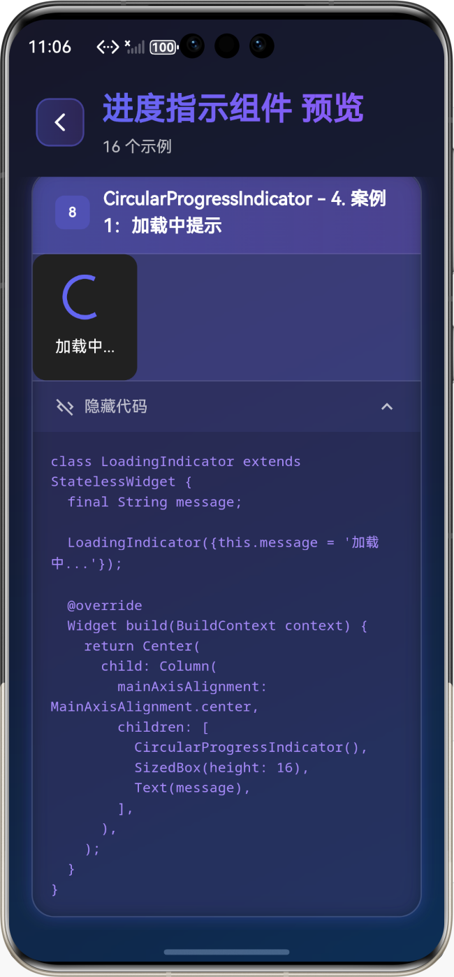
实际应用案例
案例1:加载中提示
class LoadingIndicator extends StatelessWidget {
final String message;
LoadingIndicator({this.message = '加载中...'});
Widget build(BuildContext context) {
return Center(
child: Column(
mainAxisAlignment: MainAxisAlignment.center,
children: [
CircularProgressIndicator(),
SizedBox(height: 16),
Text(message),
],
),
);
}
}
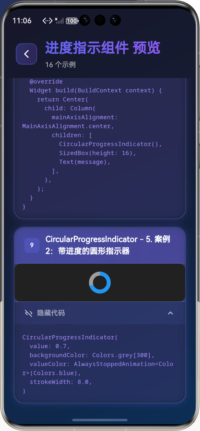
案例2:带进度的圆形指示器
CircularProgressIndicator(
  value: 0.7,
  backgroundColor: Colors.grey[300],
  valueColor: AlwaysStoppedAnimation<Color>(Colors.blue),
  strokeWidth: 8.0,
)
💡 实际应用场景
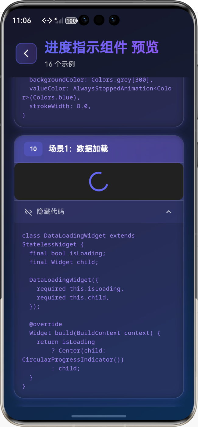
场景1:数据加载
class DataLoadingWidget extends StatelessWidget {
final bool isLoading;
final Widget child;
DataLoadingWidget({
required this.isLoading,
required this.child,
});
Widget build(BuildContext context) {
return isLoading
? Center(child: CircularProgressIndicator())
: child;
}
}
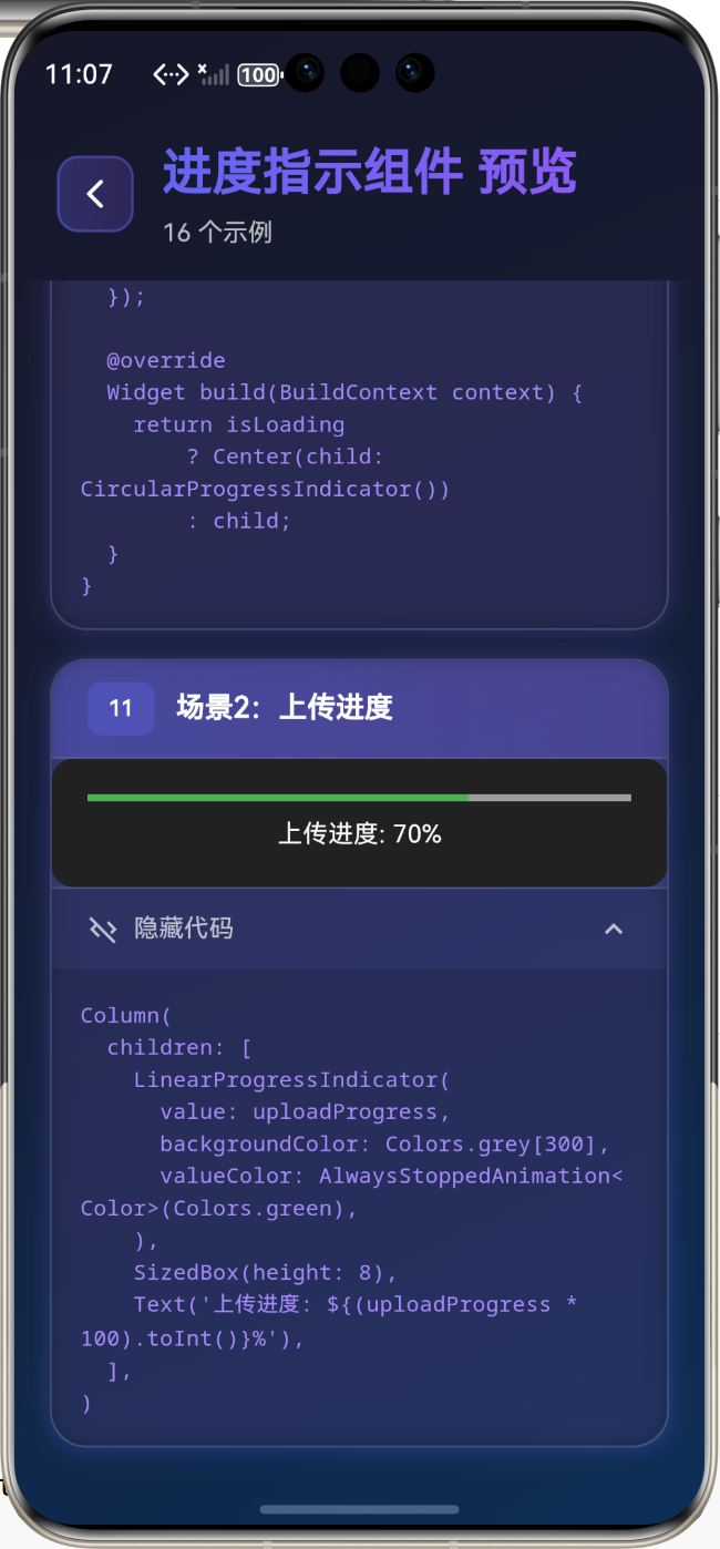
场景2:上传进度
Column(
  children: [
    LinearProgressIndicator(
      value: uploadProgress,
      backgroundColor: Colors.grey[300],
      valueColor: AlwaysStoppedAnimation<Color>(Colors.green),
    ),
    SizedBox(height: 8),
    Text('上传进度: ${(uploadProgress * 100).toInt()}%'),
  ],
)
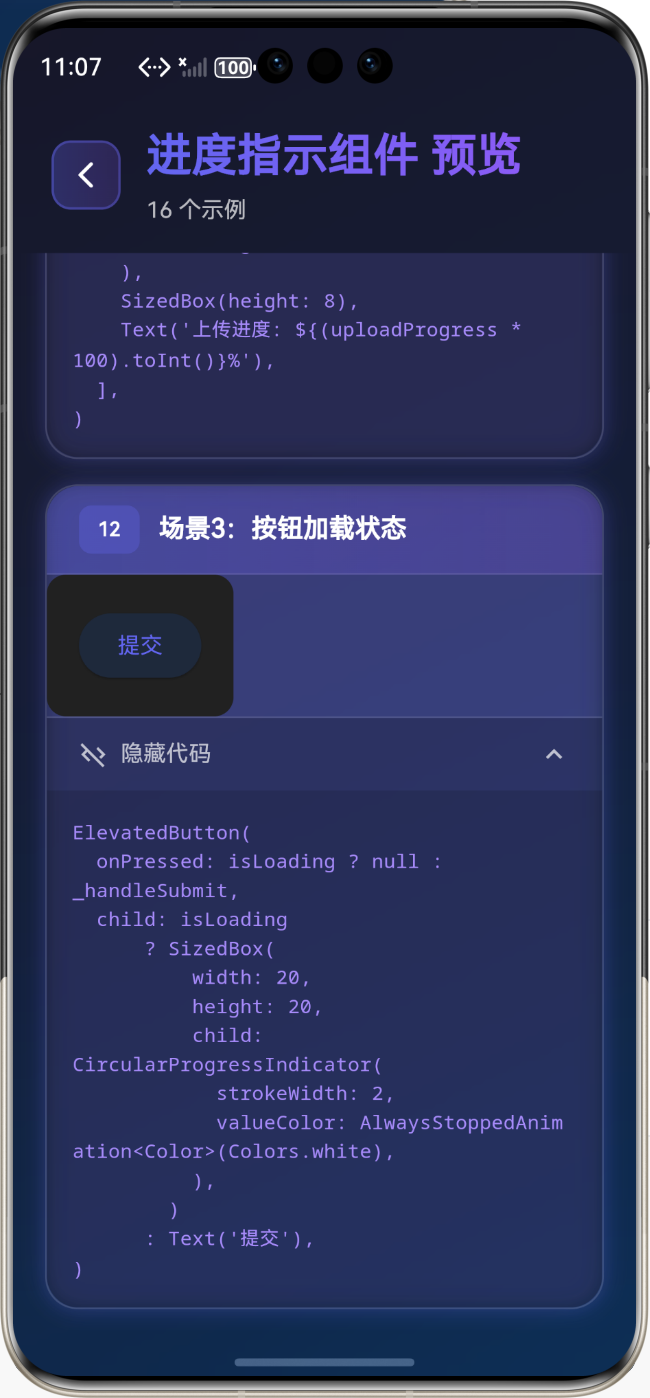
场景3:按钮加载状态
ElevatedButton(
  onPressed: isLoading ? null : _handleSubmit,
  child: isLoading
      ? SizedBox(
          width: 20,
          height: 20,
          child: CircularProgressIndicator(
            strokeWidth: 2,
            valueColor: AlwaysStoppedAnimation<Color>(Colors.white),
          ),
        )
      : Text('提交'),
)
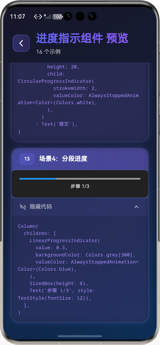
场景4:分段进度
Column(
  children: [
    LinearProgressIndicator(
      value: 0.3,
      backgroundColor: Colors.grey[300],
      valueColor: AlwaysStoppedAnimation<Color>(Colors.blue),
    ),
    SizedBox(height: 8),
    Text('步骤 1/3', style: TextStyle(fontSize: 12)),
  ],
)
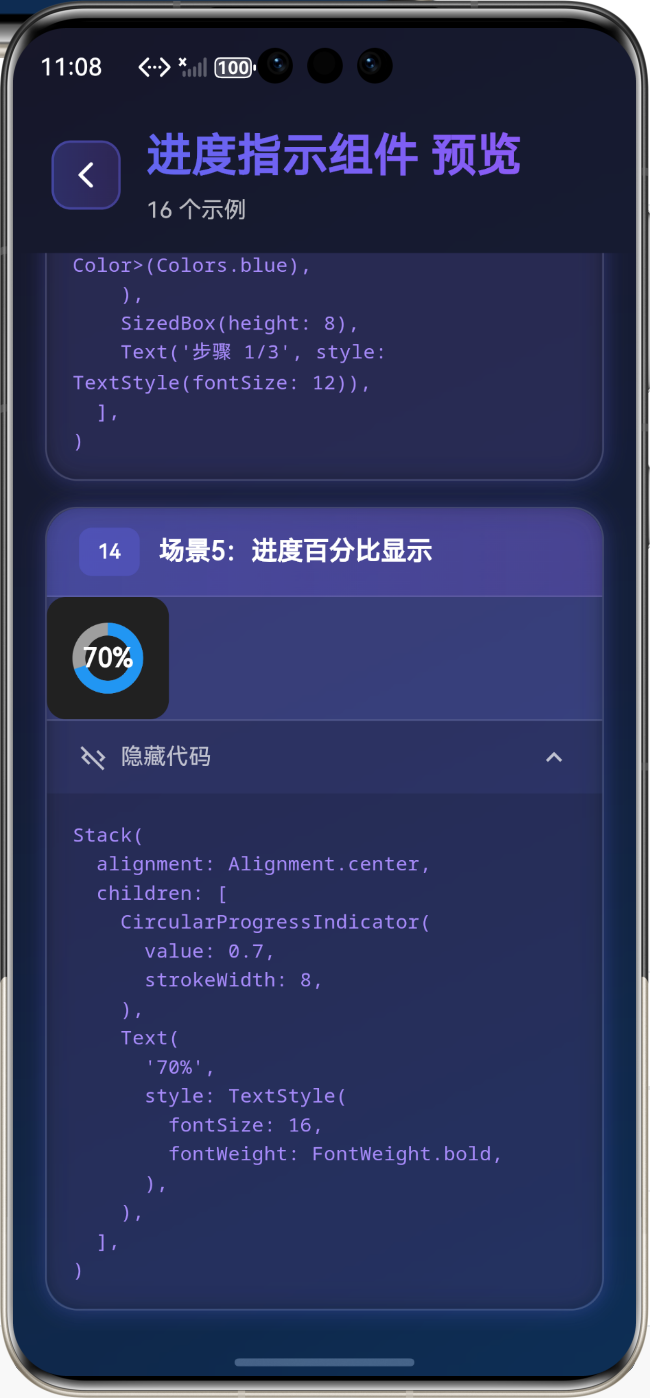
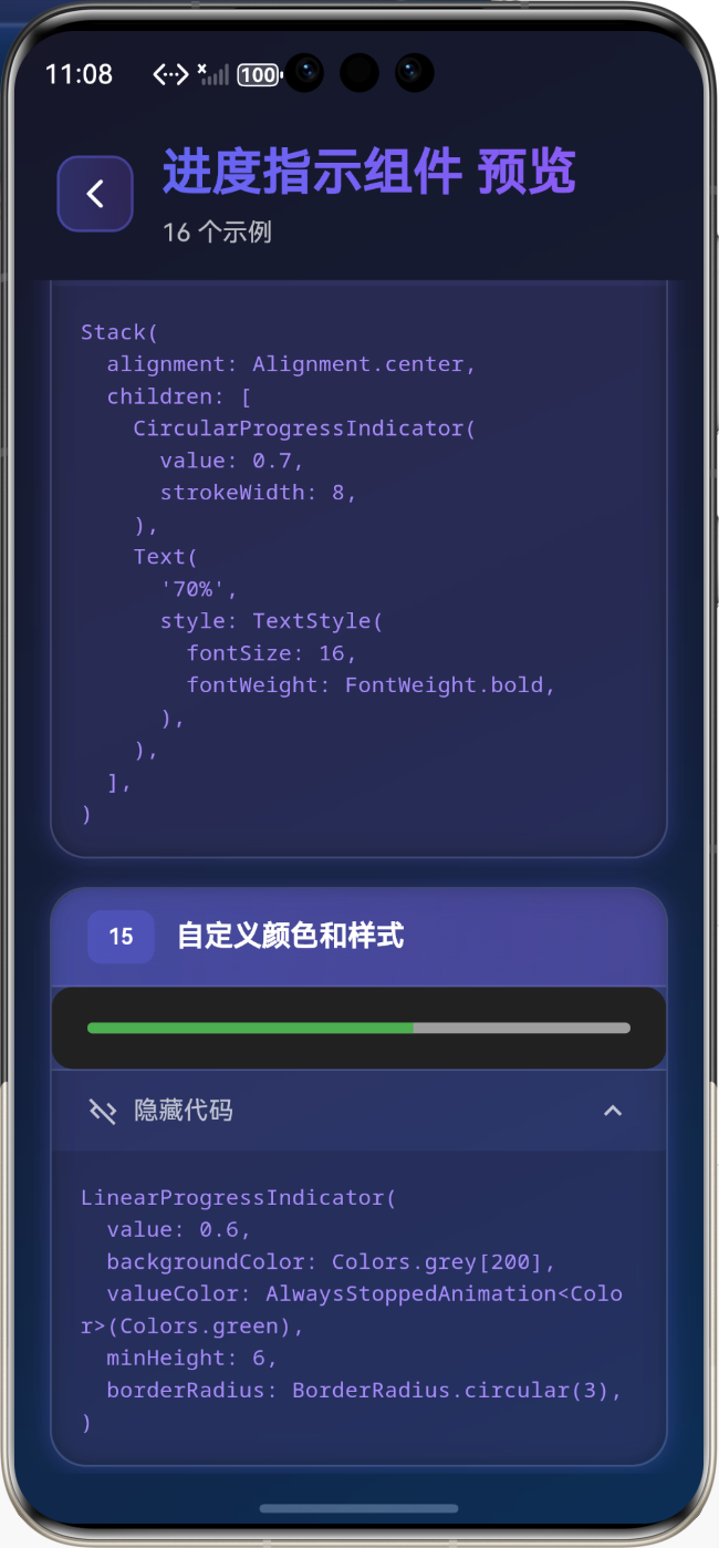
场景5:进度百分比显示
Stack(
  alignment: Alignment.center,
  children: [
    CircularProgressIndicator(
      value: 0.7,
      strokeWidth: 8,
    ),
    Text(
      '70%',
      style: TextStyle(
        fontSize: 16,
        fontWeight: FontWeight.bold,
      ),
    ),
  ],
)
🎨 进度指示器样式定制
自定义颜色和样式
LinearProgressIndicator(
  value: 0.6,
  backgroundColor: Colors.grey[200],
  valueColor: AlwaysStoppedAnimation<Color>(Colors.green),
  minHeight: 6,
  borderRadius: BorderRadius.circular(3),
)
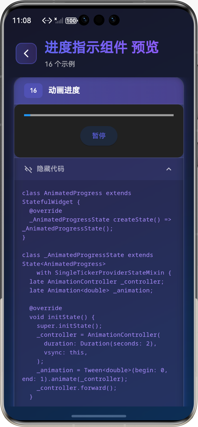
动画进度
class AnimatedProgress extends StatefulWidget {
_AnimatedProgressState createState() => _AnimatedProgressState();
}
class _AnimatedProgressState extends State<AnimatedProgress>
with SingleTickerProviderStateMixin {
late AnimationController _controller;
late Animation<double> _animation;
void initState() {
super.initState();
_controller = AnimationController(
duration: Duration(seconds: 2),
vsync: this,
);
_animation = Tween<double>(begin: 0, end: 1).animate(_controller);
_controller.forward();
}
Widget build(BuildContext context) {
return AnimatedBuilder(
animation: _animation,
builder: (context, child) {
return LinearProgressIndicator(value: _animation.value);
},
);
}
}
⚠️ 常见问题与解决方案
问题1:进度条不显示
解决方案:
- 确保设置了
value属性(0.0 到 1.0) - 检查容器是否有足够的空间
- 确认
backgroundColor和valueColor有足够的对比度
问题2:进度更新不及时
解决方案:
- 使用
setState更新进度值 - 考虑使用
AnimatedBuilder实现平滑动画 - 避免在
build方法中进行耗时操作
问题3:多个进度指示器性能问题
解决方案:
- 使用
RepaintBoundary隔离重绘区域 - 避免频繁更新进度值
- 考虑使用
CustomPaint自定义绘制
💼 最佳实践
1. 统一的进度组件
class AppProgressIndicator extends StatelessWidget {
final double value;
final bool isLinear;
const AppProgressIndicator({
required this.value,
this.isLinear = true,
});
Widget build(BuildContext context) {
if (isLinear) {
return LinearProgressIndicator(
value: value,
backgroundColor: Colors.grey[300],
valueColor: AlwaysStoppedAnimation<Color>(Colors.blue),
);
} else {
return CircularProgressIndicator(
value: value,
backgroundColor: Colors.grey[300],
valueColor: AlwaysStoppedAnimation<Color>(Colors.blue),
);
}
}
}
📚 总结
通过本教程,我们学习了:
- ✅
LinearProgressIndicator线性进度条的用法 - ✅
CircularProgressIndicator圆形进度指示器的用法 - ✅ 确定进度和不确定进度的区别
- ✅ 进度指示器的样式定制
- ✅ 实际应用场景和最佳实践
进度指示器是 Flutter 应用中重要的用户反馈组件,掌握好这些组件的用法,能够让你的应用用户体验更加友好!
🔗 相关资源
Happy Coding! 🎨✨

开源鸿蒙跨平台开发社区汇聚开发者与厂商,共建“一次开发,多端部署”的开源生态,致力于降低跨端开发门槛,推动万物智联创新。
更多推荐

 34
34 0
0- 0


 已为社区贡献29条内容

所有评论(0)