Flutter for OpenHarmony移动数据使用监管助手App实战 - 通知设置实现
本文介绍了App通知设置页面的设计与实现。该页面包含四个主要功能区域:提醒通知(流量超标、套餐余量等即时提醒)、报告通知(每日/每周/每月定期报告)、通知方式设置以及免打扰时段设置。页面采用模块化设计,各功能区域封装为独立组件,通过响应式编程实现状态管理。用户可自定义各类通知的开关、推送时间和方式,并支持一键重置为默认设置。界面遵循Material Design规范,确保视觉一致性和操作便捷性,帮
通知设置页面让用户自定义App的通知行为,包括流量超标提醒、套餐余量提醒、每日/每周报告等。合理的通知设置可以帮助用户及时了解流量使用情况,又不会造成打扰。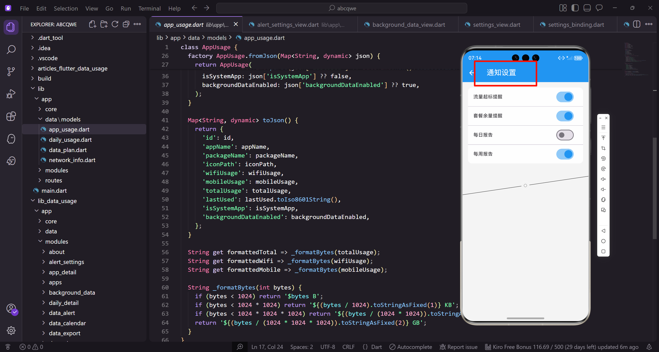
功能设计
通知设置页面需要实现:
- 各类通知的开关控制
- 通知时间设置
- 通知方式选择(声音、震动、静默)
- 免打扰时段设置
页面整体结构
首先定义通知设置页面的基本框架:
class NotificationSettingsView extends GetView<NotificationSettingsController> {
const NotificationSettingsView({super.key});
Widget build(BuildContext context) {
继承GetView自动注入NotificationSettingsController。
const构造函数优化widget重建性能。
build方法返回页面的完整UI结构。
    return Scaffold(
      backgroundColor: AppTheme.backgroundColor,
      appBar: AppBar(
        title: const Text('通知设置'),
        actions: [
          TextButton(
Scaffold提供Material Design页面框架。
统一背景色保持视觉一致性。
AppBar设置页面标题为"通知设置"。
            onPressed: () => controller.resetToDefault(),
            child: Text('重置', style: TextStyle(color: Colors.white)),
          ),
        ],
      ),
      body: SingleChildScrollView(
重置按钮一键恢复默认设置。
TextButton比IconButton更直观。
SingleChildScrollView让内容可滚动。
        padding: EdgeInsets.all(16.w),
        child: Column(
          children: [
            _buildAlertSection(),
            SizedBox(height: 16.h),
统一的内边距让内容不贴边。
Column垂直排列四个设置区域。
16.h的间距让各区域视觉分隔清晰。
            _buildReportSection(),
            SizedBox(height: 16.h),
            _buildNotificationModeSection(),
            SizedBox(height: 16.h),
            _buildDoNotDisturbSection(),
          ],
        ),
      ),
    );
  }
}
四个区域:提醒通知、报告通知、通知方式、免打扰。
每个区域封装成独立方法便于维护。
闭合所有括号完成页面结构。
提醒通知区域
提醒通知包含各种即时提醒的开关:
Widget _buildAlertSection() {
  return _buildSection(
    '提醒通知',
    '流量使用相关的即时提醒',
    Column(
      children: [
调用通用的_buildSection方法。
标题和副标题说明区域功能。
Column垂直排列多个通知项。
        _buildNotificationItem(
          icon: Icons.warning_amber,
          iconColor: Colors.orange,
          title: '流量超标提醒',
          subtitle: '当日流量超过设定阈值时提醒',
          value: controller.usageAlert,
        ),
第一项:流量超标提醒。
橙色警告图标表示警示类通知。
当流量超过阈值时发送提醒。
        Divider(height: 1, indent: 72.w),
        _buildNotificationItem(
          icon: Icons.battery_alert,
          iconColor: Colors.red,
          title: '套餐余量提醒',
          subtitle: '套餐剩余流量不足时提醒',
          value: controller.planAlert,
        ),
分隔线与图标右边缘对齐。
第二项:套餐余量提醒。
红色图标表示紧急程度较高。
        Divider(height: 1, indent: 72.w),
        _buildNotificationItem(
          icon: Icons.speed,
          iconColor: AppTheme.primaryColor,
          title: '网速异常提醒',
          subtitle: '检测到网速明显下降时提醒',
          value: controller.speedAlert,
        ),
第三项:网速异常提醒。
主色调图标表示一般提醒。
帮助用户发现网络问题。
        Divider(height: 1, indent: 72.w),
        _buildNotificationItem(
          icon: Icons.apps,
          iconColor: AppTheme.wifiColor,
          title: '应用流量异常',
          subtitle: '某应用流量使用异常增加时提醒',
          value: controller.appAlert,
        ),
      ],
    ),
  );
}
第四项:应用流量异常提醒。
WiFi颜色图标区分不同类型。
帮助用户发现异常的应用行为。
报告通知区域
报告通知包含定期报告的设置:
Widget _buildReportSection() {
  return _buildSection(
    '报告通知',
    '定期的流量使用报告',
    Column(
      children: [
        _buildNotificationItem(
报告通知区域的标题和副标题。
定期报告帮助用户了解流量使用趋势。
Column排列三种报告类型。
          icon: Icons.today,
          iconColor: AppTheme.primaryColor,
          title: '每日报告',
          subtitle: '每天推送当日流量使用汇总',
          value: controller.dailyReport,
          trailing: _buildTimeSelector(controller.dailyReportTime),
        ),
每日报告在设定时间推送。
trailing参数添加时间选择器。
用户可以自定义推送时间。
        Divider(height: 1, indent: 72.w),
        _buildNotificationItem(
          icon: Icons.date_range,
          iconColor: AppTheme.wifiColor,
          title: '每周报告',
          subtitle: '每周推送本周流量使用分析',
          value: controller.weeklyReport,
          trailing: _buildDaySelector(controller.weeklyReportDay),
        ),
每周报告包含一周的流量分析。
trailing添加星期选择器。
用户可以选择每周几推送。
        Divider(height: 1, indent: 72.w),
        _buildNotificationItem(
          icon: Icons.calendar_month,
          iconColor: AppTheme.mobileColor,
          title: '每月报告',
          subtitle: '每月推送本月流量使用总结',
          value: controller.monthlyReport,
        ),
      ],
    ),
  );
}
每月报告在月初推送上月总结。
不需要额外的时间选择器。
三种报告覆盖不同的时间维度。
时间选择器组件
让用户选择报告推送时间:
Widget _buildTimeSelector(RxString time) {
  return GestureDetector(
    onTap: () => _showTimePicker(time),
    child: Obx(() => Container(
      padding: EdgeInsets.symmetric(horizontal: 12.w, vertical: 6.h),
GestureDetector处理点击事件。
点击弹出时间选择器。
Obx监听时间变量实现响应式更新。
      decoration: BoxDecoration(
        color: AppTheme.primaryColor.withOpacity(0.1),
        borderRadius: BorderRadius.circular(8.r),
      ),
      child: Text(
        time.value,
浅色背景突出显示时间。
8.r圆角让容器更圆润。
显示当前设置的时间。
        style: TextStyle(
          fontSize: 13.sp,
          color: AppTheme.primaryColor,
          fontWeight: FontWeight.w500,
        ),
      ),
    )),
  );
}
主色调文字与背景协调。
w500字重让时间稍微加粗。
整体设计简洁直观。
星期选择器组件
让用户选择每周报告的推送日期:
Widget _buildDaySelector(RxInt day) {
  final days = ['周一', '周二', '周三', '周四', '周五', '周六', '周日'];
  return GestureDetector(
    onTap: () => _showDayPicker(day),
定义星期的中文名称数组。
GestureDetector处理点击事件。
点击弹出星期选择器。
    child: Obx(() => Container(
      padding: EdgeInsets.symmetric(horizontal: 12.w, vertical: 6.h),
      decoration: BoxDecoration(
        color: AppTheme.wifiColor.withOpacity(0.1),
        borderRadius: BorderRadius.circular(8.r),
      ),
Obx监听day变量实现响应式更新。
WiFi颜色背景与每周报告图标协调。
样式与时间选择器一致。
      child: Text(
        days[day.value],
        style: TextStyle(
          fontSize: 13.sp,
          color: AppTheme.wifiColor,
          fontWeight: FontWeight.w500,
        ),
      ),
    )),
  );
}
根据索引显示对应的星期名称。
WiFi颜色文字与背景协调。
整体风格与时间选择器统一。
通知方式区域
让用户设置通知的提醒方式:
Widget _buildNotificationModeSection() {
  return _buildSection(
    '通知方式',
    '设置通知的提醒方式',
    Column(
      children: [
        _buildModeItem(
          icon: Icons.volume_up,
          title: '声音',
          value: controller.soundEnabled,
        ),
通知方式区域的标题和副标题。
第一项:声音开关。
控制通知是否播放提示音。
        Divider(height: 1, indent: 72.w),
        _buildModeItem(
          icon: Icons.vibration,
          title: '震动',
          value: controller.vibrationEnabled,
        ),
第二项:震动开关。
控制通知是否震动提醒。
在静音场景下很有用。
        Divider(height: 1, indent: 72.w),
        _buildModeItem(
          icon: Icons.notifications_active,
          title: '横幅通知',
          value: controller.bannerEnabled,
        ),
第三项:横幅通知开关。
控制是否显示顶部横幅。
横幅通知更醒目但可能打扰用户。
        Divider(height: 1, indent: 72.w),
        _buildModeItem(
          icon: Icons.badge,
          title: '角标',
          value: controller.badgeEnabled,
        ),
      ],
    ),
  );
}
第四项:角标开关。
控制App图标是否显示未读数量。
四种方式可以任意组合。
通知方式项组件
通知方式的单个设置项:
Widget _buildModeItem({
  required IconData icon,
  required String title,
  required RxBool value,
}) {
  return Obx(() => ListTile(
    contentPadding: EdgeInsets.symmetric(horizontal: 16.w, vertical: 4.h),
接收图标、标题和开关值三个参数。
Obx监听value实现响应式更新。
contentPadding调整内边距。
    leading: Container(
      width: 44.w,
      height: 44.w,
      decoration: BoxDecoration(
        color: value.value
            ? AppTheme.primaryColor.withOpacity(0.1)
            : Colors.grey.shade100,
        borderRadius: BorderRadius.circular(12.r),
      ),
leading放置图标容器。
开启时用主色浅色背景。
关闭时用灰色背景。
      child: Icon(
        icon,
        color: value.value ? AppTheme.primaryColor : Colors.grey,
        size: 24.sp,
      ),
    ),
    title: Text(
      title,
      style: TextStyle(fontSize: 15.sp, fontWeight: FontWeight.w500),
    ),
图标颜色也根据状态变化。
标题用15.sp字号,稍微加粗。
视觉反馈明确。
    trailing: Switch(
      value: value.value,
      onChanged: (v) => value.value = v,
      activeColor: AppTheme.primaryColor,
    ),
  ));
}
trailing放置开关组件。
onChanged直接更新响应式变量。
主色调的activeColor保持视觉统一。
免打扰区域
让用户设置不接收通知的时间段:
Widget _buildDoNotDisturbSection() {
  return _buildSection(
    '免打扰',
    '设置不接收通知的时间段',
    Column(
      children: [
        Obx(() => SwitchListTile(
免打扰区域的标题和副标题。
在设定时间段内不发送通知。
Column排列开关和时间选择器。
          contentPadding: EdgeInsets.symmetric(horizontal: 16.w),
          title: Text(
            '开启免打扰',
            style: TextStyle(fontSize: 15.sp, fontWeight: FontWeight.w500),
          ),
          subtitle: Text(
            '在设定时间段内不发送通知',
SwitchListTile组合标题和开关。
标题说明功能用途。
副标题提供更多说明。
            style: TextStyle(fontSize: 13.sp, color: AppTheme.textSecondary),
          ),
          value: controller.doNotDisturbEnabled.value,
          onChanged: (v) => controller.doNotDisturbEnabled.value = v,
          activeColor: AppTheme.primaryColor,
        )),
绑定doNotDisturbEnabled状态。
onChanged更新开关状态。
主色调的activeColor保持统一。
        Obx(() {
          if (!controller.doNotDisturbEnabled.value) return SizedBox.shrink();
          return Padding(
            padding: EdgeInsets.fromLTRB(16.w, 0, 16.w, 16.h),
            child: _buildTimeRangeSelector(),
          );
        }),
      ],
    ),
  );
}
只有开启免打扰时才显示时间选择器。
SizedBox.shrink()不占用空间。
Padding调整时间选择器的位置。
时间范围选择器
选择免打扰的开始和结束时间:
Widget _buildTimeRangeSelector() {
  return Container(
    padding: EdgeInsets.all(16.w),
    decoration: BoxDecoration(
      color: Colors.grey.shade50,
      borderRadius: BorderRadius.circular(12.r),
    ),
Container作为时间选择器的容器。
浅灰色背景与白色卡片区分。
12.r圆角保持视觉一致。
    child: Row(
      children: [
        Expanded(
          child: GestureDetector(
            onTap: () => _showTimePicker(controller.dndStartTime),
            child: Column(
              children: [
Row横向排列开始和结束时间。
Expanded让两边平分宽度。
GestureDetector处理点击事件。
                Text('开始时间', style: TextStyle(fontSize: 12.sp, color: AppTheme.textSecondary)),
                SizedBox(height: 4.h),
                Obx(() => Text(
                  controller.dndStartTime.value,
                  style: TextStyle(fontSize: 18.sp, fontWeight: FontWeight.bold, color: AppTheme.primaryColor),
                )),
              ],
            ),
          ),
        ),
标签"开始时间"用小字号。
时间用18.sp大字号突出显示。
主色调加粗让时间更醒目。
        Icon(Icons.arrow_forward, color: AppTheme.textSecondary),
        Expanded(
          child: GestureDetector(
            onTap: () => _showTimePicker(controller.dndEndTime),
            child: Column(
              children: [
箭头图标表示时间范围。
结束时间的布局与开始时间一致。
点击弹出时间选择器。
                Text('结束时间', style: TextStyle(fontSize: 12.sp, color: AppTheme.textSecondary)),
                SizedBox(height: 4.h),
                Obx(() => Text(
                  controller.dndEndTime.value,
                  style: TextStyle(fontSize: 18.sp, fontWeight: FontWeight.bold, color: AppTheme.primaryColor),
                )),
              ],
            ),
          ),
        ),
      ],
    ),
  );
}
结束时间的样式与开始时间一致。
Obx监听时间变量实现响应式更新。
整体布局对称美观。
通用组件
通知设置项的通用组件:
Widget _buildSection(String title, String subtitle, Widget child) {
  return Container(
    decoration: BoxDecoration(
      color: Colors.white,
      borderRadius: BorderRadius.circular(16.r),
    ),
通用的区域容器组件。
白色背景与页面灰色背景对比。
16.r圆角让卡片更圆润。
    child: Column(
      crossAxisAlignment: CrossAxisAlignment.start,
      children: [
        Padding(
          padding: EdgeInsets.all(16.w),
          child: Column(
            crossAxisAlignment: CrossAxisAlignment.start,
Column垂直排列标题和内容。
crossAxisAlignment让内容左对齐。
内边距16.w让标题不贴边。
            children: [
              Text(
                title,
                style: TextStyle(
                  fontSize: 16.sp,
                  fontWeight: FontWeight.w600,
                  color: AppTheme.textPrimary,
                ),
              ),
标题用16.sp字号,w600加粗。
主要文字颜色确保可读性。
标题是区域的主要标识。
              SizedBox(height: 4.h),
              Text(
                subtitle,
                style: TextStyle(fontSize: 13.sp, color: AppTheme.textSecondary),
              ),
            ],
          ),
        ),
        Divider(height: 1),
        child,
      ],
    ),
  );
}
副标题用13.sp小字号,次要颜色。
Divider分隔标题和内容。
child是传入的具体内容。
通知项组件
单个通知设置项的组件:
Widget _buildNotificationItem({
  required IconData icon,
  required Color iconColor,
  required String title,
  required String subtitle,
  required RxBool value,
  Widget? trailing,
}) {
接收多个参数定义通知项的外观和行为。
icon和iconColor定义图标样式。
trailing是可选的额外组件。
  return Obx(() => ListTile(
    contentPadding: EdgeInsets.symmetric(horizontal: 16.w, vertical: 8.h),
    leading: Container(
      width: 44.w,
      height: 44.w,
      decoration: BoxDecoration(
Obx监听value实现响应式更新。
contentPadding调整内边距。
leading放置图标容器。
        color: value.value ? iconColor.withOpacity(0.1) : Colors.grey.shade100,
        borderRadius: BorderRadius.circular(12.r),
      ),
      child: Icon(
        icon,
        color: value.value ? iconColor : Colors.grey,
        size: 24.sp,
      ),
    ),
开启时用对应颜色的浅色背景。
关闭时用灰色背景。
图标颜色也根据状态变化。
    title: Text(
      title,
      style: TextStyle(fontSize: 15.sp, fontWeight: FontWeight.w500),
    ),
    subtitle: Text(
      subtitle,
      style: TextStyle(fontSize: 12.sp, color: AppTheme.textSecondary),
    ),
标题用15.sp字号,稍微加粗。
副标题用12.sp小字号,次要颜色。
信息层次清晰。
    trailing: Row(
      mainAxisSize: MainAxisSize.min,
      children: [
        if (trailing != null && value.value) ...[
          trailing,
          SizedBox(width: 8.w),
        ],
        Switch(
          value: value.value,
          onChanged: (v) => value.value = v,
          activeColor: AppTheme.primaryColor,
        ),
      ],
    ),
  ));
}
trailing组合额外组件和开关。
只有开启时才显示额外组件。
Switch控制通知的开关状态。
Controller实现
控制器管理通知设置的状态:
class NotificationSettingsController extends GetxController {
  final usageAlert = true.obs;
  final planAlert = true.obs;
  final speedAlert = false.obs;
  final appAlert = false.obs;
提醒通知的四个开关状态。
流量超标和套餐余量默认开启。
网速异常和应用异常默认关闭。
  final dailyReport = false.obs;
  final dailyReportTime = '20:00'.obs;
  final weeklyReport = true.obs;
  final weeklyReportDay = 0.obs;
  final monthlyReport = true.obs;
报告通知的状态和时间设置。
每日报告默认关闭,每周每月默认开启。
weeklyReportDay的0表示周一。
  final soundEnabled = true.obs;
  final vibrationEnabled = true.obs;
  final bannerEnabled = true.obs;
  final badgeEnabled = true.obs;
通知方式的四个开关状态。
默认全部开启,用户可以关闭。
满足不同用户的偏好。
final doNotDisturbEnabled = false.obs;
final dndStartTime = '22:00'.obs;
final dndEndTime = '08:00'.obs;
void onInit() {
super.onInit();
loadSettings();
setupAutoSave();
}
免打扰默认关闭。
默认时间22:00到08:00覆盖睡眠时间。
onInit加载设置并设置自动保存。
  void setupAutoSave() {
    ever(usageAlert, (_) => saveSettings());
    ever(planAlert, (_) => saveSettings());
  }

  void resetToDefault() {
    Get.dialog(
      AlertDialog(
        title: Text('重置设置'),
ever监听变量变化自动保存。
resetToDefault弹出确认对话框。
防止用户误操作。
        content: Text('确定要将通知设置恢复为默认值吗?'),
        actions: [
          TextButton(onPressed: () => Get.back(), child: Text('取消')),
          ElevatedButton(
            onPressed: () {
              _applyDefaultSettings();
              Get.back();
              Get.snackbar('已重置', '通知设置已恢复为默认值');
            },
            child: Text('确定'),
          ),
        ],
      ),
    );
  }
确认后恢复默认设置。
关闭对话框并显示提示。
用户可以随时重置。
  void _applyDefaultSettings() {
    usageAlert.value = true;
    planAlert.value = true;
    speedAlert.value = false;
    appAlert.value = false;
    dailyReport.value = false;
    weeklyReport.value = true;
    monthlyReport.value = true;
恢复所有设置为默认值。
核心提醒默认开启。
非核心提醒默认关闭。
    soundEnabled.value = true;
    vibrationEnabled.value = true;
    bannerEnabled.value = true;
    badgeEnabled.value = true;
    doNotDisturbEnabled.value = false;
  }
}
通知方式默认全部开启。
免打扰默认关闭。
默认设置经过考虑,平衡功能和打扰。
时间选择器
弹出系统时间选择器:
void _showTimePicker(RxString time) async {
  final parts = time.value.split(':');
  final initialTime = TimeOfDay(
    hour: int.parse(parts[0]),
    minute: int.parse(parts[1]),
  );
解析当前时间字符串。
split按冒号分割小时和分钟。
构造TimeOfDay作为初始值。
  final picked = await showTimePicker(
    context: Get.context!,
    initialTime: initialTime,
    builder: (context, child) {
      return Theme(
        data: Theme.of(context).copyWith(
          colorScheme: ColorScheme.light(primary: AppTheme.primaryColor),
        ),
        child: child!,
      );
    },
  );
showTimePicker弹出系统时间选择器。
initialTime设置初始选中时间。
builder自定义主题颜色。
  if (picked != null) {
    time.value = '${picked.hour.toString().padLeft(2, '0')}:${picked.minute.toString().padLeft(2, '0')}';
  }
}
用户选择后更新时间值。
padLeft补零确保两位数格式。
picked为null表示用户取消了选择。
写在最后
通知设置页面让用户精细化控制App的通知行为。通过分类清晰的设置项、灵活的时间选择、便捷的免打扰功能,帮助用户在获取重要信息和避免打扰之间找到平衡。
可以继续优化的方向:
- 支持按应用设置通知
- 添加通知历史记录
- 支持自定义通知铃声
- 添加智能通知建议
欢迎加入开源鸿蒙跨平台社区:https://openharmonycrossplatform.csdn.net

开源鸿蒙跨平台开发社区汇聚开发者与厂商,共建“一次开发,多端部署”的开源生态,致力于降低跨端开发门槛,推动万物智联创新。
更多推荐
 13
13 0
0- 0


 已为社区贡献30条内容

所有评论(0)