Flutter for OpenHarmony 健康管理App应用实战 - 运动记录实现
运动记录是健康管理App的重要功能。用户需要记录自己做了什么运动、持续多长时间、消耗了多少卡路里。一个好的运动记录页面应该让用户快速找到运动项目,方便地输入时长,并清晰地展示消耗的热量。我们这个运动记录页面包含:搜索功能、分类筛选、运动列表、时长选择器、卡路里计算。这一篇我们深入讲解运动记录页面的实现细节,包括页面结构设计、搜索和筛选逻辑、交互体验优化等方面。
写在前面
运动记录是健康管理App的重要功能。用户需要记录自己做了什么运动、持续多长时间、消耗了多少卡路里。一个好的运动记录页面应该让用户快速找到运动项目,方便地输入时长,并清晰地展示消耗的热量。
我们这个运动记录页面包含:搜索功能、分类筛选、运动列表、时长选择器、卡路里计算。这一篇我们深入讲解运动记录页面的实现细节,包括页面结构设计、搜索和筛选逻辑、交互体验优化等方面。
导入依赖
import 'package:flutter/material.dart';
import 'package:provider/provider.dart';
import '../../utils/colors.dart';
import '../../l10n/app_localizations.dart';
import '../../models/exercise_item.dart';
import '../../data/exercise_database.dart';
import '../../providers/user_provider.dart';
导入说明:
ExerciseItem是运动数据模型,包含运动名称、强度、MET值等信息ExerciseDatabase是运动数据库,提供搜索、分类查询等方法UserProvider是用户状态管理,用于记录消耗的卡路里并更新首页数据AppLocalizations用于国际化支持,让应用支持多语言
为什么使用StatefulWidget
class AddExercisePage extends StatefulWidget {
const AddExercisePage({super.key});
State<AddExercisePage> createState() => _AddExercisePageState();
}
StatefulWidget的必要性:
运动记录页面需要管理多个状态:搜索关键词、选中的分类、显示的运动列表等。这些状态会随着用户的交互而变化,所以必须使用 StatefulWidget。
如果用 StatelessWidget,就无法响应用户的输入和点击事件。
状态变量设计
class _AddExercisePageState extends State<AddExercisePage> {
  final ExerciseDatabase _database = ExerciseDatabase();
  final TextEditingController _searchController = TextEditingController();

  ExerciseCategory? _selectedCategory;
  List<ExerciseItem> _displayedExercises = [];
  String _searchQuery = '';
状态变量的说明:
_database- 运动数据库实例,用于查询和搜索运动数据_searchController- 搜索框的文本控制器,用于获取用户输入和清空搜索框_selectedCategory- 当前选中的分类,null表示显示全部或热门运动_displayedExercises- 当前显示的运动列表,会根据搜索和筛选动态更新_searchQuery- 当前的搜索关键词,用于判断是否显示清除按钮
生命周期管理
void initState() {
super.initState();
_displayedExercises = _database.popularExercises;
}
void dispose() {
_searchController.dispose();
super.dispose();
}
初始化和清理的设计:
initState中初始化显示热门运动列表,这样用户打开页面时能立即看到常见的运动项目dispose中释放TextEditingController,防止内存泄漏。这是一个很容易被忽视的细节,但对应用的稳定性很重要
热门运动列表通常包含跑步、骑自行车、游泳等常见运动,这样用户不需要搜索就能快速找到。
搜索逻辑设计
  void _onSearch(String query) {
    setState(() {
      _searchQuery = query;
      if (query.isEmpty) {
        _displayedExercises = _selectedCategory != null
            ? _database.getByCategory(_selectedCategory!)
            : _database.popularExercises;
      } else {
        _displayedExercises = _database.search(query);
      }
    });
  }
搜索逻辑的说明:
这个方法处理搜索框的输入变化。关键的设计决策是:
- 搜索和分类互斥 - 当用户输入搜索关键词时,忽略分类筛选,直接在全部运动中搜索。这样用户能找到任何运动,不会因为分类筛选而漏掉
- 清空搜索时恢复状态 - 当用户清空搜索框时,恢复到之前的分类筛选状态或热门列表
- 实时搜索 - 每次输入都立即搜索,不需要用户点击搜索按钮
这样的设计让搜索体验更流畅,用户能快速找到想要的运动。
分类筛选逻辑
  void _onCategorySelected(ExerciseCategory? category) {
    setState(() {
      _selectedCategory = category;
      _searchQuery = '';
      _searchController.clear();
      _displayedExercises = category != null
          ? _database.getByCategory(category)
          : _database.popularExercises;
    });
  }
分类筛选的设计:
- 清空搜索框 - 选择分类时自动清空搜索框,避免搜索结果和分类筛选混淆
- 更新显示列表 - 根据选中的分类获取对应的运动列表
- "All"分类 - 当
category为null时,显示热门运动而不是全部运动。这样做是为了避免列表过长,提升性能
这样的设计让用户能清晰地了解当前的筛选状态。
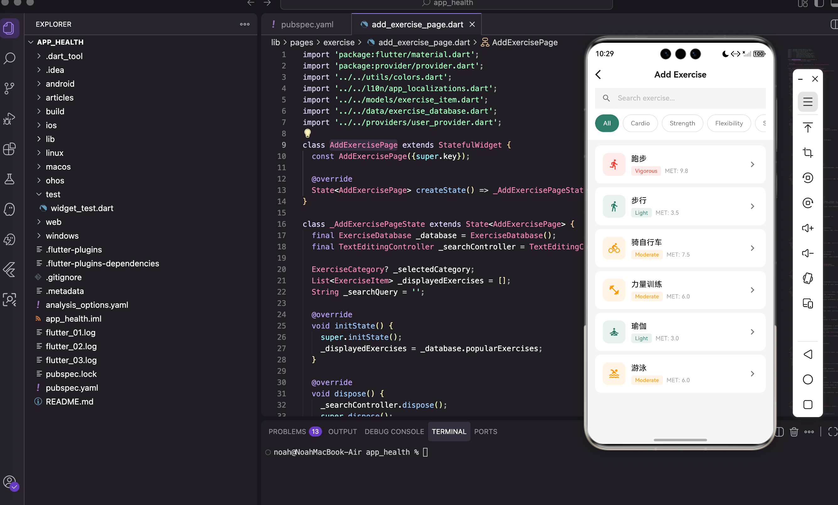
页面结构设计
Widget build(BuildContext context) {
final colors = context.appColors;
final l10n = context.l10n;
final isDark = Theme.of(context).brightness == Brightness.dark;
final primaryColor = isDark ? AppColors.primaryLight : AppColors.primary;
return Scaffold(
backgroundColor: colors.inputBackground,
appBar: AppBar(
backgroundColor: colors.cardBackground,
elevation: 0,
leading: IconButton(
icon: Icon(Icons.arrow_back_ios, color: colors.textPrimary),
onPressed: () => Navigator.pop(context),
),
title: Text(
l10n.addExercise,
style: TextStyle(
color: colors.textPrimary,
fontSize: 18,
fontWeight: FontWeight.w600,
),
),
),
body: Column(
children: [
_buildSearchHeader(colors, l10n, primaryColor),
Expanded(
child: _displayedExercises.isEmpty
? _buildEmptyState(colors)
: ListView.builder(
padding: const EdgeInsets.only(top: 8),
itemCount: _displayedExercises.length,
itemBuilder: (context, index) {
return _buildExerciseItem(_displayedExercises[index], colors, l10n, primaryColor);
},
),
),
],
),
);
}
页面结构的说明:
页面分为三个主要部分:
- AppBar - 显示页面标题和返回按钮,背景色与卡片相同,elevation为0让它看起来更平坦
- 搜索和筛选区域 - 包含搜索框和分类标签,固定在顶部
- 运动列表 - 用
Expanded占据剩余空间,支持滚动。当列表为空时显示空状态提示
用 Column 和 Expanded 的组合让布局更灵活,搜索区域始终可见,列表可以滚动。
搜索头部设计
Widget _buildSearchHeader(AppColorsExtension colors, AppLocalizations l10n, Color primaryColor) {
  return Container(
    color: colors.cardBackground,
    padding: const EdgeInsets.fromLTRB(16, 0, 16, 16),
    child: Column(
      children: [
        Container(
          height: 44,
          decoration: BoxDecoration(
            color: colors.inputBackground,
            borderRadius: BorderRadius.circular(22),
          ),
          child: TextField(
            controller: _searchController,
            onChanged: _onSearch,
            style: TextStyle(color: colors.textPrimary),
            decoration: InputDecoration(
              hintText: '${l10n.search} ${l10n.exercise}...',
              hintStyle: TextStyle(color: colors.textSecondary, fontSize: 15),
              prefixIcon: Icon(Icons.search, color: colors.textSecondary, size: 20),
              suffixIcon: _searchQuery.isNotEmpty
                  ? IconButton(
                      icon: Icon(Icons.clear, size: 18, color: colors.textSecondary),
                      onPressed: () {
                        _searchController.clear();
                        _onSearch('');
                      },
                    )
                  : null,
              border: InputBorder.none,
              contentPadding: const EdgeInsets.symmetric(vertical: 12),
            ),
          ),
        ),
搜索框的设计:
- 胶囊形状 -
borderRadius: BorderRadius.circular(22)创建圆角,高度44对应标准的触摸目标大小 - 清除按钮 - 只在有搜索内容时显示,点击时清空搜索框并恢复列表
- 实时搜索 -
onChanged回调让搜索立即执行,不需要用户点击搜索按钮 - 无边框 -
border: InputBorder.none让输入框看起来更简洁
这样的设计让搜索体验更直观和高效。
分类标签区域:
        const SizedBox(height: 12),
        SingleChildScrollView(
          scrollDirection: Axis.horizontal,
          child: Row(
            children: [
              _buildCategoryChip(null, 'All', colors, primaryColor),
              ...ExerciseCategory.values.map(
                (c) => _buildCategoryChip(c, _getCategoryName(c, l10n), colors, primaryColor),
              ),
            ],
          ),
        ),
      ],
    ),
  );
}
分类标签区域的设计:
- 横向滚动 - 用
SingleChildScrollView让分类标签可以横向滚动,避免屏幕空间不足 - "All"标签 - 第一个是"All",对应null值,显示热门运动
- 动态生成 - 用
ExerciseCategory.values.map()动态生成所有分类的标签,这样添加新分类时不需要修改UI代码
这样的设计让分类筛选更灵活和可维护。
分类标签设计
Widget _buildCategoryChip(ExerciseCategory? category, String label, AppColorsExtension colors, Color primaryColor) {
  final isSelected = _selectedCategory == category;
  return Padding(
    padding: const EdgeInsets.only(right: 8),
    child: GestureDetector(
      onTap: () => _onCategorySelected(category),
      child: Container(
        padding: const EdgeInsets.symmetric(horizontal: 16, vertical: 8),
        decoration: BoxDecoration(
          color: isSelected ? primaryColor : colors.cardBackground,
          borderRadius: BorderRadius.circular(20),
          border: Border.all(color: isSelected ? primaryColor : colors.divider),
        ),
        child: Text(
          label,
          style: TextStyle(
            fontSize: 13,
            color: isSelected ? Colors.white : colors.textSecondary,
            fontWeight: isSelected ? FontWeight.w500 : FontWeight.normal,
          ),
        ),
      ),
    ),
  );
}
分类标签的视觉设计:
- 选中状态 - 用主色背景和白色文字,让用户清晰地看到当前选中的分类
- 未选中状态 - 用卡片背景和边框,看起来像一个可点击的按钮
- 圆角设计 -
borderRadius: BorderRadius.circular(20)创建胶囊形状,与搜索框风格统一 - 间距 -
padding: const EdgeInsets.only(right: 8)让标签之间有适当的间距
这样的设计让分类筛选的状态一目了然。
空状态设计
Widget _buildEmptyState(AppColorsExtension colors) {
  return Center(
    child: Column(
      mainAxisAlignment: MainAxisAlignment.center,
      children: [
        Icon(Icons.search_off, size: 64, color: colors.textSecondary.withOpacity(0.5)),
        const SizedBox(height: 16),
        Text('No exercises found', style: TextStyle(fontSize: 16, color: colors.textSecondary)),
      ],
    ),
  );
}
空状态的设计:
- 大图标 - 用搜索关闭图标表示没有找到结果,大小64让它更显眼
- 半透明 -
withOpacity(0.5)让图标看起来不那么突兀 - 文字提示 - 告诉用户没有找到匹配的运动,可以尝试其他搜索词或分类
这样的设计让用户明白当前的状态,而不是困惑于空白屏幕。
运动列表项设计
Widget _buildExerciseItem(ExerciseItem exercise, AppColorsExtension colors, AppLocalizations l10n, Color primaryColor) {
  return GestureDetector(
    onTap: () => _showDurationDialog(exercise, colors, l10n, primaryColor),
    child: Container(
      margin: const EdgeInsets.symmetric(horizontal: 16, vertical: 4),
      padding: const EdgeInsets.all(16),
      decoration: BoxDecoration(color: colors.cardBackground, borderRadius: BorderRadius.circular(12)),
      child: Row(
        children: [
          Container(
            width: 48, height: 48,
            decoration: BoxDecoration(
              color: _getIntensityColor(exercise.intensity).withOpacity(0.1),
              borderRadius: BorderRadius.circular(12),
            ),
            child: Icon(_getExerciseIcon(exercise.iconType), color: _getIntensityColor(exercise.intensity), size: 24),
          ),
          const SizedBox(width: 12),
          Expanded(
            child: Column(
              crossAxisAlignment: CrossAxisAlignment.start,
              children: [
                Text(exercise.name, style: TextStyle(fontSize: 16, fontWeight: FontWeight.w500, color: colors.textPrimary)),
                const SizedBox(height: 4),
                Row(
                  children: [
                    Container(
                      padding: const EdgeInsets.symmetric(horizontal: 8, vertical: 2),
                      decoration: BoxDecoration(
                        color: _getIntensityColor(exercise.intensity).withOpacity(0.1),
                        borderRadius: BorderRadius.circular(4),
                      ),
                      child: Text(exercise.intensityLabel, style: TextStyle(fontSize: 11, color: _getIntensityColor(exercise.intensity))),
                    ),
                    const SizedBox(width: 8),
                    Text('MET: ${exercise.metValue}', style: TextStyle(fontSize: 12, color: colors.textSecondary)),
                  ],
                ),
              ],
            ),
          ),
          Icon(Icons.chevron_right, color: colors.textSecondary),
        ],
      ),
    ),
  );
}
运动列表项的设计:
- 图标区域 - 左侧是一个48x48的方形图标,背景色根据运动强度变化,这样用户能快速识别运动类型
- 强度标签 - 显示运动强度(低、中、高),用颜色编码让用户一眼看出
- MET值 - MET(代谢当量)是计算卡路里消耗的关键参数,1 MET = 1 kcal/kg/h,数值越高说明运动强度越大
- 右侧箭头 - 表示可以点击进入时长选择
这样的设计让用户能快速了解每个运动的特点。
时长选择对话框实现
点击运动项弹出时长选择对话框:
void _showDurationDialog(ExerciseItem exercise, AppColorsExtension colors, AppLocalizations l10n, Color primaryColor) {
  final userProvider = context.read<UserProvider>();
  final weight = userProvider.profile.weight;
  int duration = 30;

  showModalBottomSheet(
    context: context,
    isScrollControlled: true,
    backgroundColor: colors.cardBackground,
    shape: const RoundedRectangleBorder(borderRadius: BorderRadius.vertical(top: Radius.circular(20))),
    builder: (ctx) {
      return StatefulBuilder(
        builder: (ctx, setModalState) {
          final calories = exercise.calculateCalories(weight, duration);
          return Padding(
            padding: EdgeInsets.only(bottom: MediaQuery.of(ctx).viewInsets.bottom),
            child: Container(
              padding: const EdgeInsets.all(24),
              child: Column(
                mainAxisSize: MainAxisSize.min,
                crossAxisAlignment: CrossAxisAlignment.start,
                children: [
                  _buildDialogHeader(exercise, colors),
                  const SizedBox(height: 24),
                  Text(l10n.duration, style: TextStyle(fontSize: 16, fontWeight: FontWeight.w500, color: colors.textPrimary)),
                  const SizedBox(height: 12),
                  _buildDurationSelector(duration, primaryColor, colors, (d) => setModalState(() => duration = d)),
                  const SizedBox(height: 8),
                  _buildQuickDurationButtons(duration, primaryColor, colors, (d) => setModalState(() => duration = d)),
                  const SizedBox(height: 24),
                  _buildCaloriesDisplay(calories),
                  const SizedBox(height: 24),
                  _buildAddButton(exercise, calories, l10n, primaryColor, userProvider),
                ],
              ),
            ),
          );
        },
      );
    },
  );
}
对话框的设计:
- BottomSheet - 从底部弹出,让用户能看到背后的内容,提升上下文感
- StatefulBuilder - 让弹窗内部可以独立管理状态,不影响页面状态
- viewInsets.bottom - 处理键盘弹出时的布局,避免内容被键盘遮挡
- 实时计算 - 每次时长改变都立即计算卡路里,让用户看到实时反馈
这样的设计让用户能方便地调整时长并看到卡路里变化。
时长选择器设计
Widget _buildDurationSelector(int duration, Color primaryColor, AppColorsExtension colors, Function(int) onChanged) {
  return Row(
    mainAxisAlignment: MainAxisAlignment.center,
    children: [
      IconButton(
        onPressed: duration > 5 ? () => onChanged(duration - 5) : null,
        icon: const Icon(Icons.remove_circle_outline),
        color: primaryColor, iconSize: 32,
      ),
      const SizedBox(width: 16),
      Text('$duration', style: TextStyle(fontSize: 48, fontWeight: FontWeight.bold, color: primaryColor)),
      Text(' min', style: TextStyle(fontSize: 18, color: colors.textSecondary)),
      const SizedBox(width: 16),
      IconButton(
        onPressed: () => onChanged(duration + 5),
        icon: const Icon(Icons.add_circle_outline),
        color: primaryColor, iconSize: 32,
      ),
    ],
  );
}
时长选择器的设计:
- 大字号 - 48号字体让时长数字清晰可见,用户能快速了解当前设置
- 加减按钮 - 每次调整5分钟,这是一个合理的步长,不会太粗糙也不会太细致
- 最小值检查 - 减少按钮在时长≤5分钟时禁用,防止设置无效的时长
- 主色强调 - 用主色突出显示时长和按钮,让用户关注这个重要的参数
这样的设计让用户能快速调整时长。
快捷时长按钮:
Widget _buildQuickDurationButtons(int duration, Color primaryColor, AppColorsExtension colors, Function(int) onChanged) {
  return Row(
    mainAxisAlignment: MainAxisAlignment.center,
    children: [15, 30, 45, 60, 90].map((d) {
      final isSelected = duration == d;
      return Padding(
        padding: const EdgeInsets.symmetric(horizontal: 4),
        child: GestureDetector(
          onTap: () => onChanged(d),
          child: Container(
            padding: const EdgeInsets.symmetric(horizontal: 12, vertical: 6),
            decoration: BoxDecoration(
              color: isSelected ? primaryColor : colors.inputBackground,
              borderRadius: BorderRadius.circular(16),
            ),
            child: Text('${d}m', style: TextStyle(fontSize: 13, color: isSelected ? Colors.white : colors.textSecondary)),
          ),
        ),
      );
    }).toList(),
  );
}
快捷按钮的设计:
- 常用时长 - 15、30、45、60、90分钟是最常见的运动时长,用户可以一键设置
- 减少输入 - 不需要用加减按钮逐步调整,直接点击快捷按钮更快
- 视觉反馈 - 选中的按钮用主色背景,未选中的用输入框背景,让用户清晰地看到当前选择
- 紧凑布局 - 5个按钮排成一行,占用空间不大但功能完整
这样的设计大大提升了用户体验。
卡路里显示设计
Widget _buildCaloriesDisplay(int calories) {
  return Container(
    width: double.infinity,
    padding: const EdgeInsets.all(16),
    decoration: BoxDecoration(color: AppColors.orange.withOpacity(0.1), borderRadius: BorderRadius.circular(12)),
    child: Row(
      mainAxisAlignment: MainAxisAlignment.center,
      children: [
        const Icon(Icons.local_fire_department, color: AppColors.orange, size: 28),
        const SizedBox(width: 8),
        Text('$calories', style: const TextStyle(fontSize: 32, fontWeight: FontWeight.bold, color: AppColors.orange)),
        const Text(' Cal', style: TextStyle(fontSize: 18, color: AppColors.orange)),
      ],
    ),
  );
}
卡路里显示的设计:
- 橙色主题 - 用橙色表示热量,这是一个通用的设计约定,用户能快速理解
- 火焰图标 - 增强视觉效果,让卡路里消耗的概念更直观
- 大字号 - 32号字体让卡路里数字成为焦点,用户能清晰地看到这次运动会消耗多少热量
- 满宽容器 - 用
width: double.infinity让容器占满宽度,提升视觉重要性
这样的设计让用户能清晰地了解运动的热量消耗。
添加按钮实现
Widget _buildAddButton(ExerciseItem exercise, int calories, AppLocalizations l10n, Color primaryColor, UserProvider userProvider) {
  return SizedBox(
    width: double.infinity,
    child: ElevatedButton(
      onPressed: () {
        userProvider.addCaloriesBurned(calories);
        Navigator.pop(context);
        Navigator.pop(context);
        ScaffoldMessenger.of(context).showSnackBar(
          SnackBar(content: Text('Added ${exercise.name} - $calories Cal burned'), backgroundColor: primaryColor, behavior: SnackBarBehavior.floating),
        );
      },
      style: ElevatedButton.styleFrom(
        backgroundColor: primaryColor, foregroundColor: Colors.white,
        padding: const EdgeInsets.symmetric(vertical: 16),
        shape: RoundedRectangleBorder(borderRadius: BorderRadius.circular(12)),
      ),
      child: Text(l10n.addExercise, style: const TextStyle(fontSize: 16, fontWeight: FontWeight.w600)),
    ),
  );
}
添加按钮的设计:
- 数据保存 -
userProvider.addCaloriesBurned(calories)更新用户的卡路里消耗数据 - 页面关闭 - 两次
Navigator.pop()分别关闭时长选择对话框和运动记录页面,返回首页 - 成功提示 - 用
SnackBar显示成功消息,让用户确认操作已完成 - 浮动样式 -
behavior: SnackBarBehavior.floating让提示框浮在屏幕上,不会被底部导航栏遮挡
这样的设计让用户能清晰地了解操作结果。
交互体验优化
运动记录页面的交互体验优化有几个重要方面:
1. 搜索和筛选的协调
搜索和分类筛选是两种不同的查找方式。当用户输入搜索关键词时,应该忽略分类筛选,这样用户能找到任何运动。当用户清空搜索框时,恢复到之前的分类筛选状态。这样的设计避免了搜索结果和分类筛选的冲突。
2. 快捷按钮减少输入
时长选择器提供了加减按钮和快捷按钮两种方式。快捷按钮让用户能一键设置常用时长,不需要逐步调整。这样的设计大大提升了效率,特别是对于常见的运动时长。
3. 实时反馈
每次调整时长时,卡路里显示都会立即更新。这样用户能看到时长变化对卡路里消耗的影响,帮助他们做出更好的决策。
4. 清晰的状态指示
分类标签的选中状态用颜色和背景区分,让用户清晰地看到当前的筛选状态。搜索框的清除按钮只在有内容时显示,避免了不必要的视觉干扰。
改进方向
运动记录页面还有几个可以改进的方向:
1. 收藏功能
用户可能有常做的运动,可以添加一个收藏功能,让用户快速访问常用运动。这样可以减少搜索时间。
2. 运动历史
记录用户最近做过的运动,在列表顶部显示,让用户快速重复之前的运动。
3. 自定义运动
允许用户添加自定义运动,比如某个特定的健身课程或游戏。这样应用能适应更多用户的需求。
4. 运动建议
根据用户的目标和历史数据,推荐合适的运动。比如如果用户的目标是减肥,可以推荐高强度运动。
5. 社交分享
允许用户分享他们的运动成就,比如"我今天跑了5公里,消耗了500卡路里"。这样可以增加用户的动力。
性能考虑
运动记录页面的性能优化有几个方面:
1. 列表优化
用 ListView.builder 而不是 ListView,这样只会构建可见的列表项,不会构建所有项。当运动数据库很大时,这样的优化能显著提升性能。
2. 搜索优化
搜索操作可能很耗时,特别是当运动数据库很大时。可以考虑添加搜索延迟(debounce),避免每次输入都执行搜索。或者使用全文搜索引擎来加速搜索。
3. 图片缓存
如果运动项有图片,应该使用图片缓存来避免重复加载。Flutter的 Image.network 已经内置了缓存,但可以根据需要调整缓存策略。
小结
运动记录页面的实现要点:
- StatefulWidget 管理搜索、筛选等动态状态
- 搜索和分类互斥 - 搜索时忽略分类,清空搜索时恢复分类
- StatefulBuilder 让弹窗内部可以独立管理状态
- MET值 用于计算卡路里消耗,公式是:卡路里 = MET × 体重(kg) × 时间(小时)
- 快捷按钮 减少用户输入,提升体验
- 实时反馈 让用户看到时长变化对卡路里的影响
下一篇我们来看运动数据库的实现,了解如何组织运动数据和提供高效的查询方法。敬请期待!
欢迎加入开源鸿蒙跨平台社区:https://openharmonycrossplatform.csdn.net

开源鸿蒙跨平台开发社区汇聚开发者与厂商,共建“一次开发,多端部署”的开源生态,致力于降低跨端开发门槛,推动万物智联创新。
更多推荐

 13
13 0
0- 0


 已为社区贡献63条内容

所有评论(0)