flutter_for_openharmony手语学习app实战+课程列表实现
本文介绍了课程列表页面的实现方法,包含以下核心功能:1) 通过构造参数接收课程分类;2) 使用ListView.builder构建高性能列表;3) 卡片式布局包含序号、标题、描述和难度标签;4) 点击跳转课程详情页。设计注重细节,如圆角卡片、水波纹效果、信息层级区分等,提升用户体验。采用数据与UI分离的架构,使代码更易维护。
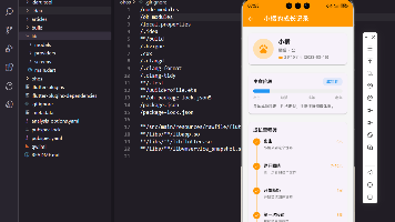
课程列表是学习模块的核心页面,展示某个分类下的所有课程。本文介绍如何实现一个功能完善的课程列表,包括课程信息展示、完成状态标识和页面跳转。
页面参数传递
课程列表需要接收分类参数:
class LessonListScreen extends StatelessWidget {
final String category;
const LessonListScreen({super.key, required this.category});
Widget build(BuildContext context) {
final lessons = _getLessonsForCategory(category);
通过构造函数的required关键字强制要求传入category参数,确保页面知道要显示哪个分类的课程。_getLessonsForCategory方法根据分类获取对应的课程数据,实现数据与UI的分离。
Scaffold基础布局
构建页面的整体结构:
    return Scaffold(
      appBar: AppBar(title: Text(category)),
      body: ListView.builder(
        padding: EdgeInsets.all(16.w),
        itemCount: lessons.length,
        itemBuilder: (context, index) {
          final lesson = lessons[index];
AppBar的标题直接显示分类名称,让用户清楚当前位置。ListView.builder采用懒加载方式构建列表,即使课程数量很多也不会影响性能。每次构建时从lessons数组中取出对应索引的课程数据。
卡片容器与点击
每个课程项用Card和InkWell包裹:
          return Card(
            margin: EdgeInsets.only(bottom: 12.h),
            child: InkWell(
              onTap: () => Navigator.push(
                context,
                MaterialPageRoute(
                  builder: (_) => LessonDetailScreen(lessonId: lesson['id'] as String),
                ),
              ),
              borderRadius: BorderRadius.circular(12.r),
Card提供阴影和圆角效果,InkWell添加点击水波纹动画。点击时通过Navigator.push跳转到课程详情页,传入课程ID作为参数。borderRadius设置与Card一致,让水波纹动画不会超出卡片边界,细节更精致。
课程序号设计
左侧显示课程序号:
              child: Padding(
                padding: EdgeInsets.all(16.w),
                child: Row(
                  children: [
                    Container(
                      width: 60.w,
                      height: 60.w,
                      decoration: BoxDecoration(
                        color: const Color(0xFF00897B).withOpacity(0.1),
                        borderRadius: BorderRadius.circular(12.r),
                      ),
                      child: Center(
                        child: Text(
                          '${index + 1}',
                          style: TextStyle(
                            fontSize: 24.sp,
                            fontWeight: FontWeight.bold,
                            color: const Color(0xFF00897B),
                          ),
                        ),
                      ),
                    ),
                    SizedBox(width: 16.w),
序号容器设为60x60的正方形,用主题色半透明背景和圆角装饰。序号文字采用24.sp的大字号和粗体,颜色与背景呼应。这种设计让课程顺序一目了然,也增加了视觉趣味性。
课程信息区域
中间区域显示课程详细信息:
                    Expanded(
                      child: Column(
                        crossAxisAlignment: CrossAxisAlignment.start,
                        children: [
                          Text(
                            lesson['title'] as String,
                            style: TextStyle(fontSize: 16.sp, fontWeight: FontWeight.bold),
                          ),
                          SizedBox(height: 4.h),
                          Text(
                            lesson['description'] as String,
                            style: TextStyle(fontSize: 13.sp, color: Colors.grey[600]),
                            maxLines: 2,
                            overflow: TextOverflow.ellipsis,
                          ),
用Expanded让信息区域占据剩余空间,Column纵向排列标题和描述。标题用粗体突出,描述用灰色小字显示。maxLines: 2限制描述最多显示两行,overflow: TextOverflow.ellipsis超出部分显示省略号,避免文字过长破坏布局。
时长和难度标签
底部显示课程时长和难度:
                          SizedBox(height: 8.h),
                          Row(
                            children: [
                              Icon(Icons.access_time, size: 14.sp, color: Colors.grey),
                              SizedBox(width: 4.w),
                              Text(
                                '${lesson['duration']}分钟',
                                style: TextStyle(fontSize: 12.sp, color: Colors.grey),
                              ),
                              SizedBox(width: 16.w),
时长用时钟图标和文字组合显示,图标大小14.sp与文字12.sp接近,保持视觉平衡。图标和文字都用灰色,表示这是次要信息。图标和文字之间只留4.w的小间距,让它们看起来是一个整体。
难度标签样式
难度信息用彩色标签展示:
                              Container(
                                padding: EdgeInsets.symmetric(horizontal: 6.w, vertical: 2.h),
                                decoration: BoxDecoration(
                                  color: Colors.green.withOpacity(0.1),
                                  borderRadius: BorderRadius.circular(4.r),
                                ),
                                child: Text(
                                  lesson['difficulty'] as String,
                                  style: TextStyle(fontSize: 10.sp, color: Colors.green),
                                ),
                              ),
                            ],
                          ),
                        ],
                      ),
                    ),
难度标签用绿色半透明背景和小圆角,文字也是绿色。padding设置为水平6.w垂直2.h,让标签紧凑但不拥挤。这种彩色标签比纯文字更醒目,用户可以快速识别课程难度。
完成状态图标
右侧显示课程完成状态:
                    Icon(
                      lesson['completed'] as bool ? Icons.check_circle : Icons.play_circle_outline,
                      color: lesson['completed'] as bool ? Colors.green : const Color(0xFF00897B),
                      size: 32.sp,
                    ),
                  ],
                ),
              ),
            ),
          );
        },
      ),
    );
  }
根据completed字段动态显示图标:已完成显示绿色对勾,未完成显示主题色播放图标。图标大小32.sp足够醒目,让用户一眼看出哪些课程已学完。这种视觉反馈增强了成就感,激励用户继续学习。
数据获取方法
根据分类返回对应课程:
  List<Map<String, dynamic>> _getLessonsForCategory(String category) {
    final baseLessons = {
      '基础问候': [
        {'id': 'greet_1', 'title': '你好', 'description': '学习最基本的问候语', 'duration': 5, 'difficulty': '初级', 'completed': true},
        {'id': 'greet_2', 'title': '早上好', 'description': '早晨问候的手语表达', 'duration': 5, 'difficulty': '初级', 'completed': true},
        {'id': 'greet_3', 'title': '晚上好', 'description': '晚间问候的手语表达', 'duration': 5, 'difficulty': '初级', 'completed': false},
        {'id': 'greet_4', 'title': '再见', 'description': '告别时的手语表达', 'duration': 5, 'difficulty': '初级', 'completed': false},
        {'id': 'greet_5', 'title': '谢谢', 'description': '表达感谢的手语', 'duration': 5, 'difficulty': '初级', 'completed': false},
      ],
用Map存储不同分类的课程数据,每个课程包含ID、标题、描述、时长、难度和完成状态。这种结构清晰明了,方便维护。实际项目中应该从服务器或数据库获取数据,这里用硬编码是为了演示。
数字手语分类
另一个分类的课程数据:
      '数字手语': [
        {'id': 'num_1', 'title': '数字1-5', 'description': '学习数字1到5的手语', 'duration': 8, 'difficulty': '初级', 'completed': true},
        {'id': 'num_2', 'title': '数字6-10', 'description': '学习数字6到10的手语', 'duration': 8, 'difficulty': '初级', 'completed': false},
        {'id': 'num_3', 'title': '数字11-20', 'description': '学习两位数的手语表达', 'duration': 10, 'difficulty': '中级', 'completed': false},
        {'id': 'num_4', 'title': '数字21-100', 'description': '学习更大数字的手语', 'duration': 15, 'difficulty': '中级', 'completed': false},
      ],
    };
数字手语分类包含4个课程,从简单到复杂递进。时长也随难度增加,初级课程5-8分钟,中级课程10-15分钟。这种渐进式设计符合学习规律,让用户循序渐进掌握知识。
默认数据处理
处理未定义的分类:
    return baseLessons[category] ?? [
      {'id': 'default_1', 'title': '课程1', 'description': '课程描述', 'duration': 5, 'difficulty': '初级', 'completed': false},
      {'id': 'default_2', 'title': '课程2', 'description': '课程描述', 'duration': 5, 'difficulty': '初级', 'completed': false},
      {'id': 'default_3', 'title': '课程3', 'description': '课程描述', 'duration': 5, 'difficulty': '中级', 'completed': false},
    ];
  }
}
使用??运算符提供默认数据,避免分类不存在时返回null导致错误。这是一种防御性编程的做法,提高代码健壮性。默认数据包含3个通用课程,确保页面始终有内容显示。
Row布局的技巧
课程项使用Row横向排列:
Row(
  children: [
    Container(...),      // 固定宽度的序号
    SizedBox(width: 16.w),
    Expanded(...),       // 自适应宽度的信息区
    Icon(...),           // 固定大小的状态图标
  ],
)
序号和图标用固定尺寸,中间信息区用Expanded占据剩余空间。这样无论屏幕多宽,布局都不会错乱。SizedBox控制元素间距,让布局疏密有致。
文字溢出处理
描述文字的溢出控制:
Text(
  lesson['description'] as String,
  style: TextStyle(fontSize: 13.sp, color: Colors.grey[600]),
  maxLines: 2,
  overflow: TextOverflow.ellipsis,
),
maxLines: 2限制最多显示两行,overflow: TextOverflow.ellipsis超出部分用省略号代替。这样即使描述很长,也不会占用过多空间。用户可以点击进入详情页查看完整内容,列表页保持简洁。
颜色语义化
不同状态使用不同颜色:
color: lesson['completed'] as bool ? Colors.green : const Color(0xFF00897B),
已完成用绿色表示成功,未完成用主题色表示可操作。这种颜色语义化符合用户认知习惯,绿色代表完成、成功,青色代表待处理、可点击。无需文字说明,用户就能理解状态含义。
图标的选择
状态图标的语义:
lesson['completed'] as bool ? Icons.check_circle : Icons.play_circle_outline
对勾圆圈表示已完成,播放圆圈表示可以开始学习。图标选择要符合用户认知,对勾是完成的通用符号,播放是开始的通用符号。图标语义化减少用户的理解成本。
导航跳转
点击课程跳转到详情页:
onTap: () => Navigator.push(
  context,
  MaterialPageRoute(
    builder: (_) => LessonDetailScreen(lessonId: lesson['id'] as String),
  ),
),
使用Navigator.push进行页面跳转,MaterialPageRoute提供平台风格的过渡动画。传入课程ID让详情页知道要显示哪个课程。这是Flutter中最基本的页面导航方式。
响应式尺寸
使用flutter_screenutil适配不同屏幕:
width: 60.w,
height: 60.w,
fontSize: 24.sp,
padding: EdgeInsets.all(16.w),
.w和.h单位会根据屏幕尺寸自动缩放,.sp单位用于字号。这样在小屏手机和大屏平板上都能保持合适的比例,一套代码适配所有设备。
间距的层次
不同位置使用不同间距:
SizedBox(width: 4.w),   // 图标和文字的小间距
SizedBox(width: 16.w),  // 元素之间的中等间距
SizedBox(height: 4.h),  // 标题和描述的小间距
SizedBox(height: 8.h),  // 描述和标签的中等间距
紧密相关的元素用小间距,不同功能区域用大间距。这种间距层次让界面有呼吸感,不会显得拥挤或松散。
卡片间距
列表项之间的间距:
Card(
  margin: EdgeInsets.only(bottom: 12.h),
  child: ...
)
只设置底部间距,因为ListView已经有整体的padding。12.h的间距让卡片之间有明显分隔,但又不会太远。这个数值是经过视觉调试得出的最佳值。
类型转换
从Map中取值时的类型转换:
lesson['title'] as String
lesson['duration'] as int
lesson['completed'] as bool
Map的值类型是dynamic,使用时需要转换为具体类型。as关键字进行强制类型转换,如果类型不匹配会抛出异常。这种显式转换让代码更安全,编译器能检查类型错误。
数据结构的扩展
当前使用Map存储课程数据:
{'id': 'greet_1', 'title': '你好', 'description': '学习最基本的问候语', ...}
实际项目中应该定义Lesson类,添加更多属性如封面图、视频URL、学习人数等。也可以添加方法如isCompleted()、getDurationText()等,让代码更面向对象。
小结
课程列表页面通过清晰的布局展示课程信息,序号、标题、描述、时长、难度和完成状态一目了然。点击跳转到详情页,完成状态用不同颜色和图标标识,给用户明确的视觉反馈。整体设计注重信息层次和视觉平衡,打造流畅的学习体验。
课程排序功能
按不同维度排序课程:
enum SortType { sequence, duration, difficulty }

List<Map> _sortLessons(List<Map> lessons, SortType type) {
  switch (type) {
    case SortType.duration:
      return lessons..sort((a, b) => a['duration'].compareTo(b['duration']));
    case SortType.difficulty:
      final order = {'初级': 1, '中级': 2, '高级': 3};
      return lessons..sort((a, b) =>
        order[a['difficulty']]!.compareTo(order[b['difficulty']]!));
    default:
      return lessons;
  }
}
提供按时长、难度排序的功能,用户可以根据自己的时间和水平选择合适的课程。默认按顺序排列。
筛选功能
按完成状态筛选课程:
DropdownButton<String>(
  value: filterType,
  items: ['全部', '已完成', '未完成'].map((type) {
    return DropdownMenuItem(value: type, child: Text(type));
  }).toList(),
  onChanged: (value) {
    setState(() {
      filterType = value!;
      if (value == '已完成') {
        filteredLessons = lessons.where((l) => l['completed']).toList();
      } else if (value == '未完成') {
        filteredLessons = lessons.where((l) => !l['completed']).toList();
      } else {
        filteredLessons = lessons;
      }
    });
  },
)
下拉菜单选择筛选条件,只显示符合条件的课程。这种灵活筛选让用户快速找到目标课程。
课程进度保存
保存用户的学习进度:
void _saveProgress(String lessonId, double progress) async {
  final prefs = await SharedPreferences.getInstance();
  await prefs.setDouble('lesson_${lessonId}_progress', progress);

  if (progress >= 1.0) {
    await prefs.setBool('lesson_${lessonId}_completed', true);
  }
}
使用SharedPreferences保存每个课程的学习进度,进度达到100%时标记为已完成。下次打开应用时恢复进度。
课程解锁机制
按顺序解锁课程:
bool _isLessonLocked(int index) {
  if (index == 0) return false;
  return !lessons[index - 1]['completed'];
}
第一个课程默认解锁,后续课程需要完成前一个才能解锁。这种渐进式解锁引导用户按顺序学习。
锁定状态显示
显示锁定图标:
if (_isLessonLocked(index))
  Positioned(
    right: 0,
    top: 0,
    child: Container(
      padding: EdgeInsets.all(4.w),
      decoration: BoxDecoration(
        color: Colors.grey,
        borderRadius: BorderRadius.circular(4.r),
      ),
      child: Icon(Icons.lock, size: 16.sp, color: Colors.white),
    ),
  ),
锁定的课程右上角显示锁图标,点击时提示需要先完成前置课程。这种视觉提示让用户明白学习路径。
课程预览功能
未解锁课程也可以预览:
onTap: () {
  if (_isLessonLocked(index)) {
    showDialog(
      context: context,
      builder: (context) => AlertDialog(
        title: Text('课程已锁定'),
        content: Text('请先完成前面的课程'),
        actions: [
          TextButton(
            onPressed: () => Navigator.pop(context),
            child: Text('知道了'),
          ),
          TextButton(
            onPressed: () {
              Navigator.pop(context);
              _showPreview(lesson);
            },
            child: Text('预览'),
          ),
        ],
      ),
    );
  } else {
    _navigateToDetail(lesson);
  }
}
锁定课程点击时弹出对话框,提供预览选项。预览只能看简介和目录,不能学习内容。
学习时长统计
统计每个课程的学习时长:
void _trackLearningTime(String lessonId) async {
  final startTime = DateTime.now();

  // 页面关闭时计算时长
  WidgetsBinding.instance.addPostFrameCallback((_) {
    final duration = DateTime.now().difference(startTime);
    _saveLearningDuration(lessonId, duration.inMinutes);
  });
}
记录进入课程详情的时间,离开时计算学习时长并保存。这些数据可以用于学习统计和推荐算法。
课程推荐
根据学习历史推荐课程:
List<Map> _getRecommendedLessons() {
  final completedCategories = lessons
      .where((l) => l['completed'])
      .map((l) => l['category'])
      .toSet();

  return allLessons
      .where((l) =>
        !l['completed'] &&
        completedCategories.contains(l['category']))
      .take(3)
      .toList();
}
找出用户已完成课程的分类,推荐同分类的未完成课程。这种智能推荐提升学习效率。
离线下载
支持课程离线下载:
IconButton(
  icon: Icon(
    lesson['downloaded'] ? Icons.download_done : Icons.download,
    color: lesson['downloaded'] ? Colors.green : Colors.grey,
  ),
  onPressed: () => _downloadLesson(lesson),
)
课程列表项添加下载按钮,已下载显示绿色对勾,未下载显示灰色下载图标。离线功能让用户随时随地学习。
欢迎加入开源鸿蒙跨平台社区:https://openharmonycrossplatform.csdn.net

开源鸿蒙跨平台开发社区汇聚开发者与厂商,共建“一次开发,多端部署”的开源生态,致力于降低跨端开发门槛,推动万物智联创新。
更多推荐

 15
15 0
0- 0


 已为社区贡献1条内容

所有评论(0)