Flutter跨平台开发:评价列表组件适配OpenHarmony实战
前言
在电商应用中,评价列表是用户决策的关键环节。真实、清晰的评价展示能显著提升用户信任度和转化率。本文将分享一个经过实际项目验证的Flutter评价列表组件实现方案,重点讲解如何在Flutter框架下直接开发OpenHarmony应用。
评价数据模型设计
评价数据模型是整个组件的基础,需要合理设计以满足各种展示需求:
class Review {
  final String id;
  final String userId;
  final String userName;
  final String? userAvatar;
  final int rating;
  final String content;
  final List<String> images;
  final DateTime createTime;
  final String? specInfo;

  const Review({
    required this.id,
    required this.userId,
    required this.userName,
    this.userAvatar,
    required this.rating,
    required this.content,
    required this.images,
    required this.createTime,
    this.specInfo,
  });
}
关键点说明:
id:评价唯一标识,用于后续交互(如回复、点赞)rating:评分值,1-5分,使用整数存储images:图片URL列表,最多显示9张specInfo:商品规格信息,如"颜色:红色 尺码:XL",帮助用户理解评价上下文
评价统计组件实现
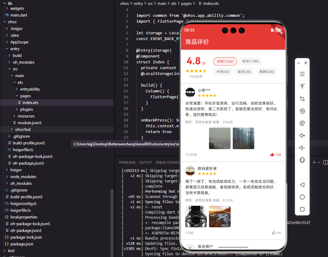
评价统计组件展示商品的整体评价情况,包括平均评分和各类评价数量:
class ReviewSummary extends StatelessWidget {
final double averageRating;
final int totalCount;
final int goodCount;
final int mediumCount;
final int badCount;
const ReviewSummary({
Key? key,
required this.averageRating,
required this.totalCount,
required this.goodCount,
required this.mediumCount,
required this.badCount,
}) : super(key: key);
Widget build(BuildContext context) {
return Container(
padding: const EdgeInsets.all(16),
color: Colors.white,
child: Row(
children: [
_buildRatingScore(),
const SizedBox(width: 24),
Expanded(child: _buildRatingTags()),
],
),
);
}
Widget _buildRatingScore() {
return Column(
children: [
Row(
crossAxisAlignment: CrossAxisAlignment.end,
children: [
Text(
averageRating.toStringAsFixed(1),
style: const TextStyle(
fontSize: 36,
fontWeight: FontWeight.bold,
color: Color(0xFFE53935),
),
),
const Padding(
padding: EdgeInsets.only(bottom: 6),
child: Text(
' 分',
style: TextStyle(
fontSize: 14,
color: Color(0xFFE53935),
),
),
),
],
),
const SizedBox(height: 4),
_buildStars(averageRating),
],
);
}
Widget _buildStars(double rating) {
return Row(
mainAxisSize: MainAxisSize.min,
children: List.generate(5, (index) {
final starValue = index + 1;
IconData icon;
if (rating >= starValue) {
icon = Icons.star;
} else if (rating >= starValue - 0.5) {
icon = Icons.star_half;
} else {
icon = Icons.star_border;
}
return Icon(
icon,
size: 16,
color: const Color(0xFFFFB300),
);
}),
);
}
Widget _buildRatingTags() {
return Wrap(
spacing: 8,
runSpacing: 8,
children: [
_buildTag('全部($totalCount)', true),
_buildTag('好评($goodCount)', false),
_buildTag('中评($mediumCount)', false),
_buildTag('差评($badCount)', false),
_buildTag('有图', false),
],
);
}
Widget _buildTag(String text, bool isSelected) {
return Container(
padding: const EdgeInsets.symmetric(horizontal: 12, vertical: 6),
decoration: BoxDecoration(
color: isSelected
? const Color(0xFFFFF0F0)
: const Color(0xFFF5F5F5),
borderRadius: BorderRadius.circular(14),
border: isSelected
? Border.all(color: const Color(0xFFE53935))
: null,
),
child: Text(
text,
style: TextStyle(
fontSize: 12,
color: isSelected
? const Color(0xFFE53935)
: const Color(0xFF666666),
),
),
);
}
}
关键点说明:
- 评分数字使用36像素大字号和红色粗体,在视觉上非常突出
- "分"字使用较小字号,通过底部对齐与数字形成整体
- 星星评分根据评分值动态生成实心星、半星和空心星
- 选中状态的标签使用红色边框和浅红色背景,未选中状态使用灰色背景
评价卡片组件实现
评价卡片是展示单条评价的核心组件:
class ReviewCard extends StatelessWidget {
final Review review;
final VoidCallback? onImageTap;
const ReviewCard({
Key? key,
required this.review,
this.onImageTap,
}) : super(key: key);
Widget build(BuildContext context) {
return Container(
padding: const EdgeInsets.all(16),
color: Colors.white,
child: Column(
crossAxisAlignment: CrossAxisAlignment.start,
children: [
_buildUserInfo(),
const SizedBox(height: 12),
_buildContent(),
if (review.images.isNotEmpty)
...[
const SizedBox(height: 12),
_buildImages(),
],
const SizedBox(height: 12),
_buildFooter(),
],
),
);
}
Widget _buildUserInfo() {
return Row(
children: [
CircleAvatar(
radius: 18,
backgroundImage: review.userAvatar != null
? NetworkImage(review.userAvatar!)
: null,
backgroundColor: const Color(0xFFEEEEEE),
child: review.userAvatar == null
? const Icon(Icons.person, size: 20, color: Color(0xFF999999))
: null,
),
const SizedBox(width: 10),
Expanded(
child: Column(
crossAxisAlignment: CrossAxisAlignment.start,
children: [
Text(
review.userName,
style: const TextStyle(
fontSize: 14,
color: Color(0xFF333333),
),
),
const SizedBox(height: 2),
_buildStars(review.rating.toDouble()),
],
),
),
],
);
}
Widget _buildContent() {
return Column(
crossAxisAlignment: CrossAxisAlignment.start,
children: [
Text(
review.content,
style: const TextStyle(
fontSize: 14,
color: Color(0xFF333333),
height: 1.5,
),
maxLines: 4,
overflow: TextOverflow.ellipsis,
),
if (review.specInfo != null)
Padding(
padding: const EdgeInsets.only(top: 8),
child: Text(
review.specInfo!,
style: const TextStyle(
fontSize: 12,
color: Color(0xFF999999),
),
),
),
],
);
}
Widget _buildImages() {
return Wrap(
spacing: 8,
runSpacing: 8,
children: review.images.take(9).map((imageUrl) {
return GestureDetector(
onTap: onImageTap,
child: ClipRRect(
borderRadius: BorderRadius.circular(4),
child: Image.network(
imageUrl,
width: 80,
height: 80,
fit: BoxFit.cover,
),
),
);
}).toList(),
);
}
Widget _buildFooter() {
return Row(
mainAxisAlignment: MainAxisAlignment.spaceBetween,
children: [
Text(
DateFormat('yyyy-MM-dd').format(review.createTime),
style: const TextStyle(color: Color(0xFF999999)),
),
Row(
children: [
const Icon(Icons.favorite, size: 16, color: Color(0xFF999999)),
const SizedBox(width: 4),
Text(
'12',
style: TextStyle(color: Color(0xFF999999)),
),
const SizedBox(width: 12),
const Icon(Icons.reply, size: 16, color: Color(0xFF999999)),
const SizedBox(width: 4),
Text(
'3',
style: TextStyle(color: Color(0xFF999999)),
),
],
),
],
);
}
}
关键点说明:
- 使用条件渲染确保只有当评价包含图片时才显示图片区域
- 评价内容限制最多显示4行,超出部分显示省略号
- 规格信息使用灰色小字号显示在内容下方
- 评价图片最多显示9张,使用80像素的正方形尺寸
评价列表组件数据流图
下面的Mermaid图表展示了评价列表组件的数据流:
评价卡片组件UI结构分解图
下面的Mermaid图表展示了评价卡片组件的UI结构:
跨平台兼容性处理
在Flutter开发OpenHarmony应用时,我们需要注意以下兼容性问题:
-
图片加载:OpenHarmony的Image组件与Flutter的Image组件略有不同
// Flutter Image.network(imageUrl, width: 80, height: 80, fit: BoxFit.cover) // OpenHarmony Image(imageUrl).width(80).height(80).objectFit(ImageFit.Cover)解决方案:使用统一的图片加载方法封装,确保在不同平台上的表现一致。
-
状态管理:OpenHarmony使用ArkUI的
@State和@Prop装饰器,而Flutter使用StatefulWidget
解决方案:在Flutter中使用StatefulWidget,在OpenHarmony中使用ArkUI的@State,保持组件逻辑一致。 -
布局系统:OpenHarmony的ArkUI使用
Column、Row等布局,与Flutter类似但语法略有差异
解决方案:使用Flutter的布局系统,确保在OpenHarmony上也能正常工作。
常见问题与解决方案
-
问题:OpenHarmony应用中评价图片显示不全
解决方案:检查图片URL是否有效,确保使用正确的图片加载方式。在OpenHarmony中,需要使用objectFit属性设置为ImageFit.Cover。 -
问题:评价卡片在OpenHarmony中显示错位
解决方案:检查容器的width和height设置,确保在不同屏幕尺寸上都能正常显示。 -
问题:评价筛选标签点击事件不响应
解决方案:在OpenHarmony中使用@Click装饰器处理点击事件,确保事件正确绑定。
总结
本文通过一个完整的评价列表组件实现,展示了如何使用Flutter框架直接开发OpenHarmony应用。评价统计组件、评价筛选标签和评价卡片组件的实现,为用户提供了清晰可信的评价展示功能。
在实际项目中,我们发现通过合理设计数据模型、统一API接口和处理平台差异,可以高效地实现跨平台组件。评价列表组件是电商应用的核心功能,其展示质量直接影响用户的信任度和购买意愿。
希望本文能帮助开发者更好地理解和实现Flutter开发OpenHarmony应用,为用户提供优质的商品评价体验。
欢迎大家加入开源鸿蒙跨平台开发者社区,一起探索更多鸿蒙跨平台开发技术!

开源鸿蒙跨平台开发社区汇聚开发者与厂商,共建“一次开发,多端部署”的开源生态,致力于降低跨端开发门槛,推动万物智联创新。
更多推荐
 16
16 0
0- 0


 已为社区贡献60条内容

所有评论(0)