Flutter for OpenHarmony 看书管理记录App实战:首页仪表盘实现
本文介绍了一个基于Flutter for OpenHarmony开发的阅读管理App的首页仪表盘实现。该页面包含四个主要模块:阅读进度卡片(使用渐变背景和圆形进度条展示68%的月度目标完成情况)、快捷操作区域(包含添加书籍、写笔记等常用功能)、正在阅读书籍列表和最近笔记记录。文章详细讲解了UI设计思路,包括采用暖色调配色方案提升视觉舒适度,以及使用flutter_screenutil进行多设备适配
最近在做一个看书管理记录的App,主要是想把自己读过的书、正在读的书都记录下来,方便追踪阅读进度和统计阅读数据。今天先从首页仪表盘开始,这个页面是整个App的门面,需要展示阅读进度、快捷操作入口、正在阅读的书籍等信息。
做这个App的初衷很简单,平时看书比较杂,有时候一本书看到一半就放下了,过段时间再拿起来已经忘了读到哪里。用备忘录记太乱,所以干脆自己写一个专门的App来管理。
开发环境说明
这个项目基于 Flutter for OpenHarmony 开发,可以同时运行在鸿蒙设备和其他平台上。用到的主要依赖包括:
- flutter_screenutil:屏幕适配,让UI在不同尺寸设备上正常显示
- get:路由管理和状态管理,用起来比较轻量
- percent_indicator:进度指示器组件,用来展示阅读进度
这些依赖都是经过鸿蒙适配的版本,可以直接在 OpenHarmony 设备上运行。
整体页面结构
首页仪表盘用 StatelessWidget 实现,因为这个页面主要是展示数据,暂时不需要复杂的状态管理。
import 'package:flutter/material.dart';
import 'package:flutter_screenutil/flutter_screenutil.dart';
import 'package:get/get.dart';
import 'package:percent_indicator/circular_percent_indicator.dart';
import '../../app/routes/app_routes.dart';
这里导入了必要的依赖包。percent_indicator 是用来显示圆形进度条的,后面会用它来展示月度阅读目标的完成情况。
页面主体框架
class DashboardView extends StatelessWidget {
const DashboardView({super.key});
Widget build(BuildContext context) {
return Scaffold(
backgroundColor: const Color(0xFFFDF8F3),
appBar: AppBar(
title: const Text('阅读记录'),
backgroundColor: const Color(0xFF5B4636),
foregroundColor: Colors.white,
actions: [
IconButton(icon: const Icon(Icons.search), onPressed: () => Get.toNamed(AppRoutes.search)),
IconButton(icon: const Icon(Icons.calendar_month), onPressed: () => Get.toNamed(AppRoutes.calendar)),
],
),
背景色用了 0xFFFDF8F3,是一种很淡的米白色,看起来比较温馨,符合阅读类App的调性。选这个颜色是因为纯白色看久了眼睛会累,而这种带一点暖色调的白色会舒服很多。
AppBar 的颜色选了 0xFF5B4636,这是一种深棕色,和书籍、纸张的质感比较搭。右上角放了搜索和日历两个按钮,搜索可以快速找书,日历可以查看阅读记录。
页面内容布局
      body: SingleChildScrollView(
        padding: EdgeInsets.all(16.w),
        child: Column(
          crossAxisAlignment: CrossAxisAlignment.start,
          children: [
            _buildReadingProgress(),
            SizedBox(height: 20.h),
            _buildQuickActions(),
            SizedBox(height: 20.h),
            _buildCurrentReading(),
            SizedBox(height: 20.h),
            _buildRecentNotes(),
          ],
        ),
      ),
    );
  }
页面主体用 SingleChildScrollView 包裹,内容多了可以滚动。用 Column 垂直排列四个模块:阅读进度、快捷操作、正在阅读、最近笔记。
crossAxisAlignment: CrossAxisAlignment.start 让子组件都靠左对齐。整体 padding 设置为 16,给内容留出呼吸空间。
阅读进度卡片
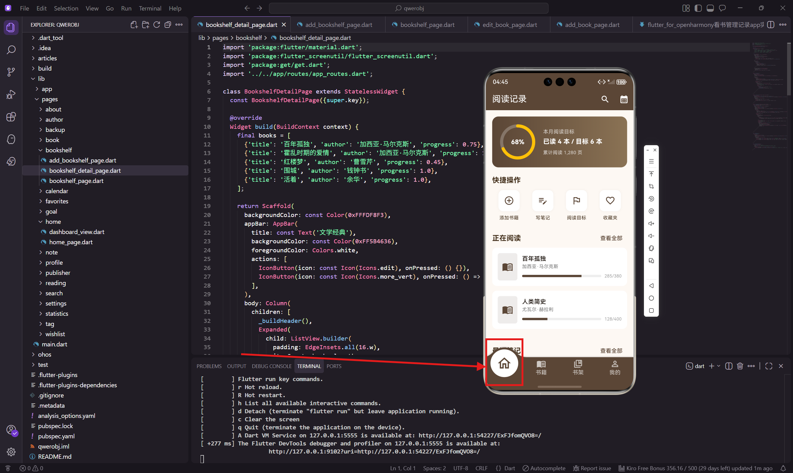
这是首页最显眼的部分,用渐变背景让它更有层次感。
  Widget _buildReadingProgress() {
    return Container(
      padding: EdgeInsets.all(20.w),
      decoration: BoxDecoration(
        gradient: const LinearGradient(colors: [Color(0xFF5B4636), Color(0xFF8B7355)]),
        borderRadius: BorderRadius.circular(16.r),
      ),
LinearGradient 从深棕色渐变到浅棕色,视觉上更有质感。如果只用单一颜色会比较平,加上渐变之后立体感就出来了。
圆形进度指示器
      child: Row(
        children: [
          CircularPercentIndicator(
            radius: 45.r,
            lineWidth: 8.w,
            percent: 0.68,
            center: Text('68%', style: TextStyle(color: Colors.white, fontSize: 16.sp, fontWeight: FontWeight.bold)),
            progressColor: Colors.amber,
            backgroundColor: Colors.white24,
            circularStrokeCap: CircularStrokeCap.round,
          ),
用 CircularPercentIndicator 组件显示阅读目标完成度。percent: 0.68 表示完成了68%,进度条颜色用琥珀色,和棕色背景形成对比。
circularStrokeCap: CircularStrokeCap.round 让进度条两端是圆形的,看起来更柔和。
进度文字说明
          SizedBox(width: 20.w),
          Expanded(
            child: Column(
              crossAxisAlignment: CrossAxisAlignment.start,
              children: [
                Text('本月阅读目标', style: TextStyle(color: Colors.white70, fontSize: 13.sp)),
                SizedBox(height: 4.h),
                Text('已读 4 本 / 目标 6 本', style: TextStyle(color: Colors.white, fontSize: 16.sp, fontWeight: FontWeight.bold)),
                SizedBox(height: 8.h),
                Text('累计阅读 1,280 页', style: TextStyle(color: Colors.white70, fontSize: 12.sp)),
              ],
            ),
          ),
        ],
      ),
    );
  }
右边显示具体的数字信息。标题用半透明白色,数据用纯白加粗,形成主次分明的层次。累计页数作为补充信息,字号小一些。
快捷操作区域
  Widget _buildQuickActions() {
    final actions = [
      {'icon': Icons.add_circle_outline, 'label': '添加书籍', 'route': AppRoutes.addBook},
      {'icon': Icons.edit_note, 'label': '写笔记', 'route': AppRoutes.addNote},
      {'icon': Icons.flag_outlined, 'label': '阅读目标', 'route': AppRoutes.readingGoal},
      {'icon': Icons.favorite_border, 'label': '收藏夹', 'route': AppRoutes.favorites},
    ];
用一个 List 存储快捷操作的配置数据,每个操作有图标、标签、路由三个属性。这种数据驱动的写法好处是,以后要加减按钮只需要改数组就行。
快捷按钮渲染
    return Column(
      crossAxisAlignment: CrossAxisAlignment.start,
      children: [
        Text('快捷操作', style: TextStyle(fontSize: 18.sp, fontWeight: FontWeight.bold, color: const Color(0xFF3D2914))),
        SizedBox(height: 12.h),
        Row(
          mainAxisAlignment: MainAxisAlignment.spaceAround,
          children: actions.map((a) => GestureDetector(
            onTap: () => Get.toNamed(a['route'] as String),
            child: Column(
              children: [
                Container(
                  padding: EdgeInsets.all(14.w),
                  decoration: BoxDecoration(
                    color: Colors.white,
                    borderRadius: BorderRadius.circular(12.r),
                    boxShadow: [BoxShadow(color: Colors.grey.withOpacity(0.1), blurRadius: 4)],
                  ),
                  child: Icon(a['icon'] as IconData, color: const Color(0xFF5B4636), size: 26.sp),
                ),
                SizedBox(height: 8.h),
                Text(a['label'] as String, style: TextStyle(fontSize: 12.sp, color: const Color(0xFF3D2914))),
              ],
            ),
          )).toList(),
        ),
      ],
    );
  }
标题用深棕色 0xFF3D2914,和主题色呼应但又有区分。按钮用白色背景加淡淡的阴影,有浮起来的感觉。
GestureDetector 包裹整个按钮区域,点击范围更大,用户体验更好。
正在阅读列表
  Widget _buildCurrentReading() {
    final books = [
      {'title': '百年孤独', 'author': '加西亚·马尔克斯', 'progress': 0.75, 'pages': '285/380'},
      {'title': '人类简史', 'author': '尤瓦尔·赫拉利', 'progress': 0.32, 'pages': '128/400'},
    ];
    return Column(
      crossAxisAlignment: CrossAxisAlignment.start,
      children: [
        Row(
          mainAxisAlignment: MainAxisAlignment.spaceBetween,
          children: [
            Text('正在阅读', style: TextStyle(fontSize: 18.sp, fontWeight: FontWeight.bold, color: const Color(0xFF3D2914))),
            TextButton(onPressed: () => Get.toNamed(AppRoutes.readingRecord), child: const Text('查看全部')),
          ],
        ),
这里展示正在阅读的书籍,标题栏右边有"查看全部"按钮。数据暂时写死,实际项目中应该从数据库读取。
书籍卡片样式
        ...books.map((b) => Container(
          margin: EdgeInsets.only(bottom: 12.h),
          padding: EdgeInsets.all(14.w),
          decoration: BoxDecoration(color: Colors.white, borderRadius: BorderRadius.circular(12.r)),
          child: Row(
            children: [
              Container(
                width: 50.w, height: 70.h,
                decoration: BoxDecoration(color: const Color(0xFF5B4636).withOpacity(0.1), borderRadius: BorderRadius.circular(6.r)),
                child: Icon(Icons.menu_book, color: const Color(0xFF5B4636), size: 28.sp),
              ),
              SizedBox(width: 12.w),
每本书是一个白色卡片,左边是书籍图标(实际项目中应该是封面图),右边是书名和进度信息。
阅读进度条
              Expanded(
                child: Column(
                  crossAxisAlignment: CrossAxisAlignment.start,
                  children: [
                    Text(b['title'] as String, style: TextStyle(fontWeight: FontWeight.w600, fontSize: 15.sp)),
                    Text(b['author'] as String, style: TextStyle(color: Colors.grey[600], fontSize: 12.sp)),
                    SizedBox(height: 8.h),
                    Row(
                      children: [
                        Expanded(
                          child: ClipRRect(
                            borderRadius: BorderRadius.circular(4.r),
                            child: LinearProgressIndicator(
                              value: b['progress'] as double,
                              backgroundColor: Colors.grey[200],
                              valueColor: const AlwaysStoppedAnimation(Color(0xFF5B4636)),
                              minHeight: 6.h,
                            ),
                          ),
                        ),
                        SizedBox(width: 8.w),
                        Text(b['pages'] as String, style: TextStyle(color: Colors.grey[500], fontSize: 11.sp)),
                      ],
                    ),
                  ],
                ),
              ),
            ],
          ),
        )).toList(),
      ],
    );
  }
进度条用 LinearProgressIndicator,外面套 ClipRRect 加圆角。右边显示具体页数,让用户一眼就能看到阅读进度。
最近笔记模块
  Widget _buildRecentNotes() {
    return Column(
      crossAxisAlignment: CrossAxisAlignment.start,
      children: [
        Row(
          mainAxisAlignment: MainAxisAlignment.spaceBetween,
          children: [
            Text('最近笔记', style: TextStyle(fontSize: 18.sp, fontWeight: FontWeight.bold, color: const Color(0xFF3D2914))),
            TextButton(onPressed: () => Get.toNamed(AppRoutes.noteList), child: const Text('查看全部')),
          ],
        ),
        Container(
          padding: EdgeInsets.all(14.w),
          decoration: BoxDecoration(color: Colors.white, borderRadius: BorderRadius.circular(12.r)),
          child: Column(
            crossAxisAlignment: CrossAxisAlignment.start,
            children: [
              Row(
                children: [
                  Container(
                    padding: EdgeInsets.symmetric(horizontal: 8.w, vertical: 4.h),
                    decoration: BoxDecoration(color: const Color(0xFF5B4636).withOpacity(0.1), borderRadius: BorderRadius.circular(4.r)),
                    child: Text('百年孤独', style: TextStyle(fontSize: 11.sp, color: const Color(0xFF5B4636))),
                  ),
                  const Spacer(),
                  Text('2024-01-15', style: TextStyle(color: Colors.grey[500], fontSize: 11.sp)),
                ],
              ),
              SizedBox(height: 8.h),
              Text('孤独是人类永恒的主题,马尔克斯用魔幻现实主义的手法,展现了布恩迪亚家族七代人的命运...', maxLines: 2, overflow: TextOverflow.ellipsis, style: TextStyle(fontSize: 13.sp, color: Colors.grey[700])),
            ],
          ),
        ),
      ],
    );
  }
}
最近笔记展示最新的一条读书笔记,包括来源书籍、日期、内容摘要。内容用 maxLines: 2 限制两行,超出部分用省略号。
配色方案总结
整个首页用到的颜色不多,主要是这几个:
- 主题深棕色
0xFF5B4636:AppBar、图标、进度条 - 文字深棕色
0xFF3D2914:标题文字 - 米白背景
0xFFFDF8F3:页面背景 - 纯白色:卡片背景
- 琥珀色:进度指示器
颜色不要用太多,选定一个主题色围绕它搭配就行了。深棕色给人一种书香、沉稳的感觉,很适合阅读类App。
小结
首页仪表盘的实现其实不复杂,主要是把各个模块拆分清楚,每个模块负责自己的展示逻辑。用 flutter_screenutil 做适配,在不同尺寸的设备上都能正常显示。
代码组织上,把每个模块抽成独立的方法,这样主 build 方法就很清晰,一眼就能看出页面结构。以后要修改某个模块,直接找到对应的方法就行了。
下一篇会讲书籍列表页面的实现,涉及到列表渲染和Tab切换,敬请期待。
欢迎加入开源鸿蒙跨平台社区:https://openharmonycrossplatform.csdn.net

开源鸿蒙跨平台开发社区汇聚开发者与厂商,共建“一次开发,多端部署”的开源生态,致力于降低跨端开发门槛,推动万物智联创新。
更多推荐

 29
29 0
0- 0


 已为社区贡献30条内容

所有评论(0)