rn_for_openharmony商城项目app实战-商品评价实现
本文介绍了电商App商品评价列表页面的实现过程,主要包括评价统计、评价列表和写评价入口三大功能模块。文章详细讲解了如何计算平均评分、好评率等关键数据,并采用FlatList优化长列表性能。页面设计遵循用户习惯,展示用户头像、评分星级、评价内容和晒图等信息,同时处理了无评价等边界情况。通过组件化设计提升了代码复用性,如支持单个商品评价和全部评价两种场景。文章还分享了样式设计细节,包括卡片布局、星级评
案例开源地址:https://atomgit.com/nutpi/rn_openharmony_buy
写在前面
商品评价这个功能,对电商 App 来说太重要了。用户买东西之前,十有八九会先看看评价。好评多的放心买,差评多的绕道走。所以评价页面做得好不好,直接影响用户的购买决策。
我自己网购的时候也是这样,特别是买贵的东西,评价区能翻好几页。看看别人买了用得怎么样,有没有踩坑。所以做这个页面的时候,我就想着要把评价信息展示得清晰、全面,让用户能快速判断这个商品值不值得买。
这篇文章记录一下商品评价列表页面的实现过程,包括评价统计、评价列表、写评价入口这几个核心功能。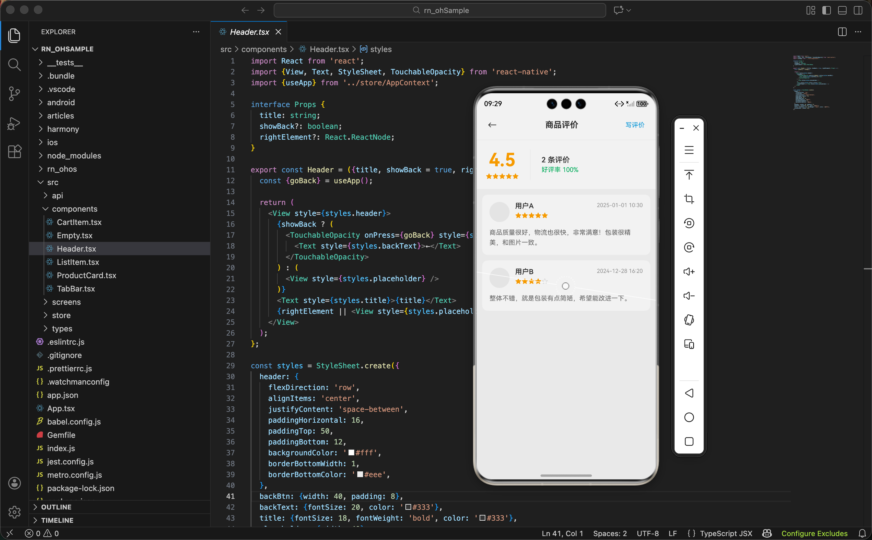
先想清楚页面要展示什么
评价页面需要展示的信息:
统计信息:
- 平均评分:这个商品整体评价如何
- 评价数量:有多少人评价了
- 好评率:好评占比多少
评价列表:
- 用户头像和昵称
- 评分星级
- 评价内容
- 评价时间
- 晒图(如果有的话)
操作入口:
- 写评价按钮
引入需要的依赖
import React from 'react';
这个页面不需要 useState,因为评价数据是从全局状态里取的,不需要本地状态。
import {View, Text, FlatList, StyleSheet, Image, TouchableOpacity} from 'react-native';
这里用
FlatList而不是ScrollView+map,是因为评价列表可能很长。FlatList有虚拟列表优化,只渲染屏幕上可见的项,性能更好。如果用map一次性渲染几百条评价,页面会卡死。
import {useApp} from '../store/AppContext';
import {Header} from '../components/Header';
import {Empty} from '../components/Empty';
import {Review} from '../types';
Empty 是空状态组件,没有评价的时候显示。Review 是评价的类型定义。
获取数据和计算统计信息
export const ReviewsScreen = () => {
  const {reviews, screenParams, navigate} = useApp();
  const productId = screenParams?.productId;
从全局状态里取评价列表和页面参数。productId 是从上一个页面传过来的,表示要看哪个商品的评价。
  const filteredReviews = productId
    ? reviews.filter(r => r.productId === productId)
    : reviews;
根据
productId筛选评价。如果有productId就只显示这个商品的评价,没有的话显示所有评价。这样这个页面既可以作为单个商品的评价页,也可以作为全部评价的列表页,复用性更强。
  const avgRating = filteredReviews.length > 0
    ? (filteredReviews.reduce((sum, r) => sum + r.rating, 0) / filteredReviews.length).toFixed(1)
    : '0.0';
计算平均评分。用 reduce 把所有评分加起来,除以评价数量,保留一位小数。
这里有个细节,如果没有评价,直接返回
'0.0'字符串,而不是计算(会得到 NaN)。这种边界情况一定要处理,不然页面会显示 NaN,很丑。
计算好评率
好评率的计算稍微复杂一点:
const goodRate = filteredReviews.filter(r => r.rating >= 4).length > 0
  ? Math.round((filteredReviews.filter(r => r.rating >= 4).length / filteredReviews.length) * 100)
  : 0;
我把 4 星和 5 星算作好评。好评数量除以总数量,乘以 100 得到百分比,用
Math.round四舍五入取整。
说实话这段代码写得有点啰嗦,filter 调用了两次。更好的写法是先算出好评数量存起来:
const goodCount = filteredReviews.filter(r => r.rating >= 4).length;
const goodRate = filteredReviews.length > 0
  ? Math.round((goodCount / filteredReviews.length) * 100)
  : 0;
不过为了和源码保持一致,我就不改了。实际项目中建议用优化后的写法。
渲染单条评价
FlatList 需要一个 renderItem 函数来渲染每一项:
const renderReview = ({item}: {item: Review}) => (
  <View style={styles.reviewCard}>
每条评价用一个卡片包裹。
    <View style={styles.userRow}>
      <Image source={{uri: item.avatar}} style={styles.avatar} />
第一行是用户信息,左边是头像。
      <View style={styles.userInfo}>
        <Text style={styles.username}>{item.username}</Text>
        <View style={styles.ratingRow}>
          {[1, 2, 3, 4, 5].map(star => (
            <Text key={star} style={[styles.star, star <= item.rating && styles.starActive]}>
              {star <= item.rating ? '★' : '☆'}
            </Text>
          ))}
        </View>
      </View>
中间是用户名和评分星级。星级用一个数组
[1, 2, 3, 4, 5]来渲染 5 颗星,根据评分决定是实心星还是空心星。比如评分是 4,那前 4 颗是实心的★,第 5 颗是空心的☆。
      <Text style={styles.time}>{item.time}</Text>
    </View>
右边是评价时间。
<Text style={styles.content}>{item.content}</Text>
第二部分是评价内容,就是用户写的文字。
    {item.images.length > 0 && (
      <View style={styles.imagesRow}>
        {item.images.map((img, index) => (
          <Image key={index} source={{uri: img}} style={styles.reviewImage} />
        ))}
      </View>
    )}
  </View>
);
第三部分是晒图,只有用户上传了图片才显示。用
item.images.length > 0判断有没有图片。
评价卡片的样式
reviewCard: {
  backgroundColor: '#fff',
  borderRadius: 12,
  padding: 16,
  marginBottom: 12
},
卡片用白色背景,圆角 12,每张卡片之间有 12 的间距。
userRow: {
  flexDirection: 'row',
  alignItems: 'flex-start',
  marginBottom: 12
},
avatar: {width: 44, height: 44, borderRadius: 22, backgroundColor: '#f0f0f0'},
头像 44x44,圆形。
backgroundColor: '#f0f0f0'是图片加载前的占位色。
userInfo: {flex: 1, marginLeft: 12},
username: {fontSize: 15, fontWeight: '600', color: '#333'},
ratingRow: {flexDirection: 'row', marginTop: 4},
star: {fontSize: 14, color: '#ddd'},
starActive: {color: '#f5a623'},
星星默认是灰色
#ddd,亮起来的是橙黄色#f5a623。这个颜色是评分星星的标准色,很多 App 都用这个。
content: {fontSize: 14, color: '#666', lineHeight: 22},
评价内容用 14 号字,灰色,行高 22 让文字不会挤在一起。
imagesRow: {flexDirection: 'row', marginTop: 12},
reviewImage: {width: 80, height: 80, borderRadius: 8, marginRight: 8, backgroundColor: '#f0f0f0'},
晒图横向排列,每张图 80x80,图片之间有 8 的间距。
页面头部和写评价按钮
<Header
  title="商品评价"
  rightElement={
    <TouchableOpacity onPress={() => navigate('writeReview', {productId})}>
      <Text style={styles.writeBtn}>写评价</Text>
    </TouchableOpacity>
  }
/>
Header 组件支持传入
rightElement,我在右边放了一个"写评价"按钮。点击跳转到写评价页面,把productId传过去。
writeBtn: {fontSize: 14, color: '#3498db', padding: 8},
按钮用蓝色文字,加点 padding 扩大点击区域。
评价统计区域
<View style={styles.summary}>
  <View style={styles.summaryLeft}>
    <Text style={styles.avgRating}>{avgRating}</Text>
    <View style={styles.starsRow}>
      {[1, 2, 3, 4, 5].map(star => (
        <Text key={star} style={[
          styles.summaryStar,
          star <= Math.round(Number(avgRating)) && styles.summaryStarActive
        ]}>★</Text>
      ))}
    </View>
  </View>
左边显示平均评分和对应的星级。评分用超大字号,很醒目。
星级这里用
Math.round(Number(avgRating))四舍五入,比如平均分 4.3 显示 4 颗星,4.6 显示 5 颗星。
  <View style={styles.summaryRight}>
    <Text style={styles.totalReviews}>{filteredReviews.length} 条评价</Text>
    <Text style={styles.goodRate}>好评率 {goodRate}%</Text>
  </View>
</View>
右边显示评价总数和好评率。
summary: {
  flexDirection: 'row',
  backgroundColor: '#fff',
  padding: 20,
  alignItems: 'center'
},
summaryLeft: {
  alignItems: 'center',
  paddingRight: 24,
  borderRightWidth: 1,
  borderRightColor: '#f0f0f0'
},
avgRating: {fontSize: 40, fontWeight: 'bold', color: '#f5a623'},
左右两部分用竖线分隔。平均评分用 40 号字,橙黄色,非常醒目。
totalReviews: {fontSize: 16, color: '#333', fontWeight: '600'},
goodRate: {fontSize: 14, color: '#27ae60', marginTop: 4},
好评率用绿色,给用户积极的感觉。
空状态处理
{filteredReviews.length === 0 ? (
  <Empty
    icon="⭐"
    title="暂无评价"
    subtitle="快来写下第一条评价吧"
    buttonText="写评价"
    onPress={() => navigate('writeReview', {productId})}
  />
) : (
  <FlatList
    data={filteredReviews}
    keyExtractor={item => item.id.toString()}
    contentContainerStyle={styles.list}
    renderItem={renderReview}
  />
)}
如果没有评价,显示空状态组件,引导用户去写评价。有评价的话用
FlatList渲染列表。
Empty 组件是我们自己封装的,支持自定义图标、标题、副标题、按钮文字和点击事件。这种空状态组件在很多页面都能复用。
完整页面结构
return (
  <View style={styles.container}>
    <Header
      title="商品评价"
      rightElement={/* 写评价按钮 */}
    />

    <View style={styles.summary}>
      {/* 评价统计 */}
    </View>

    {filteredReviews.length === 0 ? (
      <Empty /* 空状态 */ />
    ) : (
      <FlatList /* 评价列表 */ />
    )}
  </View>
);
页面结构很清晰:Header、统计区域、列表(或空状态)。
一些产品层面的思考
做评价功能的时候,我想了一些产品层面的问题:
1. 评价排序
现在是按时间倒序,最新的在前面。但有时候用户更想看有图的评价,或者差评。可以加个筛选功能:全部、有图、好评、差评。
2. 评价回复
商家可以回复用户的评价,这个功能很多电商平台都有。用户看到商家积极回复,会觉得这个店靠谱。
3. 评价点赞
用户可以给有用的评价点赞,点赞多的评价排在前面。这样高质量的评价更容易被看到。
4. 追评
用户收到货用了一段时间后,可以追加评价。追评往往更有参考价值,因为是真实使用后的感受。
5. 匿名评价
有些用户不想暴露自己买了什么,可以选择匿名评价。
这些功能这里就不实现了,但值得思考。
关于 FlatList 的一些经验
用 FlatList 有几个注意事项:
1. keyExtractor 要唯一
keyExtractor={item => item.id.toString()}
每一项要有唯一的 key,不然 React 会警告,而且列表更新时可能出问题。用
id是最稳妥的,如果没有id可以用索引,但不推荐。
2. 避免在 renderItem 里定义函数
如果在 renderItem 里定义内联函数,每次渲染都会创建新函数,可能导致不必要的重渲染。最好把 renderItem 提取出来,或者用 useCallback 包裹。
3. 合理使用 getItemLayout
如果每一项高度固定,可以用 getItemLayout 告诉 FlatList,这样滚动性能会更好。我们这里评价内容长度不固定,所以没用。
小结
商品评价页面的核心是信息展示:
- 统计信息让用户快速了解整体评价情况
- 评价列表展示具体的用户反馈
- 空状态引导用户去写评价
- 用
FlatList优化长列表性能
几个关键点:
- 平均评分和好评率的计算要处理边界情况
- 星级渲染用数组 map 的方式比较灵活
- 晒图只在有图片时显示
- Header 右边放写评价入口,方便用户操作
下一篇写"写评价"页面,敬请期待。
欢迎加入开源鸿蒙跨平台社区:https://openharmonycrossplatform.csdn.net

开源鸿蒙跨平台开发社区汇聚开发者与厂商,共建“一次开发,多端部署”的开源生态,致力于降低跨端开发门槛,推动万物智联创新。
更多推荐
 15
15 0
0- 0


 已为社区贡献18条内容

所有评论(0)