Flutter for OpenHarmony 教育百科实战:数字趣闻
本文介绍了"数字趣闻"功能的设计与实现,该功能通过展示随机数学趣闻和用户查询特定数字信息,让学习变得更有趣。文章详细阐述了状态管理方案,包括分开存储随机趣闻和用户查询结果;介绍了随机趣闻加载时的错误静默处理策略;说明了用户查询数字时的输入验证和加载状态管理;最后分享了页面布局设计技巧,特别是随机趣闻卡片的视觉效果实现,包括渐变配色、阴影处理和点击刷新功能。整体设计注重用户体验和
说实话,数字趣闻这个功能是我在做教育百科时最喜欢的一个模块。每个数字背后都有故事,比如42是《银河系漫游指南》里"生命、宇宙以及一切的终极答案",365是一年的天数,1729是著名的"出租车数"……这些冷知识让学习变得有趣多了。
这个页面的核心功能有三个:展示随机数学趣闻、让用户查询特定数字、提供快速查询入口。听起来简单,但要做好用户体验还是需要花点心思的。
状态管理的设计思路
先来看看这个页面需要管理哪些状态:
class NumbersScreen extends StatefulWidget {
const NumbersScreen({super.key});
State<NumbersScreen> createState() => _NumbersScreenState();
}
这是标准的StatefulWidget声明,没什么特别的。关键在State类里面:
class _NumbersScreenState extends State<NumbersScreen> {
final _numberController = TextEditingController();
String _fact = '';
String _mathFact = '';
bool _isLoading = false;
void initState() {
super.initState();
_loadRandomMathFact();
}
}
这里我用了两个字符串变量来存储趣闻:
_fact存用户主动查询的结果,_mathFact存随机加载的数学趣闻。你可能会问,为什么不用一个变量?
原因很简单:这两个数据的来源和用途不同。随机趣闻是页面一打开就自动加载的,放在顶部的卡片里;用户查询的结果是按需加载的,显示在搜索框下方。把它们分开管理,逻辑更清晰,也方便后续维护。
_numberController是输入框的控制器,用来获取用户输入的数字。记得在dispose里释放它,不然会内存泄漏。
随机趣闻的加载
页面初始化时自动加载一条随机趣闻:
Future<void> _loadRandomMathFact() async {
  try {
    final fact = await ApiService.getRandomMathFact();
    if (mounted) {
      setState(() => _mathFact = fact);
    }
  } catch (e) {
    // 静默处理,不影响用户使用其他功能
  }
}
这段代码有几个值得注意的地方。首先是
mounted检查——这个我在首页那篇文章里详细讲过,主要是防止Widget已经销毁了还调用setState。
其次是错误处理。你看我这里用的是空的catch块,没有显示任何错误提示。这是故意的。随机趣闻只是一个"锦上添花"的功能,加载失败了用户还可以手动查询数字,没必要弹个错误框打扰人家。
但是,如果是用户主动查询的功能失败了,那就必须给反馈,不然用户会一脸懵。
用户查询数字的逻辑
当用户输入数字点击查询时:
Future<void> _searchNumber() async {
  if (_numberController.text.isEmpty) return;

  final number = int.tryParse(_numberController.text);
  if (number == null) {
    ScaffoldMessenger.of(context).showSnackBar(
      const SnackBar(content: Text('请输入有效的数字')),
    );
    return;
  }
这里做了两层验证。第一层检查输入是否为空,空的话直接返回,连提示都不用给——用户什么都没输入就点查询,多半是手滑了。
第二层用
int.tryParse检查输入是否是有效数字。tryParse比parse好在哪?parse遇到无效输入会抛异常,tryParse只会返回null。用tryParse配合null检查,代码更简洁。
  setState(() => _isLoading = true);

  try {
    final fact = await ApiService.getNumberFact(number);
    if (mounted) {
      setState(() {
        _fact = fact;
        _isLoading = false;
      });
    }
  } catch (e) {
    if (mounted) {
      setState(() => _isLoading = false);
      ScaffoldMessenger.of(context).showSnackBar(
        const SnackBar(content: Text('查询失败,请稍后重试')),
      );
    }
  }
}
查询开始时设置
_isLoading = true,这样按钮会显示加载动画,也能防止用户重复点击。查询完成后(无论成功失败)都要把_isLoading设回false。
页面整体布局
来看看build方法怎么组织这些内容:
Widget build(BuildContext context) {
final isDark = Theme.of(context).brightness == Brightness.dark;
return Scaffold(
appBar: AppBar(
title: const Text('数字趣闻'),
actions: [
IconButton(
icon: const Icon(Icons.refresh),
onPressed: _loadRandomMathFact,
tooltip: '换一条趣闻',
),
],
),
AppBar右上角放了个刷新按钮,点击可以换一条随机趣闻。
tooltip属性很重要,长按按钮会显示提示文字,这是无障碍设计的一部分。
    body: ListView(
      padding: const EdgeInsets.all(16),
      children: [
        _buildMathFactCard(isDark),
        const SizedBox(height: 24),
        _buildSearchSection(isDark),
        const SizedBox(height: 24),
        _buildQuickNumbers(),
        const SizedBox(height: 32),
      ],
    ),
  );
}
页面用ListView包裹,这样内容多的时候可以滚动。三个主要区域之间用SizedBox隔开,24的间距看起来比较舒服。
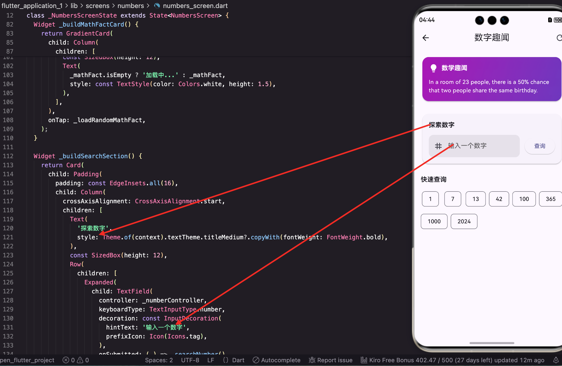
随机趣闻卡片的设计
这个卡片是页面的视觉焦点,我花了不少心思:
Widget _buildMathFactCard(bool isDark) {
  return GestureDetector(
    onTap: _loadRandomMathFact,
    child: Container(
      padding: const EdgeInsets.all(20),
      decoration: BoxDecoration(
        gradient: LinearGradient(
          begin: Alignment.topLeft,
          end: Alignment.bottomRight,
          colors: isDark
              ? [const Color(0xFF4a148c), const Color(0xFF1a237e)]
              : [const Color(0xFF9c27b0), const Color(0xFF673ab7)],
        ),
        borderRadius: BorderRadius.circular(20),
整个卡片是可点击的,点击也能刷新趣闻。渐变色用的是紫色系,深色模式下颜色更深一些,避免太刺眼。
        boxShadow: [
          BoxShadow(
            color: (isDark ? Colors.black : const Color(0xFF9c27b0)).withOpacity(0.3),
            blurRadius: 15,
            offset: const Offset(0, 8),
          ),
        ],
      ),
阴影的颜色和卡片的主色调一致,这样看起来更自然。offset设为(0, 8)让阴影往下偏移,卡片就像悬浮在页面上。
卡片内容的布局:
      child: Column(
        crossAxisAlignment: CrossAxisAlignment.start,
        children: [
          Row(
            children: [
              Container(
                padding: const EdgeInsets.all(10),
                decoration: BoxDecoration(
                  color: Colors.white.withOpacity(0.2),
                  borderRadius: BorderRadius.circular(12),
                ),
                child: const Icon(Icons.lightbulb_rounded, color: Colors.amber, size: 24),
              ),
              const SizedBox(width: 12),
              const Text(
                '数学趣闻',
                style: TextStyle(
                  color: Colors.white,
                  fontWeight: FontWeight.bold,
                  fontSize: 18,
                ),
              ),
              const Spacer(),
              Icon(
                Icons.touch_app_rounded,
                color: Colors.white.withOpacity(0.5),
                size: 20,
              ),
            ],
          ),
左边是灯泡图标配标题,右边放了个手指图标提示用户可以点击。灯泡用琥珀色,在紫色背景上特别醒目。
          const SizedBox(height: 16),
          Text(
            _mathFact.isEmpty ? '点击加载趣闻...' : _mathFact,
            style: TextStyle(
              color: Colors.white.withOpacity(0.95),
              fontSize: 16,
              height: 1.6,
            ),
          ),
        ],
      ),
    ),
  );
}
趣闻文字的行高设为1.6,多行文字读起来更舒服。如果还没加载到数据,显示"点击加载趣闻…"作为占位文字。
数字查询区域
这部分是用户交互最多的地方:
Widget _buildSearchSection(bool isDark) {
  return Card(
    elevation: 2,
    shape: RoundedRectangleBorder(borderRadius: BorderRadius.circular(16)),
    child: Padding(
      padding: const EdgeInsets.all(20),
      child: Column(
        crossAxisAlignment: CrossAxisAlignment.start,
        children: [
          Row(
            children: [
              Icon(
                Icons.search_rounded,
                color: Theme.of(context).colorScheme.primary,
              ),
              const SizedBox(width: 8),
              Text(
                '探索数字',
                style: Theme.of(context).textTheme.titleMedium?.copyWith(
                  fontWeight: FontWeight.bold,
                ),
              ),
            ],
          ),
标题前面加个搜索图标,让用户一眼就知道这是干嘛的。
          const SizedBox(height: 16),
          Row(
            children: [
              Expanded(
                child: TextField(
                  controller: _numberController,
                  keyboardType: TextInputType.number,
                  decoration: InputDecoration(
                    hintText: '输入任意数字',
                    prefixIcon: const Icon(Icons.tag),
                    border: OutlineInputBorder(
                      borderRadius: BorderRadius.circular(12),
                    ),
                    contentPadding: const EdgeInsets.symmetric(
                      horizontal: 16,
                      vertical: 14,
                    ),
                  ),
                  onSubmitted: (_) => _searchNumber(),
                ),
              ),
keyboardType: TextInputType.number让键盘只显示数字,减少用户输入错误的可能。onSubmitted让用户按回车也能触发查询,不用非得点按钮。
              const SizedBox(width: 12),
              SizedBox(
                height: 50,
                child: ElevatedButton(
                  onPressed: _isLoading ? null : _searchNumber,
                  style: ElevatedButton.styleFrom(
                    shape: RoundedRectangleBorder(
                      borderRadius: BorderRadius.circular(12),
                    ),
                  ),
                  child: _isLoading
                      ? const SizedBox(
                          width: 20,
                          height: 20,
                          child: CircularProgressIndicator(
                            strokeWidth: 2,
                            color: Colors.white,
                          ),
                        )
                      : const Text('查询'),
                ),
              ),
            ],
          ),
按钮在加载时显示小型进度指示器,同时设为禁用状态防止重复点击。按钮高度固定为50,和输入框高度一致,看起来更整齐。
查询结果的展示:
          if (_fact.isNotEmpty) ...[
            const SizedBox(height: 20),
            Container(
              width: double.infinity,
              padding: const EdgeInsets.all(16),
              decoration: BoxDecoration(
                color: isDark
                    ? Colors.white.withOpacity(0.05)
                    : Theme.of(context).colorScheme.primaryContainer.withOpacity(0.3),
                borderRadius: BorderRadius.circular(12),
                border: Border.all(
                  color: Theme.of(context).colorScheme.primary.withOpacity(0.2),
                ),
              ),
              child: Text(
                _fact,
                style: TextStyle(
                  fontSize: 15,
                  height: 1.6,
                  color: isDark ? Colors.white.withOpacity(0.9) : null,
                ),
              ),
            ),
          ],
        ],
      ),
    ),
  );
}
查询结果用一个带边框的容器展示,背景色比卡片稍深一点,形成层次感。只有当
_fact不为空时才显示这个区域。
快速查询入口
这个功能是为了降低使用门槛——有些用户可能不知道查什么数字好,给他们一些选项:
Widget _buildQuickNumbers() {
  final quickNumbers = [
    {'number': 0, 'label': '零'},
    {'number': 1, 'label': '一'},
    {'number': 7, 'label': '幸运数'},
    {'number': 13, 'label': '不吉利?'},
    {'number': 42, 'label': '终极答案'},
    {'number': 100, 'label': '满分'},
    {'number': 365, 'label': '一年'},
    {'number': 1729, 'label': '出租车数'},
  ];
我精心挑选了这些数字,每个都有点意思。42是《银河系漫游指南》的梗,1729是拉马努金和哈代的故事里提到的"出租车数"——据说是最小的可以用两种方式表示为两个立方数之和的数。
  return Column(
    crossAxisAlignment: CrossAxisAlignment.start,
    children: [
      Row(
        children: [
          Icon(
            Icons.bolt_rounded,
            color: Theme.of(context).colorScheme.primary,
          ),
          const SizedBox(width: 8),
          Text(
            '快速探索',
            style: Theme.of(context).textTheme.titleMedium?.copyWith(
              fontWeight: FontWeight.bold,
            ),
          ),
        ],
      ),
      const SizedBox(height: 12),
      Wrap(
        spacing: 8,
        runSpacing: 8,
        children: quickNumbers.map((item) {
          return ActionChip(
            avatar: CircleAvatar(
              backgroundColor: Theme.of(context).colorScheme.primaryContainer,
              child: Text(
                item['number'].toString(),
                style: TextStyle(
                  fontSize: 10,
                  color: Theme.of(context).colorScheme.primary,
                ),
              ),
            ),
            label: Text(item['label'] as String),
            onPressed: () async {
              _numberController.text = item['number'].toString();
              await _searchNumber();
            },
          );
        }).toList(),
      ),
    ],
  );
}
用Wrap让标签自动换行,ActionChip点击后会自动填入数字并执行查询。每个标签左边有个小圆圈显示数字,右边是描述文字,一目了然。
资源释放
别忘了在dispose里释放TextEditingController:
void dispose() {
_numberController.dispose();
super.dispose();
}
这是Flutter开发的基本功,但很多人会忘记。TextEditingController内部有监听器,不释放的话会造成内存泄漏。
写在最后
数字趣闻这个功能虽然简单,但细节还是挺多的。随机趣闻让用户每次打开都有新鲜感,手动查询满足好奇心,快速入口降低使用门槛。三个功能互相配合,让这个页面既有趣又实用。
渐变卡片的设计是这个页面的亮点,紫色系的配色给人一种神秘感,很适合"趣闻"这个主题。阴影和圆角的运用让卡片有立体感,不会显得太平。
下一篇我们来看答题挑战功能,那是一个更复杂的交互流程,涉及到计时、计分、选项打乱等逻辑。
本文是Flutter for OpenHarmony教育百科实战系列的第十三篇,后续会持续更新更多内容。
欢迎加入开源鸿蒙跨平台社区:https://openharmonycrossplatform.csdn.net

开源鸿蒙跨平台开发社区汇聚开发者与厂商,共建“一次开发,多端部署”的开源生态,致力于降低跨端开发门槛,推动万物智联创新。
更多推荐


 29
29 0
0- 0


 已为社区贡献24条内容

所有评论(0)