Flutter for OpenHarmony 万能游戏库App实战 - 宝可梦详情实现
本文介绍了如何实现一个功能丰富的宝可梦详情页面,包含数据加载、UI设计和交互优化。通过调用两个API并行获取宝可梦详情和物种信息,使用类型颜色映射实现直观识别,并优先获取中文描述。页面采用CustomScrollView和SliverAppBar实现动态滚动效果,主色调随宝可梦类型变化,并加入Hero动画实现流畅的页面跳转过渡。整个设计注重数据展示的完整性和用户体验的流畅性。
从列表页面点击一个宝可梦,用户会进入详情页面。详情页面要展示宝可梦的完整信息:基本属性、类型、技能、属性值等。这篇文章我们来实现一个功能丰富的详情页面,涉及到多个API调用、复杂的数据处理、以及精美的UI设计。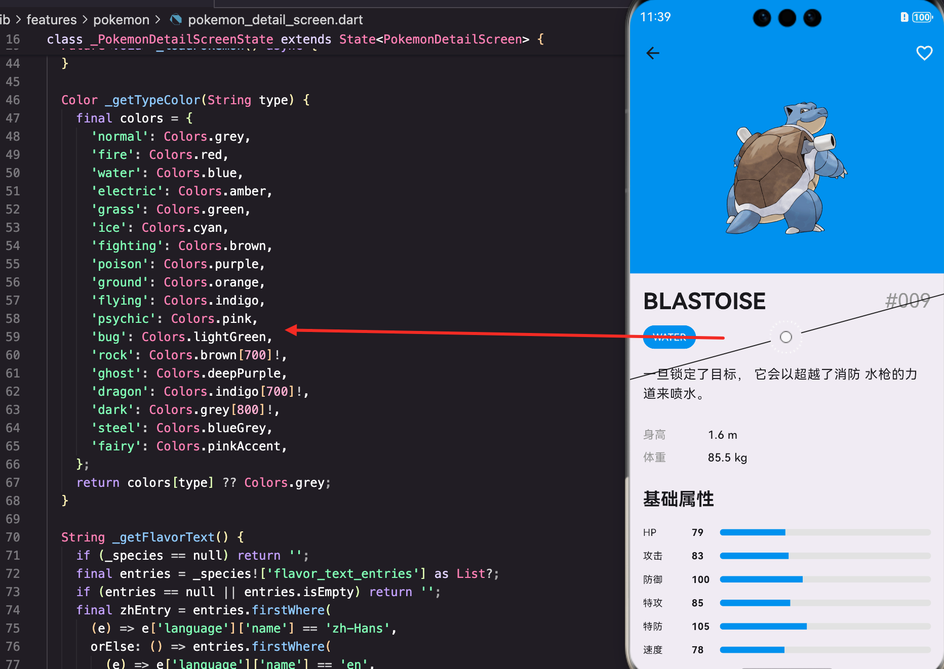
详情页面的数据加载
首先看看页面的初始化。详情页面需要加载两个API:宝可梦详情和物种信息:
class PokemonDetailScreen extends StatefulWidget {
final int pokemonId;
const PokemonDetailScreen({super.key, required this.pokemonId});
State<PokemonDetailScreen> createState() => _PokemonDetailScreenState();
}
class _PokemonDetailScreenState extends State<PokemonDetailScreen> {
final PokemonApi _api = PokemonApi();
Map<String, dynamic>? _pokemon;
Map<String, dynamic>? _species;
bool _isLoading = true;
String? _error;
void initState() {
super.initState();
_loadPokemon();
}
页面接收pokemonId作为参数。_pokemon存储宝可梦的详细信息(属性、技能等),_species存储物种信息(描述、进化链等)。这两个数据来自不同的API端点。
并行加载数据:
  Future<void> _loadPokemon() async {
    try {
      final pokemon = await _api.getPokemonDetail(widget.pokemonId.toString());
      final species = await _api.getPokemonSpecies(widget.pokemonId.toString());
      setState(() {
        _pokemon = pokemon;
        _species = species;
        _isLoading = false;
      });
    } catch (e) {
      setState(() {
        _error = e.toString();
        _isLoading = false;
      });
    }
  }
这里用了两个await,看起来是串行的。但实际上可以用Future.wait来并行加载,提升性能。不过这里为了代码简洁就没有优化。
类型颜色的映射
宝可梦有18种类型,每种类型都有对应的颜色。我们用一个Map来存储这个映射关系:
  Color _getTypeColor(String type) {
    final colors = {
      'normal': Colors.grey,
      'fire': Colors.red,
      'water': Colors.blue,
      'electric': Colors.amber,
      'grass': Colors.green,
      'ice': Colors.cyan,
      'fighting': Colors.brown,
      'poison': Colors.purple,
      'ground': Colors.orange,
      'flying': Colors.indigo,
      'psychic': Colors.pink,
      'bug': Colors.lightGreen,
      'rock': Colors.brown[700]!,
      'ghost': Colors.deepPurple,
      'dragon': Colors.indigo[700]!,
      'dark': Colors.grey[800]!,
      'steel': Colors.blueGrey,
      'fairy': Colors.pinkAccent,
    };
    return colors[type] ?? Colors.grey;
  }
这个映射很重要。火系用红色、水系用蓝色等,这样用户能直观地识别宝可梦的类型。如果类型不在Map里,就返回灰色作为默认值。
获取宝可梦描述
宝可梦的描述信息存储在species数据中,而且支持多语言。我们要优先获取中文描述:
  String _getFlavorText() {
    if (_species == null) return '';
    final entries = _species!['flavor_text_entries'] as List?;
    if (entries == null || entries.isEmpty) return '';
    final zhEntry = entries.firstWhere(
      (e) => e['language']['name'] == 'zh-Hans',
      orElse: () => entries.firstWhere(
        (e) => e['language']['name'] == 'en',
        orElse: () => entries.first,
      ),
    );
    return zhEntry['flavor_text']?.replaceAll('\n', ' ') ?? '';
  }
这个方法用了嵌套的firstWhere。先找中文描述,如果没有就找英文,再没有就用第一个。这样能最大化地获取有用的信息。
replaceAll(‘\n’, ’ ')把换行符替换成空格,这样描述文本能正常显示。
页面的整体布局
详情页面用CustomScrollView实现复杂的滚动效果:
Widget build(BuildContext context) {
if (_isLoading) return Scaffold(appBar: AppBar(), body: const LoadingWidget());
if (_error != null) return Scaffold(appBar: AppBar(), body: AppErrorWidget(message: _error!, onRetry: _loadPokemon));
final types = (_pokemon!['types'] as List).map((t) => t['type']['name'] as String).toList();
final mainColor = _getTypeColor(types.first);
final stats = _pokemon!['stats'] as List;
return Scaffold(
body: CustomScrollView(
slivers: [
先处理加载中和错误状态。然后提取类型列表,用第一个类型的颜色作为主色调。这样页面的配色就和宝可梦的类型相关联。
SliverAppBar的设计
SliverAppBar是一个可以伸缩的AppBar,非常适合详情页面:
          SliverAppBar(
            expandedHeight: 300,
            pinned: true,
            backgroundColor: mainColor,
            flexibleSpace: FlexibleSpaceBar(
              background: Container(
                decoration: BoxDecoration(
                  gradient: LinearGradient(
                    begin: Alignment.topCenter,
                    end: Alignment.bottomCenter,
                    colors: [mainColor, mainColor.withOpacity(0.7)],
                  ),
                ),
                child: SafeArea(
                  child: Column(
                    mainAxisAlignment: MainAxisAlignment.center,
                    children: [
                      const SizedBox(height: 40),
                      Hero(
                        tag: 'pokemon_${widget.pokemonId}',
                        child: AppNetworkImage(
                          imageUrl: 'https://raw.githubusercontent.com/PokeAPI/sprites/master/sprites/pokemon/other/official-artwork/${widget.pokemonId}.png',
                          width: 180,
                          height: 180,
                        ),
                      ),
                    ],
                  ),
                ),
              ),
            ),
expandedHeight: 300表示展开高度是300。pinned: true表示AppBar滚动到顶部时会固定住,不会继续滚动。
flexibleSpace的background是一个渐变容器,从主色到半透明的主色。这样视觉效果更丰富。
用Hero包装宝可梦图片,这样从列表页面跳转过来时有平滑的过渡动画。
收藏按钮:
            actions: [
              Consumer<FavoritesProvider>(
                builder: (context, favorites, _) {
                  final isFav = favorites.isFavorite(widget.pokemonId.toString(), 'pokemon');
                  return IconButton(
                    icon: Icon(isFav ? Icons.favorite : Icons.favorite_border, color: Colors.white),
                    onPressed: () {
                      favorites.toggleFavorite(FavoriteItem(
                        id: widget.pokemonId.toString(),
                        type: 'pokemon',
                        name: _pokemon!['name']?.toString() ?? '',
                        imageUrl: 'https://raw.githubusercontent.com/PokeAPI/sprites/master/sprites/pokemon/other/official-artwork/${widget.pokemonId}.png',
                        data: {'id': widget.pokemonId, 'name': _pokemon!['name']},
                      ));
                      ScaffoldMessenger.of(context).showSnackBar(
                        SnackBar(
                          content: Text(isFav ? '已取消收藏' : '已添加到收藏'),
                          duration: const Duration(seconds: 1),
                        ),
                      );
                    },
                  );
                },
              ),
            ],
用Consumer监听FavoritesProvider。根据是否已收藏显示不同的图标:filled heart或border heart。
点击按钮时调用toggleFavorite来切换收藏状态。然后显示一个SnackBar提示用户。
详情内容的展示
SliverToBoxAdapter用来在CustomScrollView中添加非Sliver的内容:
          SliverToBoxAdapter(
            child: Padding(
              padding: const EdgeInsets.all(16),
              child: Column(
                crossAxisAlignment: CrossAxisAlignment.start,
                children: [
                  Row(
                    mainAxisAlignment: MainAxisAlignment.spaceBetween,
                    children: [
                      Text(_pokemon!['name'].toString().toUpperCase(), style: Theme.of(context).textTheme.headlineMedium?.copyWith(fontWeight: FontWeight.bold)),
                      Text('#${widget.pokemonId.toString().padLeft(3, '0')}', style: Theme.of(context).textTheme.headlineSmall?.copyWith(color: Colors.grey)),
                    ],
                  ),
页面标题显示宝可梦的名称和编号。名称用大写显示,编号用补零的格式。
类型标签:
                  const SizedBox(height: 12),
                  Wrap(
                    spacing: 8,
                    children: types.map((type) => TagChip(label: type.toUpperCase(), color: _getTypeColor(type), selected: true)).toList(),
                  ),
用Wrap来显示类型标签。Wrap会自动换行,如果一行放不下就会换到下一行。
每个标签用TagChip组件,颜色对应该类型的颜色。
宝可梦描述:
                  const SizedBox(height: 20),
                  Text(_getFlavorText(), style: Theme.of(context).textTheme.bodyLarge),
显示从species获取的宝可梦描述。这是用户了解宝可梦的重要信息。
基本信息:
                  const SizedBox(height: 24),
                  _buildInfoRow('身高', '${_pokemon!['height'] / 10} m'),
                  _buildInfoRow('体重', '${_pokemon!['weight'] / 10} kg'),
显示身高和体重。注意这里要除以10,因为API返回的是分米和百克。
属性值的展示
属性值用进度条来展示,这样用户能直观地比较:
                  const SizedBox(height: 24),
                  Text('基础属性', style: Theme.of(context).textTheme.titleLarge?.copyWith(fontWeight: FontWeight.bold)),
                  const SizedBox(height: 12),
                  ...stats.map((stat) => _buildStatBar(stat['stat']['name'], stat['base_stat'], mainColor)),
stats是一个列表,包含HP、攻击、防御等6个属性。用map遍历每个属性,调用_buildStatBar来构建进度条。
_buildStatBar方法:
  Widget _buildStatBar(String name, int value, Color color) {
    final statNames = {
      'hp': 'HP',
      'attack': '攻击',
      'defense': '防御',
      'special-attack': '特攻',
      'special-defense': '特防',
      'speed': '速度',
    };
    return Padding(
      padding: const EdgeInsets.symmetric(vertical: 6),
      child: Row(
        children: [
          SizedBox(width: 60, child: Text(statNames[name] ?? name, style: const TextStyle(fontSize: 12))),
          SizedBox(width: 35, child: Text(value.toString(), style: const TextStyle(fontWeight: FontWeight.bold, fontSize: 12))),
          Expanded(
            child: ClipRRect(
              borderRadius: BorderRadius.circular(4),
              child: LinearProgressIndicator(
                value: value / 255,
                backgroundColor: Colors.grey[200],
                valueColor: AlwaysStoppedAnimation(color),
                minHeight: 8,
              ),
            ),
          ),
        ],
      ),
    );
  }
这个方法用Row来排列属性名、数值和进度条。属性名用Map来翻译成中文。
LinearProgressIndicator的value是0到1之间的数值,所以要用value / 255来归一化。255是属性值的最大值。
valueColor用AlwaysStoppedAnimation来设置进度条的颜色,这样能动态改变颜色。
技能的展示
技能用Chip来展示,这样看起来很整洁:
                  const SizedBox(height: 24),
                  Text('技能', style: Theme.of(context).textTheme.titleLarge?.copyWith(fontWeight: FontWeight.bold)),
                  const SizedBox(height: 12),
                  Wrap(
                    spacing: 8,
                    runSpacing: 8,
                    children: (_pokemon!['abilities'] as List).map((a) => Chip(label: Text(a['ability']['name']))).toList(),
                  ),
用Wrap来显示技能列表。runSpacing控制行间距,spacing控制列间距。
每个技能用Chip组件,这是Material Design中展示标签的标准方式。
辅助方法
_buildInfoRow用来显示标签和值的组合:
  Widget _buildInfoRow(String label, String value) {
    return Padding(
      padding: const EdgeInsets.symmetric(vertical: 4),
      child: Row(
        children: [
          SizedBox(width: 80, child: Text(label, style: const TextStyle(color: Colors.grey))),
          Text(value, style: const TextStyle(fontWeight: FontWeight.w500)),
        ],
      ),
    );
  }
用固定宽度的SizedBox来对齐标签,这样所有的值都能整齐地排列。
数据处理的细节
从API返回的数据中提取类型列表:
final types = (_pokemon!['types'] as List).map((t) => t['type']['name'] as String).toList();
API返回的types是一个嵌套的列表,每个元素都是一个Map,包含type字段。这里用map来提取type的name。
最后用toList()转成列表,这样能用.first来获取主类型。
总结
这篇文章我们实现了一个功能完整的宝可梦详情页面。涉及到的知识点包括:
- 多API调用 - 如何并行加载多个API的数据
- SliverAppBar - 实现可伸缩的AppBar效果
- Hero动画 - 让页面过渡更流畅
- 数据处理 - 从复杂的嵌套JSON中提取需要的信息
- 多语言支持 - 优先显示中文描述
- UI组件 - 使用TagChip、Chip、LinearProgressIndicator等组件
- 收藏功能 - 集成收藏功能到详情页面
一个好的详情页面能让用户深入了解内容,同时保持视觉的吸引力。通过合理的布局、精美的配色、以及丰富的信息展示,我们能创造一个令人印象深刻的用户体验。
欢迎加入开源鸿蒙跨平台社区:https://openharmonycrossplatform.csdn.net

开源鸿蒙跨平台开发社区汇聚开发者与厂商,共建“一次开发,多端部署”的开源生态,致力于降低跨端开发门槛,推动万物智联创新。
更多推荐
 10
10 0
0- 0


 已为社区贡献30条内容

所有评论(0)