RN for OpenHarmony 实战 TodoList 项目:添加按钮
本文介绍了React Native中实现按钮的多种方式及其应用场景,重点分析了TodoList应用中的浮动添加按钮(FAB)和弹窗按钮组的设计与实现。FAB采用TouchableOpacity组件,通过绝对定位、圆形形状和阴影效果实现悬浮视觉效果,并配合主题色增强视觉吸引力。弹窗中的取消和添加按钮通过不同颜色区分主次操作,提供清晰的用户反馈。文章还详细解析了添加任务的完整逻辑流程,包括输入验证、任
案例开源地址:https://gitcode.com/lqjmac/rn_openharmony_todolist
按钮是用户与应用交互的核心元素。一个设计良好的按钮不仅要好看,更要让用户清楚地知道点击后会发生什么。在我们的 TodoList 应用中,添加按钮承担着创建新任务的重要职责,它是用户使用频率最高的交互元素之一。
本文是 RN for OpenHarmony 实战 TodoList 系列的第三篇,我们将深入探讨 React Native 中按钮的实现方式,从基础的 TouchableOpacity 到完整的添加任务流程,带你掌握按钮开发的方方面面。
React Native 中的按钮选择
在 React Native 中,实现按钮有多种方式,每种方式都有其适用场景:
TouchableOpacity
这是最常用的按钮实现方式。点击时会降低组件的透明度,给用户视觉反馈。
<TouchableOpacity onPress={handlePress}>
  <Text>点击我</Text>
</TouchableOpacity>
特点:
- 点击时有透明度变化的反馈效果
- 可以包裹任意子组件
- 高度可定制
TouchableHighlight
点击时会显示一个底层颜色,类似于高亮效果。
特点:
- 点击时显示底色
- 需要指定 underlayColor
- 适合需要明显点击反馈的场景
TouchableWithoutFeedback
点击时没有任何视觉反馈。
特点:
- 无视觉反馈
- 适合自定义反馈效果的场景
- 不推荐直接使用,用户体验较差
Pressable
React Native 较新版本提供的组件,功能更强大。
特点:
- 支持更多的交互状态(pressed、hovered 等)
- 可以根据状态动态改变样式
- 更现代的 API 设计
在我们的 TodoList 项目中,我们选择使用 TouchableOpacity,因为它简单易用,透明度变化的反馈效果也很自然。
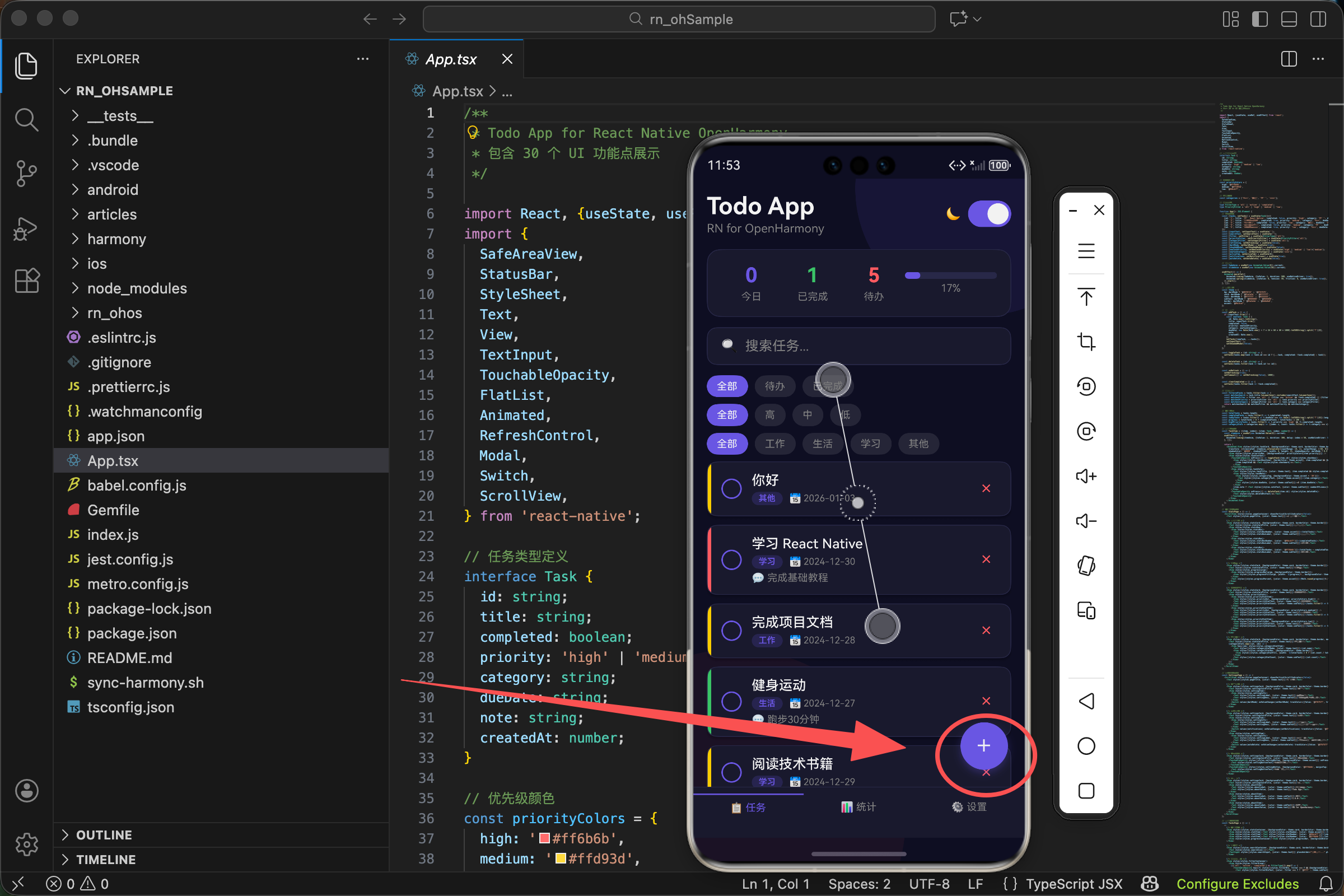
浮动添加按钮(FAB)实现
在现代移动应用设计中,浮动操作按钮(Floating Action Button,简称 FAB)是一种非常流行的设计模式。它悬浮在界面上方,用于触发应用中最重要的操作。
{activeTab === 0 && (
  <TouchableOpacity style={[styles.fab, {backgroundColor: theme.accent}]} onPress={() => setShowAddModal(true)}>
    <Text style={styles.fabIcon}>+</Text>
  </TouchableOpacity>
)}
条件渲染逻辑
{activeTab === 0 && (
  // FAB 组件
)}
这里使用了条件渲染,只有当 activeTab 等于 0(即当前在任务列表页)时才显示 FAB。这是因为:
- 在任务列表页,用户需要添加新任务,所以显示 FAB
- 在统计页和设置页,没有添加任务的需求,隐藏 FAB 可以让界面更简洁
TouchableOpacity 配置
style 属性
style={[styles.fab, {backgroundColor: theme.accent}]}
样式采用数组形式组合静态样式和动态主题色。theme.accent 是我们定义的强调色(紫色 #6c5ce7),让按钮在界面上非常醒目。
onPress 属性
onPress={() => setShowAddModal(true)}
点击按钮时,将 showAddModal 状态设置为 true,触发添加任务弹窗的显示。这里使用箭头函数包裹是因为我们需要传递参数给 setShowAddModal。
FAB 样式详解
const styles = StyleSheet.create({
  fab: {
    position: 'absolute',
    right: 20,
    bottom: 80,
    width: 56,
    height: 56,
    borderRadius: 28,
    justifyContent: 'center',
    alignItems: 'center',
    shadowColor: '#6c5ce7',
    shadowOffset: {width: 0, height: 4},
    shadowOpacity: 0.3,
    shadowRadius: 8,
    elevation: 8
  },
  fabIcon: {
    fontSize: 32,
    color: '#fff',
    fontWeight: '300'
  },
});
定位相关
position: 'absolute'- 绝对定位,脱离文档流right: 20- 距离右边 20 像素bottom: 80- 距离底部 80 像素(留出底部 Tab 栏的空间)
尺寸相关
width: 56和height: 56- Material Design 规范中 FAB 的标准尺寸borderRadius: 28- 半径等于宽度的一半,形成完美的圆形
居中相关
justifyContent: 'center'- 子元素垂直居中alignItems: 'center'- 子元素水平居中
阴影效果
阴影让按钮看起来悬浮在界面上方,增加层次感:
shadowColor: '#6c5ce7'- 使用主题色作为阴影颜色,让阴影带有一点紫色调shadowOffset: {width: 0, height: 4}- 阴影向下偏移 4 像素shadowOpacity: 0.3- 阴影透明度 30%shadowRadius: 8- 阴影模糊半径 8 像素elevation: 8- Android 平台的阴影高度
彩色阴影是一个很棒的设计技巧,它让按钮看起来像是在发光,比普通的黑色阴影更有活力。
弹窗中的按钮组
当用户点击 FAB 后,会弹出添加任务的弹窗。弹窗底部有两个按钮:取消和添加。
<View style={styles.modalButtons}>
  <TouchableOpacity style={[styles.modalBtn, {backgroundColor: theme.border}]} onPress={() => setShowAddModal(false)}>
    <Text style={{color: theme.text}}>取消</Text>
  </TouchableOpacity>
  <TouchableOpacity style={[styles.modalBtn, {backgroundColor: theme.accent}]} onPress={addTask}>
    <Text style={{color: '#fff'}}>添加</Text>
  </TouchableOpacity>
</View>
按钮组布局
modalButtons: {flexDirection: 'row', gap: 12},
flexDirection: 'row'- 两个按钮水平排列gap: 12- 按钮之间间隔 12 像素
取消按钮
<TouchableOpacity style={[styles.modalBtn, {backgroundColor: theme.border}]} onPress={() => setShowAddModal(false)}>
  <Text style={{color: theme.text}}>取消</Text>
</TouchableOpacity>
取消按钮的设计要点:
- 背景色 - 使用 theme.border(较浅的颜色),表示这是次要操作
- 文字颜色 - 使用 theme.text,与背景形成对比但不太强烈
- 点击行为 - 关闭弹窗,不执行任何其他操作
添加按钮
<TouchableOpacity style={[styles.modalBtn, {backgroundColor: theme.accent}]} onPress={addTask}>
  <Text style={{color: '#fff'}}>添加</Text>
</TouchableOpacity>
添加按钮的设计要点:
- 背景色 - 使用 theme.accent(强调色),表示这是主要操作
- 文字颜色 - 使用白色,与深色背景形成强烈对比
- 点击行为 - 调用 addTask 函数执行添加任务的逻辑
按钮样式
modalBtn: {flex: 1, paddingVertical: 14, borderRadius: 12, alignItems: 'center'},
flex: 1- 两个按钮平分可用空间,宽度相等paddingVertical: 14- 上下内边距 14 像素,让按钮有足够的点击区域borderRadius: 12- 圆角与弹窗整体风格一致alignItems: 'center'- 文字水平居中
主要操作按钮和次要操作按钮使用不同的颜色是一个重要的设计原则,它能帮助用户快速识别哪个是他们最可能想要点击的按钮。
添加任务的完整逻辑
当用户点击添加按钮时,会触发 addTask 函数:
const addTask = () => {
  if (inputText.trim()) {
    const newTask: Task = {
      id: Date.now().toString(),
      title: inputText.trim(),
      completed: false,
      priority: newTaskPriority,
      category: newTaskCategory,
      dueDate: new Date(Date.now() + 7 * 24 * 60 * 60 * 1000).toISOString().split('T')[0],
      note: '',
      createdAt: Date.now(),
    };
    setTasks([newTask, ...tasks]);
    setInputText('');
    setShowAddModal(false);
  }
};
第一步:输入验证
if (inputText.trim()) {
在执行任何操作之前,首先检查用户是否输入了有效内容:
trim()方法去除首尾空白字符- 如果去除空白后字符串为空,条件为 false,不执行后续操作
这个简单的验证可以防止用户创建空标题的任务,提升数据质量。
第二步:构建任务对象
const newTask: Task = {
  id: Date.now().toString(),
  title: inputText.trim(),
  completed: false,
  priority: newTaskPriority,
  category: newTaskCategory,
  dueDate: new Date(Date.now() + 7 * 24 * 60 * 60 * 1000).toISOString().split('T')[0],
  note: '',
  createdAt: Date.now(),
};
各字段的赋值逻辑:
id 生成
id: Date.now().toString(),
使用当前时间戳作为 ID。时间戳是一个足够唯一的标识符,在单用户本地应用中完全够用。
标题处理
title: inputText.trim(),
使用 trim() 处理后的输入内容,确保标题没有多余的空白。
默认状态
completed: false,
新任务默认为未完成状态。
用户选择的属性
priority: newTaskPriority,
category: newTaskCategory,
这两个值来自用户在弹窗中的选择。
截止日期计算
dueDate: new Date(Date.now() + 7 * 24 * 60 * 60 * 1000).toISOString().split('T')[0],
这行代码做了以下计算:
Date.now()- 获取当前时间戳(毫秒)+ 7 * 24 * 60 * 60 * 1000- 加上 7 天的毫秒数new Date(...)- 创建日期对象.toISOString()- 转换为 ISO 格式字符串(如 “2024-12-30T00:00:00.000Z”).split('T')[0]- 取 T 之前的部分,得到 “2024-12-30” 格式
创建时间
createdAt: Date.now(),
记录任务创建的时间戳,可用于排序或显示。
第三步:更新状态
setTasks([newTask, ...tasks]);
将新任务添加到任务列表的开头。使用展开运算符 ...tasks 保留原有任务,[newTask, ...tasks] 将新任务放在最前面。
新任务放在列表开头是一个常见的设计选择,因为用户通常最关注刚刚创建的任务。
第四步:清理和关闭
setInputText('');
setShowAddModal(false);
- 清空输入框,为下次添加做准备
- 关闭弹窗,返回任务列表
优先级选择按钮
在添加任务弹窗中,用户可以选择任务的优先级。这是通过一组按钮实现的:
<Text style={[styles.modalLabel, {color: theme.subText}]}>优先级</Text>
<View style={styles.prioritySelector}>
  {(['high', 'medium', 'low'] as const).map(p => (
    <TouchableOpacity
      key={p}
      style={[styles.priorityOption, {borderColor: priorityColors[p]}, newTaskPriority === p && {backgroundColor: priorityColors[p]}]}
      onPress={() => setNewTaskPriority(p)}>
      <Text style={{color: newTaskPriority === p ? '#fff' : priorityColors[p]}}>
        {p === 'high' ? '高' : p === 'medium' ? '中' : '低'}
      </Text>
    </TouchableOpacity>
  ))}
</View>
优先级颜色定义
const priorityColors = {
  high: '#ff6b6b',
  medium: '#ffd93d',
  low: '#6bcb77',
};
三种优先级使用三种不同的颜色:
- 高优先级 - 红色 (#ff6b6b),表示紧急、重要
- 中优先级 - 黄色 (#ffd93d),表示一般重要
- 低优先级 - 绿色 (#6bcb77),表示可以稍后处理
动态样式实现
style={[
  styles.priorityOption,
  {borderColor: priorityColors[p]},
  newTaskPriority === p && {backgroundColor: priorityColors[p]}
]}
样式数组包含三部分:
- 基础样式 - styles.priorityOption
- 边框颜色 - 始终使用对应优先级的颜色
- 背景颜色 - 只有当前选中的按钮才有背景色
这种设计让用户一眼就能看出当前选择的是哪个优先级。
文字颜色切换
<Text style={{color: newTaskPriority === p ? '#fff' : priorityColors[p]}}>
- 选中状态:白色文字(与彩色背景形成对比)
- 未选中状态:使用对应优先级的颜色(与白色/透明背景形成对比)
优先级按钮样式
prioritySelector: {flexDirection: 'row', gap: 12, marginBottom: 16},
priorityOption: {flex: 1, paddingVertical: 10, borderRadius: 8, borderWidth: 2, alignItems: 'center'},
flexDirection: 'row'- 三个按钮水平排列gap: 12- 按钮之间间隔 12 像素flex: 1- 三个按钮平分空间borderWidth: 2- 较粗的边框让按钮更醒目borderRadius: 8- 圆角设计
分类选择按钮
分类选择的实现与优先级类似,但布局略有不同:
<Text style={[styles.modalLabel, {color: theme.subText}]}>分类</Text>
<View style={styles.categorySelector}>
  {categories.map(c => (
    <TouchableOpacity
      key={c}
      style={[styles.categoryOption, {borderColor: theme.accent}, newTaskCategory === c && {backgroundColor: theme.accent}]}
      onPress={() => setNewTaskCategory(c)}>
      <Text style={{color: newTaskCategory === c ? '#fff' : theme.accent}}>{c}</Text>
    </TouchableOpacity>
  ))}
</View>
分类列表
const categories = ['工作', '生活', '学习', '其他'];
我们预定义了四个分类,覆盖了大多数日常任务场景。
分类按钮样式
categorySelector: {flexDirection: 'row', flexWrap: 'wrap', gap: 8, marginBottom: 24},
categoryOption: {paddingHorizontal: 16, paddingVertical: 8, borderRadius: 8, borderWidth: 1},
与优先级按钮的区别:
flexWrap: 'wrap'- 允许换行,当分类较多时自动换到下一行- 没有
flex: 1- 按钮宽度由内容决定,而不是平分空间 borderWidth: 1- 较细的边框,视觉上更轻盈paddingHorizontal: 16- 水平内边距让按钮宽度适应文字长度
分类按钮采用自适应宽度的设计,因为不同分类名称的长度可能不同,固定宽度会导致短名称的按钮看起来太空旷。
按钮的交互反馈
TouchableOpacity 默认会在点击时降低透明度,但我们可以自定义这个行为:
activeOpacity 属性
<TouchableOpacity activeOpacity={0.7} onPress={handlePress}>
  {/* 内容 */}
</TouchableOpacity>
- 默认值是 0.2,点击时透明度变为 20%
- 设置为 0.7 表示点击时透明度变为 70%,反馈更subtle
- 设置为 1 表示没有透明度变化
自定义点击效果
如果需要更复杂的点击效果,可以使用 Pressable 组件:
<Pressable
  style={({pressed}) => [
    styles.button,
    pressed && styles.buttonPressed
  ]}
  onPress={handlePress}
>
  {({pressed}) => (
    <Text style={pressed ? styles.textPressed : styles.text}>
      按钮文字
    </Text>
  )}
</Pressable>
Pressable 的优势:
- 可以根据 pressed 状态动态改变样式
- 支持更多的交互状态
- 更灵活的自定义能力
按钮的禁用状态
在某些情况下,我们需要禁用按钮,比如当输入框为空时禁用添加按钮:
<TouchableOpacity
  style={[styles.modalBtn, {backgroundColor: inputText.trim() ? theme.accent : theme.border}]}
  onPress={addTask}
  disabled={!inputText.trim()}
>
  <Text style={{color: inputText.trim() ? '#fff' : theme.subText}}>添加</Text>
</TouchableOpacity>
disabled 属性
disabled={!inputText.trim()}
当输入框为空时,disabled 为 true,按钮不响应点击事件。
视觉反馈
禁用状态的按钮应该有明显的视觉区别:
- 背景色 - 使用较浅的颜色(theme.border)
- 文字颜色 - 使用次要文字颜色(theme.subText)
禁用状态的视觉反馈很重要,它告诉用户"这个按钮现在不能点击",避免用户困惑。
按钮的无障碍支持
为了让应用对所有用户都友好,按钮应该添加无障碍属性:
<TouchableOpacity
  accessible={true}
  accessibilityRole="button"
  accessibilityLabel="添加新任务"
  accessibilityHint="点击打开添加任务弹窗"
  onPress={() => setShowAddModal(true)}
>
  <Text>+</Text>
</TouchableOpacity>
无障碍属性说明
- accessible - 标记为可访问元素
- accessibilityRole - 告诉辅助技术这是一个按钮
- accessibilityLabel - 屏幕阅读器朗读的标签
- accessibilityHint - 提供额外的操作提示
性能优化
避免在 onPress 中创建新函数
不推荐的写法:
<TouchableOpacity onPress={() => handlePress(item.id)}>
每次渲染都会创建新的箭头函数,可能导致不必要的重新渲染。
推荐的写法:
const handlePressItem = useCallback((id: string) => {
  // 处理逻辑
}, []);

// 或者使用 bind
<TouchableOpacity onPress={handlePressItem.bind(null, item.id)}>
使用 React.memo
如果按钮组件比较复杂,可以使用 React.memo 避免不必要的重新渲染:
const MyButton = React.memo(({onPress, title}) => (
  <TouchableOpacity onPress={onPress}>
    <Text>{title}</Text>
  </TouchableOpacity>
));
常见问题与解决方案
问题 1:按钮点击区域太小
解决方案:增加 padding 或使用 hitSlop
<TouchableOpacity
  hitSlop={{top: 10, bottom: 10, left: 10, right: 10}}
  onPress={handlePress}
>
  <Text>小按钮</Text>
</TouchableOpacity>
hitSlop 可以扩大点击区域而不改变按钮的视觉大小。
问题 2:快速连续点击触发多次
解决方案:添加防抖或节流
const [isSubmitting, setIsSubmitting] = useState(false);

const handlePress = async () => {
  if (isSubmitting) return;
  setIsSubmitting(true);

  await doSomething();

  setIsSubmitting(false);
};
问题 3:按钮在列表中点击不灵敏
解决方案:检查是否有手势冲突,可以尝试使用 delayPressIn
<TouchableOpacity delayPressIn={50} onPress={handlePress}>
  {/* 内容 */}
</TouchableOpacity>
总结
按钮虽然是最基础的交互元素,但要做好需要考虑很多细节。好的按钮设计能够引导用户完成操作,提升整体的用户体验。
在下一篇文章中,我们将探讨 TodoList 项目中的勾选框组件,学习如何实现任务完成状态的切换,敬请期待。
欢迎加入开源鸿蒙跨平台社区:https://openharmonycrossplatform.csdn.net

开源鸿蒙跨平台开发社区汇聚开发者与厂商,共建“一次开发,多端部署”的开源生态,致力于降低跨端开发门槛,推动万物智联创新。
更多推荐

 28
28 0
0- 0


 已为社区贡献11条内容

所有评论(0)