android flutter:基础组件
本文借鉴老孟《Flutter实战入门》
flutter 常用得组件有基础组件、Material风格组件、Cupertino风格组件、容器类组件、列表及表格组件。本节主要学习基础组件。
一、文件组件(Text)
1、Text属性
《Flutter 实战入门》第34页;
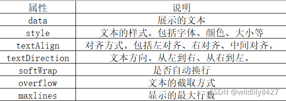
(1) data:使用Text组件直接显示“Flutter实战入门”,代码如下
Text('Flutter 实战入门')
(2)style:表示文本的样式,类型为TextStyle,主要参数属性如下(35页):
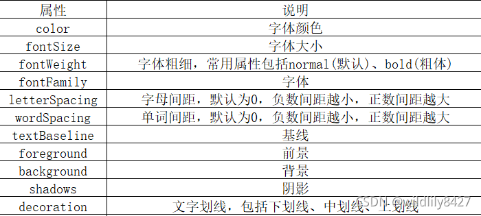
//设置字体颜色为蓝色、字体大小为20、带阴影
Text(
   style:TextStyle(color: Colors.blue,fontSize: 20,
       shadows: [
          Shadow(color: Colors.black12,offset: Offset(3,3),blurRadius: 3)
       ])
     )
(3)textAlign:文本的对齐方式
Text(
   'Flutter 实战入门',
   textAlign:TextAlign.center,
 )
(4)softWrap:是否自动换行,true:自动换行;false:不自动换行
Text(
   'Flutter 实战入门',
   softWrap:true,
 )
(5)Overflow:当文本超过范围时的截取方式。包括直接截取、渐隐、省略号。

Text(
   'Flutter 实战入门,截取方式,直接截取',
   overflow: TextOverflow.clip
   softWrap:false,
 )

Text(
   'Flutter 实战入门,截取方式,渐隐',
    overflow: TextOverflow.fade
    softWrap:false,
)
(6)TextSpan:将一句话中的某几个字高亮显示。
RichText(
    text: TextSpan(style: TextStyle(fontSize: 18), children: [
      TextSpan(text: "登陆即视为同意", style: TextStyle(color: Color(0xAA333333))),
      TextSpan(text: "《巴乐兔服务协议》", style: TextStyle(color: Color(0xAACE1928))),
    ]),
    textDirection: TextDirection.ltr,
  )
二、文本输入组件(TextField)
TextField常用属性及说明:
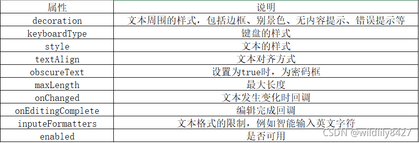
例如,需求如下:圆角边框、文本居中、只能输入英文字符。代码如下:
TextField (
          decoration: InputDecoration (
             filled: true,
             border: OutlineInputBorder(
                 borderRadius: BorderRadius.all(Radius.circular(20))
              ),
          ),
          textAlign: TextAlign.center,
           inputFormatters: [
             WhitelistingTextInputFormatter(RegExp("[a-zA-Z]")),
           ],
),
密码输入框,代码如下:
TextField(
         decoration: InputDecoration(labelText: '请输入密码'),
         obscureText:true,
),
三、图片组件(Image)
Image 组件用于显示图片,可以加载网络上、项目中或者设备上的图片,Image组件常用属性如下:
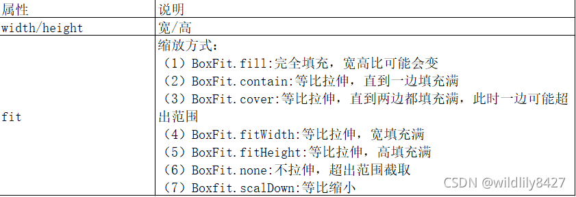
1、加载网路图片
Image.network(
    '图片网络地址',
    width: 200,//指定宽高,如果不指定则依赖图片本身大小
    height: 200,
),
2、加载项目中的图标
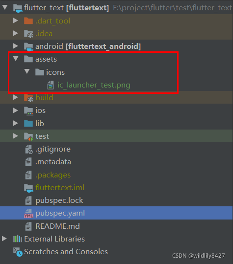
(1)在项目根目录新建/assets/icons/文件夹,并将待显示的图片拷贝到该文件夹下。注:图片的格式为.png
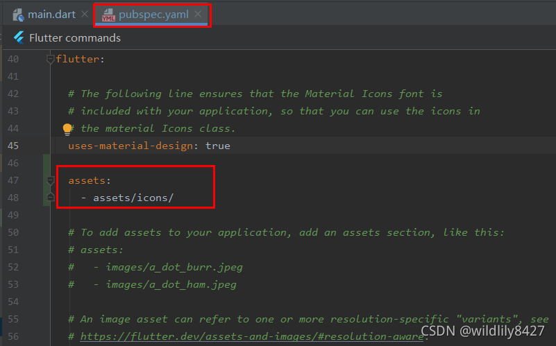
(2)修改pubspec.yaml文件,将/assets/icons路径添加到该文件中,`
assets:
    - assets/icons/
(3)添加加载图片的代码
Image.asset(
              'assets/icons/ic_launcher_test.png',
              width: 200,
              height: 200,
            ),
3、加载手机SD卡上的图片(没整明白,后面再弄)
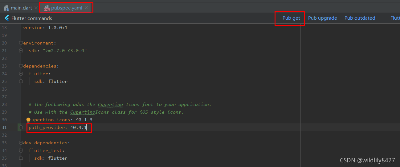
(1)修改pubspec.yaml文件,添加第三方库(path_provider)获取设备SD卡存储路径。
四、按钮组件(Button)
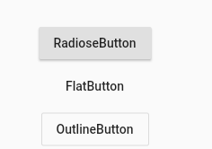
常用的按钮组件有3个:
RaisedButton:带阴影的按钮
FlatButton:无阴影的按钮
OutlineButton:带边框的按钮
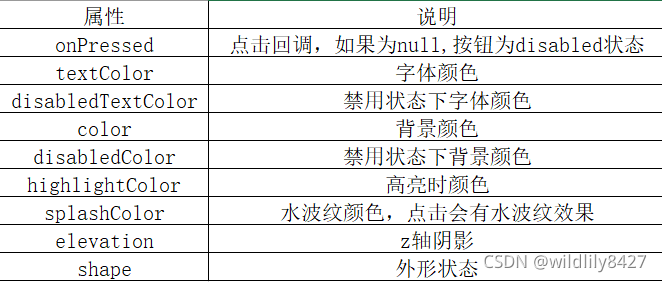
按钮组件的属性,如下:
//按钮组件基本用法
            new RaisedButton(
                onPressed: () {
                  //点击时,会打印“onPressed”字符串
                  print('onPressed');
                  },
                child: Text('RadioseButton'),
                ),
            new FlatButton(
                onPressed: (){},
                child: Text('FlatButton'),
            ),
            new OutlineButton(
                onPressed: () {},
                child: Text('OutlineButton'),
            ),
//带图标的按钮
            new RaisedButton.icon(
                onPressed: () {},
                icon: Icon(Icons.access_alarm),
                label: Text('lable'),
            ),

五、容器类组件(Container)
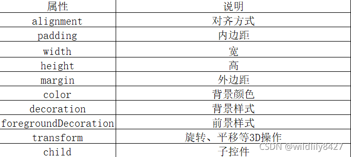
主要属性,如下:
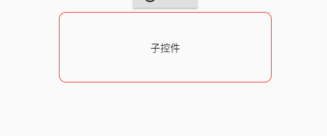
//宽300、高100的Container,子控件是Text且居中显示,四周红色圆角边框
            new Container(
              width: 300,
              height: 100,
              padding: EdgeInsets.all(10),
              decoration: BoxDecoration(
                border: Border.all(color: Colors.red, width: 1, style: BorderStyle.solid),
                borderRadius: BorderRadius.all(Radius.circular(10))
              ),
              child: new Text('子控件'),
              alignment: AlignmentDirectional.center,
            ),
六、容器类组件(Row和Column)
Row:水平方向;Column:垂直方向。属性如下:

 //有3个Container子控件分别为1、2、3,子控件平均分布再Row内
            new Row(
              mainAxisAlignment: MainAxisAlignment.spaceEvenly,
              children: <Widget>[
                Container(
                  width: 50,
                  height: 30,
                  decoration: BoxDecoration(border: Border.all(color: Colors.red,width: 1,style: BorderStyle.solid)),
                  child: new Text('1'),
                  alignment: AlignmentDirectional.center,
                ),
                Container(
                  width: 50,
                  height: 30,
                  decoration: BoxDecoration(border: Border.all(color: Colors.yellow,width: 1,style: BorderStyle.solid)),
                  child: new Text('2'),
                  alignment: AlignmentDirectional.center,
                ),
                Container(
                  width: 50,
                  height: 30,
                  decoration: BoxDecoration(border: Border.all(color: Colors.blue,width: 1,style: BorderStyle.solid)),
                  child: new Text('3'),
                  alignment: AlignmentDirectional.center,
                ),
              ],
            ),

对齐方式属性,如下:

开源鸿蒙跨平台开发社区汇聚开发者与厂商,共建“一次开发,多端部署”的开源生态,致力于降低跨端开发门槛,推动万物智联创新。
更多推荐



 0
0 0
0- 0


 已为社区贡献9条内容

所有评论(0)