.Net MAUI 自定义仿Win11对话框
测试机器为:美帝良心想 padpro11,系统版本:安卓11
开发环境:Microsoft Visual Studio Community 2022 (64 位) - Current 版本 17.4.4/ .Net 7.0
Demo下载:【demo】.Net MAUI 自定义仿Win11对话框
效果如下视频:
.net MAUI 自定义对话框
一、创建一个.NET MAUI app项目
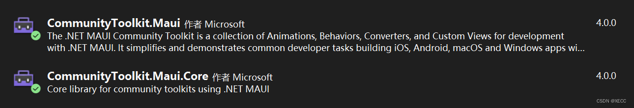
二、安装 CommunityToolkit.Maui 和 CommunityToolkit.Maui.Core 两个NuGet 包
在 MauiProgram.cs 文件中添加上面两个包的扩展方法,如下图:
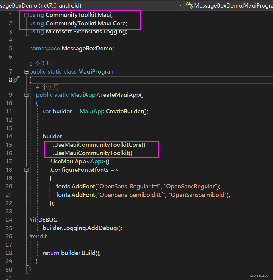
代码:
builder
.UseMauiCommunityToolkitCore()
.UseMauiCommunityToolkit()
.UseMauiApp<App>()
.ConfigureFonts(fonts =>
{
fonts.AddFont("OpenSans-Regular.ttf", "OpenSansRegular");
fonts.AddFont("OpenSans-Semibold.ttf", "OpenSansSemibold");
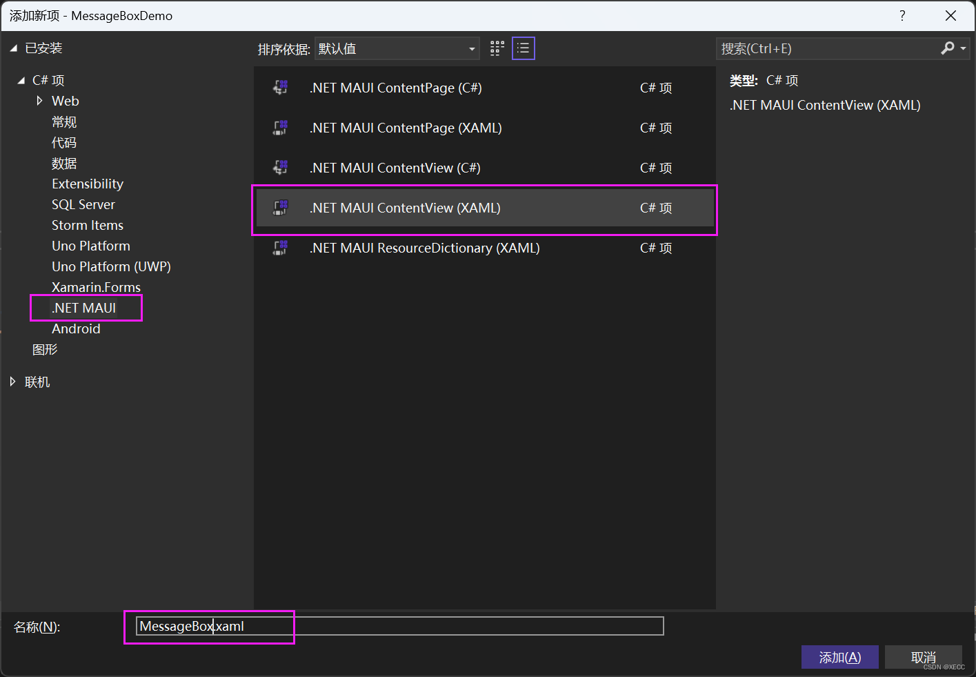
});三、在项目中新建个文件夹 如Controls →右键添加→新建项→.NET MAUI ContentView(XAML)→命名为 MessageBox,名字自己取喜欢的就行,如下图:
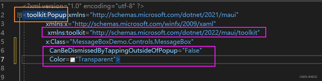
四、在MessageBox.xaml 中引入
xmlns:toolkit="http://schemas.microsoft.com/dotnet/2022/maui/toolkit"
并将 ContentView 改为 toolkit:Popup ,
将CanBeDismissedByTappingOutsideOfPopup="False" 意思是禁止触摸边缘时候隐藏
Color="Transparent" 将背景色设置为透明 如下图:
代码如下:
<toolkit:Popup xmlns="http://schemas.microsoft.com/dotnet/2021/maui"
xmlns:x="http://schemas.microsoft.com/winfx/2009/xaml"
xmlns:toolkit="http://schemas.microsoft.com/dotnet/2022/maui/toolkit"
x:Class="MessageBoxDemo.Controls.MessageBox"
CanBeDismissedByTappingOutsideOfPopup="False"
Color="Transparent">
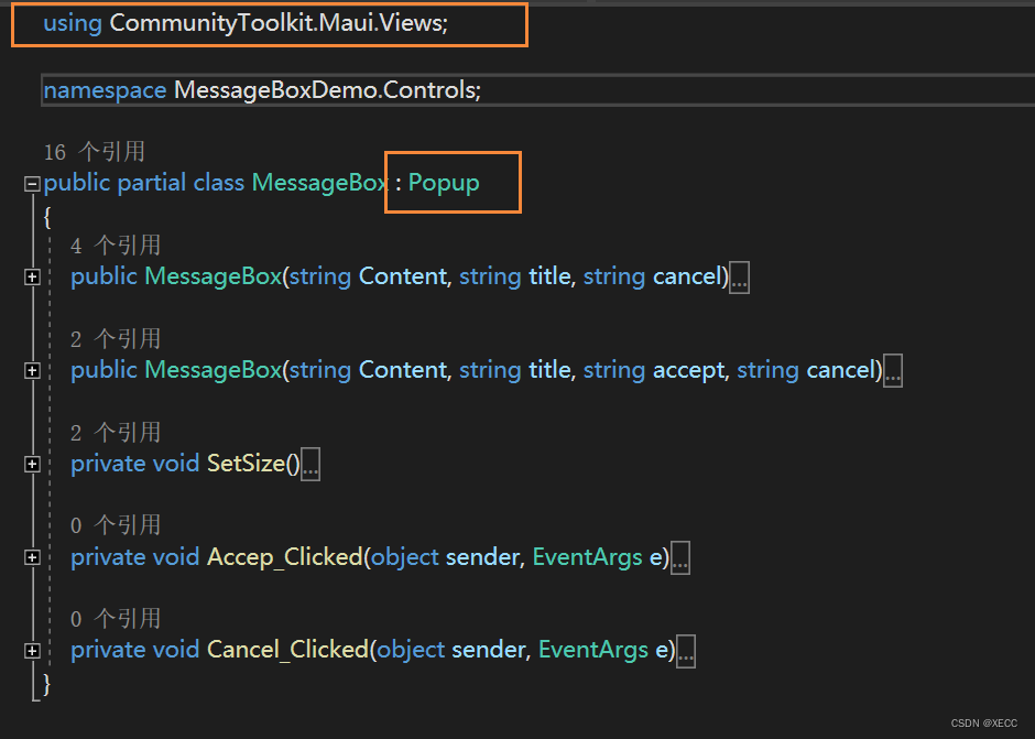
</toolkit:Popup>在 MessageBox.xaml.cs后台代码中引用 using CommunityToolkit.Maui.Views;
的继承改为Popup,如下图
五、在MessageBox.xaml 中设计 对话框的界面布局,代码如下:
<?xml version="1.0" encoding="utf-8" ?>
<toolkit:Popup xmlns="http://schemas.microsoft.com/dotnet/2021/maui"
             xmlns:x="http://schemas.microsoft.com/winfx/2009/xaml"
              xmlns:toolkit="http://schemas.microsoft.com/dotnet/2022/maui/toolkit"
             x:Class="MessageBoxDemo.Controls.MessageBox"
               CanBeDismissedByTappingOutsideOfPopup="False"
               Color="Transparent">


    <Grid x:Name="gridFrame" RowSpacing="0" ColumnSpacing="0">

        <Border
            Stroke="{StaticResource Gray100Brush}"
            Margin="10"
            Padding="0"
            StrokeThickness=".6"
            Opacity=".95"
            Grid.RowSpan="2"
            BackgroundColor="{AppThemeBinding Default=#f1f1f1, Dark={StaticResource Gray900}}">

            <!--圆角-->
            <Border.StrokeShape>
                <RoundRectangle CornerRadius="8"/>
            </Border.StrokeShape>
            <Border.Shadow>
            <!--阴影-->
                <Shadow Brush="Black"
                Offset="2,5"
                Radius="5"
                Opacity="0.3" />
            </Border.Shadow>


            <Grid RowSpacing="0" ColumnSpacing="0" RowDefinitions="3*,2*">

                <Border BackgroundColor="{AppThemeBinding Default={StaticResource White}, Dark={StaticResource Gray600}}" StrokeThickness="0">
                    <Border.StrokeShape>
                        <RoundRectangle CornerRadius="0"/>
                    </Border.StrokeShape>
                </Border>

                <VerticalStackLayout  Spacing="10" Margin="20,20,20,0" x:Name="contentVerticalStackLayout">
                    <Label x:Name="titleLabel" FontSize="18"/>
                    <Label x:Name="contentLabel" FontSize="14" />
                </VerticalStackLayout>


                <Grid Grid.Row="1" ColumnDefinitions="*,*" RowSpacing="0" ColumnSpacing="0">

                    <Button x:Name="acceptButton"
                            IsVisible="false"
                            FontSize="12"
                            BackgroundColor="{AppThemeBinding Default=#fbfbfb, Dark={StaticResource Gray600}}"
                            Text="确定"
                            HorizontalOptions="Center"
                            VerticalOptions="Center"
                            MinimumWidthRequest="96"
                            HeightRequest="36"
                            CornerRadius="3"
                            BorderWidth="0"
                            Clicked="Accep_Clicked"
                            TextColor="{AppThemeBinding Default={StaticResource Black}, Dark={StaticResource Gray100}}">
                        <Button.Shadow>
                            <Shadow Brush="{StaticResource BlackBrush}" Offset="2,2"  Radius="2"  Opacity="0.10" />
                        </Button.Shadow>
                    </Button>


                    <Button x:Name="cancelButton"
                        FontSize="12"
                        BackgroundColor="{AppThemeBinding Default=#fbfbfb, Dark={StaticResource Gray600}}"
                        Grid.Column="1"
                        HorizontalOptions="Center"
                        VerticalOptions="Center"
                        MinimumWidthRequest="96"
                        HeightRequest="36"
                        CornerRadius="3"
                        BorderWidth="0"
                        Clicked="Cancel_Clicked"
                        TextColor="{AppThemeBinding Default={StaticResource Black}, Dark={StaticResource Gray100}}" >
                        <Button.Shadow>
                            <Shadow Brush="{StaticResource BlackBrush}" Offset="2,2"  Radius="2"  Opacity="0.10" />
                        </Button.Shadow>
                    </Button>
                </Grid>
            </Grid>

        </Border>
    </Grid>
</toolkit:Popup>
在 MessageBox.xaml.cs 后台代码中实现以下方法,代码如下
using CommunityToolkit.Maui.Views;
namespace MessageBoxDemo.Controls;
public partial class MessageBox : Popup
{
//支持的第一种显示方式
public MessageBox(string Content, string title, string cancel)
{
InitializeComponent();
SetSize();
contentLabel.Text = Content;
titleLabel.Text = title;
cancelButton.Text = cancel;
if (string.IsNullOrEmpty(title))
{
titleLabel.IsVisible = false;
contentVerticalStackLayout.VerticalOptions = LayoutOptions.Center;
contentVerticalStackLayout.Margin = new Thickness(20, 0);
}
}
//支持的第二种显示方式
public MessageBox(string Content, string title, string accept, string cancel)
{
InitializeComponent();
SetSize();
contentLabel.Text = Content;
titleLabel.Text = title;
acceptButton.Text = accept;
cancelButton.Text = cancel;
acceptButton.IsVisible = true;
if (string.IsNullOrEmpty(title))
{
titleLabel.IsVisible = false;
contentVerticalStackLayout.VerticalOptions = LayoutOptions.Center;
contentVerticalStackLayout.Margin = new Thickness(20, 0);
}
}
//设置对话框的宽高
private void SetSize()
{
MainThread.BeginInvokeOnMainThread(() =>
{
var width = DeviceDisplay.Current.MainDisplayInfo.Width / DeviceDisplay.Current.MainDisplayInfo.Density;
var height = DeviceDisplay.Current.MainDisplayInfo.Height / DeviceDisplay.Current.MainDisplayInfo.Density;
// Debug.WriteLine($"屏幕宽度:{width},屏幕高度:{height}");
width = width > 500 ? 300 : width - 60;
height = height > 750 ? 500 : height - 120;
gridFrame.MinimumWidthRequest = DeviceInfo.Current.Idiom != DeviceIdiom.Phone ? 400 : 320;
gridFrame.MaximumWidthRequest = width;
gridFrame.MinimumHeightRequest = DeviceInfo.Current.Idiom != DeviceIdiom.Phone ? 250 : 220;
gridFrame.MaximumHeightRequest = height;
});
}
private void Accep_Clicked(object sender, EventArgs e)
{
//同意按钮返回值
Close(true);
}
private void Cancel_Clicked(object sender, EventArgs e)
{
//取消按钮返回值
Close(false);
}
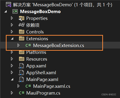
}六、写一个扩展方法,创建一个Extensions文件夹→右键→添加→类→命名为MessageBoxExtension.cs 如下图:
在其中写一个扩展方法,如下图:
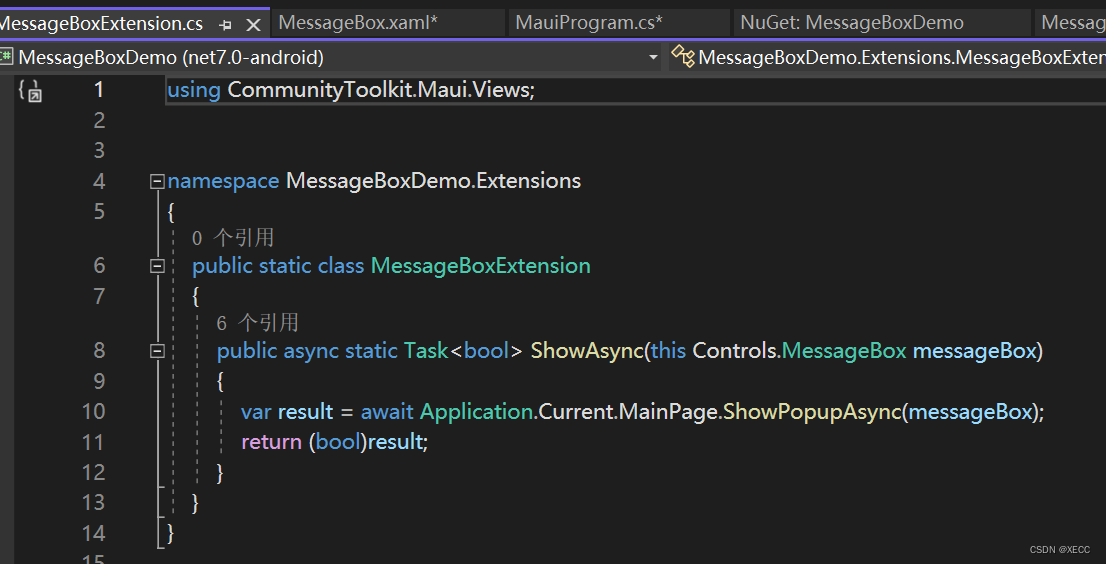
代码内容:
using CommunityToolkit.Maui.Views;


namespace MessageBoxDemo.Extensions
{
    public static class MessageBoxExtension
    {
        public async static Task<bool> ShowAsync(this Controls.MessageBox messageBox)
        {
            var result = await Application.Current.MainPage.ShowPopupAsync(messageBox);
            return (bool)result;
        }
    }
}
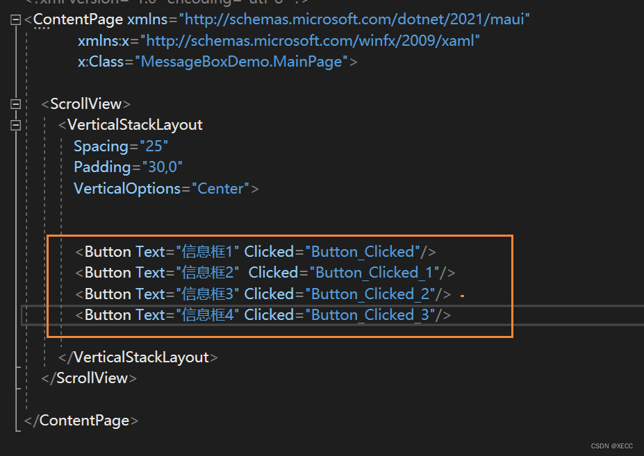
七、使用方式:用4个Button来弹出四种显示方法
后台方法实现:
引入下面的命名空间
using MessageBoxDemo.Extensions;
后台代码如下
private async void Button_Clicked(object sender, EventArgs e)
{
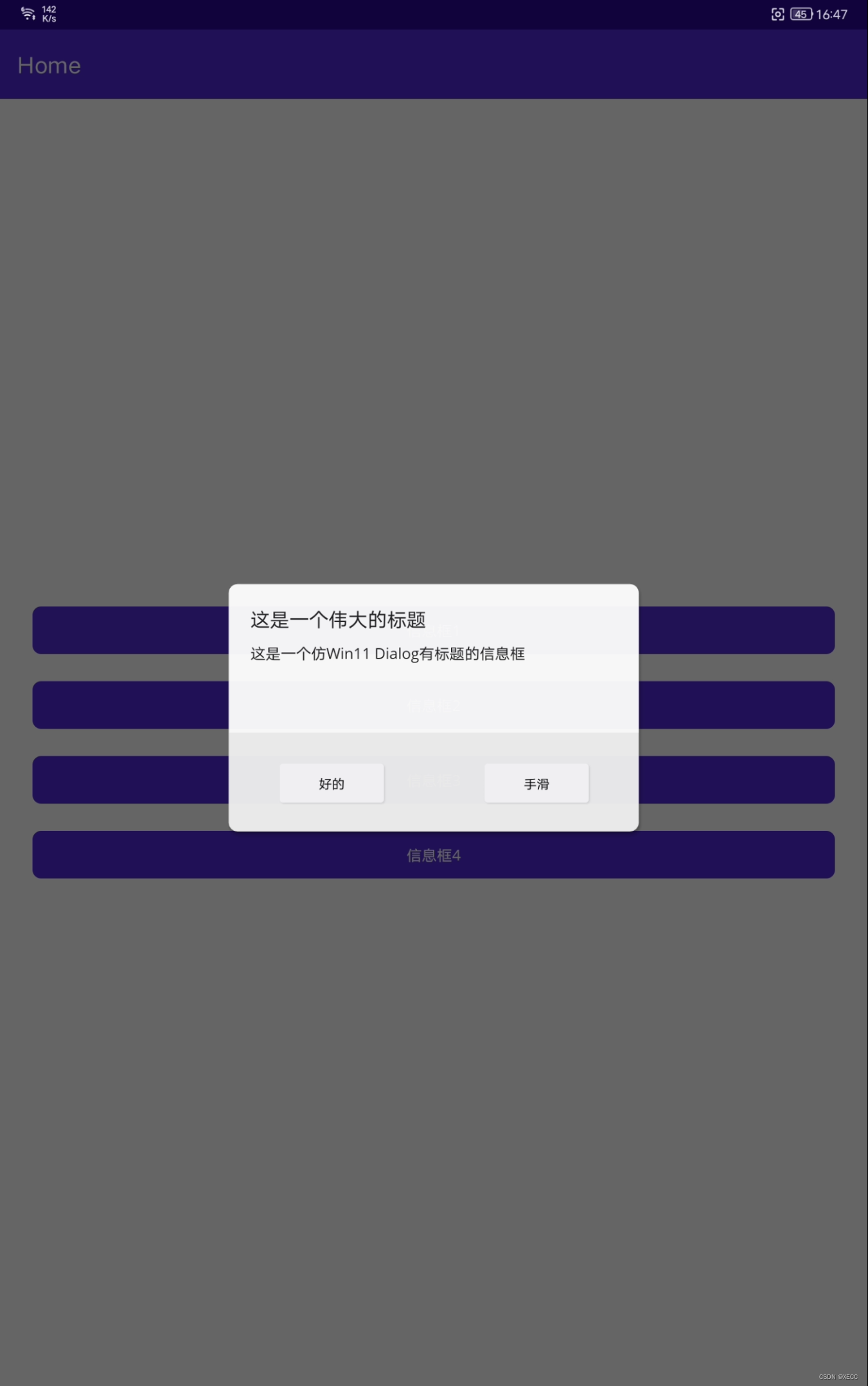
MessageBox messageBox = new MessageBox("这是一个仿Win11 Dialog有标题的信息框","这是一个伟大的标题","好的","手滑");
var result = await messageBox.ShowAsync();
var content = result ? "好的" : "手滑";
messageBox = new MessageBox($"你点击了:{content} 按钮", "信息提示", "好的");
await messageBox.ShowAsync();
}
private async void Button_Clicked_1(object sender, EventArgs e)
{
MessageBox messageBox = new MessageBox("这是一个仿Win11 Dialog无标题的信息框", null, "好的", "手滑");
var result = await messageBox.ShowAsync();
var content = result ? "好的" : "手滑";
messageBox = new MessageBox($"你点击了:{content} 按钮", "信息提示", "好的");
await messageBox.ShowAsync();
}
private async void Button_Clicked_2(object sender, EventArgs e)
{
MessageBox messageBox = new MessageBox("这是一个仿Win11 Dialog 无标题,单提醒,的信息框", null, "好的");
await messageBox.ShowAsync();
}
private async void Button_Clicked_3(object sender, EventArgs e)
{
MessageBox messageBox = new MessageBox("这是一个仿Win11 Dialog 无标题,单提醒,的信息框", "这是一个伟大的标题", "牛批");
await messageBox.ShowAsync();
}效果视频显示,

开源鸿蒙跨平台开发社区汇聚开发者与厂商,共建“一次开发,多端部署”的开源生态,致力于降低跨端开发门槛,推动万物智联创新。
更多推荐
 1
1 0
0- 0


 已为社区贡献1条内容

所有评论(0)