Flutter 中 Stack 的使用详解(内含对比图) _ Flutter Widgets(1)
为啥不聊overflow呢,因为本文是基于 Flutter 2.2.1 版本的,overflow已经被弃用了,很多地方的剪裁行为以后都统一为,这参数我们之前在剪裁篇《Flutter 中各种剪裁 Widget 的使用》聊过,建议回看当我们设置的子项定位后大小超过了 Stack 布局的时候,我们期望怎样剪裁渲染呢?是剪裁还是显示,是带抗锯齿还是不带呢?// 设置剪裁行为默认 hardEdge// 这里
class Alignment extends AlignmentGeometry {
/// Creates an alignment.
///
/// The [x] and [y] arguments must not be null.
const Alignment(this.x, this.y)
: assert(x != null),
assert(y != null);
static const Alignment topLeft = Alignment(-1.0, -1.0);
static const Alignment center = Alignment(0.0, 0.0);
…
}
// AlignmentDirectional
class AlignmentDirectional extends AlignmentGeometry {
const AlignmentDirectional(this.start, this.y)
: assert(start != null),
assert(y != null);
static const AlignmentDirectional topStart = AlignmentDirectional(-1.0, -1.0);
// 考虑使用 Alignment.center 代替
static const AlignmentDirectional center = AlignmentDirectional(0.0, 0.0);
…
}
上面我们贴出了核心源码,可以看出他俩都是继承自 AlignmentGeometry ,然后实现也是差不多,而且源码中的注释也是推荐我们使用 Alignment 代替
各种对齐方式效果
这里我们就使用 Alignment 了
| Alignment.topLeft | Alignment.topCenter | Alignment.topRight |
|---|---|---|
 |
 |
 |
| Alignment.centerLeft | Alignment.center | Alignment.centerRight |
 |
 |
 |
| Alignment.bottomLeft | Alignment.bottomCenter | Alignment.bottomRight |
 |
 |
 |
学点技巧
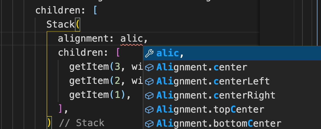
当我们输入 **Alignment.bottomRight** 这类参数时,因为单次比较长如果全部输入就太麻烦了,我们可以输入部分前缀+常量的首字母,如下
- Alignment.bottomRight => alibr
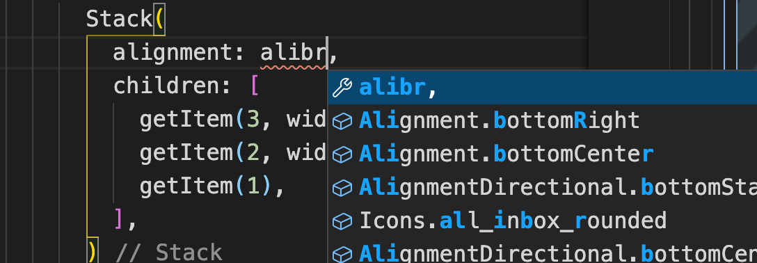
- Alignment.center => alic
阅读我得文章你会发现,不光有源码分析、结构化梳理还有各种实用的技巧,记得关注我哦
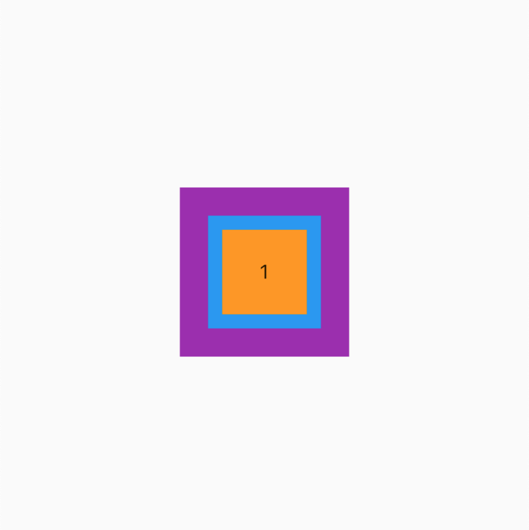
fit(填充方式)
为了展示效果,我们先添加一个背景 BgContainer (之前的篇章封装的通用组件)
BgContainer(
child: Stack(
// 居中
alignment: Alignment.center,
// 设置默认值 loose
fit: StackFit.loose,
children: [
getItem(3, width: 120, height: 120, color: Colors.purple),
getItem(2, width: 80, height: 80, color: Colors.blue),
getItem(1),
],
),
)
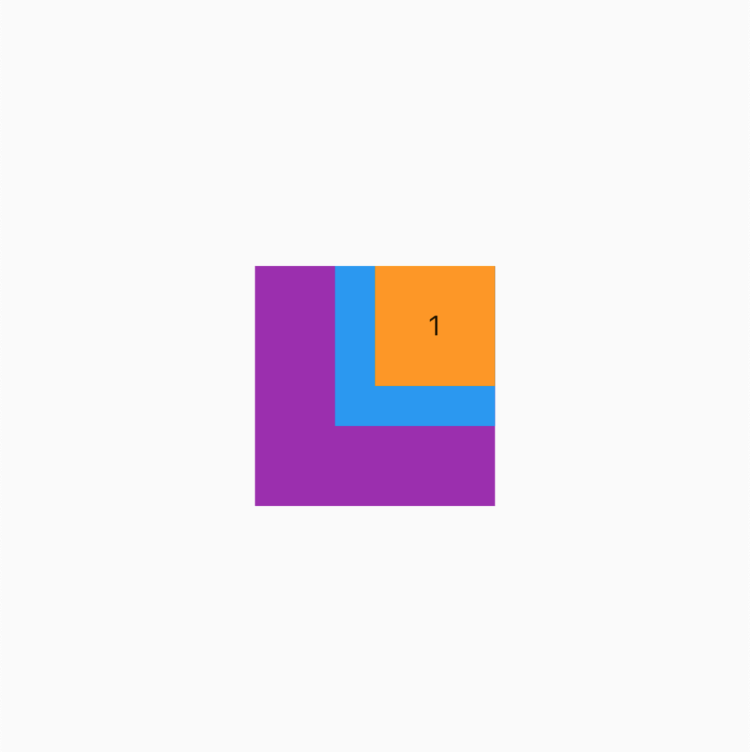
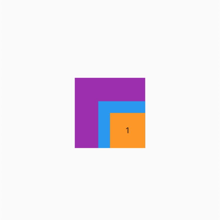
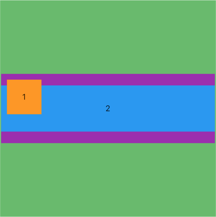
StackFit.loose (疏松的) - 默认
这里为了显示效果我们使用了 DevTools 中的 Widget Inspector 来调试布局,之后可能会聊 Flutter DevTools 的使用技巧(这里不做承诺,还是可能回聊)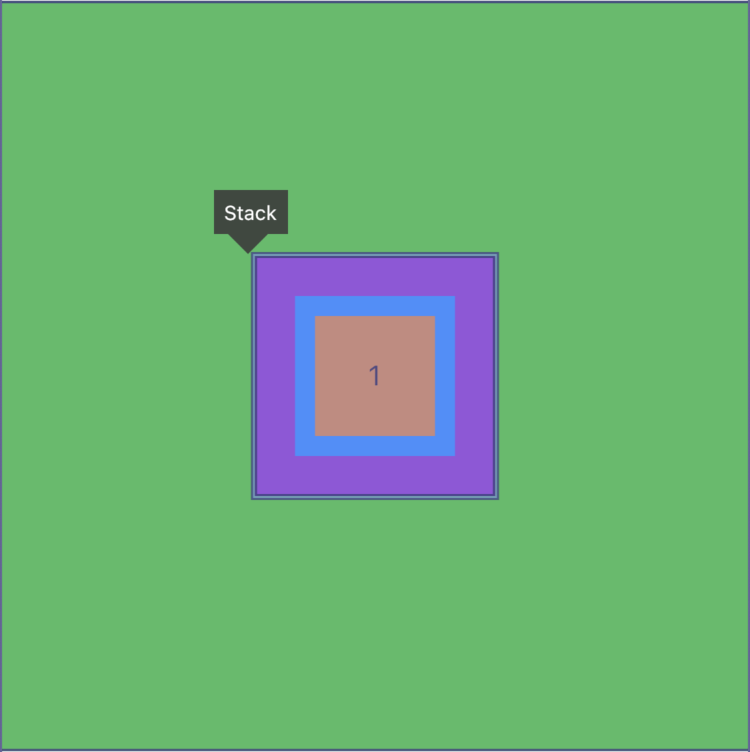
通过上图可以看到此时 Stack 的大小取决于子项中最大的(也就是紫色 120 宽高的子项)
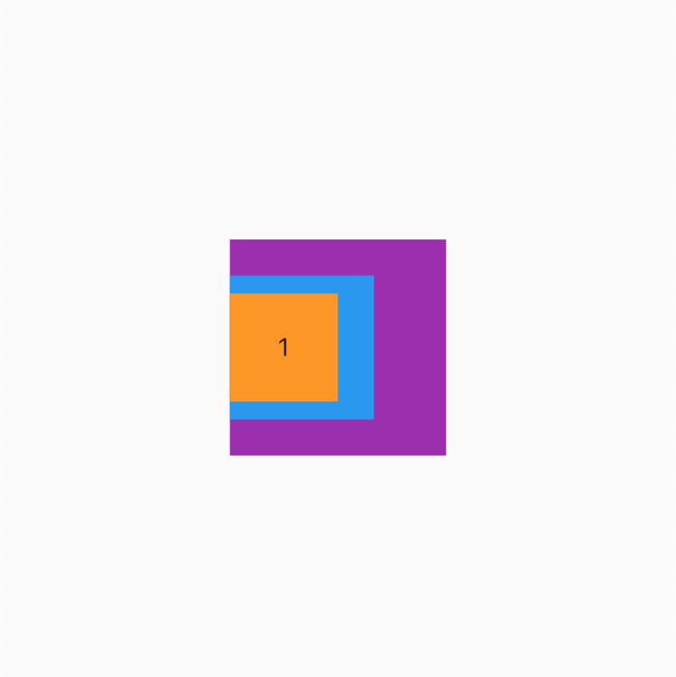
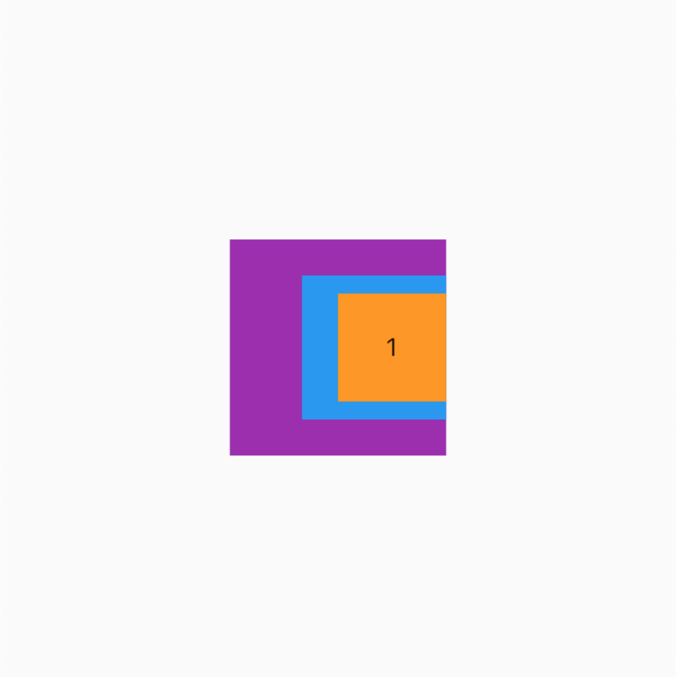
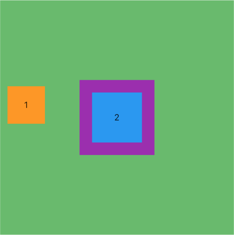
StackFit.expand(展开的)
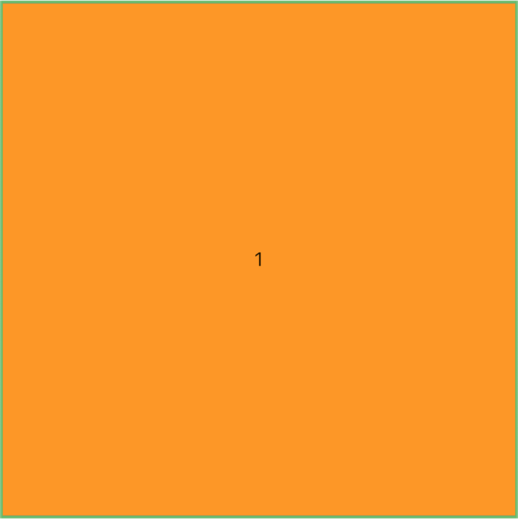
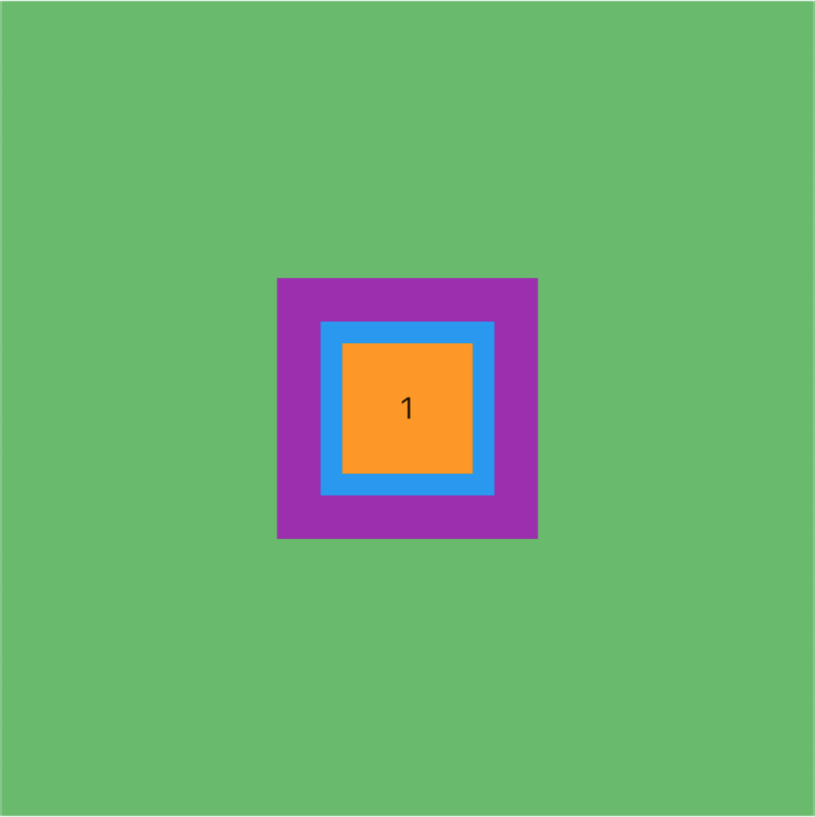
这里似乎不是很符合预期,理论上不应该是扩展 Stack 到最大即可吗?
目前我们的子项都是没有设置定位的,所以此时所有的子类约束都会扩展到与Stack 最大值一致
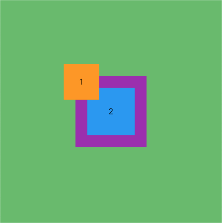
添加定位
我们此时做一点点改变看看效果,先看代码
BgContainer(
child: Stack(
alignment: Alignment.center,
fit: StackFit.expand,
children: [
getItem(3, width: 120, height: 120, color: Colors.purple),
getItem(2, width: 80, height: 80, color: Colors.blue),
// 这添加了定位
Positioned(
// 距左边 10
left: 10,
// 距上边 10
top: 10,
child: getItem(1),
),
],
),
)
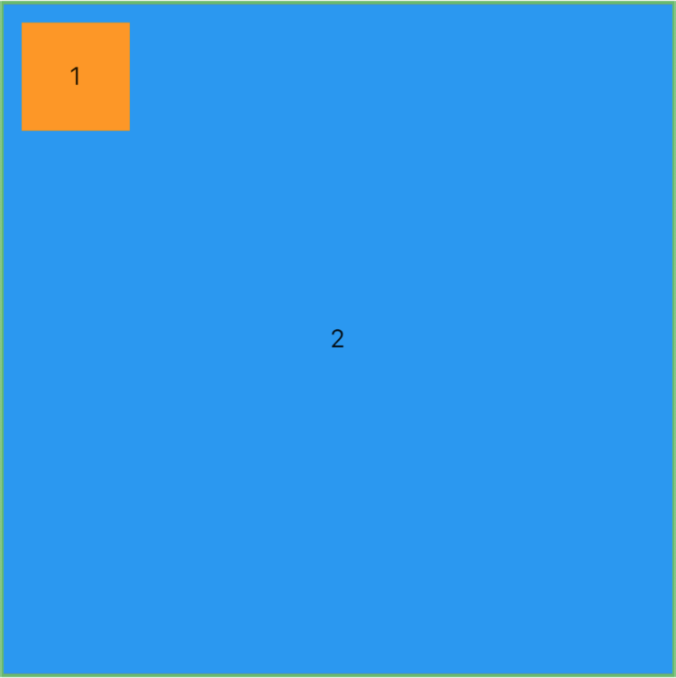
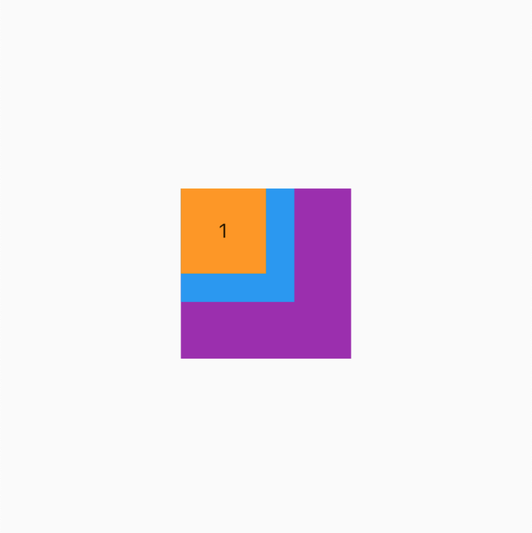
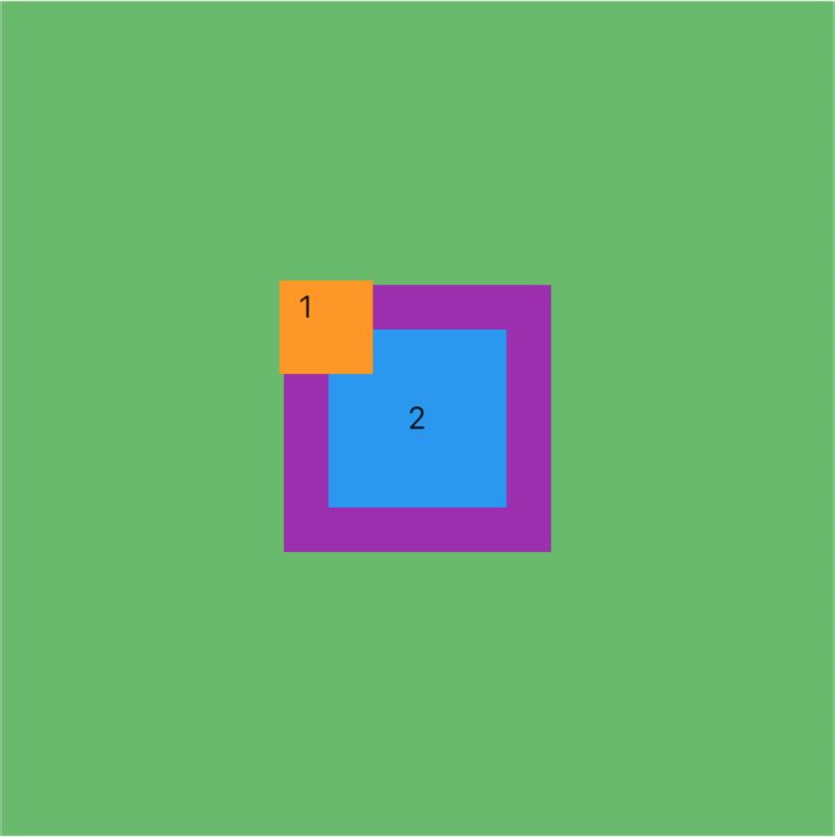
此时看到效果了,1 黄色 子项遵循了自己的约束,因为他添加了定位,其他 2、3 因为没有添加定位所以和 Stack 一样大,约束被传递。
这里我们暂时不讲定位的使用,下篇我们系统的聊
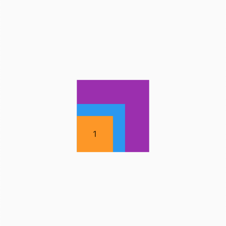
StackFit.passthrough(直穿的)
我们先看看效果
这里似乎和 loose 没有啥区别啊?我们可以看看源码后改变成以下的示例代码再看看
BgContainer(
// 添加了一个横向布局
child: Row(
children: [
// 添加了展开组件,前面讲过可以去专栏看看
Expanded(
child: Stack(
alignment: Alignment.center,
// 设置填充方式为 passthrough
fit: StackFit.passthrough,
children: [
getItem(3, width: 120, height: 120, color: Colors.purple),
getItem(2, width: 80, height: 80, color: Colors.blue),
Positioned(
left: 10,
top: 10,
child: getItem(1),
),
],
),
)
],
),
),
)
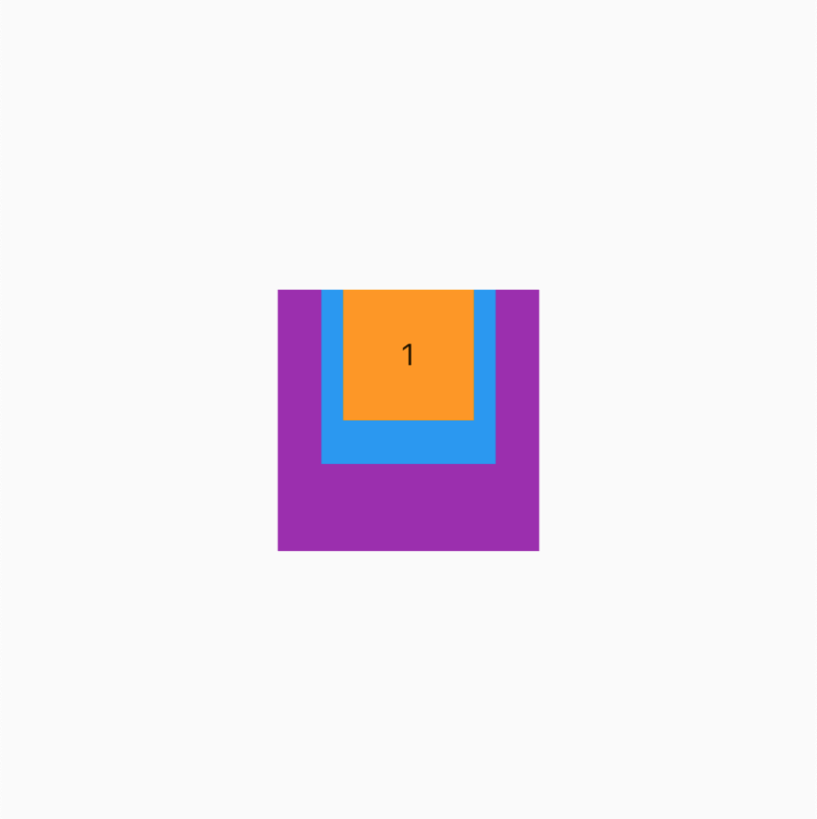
这里我们看到与 expand 还有些不同,这里我们只展开了宽度,高度还是子项的高度。因为这里 Stack 的宽度约束是展开的屏幕宽度,直接传递给了没有添加定位的子组件,所以看到 2、3 子组件跟着变了,而 1 子组件的大小没有发生变化。
如果是 loose 会怎样?
对于非定位组件会继续保持对齐方式和子项的约束
小总结
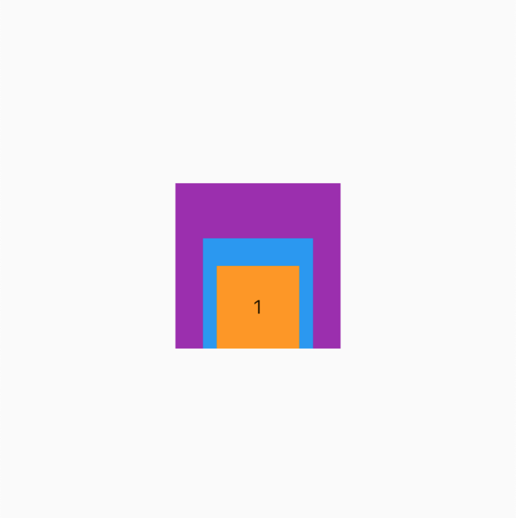
clipBehavior(剪裁行为)
为啥不聊 overflow 呢,因为本文是基于 Flutter 2.2.1 版本的,overflow 已经被弃用了,很多地方的剪裁行为以后都统一为 clipBehavior ,这参数我们之前在剪裁篇《Flutter 中各种剪裁 Widget 的使用》聊过,建议回看
当我们设置的子项定位后大小超过了 Stack 布局的时候,我们期望怎样剪裁渲染呢?是剪裁还是显示,是带抗锯齿还是不带呢?
BgContainer(
child: Stack(
alignment: Alignment.center,
fit: StackFit.passthrough,
// 设置剪裁行为默认 hardEdge
clipBehavior: Clip.hardEdge,
children: [
getItem(3, width: 120, height: 120, color: Colors.purple),
getItem(2, width: 80, height: 80, color: Colors.blue),
// 这里设置定位左上角 -20
Positioned(
left: -20,
top: -20,
child: getItem(1),
),
],
),
)
看效果
| Clip.none(不剪裁) | Clip.hardEdge | antiAlias、antiAliasWithSaveLayer |
|---|---|---|
 |
 |
 |
最后
跳槽季整理面试题已经成了我多年的习惯!在这里我和身边一些朋友特意整理了一份快速进阶为Android高级工程师的系统且全面的学习资料。涵盖了Android初级——Android高级架构师进阶必备的一些学习技能。
附上:我们之前因为秋招收集的二十套一二线互联网公司Android面试真题(含BAT、小米、华为、美团、滴滴)和我自己整理Android复习笔记(包含Android基础知识点、Android扩展知识点、Android源码解析、设计模式汇总、Gradle知识点、常见算法题汇总。)
《Android学习笔记总结+移动架构视频+大厂面试真题+项目实战源码》,点击传送门,即可获取!
含Android基础知识点、Android扩展知识点、Android源码解析、设计模式汇总、Gradle知识点、常见算法题汇总。)
[外链图片转存中…(img-iMEckZDf-1714810694095)]
《Android学习笔记总结+移动架构视频+大厂面试真题+项目实战源码》,点击传送门,即可获取!

开源鸿蒙跨平台开发社区汇聚开发者与厂商,共建“一次开发,多端部署”的开源生态,致力于降低跨端开发门槛,推动万物智联创新。
更多推荐
 23
23 0
0- 0


 已为社区贡献11条内容

所有评论(0)