OpenHarmony 与 Flutter 的完美融合财务管理应用:深色主题适配
OpenHarmony 钱包应用 v1.12.0 版本新增深色模式支持,包含三大核心功能:1. 主题配置模型(ThemeConfig)提供浅色/深色主题颜色方案;2. 主题管理服务(ThemeService)实现单例模式的主题切换;3. 设置页面新增外观设置选项,支持一键切换主题模式。该更新通过完整的主题管理系统,优化了用户在低光环境下的使用体验,同时保持UI风格的一致性。
·
更新概述
v1.12.0 版本为 OpenHarmony 钱包应用增加了完整的深色模式支持。用户现在可以在设置页面轻松切换浅色和深色模式,深色模式可以在低光环境下减少眼睛疲劳。新增的设置页面还提供了应用信息和其他配置选项。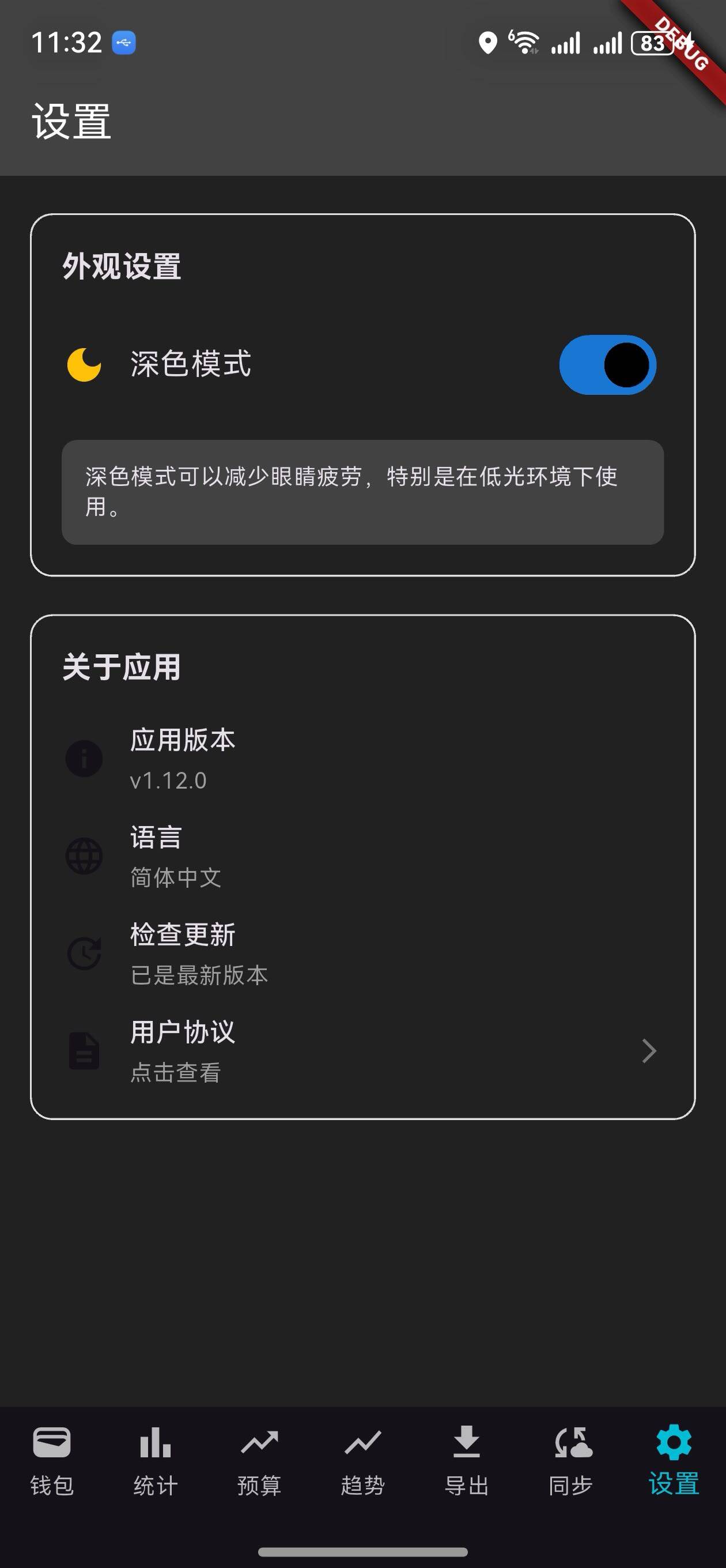
核心功能更新
1. 主题配置模型
ThemeConfig 类定义
/// 主题模型
class ThemeConfig {
  final bool isDarkMode;
  final Color primaryColor;
  final Color accentColor;

  ThemeConfig({
    required this.isDarkMode,
    required this.primaryColor,
    required this.accentColor,
  });

  factory ThemeConfig.light() {
    return ThemeConfig(
      isDarkMode: false,
      primaryColor: Colors.blue,
      accentColor: Colors.blueAccent,
    );
  }

  factory ThemeConfig.dark() {
    return ThemeConfig(
      isDarkMode: true,
      primaryColor: Colors.blue.shade700,
      accentColor: Colors.cyan,
    );
  }

  ThemeData toThemeData() {
    if (isDarkMode) {
      return ThemeData.dark(useMaterial3: true).copyWith(
        colorScheme: ColorScheme.dark(
          primary: primaryColor,
          secondary: accentColor,
        ),
        scaffoldBackgroundColor: Colors.grey.shade900,
        appBarTheme: AppBarTheme(
          backgroundColor: Colors.grey.shade800,
          elevation: 0,
        ),
      );
    } else {
      return ThemeData.light(useMaterial3: true).copyWith(
        colorScheme: ColorScheme.light(
          primary: primaryColor,
          secondary: accentColor,
        ),
        scaffoldBackgroundColor: Colors.white,
        appBarTheme: AppBarTheme(
          backgroundColor: primaryColor,
          elevation: 0,
        ),
      );
    }
  }
}
说明:
- 定义浅色和深色主题的颜色方案
- 提供工厂方法快速创建主题
- 支持转换为 Flutter 的
ThemeData
主题颜色对比
| 元素 | 浅色模式 | 深色模式 |
|---|---|---|
| 主色 | Colors.blue | Colors.blue.shade700 |
| 强调色 | Colors.blueAccent | Colors.cyan |
| 背景 | Colors.white | Colors.grey.shade900 |
| AppBar | Colors.blue | Colors.grey.shade800 |
2. 主题管理服务
ThemeService 类
/// 主题管理服务
class ThemeService {
  static final ThemeService _instance = ThemeService._internal();
  late ThemeConfig _currentTheme;

  factory ThemeService() {
    return _instance;
  }

  ThemeService._internal() {
    _currentTheme = ThemeConfig.light();
  }

  /// 获取当前主题
  ThemeConfig get currentTheme => _currentTheme;

  /// 切换主题
  void toggleTheme() {
    _currentTheme = _currentTheme.isDarkMode
        ? ThemeConfig.light()
        : ThemeConfig.dark();
  }

  /// 设置为深色模式
  void setDarkMode(bool isDark) {
    _currentTheme = isDark ? ThemeConfig.dark() : ThemeConfig.light();
  }

  /// 获取主题数据
  ThemeData getThemeData() {
    return _currentTheme.toThemeData();
  }

  /// 是否为深色模式
  bool get isDarkMode => _currentTheme.isDarkMode;
}
说明:
- 单例模式确保全局只有一个主题服务
toggleTheme(): 在浅色和深色模式之间切换setDarkMode(): 设置为指定模式getThemeData(): 获取 Flutter 主题数据
3. 设置页面
主题设置部分
/// 构建主题设置部分
Widget _buildThemeSection() {
  return Padding(
    padding: const EdgeInsets.symmetric(horizontal: 16),
    child: Container(
      padding: const EdgeInsets.all(16),
      decoration: BoxDecoration(
        border: Border.all(color: Colors.grey.shade300),
        borderRadius: BorderRadius.circular(12),
      ),
      child: Column(
        crossAxisAlignment: CrossAxisAlignment.start,
        children: [
          Text(
            '外观设置',
            style: Theme.of(context).textTheme.titleMedium?.copyWith(
                  fontWeight: FontWeight.bold,
                ),
          ),
          const SizedBox(height: 16),
          Row(
            mainAxisAlignment: MainAxisAlignment.spaceBetween,
            children: [
              Row(
                children: [
                  Icon(
                    widget.themeService.isDarkMode
                        ? Icons.dark_mode
                        : Icons.light_mode,
                    color: widget.themeService.isDarkMode
                        ? Colors.amber
                        : Colors.orange,
                  ),
                  const SizedBox(width: 12),
                  Text(
                    widget.themeService.isDarkMode ? '深色模式' : '浅色模式',
                    style: Theme.of(context).textTheme.bodyLarge,
                  ),
                ],
              ),
              Switch(
                value: widget.themeService.isDarkMode,
                onChanged: (value) {
                  setState(() {
                    widget.themeService.setDarkMode(value);
                  });
                  // 重建整个应用以应用新主题
                  _rebuildApp();
                },
              ),
            ],
          ),
          const SizedBox(height: 16),
          Container(
            padding: const EdgeInsets.all(12),
            decoration: BoxDecoration(
              color: Theme.of(context).brightness == Brightness.dark
                  ? Colors.grey.shade800
                  : Colors.grey.shade100,
              borderRadius: BorderRadius.circular(8),
            ),
            child: Text(
              widget.themeService.isDarkMode
                  ? '深色模式可以减少眼睛疲劳,特别是在低光环境下使用。'
                  : '浅色模式提供清晰的对比度和良好的可读性。',
              style: Theme.of(context).textTheme.bodySmall,
            ),
          ),
        ],
      ),
    ),
  );
}
说明:
- 显示当前主题模式
- 提供切换开关
- 显示主题说明文字

关于应用部分
/// 构建关于部分
Widget _buildAboutSection() {
  return Padding(
    padding: const EdgeInsets.symmetric(horizontal: 16),
    child: Container(
      padding: const EdgeInsets.all(16),
      decoration: BoxDecoration(
        border: Border.all(color: Colors.grey.shade300),
        borderRadius: BorderRadius.circular(12),
      ),
      child: Column(
        crossAxisAlignment: CrossAxisAlignment.start,
        children: [
          Text(
            '关于应用',
            style: Theme.of(context).textTheme.titleMedium?.copyWith(
                  fontWeight: FontWeight.bold,
                ),
          ),
          const SizedBox(height: 16),
          _buildSettingItem(
            icon: Icons.info,
            title: '应用版本',
            subtitle: 'v1.12.0',
          ),
          const SizedBox(height: 12),
          _buildSettingItem(
            icon: Icons.language,
            title: '语言',
            subtitle: '简体中文',
          ),
          const SizedBox(height: 12),
          _buildSettingItem(
            icon: Icons.update,
            title: '检查更新',
            subtitle: '已是最新版本',
          ),
          const SizedBox(height: 12),
          _buildSettingItem(
            icon: Icons.description,
            title: '用户协议',
            subtitle: '点击查看',
            onTap: () {
              ScaffoldMessenger.of(context).showSnackBar(
                const SnackBar(content: Text('用户协议')),
              );
            },
          ),
        ],
      ),
    ),
  );
}
说明:
- 显示应用版本
- 显示语言设置
- 提供更新检查
- 显示用户协议链接
UI 变化
设置页面布局
┌─────────────────────────────────┐
│  设置                            │
├─────────────────────────────────┤
│  外观设置                        │
│  🌙 深色模式            [开关]   │
│  深色模式可以减少眼睛疲劳...    │
├─────────────────────────────────┤
│  关于应用                        │
│  ℹ️ 应用版本       v1.12.0      │
│  🌐 语言           简体中文      │
│  🔄 检查更新       已是最新版本  │
│  📄 用户协议       点击查看 →   │
└─────────────────────────────────┘
浅色模式 vs 深色模式
浅色模式特点
- 背景:白色
- 文字:深灰色
- AppBar:蓝色
- 适合白天使用
深色模式特点
- 背景:深灰色(#121212)
- 文字:浅灰色
- AppBar:深蓝色
- 适合夜间使用
主题应用流程
1. 用户进入设置页面
   ↓
2. 点击主题切换开关
   ↓
3. 调用 ThemeService.setDarkMode()
   ↓
4. 更新当前主题配置
   ↓
5. 调用 _rebuildApp()
   ↓
6. 重建整个应用
   ↓
7. 应用新主题到所有页面
   ↓
8. 用户看到新主题效果
版本对比
| 功能 | v1.11.0 | v1.12.0 |
|---|---|---|
| 数据同步 | ✅ | ✅ |
| 同步队列管理 | ✅ | ✅ |
| 同步历史记录 | ✅ | ✅ |
| 主题配置模型 | ❌ | ✅ |
| 主题管理服务 | ❌ | ✅ |
| 深色模式 | ❌ | ✅ |
| 设置页面 | ❌ | ✅ |
| 主题切换 | ❌ | ✅ |
| 应用信息 | ❌ | ✅ |
使用场景
场景 1:切换到深色模式
- 进入设置页面
- 在"外观设置"中找到主题切换
- 点击切换开关
- 应用立即切换到深色模式
- 所有页面都应用深色主题
场景 2:查看应用信息
- 进入设置页面
- 查看"关于应用"部分
- 了解应用版本和语言
- 检查是否有新版本
场景 3:夜间使用
- 晚上使用应用时
- 切换到深色模式
- 减少眼睛疲劳
- 提高使用舒适度
技术亮点
1. 单例模式
ThemeService使用单例模式- 确保全局只有一个主题实例
- 避免主题冲突
2. 工厂方法
ThemeConfig.light()和ThemeConfig.dark()- 快速创建预定义主题
- 易于扩展新主题
3. 主题数据转换
toThemeData()方法- 将自定义主题转换为 Flutter 主题
- 支持所有 Material Design 组件
4. 应用重建
- 通过
Navigator.pushAndRemoveUntil()重建应用 - 确保新主题应用到所有页面
- 提供流畅的主题切换体验
下一步计划
v1.13.0 将继续增强功能,计划增加:
- 📊 高级统计分析
- 💾 本地数据持久化
- 🔐 数据加密和安全
- 📈 收入支出趋势预测
感谢使用 OpenHarmony 钱包! 🎉
如有建议或问题,欢迎反馈。

开源鸿蒙跨平台开发社区汇聚开发者与厂商,共建“一次开发,多端部署”的开源生态,致力于降低跨端开发门槛,推动万物智联创新。
更多推荐
 7
7 0
0- 0


 已为社区贡献2条内容

所有评论(0)