Flutter for OpenHarmony 实战:HarmonyOS ArkTS API 24 锚点链接平滑滚动
前言:跨生态开发的新机遇
在移动开发领域,我们总是面临着选择与适配。今天,你的Flutter应用在Android和iOS上跑得正欢,明天可能就需要考虑一个新的平台:HarmonyOS(鸿蒙)。这不是一道选答题,而是很多团队正在面对的现实。
Flutter的优势很明确——写一套代码,就能在两个主要平台上运行,开发体验流畅。而鸿蒙代表的是下一个时代的互联生态,它不仅仅是手机系统,更着眼于未来全场景的体验。将现有的Flutter应用适配到鸿蒙,听起来像是一个“跨界”任务,但它本质上是一次有价值的技术拓展:让产品触达更多用户,也让技术栈覆盖更广。
不过,这条路走起来并不像听起来那么简单。Flutter和鸿蒙,从底层的架构到上层的工具链,都有着各自的设计逻辑。会遇到一些具体的问题:代码如何组织?原有的功能在鸿蒙上如何实现?那些平台特有的能力该怎么调用?更实际的是,从编译打包到上架部署,整个流程都需要重新摸索。
这篇文章想做的,就是把这些我们趟过的路、踩过的坑,清晰地摊开给你看。我们不会只停留在“怎么做”,还会聊到“为什么得这么做”,以及“如果出了问题该往哪想”。这更像是一份实战笔记,源自真实的项目经验,聚焦于那些真正卡住过我们的环节。
无论你是在为一个成熟产品寻找新的落地平台,还是从一开始就希望构建能面向多端的应用,这里的思路和解决方案都能提供直接的参考。理解了两套体系之间的异同,掌握了关键的衔接技术,不仅能完成这次迁移,更能积累起应对未来技术变化的能力。
混合工程结构深度解析
项目目录架构
当Flutter项目集成鸿蒙支持后,典型的项目结构会发生显著变化。以下是经过ohos_flutter插件初始化后的项目结构:
my_flutter_harmony_app/
├── lib/                          # Flutter业务代码(基本不变)
│   ├── main.dart                 # 应用入口
│   ├── home_page.dart           # 首页
│   └── utils/
│       └── platform_utils.dart  # 平台工具类
├── pubspec.yaml                  # Flutter依赖配置
├── ohos/                         # 鸿蒙原生层(核心适配区)
│   ├── entry/                    # 主模块
│   │   └── src/main/
│   │       ├── ets/              # ArkTS代码
│   │       │   ├── MainAbility/
│   │       │   │   ├── MainAbility.ts       # 主Ability
│   │       │   │   └── MainAbilityContext.ts
│   │       │   └── pages/
│   │       │       ├── Index.ets           # 主页面
│   │       │       └── Splash.ets          # 启动页
│   │       ├── resources/        # 鸿蒙资源文件
│   │       │   ├── base/
│   │       │   │   ├── element/  # 字符串等
│   │       │   │   ├── media/    # 图片资源
│   │       │   │   └── profile/  # 配置文件
│   │       │   └── en_US/        # 英文资源
│   │       └── config.json       # 应用核心配置
│   ├── ohos_test/               # 测试模块
│   ├── build-profile.json5      # 构建配置
│   └── oh-package.json5         # 鸿蒙依赖管理
└── README.md
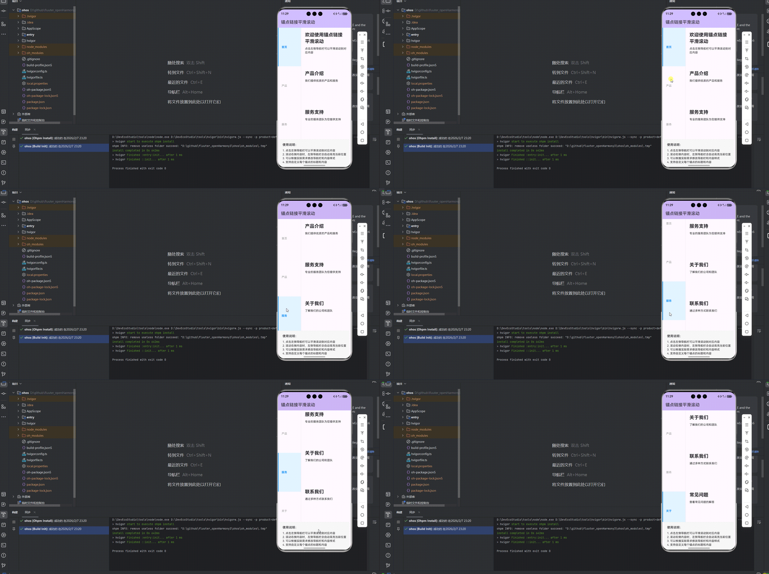
展示效果图片
flutter 实时预览 效果展示
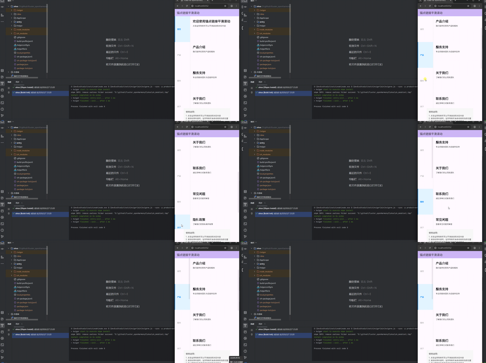
运行到鸿蒙虚拟设备中效果展示
目录
功能代码实现
核心组件:AnchorScroll
组件结构
在 lib/anchor/anchor_scroll.dart 文件中,我们实现了一个支持平滑滚动的锚点导航组件:
import 'package:flutter/material.dart';
class AnchorScroll extends StatefulWidget {
final List<AnchorItem> items;
final ScrollController? scrollController;
final double? itemHeight;
final Color? activeColor;
final Color? inactiveColor;
final TextStyle? textStyle;
const AnchorScroll({
super.key,
required this.items,
this.scrollController,
this.itemHeight = 50.0,
this.activeColor = Colors.blue,
this.inactiveColor = Colors.grey,
this.textStyle,
});
State<AnchorScroll> createState() => _AnchorScrollState();
}
class AnchorItem {
final String title;
final Widget child;
const AnchorItem({
required this.title,
required this.child,
});
}
class _AnchorScrollState extends State<AnchorScroll> {
late ScrollController _scrollController;
int _activeIndex = 0;
void initState() {
super.initState();
_scrollController = widget.scrollController ?? ScrollController();
_scrollController.addListener(_onScroll);
}
void dispose() {
_scrollController.removeListener(_onScroll);
if (widget.scrollController == null) {
_scrollController.dispose();
}
super.dispose();
}
void _onScroll() {
final offset = _scrollController.offset;
final itemHeight = widget.itemHeight!;
final newIndex = (offset / itemHeight).round();
if (newIndex != _activeIndex && newIndex >= 0 && newIndex < widget.items.length) {
setState(() {
_activeIndex = newIndex;
});
}
}
void _scrollToIndex(int index) {
setState(() {
_activeIndex = index;
});
_scrollController.animateTo(
index * widget.itemHeight!,
duration: Duration(milliseconds: 500),
curve: Curves.easeInOut,
);
}
Widget build(BuildContext context) {
return Row(
children: [
// 左侧导航栏
Container(
width: 120,
decoration: BoxDecoration(
border: Border(right: BorderSide(color: Colors.grey[200]!)),
),
child: ListView.builder(
itemCount: widget.items.length,
itemBuilder: (context, index) {
return GestureDetector(
onTap: () => _scrollToIndex(index),
child: Container(
height: widget.itemHeight,
padding: EdgeInsets.symmetric(horizontal: 16),
alignment: Alignment.centerLeft,
decoration: BoxDecoration(
color: _activeIndex == index ? Colors.blue[50] : null,
border: Border(
left: BorderSide(
color: _activeIndex == index ? widget.activeColor! : Colors.transparent,
width: 3,
),
),
),
child: Text(
widget.items[index].title,
style: TextStyle(
color: _activeIndex == index ? widget.activeColor : widget.inactiveColor,
fontWeight: _activeIndex == index ? FontWeight.bold : FontWeight.normal,
).merge(widget.textStyle),
),
),
);
},
),
),
// 右侧内容区域
Expanded(
child: ListView.builder(
controller: _scrollController,
itemCount: widget.items.length,
itemBuilder: (context, index) {
return Container(
height: widget.itemHeight,
padding: EdgeInsets.all(20),
child: widget.items[index].child,
);
},
),
),
],
);
}
}
组件开发要点
-
参数设计:
items:锚点项列表,包含标题和对应内容scrollController:滚动控制器,可外部传入itemHeight:每个锚点项的高度activeColor:激活状态的颜色inactiveColor:非激活状态的颜色textStyle:文本样式
-
滚动实现:
- 使用
ScrollController控制滚动行为 - 通过
addListener监听滚动事件 - 计算当前滚动位置对应的锚点索引
- 使用
animateTo实现平滑滚动
- 使用
-
状态管理:
- 使用
_activeIndex存储当前激活的锚点索引 - 在
dispose方法中释放滚动控制器 - 支持外部传入滚动控制器,避免重复创建
- 使用
-
布局设计:
- 左侧固定宽度的导航栏
- 右侧自适应宽度的内容区域
- 导航项激活状态的视觉反馈
使用方法
AnchorScroll(
  items: [
    AnchorItem(
      title: '首页',
      child: Column(
        crossAxisAlignment: CrossAxisAlignment.start,
        children: [
          Text(
            '欢迎使用锚点链接平滑滚动',
            style: TextStyle(
              fontSize: 24,
              fontWeight: FontWeight.bold,
            ),
          ),
          SizedBox(height: 10),
          Text('点击左侧导航栏可以平滑滚动到对应内容'),
        ],
      ),
    ),
    // 更多锚点项...
  ],
  itemHeight: 200.0,
  activeColor: Colors.blue,
  inactiveColor: Colors.grey,
);
首页集成:AnchorHome
页面结构
在 lib/anchor/anchor_home.dart 文件中,我们集成了锚点滚动组件,提供了多个示例内容:
import 'package:flutter/material.dart';
import 'anchor_scroll.dart';
class AnchorHome extends StatefulWidget {
const AnchorHome({super.key});
State<AnchorHome> createState() => _AnchorHomeState();
}
class _AnchorHomeState extends State<AnchorHome> {
List<AnchorItem> _items = [];
void initState() {
super.initState();
_initItems();
}
void _initItems() {
_items = [
AnchorItem(
title: '首页',
child: Column(
crossAxisAlignment: CrossAxisAlignment.start,
children: [
Text(
'欢迎使用锚点链接平滑滚动',
style: TextStyle(
fontSize: 24,
fontWeight: FontWeight.bold,
),
),
SizedBox(height: 10),
Text('点击左侧导航栏可以平滑滚动到对应内容'),
],
),
),
AnchorItem(
title: '产品',
child: Column(
crossAxisAlignment: CrossAxisAlignment.start,
children: [
Text(
'产品介绍',
style: TextStyle(
fontSize: 24,
fontWeight: FontWeight.bold,
),
),
SizedBox(height: 10),
Text('我们提供优质的产品和服务'),
],
),
),
AnchorItem(
title: '服务',
child: Column(
crossAxisAlignment: CrossAxisAlignment.start,
children: [
Text(
'服务支持',
style: TextStyle(
fontSize: 24,
fontWeight: FontWeight.bold,
),
),
SizedBox(height: 10),
Text('专业的服务团队为您提供支持'),
],
),
),
AnchorItem(
title: '关于',
child: Column(
crossAxisAlignment: CrossAxisAlignment.start,
children: [
Text(
'关于我们',
style: TextStyle(
fontSize: 24,
fontWeight: FontWeight.bold,
),
),
SizedBox(height: 10),
Text('了解我们的公司和团队'),
],
),
),
AnchorItem(
title: '联系',
child: Column(
crossAxisAlignment: CrossAxisAlignment.start,
children: [
Text(
'联系我们',
style: TextStyle(
fontSize: 24,
fontWeight: FontWeight.bold,
),
),
SizedBox(height: 10),
Text('通过多种方式联系我们'),
],
),
),
AnchorItem(
title: '常见问题',
child: Column(
crossAxisAlignment: CrossAxisAlignment.start,
children: [
Text(
'常见问题',
style: TextStyle(
fontSize: 24,
fontWeight: FontWeight.bold,
),
),
SizedBox(height: 10),
Text('查看常见问题的解答'),
],
),
),
AnchorItem(
title: '隐私政策',
child: Column(
crossAxisAlignment: CrossAxisAlignment.start,
children: [
Text(
'隐私政策',
style: TextStyle(
fontSize: 24,
fontWeight: FontWeight.bold,
),
),
SizedBox(height: 10),
Text('了解我们的隐私保护政策'),
],
),
),
AnchorItem(
title: '使用条款',
child: Column(
crossAxisAlignment: CrossAxisAlignment.start,
children: [
Text(
'使用条款',
style: TextStyle(
fontSize: 24,
fontWeight: FontWeight.bold,
),
),
SizedBox(height: 10),
Text('了解我们的服务使用条款'),
],
),
),
];
}
Widget build(BuildContext context) {
return Scaffold(
appBar: AppBar(
title: Text('锚点链接平滑滚动'),
backgroundColor: Theme.of(context).colorScheme.inversePrimary,
),
body: Column(
children: [
// 锚点滚动组件
Expanded(
child: AnchorScroll(
items: _items,
itemHeight: 200.0,
activeColor: Colors.blue,
inactiveColor: Colors.grey,
),
),
// 使用说明
Container(
padding: EdgeInsets.all(16),
decoration: BoxDecoration(
color: Colors.grey[100],
border: Border(top: BorderSide(color: Colors.grey[200]!)),
),
child: Column(
crossAxisAlignment: CrossAxisAlignment.start,
children: [
Text(
'使用说明:',
style: TextStyle(
fontSize: 16,
fontWeight: FontWeight.w500,
),
),
SizedBox(height: 8),
Text('1. 点击左侧导航栏可以平滑滚动到对应内容'),
Text('2. 滚动右侧内容时,左侧导航栏会自动高亮当前位置'),
Text('3. 可以根据实际需求修改导航栏和内容样式'),
Text('4. 支持自定义每个锚点的标题和内容'),
],
),
),
],
),
);
}
}
集成要点
-
示例数据:
- 提供了 8 个不同类型的锚点内容
- 涵盖首页、产品、服务、关于、联系、常见问题、隐私政策和使用条款
-
页面布局:
- 使用
Scaffold构建基本页面结构 - 顶部固定的
AppBar - 中间的
AnchorScroll组件 - 底部的使用说明区域
- 使用
-
响应式设计:
- 使用
Expanded让锚点滚动组件占满剩余空间 - 底部使用说明区域固定显示
- 使用
-
用户引导:
- 清晰的使用说明
- 直观的导航栏和内容布局
主页面配置
在 lib/main.dart 文件中,我们将锚点滚动页面设置为主页面:
import 'package:flutter/material.dart';
import 'anchor/anchor_home.dart';
void main() {
runApp(const MyApp());
}
class MyApp extends StatelessWidget {
const MyApp({super.key});
Widget build(BuildContext context) {
return MaterialApp(
title: 'Flutter for openHarmony',
theme: ThemeData(
colorScheme: ColorScheme.fromSeed(seedColor: Colors.deepPurple),
useMaterial3: true,
),
debugShowCheckedModeBanner: false,
home: const AnchorHome(),
);
}
}
开发中容易遇到的问题
1. 滚动控制器管理问题
问题描述:滚动控制器未正确释放,可能导致内存泄漏。
解决方案:
- 在
dispose方法中移除滚动监听器 - 检查滚动控制器是否由外部传入,避免重复释放
- 确保在组件销毁时正确清理所有相关资源
2. 布局适配问题
问题描述:在不同屏幕尺寸下,导航栏和内容区域的布局可能出现异常。
解决方案:
- 使用
Expanded组件让内容区域自适应剩余空间 - 避免使用固定宽度,考虑使用百分比或
MediaQuery - 测试不同屏幕尺寸下的显示效果
3. 锚点定位问题
问题描述:滚动时锚点定位不准确,或导航栏高亮与内容不匹配。
解决方案:
- 确保
itemHeight与实际内容高度一致 - 合理计算滚动偏移量与锚点索引的关系
- 使用
round或floor方法确保索引计算准确
4. 动画性能问题
问题描述:在低端设备上,平滑滚动动画可能出现卡顿。
解决方案:
- 合理设置动画持续时间,避免过长
- 使用
Curves.easeInOut等性能较好的曲线 - 避免在滚动过程中进行复杂的计算或渲染
5. 状态同步问题
问题描述:导航栏状态与内容滚动位置不同步。
解决方案:
- 在
_scrollToIndex方法中手动更新激活状态 - 确保滚动监听器正确处理边界情况
- 测试快速滚动时的状态更新是否及时
总结开发中用到的技术点
1. Flutter 滚动系统
- ScrollController:控制滚动行为和监听滚动事件
- animateTo:实现平滑滚动效果
- addListener:监听滚动位置变化
- offset:获取当前滚动偏移量
2. 状态管理
- setState:更新组件状态,触发 UI 重建
- initState:初始化组件状态和资源
- dispose:释放资源,避免内存泄漏
- late 关键字:延迟初始化变量
3. 布局与样式
- Row:水平排列子组件
- Container:用于布局和装饰
- ListView.builder:高效构建列表
- BoxDecoration:配置容器样式
- Border:添加边框效果
- Expanded:自适应剩余空间
4. 交互设计
- GestureDetector:处理触摸事件
- onTap:响应点击事件
- animateTo:实现平滑过渡效果
- Curves:添加动画缓动效果
5. 组件化开发
- StatefulWidget:管理有状态的组件
- StatelessWidget:构建无状态的组件
- 参数传递:通过构造函数传递配置参数
- AnchorItem:自定义数据模型
6. 性能优化
- 滚动控制器复用:支持外部传入滚动控制器
- 列表项构建:使用
ListView.builder按需构建 - 边界检查:确保索引计算在有效范围内
- 资源管理:正确释放滚动监听器
7. 响应式设计
- MediaQuery:获取屏幕尺寸信息
- Expanded:实现自适应布局
- 固定与自适应结合:左侧固定导航,右侧自适应内容
通过以上技术点的综合运用,我们成功实现了一个功能完整、交互友好的锚点链接平滑滚动应用,展示了如何在 Flutter for OpenHarmony 项目中创建具有专业感的导航体验。该组件可以广泛应用于文档阅读、产品展示、设置页面等场景,为用户提供流畅的导航体验。
开源鸿蒙跨平台开发社区汇聚开发者与厂商,共建“一次开发,多端部署”的开源生态,致力于降低跨端开发门槛,推动万物智联创新。
更多推荐
 3
3 0
0- 0


 已为社区贡献53条内容

所有评论(0)