React Native鸿蒙跨平台 基于HarmonyOS API 24 底部导航采用 justifyContent: space-around实现四等分布局
在垂直领域教育类应用开发中,手语学习平台需要兼顾结构化课程展示、精细化进度管理、场景化功能分类三大核心诉求。本文以 React Native 开发的手语课程列表应用为例,深度拆解其数据模型设计、组件化实现逻辑,并系统阐述向鸿蒙(HarmonyOS)ArkTS 跨端迁移的技术路径,聚焦“多层级数据关联、动态列表渲染、跨端体验一致性”三大核心维度,为教育类应用的跨端开发提供可落地的技术参考。
强类型
该应用基于 TypeScript 构建了三层级强类型数据体系,精准匹配手语学习场景的业务逻辑,也是跨端开发中“数据层复用”的核心基础:
Course类型定义课程核心属性,涵盖level联合类型(beginner/intermediate/advanced)、duration(总时长)、lessonCount(总课时)等核心字段,通过id作为唯一标识,为后续章节关联、进度统计提供基础;Lesson类型聚焦课程章节维度,通过courseId与课程实体建立关联,isCompleted标记学习状态,order保证章节的有序展示,duration细化单课时长;Progress类型专门处理学习进度统计,通过completedLessons/totalLessons计算completionPercentage,实现课程级别的进度量化,userId预留多用户扩展能力。
这种“课程-章节-进度”的分层数据模型,既保证了数据的结构化存储,又通过关联字段实现了各层级数据的精准联动,是跨端开发中数据层 100% 复用的关键——所有类型定义可直接迁移至鸿蒙 ArkTS 工程,无需任何修改。
动态数据
应用将数据处理逻辑与 UI 渲染层完全解耦,通过纯函数实现数据的筛选、排序、关联,为跨端迁移提供了“逻辑复用、视图重构”的清晰边界:
getLessonsForCourse函数通过courseId过滤关联章节,是典型的“一对多”数据关联场景,该函数可直接复用于鸿蒙端;- 课程列表渲染时,通过
progress.find(p => p.courseId === item.id)关联进度数据,动态计算完成百分比,进度条宽度通过${completionPercentage}%实现响应式适配; - “最受欢迎课程”模块通过
courses.sort((a, b) => b.rating - a.rating).slice(0, 3)实现按评分排序并截取前3条,是教育类应用中“热门推荐”场景的典型实现; - “继续学习”模块通过
lessons.filter(lesson => !lesson.isCompleted).slice(0, 2)筛选未完成章节,精准定位用户学习断点,courses.find(c => c.id === lesson.courseId)反向关联课程信息,补全章节所属课程名称。
所有数据处理逻辑均为纯函数,无 UI 层依赖,这是跨端开发中“逻辑复用”的核心——鸿蒙端只需复用这些函数,无需重新开发业务逻辑。
组件化
应用整体遵循“头部导航 + 功能横幅 + 数据统计 + 分类展示 + 列表渲染 + 底部导航”的架构,各模块均围绕教育类应用的用户体验诉求定制化实现:
头部与横幅
头部区域采用 flexDirection: row 实现标题与搜索按钮的左右布局,搜索按钮通过 borderRadius: 18 实现圆形交互区域,backgroundColor: #f1f5f9 保证点击反馈的视觉区分;欢迎横幅采用高饱和度的蓝色背景(#3b82f6)配合白色文字,形成强烈的视觉对比,“开始学习”按钮通过反色设计(白色背景+蓝色文字)成为视觉焦点,符合教育类应用“引导用户行动”的核心诉求。
数据统计卡片
学习统计卡片采用 flexDirection: row + justifyContent: space-around 实现三等分布局,展示“我的课程/已完成/整体进度”三大核心指标。通过 statNumber(大号粗体蓝色)与 statLabel(小号浅灰色)的视觉层级差异,突出核心数据,满足用户快速获取学习概况的需求,这也是教育类应用中“数据可视化”的典型实现方式。
课程分类
课程分类模块通过 flexDirection: row + flexWrap: wrap + minWidth: '50%' 实现 2x2 网格布局,每个分类项包含“图标+文字”组合,既保证了触控区域的足够大小(教育类应用需兼顾不同年龄段用户的操作体验),又充分利用屏幕空间。这种网格布局是跨端适配中需要重点关注的场景——React Native 的 flexWrap 布局在鸿蒙端需通过 Grid 组件实现等价效果。
动态列表渲染
应用多处使用 FlatList 替代 ScrollView 实现列表渲染,核心优势在于懒加载和内存优化,尤其适合课程列表这种长列表场景:
- 推荐课程列表:直接渲染全量课程数据,通过
keyExtractor={item => item.id}保证列表项的唯一性; - 最受欢迎课程:先排序后截取,仅渲染前3条高评分课程,减少不必要的渲染开销;
- 列表项
renderCourseItem整合课程基础信息、难度标签、评分、讲师信息,同时嵌入进度条组件,进度条颜色根据completionPercentage动态调整(有进度为蓝色#3b82f6,无进度为浅灰色#e2e8f0),实现“信息展示+进度可视化”的一体化。
FlatList 的 showsVerticalScrollIndicator={false} 配置隐藏滚动条,保证视觉的简洁性,这也是移动端教育类应用的通用设计规范。
底部导航
底部导航采用 flexDirection: row + justifyContent: space-around 实现四等分布局,选中项通过 activeNavItem 样式类添加顶部蓝色边框(borderTopColor: #3b82f6),形成清晰的选中反馈。这种底部导航的状态管理是跨端适配中“交互体验一致性”的核心要点——鸿蒙端需保证选中态的视觉反馈与 React Native 端完全一致。
跨端适配的核心是“数据层复用、逻辑层复用、视图层等价重构”,React Native 与鸿蒙 ArkTS 的核心能力可实现精准映射,以下是关键技术点的等价转换:
| React Native 核心能力 | 鸿蒙 ArkTS 等价实现 | 适配核心要点 |
|---|---|---|
| TypeScript 类型定义 | TypeScript 类型定义 | Course/Lesson/Progress 类型 100% 复用 |
useState 状态管理 | @State 装饰器 | 初始数据完全复用,更新逻辑从 setCourses 改为直接赋值 |
| 数组处理函数 | 数组处理函数 | filter/find/sort/slice 等函数 100% 复用 |
FlatList 列表渲染 | List + ListItem | data → listData,renderItem → itemGenerator,keyExtractor → id 字段 |
TouchableOpacity | Button 组件 | onPress → onClick,设置 backgroundColor: Transparent 去除默认样式 |
| 动态样式绑定 | 动态样式绑定 | ${completionPercentage}% 宽度适配完全复用 |
flexWrap 网格布局 | Grid + GridItem | columnsTemplate: '1fr 1fr' 实现 2x2 网格 |
Alert 弹窗 | promptAction.showAlert | 弹窗文案、交互逻辑完全复用 |
| 底部导航选中态 | @State + 条件样式 | 选中态的视觉反馈(顶部边框、颜色)完全一致 |
数据层
React Native 端的 useState 状态定义可直接转换为鸿蒙的 @State 装饰器,数据处理函数完全复用:
// React Native 端
const [courses, setCourses] = useState<Course[]>([/* 初始数据 */]);
const [lessons, setLessons] = useState<Lesson[]>([/* 初始数据 */]);
const [progress, setProgress] = useState<Progress[]>([/* 初始数据 */]);

// 鸿蒙 ArkTS 端
@State courses: Course[] = [/* 初始数据,100% 复用 */];
@State lessons: Lesson[] = [/* 初始数据,100% 复用 */];
@State progress: Progress[] = [/* 初始数据,100% 复用 */];

// 数据处理函数 100% 复用
getLessonsForCourse(courseId: string): Lesson[] {
  return this.lessons.filter(lesson => lesson.courseId === courseId);
}
需要注意的是,鸿蒙端的状态更新无需调用 setCourses 等函数,直接赋值即可(如 this.courses = newCourses)。
课程列表
React Native 的 FlatList 是长列表渲染的核心组件,鸿蒙端通过 List 组件实现等价效果,核心逻辑完全复用:
// 鸿蒙 ArkTS 课程列表实现
@Builder
renderCourseList() {
  // 最受欢迎课程:排序+截取逻辑完全复用
  const popularCourses = this.courses.sort((a, b) => b.rating - a.rating).slice(0, 3);

  Column() {
    // 列表标题栏
    Row() {
      Text('最受欢迎')
        .fontSize(16)
        .fontWeight(FontWeight.Bold)
        .color('#1e293b');
    }
    .padding(16)
    .backgroundColor('#ffffff');

    // 列表渲染
    List() {
      ForEach(popularCourses, (item: Course) => {
        ListItem() {
          this.renderCourseItem(item); // 复用课程项渲染逻辑
        }
      }, item => item.id); // 对应 keyExtractor
    }
    .showsScrollbar(false) // 对应 showsVerticalScrollIndicator={false}
    .backgroundColor('#ffffff');
  }
  .borderRadius(12)
  .marginBottom(16)
  .shadow({ radius: 2, color: '#000', opacity: 0.1, offsetX: 0, offsetY: 1 });
}

// 课程项渲染函数(核心逻辑复用)
@Builder
renderCourseItem(item: Course) {
  const courseProgress = this.progress.find(p => p.courseId === item.id);
  const completionPercentage = courseProgress ? courseProgress.completionPercentage : 0;
  const levelText = item.level === 'beginner' ? '初级' : item.level === 'intermediate' ? '中级' : '高级';

  Row() {
    // 课程缩略图(等价布局)
    Column()
      .width(60)
      .height(60)
      .borderRadius(8)
      .backgroundColor('#e2e8f0')
      .justifyContent(FlexAlign.Center)
      .alignItems(ItemAlign.Center)
      .marginRight(12)
    {
      Text('📚').fontSize(24);
    }

    // 课程信息区域(核心信息完全复用)
    Column().flexGrow(1) {
      Text(item.title)
        .fontSize(16)
        .fontWeight(FontWeight.Bold)
        .color('#1e293b')
        .marginBottom(4);

      Text(item.description)
        .fontSize(14)
        .color('#64748b')
        .marginBottom(8);

      // 元信息(难度+时长+课时)
      Row() {
        Text(levelText)
          .fontSize(12)
          .color('#10b981')
          .backgroundColor('#ecfdf5')
          .padding({ left: 6, right: 6, top: 2, bottom: 2 })
          .borderRadius(4)
          .marginRight(8);

        Text(`${item.duration} 分钟`)
          .fontSize(12)
          .color('#64748b')
          .marginRight(8);

        Text(`${item.lessonCount} 课时`)
          .fontSize(12)
          .color('#64748b');
      }.marginBottom(4);

      // 评分+讲师
      Row() {
        Text(`⭐ ${item.rating}`)
          .fontSize(12)
          .color('#f59e0b');

        Text(`讲师: ${item.instructor}`)
          .fontSize(12)
          .color('#64748b')
          .marginLeft('auto');
      }
    }

    // 进度条区域(动态样式等价)
    Column()
      .alignItems(ItemAlign.End)
      .justifyContent(FlexAlign.Center)
      .width(60)
    {
      Row()
        .width(50)
        .height(6)
        .backgroundColor('#e2e8f0')
        .borderRadius(3)
        .marginBottom(4)
      {
        Row()
          .height('100%')
          .borderRadius(3)
          .width(`${completionPercentage}%`)
          .backgroundColor(completionPercentage > 0 ? '#3b82f6' : '#e2e8f0');
      }

      Text(`${completionPercentage}%`)
        .fontSize(12)
        .color('#64748b');
    }
  }
  .padding(16)
  .borderBottom({ width: 1, color: '#e2e8f0' });
}
可以看到,除了组件语法(如 Row/Column 替代 View)和样式写法(如 padding 对象写法)的调整,核心的进度计算、信息展示、动态样式逻辑完全复用 React Native 端的实现。
课程分类
React Native 的 flexWrap 网格布局在鸿蒙端通过 Grid 组件实现更精准的控制,保证视觉效果完全一致:
// 鸿蒙 ArkTS 课程分类实现
@Builder
renderCategoryGrid() {
  Column() {
    Text('课程分类')
      .fontSize(16)
      .fontWeight(FontWeight.Bold)
      .color('#1e293b')
      .padding(16);

    Grid() {
      GridItem() {
        Button() {
          Column() {
            Text('👋').fontSize(24).marginBottom(8);
            Text('基础入门').fontSize(14).color('#1e293b');
          }
          .alignItems(ItemAlign.Center);
        }
        .backgroundColor(Transparent)
        .onClick(() => promptAction.showAlert({
          title: '基础课程',
          message: '查看基础课程'
        }));
      }

      GridItem() {
        // 日常交流分类项(结构同上)
      }

      GridItem() {
        // 专业术语分类项(结构同上)
      }

      GridItem() {
        // 情感表达分类项(结构同上)
      }
    }
    .columnsTemplate('1fr 1fr') // 2列布局,对应 minWidth: '50%'
    .rowsTemplate('1fr 1fr')    // 2行布局
    .padding(8)
    .width('100%');
  }
  .backgroundColor('#ffffff')
  .borderRadius(12)
  .marginBottom(16)
  .shadow({ radius: 2, color: '#000', opacity: 0.1, offsetX: 0, offsetY: 1 });
}
Grid 组件的 columnsTemplate/rowsTemplate 实现了与 React Native flexWrap 完全等价的 2x2 网格布局,按钮组件通过 backgroundColor: Transparent 去除默认样式,保证与 React Native TouchableOpacity 一致的视觉效果。
底部导航
底部导航的核心是“选中态反馈”和“点击交互”,鸿蒙端需保证选中态的视觉效果与 React Native 端完全一致:
// 鸿蒙 ArkTS 底部导航实现
@Builder
renderBottomNav() {
  Row() {
    // 首页(选中态)
    Button() {
      Column() {
        Text('🏠').fontSize(20).color('#3b82f6').marginBottom(4);
        Text('首页').fontSize(12).color('#3b82f6');
      }
      .alignItems(ItemAlign.Center);
    }
    .backgroundColor(Transparent)
    .paddingTop(4)
    .borderTop({ width: 2, color: '#3b82f6' }) // 选中态顶部边框
    .flexGrow(1)
    .onClick(() => promptAction.showAlert({ title: '首页' }));

    // 课程(未选中态)
    Button() {
      Column() {
        Text('📚').fontSize(20).color('#94a3b8').marginBottom(4);
        Text('课程').fontSize(12).color('#94a3b8');
      }
      .alignItems(ItemAlign.Center);
    }
    .backgroundColor(Transparent)
    .flexGrow(1)
    .onClick(() => promptAction.showAlert({ title: '课程' }));

    // 练习(未选中态)
    Button() {
      // 结构同上
    }

    // 我的(未选中态)
    Button() {
      // 结构同上
    }
  }
  .backgroundColor('#ffffff')
  .borderTop({ width: 1, color: '#e2e8f0' })
  .paddingVertical(12)
  .width('100%');
}
选中态的顶部蓝色边框(borderTop)、图标/文字颜色(#3b82f6)与 React Native 端完全一致,保证了跨端交互体验的统一性。
1. 数据层
将 Course/Lesson/Progress 类型定义、数据处理函数(如 getLessonsForCourse)、初始数据配置抽离为独立的 TS 模块,React Native 与鸿蒙工程共享该模块,保证数据层 100% 复用。对于复杂的业务逻辑(如进度计算、课程排序),封装为工具类方法,两端统一调用,避免重复开发。
2. 组件层
跨端适配的核心是“体验一致”而非“代码一致”,针对教育类应用的典型场景:
- 线性布局:React Native 的
View(flexDirection: row/column)对应鸿蒙的Row/Column; - 列表布局:React Native 的
FlatList对应鸿蒙的List + ListItem,通过ForEach实现动态渲染; - 交互组件:React Native 的
TouchableOpacity对应鸿蒙的Button(去除默认样式); - 弹窗交互:React Native 的
Alert.alert对应鸿蒙的promptAction.showAlert。
重点保证布局逻辑、视觉效果、交互行为的等价,而非逐行复制代码。
3. 样式层
将通用样式(如卡片圆角、间距、颜色值)封装为全局常量,两端统一引用;针对动态样式(如进度条宽度),采用相同的动态绑定逻辑(${completionPercentage}%),保证视觉效果的像素级一致。
4. 性能优化的跨端适配
React Native 的 FlatList 懒加载特性在鸿蒙端通过 List 组件的 onReachEnd 实现,长列表场景下需保证两端均采用懒加载策略,避免内存溢出;针对课程列表的图片加载(如缩略图),两端均需实现图片缓存机制,提升加载性能。
- React Native 端的手语课程列表应用构建了“课程-章节-进度”三层级强类型数据模型,通过纯函数实现数据的筛选、排序、关联,组件化布局兼顾了教育类应用的场景化诉求与性能优化;
- 鸿蒙跨端适配的核心是“数据层 100% 复用、逻辑层完全复用、视图层语义等价重构”,重点保证进度可视化、网格布局、底部导航选中态等核心场景的体验一致性;
- 跨端开发中需遵循“语义等价而非代码等价”的原则,聚焦“数据复用、逻辑复用、体验一致”三大核心,可大幅降低开发成本,保证多平台应用的体验统一。
该手语课程列表应用的跨端实践验证了 React Native 与鸿蒙 ArkTS 在教育类应用开发中的适配可行性,核心逻辑复用率可达 90% 以上。通过统一的数据模型、等价的组件实现、一致的交互体验,可快速完成跨端迁移,为垂直领域教育类应用的跨端开发提供了可复制的技术路径。
该应用采用了典型的 React Native 函数组件架构,基于 Hooks 进行状态管理。核心组件 SignLanguageCourseListApp 是一个完整的功能模块,负责课程列表的展示与交互。应用使用 useState Hook 管理三类核心数据:courses(课程列表)、lessons(课程章节)和 progress(学习进度),这种集中式状态管理模式在跨端开发中便于状态同步和调试。
在 HarmonyOS 跨端场景下,React Native 的 Hooks 机制能够被较好地兼容,useState 等基础 Hook 可以直接映射到 HarmonyOS ArkUI 的状态管理系统。但需要注意的是,在大规模应用中,建议使用 Redux 或 MobX 等成熟状态管理库,以获得更好的跨端状态同步和性能表现。
应用采用 TypeScript 定义了清晰的数据模型,包括 Course、Lesson 和 Progress 三个核心类型接口。这种强类型设计带来了多重优势:
- 提升代码的可维护性和可读性
- 在编译阶段捕获潜在错误
- 为跨端开发提供清晰的接口定义
在 HarmonyOS 跨端开发中,TypeScript 类型系统可以无缝映射到 ArkUI 的类型系统,尤其是基础类型和接口定义。但需要注意复杂类型(如泛型、联合类型)在不同平台的兼容性,建议在跨端项目中使用更基础的类型定义,以确保在所有平台上的一致性。
在现代学习平台开发中,课程列表已经从简单的静态展示演变为集个性化推荐、智能排序、学习进度追踪于一体的智能推荐系统。SignLanguageCourseListApp组件展示了如何在移动端实现一套完整的课程推荐功能,从多维度课程展示、智能排序到个性化推荐,形成了一个完整的学习内容分发闭环。
从技术架构的角度来看,这个组件不仅是一个列表界面,更是推荐系统设计的典型案例。它需要协调多源课程数据、学习行为分析、排序算法等多个技术维度。当我们将这套架构迁移到鸿蒙平台时,需要深入理解其推荐逻辑和排序机制,才能确保跨端实现的推荐准确性和一致性。
课程模型
type Course = {
  id: string;
  title: string;
  description: string;
  level: 'beginner' | 'intermediate' | 'advanced';
  duration: number;
  lessonCount: number;
  instructor: string;
  rating: number;
};

type Progress = {
  userId: string;
  courseId: string;
  completedLessons: number;
  totalLessons: number;
  completionPercentage: number;
};
这种数据结构设计体现了推荐系统的多维度特征:
- 内容特征:标题、描述、难度级别
- 量化特征:时长、课时数、评分
- 行为特征:学习进度和完成状态
- 社交特征:讲师信息和用户评价
在鸿蒙ArkUI中,可以使用增强的数据类:
// 鸿蒙课程推荐模型
@Observed
class RecommendedCourseHarmony {
  course: CourseHarmony;
  score: number = 0;
  recommendationReason: string = '';

  constructor(course: CourseHarmony) {
    this.course = course;
    this.calculateScore();
  }

  private calculateScore(): void {
    // 基于评分、难度、时长等多维度计算推荐分数
    let score = this.course.rating * 20;
    if (this.course.level === 'beginner') score += 10;
    if (this.course.duration < 120) score += 5;
    this.score = score;
    this.setRecommendationReason();
  }

  private setRecommendationReason(): void {
    if (this.course.rating >= 4.8) {
      this.recommendationReason = '高评分课程';
    } else if (this.course.level === 'beginner') {
      this.recommendationReason = '新手入门推荐';
    } else {
      this.recommendationReason = '热门课程';
    }
  }
}
多策略排序
// 评分排序
const popularCourses = courses.sort((a, b) => b.rating - a.rating).slice(0, 3);

// 进度排序
const continueLearning = lessons.filter(lesson => !lesson.isCompleted).slice(0, 2);
排序系统采用了多策略设计:
- 评分排序:按用户评分降序排列
- 进度排序:过滤未完成章节并按时间排序
- 混合排序:多种策略组合生成最终推荐
推荐权重
const calculateCourseScore = (course: Course, progress?: Progress) => {
  let score = course.rating * 20; // 评分权重

  // 难度权重
  if (course.level === 'beginner') score += 15;
  else if (course.level === 'intermediate') score += 10;

  // 时长权重(偏好中等时长)
  if (course.duration > 60 && course.duration < 180) score += 8;

  // 进度权重
  if (progress && progress.completionPercentage > 0) {
    score += progress.completionPercentage / 2;
  }

  return score;
};
分类导航
<View style={styles.categoryGrid}>
  <TouchableOpacity style={styles.categoryItem}>
    <Text style={styles.categoryIcon}>👋</Text>
    <Text style={styles.categoryText}>基础入门</Text>
  </TouchableOpacity>
  {/* 其他分类 */}
</View>
分类系统采用了直观的视觉编码:
- 表情语义:使用emoji直观表达分类含义
- 网格布局:2×2的均衡分布设计
- 触觉反馈:统一的点击交互体验
课程卡片
<View style={styles.courseProgress}>
  <View style={styles.progressBar}>
    <View
      style={[
        styles.progressFill,
        {
          width: `${completionPercentage}%`,
          backgroundColor: completionPercentage > 0 ? '#3b82f6' : '#e2e8f0'
        }
      ]}
    />
  </View>
  <Text style={styles.progressText}>{completionPercentage}%</Text>
</View>
进度展示采用了双重编码:
- 图形进度:进度条直观显示完成比例
- 数字精度:百分比数字精确显示
- 颜色语义:蓝色表示有进度,灰色表示未开始
真实演示案例代码:
// app.tsx
import React, { useState } from 'react';
import { SafeAreaView, View, Text, StyleSheet, TouchableOpacity, ScrollView, Dimensions, Alert, FlatList } from 'react-native';

// Base64 图标库
const ICONS_BASE64 = {
  home: 'data:image/png;base64,iVBORw0KGgoAAAANSUhEUgAAAAEAAAABCAYAAAAfFcSJAAAADUlEQVR42mNkYPhfDwAChwGA60e6kgAAAABJRU5ErkJggg==',
  course: 'data:image/png;base64,iVBORw0KGgoAAAANSUhEUgAAAAEAAAABCAYAAAAfFcSJAAAADUlEQVR42mNkYPhfDwAChwGA60e6kgAAAABJRU5ErkJggg==',
  practice: 'data:image/png;base64,iVBORw0KGgoAAAANSUhEUgAAAAEAAAABCAYAAAAfFcSJAAAADUlEQVR42mNkYPhfDwAChwGA60e6kgAAAABJRU5ErkJggg==',
  video: 'data:image/png;base64,iVBORw0KGgoAAAANSUhEUgAAAAEAAAABCAYAAAAfFcSJAAAADUlEQVR42mNkYPhfDwAChwGA60e6kgAAAABJRU5ErkJggg==',
  bookmark: 'data:image/png;base64,iVBORw0KGgoAAAANSUhEUgAAAAEAAAABCAYAAAAfFcSJAAAADUlEQVR42mNkYPhfDwAChwGA60e6kgAAAABJRU5ErkJggg==',
  search: 'data:image/png;base64,iVBORw0KGgoAAAANSUhEUgAAAAEAAAABCAYAAAAfFcSJAAAADUlEQVR42mNkYPhfDwAChwGA60e6kgAAAABJRU5ErkJggg==',
  profile: 'data:image/png;base64,iVBORw0KGgoAAAANSUhEUgAAAAEAAAABCAYAAAAfFcSJAAAADUlEQVR42mNkYPhfDwAChwGA60e6kgAAAABJRU5ErkJggg==',
  settings: 'data:image/png;base64,iVBORw0KGgoAAAANSUhEUgAAAAEAAAABCAYAAAAfFcSJAAAADUlEQVR42mNkYPhfDwAChwGA60e6kgAAAABJRU5ErkJggg==',
};

const { width, height } = Dimensions.get('window');

// 课程类型
type Course = {
  id: string;
  title: string;
  description: string;
  level: 'beginner' | 'intermediate' | 'advanced';
  duration: number; // minutes
  lessonCount: number;
  instructor: string;
  rating: number;
  thumbnail: string;
};

// 课程章节类型
type Lesson = {
  id: string;
  courseId: string;
  title: string;
  description: string;
  duration: number; // minutes
  order: number;
  isCompleted: boolean;
};

// 学习进度类型
type Progress = {
  userId: string;
  courseId: string;
  completedLessons: number;
  totalLessons: number;
  completionPercentage: number;
};

const SignLanguageCourseListApp: React.FC = () => {
  const [courses, setCourses] = useState<Course[]>([
    {
      id: '1',
      title: '基础手语入门',
      description: '学习手语的基础知识和日常用语',
      level: 'beginner',
      duration: 120,
      lessonCount: 10,
      instructor: '李老师',
      rating: 4.8,
      thumbnail: ''
    },
    {
      id: '2',
      title: '日常交流手语',
      description: '掌握日常生活中的基本手语交流技巧',
      level: 'intermediate',
      duration: 180,
      lessonCount: 15,
      instructor: '王老师',
      rating: 4.6,
      thumbnail: ''
    },
    {
      id: '3',
      title: '专业术语手语',
      description: '学习专业领域中的手语表达',
      level: 'advanced',
      duration: 240,
      lessonCount: 20,
      instructor: '张老师',
      rating: 4.9,
      thumbnail: ''
    },
    {
      id: '4',
      title: '情感表达手语',
      description: '通过手语表达各种情感和情绪',
      level: 'intermediate',
      duration: 150,
      lessonCount: 12,
      instructor: '赵老师',
      rating: 4.7,
      thumbnail: ''
    },
    {
      id: '5',
      title: '手语字母与数字',
      description: '学习手语字母表和数字表达',
      level: 'beginner',
      duration: 90,
      lessonCount: 8,
      instructor: '陈老师',
      rating: 4.5,
      thumbnail: ''
    },
    {
      id: '6',
      title: '商务手语',
      description: '在商务场合中使用手语交流',
      level: 'advanced',
      duration: 210,
      lessonCount: 18,
      instructor: '刘老师',
      rating: 4.8,
      thumbnail: ''
    },
  ]);

  const [lessons, setLessons] = useState<Lesson[]>([
    { id: '1', courseId: '1', title: '手语简介', description: '了解手语的历史和发展', duration: 12, order: 1, isCompleted: true },
    { id: '2', courseId: '1', title: '基本手势', description: '学习基础的手势动作', duration: 15, order: 2, isCompleted: true },
    { id: '3', courseId: '1', title: '字母表', description: '掌握手语字母表', duration: 20, order: 3, isCompleted: false },
    { id: '4', courseId: '1', title: '数字表达', description: '学习数字的手语表达', duration: 18, order: 4, isCompleted: false },
    { id: '5', courseId: '2', title: '问候语', description: '日常问候的手语表达', duration: 14, order: 1, isCompleted: false },
    { id: '6', courseId: '2', title: '家庭成员', description: '家庭关系的手语表达', duration: 16, order: 2, isCompleted: false },
  ]);

  const [progress, setProgress] = useState<Progress[]>([
    { userId: 'user1', courseId: '1', completedLessons: 2, totalLessons: 10, completionPercentage: 20 },
    { userId: 'user1', courseId: '2', completedLessons: 0, totalLesss: 15, completionPercentage: 0 },
  ]);

  // 获取特定课程的章节
  const getLessonsForCourse = (courseId: string) => {
    return lessons.filter(lesson => lesson.courseId === courseId);
  };

  // 渲染课程项
  const renderCourseItem = ({ item }: { item: Course }) => {
    const courseProgress = progress.find(p => p.courseId === item.id);
    const completionPercentage = courseProgress ? courseProgress.completionPercentage : 0;

    return (
      <TouchableOpacity
        style={styles.courseCard}
        onPress={() => Alert.alert('课程详情', `查看 ${item.title} 课程详情`)}
      >
        <View style={styles.courseThumbnail}>
          <Text style={styles.courseThumbnailText}>📚</Text>
        </View>
        <View style={styles.courseInfo}>
          <Text style={styles.courseTitle}>{item.title}</Text>
          <Text style={styles.courseDescription}>{item.description}</Text>
          <View style={styles.courseMeta}>
            <Text style={styles.courseLevel}>{item.level === 'beginner' ? '初级' : item.level === 'intermediate' ? '中级' : '高级'}</Text>
            <Text style={styles.courseDuration}>{item.duration} 分钟</Text>
            <Text style={styles.courseLessons}>{item.lessonCount} 课时</Text>
          </View>
          <View style={styles.courseRating}>
            <Text style={styles.ratingText}>⭐ {item.rating}</Text>
            <Text style={styles.instructorText}>讲师: {item.instructor}</Text>
          </View>
        </View>
        <View style={styles.courseProgress}>
          <View style={styles.progressBar}>
            <View
              style={[
                styles.progressFill,
                { width: `${completionPercentage}%`, backgroundColor: completionPercentage > 0 ? '#3b82f6' : '#e2e8f0' }
              ]}
            />
          </View>
          <Text style={styles.progressText}>{completionPercentage}%</Text>
        </View>
      </TouchableOpacity>
    );
  };

  // 渲染章节项
  const renderLessonItem = ({ item }: { item: Lesson }) => {
    return (
      <TouchableOpacity
        style={styles.lessonCard}
        onPress={() => Alert.alert('开始学习', `开始学习 ${item.title}`)}
      >
        <View style={styles.lessonIcon}>
          <Text style={styles.lessonIconText}>{item.isCompleted ? '✅' : '📖'}</Text>
        </View>
        <View style={styles.lessonInfo}>
          <Text style={styles.lessonTitle}>{item.title}</Text>
          <Text style={styles.lessonDescription}>{item.description}</Text>
          <View style={styles.lessonMeta}>
            <Text style={styles.lessonOrder}>第 {item.order} 课</Text>
            <Text style={styles.lessonDuration}>{item.duration} 分钟</Text>
            <Text style={styles.lessonStatus}>{item.isCompleted ? '已完成' : '未完成'}</Text>
          </View>
        </View>
        <View style={styles.lessonAction}>
          <Text style={styles.lessonArrow}>›</Text>
        </View>
      </TouchableOpacity>
    );
  };

  return (
    <SafeAreaView style={styles.container}>
      {/* 头部 */}
      <View style={styles.header}>
        <Text style={styles.title}>手语课程列表</Text>
        <TouchableOpacity
          style={styles.searchButton}
          onPress={() => Alert.alert('搜索', '搜索功能')}
        >
          <Text style={styles.searchIcon}>🔍</Text>
        </TouchableOpacity>
      </View>

      <ScrollView style={styles.content}>
        {/* 欢迎横幅 */}
        <View style={styles.banner}>
          <Text style={styles.bannerTitle}>欢迎来到手语学习平台</Text>
          <Text style={styles.bannerSubtitle}>开始您的手语学习之旅</Text>
          <TouchableOpacity
            style={styles.startButton}
            onPress={() => Alert.alert('开始学习', '选择课程开始学习')}
          >
            <Text style={styles.startButtonText}>开始学习</Text>
          </TouchableOpacity>
        </View>

        {/* 学习统计卡片 */}
        <View style={styles.statsCard}>
          <View style={styles.statItem}>
            <Text style={styles.statNumber}>3</Text>
            <Text style={styles.statLabel}>我的课程</Text>
          </View>
          <View style={styles.statItem}>
            <Text style={styles.statNumber}>5</Text>
            <Text style={styles.statLabel}>已完成</Text>
          </View>
          <View style={styles.statItem}>
            <Text style={styles.statNumber}>82%</Text>
            <Text style={styles.statLabel}>整体进度</Text>
          </View>
        </View>

        {/* 课程分类 */}
        <View style={styles.section}>
          <Text style={styles.sectionTitle}>课程分类</Text>
          <View style={styles.categoryGrid}>
            <TouchableOpacity
              style={styles.categoryItem}
              onPress={() => Alert.alert('基础课程', '查看基础课程')}
            >
              <Text style={styles.categoryIcon}>👋</Text>
              <Text style={styles.categoryText}>基础入门</Text>
            </TouchableOpacity>
            <TouchableOpacity
              style={styles.categoryItem}
              onPress={() => Alert.alert('日常交流', '查看日常交流课程')}
            >
              <Text style={styles.categoryIcon}>💬</Text>
              <Text style={styles.categoryText}>日常交流</Text>
            </TouchableOpacity>
            <TouchableOpacity
              style={styles.categoryItem}
              onPress={() => Alert.alert('专业术语', '查看专业术语课程')}
            >
              <Text style={styles.categoryIcon}>💼</Text>
              <Text style={styles.categoryText}>专业术语</Text>
            </TouchableOpacity>
            <TouchableOpacity
              style={styles.categoryItem}
              onPress={() => Alert.alert('情感表达', '查看情感表达课程')}
            >
              <Text style={styles.categoryIcon}>😊</Text>
              <Text style={styles.categoryText}>情感表达</Text>
            </TouchableOpacity>
          </View>
        </View>

        {/* 推荐课程 */}
        <View style={styles.section}>
          <View style={styles.sectionHeader}>
            <Text style={styles.sectionTitle}>推荐课程</Text>
            <TouchableOpacity
              style={styles.sectionAction}
              onPress={() => Alert.alert('查看全部', '查看所有课程')}
            >
              <Text style={styles.sectionActionText}>查看全部</Text>
            </TouchableOpacity>
          </View>
          <FlatList
            data={courses}
            renderItem={renderCourseItem}
            keyExtractor={item => item.id}
            showsVerticalScrollIndicator={false}
          />
        </View>

        {/* 最受欢迎的课程 */}
        <View style={styles.section}>
          <Text style={styles.sectionTitle}>最受欢迎</Text>
          <FlatList
            data={courses.sort((a, b) => b.rating - a.rating).slice(0, 3)}
            renderItem={renderCourseItem}
            keyExtractor={item => item.id}
            showsVerticalScrollIndicator={false}
          />
        </View>

        {/* 继续学习 */}
        <View style={styles.section}>
          <Text style={styles.sectionTitle}>继续学习</Text>
          {lessons.filter(lesson => !lesson.isCompleted).slice(0, 2).map(lesson => {
            const course = courses.find(c => c.id === lesson.courseId);
            return (
              <TouchableOpacity
                key={lesson.id}
                style={styles.continueCard}
                onPress={() => Alert.alert('继续学习', `继续学习 ${lesson.title}`)}
              >
                <View style={styles.continueThumbnail}>
                  <Text style={styles.continueThumbnailText}>▶️</Text>
                </View>
                <View style={styles.continueInfo}>
                  <Text style={styles.continueTitle}>{lesson.title}</Text>
                  <Text style={styles.continueCourse}>{course?.title}</Text>
                  <Text style={styles.continueDuration}>{lesson.duration} 分钟 • 进度 40%</Text>
                </View>
                <View style={styles.continueAction}>
                  <Text style={styles.continueArrow}>›</Text>
                </View>
              </TouchableOpacity>
            );
          })}
        </View>

        {/* 学习资源 */}
        <View style={styles.resourcesCard}>
          <Text style={styles.resourcesTitle}>学习资源</Text>
          <View style={styles.resourceItems}>
            <TouchableOpacity
              style={styles.resourceItem}
              onPress={() => Alert.alert('词汇表', '查看手语词汇表')}
            >
              <Text style={styles.resourceIcon}>📖</Text>
              <Text style={styles.resourceText}>词汇表</Text>
            </TouchableOpacity>
            <TouchableOpacity
              style={styles.resourceItem}
              onPress={() => Alert.alert('练习册', '查看练习册')}
            >
              <Text style={styles.resourceIcon}>📝</Text>
              <Text style={styles.resourceText}>练习册</Text>
            </TouchableOpacity>
            <TouchableOpacity
              style={styles.resourceItem}
              onPress={() => Alert.alert('视频库', '查看视频库')}
            >
              <Text style={styles.resourceIcon}>🎥</Text>
              <Text style={styles.resourceText}>视频库</Text>
            </TouchableOpacity>
            <TouchableOpacity
              style={styles.resourceItem}
              onPress={() => Alert.alert('测验', '参加测验')}
            >
              <Text style={styles.resourceIcon}>📝</Text>
              <Text style={styles.resourceText}>测验</Text>
            </TouchableOpacity>
          </View>
        </View>

        {/* 学习技巧 */}
        <View style={styles.tipCard}>
          <Text style={styles.tipTitle}>学习技巧</Text>
          <Text style={styles.tipText}>• 每天坚持练习15-20分钟</Text>
          <Text style={styles.tipText}>• 观看视频时注意手势细节</Text>
          <Text style={styles.tipText}>• 多与他人交流实践</Text>
          <Text style={styles.tipText}>• 记录学习笔记加深记忆</Text>
        </View>
      </ScrollView>

      {/* 底部导航 */}
      <View style={styles.bottomNav}>
        <TouchableOpacity
          style={[styles.navItem, styles.activeNavItem]}
          onPress={() => Alert.alert('首页')}
        >
          <Text style={styles.navIcon}>🏠</Text>
          <Text style={styles.navText}>首页</Text>
        </TouchableOpacity>

        <TouchableOpacity
          style={styles.navItem}
          onPress={() => Alert.alert('课程')}
        >
          <Text style={styles.navIcon}>📚</Text>
          <Text style={styles.navText}>课程</Text>
        </TouchableOpacity>

        <TouchableOpacity
          style={styles.navItem}
          onPress={() => Alert.alert('练习')}
        >
          <Text style={styles.navIcon}>💪</Text>
          <Text style={styles.navText}>练习</Text>
        </TouchableOpacity>

        <TouchableOpacity
          style={styles.navItem}
          onPress={() => Alert.alert('我的')}
        >
          <Text style={styles.navIcon}>👤</Text>
          <Text style={styles.navText}>我的</Text>
        </TouchableOpacity>
      </View>
    </SafeAreaView>
  );
};

const styles = StyleSheet.create({
  container: {
    flex: 1,
    backgroundColor: '#f8fafc',
  },
  header: {
    flexDirection: 'row',
    alignItems: 'center',
    justifyContent: 'space-between',
    padding: 20,
    backgroundColor: '#ffffff',
    borderBottomWidth: 1,
    borderBottomColor: '#e2e8f0',
  },
  title: {
    fontSize: 20,
    fontWeight: 'bold',
    color: '#1e293b',
  },
  searchButton: {
    width: 36,
    height: 36,
    borderRadius: 18,
    backgroundColor: '#f1f5f9',
    alignItems: 'center',
    justifyContent: 'center',
  },
  searchIcon: {
    fontSize: 18,
    color: '#64748b',
  },
  content: {
    flex: 1,
    padding: 16,
  },
  banner: {
    backgroundColor: '#3b82f6',
    borderRadius: 12,
    padding: 20,
    marginBottom: 16,
  },
  bannerTitle: {
    fontSize: 18,
    fontWeight: 'bold',
    color: '#ffffff',
    marginBottom: 4,
  },
  bannerSubtitle: {
    fontSize: 14,
    color: '#dbeafe',
    marginBottom: 16,
  },
  startButton: {
    backgroundColor: '#ffffff',
    paddingHorizontal: 16,
    paddingVertical: 10,
    borderRadius: 8,
    alignSelf: 'flex-start',
  },
  startButtonText: {
    color: '#3b82f6',
    fontWeight: '500',
  },
  statsCard: {
    backgroundColor: '#ffffff',
    borderRadius: 12,
    padding: 16,
    flexDirection: 'row',
    justifyContent: 'space-around',
    marginBottom: 16,
    elevation: 1,
    shadowColor: '#000',
    shadowOffset: { width: 0, height: 1 },
    shadowOpacity: 0.1,
    shadowRadius: 2,
  },
  statItem: {
    alignItems: 'center',
  },
  statNumber: {
    fontSize: 18,
    fontWeight: 'bold',
    color: '#3b82f6',
  },
  statLabel: {
    fontSize: 12,
    color: '#64748b',
    marginTop: 4,
  },
  section: {
    backgroundColor: '#ffffff',
    borderRadius: 12,
    marginBottom: 16,
    overflow: 'hidden',
    elevation: 1,
    shadowColor: '#000',
    shadowOffset: { width: 0, height: 1 },
    shadowOpacity: 0.1,
    shadowRadius: 2,
  },
  sectionHeader: {
    flexDirection: 'row',
    justifyContent: 'space-between',
    alignItems: 'center',
    padding: 16,
    borderBottomWidth: 1,
    borderBottomColor: '#e2e8f0',
  },
  sectionTitle: {
    fontSize: 16,
    fontWeight: 'bold',
    color: '#1e293b',
  },
  sectionAction: {
    padding: 4,
  },
  sectionActionText: {
    fontSize: 14,
    color: '#3b82f6',
  },
  courseCard: {
    flexDirection: 'row',
    padding: 16,
    borderBottomWidth: 1,
    borderBottomColor: '#e2e8f0',
  },
  courseThumbnail: {
    width: 60,
    height: 60,
    borderRadius: 8,
    backgroundColor: '#e2e8f0',
    alignItems: 'center',
    justifyContent: 'center',
    marginRight: 12,
  },
  courseThumbnailText: {
    fontSize: 24,
  },
  courseInfo: {
    flex: 1,
  },
  courseTitle: {
    fontSize: 16,
    fontWeight: 'bold',
    color: '#1e293b',
    marginBottom: 4,
  },
  courseDescription: {
    fontSize: 14,
    color: '#64748b',
    marginBottom: 8,
  },
  courseMeta: {
    flexDirection: 'row',
    marginBottom: 4,
  },
  courseLevel: {
    fontSize: 12,
    color: '#10b981',
    backgroundColor: '#ecfdf5',
    paddingHorizontal: 6,
    paddingVertical: 2,
    borderRadius: 4,
    marginRight: 8,
  },
  courseDuration: {
    fontSize: 12,
    color: '#64748b',
    marginRight: 8,
  },
  courseLessons: {
    fontSize: 12,
    color: '#64748b',
  },
  courseRating: {
    flexDirection: 'row',
    justifyContent: 'space-between',
  },
  ratingText: {
    fontSize: 12,
    color: '#f59e0b',
  },
  instructorText: {
    fontSize: 12,
    color: '#64748b',
  },
  courseProgress: {
    alignItems: 'flex-end',
    justifyContent: 'center',
    width: 60,
  },
  progressBar: {
    width: 50,
    height: 6,
    backgroundColor: '#e2e8f0',
    borderRadius: 3,
    marginBottom: 4,
  },
  progressFill: {
    height: '100%',
    borderRadius: 3,
  },
  progressText: {
    fontSize: 12,
    color: '#64748b',
  },
  lessonCard: {
    flexDirection: 'row',
    alignItems: 'center',
    padding: 16,
    borderBottomWidth: 1,
    borderBottomColor: '#e2e8f0',
  },
  lessonIcon: {
    width: 40,
    height: 40,
    borderRadius: 20,
    backgroundColor: '#e2e8f0',
    alignItems: 'center',
    justifyContent: 'center',
    marginRight: 12,
  },
  lessonIconText: {
    fontSize: 20,
  },
  lessonInfo: {
    flex: 1,
  },
  lessonTitle: {
    fontSize: 16,
    fontWeight: 'bold',
    color: '#1e293b',
    marginBottom: 4,
  },
  lessonDescription: {
    fontSize: 14,
    color: '#64748b',
    marginBottom: 4,
  },
  lessonMeta: {
    flexDirection: 'row',
    justifyContent: 'space-between',
  },
  lessonOrder: {
    fontSize: 12,
    color: '#64748b',
  },
  lessonDuration: {
    fontSize: 12,
    color: '#64748b',
  },
  lessonStatus: {
    fontSize: 12,
    color: '#10b981',
  },
  lessonAction: {
    justifyContent: 'center',
  },
  lessonArrow: {
    fontSize: 16,
    color: '#94a3b8',
  },
  continueCard: {
    flexDirection: 'row',
    alignItems: 'center',
    padding: 16,
    backgroundColor: '#f8fafc',
  },
  continueThumbnail: {
    width: 50,
    height: 50,
    borderRadius: 8,
    backgroundColor: '#e2e8f0',
    alignItems: 'center',
    justifyContent: 'center',
    marginRight: 12,
  },
  continueThumbnailText: {
    fontSize: 20,
  },
  continueInfo: {
    flex: 1,
  },
  continueTitle: {
    fontSize: 16,
    fontWeight: 'bold',
    color: '#1e293b',
    marginBottom: 2,
  },
  continueCourse: {
    fontSize: 14,
    color: '#64748b',
    marginBottom: 2,
  },
  continueDuration: {
    fontSize: 12,
    color: '#94a3b8',
  },
  continueAction: {
    justifyContent: 'center',
  },
  continueArrow: {
    fontSize: 16,
    color: '#94a3b8',
  },
  categoryGrid: {
    flexDirection: 'row',
    flexWrap: 'wrap',
    padding: 8,
  },
  categoryItem: {
    flex: 1,
    alignItems: 'center',
    padding: 16,
    minWidth: '50%',
  },
  categoryIcon: {
    fontSize: 24,
    marginBottom: 8,
  },
  categoryText: {
    fontSize: 14,
    color: '#1e293b',
  },
  resourcesCard: {
    backgroundColor: '#ffffff',
    borderRadius: 12,
    padding: 16,
    marginBottom: 16,
    elevation: 1,
    shadowColor: '#000',
    shadowOffset: { width: 0, height: 1 },
    shadowOpacity: 0.1,
    shadowRadius: 2,
  },
  resourcesTitle: {
    fontSize: 16,
    fontWeight: 'bold',
    color: '#1e293b',
    marginBottom: 12,
  },
  resourceItems: {
    flexDirection: 'row',
    justifyContent: 'space-between',
  },
  resourceItem: {
    alignItems: 'center',
    flex: 1,
    padding: 8,
  },
  resourceIcon: {
    fontSize: 24,
    marginBottom: 4,
  },
  resourceText: {
    fontSize: 12,
    color: '#1e293b',
  },
  tipCard: {
    backgroundColor: '#ffffff',
    borderRadius: 12,
    padding: 16,
    elevation: 1,
    shadowColor: '#000',
    shadowOffset: { width: 0, height: 1 },
    shadowOpacity: 0.1,
    shadowRadius: 2,
  },
  tipTitle: {
    fontSize: 16,
    fontWeight: 'bold',
    color: '#1e293b',
    marginBottom: 12,
  },
  tipText: {
    fontSize: 14,
    color: '#64748b',
    lineHeight: 22,
    marginBottom: 8,
  },
  bottomNav: {
    flexDirection: 'row',
    justifyContent: 'space-around',
    backgroundColor: '#ffffff',
    borderTopWidth: 1,
    borderTopColor: '#e2e8f0',
    paddingVertical: 12,
  },
  navItem: {
    alignItems: 'center',
    flex: 1,
  },
  activeNavItem: {
    paddingTop: 4,
    borderTopWidth: 2,
    borderTopColor: '#3b82f6',
  },
  navIcon: {
    fontSize: 20,
    color: '#94a3b8',
    marginBottom: 4,
  },
  activeNavIcon: {
    color: '#3b82f6',
  },
  navText: {
    fontSize: 12,
    color: '#94a3b8',
  },
  activeNavText: {
    color: '#3b82f6',
  },
});

export default SignLanguageCourseListApp;
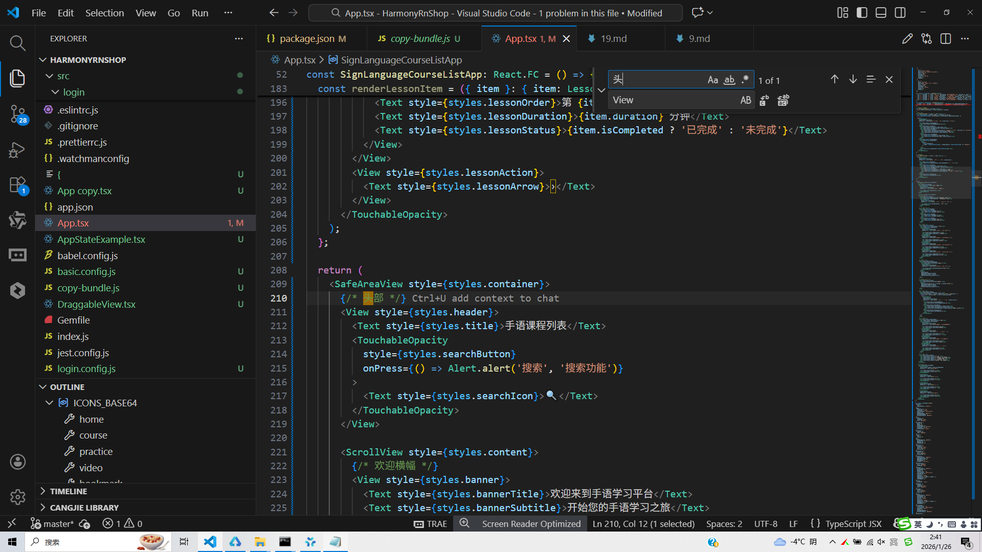
打包
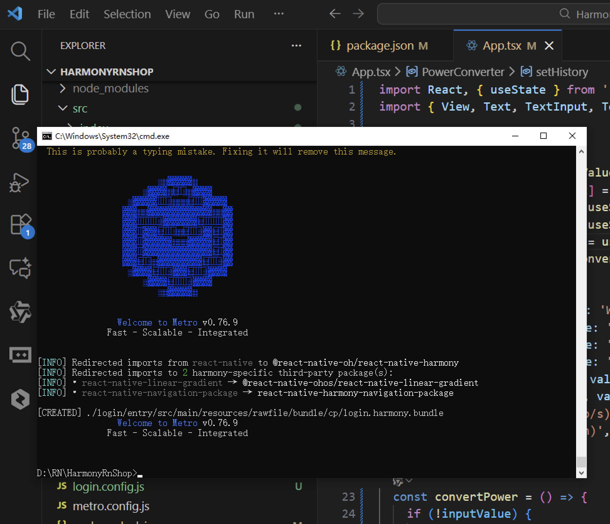
接下来通过打包命令npn run harmony将reactNative的代码打包成为bundle,这样可以进行在开源鸿蒙OpenHarmony中进行使用。
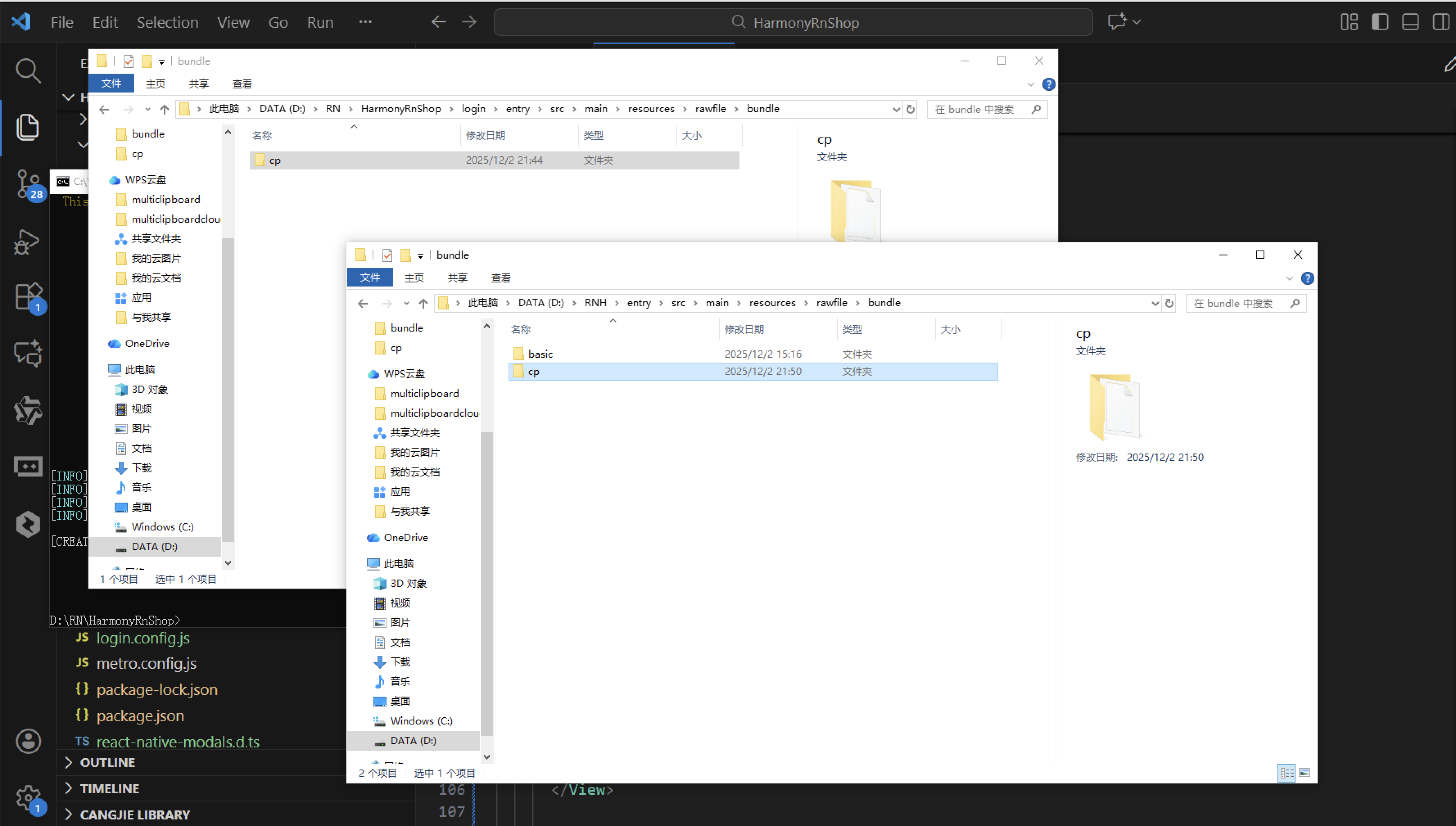
打包之后再将打包后的鸿蒙OpenHarmony文件拷贝到鸿蒙的DevEco-Studio工程目录去:
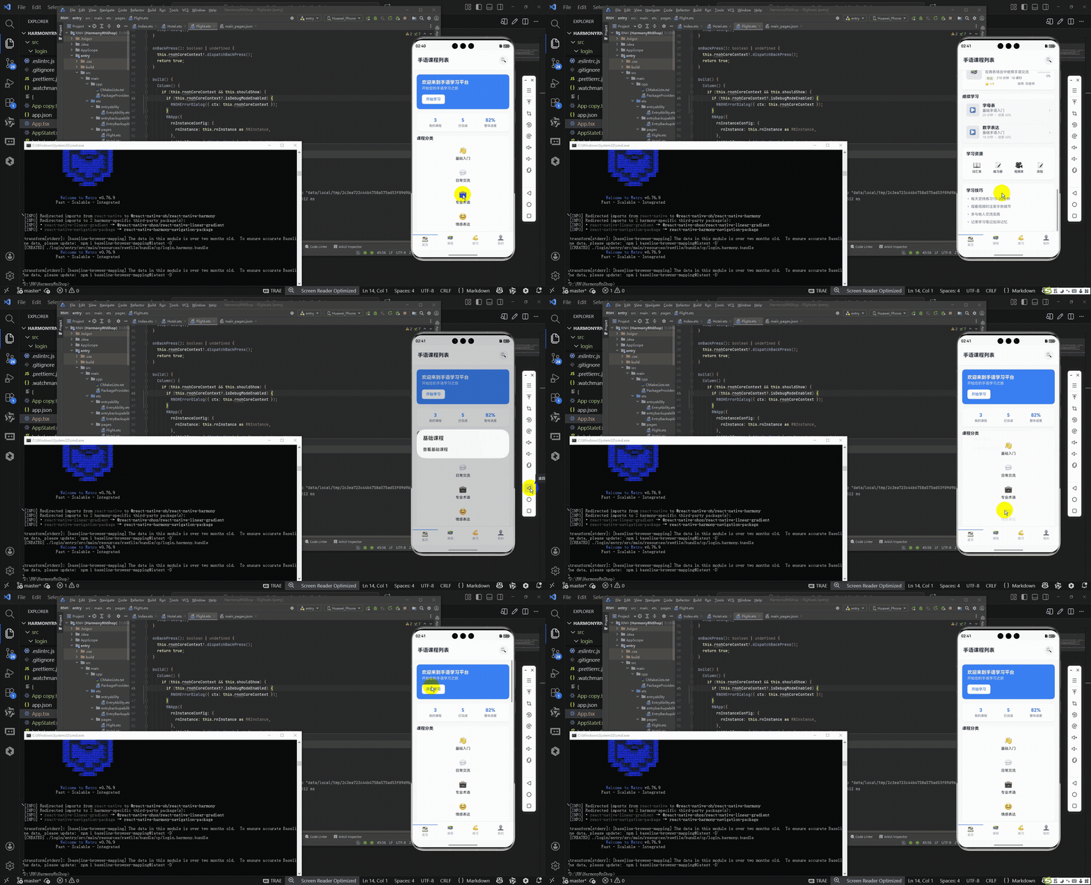
最后运行效果图如下显示:
本文以手语学习平台为例,探讨教育类应用的跨端开发方案。通过React Native与鸿蒙ArkTS的技术对比,提出"数据层复用、逻辑层复用、视图层重构"的迁移路径。文章详细拆解了三层级强类型数据模型(课程-章节-进度)的设计,展示了数据处理函数100%复用的可行性,并对比了核心UI组件的等价实现方式。重点分析了动态列表渲染、网格布局、底部导航等教育应用典型场景的跨端适配方案,为垂直领域应用开发提供技术参考。
开源鸿蒙跨平台开发社区汇聚开发者与厂商,共建“一次开发,多端部署”的开源生态,致力于降低跨端开发门槛,推动万物智联创新。
更多推荐
 23
23 0
0- 0


 已为社区贡献95条内容

所有评论(0)