HarmonyOS开发实战:小分享-BottomTabBar自定义底部导航栏组件
前言
欢迎加入开源鸿蒙跨平台社区:https://openharmonycrossplatform.csdn.net
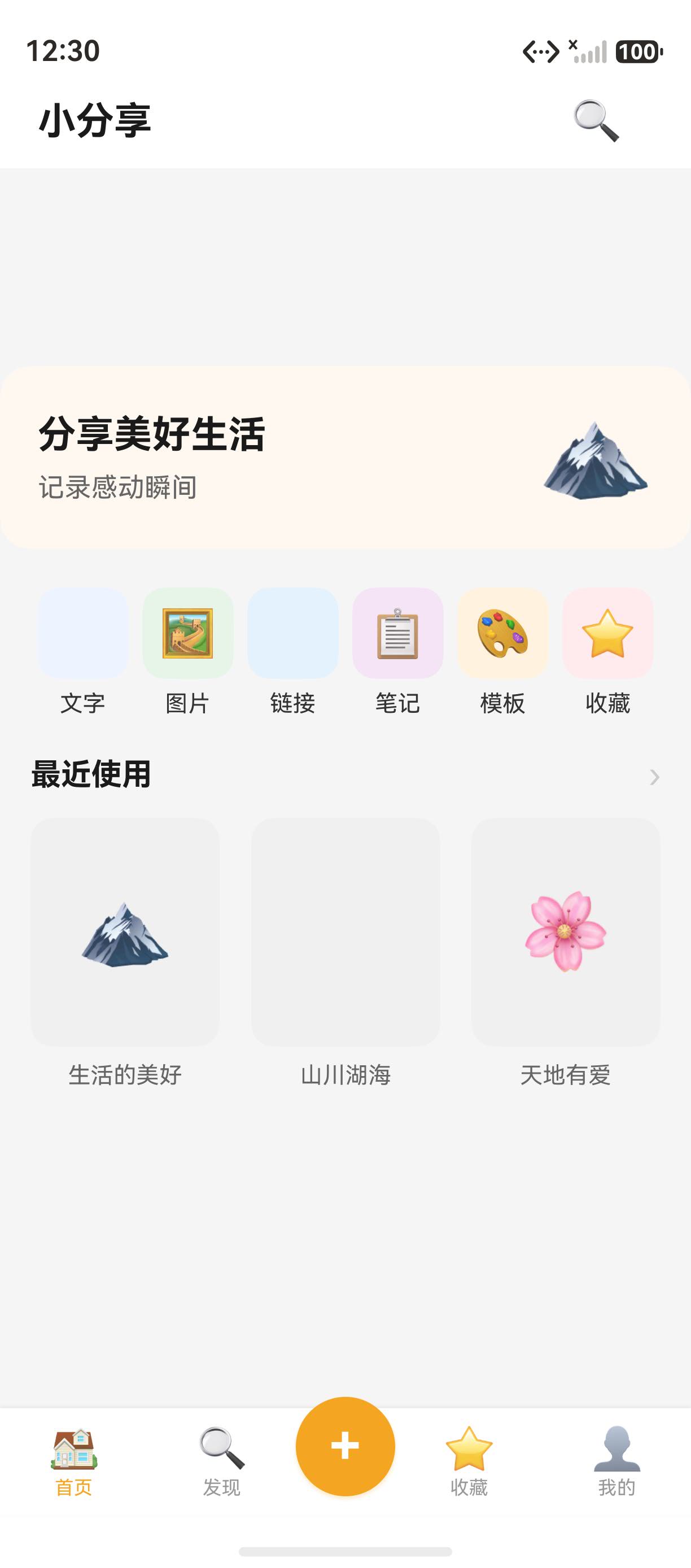
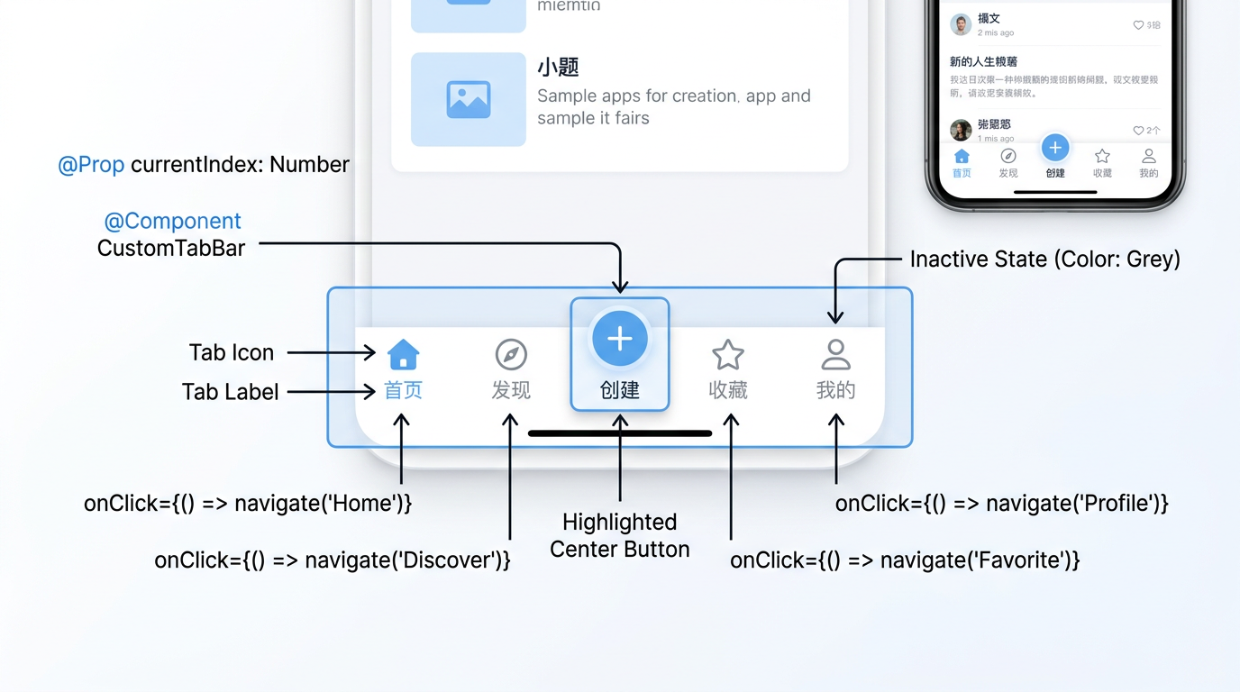
底部导航栏 是移动应用的核心交互组件,让用户在不同的主页面间快速切换。小分享 App 的 BottomTabBar 采用自定义组件方案,包含 5 个 Tab 和一个中间凸起的 + 按钮。本篇全面拆解其实现,涵盖 @Component 组件封装、@Prop 参数传递、凸起按钮设计、Tab 切换路由等关键知识点。详细 API 可参考 HarmonyOS Row 组件官方文档。
一、BottomTabBar 完整代码
1.1 组件定义
小分享 App 的 BottomTabBar 组件定义在 components/BottomTabBar.ets 中,完整的实现代码如下:
import router from '@ohos.router';
import { TabItem } from '../common/interfaces';

@Preview
@Component
export struct BottomTabBar {
  @Prop currentIndex: number = 0;

  private tabItems: Array<TabItem> = [
    { icon: '🏠', label: '首页' },
    { icon: '🔍', label: '发现' },
    { icon: '➕', label: '' },
    { icon: '⭐', label: '收藏' },
    { icon: '👤', label: '我的' }
  ];

  build() {
    Row() {
      ForEach(this.tabItems, (item: TabItem, index: number) => {
        if (index === 2) {
          // 中间 + 按钮(凸起设计)
          Column() {
            Text('+')
              .fontSize(28)
              .fontColor(Color.White)
              .fontWeight(FontWeight.Bold)
          }
          .width(52).height(52)
          .backgroundColor('#F5A623')
          .borderRadius(26)
          .justifyContent(FlexAlign.Center)
          .alignItems(HorizontalAlign.Center)
          .margin({ top: -16 })
          .shadow({ radius: 8, color: '#40F5A623', offsetY: 4 })
          .onClick(() => {
            router.pushUrl({ url: 'pages/CreateSelectPage' })
          })
        } else {
          // 普通 Tab 项
          Column({ space: 2 }) {
            Text(item.icon).fontSize(22)
            Text(item.label)
              .fontSize(10)
              .fontColor(index === this.currentIndex ? '#F5A623' : '#999999')
          }
          .layoutWeight(1)
          .justifyContent(FlexAlign.Center)
          .alignItems(HorizontalAlign.Center)
          .onClick(() => {
            this.onTabClick(index)
          })
        }
      }, (item: TabItem, index: number) => `${item.label}_${index}`)
    }
    .width('100%').height(56)
    .backgroundColor(Color.White)
    .shadow({ radius: 4, color: '#10000000', offsetY: -2 })
  }

  private onTabClick(index: number): void {
    const pages: string[] = ['pages/HomePage', 'pages/DiscoverPage', '',
      'pages/FavoritesPage', 'pages/ProfilePage'];
    const targetPage = pages[index];
    if (targetPage) {
      router.replaceUrl({ url: targetPage })
    }
  }
}
1.2 TabItem 接口定义
TabItem 接口定义在 common/interfaces.ets 中,作为底部导航栏的数据模型:
export interface TabItem {
  icon: string;    // 图标 Emoji
  label: string;   // 标签文字
}
二、五种 Tab 设计与布局
2.1 Tab 列表
BottomTabBar 包含 5 个 Tab,每个 Tab 对应一个主页面:
| 索引 | 图标 | 标签 | 跳转页面 | 渲染方式 |
|---|---|---|---|---|
| 0 | 🏠 | 首页 | pages/HomePage |
普通 Tab |
| 1 | 🔍 | 发现 | pages/DiscoverPage |
普通 Tab |
| 2 | ➕ | (空) | pages/CreateSelectPage |
凸起按钮 |
| 3 | ⭐ | 收藏 | pages/FavoritesPage |
普通 Tab |
| 4 | 👤 | 我的 | pages/ProfilePage |
普通 Tab |
2.2 ForEach 循环渲染
使用 ForEach 循环渲染 5 个 Tab,通过 index 判断是否为中间按钮:
ForEach(this.tabItems, (item: TabItem, index: number) => {
  if (index === 2) {
    // 渲染凸起 + 按钮
  } else {
    // 渲染普通 Tab 项
  }
}, (item: TabItem, index: number) => `${item.label}_${index}`)
2.3 代码块示例:条件渲染
// 条件渲染的两种模式
if (index === 2) {
  // 模式 A:凸起 + 按钮
  this.renderCenterButton()
} else {
  // 模式 B:普通 Tab
  this.renderNormalTab(index)
}
三、中间凸起按钮实现
3.1 凸起核心代码
中间 + 按钮是 BottomTabBar 的视觉焦点,代码如下:
Column() {
  Text('+')
    .fontSize(28)
    .fontColor(Color.White)
    .fontWeight(FontWeight.Bold)
}
.width(52).height(52)
.backgroundColor('#F5A623')
.borderRadius(26)
.margin({ top: -16 })
.shadow({ radius: 8, color: '#40F5A623', offsetY: 4 })
3.2 凸起原理
margin({ top: -16 }) 让按钮向上偏移 16vp,超出底部导航栏范围:
BottomTabBar 高度 56vp
          ┌─────────────┐
          │     + 52×52  │  ← margin({top: -16}) 上移 16vp
          │   ┌─────┐   │
 Home     │  │  +  │    │  Favorites
          │   └─────┘   │
          └─────────────┘
3.3 阴影效果
凸起按钮的阴影效果通过 shadow 属性实现:
.shadow({
  radius: 8,              // 阴影半径 8vp
  color: '#40F5A623',     // 半透明主色阴影
  offsetY: 4              // 向下偏移 4vp
})
提示:
shadow属性的color使用十六进制 ARGB 格式,前两位是透明度(alpha),#40表示 25% 不透明度。
四、@Prop currentIndex 控制高亮
4.1 高亮逻辑
Tab 的高亮态通过 @Prop currentIndex 控制,当 index === currentIndex 时文字变为主色:
Text(item.label)
  .fontSize(10)
  .fontColor(index === this.currentIndex ? '#F5A623' : '#999999')
4.2 高亮状态对比
| 状态 | 条件 | 文字颜色 | 视觉效果 |
|---|---|---|---|
| 选中 | index === currentIndex |
#F5A623 (橙色) |
突出显示 |
| 未选中 | index !== currentIndex |
#999999 (灰色) |
正常显示 |
4.3 @Prop 装饰器
@Prop 用于父组件向子组件传递数据,实现单向数据流:
// 父组件(HomePage)
@State currentTab: number = 0
BottomTabBar({ currentIndex: this.currentTab })

// 子组件(BottomTabBar)
@Prop currentIndex: number = 0
五、Tab 切换路由策略
5.1 onTabClick 方法
Tab 切换时调用 onTabClick 方法,使用 replaceUrl 避免路由栈膨胀:
private onTabClick(index: number): void {
  const pages: string[] = [
    'pages/HomePage',
    'pages/DiscoverPage',
    '',
    'pages/FavoritesPage',
    'pages/ProfilePage'
  ]
  const targetPage = pages[index]
  if (targetPage) {
    router.replaceUrl({ url: targetPage })
  }
}
5.2 路由 API 对比
Tab 切换使用 replaceUrl 而非 pushUrl,原因如下:
| API | 特性 | 适用场景 |
|---|---|---|
router.replaceUrl |
替换当前页,栈不变 | Tab 切换、启动页跳转 |
router.pushUrl |
新页入栈,可返回 | 列表→详情、编辑→预览 |
router.back() |
出栈返回 | 返回上一页 |
5.3 代码块示例:路由栈保护
// 当路由栈深度超过 30 时清空
if (router.getLength() > 30) {
  router.clear()
  router.replaceUrl({ url: 'pages/HomePage' })
}
六、底部阴影设计
6.1 阴影配置
底部导航栏的阴影让它看起来浮在内容之上:
.shadow({
  radius: 4,
  color: '#10000000',
  offsetY: -2    // 负值使阴影向上
})
提示:
offsetY: -2让阴影向上偏移,产生“浮起“的视觉效果。
七、组件引用与复用
7.1 在页面中引用
在首页中使用 BottomTabBar 组件:
import { BottomTabBar } from '../components/BottomTabBar';

@Entry
@Component
struct HomePage {
  build() {
    Column() {
      // 内容区域
      Scroll() { /* ... */ }
        .layoutWeight(1)

      // 底部导航栏
      BottomTabBar({ currentIndex: 0 })
    }
    .width('100%').height('100%')
    .backgroundColor('#F5F5F5')
  }
}
7.2 @Preview 装饰器
@Preview 装饰器允许在 DevEco Studio 中预览组件效果,无需编译运行:
@Preview
@Component
export struct BottomTabBar {
  // ...
}
八、扩展思考
8.1 更多自定义样式
// 自定义 Tab 字体大小
.fontSize('10fp')
// 自定义选中态颜色
.fontColor('#F5A623')
// 自定义背景色变化
.backgroundColor(this.currentIndex === index ? '#FFF3E0' : Color.White)
8.2 与 Tabs 组件对比
HarmonyOS 也提供了原生的 Tabs 组件,对比自定义方案:
| 对比维度 | 自定义 BottomTabBar | Tabs 组件 |
|---|---|---|
| 灵活性 | 完全自定义 | 固定样式 |
| 凸起按钮 | 支持 | 不支持 |
| 开发成本 | 较高 | 较低 |
| 动画 | 需手动实现 | 内置 |
九、常见问题
9.1 问题 1:Tab 点击无反应
原因:onTabClick 方法中 pages 数组索引越界或 targetPage 为空字符串。
解决:确保 pages 数组长度与 Tab 数量一致,空字符串跳过。
9.2 问题 2:凸起按钮位置偏移
原因:margin({ top: -16 }) 与其他布局属性冲突。
解决:确保凸起按钮的父容器没有设置 overflow: hidden。
十、核心知识点
10.1 技术要点
- 使用
@Component和@Prop封装可复用的底部导航组件 ForEach循环渲染 + 条件判断实现不同 Tab 样式margin({ top: -16 })实现凸起按钮效果router.replaceUrl避免 Tab 切换时路由栈膨胀
10.2 实战建议
- 中间凸起按钮的
margin({top: -16})值需根据导航栏高度调整 - Tab 切换时用
replaceUrl而非pushUrl,避免栈溢出 - 所有 Tab 页面路径集中管理在
pages数组中
总结
本文详细拆解了小分享 App BottomTabBar 自定义底部导航栏组件的完整实现,从 Tab 布局、凸起按钮、@Prop 高亮、路由切换 到 组件复用,涵盖了底部导航栏的全部核心知识点。下一篇我们将深入 @State 与 @Prop 状态管理,讲解 Tab 高亮联动的实现原理。
附录:完整代码索引
本文涉及的所有代码片段均来自小分享 App 的以下文件:
| 文件路径 | 说明 |
|---|---|
components/BottomTabBar.ets |
底部导航栏组件 |
common/interfaces.ets |
TabItem 接口定义 |
pages/HomePage.ets |
首页(使用 BottomTabBar) |
pages/DiscoverPage.ets |
发现页(使用 BottomTabBar) |
pages/FavoritesPage.ets |
收藏页(使用 BottomTabBar) |
pages/ProfilePage.ets |
个人中心(使用 BottomTabBar) |
以上代码均可在小分享 App 工程中查看完整实现。
- 第一步:了解组件的基本用法
- 第二步:掌握组件的核心属性
如果这篇文章对你有帮助,欢迎点赞👍、收藏⭐、关注🔔,你的支持是我持续创作的动力!
开源鸿蒙跨平台开发社区汇聚开发者与厂商,共建“一次开发,多端部署”的开源生态,致力于降低跨端开发门槛,推动万物智联创新。
更多推荐


 5
5 0
0- 0


 已为社区贡献12条内容

所有评论(0)