【精通篇】打造React Native鸿蒙基于HarmonyOS API 24跨平台开发高级复合组件库开发系列:步进器(Stepper)可以增加或减少数值的UI组件
本文是基于HarmonyOS API 24的进行的React Native跨平台技术实战项目
React Native 跨端鸿蒙开发,行业简称 RNOH(React Native OpenHarmony),是社区 + 华为共建的适配层方案:把 Meta 的 React Native 框架完整移植到鸿蒙(HarmonyOS NEXT / OpenHarmony),让一套 React/JS/TS 代码,同时运行在Android、iOS、鸿蒙手机 / 平板 / PC多端,属于原生级跨端方案,区别于 WebView 套壳网页方案。
简单一句话:前端工程师不用学 ArkTS,用熟悉的 React 语法写业务,底层自动映射成鸿蒙 ArkUI 原生控件,打包成鸿蒙标准 hap 应用上架应用市场。
它的核心定位可以概括为:不改变 React/TypeScript 前端研发习惯,复用现有 RN 业务代码资产,依托鸿蒙系统底层接口做一层高性能中间适配层,将 JSX 组件、JS 业务逻辑映射为鸿蒙原生 ArkUI 控件,最终构建可在手机、平板、车机、智慧屏、PC 等全鸿蒙设备运行、支持上架华为应用市场的原生级应用。和 UniApp、WebView 套壳等网页类跨端方案有本质区别,RNOH 不依赖浏览器内核渲染页面,所有 UI 渲染、手势交互、视图层级全部交给鸿蒙系统原生图形引擎处理,不存在网页性能瓶颈、样式兼容偏差等问题。
兼容完整 React 生态、Hooks、JSX、RN 标准组件,前端工程师无需学习 ArkTS、ArkUI 声明式语法,仅需少量平台兼容代码即可完成多端适配;底层打通鸿蒙 NAPI、ArkUI C 底层接口,兼顾代码复用性与鸿蒙原生能力调用,核心面向存量 RN App 快速新增鸿蒙渠道,是前端团队切入鸿蒙生态最低成本的技术路线。
在React Native中实现一个步进器(Stepper),通常指的是一个可以增加或减少数值的UI组件。虽然React Native原生不直接提供Stepper组件,你可以通过组合使用一些基本的UI组件(如TouchableOpacity、Text和View)来自定义一个步进器。下面是如何实现一个基本的步进器组件的步骤:
- 创建Stepper组件
首先,创建一个名为Stepper.js的React组件文件,然后在这个文件中定义你的步进器。
import React, { useState } from 'react';
import { View, Text, TouchableOpacity, StyleSheet } from 'react-native';

const Stepper = ({ initialValue = 0, step = 1, min = 0, max }) => {
  const [value, setValue] = useState(initialValue);

  const decrease = () => {
    if (value - step >= min) {
      setValue(value - step);
    }
  };

  const increase = () => {
    if (max === undefined || value + step <= max) {
      setValue(value + step);
    }
  };

  return (
    <View style={styles.container}>
      <TouchableOpacity onPress={decrease} style={styles.button}>
        <Text>-</Text>
      </TouchableOpacity>
      <Text style={styles.value}>{value}</Text>
      <TouchableOpacity onPress={increase} style={styles.button}>
        <Text>+</Text>
      </TouchableOpacity>
    </View>
  );
};

const styles = StyleSheet.create({
  container: {
    flexDirection: 'row',
    alignItems: 'center',
    justifyContent: 'space-between',
    borderWidth: 1,
    borderColor: 'ccc',
    borderRadius: 5,
    paddingHorizontal: 10,
  },
  button: {
    padding: 10,
  },
  value: {
    fontSize: 18,
  },
});

export default Stepper;
- 使用Stepper组件
在你的应用中,你可以通过导入并使用Stepper组件来展示它。例如:
import React from 'react';
import { View } from 'react-native';
import Stepper from './Stepper'; // 确保路径正确

const App = () => {
  return (
    <View style={{ flex: 1, justifyContent: 'center', alignItems: 'center' }}>
      <Stepper initialValue={5} step={2} min={0} max={10} />
    </View>
  );
};

export default App;
- 调整样式和功能(可选)
你可以根据需要调整Stepper组件的样式和功能,比如增加禁用按钮的功能,或者在达到最大值或最小值时改变按钮颜色等。你可以通过修改styles对象或增加更多的状态逻辑来实现这些功能。例如,你可以在达到最大值时禁用增加按钮,达到最小值时禁用减少按钮:
const Stepper = ({ initialValue = 0, step = 1, min = 0, max }) => {
  const [value, setValue] = useState(initialValue);
  const isMaxReached = max !== undefined && value >= max; // 检查是否到达最大值
  const isMinReached = value <= min; // 检查是否到达最小值
  // ... 其他代码保持不变 ...
};
然后根据isMaxReached和isMinReached的值来调整按钮的样式或禁用状态。例如,你可以使用disabled属性或者在按钮上显示不同的图标来表示当前的状态。
通过这种方式,你可以在React Native中创建一个功能齐全的步进器组件,适用于各种应用场景。
真实案例演示效果:
import React, { useState } from 'react';
import { View, Text, StyleSheet, ScrollView, Dimensions, TouchableOpacity } from 'react-native';

// Simple Icon Component using Unicode symbols
interface IconProps {
  name: string;
  size?: number;
  color?: string;
  style?: object;
}

const Icon: React.FC<IconProps> = ({
  name,
  size = 24,
  color = '#333333',
  style
}) => {
  const getIconSymbol = () => {
    switch (name) {
      case 'minus': return '−';
      case 'plus': return '+';
      case 'cart': return '🛒';
      case 'box': return '📦';
      case 'user': return '👤';
      case 'ticket': return '🎟️';
      case 'coin': return '💰';
      case 'gift': return '🎁';
      default: return '+';
    }
  };

  return (
    <View style={[{ width: size, height: size, justifyContent: 'center', alignItems: 'center' }, style]}>
      <Text style={{ fontSize: size * 0.8, color, includeFontPadding: false, textAlign: 'center' }}>
        {getIconSymbol()}
      </Text>
    </View>
  );
};

// Stepper Component
interface StepperProps {
  value: number;
  onChange: (value: number) => void;
  min?: number;
  max?: number;
  step?: number;
  disabled?: boolean;
  showBorder?: boolean;
  size?: 'small' | 'medium' | 'large';
  iconType?: 'default' | 'cart' | 'box' | 'user';
}

const Stepper: React.FC<StepperProps> = ({
  value,
  onChange,
  min = 0,
  max = 99,
  step = 1,
  disabled = false,
  showBorder = true,
  size = 'medium',
  iconType = 'default'
}) => {
  const getSizeStyles = () => {
    switch (size) {
      case 'small':
        return { width: 30, height: 30, fontSize: 16 };
      case 'large':
        return { width: 50, height: 50, fontSize: 24 };
      default:
        return { width: 40, height: 40, fontSize: 20 };
    }
  };

  const buttonSize = getSizeStyles();

  const increment = () => {
    if (disabled || value >= max) return;
    onChange(Math.min(max, value + step));
  };

  const decrement = () => {
    if (disabled || value <= min) return;
    onChange(Math.max(min, value - step));
  };

  const getIconName = () => {
    switch (iconType) {
      case 'cart': return 'cart';
      case 'box': return 'box';
      case 'user': return 'user';
      default: return undefined;
    }
  };

  return (
    <View style={[styles.stepperContainer, !showBorder && styles.stepperNoBorder]}>
      <TouchableOpacity
        style={[
          styles.button,
          buttonSize,
          (disabled || value <= min) && styles.buttonDisabled
        ]}
        onPress={decrement}
        disabled={disabled || value <= min}
        activeOpacity={disabled || value <= min ? 1 : 0.7}
      >
        <Icon
          name="minus"
          size={buttonSize.fontSize * 0.8}
          color={disabled || value <= min ? '#cccccc' : '#1890ff'}
        />
      </TouchableOpacity>

      <View style={[styles.valueContainer, buttonSize]}>
        {getIconName() && (
          <Icon
            name={getIconName()!}
            size={buttonSize.fontSize * 0.6}
            color="#999999"
            style={styles.valueIcon}
          />
        )}
        <Text style={[
          styles.valueText,
          { fontSize: buttonSize.fontSize * 0.7 },
          disabled && styles.valueTextDisabled
        ]}>
          {value}
        </Text>
      </View>

      <TouchableOpacity
        style={[
          styles.button,
          buttonSize,
          (disabled || value >= max) && styles.buttonDisabled
        ]}
        onPress={increment}
        disabled={disabled || value >= max}
        activeOpacity={disabled || value >= max ? 1 : 0.7}
      >
        <Icon
          name="plus"
          size={buttonSize.fontSize * 0.8}
          color={disabled || value >= max ? '#cccccc' : '#1890ff'}
        />
      </TouchableOpacity>
    </View>
  );
};

// Main App Component
const StepperComponentApp = () => {
  const [quantity, setQuantity] = useState(1);
  const [people, setPeople] = useState(2);
  const [tickets, setTickets] = useState(0);
  const [coins, setCoins] = useState(10);
  const [gifts, setGifts] = useState(1);

  return (
    <ScrollView style={styles.container}>
      <View style={styles.header}>
        <Text style={styles.headerTitle}>步进器组件</Text>
        <Text style={styles.headerSubtitle}>美观实用的数量调节控件</Text>
      </View>

      <View style={styles.section}>
        <Text style={styles.sectionTitle}>基础用法</Text>
        <View style={styles.stepperGroupsContainer}>
          <View style={styles.stepperGroup}>
            <Text style={styles.stepperLabel}>商品数量</Text>
            <Stepper
              value={quantity}
              onChange={setQuantity}
              min={1}
              max={99}
              iconType="cart"
            />
            <View style={styles.valueDisplay}>
              <Text style={styles.valueDisplayText}>当前数量: {quantity}</Text>
            </View>
          </View>

          <View style={styles.stepperGroup}>
            <Text style={styles.stepperLabel}>人员数量</Text>
            <Stepper
              value={people}
              onChange={setPeople}
              min={1}
              max={20}
              iconType="user"
            />
            <View style={styles.valueDisplay}>
              <Text style={styles.valueDisplayText}>当前人数: {people}</Text>
            </View>
          </View>
        </View>
      </View>

      <View style={styles.section}>
        <Text style={styles.sectionTitle}>不同尺寸</Text>
        <View style={styles.stepperGroupsContainer}>
          <View style={styles.stepperGroup}>
            <Text style={styles.stepperLabel}>小尺寸</Text>
            <Stepper
              value={tickets}
              onChange={setTickets}
              size="small"
              iconType="ticket"
            />
          </View>

          <View style={styles.stepperGroup}>
            <Text style={styles.stepperLabel}>中等尺寸</Text>
            <Stepper
              value={coins}
              onChange={setCoins}
              size="medium"
              iconType="coin"
            />
          </View>

          <View style={styles.stepperGroup}>
            <Text style={styles.stepperLabel}>大尺寸</Text>
            <Stepper
              value={gifts}
              onChange={setGifts}
              size="large"
              iconType="gift"
            />
          </View>
        </View>
      </View>

      <View style={styles.section}>
        <Text style={styles.sectionTitle}>特殊状态</Text>
        <View style={styles.stepperGroupsContainer}>
          <View style={styles.stepperGroup}>
            <Text style={styles.stepperLabel}>禁用状态</Text>
            <Stepper
              value={3}
              onChange={() => {}}
              disabled
              iconType="box"
            />
          </View>

          <View style={styles.stepperGroup}>
            <Text style={styles.stepperLabel}>无边框样式</Text>
            <Stepper
              value={5}
              onChange={() => {}}
              showBorder={false}
              iconType="cart"
            />
          </View>
        </View>
      </View>

      <View style={styles.section}>
        <Text style={styles.sectionTitle}>购物车示例</Text>
        <View style={styles.cartSection}>
          <View style={styles.cartItem}>
            <Text style={styles.cartItemName}>苹果 iPhone 15</Text>
            <View style={styles.cartItemControls}>
              <Text style={styles.cartItemPrice}>¥6999</Text>
              <Stepper
                value={1}
                onChange={() => {}}
                min={1}
                max={5}
                size="small"
              />
            </View>
          </View>

          <View style={styles.cartItem}>
            <Text style={styles.cartItemName}>小米电视 65寸</Text>
            <View style={styles.cartItemControls}>
              <Text style={styles.cartItemPrice}>¥4999</Text>
              <Stepper
                value={1}
                onChange={() => {}}
                min={1}
                max={3}
                size="small"
              />
            </View>
          </View>

          <View style={styles.cartSummary}>
            <Text style={styles.cartTotalText}>总计: ¥11998</Text>
            <TouchableOpacity style={styles.checkoutButton}>
              <Text style={styles.checkoutButtonText}>去结算</Text>
            </TouchableOpacity>
          </View>
        </View>
      </View>

      <View style={styles.section}>
        <Text style={styles.sectionTitle}>功能演示</Text>
        <View style={styles.demosContainer}>
          <View style={styles.demoItem}>
            <Icon name="plus" size={24} color="#1890ff" style={styles.demoIcon} />
            <View>
              <Text style={styles.demoTitle}>数量调节</Text>
              <Text style={styles.demoDesc}>支持增加和减少数值</Text>
            </View>
          </View>

          <View style={styles.demoItem}>
            <Icon name="cart" size={24} color="#52c41a" style={styles.demoIcon} />
            <View>
              <Text style={styles.demoTitle}>多种尺寸</Text>
              <Text style={styles.demoDesc}>支持小、中、大三种尺寸</Text>
            </View>
          </View>

          <View style={styles.demoItem}>
            <Icon name="user" size={24} color="#722ed1" style={styles.demoIcon} />
            <View>
              <Text style={styles.demoTitle}>图标集成</Text>
              <Text style={styles.demoDesc}>支持多种图标类型</Text>
            </View>
          </View>
        </View>
      </View>

      <View style={styles.usageSection}>
        <Text style={styles.sectionTitle}>使用方法</Text>
        <View style={styles.codeBlock}>
          <Text style={styles.codeText}>{'<Stepper'}</Text>
          <Text style={styles.codeText}>  value={'{quantity}'}</Text>
          <Text style={styles.codeText}>  onChange={'{setQuantity}'}</Text>
          <Text style={styles.codeText}>  min={'{1}'} max={'{99}'}{'\n'}/></Text>
        </View>
        <Text style={styles.description}>
          Stepper组件提供了完整的步进器功能,包括数值增减、范围限制、多种尺寸和图标支持。
          通过value控制当前值,onChange处理值变化,支持自定义样式和图标。
        </Text>
      </View>

      <View style={styles.featuresSection}>
        <Text style={styles.sectionTitle}>功能特性</Text>
        <View style={styles.featuresList}>
          <View style={styles.featureItem}>
            <Icon name="plus" size={20} color="#1890ff" style={styles.featureIcon} />
            <Text style={styles.featureText}>数值增减</Text>
          </View>
          <View style={styles.featureItem}>
            <Icon name="cart" size={20} color="#52c41a" style={styles.featureIcon} />
            <Text style={styles.featureText}>多种尺寸</Text>
          </View>
          <View style={styles.featureItem}>
            <Icon name="user" size={20} color="#722ed1" style={styles.featureIcon} />
            <Text style={styles.featureText}>图标集成</Text>
          </View>
          <View style={styles.featureItem}>
            <Icon name="box" size={20} color="#fa8c16" style={styles.featureIcon} />
            <Text style={styles.featureText}>状态控制</Text>
          </View>
        </View>
      </View>

      <View style={styles.footer}>
        <Text style={styles.footerText}>© 2023 步进器组件 | 现代化UI组件库</Text>
      </View>
    </ScrollView>
  );
};

const { width } = Dimensions.get('window');

const styles = StyleSheet.create({
  container: {
    flex: 1,
    backgroundColor: '#fefefe',
  },
  header: {
    backgroundColor: '#ffffff',
    paddingVertical: 30,
    paddingHorizontal: 20,
    marginBottom: 10,
    borderBottomWidth: 1,
    borderBottomColor: '#e8e8e8',
  },
  headerTitle: {
    fontSize: 28,
    fontWeight: '700',
    color: '#262626',
    textAlign: 'center',
    marginBottom: 5,
  },
  headerSubtitle: {
    fontSize: 16,
    color: '#8c8c8c',
    textAlign: 'center',
  },
  section: {
    marginBottom: 25,
  },
  sectionTitle: {
    fontSize: 20,
    fontWeight: '700',
    color: '#262626',
    paddingHorizontal: 20,
    paddingBottom: 15,
  },
  stepperGroupsContainer: {
    backgroundColor: '#ffffff',
    marginHorizontal: 15,
    borderRadius: 12,
    padding: 20,
    elevation: 3,
    shadowColor: '#000',
    shadowOffset: { width: 0, height: 2 },
    shadowOpacity: 0.08,
    shadowRadius: 4,
    marginBottom: 10,
  },
  stepperGroup: {
    marginBottom: 25,
  },
  stepperGroupLast: {
    marginBottom: 0,
  },
  stepperLabel: {
    fontSize: 16,
    fontWeight: '500',
    color: '#262626',
    marginBottom: 15,
  },
  valueDisplay: {
    marginTop: 15,
    padding: 12,
    backgroundColor: '#e6f7ff',
    borderRadius: 8,
    borderWidth: 1,
    borderColor: '#91d5ff',
  },
  valueDisplayText: {
    fontSize: 16,
    color: '#1890ff',
    fontWeight: '500',
    textAlign: 'center',
  },
  cartSection: {
    backgroundColor: '#ffffff',
    marginHorizontal: 15,
    borderRadius: 12,
    padding: 20,
    elevation: 3,
    shadowColor: '#000',
    shadowOffset: { width: 0, height: 2 },
    shadowOpacity: 0.08,
    shadowRadius: 4,
  },
  cartItem: {
    flexDirection: 'row',
    justifyContent: 'space-between',
    alignItems: 'center',
    paddingVertical: 15,
    borderBottomWidth: 1,
    borderBottomColor: '#f0f0f0',
  },
  cartItemName: {
    fontSize: 16,
    color: '#262626',
    fontWeight: '500',
  },
  cartItemControls: {
    flexDirection: 'row',
    alignItems: 'center',
  },
  cartItemPrice: {
    fontSize: 16,
    color: '#ff4d4f',
    fontWeight: '600',
    marginRight: 15,
  },
  cartSummary: {
    flexDirection: 'row',
    justifyContent: 'space-between',
    alignItems: 'center',
    marginTop: 20,
  },
  cartTotalText: {
    fontSize: 18,
    color: '#262626',
    fontWeight: '700',
  },
  checkoutButton: {
    backgroundColor: '#1890ff',
    borderRadius: 6,
    paddingVertical: 10,
    paddingHorizontal: 20,
    elevation: 2,
    shadowColor: '#1890ff',
    shadowOffset: { width: 0, height: 2 },
    shadowOpacity: 0.2,
    shadowRadius: 4,
  },
  checkoutButtonText: {
    color: '#ffffff',
    fontSize: 16,
    fontWeight: '600',
  },
  demosContainer: {
    backgroundColor: '#ffffff',
    marginHorizontal: 15,
    borderRadius: 15,
    padding: 20,
    elevation: 3,
    shadowColor: '#000',
    shadowOffset: { width: 0, height: 2 },
    shadowOpacity: 0.08,
    shadowRadius: 4,
  },
  demoItem: {
    flexDirection: 'row',
    alignItems: 'center',
    marginBottom: 20,
  },
  demoItemLast: {
    marginBottom: 0,
  },
  demoIcon: {
    marginRight: 15,
  },
  demoTitle: {
    fontSize: 16,
    fontWeight: '600',
    color: '#262626',
    marginBottom: 3,
  },
  demoDesc: {
    fontSize: 14,
    color: '#8c8c8c',
  },
  usageSection: {
    backgroundColor: '#ffffff',
    marginHorizontal: 15,
    borderRadius: 15,
    padding: 20,
    marginBottom: 20,
    elevation: 3,
    shadowColor: '#000',
    shadowOffset: { width: 0, height: 2 },
    shadowOpacity: 0.08,
    shadowRadius: 4,
  },
  codeBlock: {
    backgroundColor: '#2b2b2b',
    borderRadius: 8,
    padding: 15,
    marginBottom: 15,
  },
  codeText: {
    fontFamily: 'monospace',
    color: '#e8e8e8',
    fontSize: 14,
    lineHeight: 22,
  },
  description: {
    fontSize: 15,
    color: '#595959',
    lineHeight: 22,
  },
  featuresSection: {
    backgroundColor: '#ffffff',
    marginHorizontal: 15,
    borderRadius: 15,
    padding: 20,
    marginBottom: 20,
    elevation: 3,
    shadowColor: '#000',
    shadowOffset: { width: 0, height: 2 },
    shadowOpacity: 0.08,
    shadowRadius: 4,
  },
  featuresList: {
    paddingLeft: 10,
  },
  featureItem: {
    flexDirection: 'row',
    alignItems: 'center',
    marginBottom: 15,
  },
  featureIcon: {
    marginRight: 15,
  },
  featureText: {
    fontSize: 16,
    color: '#262626',
  },
  footer: {
    paddingVertical: 20,
    alignItems: 'center',
  },
  footerText: {
    color: '#bfbfbf',
    fontSize: 14,
  },
  // Stepper Styles
  stepperContainer: {
    flexDirection: 'row',
    alignItems: 'center',
    borderWidth: 1,
    borderColor: '#d9d9d9',
    borderRadius: 6,
    alignSelf: 'flex-start',
  },
  stepperNoBorder: {
    borderWidth: 0,
  },
  button: {
    justifyContent: 'center',
    alignItems: 'center',
    backgroundColor: '#ffffff',
  },
  buttonDisabled: {
    backgroundColor: '#f5f5f5',
  },
  valueContainer: {
    justifyContent: 'center',
    alignItems: 'center',
    backgroundColor: '#ffffff',
    position: 'relative',
  },
  valueIcon: {
    position: 'absolute',
    top: 4,
    right: 4,
  },
  valueText: {
    color: '#262626',
    fontWeight: '500',
  },
  valueTextDisabled: {
    color: '#cccccc',
  },
});

export default StepperComponentApp;
分析这段React Native代码在鸿蒙开发中的逻辑实现:
从鸿蒙ArkUI开发角度分析,这段代码展示了一个典型的数值调节组件实现。在鸿蒙开发中,Stepper组件通过@State装饰器管理数值状态,使用@Builder构建UI布局。代码中的TouchableOpacity对应鸿蒙的Button组件,通过enabled属性控制按钮可用状态,onClick事件处理数值增减。
在鸿蒙架构中,Stepper组件的核心逻辑是通过@State装饰的数值变量实现双向绑定,当用户点击增减按钮时,触发onClick回调更新状态,界面自动刷新。边界控制通过min和max参数实现,当数值达到边界时自动禁用对应按钮。
图标组件采用Unicode符号实现,这与鸿蒙的Symbol组件设计理念相似。鸿蒙的Symbol组件提供丰富的图标库,可以通过$r(‘app.media.xxx’)引用资源图标。代码中的getIconSymbol方法对应鸿蒙的图标映射逻辑。
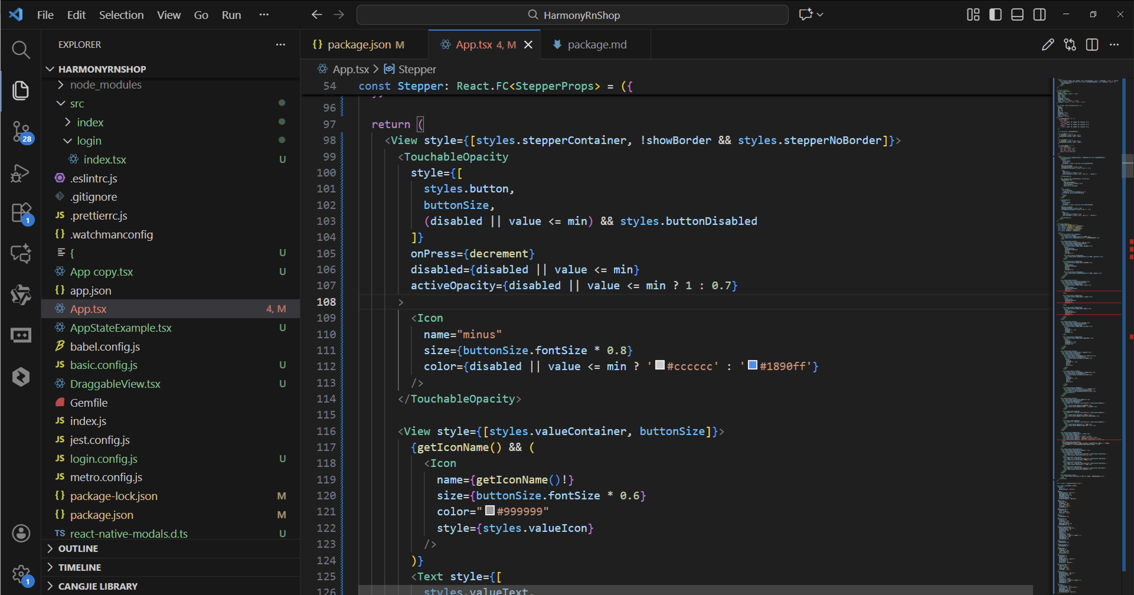
尺寸适配方面,鸿蒙通过ResourceManager实现多设备适配,类似代码中的getSizeStyles方法。鸿蒙Stepper组件支持size属性设置大小,包括small、medium、large三种预设尺寸。
状态管理采用受控组件模式,通过value和onChange实现父子组件通信,这与鸿蒙的@Prop和自定义事件机制对应。当数值变化时触发onChange回调,父组件更新状态后重新渲染。
组件样式通过StyleSheet集中管理,鸿蒙中对应的是@Styles装饰器和Resource资源管理。边框显示控制通过showBorder属性实现,鸿蒙中可以通过条件渲染或动态类名实现类似效果。
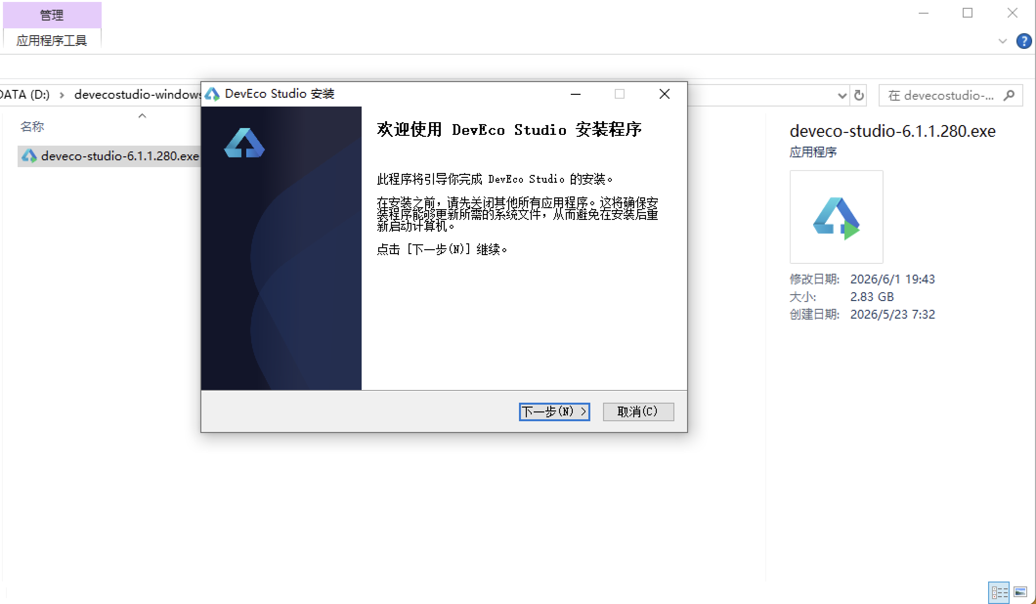
安装DevEco Studio程序
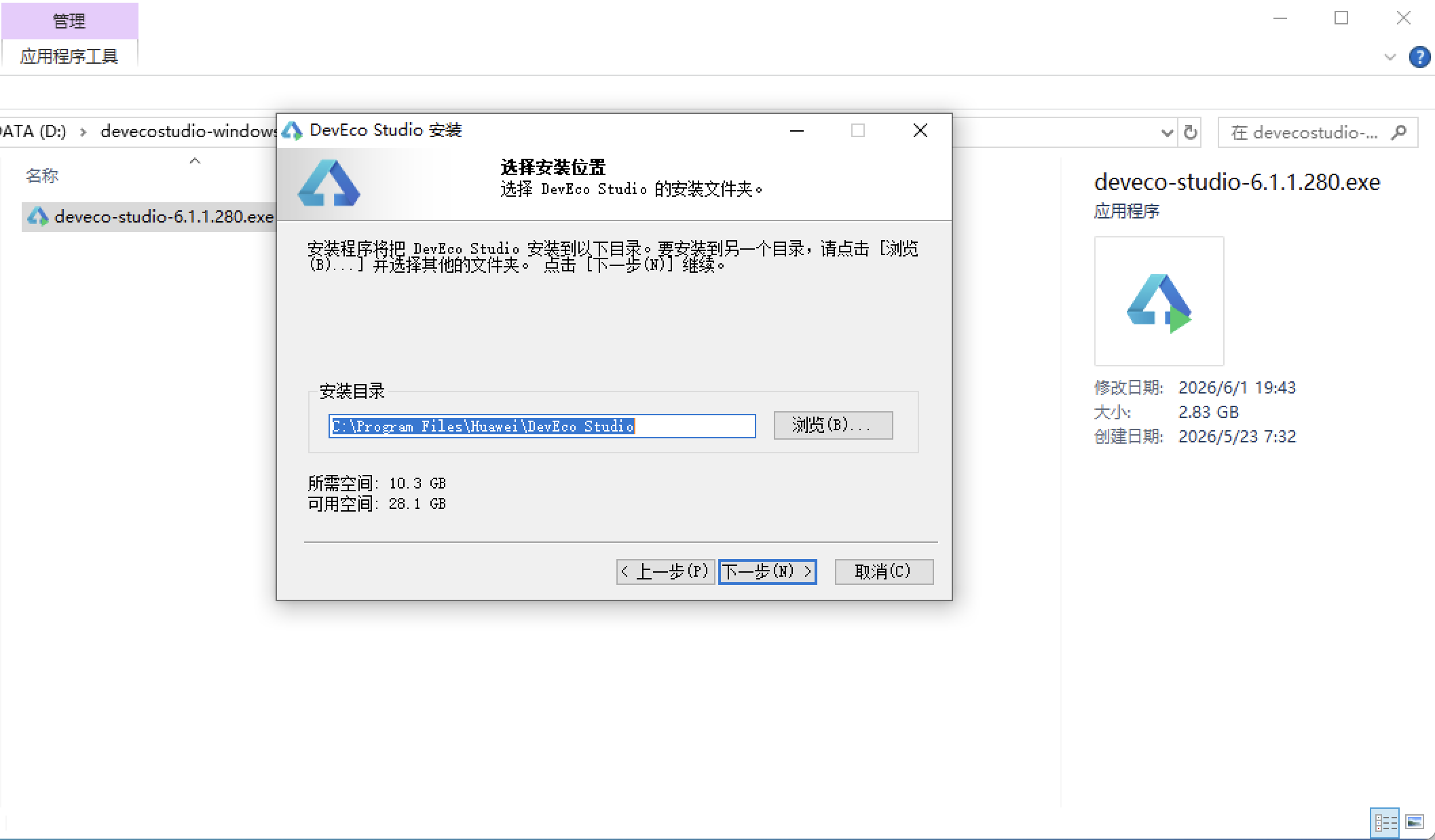
选择目标安装目录:
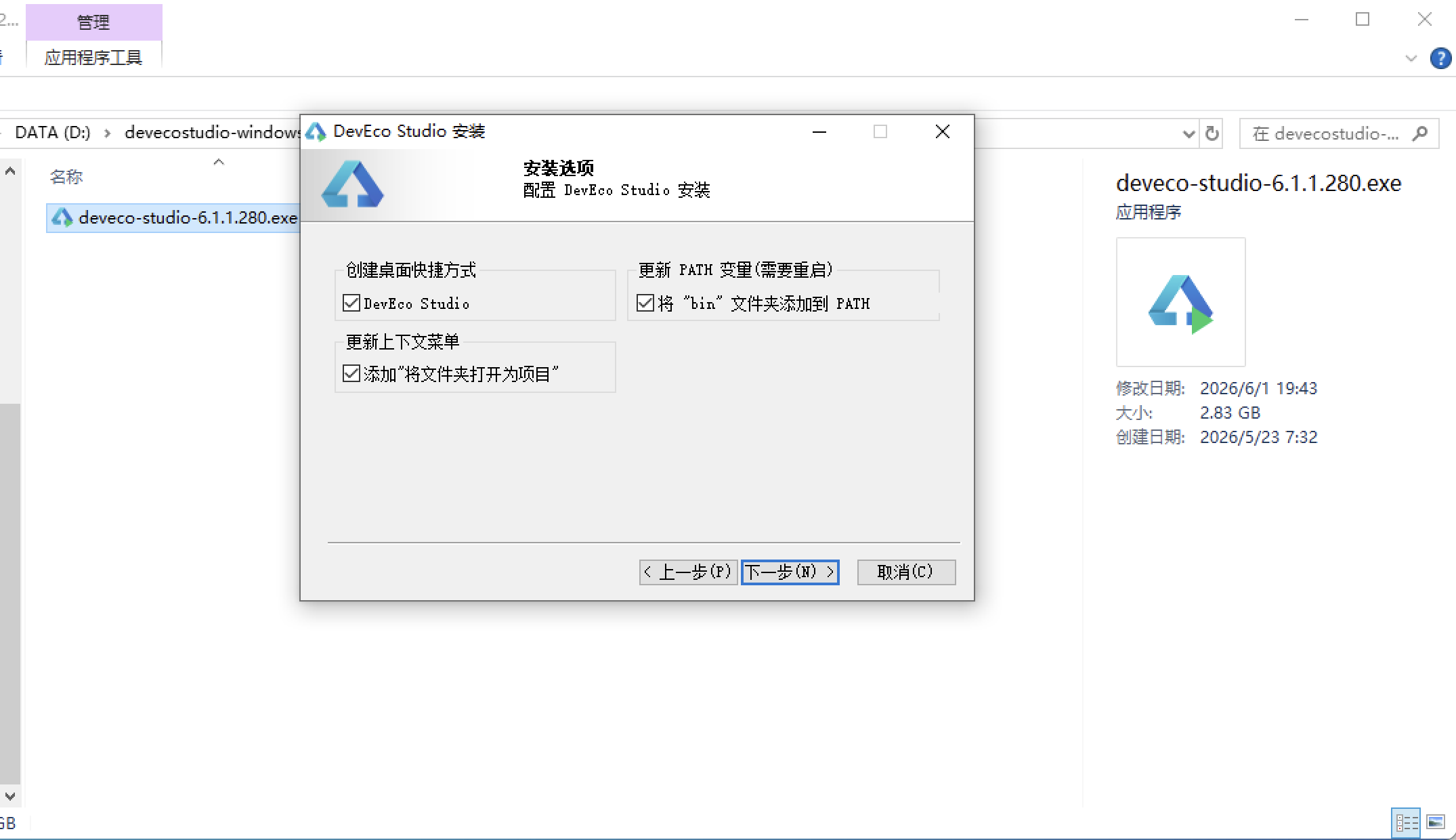
设置环境变量,但是需要重启一下:
新建一个空白模板:
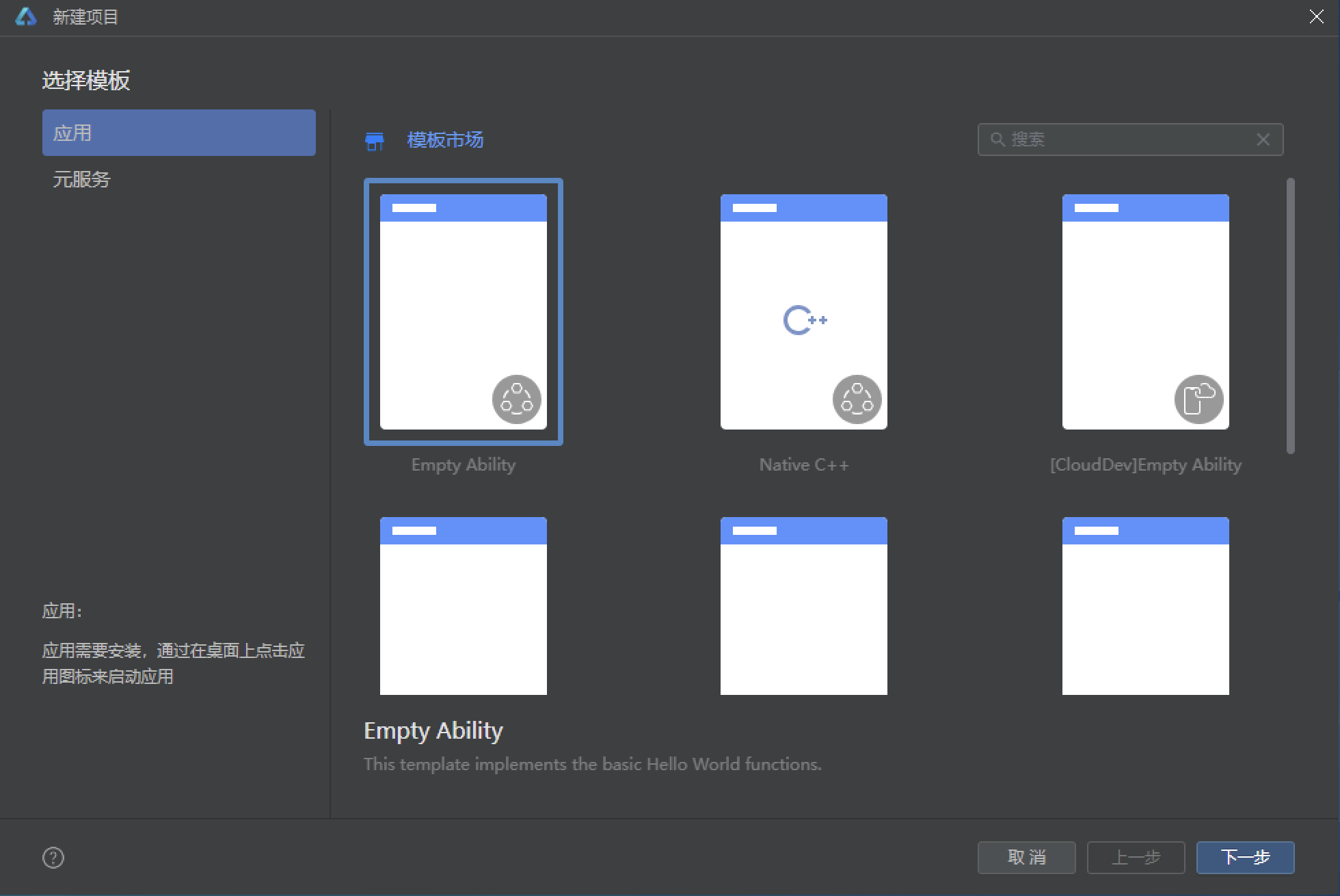
设置API为24的模板项目: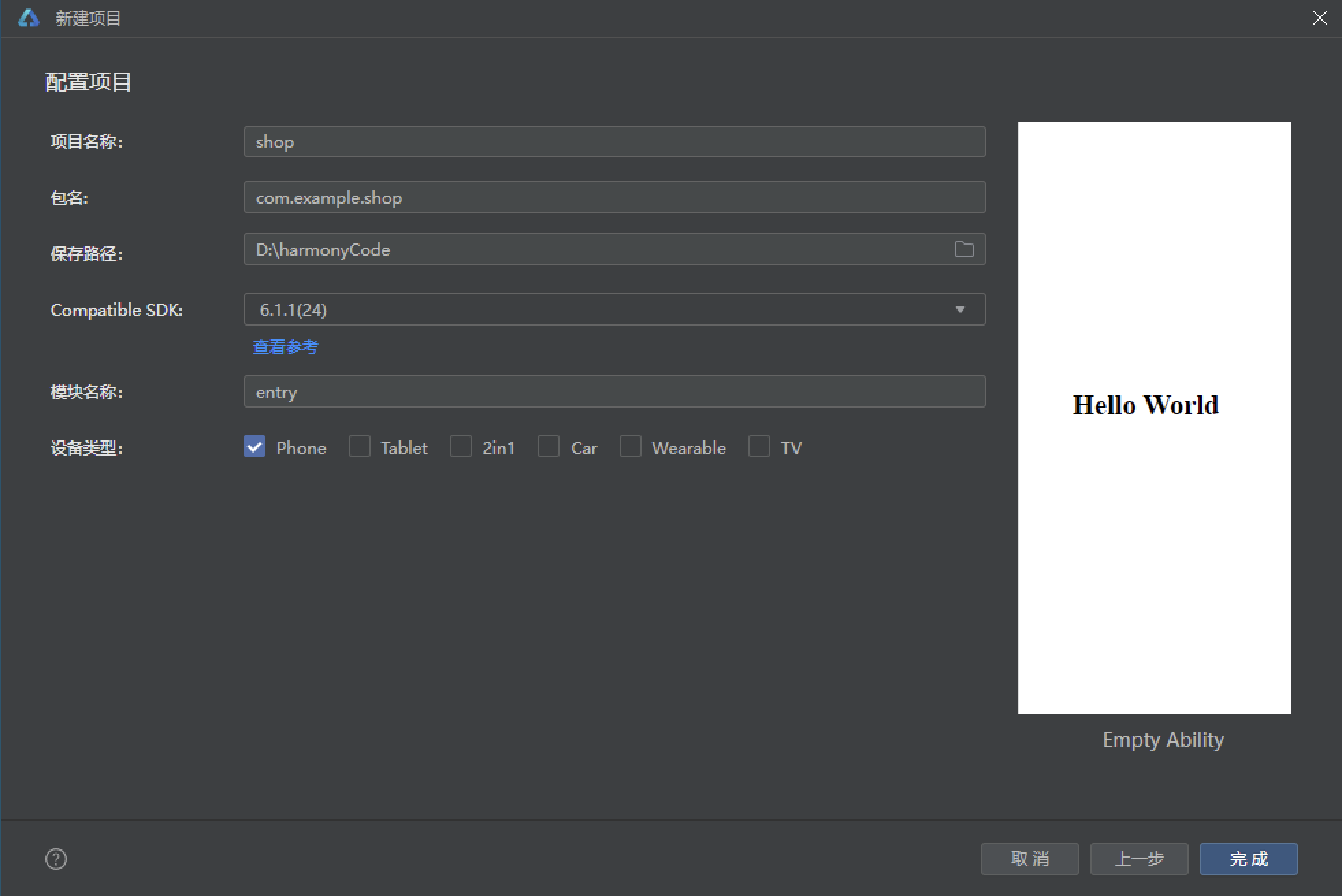
初始化项目,自动下载相关依赖:
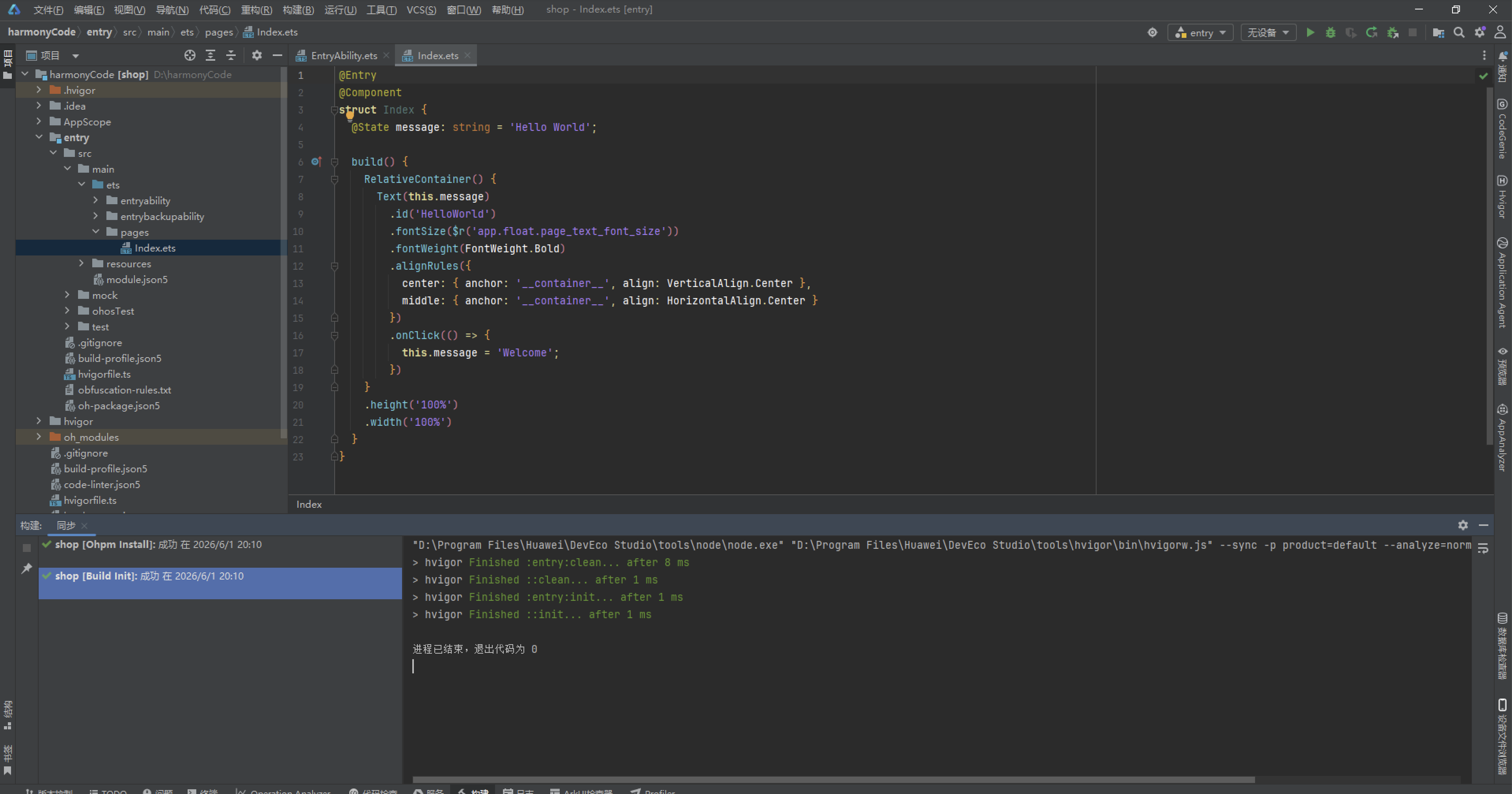
打包
接下来通过打包命令npn run harmony将reactNative的代码打包成为bundle,这样可以进行在开源鸿蒙OpenHarmony中进行使用。
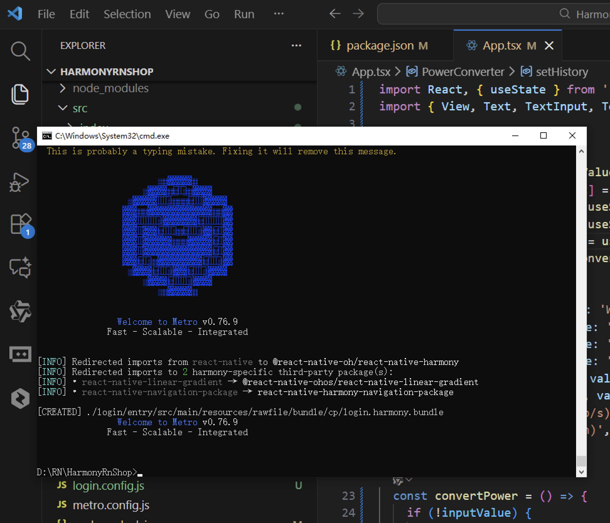
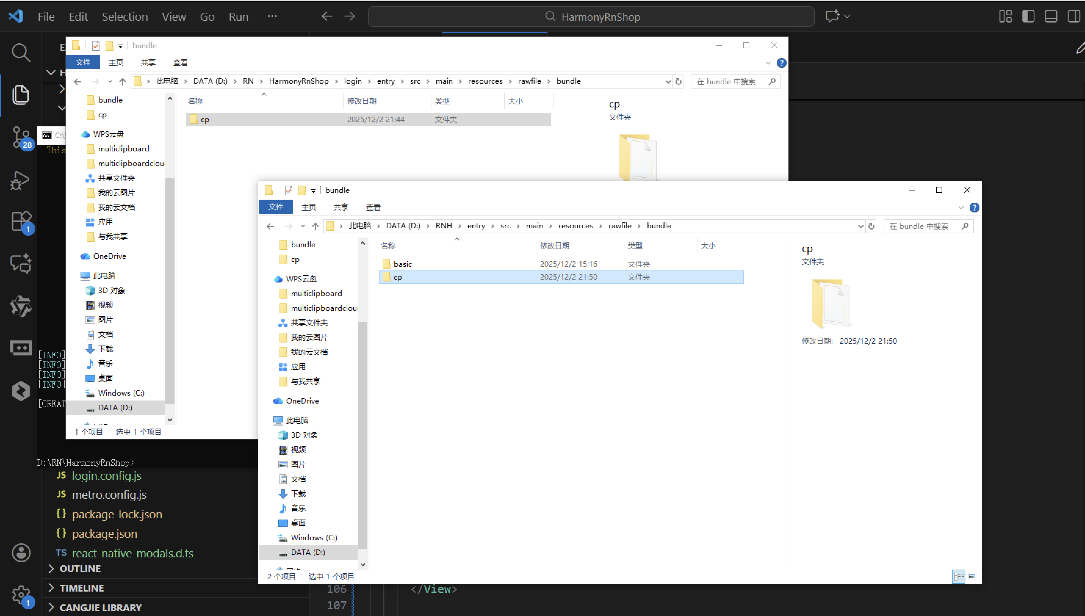
打包之后再将打包后的鸿蒙OpenHarmony文件拷贝到鸿蒙的DevEco-Studio工程目录去:
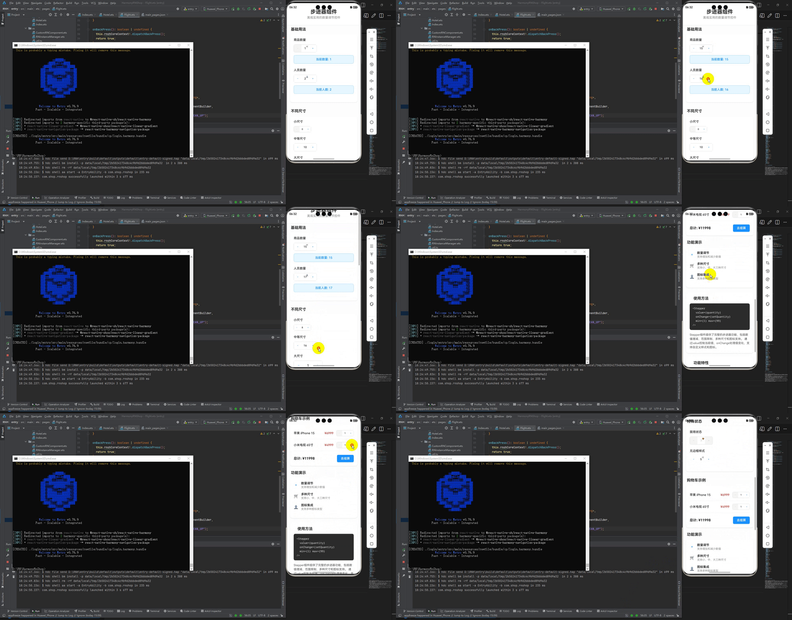
最后运行效果图如下显示:
开源鸿蒙跨平台开发社区汇聚开发者与厂商,共建“一次开发,多端部署”的开源生态,致力于降低跨端开发门槛,推动万物智联创新。
更多推荐


 4
4 0
0- 0



 已为社区贡献143条内容

所有评论(0)