styled-components:React 样式方案
styled-components:React 样式方案
styled-components 是一个 React CSS-in-JS 库,GitHub 上有 41k+ Star。
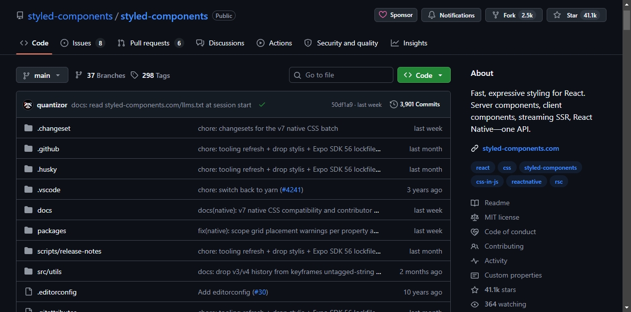
这个库让你在 React 组件里直接写 CSS,样式自动作用域隔离,按需加载。不需要处理类名,不需要单独的样式文件,也不需要额外的构建配置。
核心特性
跨平台支持
styled-components 支持服务端组件、客户端组件、流式 SSR 和 React Native,使用同一套 API,运行时自动检测环境。
完整 CSS 能力
媒体查询、伪类选择器、嵌套、关键帧动画、全局样式,CSS 支持的特性它都支持。
TypeScript 优先
包内自带类型定义,不需要额外安装 @types 包。组件 Props 自动推导到样式中,无需手动声明泛型。
体积小
压缩后不到 13kB,不需要构建插件。
基本用法
安装:
npm install styled-components
动态属性
根据组件属性调整样式。用 $ 前缀标记临时属性,避免传递到 DOM:
import styled from 'styled-components';

const Button = styled.button<{ $primary?: boolean }>`
  background: ${props => (props.$primary ? 'palevioletred' : 'white')};
  color: ${props => (props.$primary ? 'white' : 'palevioletred')};
  font-size: 1em;
  padding: 0.25em 1em;
  border: 2px solid palevioletred;
  border-radius: 3px;
`;

<Button>Normal</Button>
<Button $primary>Primary</Button>
样式继承
基于已有组件创建变体:
const TomatoButton = styled(Button)`
  background: tomato;
  color: white;
  border-color: tomato;
`;
多态渲染
通过 as 属性切换渲染元素,保持样式不变:
<Button as="a" href="/home">
  Link Button
</Button>
主题系统
通过 React Context 共享设计令牌:
import styled, { ThemeProvider } from 'styled-components';

const theme = {
  fg: 'palevioletred',
  bg: 'white',
};

const Card = styled.div`
  background: ${props => props.theme.bg};
  color: ${props => props.theme.fg};
  padding: 2em;
`;

<ThemeProvider theme={theme}>
  <Card>Themed content</Card>
</ThemeProvider>;
RSC 兼容主题
createTheme 将令牌转为 CSS 自定义属性。类名哈希在不同主题变体间保持稳定,切换明暗主题时不会出现水合不匹配。
import styled, { createTheme, ThemeProvider } from 'styled-components';

const { theme, GlobalStyle: ThemeVars } = createTheme({
  colors: {
    fg: 'palevioletred',
    bg: 'white',
  },
  space: {
    md: '1rem',
  },
});

const Card = styled.div`
  color: ${theme.colors.fg};
  background: ${theme.colors.bg};
  padding: ${theme.space.md};
`;

<ThemeProvider theme={theme}>
  <ThemeVars />
  <Card>Token-driven content</Card>
</ThemeProvider>;
令牌是占位符引用,在渲染时解析为实际值。可以在任何 CSS 值的位置插值,但不要和 JS 算术运算组合。需要运行时计算时使用 calc()。
其他功能
共享样式块
提取可复用的样式:
import styled, { css } from 'styled-components';

const truncate = css`
  white-space: nowrap;
  overflow: hidden;
  text-overflow: ellipsis;
`;

const Label = styled.span`
  ${truncate}
  max-width: 200px;
`;
第三方组件样式
包装任何接受 className 属性的组件:
import styled from 'styled-components';
import { Link } from 'react-router-dom';

const StyledLink = styled(Link)`
  color: palevioletred;
  text-decoration: none;

  &:hover {
    text-decoration: underline;
  }
`;
全局样式
注入应用级 CSS,如重置样式和字体:
import { createGlobalStyle } from 'styled-components';

const GlobalStyle = createGlobalStyle`
  body {
    margin: 0;
    font-family: system-ui, sans-serif;
  }
`;
默认属性
通过 attrs 设置默认 HTML 属性:
const PasswordInput = styled.input.attrs({
  type: 'password',
  placeholder: 'Enter password',
})`
  border: 1px solid #ccc;
  padding: 0.5em;
`;
生态
styled-components 有完善的文档,涵盖基础用法、API 参考、服务端渲染、React Server Components、主题系统和 React Native 等内容。项目主要由一个人维护,通过 Open Collective 接受赞助。
d’,
}) border: 1px solid #ccc; padding: 0.5em;;
## 生态

styled-components 有完善的文档,涵盖基础用法、API 参考、服务端渲染、React Server Components、主题系统和 React Native 等内容。项目主要由一个人维护,通过 Open Collective 接受赞助。

开源鸿蒙跨平台开发社区汇聚开发者与厂商,共建“一次开发,多端部署”的开源生态,致力于降低跨端开发门槛,推动万物智联创新。
更多推荐
 6
6 0
0- 0


 已为社区贡献1条内容

所有评论(0)