Flutter三方库适配OpenHarmony【quote_of_day】每日名言应用项目完整实战
Flutter三方库适配OpenHarmony【quote_of_day】每日名言应用项目完整实战
前言
欢迎加入开源鸿蒙跨平台社区:https://openharmonycrossplatform.csdn.net
quote_of_day 是一个典型的 Flutter 内容展示型小应用:它内置 20 条英文名言,每条数据包含 quote、author 和 category 三个字段,页面通过 _currentIndex 控制当前展示内容,支持上一条、下一条和 New Quote 切换,并根据名言分类动态调整 AppBar、背景、按钮、作者文字和指示点颜色。
这类项目虽然业务很轻,但非常适合用于 OpenHarmony 适配验证。原因很直接:它覆盖了 Flutter 应用里常见的 Material 主题、状态索引、集合数据、动态配色、AnimatedSwitcher 文案过渡、Chip 标签、IconButton、ElevatedButton、底部分页指示器和 SafeArea 布局。这些能力稳定了,很多更复杂页面的基础体验才有保障。
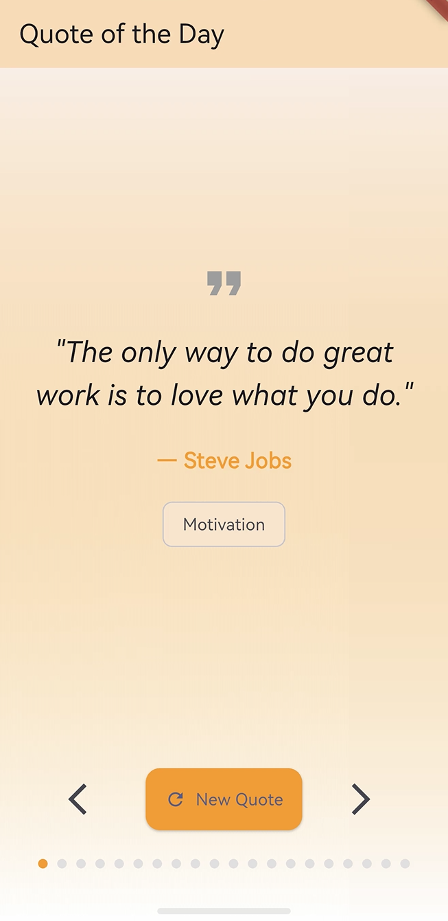
图示说明:本文围绕 Flutter 工程中的 quote_of_day 项目展开,重点分析每日名言页面的数据结构、索引切换、分类配色、动画过渡、指示点生成和 OpenHarmony 适配关注点。
内容展示类应用的关键不只是“把文字显示出来”,还包括切换节奏、分类反馈、视觉层次和边界状态是否稳定。
本文将基于项目真实源码展开,核心内容包括:
QuoteOfDayApp的应用入口与主题配置QuoteOfDayHomePage的状态管理方式_quotes本地名言列表的数据组织_currentIndex如何驱动页面内容_nextQuote()与_previousQuote()的循环切换逻辑- 分类颜色表应如何定义为
Map<String, Color> AnimatedSwitcher如何处理 quote 与 author 的切换动画- 底部 20 个圆点指示器如何生成
- OpenHarmony 适配时需要重点验证的 UI 与交互能力
一、项目背景与目标
1.1 项目定位
quote_of_day 的目标是实现一个每日名言展示页面。用户打开应用后,可以看到一条名言正文、作者和分类标签。用户可以通过左箭头返回上一条,通过右箭头或 New Quote 按钮进入下一条。
从用户体验角度看,它的核心流程是:
- 打开应用,看到当前名言。
- 阅读 quote 正文和 author。
- 通过 category Chip 理解内容分类。
- 点击上一条或下一条切换内容。
- 通过底部圆点知道当前位置。
从工程实现角度看,它对应的是:
- 使用本地列表保存内容数据。
- 使用整数索引定位当前数据。
- 使用取模运算完成循环切换。
- 使用分类字段查找颜色。
- 使用
setState触发页面刷新。 - 使用
AnimatedSwitcher优化文本切换观感。
1.2 当前功能概览
| 功能 | 当前实现 | 技术点 |
|---|---|---|
| 应用入口 | runApp(const QuoteOfDayApp()) |
Flutter 启动流程 |
| 页面主题 | 靛蓝色 Material 3 主题 | ColorScheme.fromSeed |
| 本地数据 | 20 条名言 | List<Map<String, String>> |
| 当前状态 | _currentIndex |
基于索引的状态管理 |
| 下一条 | _nextQuote() |
正向取模 |
| 上一条 | _previousQuote() |
反向取模 |
| 分类配色 | 分类到颜色映射 | Map<String, Color> |
| 文本动画 | quote 与 author 切换 | AnimatedSwitcher |
| 分类标签 | Chip |
展示 category |
| 底部指示 | 20 个圆点 | List.generate |
1.3 适合学习的能力
这个项目适合用来学习 Flutter 里的几个基础但高频的能力:
- 本地数据列表建模
- 基于 index 的内容切换
- 取模运算实现循环轮播
- Map 映射表的类型设计
- 动态颜色驱动页面风格
- AnimatedSwitcher 的 key 用法
- 底部分页指示器生成
- OpenHarmony 下 Material 组件适配验证
二、环境准备与工程结构
2.1 技术栈概览
项目依赖很少,主要使用 Flutter SDK 自带能力完成界面。
| 类别 | 当前使用 | 说明 |
|---|---|---|
| 开发语言 | Dart | Flutter 主开发语言 |
| UI 框架 | Flutter Material | 页面、按钮、标签、图标 |
| 状态管理 | StatefulWidget + setState |
单页轻量状态 |
| 动画组件 | AnimatedSwitcher |
文案切换动画 |
| 数据来源 | 本地硬编码列表 | 无网络请求 |
| 目标适配 | Flutter / OpenHarmony | 验证基础渲染与交互 |
2.2 pubspec 关键配置
工程配置中包含 Flutter SDK、Cupertino 图标、测试和 lint 依赖。
environment:
  sdk: ^3.9.2

dependencies:
  flutter:
    sdk: flutter
  cupertino_icons: ^1.0.8

dev_dependencies:
  flutter_test:
    sdk: flutter
  flutter_lints: ^5.0.0

flutter:
  uses-material-design: true
uses-material-design: true 对这个项目很重要,因为页面使用了多个 Material 图标:
Icons.format_quoteIcons.arrow_back_iosIcons.refreshIcons.arrow_forward_ios
在 OpenHarmony 适配时,如果这些图标无法正常显示,需要优先检查 Material Icons 字体资源是否被正确打包。
2.3 核心源码文件
项目核心逻辑集中在 lib/main.dart:
import 'package:flutter/material.dart';

void main() {
  runApp(const QuoteOfDayApp());
}
这个文件包含三个主要结构:
| 结构 | 类型 | 作用 |
|---|---|---|
QuoteOfDayApp |
StatelessWidget |
应用根组件 |
QuoteOfDayHomePage |
StatefulWidget |
首页组件 |
_QuoteOfDayHomePageState |
State |
管理名言数据和切换状态 |
2.4 常用运行命令
完成 Flutter 环境准备后,可以使用下面的命令验证工程:
flutter pub get
flutter analyze
flutter test
flutter run
如果使用 OpenHarmony Flutter 运行链路,则需要结合本地 OpenHarmony 设备、模拟器和 Flutter 发行版执行对应平台命令。
三、应用入口与主题配置
3.1 main 函数
应用入口非常简洁:
void main() {
  runApp(const QuoteOfDayApp());
}
runApp 会把 QuoteOfDayApp 挂载为根组件。这里使用 const,说明根组件本身没有可变字段。
3.2 QuoteOfDayApp 根组件
根组件代码如下:
class QuoteOfDayApp extends StatelessWidget {
const QuoteOfDayApp({super.key});
Widget build(BuildContext context) {
return MaterialApp(
title: 'Quote of the Day',
theme: ThemeData(
  colorScheme: ColorScheme.fromSeed(seedColor: Colors.indigo),
  useMaterial3: true,
),
home: const QuoteOfDayHomePage(title: 'Quote of the Day'),
);
}
}
这段代码完成了:
- 设置应用标题为
Quote of the Day。 - 使用
Colors.indigo生成 Material 3 色彩方案。 - 启用
useMaterial3: true。 - 将首页绑定为
QuoteOfDayHomePage。
3.3 主题配置的适配意义
主题配置影响整个应用的基础视觉风格:
theme: ThemeData(
colorScheme: ColorScheme.fromSeed(seedColor: Colors.indigo),
useMaterial3: true,
)
在 OpenHarmony 适配时,可以通过这个页面观察:
| 验证点 | 观察位置 | 预期表现 |
|---|---|---|
| Material 3 基础样式 | 按钮、Chip、AppBar | 样式自然 |
| 靛蓝色主题 | 初始色彩方案 | 默认风格统一 |
| 动态颜色覆盖 | 分类颜色切换后 | 页面随分类变化 |
| 图标字体 | 顶部 quote 图标和按钮图标 | 正常显示 |
四、页面状态设计
4.1 StatefulWidget 的选择
首页使用 StatefulWidget:
class QuoteOfDayHomePage extends StatefulWidget {
const QuoteOfDayHomePage({super.key, required this.title});
final String title;
State<QuoteOfDayHomePage> createState() => _QuoteOfDayHomePageState();
}
这个选择很合理,因为页面的当前名言会随着用户点击而变化,属于典型的局部状态。
4.2 当前索引字段
页面状态中最关键的字段是 _currentIndex:
class _QuoteOfDayHomePageState extends State<QuoteOfDayHomePage> {
  int _currentIndex = 0;
}
它代表当前展示的是 _quotes 列表中的第几条数据。
这种设计有几个优点:
- 状态非常轻量。
- 不需要复制当前 quote 对象。
- 上一条和下一条计算简单。
- 底部指示点可以直接复用同一个索引。
4.3 build 中读取当前数据
在 build 方法中,通过索引读取当前名言:
final quote = _quotes[_currentIndex];
final categoryColor = _categoryColors[quote['category']] ?? Colors.indigo;
这里的逻辑是:
- 用
_currentIndex从_quotes中取当前数据。 - 根据当前数据的
category查找分类颜色。 - 如果找不到颜色,就回退到
Colors.indigo。
这个回退逻辑很重要,可以避免新增分类但忘记配置颜色时页面异常。
五、本地名言数据设计
5.1 _quotes 数据结构
项目使用 List<Map<String, String>> 存储名言:
final List<Map<String, String>> _quotes = [
  {
    'quote': 'The only way to do great work is to love what you do.',
    'author': 'Steve Jobs',
    'category': 'Motivation',
  },
  {
    'quote': 'In the middle of difficulty lies opportunity.',
    'author': 'Albert Einstein',
    'category': 'Wisdom',
  },
];
每条数据包含三个字段:
| 字段 | 含义 | 示例 |
|---|---|---|
quote |
名言正文 | The only way to do great work... |
author |
作者 | Steve Jobs |
category |
分类 | Motivation |
5.2 当前数据规模
当前项目内置 20 条名言,覆盖多个分类:
| 分类 | 示例作者 | 用途 |
|---|---|---|
| Motivation | Steve Jobs、Tony Robbins | 激励类内容 |
| Wisdom | Albert Einstein、Chinese Proverb | 智慧类内容 |
| Perseverance | Winston Churchill、Nelson Mandela | 坚持类内容 |
| Identity | Oscar Wilde | 自我认知 |
| Courage | Franklin D. Roosevelt | 勇气主题 |
| Life | John Lennon、Robert Frost | 人生主题 |
| Dreams | Eleanor Roosevelt | 梦想主题 |
| Mindset | Buddha、Henry Ford | 思维方式 |
| Education | Nelson Mandela | 教育主题 |
| Leadership | Ralph Waldo Emerson | 领导力主题 |
| Time | Theophrastus | 时间主题 |
5.3 本地数据方案的优点
本地硬编码数据适合这个项目的原因包括:
- 不需要网络权限。
- 不需要接口错误处理。
- 页面启动即可展示内容。
- 数据结构直观,适合教学。
- OpenHarmony 适配时更容易聚焦 UI 和交互本身。
它的边界也很清楚:
- 内容更新需要修改代码。
- 没有远程同步。
- 没有收藏和历史记录。
- 没有按分类筛选。
- 没有每日自动更新策略。
六、分类配色表与类型修正
6.1 分类颜色表的设计意图
项目希望通过分类字段动态调整页面颜色,例如:
- Motivation 使用橙色。
- Wisdom 使用琥珀色。
- Perseverance 使用蓝色。
- Life 使用绿色。
- Leadership 使用靛蓝色。
这种设计可以让用户在切换名言时感受到内容类型变化,而不是只看到文本变化。
6.2 正确的数据类型
由于分类名是字符串,颜色值是 Color,因此分类颜色表应该定义为 Map<String, Color>:
final Map<String, Color> _categoryColors = {
  'Motivation': Colors.orange,
  'Wisdom': Colors.amber,
  'Perseverance': Colors.blue,
  'Identity': Colors.pink,
  'Courage': Colors.red,
  'Life': Colors.green,
  'Dreams': Colors.purple,
  'Mindset': Colors.teal,
  'Education': Colors.brown,
  'Leadership': Colors.indigo,
  'Time': Colors.grey,
};
如果声明成 List<Color>,但右侧使用的是带字符串 key 的 Map 字面量,Dart 类型系统会直接报错。
6.3 为什么必须是 Map
后续代码使用了字符串分类取颜色:
final categoryColor = _categoryColors[quote['category']] ?? Colors.indigo;
这就是典型的 key-value 访问方式。对应关系如下:
| key | value |
|---|---|
Motivation |
Colors.orange |
Wisdom |
Colors.amber |
Life |
Colors.green |
Time |
Colors.grey |
因此使用 Map<String, Color> 才能同时满足数据结构和访问方式。
6.4 回退颜色的意义
分类颜色读取时使用了空合并回退:
final categoryColor = _categoryColors[quote['category']] ?? Colors.indigo;
如果某条 quote 的分类没有配置颜色,页面会使用 Colors.indigo。这能提升容错性,避免新增数据时因为漏配颜色导致空值问题。
七、上一条与下一条循环切换
7.1 下一条逻辑
下一条函数如下:
void _nextQuote() {
  setState(() {
    _currentIndex = (_currentIndex + 1) % _quotes.length;
  });
}
这段代码通过取模实现循环:
- 当前不是最后一条时,索引加 1。
- 当前是最后一条时,加 1 后对长度取模,回到 0。
7.2 上一条逻辑
上一条函数如下:
void _previousQuote() {
  setState(() {
    _currentIndex = (_currentIndex - 1 + _quotes.length) % _quotes.length;
  });
}
这里加上 _quotes.length 是为了避免负数索引。
例如当前索引为 0 时:
(0 - 1 + 20) % 20
结果是 19,也就是从第一条回到最后一条。
7.3 循环切换示意
| 当前索引 | 点击下一条 | 结果 |
|---|---|---|
| 0 | (0 + 1) % 20 |
1 |
| 1 | (1 + 1) % 20 |
2 |
| 18 | (18 + 1) % 20 |
19 |
| 19 | (19 + 1) % 20 |
0 |
| 当前索引 | 点击上一条 | 结果 |
|---|---|---|
| 0 | (0 - 1 + 20) % 20 |
19 |
| 1 | (1 - 1 + 20) % 20 |
0 |
| 19 | (19 - 1 + 20) % 20 |
18 |
7.4 setState 的作用
两个切换函数都调用了 setState:
setState(() {
  _currentIndex = (_currentIndex + 1) % _quotes.length;
});
setState 会通知 Flutter 当前状态已改变,随后重新执行 build 方法,页面会基于新的 _currentIndex 取出新的 quote、author、category 和 categoryColor。
八、页面主体布局
8.1 Scaffold 与 AppBar
页面最外层使用 Scaffold:
return Scaffold(
  appBar: AppBar(
    title: Text(widget.title),
    backgroundColor: categoryColor.withValues(alpha: 0.3),
  ),
  body: Container(
    decoration: BoxDecoration(
      gradient: LinearGradient(
        begin: Alignment.topCenter,
        end: Alignment.bottomCenter,
        colors: [
          categoryColor.withValues(alpha: 0.1),
          Colors.white,
        ],
      ),
    ),
  ),
);
AppBar 背景色跟随当前分类变化,并使用较低透明度,让顶部栏保持轻量。
8.2 withValues 的使用
源码中使用了 withValues(alpha: ...):
categoryColor.withValues(alpha: 0.3)
categoryColor.withValues(alpha: 0.1)
categoryColor.withValues(alpha: 0.2)
它用于基于原颜色生成带透明度的新颜色。相比直接固定写死颜色,这种方式可以保持分类主题的一致性。
在适配时需要确认本地 Flutter SDK 支持该 API。如果项目使用的 SDK 较旧,可能需要使用对应版本支持的颜色透明度写法。
8.3 SafeArea 与整体结构
主体区域使用 SafeArea:
SafeArea(
  child: Column(
    children: [
      Expanded(
        child: Padding(
          padding: const EdgeInsets.all(24),
          child: Column(
            mainAxisAlignment: MainAxisAlignment.center,
            children: [
              // quote 内容
            ],
          ),
        ),
      ),
      // 底部按钮和指示器
    ],
  ),
)
布局分为两大块:
- 中间的名言内容区域。
- 底部的按钮区域和圆点指示器。
Expanded 让名言内容占据主要空间,底部交互固定在下方,阅读体验比较稳定。
九、Quote 正文与 Author 展示
9.1 顶部引用图标
页面内容区顶部使用了引用图标:
const Icon(Icons.format_quote, size: 48, color: Colors.grey)
这个图标给用户一个明确的语义提示:当前页面展示的是引言或名言。
9.2 quote 文本展示
quote 正文使用 AnimatedSwitcher 包裹:
AnimatedSwitcher(
  duration: const Duration(milliseconds: 300),
  child: Text(
    '"${quote['quote']}"',
    key: ValueKey(quote['quote']),
    style: const TextStyle(
      fontSize: 24,
      fontStyle: FontStyle.italic,
      height: 1.5,
    ),
    textAlign: TextAlign.center,
  ),
)
这里有几个关键点:
| 配置 | 作用 |
|---|---|
duration: 300ms |
控制切换动画时长 |
ValueKey(quote['quote']) |
让内容变化被识别 |
fontSize: 24 |
强化正文层级 |
FontStyle.italic |
呈现引言风格 |
height: 1.5 |
增加行距,提高可读性 |
TextAlign.center |
让内容居中展示 |
9.3 author 文本展示
作者也使用 AnimatedSwitcher:
AnimatedSwitcher(
  duration: const Duration(milliseconds: 300),
  child: Text(
    '— ${quote['author']}',
    key: ValueKey(quote['author']),
    style: TextStyle(
      fontSize: 18,
      fontWeight: FontWeight.bold,
      color: categoryColor,
    ),
  ),
)
作者文字使用当前分类颜色,这让页面在不同分类之间切换时有更强的视觉反馈。
9.4 AnimatedSwitcher 的 key 机制
AnimatedSwitcher 能正确触发动画的关键是 key:
key: ValueKey(quote['quote'])
key: ValueKey(quote['author'])
当 quote 或 author 变化时,key 也变化,Flutter 会把它们识别为不同 child,从而执行切换动画。
如果没有 key,前后都是 Text,切换动画可能不明显。
十、Category Chip 与动态配色
10.1 Chip 的实现
分类标签使用 Chip:
Chip(
  label: Text(quote['category']!),
  backgroundColor: categoryColor.withValues(alpha: 0.2),
)
Chip 很适合展示短标签。这里的 category 来自当前 quote 数据。
10.2 分类颜色如何贯穿页面
当前分类颜色会影响多个位置:
| 位置 | 使用方式 |
|---|---|
| AppBar | categoryColor.withValues(alpha: 0.3) |
| 背景渐变 | categoryColor.withValues(alpha: 0.1) |
| author 文字 | color: categoryColor |
| Chip 背景 | categoryColor.withValues(alpha: 0.2) |
| New Quote 按钮 | backgroundColor: categoryColor |
| 当前圆点 | color: categoryColor |
这种“一处状态,多处响应”的设计让页面整体更有一致性。
10.3 分类不存在时的表现
当分类没有在 _categoryColors 中找到时,代码使用默认色:
?? Colors.indigo
这是一种很实用的防御式写法。即使后续新增数据时漏掉某个分类颜色,页面依然能正常渲染。
十一、底部按钮区设计
11.1 按钮整体布局
底部按钮放在 Row 中:
Padding(
  padding: const EdgeInsets.all(24),
  child: Row(
    mainAxisAlignment: MainAxisAlignment.spaceEvenly,
    children: [
      IconButton(
        onPressed: _previousQuote,
        icon: const Icon(Icons.arrow_back_ios),
        iconSize: 32,
      ),
      ElevatedButton.icon(
        onPressed: _nextQuote,
        icon: const Icon(Icons.refresh),
        label: const Text('New Quote'),
      ),
      IconButton(
        onPressed: _nextQuote,
        icon: const Icon(Icons.arrow_forward_ios),
        iconSize: 32,
      ),
    ],
  ),
)
三个按钮的语义很明确:
- 左箭头:上一条。
- 中间按钮:新名言。
- 右箭头:下一条。
11.2 New Quote 按钮样式
中间按钮使用 ElevatedButton.icon:
ElevatedButton.icon(
  onPressed: _nextQuote,
  icon: const Icon(Icons.refresh),
  label: const Text('New Quote'),
  style: ElevatedButton.styleFrom(
    padding: const EdgeInsets.all(16),
    backgroundColor: categoryColor,
    shape: RoundedRectangleBorder(
      borderRadius: BorderRadius.circular(12),
    ),
  ),
)
这个按钮不是真正的随机按钮,它调用的是 _nextQuote,因此行为是“顺序切换到下一条”。按钮文案为 New Quote,用户感知上是获取新的名言,但从源码看并没有随机抽取。
11.3 按钮语义边界
当前项目包含三个切换入口,但只有两种切换逻辑:
| 控件 | 调用函数 | 行为 |
|---|---|---|
| 左箭头 | _previousQuote |
上一条 |
| New Quote | _nextQuote |
下一条 |
| 右箭头 | _nextQuote |
下一条 |
如果未来希望 New Quote 表示随机名言,可以增加随机索引逻辑。但当前源码里,它就是顺序下一条。
十二、底部圆点指示器
12.1 List.generate 生成圆点
底部圆点使用 List.generate 生成:
Row(
  mainAxisAlignment: MainAxisAlignment.center,
  children: List.generate(_quotes.length, (index) {
    return Container(
      width: 8,
      height: 8,
      margin: const EdgeInsets.symmetric(horizontal: 4),
      decoration: BoxDecoration(
        shape: BoxShape.circle,
        color: index == _currentIndex
            ? categoryColor
            : Colors.grey.shade300,
      ),
    );
  }),
)
圆点数量和 _quotes.length 一致。当前有 20 条名言,因此会生成 20 个圆点。
12.2 当前圆点高亮
当前索引对应的圆点使用分类颜色:
index == _currentIndex ? categoryColor : Colors.grey.shade300
其他圆点使用浅灰色。这样用户可以快速判断当前处在列表中的哪个位置。
12.3 圆点布局边界
当前每个圆点宽高为 8,左右 margin 为 4:
width: 8,
height: 8,
margin: const EdgeInsets.symmetric(horizontal: 4),
20 个圆点的横向空间大约为:
20 * (8 + 4 + 4) = 320
在常见手机宽度下通常可以容纳。如果未来名言数量增加很多,底部指示器可能需要改成可滚动、分页或缩略数量模式。
十三、OpenHarmony 适配要点
13.1 适配关注范围
quote_of_day 主要使用 Flutter Framework 能力,没有接入平台插件。因此适配重点集中在 UI 渲染、输入事件和资源字体。
| 适配项 | 涉及源码 | 验证重点 |
|---|---|---|
| MaterialApp | 根组件 | 应用启动和主题 |
| AppBar | Scaffold.appBar |
标题与动态背景色 |
| Text | quote 和 author | 文本换行、斜体、粗体 |
| Icon | Icons.format_quote 等 |
图标字体显示 |
| Chip | 分类标签 | 背景色与文字 |
| AnimatedSwitcher | 文案切换 | 动画是否生效 |
| IconButton | 左右箭头 | 点击区域与回调 |
| ElevatedButton | New Quote | 按钮样式和点击 |
| LinearGradient | 背景 | 渐变绘制 |
| Row 指示器 | 底部圆点 | 布局是否溢出 |
13.2 图标资源验证
项目使用了多个 Material Icons:
const Icon(Icons.format_quote, size: 48, color: Colors.grey)
const Icon(Icons.arrow_back_ios)
const Icon(Icons.refresh)
const Icon(Icons.arrow_forward_ios)
适配时需要确认:
- 图标是否显示为空白方块。
- 图标大小是否符合预期。
- 按钮内图标和文字是否对齐。
- OpenHarmony 构建产物是否包含 Material Icons 字体资源。
13.3 文本渲染验证
quote 正文中有较长英文句子,例如:
'Success is not final, failure is not fatal: it is the courage to continue that counts.'
这类长文本需要重点看:
- 是否自动换行。
- 是否超出屏幕。
- 行高是否自然。
- 斜体是否显示正常。
- 作者文字颜色是否跟随分类变化。
13.4 动画验证
quote 和 author 都使用了 300ms 的 AnimatedSwitcher:
AnimatedSwitcher(
  duration: const Duration(milliseconds: 300),
  child: Text(...),
)
在 OpenHarmony 设备上可以连续点击下一条,观察是否存在:
- 动画不触发。
- 文本残影。
- 快速点击时显示错乱。
- 切换过程中布局跳动明显。
13.5 动态配色验证
页面多个区域依赖 categoryColor,适配时可以切换不同分类观察颜色变化:
final categoryColor = _categoryColors[quote['category']] ?? Colors.indigo;
重点看:
- AppBar 背景是否更新。
- 背景渐变是否更新。
- author 文字是否更新。
- Chip 背景是否更新。
- 按钮背景是否更新。
- 当前圆点是否更新。
十四、测试与验证
14.1 静态分析
建议先执行:
flutter analyze
这个项目尤其要关注分类颜色表的类型声明。如果分类颜色表写成 List<Color>,静态分析会暴露类型不匹配问题。正确结构应该是:
final Map<String, Color> _categoryColors = {
  'Motivation': Colors.orange,
  'Wisdom': Colors.amber,
};
14.2 组件测试方向
可以使用 Flutter widget test 验证页面基础行为:
flutter test
适合覆盖的行为包括:
- 页面初始显示
Quote of the Day。 - 初始 quote 为列表第 1 条。
- 点击
New Quote后切换到下一条。 - 点击左箭头可以回到上一条。
- 当前分类 Chip 文本能正确显示。
14.3 示例测试代码
下面是一段针对按钮切换的测试思路:
testWidgets('New Quote switches to the next quote', (tester) async {
  await tester.pumpWidget(const QuoteOfDayApp());

  expect(find.textContaining('The only way to do great work'), findsOneWidget);

  await tester.tap(find.text('New Quote'));
  await tester.pumpAndSettle();

  expect(find.textContaining('In the middle of difficulty'), findsOneWidget);
});
这段测试验证了中间按钮会触发下一条内容展示。
14.4 手动验证流程
手动验证可以按如下顺序进行:
- 启动应用,确认首页显示标题、quote、author 和 category。
- 点击
New Quote,确认内容切换到下一条。 - 点击右箭头,确认行为同样是下一条。
- 点击左箭头,确认能回到上一条。
- 从第一条点击左箭头,确认能循环到最后一条。
- 从最后一条点击下一条,确认能回到第一条。
- 观察底部圆点是否随索引变化。
- 观察分类颜色是否同步变化。
14.5 OpenHarmony 设备验证
在 OpenHarmony 设备上,可以重点验证下面几组场景:
| 场景 | 预期结果 |
|---|---|
| 冷启动 | 页面正常进入首页 |
| 左右切换 | 索引循环稳定 |
| 快速点击 | 不崩溃、不错乱 |
| 长文本展示 | 自动换行且无溢出 |
| 图标显示 | 四个图标都可见 |
| 动态颜色 | 页面颜色跟随分类变化 |
| 动画过渡 | 300ms 切换自然 |
| 底部圆点 | 当前圆点高亮准确 |
十五、常见问题与优化建议
15.1 分类颜色表为什么不能写成 List
因为后续访问方式是通过分类字符串查找颜色:
_categoryColors[quote['category']]
这不是数组索引访问,而是 Map key 访问。数组适合用整数索引,分类颜色映射适合用字符串 key。
15.2 New Quote 是随机吗
从当前源码看,New Quote 调用的是:
onPressed: _nextQuote
所以它不是随机获取,而是顺序切换到下一条。如果希望真正随机,可以引入 dart:math:
import 'dart:math' as math;

void _randomQuote() {
  final random = math.Random();
  setState(() {
    _currentIndex = random.nextInt(_quotes.length);
  });
}
但这样可能连续随机到同一条。如果要避免连续重复,还需要记录上一次索引。
15.3 为什么使用 _currentIndex 而不是保存当前 Map
使用 _currentIndex 更适合这个项目,因为:
- 切换上一条和下一条天然依赖索引。
- 底部圆点高亮也依赖索引。
- 不需要比较 Map 内容。
- 不会复制数据。
当前 quote 可以在 build 方法里临时读取:
final quote = _quotes[_currentIndex];
15.4 底部圆点数量增加怎么办
当前 20 个圆点还能正常展示。如果未来扩展到 100 条名言,圆点会明显过多。可以改成:
- 显示当前页码和总数。
- 只显示附近几个圆点。
- 使用横向可滚动指示器。
- 改为进度条。
例如显示页码:
Text('${_currentIndex + 1} / ${_quotes.length}')
15.5 是否需要状态管理框架
当前项目只有一个页面,状态也只有 _currentIndex,使用 setState 足够清晰。如果后续加入收藏、分类筛选、搜索、远程同步和本地缓存,再考虑 Provider、Riverpod 或 Bloc 会更合适。
十六、工程扩展方向
16.1 增加分类筛选
可以从 _quotes 中提取所有分类,然后提供分类筛选入口:
final categories = _quotes
    .map((quote) => quote['category'])
    .whereType<String>()
    .toSet()
    .toList();
筛选后只在当前分类内切换名言。
16.2 增加收藏功能
收藏功能可以先用内存集合实现:
final Set<int> _favoriteIndexes = {};

void _toggleFavorite() {
  setState(() {
    if (_favoriteIndexes.contains(_currentIndex)) {
      _favoriteIndexes.remove(_currentIndex);
    } else {
      _favoriteIndexes.add(_currentIndex);
    }
  });
}
这种方式适合原型验证。如果要长期保存,需要结合本地存储方案。
16.3 增加每日固定名言
如果想让应用真正变成“每日名言”,可以根据日期计算索引:
int quoteIndexForToday(int length) {
  final now = DateTime.now();
  final daySeed = now.year * 10000 + now.month * 100 + now.day;
  return daySeed % length;
}
这样每天会得到一个稳定索引,同一天打开应用展示同一条名言。
16.4 将数据迁移到 JSON
当名言数量变多后,可以把数据放到 JSON 文件中:
[
  {
    "quote": "The only way to do great work is to love what you do.",
    "author": "Steve Jobs",
    "category": "Motivation"
  }
]
再通过资源加载读取:
final jsonString = await rootBundle.loadString('assets/quotes.json');
这种方式更适合内容维护,也能减少 Dart 源文件膨胀。
16.5 引入模型类
当前 Map<String, String> 能满足需求,但模型类更稳:
class Quote {
  const Quote({
    required this.quote,
    required this.author,
    required this.category,
  });

  final String quote;
  final String author;
  final String category;
}
使用模型类后,字段访问会从字符串 key 变为属性访问:
final current = quotes[_currentIndex];
Text(current.quote)
这能减少 key 拼写错误带来的运行时风险。
十七、相关链接与延伸阅读
17.1 Flutter 官方资料
| 主题 | 链接 |
|---|---|
| Flutter 官网 | https://flutter.dev |
| Flutter 文档 | https://docs.flutter.dev |
| Dart 语言 | https://dart.dev |
| Material 组件 | https://docs.flutter.dev/ui/widgets/material |
| StatefulWidget | https://api.flutter.dev/flutter/widgets/StatefulWidget-class.html |
| AnimatedSwitcher | https://api.flutter.dev/flutter/widgets/AnimatedSwitcher-class.html |
| Chip | https://api.flutter.dev/flutter/material/Chip-class.html |
| IconButton | https://api.flutter.dev/flutter/material/IconButton-class.html |
| ElevatedButton | https://api.flutter.dev/flutter/material/ElevatedButton-class.html |
17.2 OpenHarmony 相关资料
| 主题 | 链接 |
|---|---|
| OpenHarmony 官网 | https://www.openharmony.cn |
| OpenHarmony 文档 | https://docs.openharmony.cn |
| Gitee OpenHarmony | https://gitee.com/openharmony |
| 开源鸿蒙跨平台社区 | https://openharmonycrossplatform.csdn.net |
17.3 推荐学习路线
如果继续深入这个项目,可以按下面顺序学习:
- 理解
StatefulWidget和setState。 - 理解
_currentIndex与列表数据的关系。 - 理解取模如何实现循环上一条和下一条。
- 理解
Map<String, Color>的分类映射。 - 理解
AnimatedSwitcher的 key 机制。 - 在 OpenHarmony 设备上验证图标、文本、动画和动态配色。
十八、完整核心代码回顾
18.1 应用入口
void main() {
  runApp(const QuoteOfDayApp());
}
入口只负责挂载根组件。
18.2 根组件
class QuoteOfDayApp extends StatelessWidget {
const QuoteOfDayApp({super.key});
Widget build(BuildContext context) {
return MaterialApp(
title: 'Quote of the Day',
theme: ThemeData(
colorScheme: ColorScheme.fromSeed(seedColor: Colors.indigo),
useMaterial3: true,
),
home: const QuoteOfDayHomePage(title: 'Quote of the Day'),
);
}
}
根组件定义应用主题和首页。
18.3 当前索引
int _currentIndex = 0;
这是整个页面状态流的核心。
18.4 名言数据
final List<Map<String, String>> _quotes = [
  {
    'quote': 'The only way to do great work is to love what you do.',
    'author': 'Steve Jobs',
    'category': 'Motivation',
  },
];
每条数据由正文、作者和分类组成。
18.5 分类颜色映射
final Map<String, Color> _categoryColors = {
  'Motivation': Colors.orange,
  'Wisdom': Colors.amber,
  'Perseverance': Colors.blue,
  'Identity': Colors.pink,
  'Courage': Colors.red,
  'Life': Colors.green,
  'Dreams': Colors.purple,
  'Mindset': Colors.teal,
  'Education': Colors.brown,
  'Leadership': Colors.indigo,
  'Time': Colors.grey,
};
分类颜色表必须使用 Map,才能通过分类字符串查找颜色。
18.6 上一条和下一条
void _nextQuote() {
  setState(() {
    _currentIndex = (_currentIndex + 1) % _quotes.length;
  });
}

void _previousQuote() {
  setState(() {
    _currentIndex = (_currentIndex - 1 + _quotes.length) % _quotes.length;
  });
}
这两段代码用取模保证索引循环。
18.7 文案动画
AnimatedSwitcher(
  duration: const Duration(milliseconds: 300),
  child: Text(
    '"${quote['quote']}"',
    key: ValueKey(quote['quote']),
    textAlign: TextAlign.center,
  ),
)
ValueKey 让 Flutter 能识别内容变化,从而触发切换动画。
总结
quote_of_day 是一个很适合做 Flutter 与 OpenHarmony 基础适配验证的内容展示应用。它通过本地 20 条名言数据完成离线展示,通过 _currentIndex 管理当前内容,通过 _nextQuote() 和 _previousQuote() 实现循环切换,通过分类颜色表驱动页面动态配色,并使用 AnimatedSwitcher 让 quote 和 author 的切换更加自然。
这个项目最值得关注的工程点是分类颜色表类型:由于后续代码通过分类字符串访问颜色,因此颜色表应定义为 Map<String, Color>。修正这个类型后,页面逻辑才能和数据结构保持一致。除此之外,New Quote 当前是顺序下一条,不是随机抽取;底部圆点适合 20 条数据,但数据量大幅增加后需要调整展示方式。
从适配角度看,quote_of_day 覆盖了 Material 组件、图标字体、文本排版、动态颜色、渐变背景、按钮点击、动画切换和底部指示器等关键能力。把这些基础点验证清楚,可以为更复杂的 Flutter OpenHarmony 应用迁移打下稳定基础。
如果这篇文章对你有帮助,欢迎点赞、收藏、关注,你的支持是我持续创作的动力!
相关资源:

开源鸿蒙跨平台开发社区汇聚开发者与厂商,共建“一次开发,多端部署”的开源生态,致力于降低跨端开发门槛,推动万物智联创新。
更多推荐
 1
1 0
0- 0


 已为社区贡献21条内容

所有评论(0)