Flutter + OpenHarmony 底部导航栏组件开发实战
底部导航栏是移动应用中最核心的导航组件之一,用于在应用的主要页面之间切换。在 OpenHarmony 环境下开发 Flutter 应用时,底部导航栏组件需要支持多种视觉样式、动画效果、徽章提示等功能,以提供流畅的用户体验。final int// 当前索引items;// 导航项列表onTap;// 点击回调style;// 视觉样式animation;// 动画效果// 背景颜色// 选中颜色//
Flutter + OpenHarmony 底部导航栏组件开发实战
欢迎加入开源鸿蒙跨平台社区→ https://openharmonycrosplatform.csdn.net
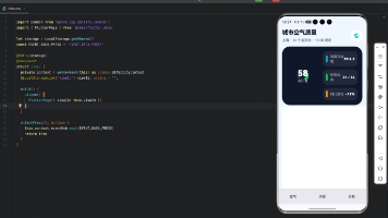
一、效果展示
📱 运行效果预览
在鸿蒙虚拟机上运行后的实际效果如下:
标准样式 :
-
固定底部导航栏
-
图标+标签组合
-
选中项高亮显示
-
阴影效果
浮动样式 : -
圆角胶囊容器
-
左右边距悬浮
-
大阴影效果
-
现代化设计
胶囊样式 : -
选中项背景胶囊
-
动态背景颜色
-
平滑过渡动画
-
突出选中状态
极简样式 : -
顶部指示条
-
无阴影设计
-
简洁边框
-
极简风格
动画效果对比 : -
淡入动画 - 透明度变化
-
缩放动画 - 大小变化
-
滑动动画 - 位置变化
-
弹跳动画 - 弹性效果
🎨 四种样式对比图示
标准样式:              浮动样
式:              胶囊样
式:              极简样式:
┌────────────────┐
╭────────────────╮
┌────────────────┐
────────────────
│ 🏠  🔍  ➕  💬  👤│    │ 🏠  🔍
➕  💬  👤│    │ 🏠  ┌───┐  💬
👤│     │   ━━━        │
│ 首页 发现 发布 消息 我的│   │ 首页 发
现 发布 消息 我的│   │ 首页 │发布│ 消息
我的│     │ 🏠  🔍  ➕  💬  👤│
└────────────────┘
╰────────────────╯
└────────────────┘
────────────────
  固定底部               浮动悬
  浮               胶囊背
  景               顶部指示条
🎨 四种动画效果
淡入动画:    缩放动画:    滑动动
画:    弹跳动画:
  🏠           🏠
  🏠            🏠
  ↓            ○
  ↑            ○○
透明度60%→100% 缩放1.0→1.15  上移
10%       弹性放大
二、组件概述
底部导航栏是移动应用中最核心的导航组件之一,用于在应用的主要页面之间切换。在 OpenHarmony 环境下开发 Flutter 应用时,底部导航栏组件需要支持多种视觉样式、动画效果、徽章提示等功能,以提供流畅的用户体验。
三、核心功能特性
✅ 四种视觉样式 - 标准、浮动、胶囊、极简
✅ 四种动画效果 - 淡入、缩放、滑动、弹跳
✅ 徽章提示支持 - 显示未读消息数量
✅ 自定义颜色主题 - 选中色、未选中色可配置
✅ 图标切换动画 - 选中/未选中图标切换
✅ 灵活布局配置 - 高度、标签显示可调节
四、技术实现架构
4.1 导航栏样式枚举
enum BottomNavStyle {
  standard,  // 标准样式 - 固定底部
  floating,  // 浮动样式 - 悬浮胶囊
  capsule,   // 胶囊样式 - 背景胶囊
  minimal    // 极简样式 - 顶部指示条
}
4.2 导航栏动画枚举
enum BottomNavAnimation {
  fade,    // 淡入动画
  scale,   // 缩放动画
  slide,   // 滑动动画
  bounce   // 弹跳动画
}
4.3 导航项数据结构
class CustomBottomNavItem {
  final IconData icon;          //
  图标
  final IconData? activeIcon;   //
  选中图标
  final String label;           //
  标签
  final Color? color;           //
  颜色
  final String? badge;          //
  徽章文本
  final bool showBadge;         //
  显示徽章
}
4.4 组件属性定义
class CustomBottomNavBar extends
StatelessWidget {
  final int
  currentIndex;              // 当前
  索引
  final List<CustomBottomNavItem>
  items; // 导航项列表
  final Function(int index)
  onTap;     // 点击回调
  final BottomNavStyle
  style;          // 视觉样式
  final BottomNavAnimation
  animation;  // 动画效果
  final Color?
  backgroundColor;        // 背景颜色
  final Color?
  selectedItemColor;      // 选中颜色
  final Color?
  unselectedItemColor;    // 未选中颜
  色
  final double?
  elevation;             // 阴影高度
  final bool
  showLabels;               // 显示
  标签
  final double?
  height;                // 高度
}
五、CustomBottomNavBar 核心实现
5.1 标准样式实现
Widget _buildStandardNav(Color
bgColor, Color selectedColor, Color
unselectedColor, bool isDark) {
  return Container(
    height: height ?? 64,
    decoration: BoxDecoration(
      color: bgColor,
      boxShadow: [
        BoxShadow(
          color: Colors.black.
          withOpacity(0.05),
          blurRadius: elevation ??
          8,
          offset: const Offset(0,
          -2),
        ),
      ],
    ),
    child: Row(
      mainAxisAlignment:
      MainAxisAlignment.spaceAround,
      children: List.generate(items.
      length, (index) {
        return _buildNavItem(index,
        selectedColor,
        unselectedColor, isDark);
      }),
    ),
  );
}
标准样式特点 :
- 固定高度64px
- 顶部阴影效果
- 平均分布导航项
5.2 浮动样式实现
Widget _buildFloatingNav(Color
bgColor, Color selectedColor, Color
unselectedColor, bool isDark) {
  return Container(
    margin: const EdgeInsets.
    symmetric(horizontal: 16,
    vertical: 8),
    height: height ?? 64,
    decoration: BoxDecoration(
      color: bgColor,
      borderRadius: BorderRadius.
      circular(32),
      boxShadow: [
        BoxShadow(
          color: Colors.black.
          withOpacity(0.1),
          blurRadius: elevation ??
          16,
          offset: const Offset(0,
          4),
        ),
      ],
    ),
    child: Row(
      mainAxisAlignment:
      MainAxisAlignment.spaceAround,
      children: List.generate(items.
      length, (index) {
        return _buildNavItem(index,
        selectedColor,
        unselectedColor, isDark);
      }),
    ),
  );
}
浮动样式特点 :
- 左右边距16px
- 圆角32px胶囊
- 大阴影效果
5.3 胶囊样式实现
Widget _buildCapsuleNav(Color
bgColor, Color selectedColor, Color
unselectedColor, bool isDark) {
  return Container(
    height: height ?? 72,
    padding: const EdgeInsets.
    symmetric(horizontal: 16,
    vertical: 8),
    child: Row(
      mainAxisAlignment:
      MainAxisAlignment.spaceAround,
      children: List.generate(items.
      length, (index) {
        final isSelected = index ==
        currentIndex;
        return GestureDetector(
          onTap: () => onTap(index),
          child: AnimatedContainer(
            duration: const Duration
            (milliseconds: 300),
            padding: const
            EdgeInsets.symmetric
            (horizontal: 20,
            vertical: 8),
            decoration:
            BoxDecoration(
              color: isSelected ?
              selectedColor.
              withOpacity(0.15) :
              Colors.transparent,
              borderRadius:
              BorderRadius.circular
              (24),
            ),
            child: Column(
              mainAxisSize:
              MainAxisSize.min,
              children: [
                Icon(
                  isSelected ?
                  (items[index].
                  activeIcon ??
                  items[index].
                  icon) : items
                  [index].icon,
                  color:
                  isSelected ?
                  selectedColor :
                  unselectedColor,
                  size: 24,
                ),
                if (showLabels) ...[
                  const SizedBox
                  (height: 4),
                  Text(
                    items[index].
                    label,
                    style: TextStyle
                    (
                      color:
                      isSelected ?
                      selectedColor
                      :
                      unselectedColo
                      r,
                      fontSize: 12,
                      fontWeight:
                      isSelected ?
                      FontWeight.
                      w600 :
                      FontWeight.
                      normal,
                    ),
                  ),
                ],
              ],
            ),
          ),
        );
      }),
    ),
  );
}
胶囊样式特点 :
- 选中项背景胶囊
- 动态背景颜色
- AnimatedContainer平滑过渡
5.4 极简样式实现
Widget _buildMinimalNav(Color
bgColor, Color selectedColor, Color
unselectedColor, bool isDark) {
  return Container(
    height: height ?? 56,
    decoration: BoxDecoration(
      color: bgColor,
      border: Border(
        top: BorderSide(
          color: isDark ? Colors.
          grey[800]! : Colors.grey
          [200]!,
          width: 1,
        ),
      ),
    ),
    child: Row(
      mainAxisAlignment:
      MainAxisAlignment.spaceAround,
      children: List.generate(items.
      length, (index) {
        final isSelected = index ==
        currentIndex;
        return GestureDetector(
          onTap: () => onTap(index),
          child: Container(
            padding: const
            EdgeInsets.symmetric
            (horizontal: 16),
            child: Column(
              mainAxisSize:
              MainAxisSize.min,
              children: [
                AnimatedContainer(
                  duration: const
                  Duration
                  (milliseconds:
                  200),
                  height: 3,
                  width:
                  isSelected ? 24 :
                  0,
                  decoration:
                  BoxDecoration(
                    color:
                    selectedColor,
                    borderRadius:
                    BorderRadius.
                    circular(2),
                  ),
                ),
                const SizedBox
                (height: 8),
                Icon(
                  isSelected ?
                  (items[index].
                  activeIcon ??
                  items[index].
                  icon) : items
                  [index].icon,
                  color:
                  isSelected ?
                  selectedColor :
                  unselectedColor,
                  size: 24,
                ),
                if (showLabels) ...[
                  const SizedBox
                  (height: 4),
                  Text(
                    items[index].
                    label,
                    style: TextStyle
                    (
                      color:
                      isSelected ?
                      selectedColor
                      :
                      unselectedColo
                      r,
                      fontSize: 11,
                    ),
                  ),
                ],
              ],
            ),
          ),
        );
      }),
    ),
  );
}
极简样式特点 :
- 顶部指示条
- 无阴影设计
- 简洁边框
5.5 动画效果实现
Widget _buildAnimatedIcon(int
index, Color selectedColor, Color
unselectedColor) {
  final isSelected = index ==
  currentIndex;
  final item = items[index];
  final icon = isSelected ? (item.
  activeIcon ?? item.icon) : item.
  icon;
  final color = isSelected ?
  selectedColor : unselectedColor;

  switch (animation) {
    case BottomNavAnimation.fade:
      return AnimatedOpacity(
        opacity: isSelected ? 1.0 :
        0.6,
        duration: const Duration
        (milliseconds: 200),
        child: Icon(icon, color:
        color, size: 24),
      );
    case BottomNavAnimation.scale:
      return AnimatedScale(
        scale: isSelected ? 1.15 :
        1.0,
        duration: const Duration
        (milliseconds: 200),
        child: Icon(icon, color:
        color, size: 24),
      );
    case BottomNavAnimation.slide:
      return AnimatedSlide(
        offset: Offset(0,
        isSelected ? -0.1 : 0),
        duration: const Duration
        (milliseconds: 200),
        child: Icon(icon, color:
        color, size: 24),
      );
    case BottomNavAnimation.bounce:
      return
      TweenAnimationBuilder<double>(
        tween: Tween(begin: 0, end:
        isSelected ? 1 : 0),
        duration: const Duration
        (milliseconds: 300),
        curve: Curves.elasticOut,
        builder: (context, value,
        child) {
          return Transform.scale(
            scale: 1.0 + value * 0.
            15,
            child: Icon(icon,
            color: color, size: 24),
          );
        },
      );
  }
}
动画实现 :
- 淡入动画 : AnimatedOpacity 透明度变化
- 缩放动画 : AnimatedScale 大小变化
- 滑动动画 : AnimatedSlide 位置变化
- 弹跳动画 : TweenAnimationBuilder 弹性效果
5.6 徽章实现
if (item.showBadge)
  Positioned(
    right: -6,
    top: -4,
    child: Container(
      padding: const EdgeInsets.
      symmetric(horizontal: 6,
      vertical: 2),
      decoration: BoxDecoration(
        color: Colors.red,
        borderRadius: BorderRadius.
        circular(10),
      ),
      child: Text(
        item.badge ?? '',
        style: const TextStyle(
          color: Colors.white,
          fontSize: 10,
          fontWeight: FontWeight.
          bold,
        ),
      ),
    ),
  ),
六、使用示例集锦
示例1:标准导航栏
CustomBottomNavBar(
  currentIndex: _currentIndex,
  items: [
    CustomBottomNavItem(icon: Icons.
    home, label: '首页'),
    CustomBottomNavItem(icon: Icons.
    explore, label: '发现'),
    CustomBottomNavItem(icon: Icons.
    person, label: '我的'),
  ],
  onTap: (index) {
    setState(() => _currentIndex =
    index);
  },
)
示例2:浮动导航栏
CustomBottomNavBar(
  currentIndex: _currentIndex,
  items: _navItems,
  style: BottomNavStyle.floating,
  onTap: (index) {
    setState(() => _currentIndex =
    index);
  },
)
示例3:胶囊导航栏
CustomBottomNavBar(
  currentIndex: _currentIndex,
  items: _navItems,
  style: BottomNavStyle.capsule,
  onTap: (index) {
    setState(() => _currentIndex =
    index);
  },
)
示例4:极简导航栏
CustomBottomNavBar(
  currentIndex: _currentIndex,
  items: _navItems,
  style: BottomNavStyle.minimal,
  onTap: (index) {
    setState(() => _currentIndex =
    index);
  },
)
示例5:带徽章导航栏
CustomBottomNavBar(
  currentIndex: _currentIndex,
  items: [
    CustomBottomNavItem(icon: Icons.
    home, label: '首页'),
    CustomBottomNavItem(
      icon: Icons.message,
      label: '消息',
      showBadge: true,
      badge: '5',
    ),
    CustomBottomNavItem(icon: Icons.
    person, label: '我的'),
  ],
  onTap: (index) {
    setState(() => _currentIndex =
    index);
  },
)
示例6:自定义颜色
CustomBottomNavBar(
  currentIndex: _currentIndex,
  items: _navItems,
  selectedItemColor: Colors.blue,
  unselectedItemColor: Colors.grey,
  onTap: (index) {
    setState(() => _currentIndex =
    index);
  },
)
示例7:自定义动画
CustomBottomNavBar(
  currentIndex: _currentIndex,
  items: _navItems,
  animation: BottomNavAnimation.
  bounce,
  onTap: (index) {
    setState(() => _currentIndex =
    index);
  },
)
示例8:隐藏标签
CustomBottomNavBar(
  currentIndex: _currentIndex,
  items: _navItems,
  showLabels: false,
  onTap: (index) {
    setState(() => _currentIndex =
    index);
  },
)
七、性能优化策略
7.1 渲染优化
- StatelessWidget :无状态组件高效渲染
- AnimatedContainer :内置动画优化
- 局部刷新 :仅更新选中项
7.2 动画优化
- AnimatedOpacity/Scale/Slide :内置动画组件
- TweenAnimationBuilder :高性能动画构建器
- Curves.elasticOut :流畅的弹性曲线
7.3 内存优化
- 轻量组件 :避免复杂嵌套
- const构造函数 :减少不必要的重建
八、常见问题解答
Q1: 如何修改导航栏高度?
设置 height 参数:
CustomBottomNavBar(
  height: 72,
  items: _navItems,
  onTap: (index) {},
)
Q2: 如何隐藏标签?
设置 showLabels: false :
CustomBottomNavBar(
  showLabels: false,
  items: _navItems,
  onTap: (index) {},
)
Q3: 如何添加徽章?
在 CustomBottomNavItem 中设置:
CustomBottomNavItem(
  icon: Icons.message,
  label: '消息',
  showBadge: true,
  badge: '5',
)
Q4: 如何自定义选中/未选中图标?
设置 activeIcon 参数:
CustomBottomNavItem(
  icon: Icons.home_outlined,
  activeIcon: Icons.home,
  label: '首页',
)
Q5: 如何修改阴影效果?
设置 elevation 参数:
CustomBottomNavBar(
  elevation: 16,
  items: _navItems,
  onTap: (index) {},
)
Q6: 如何自定义颜色?
设置 selectedItemColor 和 unselectedItemColor :
CustomBottomNavBar(
  selectedItemColor: Colors.blue,
  unselectedItemColor: Colors.grey,
  items: _navItems,
  onTap: (index) {},
)
九、总结
本文详细介绍了如何在 Flutter + OpenHarmony 环境中开发一个功能完善的底部导航栏组件。该组件具备以下技术亮点:
🎯 丰富的样式选择 - 四种风格适配不同设计
🎨 流畅的动画效果 - 四种动画提升交互体验
⚡ 徽章提示支持 - 显示未读消息等提示
🔧 高度可定制 - 颜色、尺寸、动画全面可控
实际应用场景 :
- 应用主导航
- 页面切换
- 功能入口
- 消息提示
- 用户中心

开源鸿蒙跨平台开发社区汇聚开发者与厂商,共建“一次开发,多端部署”的开源生态,致力于降低跨端开发门槛,推动万物智联创新。
更多推荐
 11
11 0
0- 0


 已为社区贡献22条内容

所有评论(0)