Flutter + OpenHarmony 通知徽章组件开发实战
Flutter + OpenHarmony 通知徽章组件开发实战
欢迎加入开源鸿蒙跨平台社区→ https://openharmonycrosplatform.csdn.net
一、效果展示
📱 运行效果预览
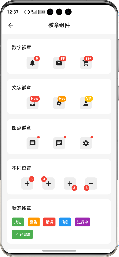
在鸿蒙虚拟机上运行后的实际效果如下:
徽章类型 :
-
圆点徽章 - 小红点提示
-
数字徽章 - 显示具体数量
-
文本徽章 - 显示"New"等文本
徽章位置 : -
右上角 - 标准位置
-
左上角 - 特殊布局
-
右下角 - 底部提示
-
左下角 - 对称布局
动画效果 : -
缩放动画 - 弹性缩放
-
淡入动画 - 渐变显示
-
弹跳动画 - 从上方落下
-
脉冲动画 - 放大缩小
交互式示例 : -
点击图标减少数量
-
数量变化时触发动画
-
购物车数量递增
-
消息数量递减
超大数字显示 : -
99 → 显示"99"
-
100 → 显示"99+"
-
999 → 显示"99+"
🎨 三种徽章类型对比
圆点徽章:    数字徽章:    文本徽章:
    ●           ┌─┐         ┌─────┐
   ┌──┐         │5│         │ New │
   │💬│        └─┘         └─────┘
   └──┘        ┌──┐         ┌──┐
               │💬│         │📧│
               └──┘         └──┘
🎨 四种位置对比
右上角:      左上角:      右下
角:      左下角:
●┌──┐        ┌──┐●
┌──┐          ┌──┐
 │💬│        │💬│
 │💬│●        ●│💬│
 └──┘        └──┘
 └──┘          └──┘
🎨 四种动画效果
缩放动画:    淡入动画:    弹跳动
画:    脉冲动画:
  ┌─┐         ░░░
  ↓            ○
  │5│   →    ▓5▓   →    ┌─┐   →
  ┌───┐
  └─┘         ███
  │5│        │ 5 │
                            └─┘
                               └───┘
二、组件概述
通知徽章是应用中常见的提示组件,用于显示未读消息数量、新功能提示、状态更新等信息。在 OpenHarmony 环境下开发 Flutter 应用时,通知徽章组件需要支持多种类型、位置、动画效果,以适应不同的应用场景。
三、核心功能特性
✅ 三种徽章类型 - 圆点、数字、文本
✅ 四种位置选择 - 四个角落
✅ 四种动画效果 - 缩放、淡入、弹跳、脉冲
✅ 自定义颜色主题 - 背景色、文字色可配置
✅ 超大数字显示 - 超过99显示"99+"
✅ 数值变化动画 - 数字变化时触发动画
四、技术实现架构
4.1 徽章类型枚举
enum BadgeType {
  dot,     // 圆点徽章
  number,  // 数字徽章
  text     // 文本徽章
}
4.2 徽章位置枚举
enum BadgePosition {
  topRight,    // 右上角
  topLeft,     // 左上角
  bottomRight, // 右下角
  bottomLeft   // 左下角
}
4.3 徽章动画枚举
enum BadgeAnimation {
  scale,   // 缩放动画
  fade,    // 淡入动画
  bounce,  // 弹跳动画
  pulse    // 脉冲动画
}
4.4 组件属性定义
class CustomNotificationBadge
extends StatefulWidget {
  final Widget
  child;              // 子组件
  final int?
  count;                // 数字
  final String?
  text;              // 文本
  final BadgeType
  type;            // 徽章类型
  final BadgePosition
  position;    // 徽章位置
  final BadgeAnimation
  animation;  // 动画效果
  final Color?
  backgroundColor;    // 背景颜色
  final Color?
  textColor;          // 文字颜色
  final double?
  size;              // 徽章大小
  final double?
  fontSize;          // 字体大小
  final int
  maxCount;              // 最大数字
  final bool
  show;                 // 是否显示
  final EdgeInsetsGeometry?
  padding; // 内边距
  final Offset?
  offset;            // 偏移量
}
五、CustomNotificationBadge 核心实现
5.1 动画控制器
class _CustomNotificationBadgeState
extends
State<CustomNotificationBadge> with
SingleTickerProviderStateMixin {
  late AnimationController
  _controller;
  late Animation<double> _animation;
  int? _previousCount;

  @override
  void initState() {
    super.initState();
    _controller =
    AnimationController(
      vsync: this,
      duration: const Duration
      (milliseconds: 300),
    );
    _animation = CurvedAnimation(
      parent: _controller,
      curve: Curves.elasticOut,  //
      弹性曲线
    );
    _previousCount = widget.count;
    if (widget.show) {
      _controller.forward();
    }
  }

  @override
  void didUpdateWidget
  (CustomNotificationBadge
  oldWidget) {
    super.didUpdateWidget
    (oldWidget);
    if (widget.count !=
    _previousCount && widget.count
    != null) {
      _previousCount = widget.count;
      _controller.reset();
      _controller.forward();  // 数
      值变化时触发动画
    }
    if (widget.show && !oldWidget.
    show) {
      _controller.forward();
    }
  }

  @override
  void dispose() {
    _controller.dispose();
    super.dispose();
  }
}
动画原理 :
- 使用 AnimationController 控制动画
- Curves.elasticOut 实现弹性效果
- didUpdateWidget 监听数值变化
- 数值变化时重新播放动画
5.2 布局构建
@override
Widget build(BuildContext context) {
  if (!widget.show) {
    return widget.child;  // 不显示时
    只返回子组件
  }

  return Stack(
    clipBehavior: Clip.none,
    children: [
      widget.child,
      Positioned(
        top: _getPosition().dy,
        right: _getPosition().dx,
        child: _buildBadge(),
      ),
    ],
  );
}
布局原理 :
- 使用 Stack 叠加布局
- Positioned 定位徽章
- clipBehavior: Clip.none 允许溢出
5.3 位置计算
Offset _getPosition() {
  final offset = widget.offset ??
  const Offset(-4, -4);
  switch (widget.position) {
    case BadgePosition.topRight:
      return offset;
    case BadgePosition.topLeft:
      return Offset(-offset.dx,
      offset.dy);
    case BadgePosition.bottomRight:
      return Offset(offset.dx,
      -offset.dy);
    case BadgePosition.bottomLeft:
      return Offset(-offset.dx,
      -offset.dy);
  }
}
5.4 圆点徽章实现
case BadgeType.dot:
  badge = Container(
    width: badgeSize * 0.6,
    height: badgeSize * 0.6,
    decoration: BoxDecoration(
      color: bgColor,
      shape: BoxShape.circle,
    ),
  );
5.5 数字徽章实现
case BadgeType.number:
  final displayCount = widget.
  count ?? 0;
  final displayText = displayCount
  > widget.maxCount
      ? '${widget.maxCount}+'
      : displayCount.toString();
  final isLarge = displayText.
  length > 2;

  badge = Container(
    constraints: BoxConstraints(
      minWidth: badgeSize,
      minHeight: badgeSize,
    ),
    padding: widget.padding ??
    EdgeInsets.symmetric(
      horizontal: isLarge ? 6 : 0,
      vertical: 2
    ),
    decoration: BoxDecoration(
      color: bgColor,
      borderRadius: BorderRadius.
      circular(badgeSize),
    ),
    child: Center(
      child: Text(
        displayText,
        style: TextStyle(
          color: txtColor,
          fontSize: txtSize,
          fontWeight: FontWeight.
          bold,
        ),
      ),
    ),
  );
数字显示逻辑 :
- 超过 maxCount 显示 “99+”
- 数字超过2位时增加内边距
- 圆角随尺寸自适应
5.6 文本徽章实现
case BadgeType.text:
  badge = Container(
    constraints: BoxConstraints(
      minWidth: badgeSize,
      minHeight: badgeSize,
    ),
    padding: widget.padding ??
    const EdgeInsets.symmetric
    (horizontal: 8, vertical: 4),
    decoration: BoxDecoration(
      color: bgColor,
      borderRadius: BorderRadius.
      circular(badgeSize / 2),
    ),
    child: Center(
      child: Text(
        widget.text ?? '',
        style: TextStyle(
          color: txtColor,
          fontSize: txtSize,
          fontWeight: FontWeight.
          bold,
        ),
      ),
    ),
  );
5.7 动画效果应用
Widget _applyAnimation(Widget
badge) {
  switch (widget.animation) {
    case BadgeAnimation.scale:
      return ScaleTransition(
        scale: _animation,
        child: badge,
      );
    case BadgeAnimation.fade:
      return FadeTransition(
        opacity: _animation,
        child: badge,
      );
    case BadgeAnimation.bounce:
      return AnimatedBuilder(
        animation: _controller,
        builder: (context, child) {
          return Transform.translate
          (
            offset: Offset(0, -10 *
            (1 - _animation.value)),
            child: child,
          );
        },
        child: badge,
      );
    case BadgeAnimation.pulse:
      return AnimatedBuilder(
        animation: _controller,
        builder: (context, child) {
          final scale = 1.0 + 0.3 *
          (1 - _animation.value);
          return Transform.scale(
            scale: scale,
            child: child,
          );
        },
        child: badge,
      );
  }
}
动画实现 :
- 缩放动画 : ScaleTransition 弹性缩放
- 淡入动画 : FadeTransition 渐变显示
- 弹跳动画 : Transform.translate 从上方落下
- 脉冲动画 : Transform.scale 放大缩小
六、使用示例集锦
示例1:圆点徽章
CustomNotificationBadge(
  type: BadgeType.dot,
  show: true,
  child: Icon(Icons.message),
)
示例2:数字徽章
CustomNotificationBadge(
  type: BadgeType.number,
  count: 5,
  child: Icon(Icons.notifications),
)
示例3:文本徽章
CustomNotificationBadge(
  type: BadgeType.text,
  text: 'New',
  backgroundColor: Colors.green,
  child: Icon(Icons.email),
)
示例4:自定义位置
CustomNotificationBadge(
  position: BadgePosition.topLeft,
  count: 3,
  child: Icon(Icons.inbox),
)
示例5:自定义动画
CustomNotificationBadge(
  animation: BadgeAnimation.bounce,
  count: 5,
  child: Icon(Icons.star),
)
示例6:自定义颜色
CustomNotificationBadge(
  count: 8,
  backgroundColor: Colors.blue,
  child: Icon(Icons.chat),
)
示例7:超大数字
CustomNotificationBadge(
  count: 999,
  maxCount: 99,  // 显示 "99+"
  child: Icon(Icons.inbox),
)
示例8:动态显示/隐藏
CustomNotificationBadge(
  count: 5,
  show: hasUnread,  // 根据条件显示
  child: Icon(Icons.message),
)
七、性能优化策略
7.1 动画优化
- AnimationController :高效管理动画生命周期
- Curves.elasticOut :流畅的弹性效果
- didUpdateWidget :仅在数值变化时触发动画
7.2 渲染优化
- 条件渲染 : show 为 false 时不渲染徽章
- 局部setState :只更新徽章相关状态
7.3 内存优化
- 及时dispose :避免内存泄漏
- 轻量动画 :仅使用缩放、平移、透明度效果
八、常见问题解答
Q1: 如何隐藏徽章?
设置 show: false :
CustomNotificationBadge(
  show: false,
  count: 5,
  child: Icon(Icons.message),
)
Q2: 如何自定义徽章大小?
设置 size 参数:
CustomNotificationBadge(
  size: 24,
  count: 5,
  child: Icon(Icons.message),
)
Q3: 如何调整徽章位置偏移?
设置 offset 参数:
CustomNotificationBadge(
  offset: const Offset(-8, -8),
  count: 5,
  child: Icon(Icons.message),
)
Q4: 如何修改最大数字限制?
设置 maxCount 参数:
CustomNotificationBadge(
  count: 150,
  maxCount: 999,  // 显示 "999+"
  child: Icon(Icons.inbox),
)
Q5: 如何在数值变化时触发动画?
组件内置支持,当 count 值变化时会自动触发动画。
Q6: 如何使用文本徽章?
设置 type: BadgeType.text 和 text 参数:
CustomNotificationBadge(
  type: BadgeType.text,
  text: 'Hot',
  backgroundColor: Colors.orange,
  child: Icon(Icons.fireplace),
)
运行截图
九、总结
本文详细介绍了如何在 Flutter + OpenHarmony 环境中开发一个功能完善的通知徽章组件。该组件具备以下技术亮点:
🎯 丰富的类型选择 - 三种类型适配不同场景
🎨 灵活的位置配置 - 四个角落自由选择
⚡ 流畅的动画效果 - 四种动画提升交互体验
🔧 高度可定制 - 颜色、尺寸、位置全面可控
实际应用场景 :
- 未读消息提示
- 购物车数量
- 新功能标记
- 状态更新提示
- 通知提醒
开源鸿蒙跨平台开发社区汇聚开发者与厂商,共建“一次开发,多端部署”的开源生态,致力于降低跨端开发门槛,推动万物智联创新。
更多推荐
 7
7 0
0- 0


 已为社区贡献60条内容

所有评论(0)