Jetpack Compose的日期时间选择器【样式可自定义,核心代码是滑轮以及年月日边界处理】
·
最近项目需要用到日期,时间选择器,但是jetpack compose的选择器市场很少有我要的那种样式,而且很多bug居多,不是滑轮滚动乱码问题就是控制范围问题,所以觉得需要自己动手搓一个提供大家使用的
编程软件
编程环境
compileOptions {
        sourceCompatibility JavaVersion.VERSION_11
        targetCompatibility JavaVersion.VERSION_11
    }
    kotlinOptions {
        jvmTarget = '11'
    }
    packaging {
        resources {
            excludes += '/META-INF/{AL2.0,LGPL2.1}'
        }
    }

    buildFeatures {
        compose true
        buildConfig = true
    }

    // 开启 viewBinding 视图绑定 [可选] --混合开发
    viewBinding {
        enabled = true
    }

    // 开启 dataBinding [可选] --混合开发
    dataBinding {
        enabled = true
    }

    composeOptions {
        kotlinCompilerExtensionVersion '1.5.1'
    }
还是先上图说话,
好了,直接上代码,各位需要自己定义,需要读懂代码,我测试过,基本没啥bug,有bug评论区提出来,我好及时修改。
先把上展示区代码贴出来,大家自己用心体会下,样式以及区别
@Composable
fun DateTimePickerExampleScreen() {
// 日期时间选择器状态
val initialDateTime = LocalDateTime.of(2024, 5, 20, 13, 14, 0)
var selectedDateTime by remember { mutableStateOf(initialDateTime) }
val dateTimeFormatter = DateTimeFormatter.ofPattern("yyyy-MM-dd HH:mm:ss")
// 单独日期选择器状态
val initialDate = LocalDate.of(2024, 5, 20)
var selectedDate by remember { mutableStateOf(initialDate) }
val dateFormatter = DateTimeFormatter.ofPattern("yyyy-MM-dd")
// 出生日期选择器状态(DatePicker2)
val initialBirthDate = LocalDate.of(1990, 10, 1)
var selectedBirthDate by remember { mutableStateOf(initialBirthDate) }
val currentDate = LocalDate.now() // 当前日期作为最大可选日期
// 车票日期选择器状态(DatePicker3)
val initialTicketDate = LocalDate.now()
var selectedTicketDate by remember { mutableStateOf(initialTicketDate) }
// 带后缀的出生日期选择器状态(DatePicker4)
val initialBirthDate4 = LocalDate.of(1998, 8, 8)
var selectedBirthDate4 by remember { mutableStateOf(initialBirthDate4) }
// 单独时间选择器状态
val initialTime = LocalTime.of(13, 14, 0)
var selectedTime by remember { mutableStateOf(initialTime) }
val timeFormatter = DateTimeFormatter.ofPattern("HH:mm:ss")
LazyColumn(
modifier = Modifier
.fillMaxSize()
.background(MaterialTheme.colorScheme.background)
.padding(16.dp),
horizontalAlignment = Alignment.CenterHorizontally,
verticalArrangement = Arrangement.spacedBy(24.dp)
) {
item {
Text(
text = "日期时间选择器示例",
style = MaterialTheme.typography.headlineMedium,
fontWeight = FontWeight.Bold
)
}
// 1. 日期时间选择器
item {
Column(horizontalAlignment = Alignment.CenterHorizontally) {
Text(
text = "1. 日期时间选择器",
style = MaterialTheme.typography.headlineSmall,
fontWeight = FontWeight.Bold
)
Spacer(modifier = Modifier.height(16.dp))
DateTimePicker(
modifier = Modifier.fillMaxWidth(),
visibleItemsCount = 5,
initialDateTime = initialDateTime,
onDateTimeChanged = { newDateTime ->
selectedDateTime = newDateTime
println("DateTimePicker: 接收到时间变化 $newDateTime")
}
)
Spacer(modifier = Modifier.height(16.dp))
Text(
text = "选中: ${selectedDateTime.format(dateTimeFormatter)}",
style = MaterialTheme.typography.bodyLarge,
color = MaterialTheme.colorScheme.primary
)
}
}
// 2. 单独日期选择器
item {
Column(horizontalAlignment = Alignment.CenterHorizontally) {
Text(
text = "2. 日期选择器(无限制)",
style = MaterialTheme.typography.headlineSmall,
fontWeight = FontWeight.Bold
)
Spacer(modifier = Modifier.height(16.dp))
DatePicker(
modifier = Modifier.fillMaxWidth(),
visibleItemsCount = 5,
initialDate = initialDate,
showDividers = false, // 不显示分割线,更美观
onDateChanged = { newDate ->
selectedDate = newDate
println("DatePicker: 接收到日期变化 $newDate")
},
colors = DatePickerDefaults.colors(
backgroundColor = Color(0xFFE3F2FD), // 浅蓝色背景
borderColor = Color(0xFF81D4FA), // 浅蓝色边框
selectedTextColor = Color(0xFF1976D2), // 深蓝色文字
unselectedTextColor = Color(0xFF424242)
)
)
Spacer(modifier = Modifier.height(16.dp))
Text(
text = "选中: ${selectedDate.format(dateFormatter)}",
style = MaterialTheme.typography.bodyLarge,
color = MaterialTheme.colorScheme.secondary
)
}
}
// 3. 出生日期选择器(DatePicker2 - 限制未来日期)
item {
Column(horizontalAlignment = Alignment.CenterHorizontally) {
Text(
text = "3. 出生日期选择器(限制未来日期)",
style = MaterialTheme.typography.headlineSmall,
fontWeight = FontWeight.Bold
)
Spacer(modifier = Modifier.height(8.dp))
Text(
text = "当前日期: ${currentDate.format(dateFormatter)}",
style = MaterialTheme.typography.bodyMedium,
color = Color.Gray
)
Spacer(modifier = Modifier.height(16.dp))
DatePicker2(
modifier = Modifier.fillMaxWidth(),
visibleItemsCount = 5,
initialDate = initialBirthDate,
maxDate = currentDate, // 限制最大日期为今天
showDividers = false,
onDateChanged = { newDate ->
selectedBirthDate = newDate
println("DatePicker2: 接收到出生日期变化 $newDate")
},
itemHeight = 60.dp,
colors = DatePicker2Defaults.colors(
backgroundColor = Color(0xFFFFF3E0), // 浅橙色背景
borderColor = Color(0xFFFFB74D), // 橙色边框
selectedTextColor = Color(0xFFFF9800), // 橙色文字
unselectedTextColor = Color(0xFF424242)
)
)
Spacer(modifier = Modifier.height(16.dp))
Text(
text = "出生日期: ${selectedBirthDate.format(dateFormatter)}",
style = MaterialTheme.typography.bodyLarge,
color = Color(0xFFFF9800)
)
Spacer(modifier = Modifier.height(8.dp))
Text(
text = "年龄: ${currentDate.year - selectedBirthDate.year} 岁",
style = MaterialTheme.typography.bodyMedium,
color = Color.Gray
)
}
}
// 4. 车票日期选择器(DatePicker3 - 限制过去日期)
item {
Column(horizontalAlignment = Alignment.CenterHorizontally) {
Text(
text = "4. 车票日期选择器(限制过去日期)",
style = MaterialTheme.typography.headlineSmall,
fontWeight = FontWeight.Bold
)
Spacer(modifier = Modifier.height(8.dp))
Text(
text = "当前日期: ${currentDate.format(dateFormatter)}",
style = MaterialTheme.typography.bodyMedium,
color = Color.Gray
)
Spacer(modifier = Modifier.height(16.dp))
DatePicker3(
modifier = Modifier.fillMaxWidth(),
visibleItemsCount = 5,
initialDate = initialTicketDate,
minDate = currentDate, // 限制最小日期为今天
showDividers = false,
onDateChanged = { newDate ->
selectedTicketDate = newDate
println("DatePicker3: 接收到车票日期变化 $newDate")
},
colors = DatePicker3Defaults.colors(
backgroundColor = Color(0xFFE8F5E8), // 浅绿色背景
borderColor = Color(0xFF81C784), // 绿色边框
selectedTextColor = Color(0xFF4CAF50), // 绿色文字
unselectedTextColor = Color(0xFF424242)
)
)
Spacer(modifier = Modifier.height(16.dp))
Text(
text = "出行日期: ${selectedTicketDate.format(dateFormatter)}",
style = MaterialTheme.typography.bodyLarge,
color = Color(0xFF4CAF50)
)
Spacer(modifier = Modifier.height(8.dp))
val daysFromNow = java.time.temporal.ChronoUnit.DAYS.between(currentDate, selectedTicketDate)
Text(
text = if (daysFromNow == 0L) "今天出行" else "${daysFromNow}天后出行",
style = MaterialTheme.typography.bodyMedium,
color = Color.Gray
)
}
}
// 5. 带后缀的出生日期选择器(DatePicker4)
item {
Column(horizontalAlignment = Alignment.CenterHorizontally) {
Text(
text = "5. 带后缀的出生日期选择器",
style = MaterialTheme.typography.headlineSmall,
fontWeight = FontWeight.Bold
)
Spacer(modifier = Modifier.height(8.dp))
Text(
text = "每个滑轮项目都带有年月日后缀",
style = MaterialTheme.typography.bodyMedium,
color = Color.Gray
)
Spacer(modifier = Modifier.height(16.dp))
DatePicker4(
modifier = Modifier.fillMaxWidth(),
visibleItemsCount = 5,
initialDate = initialBirthDate4,
maxDate = currentDate, // 限制最大日期为今天
showDividers = false,
onDateChanged = { newDate ->
selectedBirthDate4 = newDate
println("DatePicker4: 接收到出生日期变化 $newDate")
},
colors = DatePicker4Defaults.colors(
backgroundColor = Color(0xFFFFF3E0), // 浅橙色背景
borderColor = Color(0xFFFFB74D), // 橙色边框
selectedTextColor = Color(0xFFFF9800), // 橙色文字
unselectedTextColor = Color(0xFF424242)
)
)
Spacer(modifier = Modifier.height(16.dp))
Text(
text = "出生日期: ${selectedBirthDate4.format(dateFormatter)}",
style = MaterialTheme.typography.bodyLarge,
color = Color(0xFFFF9800)
)
Spacer(modifier = Modifier.height(8.dp))
Text(
text = "年龄: ${currentDate.year - selectedBirthDate4.year} 岁",
style = MaterialTheme.typography.bodyMedium,
color = Color.Gray
)
Spacer(modifier = Modifier.height(8.dp))
Text(
text = "显示格式: ${selectedBirthDate4.year}年 ${selectedBirthDate4.monthValue}月 ${selectedBirthDate4.dayOfMonth}日",
style = MaterialTheme.typography.bodySmall,
color = Color.Gray
)
}
}
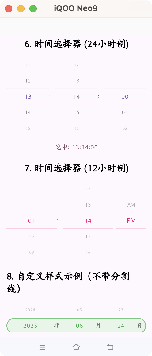
// 6. 单独时间选择器 (24小时制)
item {
Column(horizontalAlignment = Alignment.CenterHorizontally) {
Text(
text = "6. 时间选择器 (24小时制)",
style = MaterialTheme.typography.headlineSmall,
fontWeight = FontWeight.Bold
)
Spacer(modifier = Modifier.height(16.dp))
TimePicker(
modifier = Modifier.fillMaxWidth(),
visibleItemsCount = 5,
initialTime = initialTime,
is24HourFormat = true,
includeSeconds = true,
onTimeChanged = { newTime ->
selectedTime = newTime
println("TimePicker: 接收到时间变化 $newTime")
}
)
Spacer(modifier = Modifier.height(16.dp))
Text(
text = "选中: ${selectedTime.format(timeFormatter)}",
style = MaterialTheme.typography.bodyLarge,
color = MaterialTheme.colorScheme.tertiary
)
}
}
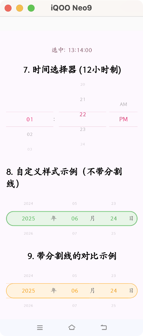
// 7. 时间选择器 (12小时制)
item {
Column(horizontalAlignment = Alignment.CenterHorizontally) {
Text(
text = "7. 时间选择器 (12小时制)",
style = MaterialTheme.typography.headlineSmall,
fontWeight = FontWeight.Bold
)
Spacer(modifier = Modifier.height(16.dp))
TimePicker(
modifier = Modifier.fillMaxWidth(),
visibleItemsCount = 5,
initialTime = initialTime,
is24HourFormat = false,
includeSeconds = false,
onTimeChanged = { newTime ->
println("TimePicker (12h): 接收到时间变化 $newTime")
},
colors = TimePickerDefaults.colors(
selectedTextColor = Color(0xFFE91E63),
unselectedTextColor = Color.Gray
)
)
}
}
// 8. 自定义样式示例(不带分割线)
item {
Column(horizontalAlignment = Alignment.CenterHorizontally) {
Text(
text = "8. 自定义样式示例(不带分割线)",
style = MaterialTheme.typography.headlineSmall,
fontWeight = FontWeight.Bold
)
Spacer(modifier = Modifier.height(16.dp))
DatePicker(
modifier = Modifier.fillMaxWidth(),
visibleItemsCount = 3,
initialDate = LocalDate.now(),
showDividers = false, // 不显示分割线
borderWidth = 2.dp, // 更粗的边框
onDateChanged = {},
colors = DatePickerDefaults.colors(
backgroundColor = Color(0xFFE8F5E8), // 浅绿色背景
borderColor = Color(0xFF81C784), // 浅绿色边框
selectedTextColor = Color(0xFF4CAF50), // 绿色文字
unselectedTextColor = Color(0xFF757575)
)
)
}
}
// 9. 带分割线的对比示例
item {
Column(horizontalAlignment = Alignment.CenterHorizontally) {
Text(
text = "9. 带分割线的对比示例",
style = MaterialTheme.typography.headlineSmall,
fontWeight = FontWeight.Bold
)
Spacer(modifier = Modifier.height(16.dp))
DatePicker(
modifier = Modifier.fillMaxWidth(),
visibleItemsCount = 3,
initialDate = LocalDate.now(),
showDividers = true, // 显示分割线
onDateChanged = {},
colors = DatePickerDefaults.colors(
backgroundColor = Color(0xFFFFF3E0), // 浅橙色背景
borderColor = Color(0xFFFFB74D), // 橙色边框
selectedTextColor = Color(0xFFFF9800), // 橙色文字
unselectedTextColor = Color(0xFF757575),
dividerColor = Color(0xFFFF9800).copy(alpha = 0.5f) // 橙色分割线
)
)
}
}
}
}
核心代码:WheelPicker
import androidx.compose.foundation.gestures.snapping.rememberSnapFlingBehavior
import androidx.compose.foundation.layout.Arrangement
import androidx.compose.foundation.layout.Box
import androidx.compose.foundation.layout.Column
import androidx.compose.foundation.layout.PaddingValues
import androidx.compose.foundation.layout.Spacer
import androidx.compose.foundation.layout.fillMaxSize
import androidx.compose.foundation.layout.height
import androidx.compose.foundation.layout.width
import androidx.compose.foundation.layout.wrapContentHeight
import androidx.compose.foundation.lazy.LazyColumn
import androidx.compose.foundation.lazy.LazyListState
import androidx.compose.foundation.lazy.rememberLazyListState
import androidx.compose.material3.Divider
import androidx.compose.material3.Text
import androidx.compose.runtime.Composable
import androidx.compose.runtime.LaunchedEffect
import androidx.compose.runtime.derivedStateOf
import androidx.compose.runtime.getValue
import androidx.compose.runtime.mutableStateOf
import androidx.compose.runtime.remember
import androidx.compose.runtime.rememberCoroutineScope
import androidx.compose.runtime.setValue
import androidx.compose.runtime.snapshotFlow
import androidx.compose.ui.Alignment
import kotlinx.coroutines.delay
import androidx.compose.ui.Modifier
import androidx.compose.ui.draw.alpha
import androidx.compose.ui.graphics.Color
import androidx.compose.ui.graphics.graphicsLayer
import androidx.compose.ui.platform.LocalDensity
import androidx.compose.ui.text.TextStyle
import androidx.compose.ui.text.style.TextAlign
import androidx.compose.ui.unit.Dp
import androidx.compose.ui.unit.dp
import kotlinx.coroutines.flow.distinctUntilChanged
import kotlinx.coroutines.launch
import kotlin.math.abs
import kotlin.math.absoluteValue

@Composable
fun WheelPicker(
    modifier: Modifier = Modifier,
    items: List<String>,
    initialIndex: Int = 0,
    visibleItemsCount: Int = 5,
    itemHeight: Dp = 40.dp,
    textStyle: TextStyle,
    selectedTextColor: Color,
    unselectedTextColor: Color,
    showDividers: Boolean = true, // 新增:控制分割线是否显示
    dividerColor: Color = selectedTextColor.copy(alpha = 0.3f), // 新增:分割线颜色
    onValueChange: (index: Int) -> Unit,
) {
    val correctedVisibleItemsCount = if (visibleItemsCount % 2 == 0) visibleItemsCount + 1 else visibleItemsCount

    // 关键修正:确保 initialIndex 不会越界
    val safeInitialIndex = initialIndex.coerceIn(0, items.size - 1)
    val lazyListState = rememberLazyListState(safeInitialIndex)
    val density = LocalDensity.current

    // 使用 SnapFlingBehavior
    val snapFlingBehavior = rememberSnapFlingBehavior(lazyListState)

    // 防止外部更新和用户滚动冲突的标记
    var isInternalUpdate by remember { mutableStateOf(false) }

    // 计算当前选中的索引(只在滚动停止时计算,避免频繁更新)
    val currentSelectedIndex by remember {
        derivedStateOf {
            if (lazyListState.isScrollInProgress) {
                // 滚动过程中不计算,使用上一次的值
                return@derivedStateOf lazyListState.firstVisibleItemIndex.coerceIn(0, items.size - 1)
            }

            val itemHeightPx = with(density) { itemHeight.toPx() }
            if (lazyListState.firstVisibleItemScrollOffset > itemHeightPx / 2) {
                (lazyListState.firstVisibleItemIndex + 1).coerceIn(0, items.size - 1)
            } else {
                lazyListState.firstVisibleItemIndex.coerceIn(0, items.size - 1)
            }
        }
    }

    // 只在滚动停止时触发回调,添加防抖机制
    LaunchedEffect(lazyListState.isScrollInProgress) {
        if (!lazyListState.isScrollInProgress && !isInternalUpdate) {
            // 添加小延迟,确保滚动完全停止
            delay(50)

            val itemHeightPx = with(density) { itemHeight.toPx() }
            val finalIndex = if (lazyListState.firstVisibleItemScrollOffset > itemHeightPx / 2) {
                (lazyListState.firstVisibleItemIndex + 1).coerceIn(0, items.size - 1)
            } else {
                lazyListState.firstVisibleItemIndex.coerceIn(0, items.size - 1)
            }
            println("WheelPicker: 滚动停止,选中索引: $finalIndex, 对应值: ${items.getOrNull(finalIndex)}")
            onValueChange(finalIndex)
        }
    }

    // 当外部的 initialIndex 变化时,让列表滚动到新位置
    LaunchedEffect(safeInitialIndex) {
        if (!lazyListState.isScrollInProgress) {
            isInternalUpdate = true
            lazyListState.animateScrollToItem(safeInitialIndex)
            isInternalUpdate = false
        }
    }

    Box(
        modifier = modifier.height(itemHeight * correctedVisibleItemsCount),
        contentAlignment = Alignment.Center
    ) {
        LazyColumn(
            state = lazyListState,
            modifier = Modifier
                .height(itemHeight * correctedVisibleItemsCount)
                .width(200.dp), // 固定宽度
            contentPadding = PaddingValues(vertical = itemHeight * ((correctedVisibleItemsCount - 1) / 2)),
            flingBehavior = snapFlingBehavior // 使用napFlingBehavior
        ) {
            items(items.size) { index ->
                // 使用更稳定的中心计算方式
                val centerIndex = remember(lazyListState.firstVisibleItemIndex, lazyListState.firstVisibleItemScrollOffset) {
                    derivedStateOf {
                        val itemHeightPx = with(density) { itemHeight.toPx() }
                        if (lazyListState.firstVisibleItemScrollOffset > itemHeightPx / 2) {
                            (lazyListState.firstVisibleItemIndex + 1).coerceIn(0, items.size - 1)
                        } else {
                            lazyListState.firstVisibleItemIndex.coerceIn(0, items.size - 1)
                        }
                    }
                }.value

                // 计算距离中心的距离
                val distanceFromCenter = abs(index - centerIndex)

                // 计算透明度和缩放
                val alpha = when {
                    distanceFromCenter == 0 -> 1f
                    distanceFromCenter <= correctedVisibleItemsCount / 2 -> 1f - (distanceFromCenter.toFloat() / (correctedVisibleItemsCount / 2)) * 0.6f
                    else -> 0.2f
                }

                val scale = when {
                    distanceFromCenter == 0 -> 1f
                    distanceFromCenter <= correctedVisibleItemsCount / 2 -> 1f - (distanceFromCenter.toFloat() / (correctedVisibleItemsCount / 2)) * 0.3f
                    else -> 0.7f
                }

                // 计算旋转角度
                val rotationX = -20f * distanceFromCenter.toFloat() / (correctedVisibleItemsCount / 2)

                val isSelected = index == centerIndex

                Box(
                    modifier = Modifier
                        .height(itemHeight)
                        .width(200.dp)
                        .alpha(alpha)
                        .graphicsLayer {
                            scaleX = scale
                            scaleY = scale
                            this.rotationX = rotationX.coerceIn(-20f, 20f)
                        },
                    contentAlignment = Alignment.Center
                ) {
                    Text(
                        text = items.getOrElse(index) { "" },
                        style = textStyle,
                        color = if (isSelected) selectedTextColor else unselectedTextColor,
                        textAlign = TextAlign.Center,
                    )
                }
            }
        }

        // 分割线(可选显示)
        if (showDividers) {
            Box(
                modifier = Modifier
                    .height(itemHeight)
                    .width(200.dp)
                    .alpha(0.6f),
                contentAlignment = Alignment.Center
            ) {
                Column(
                    modifier = Modifier.fillMaxSize(),
                    verticalArrangement = Arrangement.Center,
                    horizontalAlignment = Alignment.CenterHorizontally
                ) {
                    Divider(color = dividerColor, thickness = 1.dp)
                    Spacer(modifier = Modifier.height(itemHeight - 2.dp))
                    Divider(color = dividerColor, thickness = 1.dp)
                }
            }
        }
    }
}
核心代码:DateTimePicker
import androidx.compose.foundation.layout.*
import androidx.compose.material3.MaterialTheme
import androidx.compose.material3.Text
import androidx.compose.runtime.*
import androidx.compose.ui.Alignment
import androidx.compose.ui.Modifier
import androidx.compose.ui.graphics.Color
import androidx.compose.ui.text.TextStyle
import androidx.compose.ui.unit.Dp
import androidx.compose.ui.unit.dp
import java.time.LocalDateTime
import java.time.format.DateTimeFormatter
import java.time.temporal.ChronoUnit


@Composable
fun DateTimePicker(
    modifier: Modifier = Modifier,
    initialDateTime: LocalDateTime = LocalDateTime.now(),
    minYear: Int = 1900,
    maxYear: Int = 2100,
    onDateTimeChanged: (LocalDateTime) -> Unit,
    itemHeight: Dp = 40.dp,
    visibleItemsCount: Int = 5,
    textStyle: TextStyle = MaterialTheme.typography.titleMedium,
    colors: DateTimePickerColors = DateTimePickerDefaults.colors()
) {
    var selectedDateTime by remember { mutableStateOf(initialDateTime) }

    // 当外部的 initialDateTime 变化时,同步内部状态
    LaunchedEffect(initialDateTime) {
        selectedDateTime = initialDateTime
    }

    val years = (minYear..maxYear).map { it.toString() }
    val months = (1..12).map { it.toString().padStart(2, '0') }
    val hours = (0..23).map { it.toString().padStart(2, '0') }
    val minutes = (0..59).map { it.toString().padStart(2, '0') }
    val seconds = (0..59).map { it.toString().padStart(2, '0') }

    val daysInMonth = selectedDateTime.toLocalDate().lengthOfMonth()
    val days = (1..daysInMonth).map { it.toString().padStart(2, '0') }

    fun update(newDateTime: LocalDateTime) {
        // 只有当值真正改变时才更新,防止不必要的重组
        if (newDateTime != selectedDateTime) {
            selectedDateTime = newDateTime
            // 使用防抖机制,避免频繁回调
            onDateTimeChanged(newDateTime)
            println("DateTimePicker: 时间已更新为 $newDateTime") // 调试信息
        }
    }

    Row(
        modifier = modifier,
        horizontalArrangement = Arrangement.Center,
        verticalAlignment = Alignment.CenterVertically
    ) {
        // 关键修正:为每个 WheelPicker 添加 weight

        WheelPicker(
            modifier = Modifier.weight(1.5f), // 年份通常需要更宽
            items = years,
            initialIndex = years.indexOf(selectedDateTime.year.toString()).coerceAtLeast(0),
            itemHeight = itemHeight,
            visibleItemsCount = visibleItemsCount,
            textStyle = textStyle,
            selectedTextColor = colors.selectedTextColor,
            unselectedTextColor = colors.unselectedTextColor,
            onValueChange = { index ->
                val newYear = years[index].toInt()
                val oldDay = selectedDateTime.dayOfMonth
                var newDateTime = selectedDateTime.withYear(newYear)
                val maxDaysInNewMonth = newDateTime.toLocalDate().lengthOfMonth()
                if (oldDay > maxDaysInNewMonth) {
                    newDateTime = newDateTime.withDayOfMonth(maxDaysInNewMonth)
                }
                update(newDateTime)
            }
        )
        Text("年", style = textStyle, color = colors.unselectedTextColor, modifier = Modifier.width(25.dp))

        WheelPicker(
            modifier = Modifier.weight(1f),
            items = months,
            initialIndex = selectedDateTime.monthValue - 1, // 修复:添加初始索引
            itemHeight = itemHeight,
            visibleItemsCount = visibleItemsCount,
            textStyle = textStyle,
            selectedTextColor = colors.selectedTextColor,
            unselectedTextColor = colors.unselectedTextColor,
            onValueChange = { index ->
                val newMonth = months[index].toInt()
                val oldDay = selectedDateTime.dayOfMonth
                var newDateTime = selectedDateTime.withMonth(newMonth)
                val maxDaysInNewMonth = newDateTime.toLocalDate().lengthOfMonth()
                if (oldDay > maxDaysInNewMonth) {
                    newDateTime = newDateTime.withDayOfMonth(maxDaysInNewMonth)
                }
                update(newDateTime)
            }
        )
        Text("月", style = textStyle, color = colors.unselectedTextColor, modifier = Modifier.width(25.dp))

        // 使用 key 来确保在列表变化时重置状态
        key(days.size) {
            WheelPicker(
                modifier = Modifier.weight(1f),
                items = days,
                initialIndex = (selectedDateTime.dayOfMonth - 1).coerceIn(0, days.size - 1),
                itemHeight = itemHeight,
                visibleItemsCount = visibleItemsCount,
                textStyle = textStyle,
                selectedTextColor = colors.selectedTextColor,
                unselectedTextColor = colors.unselectedTextColor,
                onValueChange = { index ->
                    val newDay = days[index].toInt()
                    update(selectedDateTime.withDayOfMonth(newDay))
                }
            )
        }
        Text("日", style = textStyle, color = colors.unselectedTextColor, modifier = Modifier.width(25.dp))

        WheelPicker(
            modifier = Modifier.weight(1f),
            items = hours,
            initialIndex = selectedDateTime.hour, // 修复:添加初始索引
            itemHeight = itemHeight,
            visibleItemsCount = visibleItemsCount,
            textStyle = textStyle,
            selectedTextColor = colors.selectedTextColor,
            unselectedTextColor = colors.unselectedTextColor,
            onValueChange = { index ->
                val newHour = hours[index].toInt()
                update(selectedDateTime.withHour(newHour))
            }
        )
        Text("时", style = textStyle, color = colors.unselectedTextColor, modifier = Modifier.width(25.dp))

        WheelPicker(
            modifier = Modifier.weight(1f),
            items = minutes,
            initialIndex = selectedDateTime.minute, // 修复:添加初始索引
            itemHeight = itemHeight,
            visibleItemsCount = visibleItemsCount,
            textStyle = textStyle,
            selectedTextColor = colors.selectedTextColor,
            unselectedTextColor = colors.unselectedTextColor,
            onValueChange = { index ->
                val newMinute = minutes[index].toInt()
                update(selectedDateTime.withMinute(newMinute))
            }
        )
        Text("分", style = textStyle, color = colors.unselectedTextColor, modifier = Modifier.width(25.dp))

        WheelPicker(
            modifier = Modifier.weight(1f),
            items = seconds,
            initialIndex = selectedDateTime.second, // 修复:添加初始索引
            itemHeight = itemHeight,
            visibleItemsCount = visibleItemsCount,
            textStyle = textStyle,
            selectedTextColor = colors.selectedTextColor,
            unselectedTextColor = colors.unselectedTextColor,
            onValueChange = { index ->
                val newSecond = seconds[index].toInt()
                update(selectedDateTime.withSecond(newSecond))
            }
        )
        Text("秒", style = textStyle, color = colors.unselectedTextColor, modifier = Modifier.width(25.dp))
    }
}


object DateTimePickerDefaults {
    @Composable
    fun colors(
        selectedTextColor: Color = MaterialTheme.colorScheme.primary,
        unselectedTextColor: Color = MaterialTheme.colorScheme.onSurface.copy(alpha = 0.7f),
        dividerColor: Color = MaterialTheme.colorScheme.primary.copy(alpha = 0.5f)
    ): DateTimePickerColors = DateTimePickerColors(
        selectedTextColor = selectedTextColor,
        unselectedTextColor = unselectedTextColor,
        dividerColor = dividerColor
    )
}

data class DateTimePickerColors(
    val selectedTextColor: Color,
    val unselectedTextColor: Color,
    val dividerColor: Color
)
核心代码:TimePicker
import androidx.compose.foundation.layout.*
import androidx.compose.material3.MaterialTheme
import androidx.compose.material3.Text
import androidx.compose.runtime.*
import androidx.compose.ui.Alignment
import androidx.compose.ui.Modifier
import androidx.compose.ui.graphics.Color
import androidx.compose.ui.text.TextStyle
import androidx.compose.ui.unit.Dp
import androidx.compose.ui.unit.dp
import java.time.LocalTime
import java.time.format.DateTimeFormatter

@Composable
fun TimePicker(
    modifier: Modifier = Modifier,
    initialTime: LocalTime = LocalTime.now(),
    is24HourFormat: Boolean = true,
    includeSeconds: Boolean = false,
    onTimeChanged: (LocalTime) -> Unit,
    itemHeight: Dp = 40.dp,
    visibleItemsCount: Int = 5,
    textStyle: TextStyle = MaterialTheme.typography.titleMedium,
    colors: TimePickerColors = TimePickerDefaults.colors()
) {
    var selectedTime by remember { mutableStateOf(initialTime) }

    // 当外部的 initialTime 变化时,同步内部状态
    LaunchedEffect(initialTime) {
        selectedTime = initialTime
    }

    val hours = if (is24HourFormat) {
        (0..23).map { it.toString().padStart(2, '0') }
    } else {
        (1..12).map { it.toString().padStart(2, '0') }
    }

    val minutes = (0..59).map { it.toString().padStart(2, '0') }
    val seconds = (0..59).map { it.toString().padStart(2, '0') }
    val amPmOptions = listOf("AM", "PM")

    fun update(newTime: LocalTime) {
        // 只有当值真正改变时才更新,防止不必要的重组
        if (newTime != selectedTime) {
            selectedTime = newTime
            onTimeChanged(newTime)
            println("TimePicker: 时间已更新为 $newTime") // 调试信息
        }
    }

    Row(
        modifier = modifier,
        horizontalArrangement = Arrangement.Center,
        verticalAlignment = Alignment.CenterVertically
    ) {
        // 小时选择器
        WheelPicker(
            modifier = Modifier.weight(1f),
            items = hours,
            initialIndex = if (is24HourFormat) {
                selectedTime.hour
            } else {
                val hour12 = if (selectedTime.hour == 0) 12 else if (selectedTime.hour > 12) selectedTime.hour - 12 else selectedTime.hour
                hour12 - 1
            },
            itemHeight = itemHeight,
            visibleItemsCount = visibleItemsCount,
            textStyle = textStyle,
            selectedTextColor = colors.selectedTextColor,
            unselectedTextColor = colors.unselectedTextColor,
            onValueChange = { index ->
                val newHour = if (is24HourFormat) {
                    hours[index].toInt()
                } else {
                    val hour12 = hours[index].toInt()
                    val isAM = selectedTime.hour < 12
                    when {
                        hour12 == 12 && isAM -> 0
                        hour12 == 12 && !isAM -> 12
                        !isAM -> hour12 + 12
                        else -> hour12
                    }
                }
                update(selectedTime.withHour(newHour))
            }
        )
        Text(":", style = textStyle, color = colors.unselectedTextColor, modifier = Modifier.width(15.dp))

        // 分钟选择器
        WheelPicker(
            modifier = Modifier.weight(1f),
            items = minutes,
            initialIndex = selectedTime.minute,
            itemHeight = itemHeight,
            visibleItemsCount = visibleItemsCount,
            textStyle = textStyle,
            selectedTextColor = colors.selectedTextColor,
            unselectedTextColor = colors.unselectedTextColor,
            onValueChange = { index ->
                val newMinute = minutes[index].toInt()
                update(selectedTime.withMinute(newMinute))
            }
        )

        // 秒选择器(可选)
        if (includeSeconds) {
            Text(":", style = textStyle, color = colors.unselectedTextColor, modifier = Modifier.width(15.dp))

            WheelPicker(
                modifier = Modifier.weight(1f),
                items = seconds,
                initialIndex = selectedTime.second,
                itemHeight = itemHeight,
                visibleItemsCount = visibleItemsCount,
                textStyle = textStyle,
                selectedTextColor = colors.selectedTextColor,
                unselectedTextColor = colors.unselectedTextColor,
                onValueChange = { index ->
                    val newSecond = seconds[index].toInt()
                    update(selectedTime.withSecond(newSecond))
                }
            )
        }

        // AM/PM 选择器(12小时制时显示)
        if (!is24HourFormat) {
            Spacer(modifier = Modifier.width(8.dp))

            WheelPicker(
                modifier = Modifier.weight(0.6f),
                items = amPmOptions,
                initialIndex = if (selectedTime.hour < 12) 0 else 1,
                itemHeight = itemHeight,
                visibleItemsCount = visibleItemsCount,
                textStyle = textStyle,
                selectedTextColor = colors.selectedTextColor,
                unselectedTextColor = colors.unselectedTextColor,
                onValueChange = { index ->
                    val isAM = index == 0
                    val currentHour12 = if (selectedTime.hour == 0) 12 else if (selectedTime.hour > 12) selectedTime.hour - 12 else selectedTime.hour
                    val newHour = when {
                        currentHour12 == 12 && isAM -> 0
                        currentHour12 == 12 && !isAM -> 12
                        !isAM -> currentHour12 + 12
                        else -> currentHour12
                    }
                    update(selectedTime.withHour(newHour))
                }
            )
        }
    }
}

object TimePickerDefaults {
    @Composable
    fun colors(
        selectedTextColor: Color = MaterialTheme.colorScheme.primary,
        unselectedTextColor: Color = MaterialTheme.colorScheme.onSurface.copy(alpha = 0.7f),
        dividerColor: Color = MaterialTheme.colorScheme.primary.copy(alpha = 0.5f)
    ): TimePickerColors = TimePickerColors(
        selectedTextColor = selectedTextColor,
        unselectedTextColor = unselectedTextColor,
        dividerColor = dividerColor
    )
}

data class TimePickerColors(
    val selectedTextColor: Color,
    val unselectedTextColor: Color,
    val dividerColor: Color
)
核心代码:DatePicker
import androidx.compose.foundation.background
import androidx.compose.foundation.border
import androidx.compose.foundation.layout.*
import androidx.compose.foundation.shape.RoundedCornerShape
import androidx.compose.material3.MaterialTheme
import androidx.compose.material3.Text
import androidx.compose.runtime.*
import androidx.compose.ui.Alignment
import androidx.compose.ui.Modifier
import androidx.compose.ui.draw.clip
import androidx.compose.ui.graphics.Color
import androidx.compose.ui.text.TextStyle
import androidx.compose.ui.unit.Dp
import androidx.compose.ui.unit.dp
import java.time.LocalDate
import java.time.format.DateTimeFormatter

@Composable
fun DatePicker(
    modifier: Modifier = Modifier,
    initialDate: LocalDate = LocalDate.now(),
    minYear: Int = 1900,
    maxYear: Int = 2100,
    onDateChanged: (LocalDate) -> Unit,
    itemHeight: Dp = 40.dp,
    visibleItemsCount: Int = 5,
    textStyle: TextStyle = MaterialTheme.typography.titleMedium,
    colors: DatePickerColors = DatePickerDefaults.colors(),
    showDividers: Boolean = false, // 新增:控制分割线显示,默认不显示
    borderWidth: Dp = 1.dp // 新增:边框宽度
) {
    var selectedDate by remember { mutableStateOf(initialDate) }

    // 当外部的 initialDate 变化时,同步内部状态
    LaunchedEffect(initialDate) {
        selectedDate = initialDate
    }

    val years = (minYear..maxYear).map { it.toString() }
    val months = (1..12).map { it.toString().padStart(2, '0') }

    val daysInMonth = selectedDate.lengthOfMonth()
    val days = (1..daysInMonth).map { it.toString().padStart(2, '0') }

    fun update(newDate: LocalDate) {
        // 只有当值真正改变时才更新,防止不必要的重组
        if (newDate != selectedDate) {
            selectedDate = newDate
            onDateChanged(newDate)
            println("DatePicker: 日期已更新为 $newDate") // 调试信息
        }
    }

    Box(
        modifier = modifier,
        contentAlignment = Alignment.Center
    ) {
        // 背景圆角矩形(带边框)
        Box(
            modifier = Modifier
                .fillMaxWidth()
                .height(itemHeight)
                .clip(RoundedCornerShape(25.dp)) // 圆角半径
                .background(colors.backgroundColor)
                .border(
                    width = borderWidth,
                    color = colors.borderColor,
                    shape = RoundedCornerShape(25.dp)
                )
        )

        // 前景内容
        Row(
            modifier = Modifier.fillMaxWidth(),
            horizontalArrangement = Arrangement.Center,
            verticalAlignment = Alignment.CenterVertically
        ) {
        // 年份选择器
        WheelPicker(
            modifier = Modifier.weight(1.5f), // 年份通常需要更宽
            items = years,
            initialIndex = years.indexOf(selectedDate.year.toString()).coerceAtLeast(0),
            itemHeight = itemHeight,
            visibleItemsCount = visibleItemsCount,
            textStyle = textStyle,
            selectedTextColor = colors.selectedTextColor,
            unselectedTextColor = colors.unselectedTextColor,
            showDividers = showDividers,
            dividerColor = colors.dividerColor,
            onValueChange = { index ->
                val newYear = years[index].toInt()
                val oldDay = selectedDate.dayOfMonth
                var newDate = selectedDate.withYear(newYear)
                val maxDaysInNewMonth = newDate.lengthOfMonth()
                if (oldDay > maxDaysInNewMonth) {
                    newDate = newDate.withDayOfMonth(maxDaysInNewMonth)
                }
                update(newDate)
            }
        )
        Text("年", style = textStyle, color = colors.unselectedTextColor, modifier = Modifier.width(25.dp))

        // 月份选择器
        WheelPicker(
            modifier = Modifier.weight(1f),
            items = months,
            initialIndex = selectedDate.monthValue - 1,
            itemHeight = itemHeight,
            visibleItemsCount = visibleItemsCount,
            textStyle = textStyle,
            selectedTextColor = colors.selectedTextColor,
            unselectedTextColor = colors.unselectedTextColor,
            showDividers = showDividers,
            dividerColor = colors.dividerColor,
            onValueChange = { index ->
                val newMonth = months[index].toInt()
                val oldDay = selectedDate.dayOfMonth
                var newDate = selectedDate.withMonth(newMonth)
                val maxDaysInNewMonth = newDate.lengthOfMonth()
                if (oldDay > maxDaysInNewMonth) {
                    newDate = newDate.withDayOfMonth(maxDaysInNewMonth)
                }
                update(newDate)
            }
        )
        Text("月", style = textStyle, color = colors.unselectedTextColor, modifier = Modifier.width(25.dp))

        // 日期选择器 - 使用 key 来确保在列表变化时重置状态
        key(days.size) {
            WheelPicker(
                modifier = Modifier.weight(1f),
                items = days,
                initialIndex = (selectedDate.dayOfMonth - 1).coerceIn(0, days.size - 1),
                itemHeight = itemHeight,
                visibleItemsCount = visibleItemsCount,
                textStyle = textStyle,
                selectedTextColor = colors.selectedTextColor,
                unselectedTextColor = colors.unselectedTextColor,
                showDividers = showDividers,
                dividerColor = colors.dividerColor,
                onValueChange = { index ->
                    val newDay = days[index].toInt()
                    update(selectedDate.withDayOfMonth(newDay))
                }
            )
        }
        Text("日", style = textStyle, color = colors.unselectedTextColor, modifier = Modifier.width(25.dp))
        }
    }
}

object DatePickerDefaults {
    @Composable
    fun colors(
        selectedTextColor: Color = MaterialTheme.colorScheme.primary,
        unselectedTextColor: Color = MaterialTheme.colorScheme.onSurface.copy(alpha = 0.7f),
        dividerColor: Color = MaterialTheme.colorScheme.primary.copy(alpha = 0.5f),
        backgroundColor: Color = Color(0xFFE3F2FD), // 浅蓝色背景,类似UI图
        borderColor: Color = Color(0xFF81D4FA) // 浅蓝色边框,类似UI图
    ): DatePickerColors = DatePickerColors(
        selectedTextColor = selectedTextColor,
        unselectedTextColor = unselectedTextColor,
        dividerColor = dividerColor,
        backgroundColor = backgroundColor,
        borderColor = borderColor
    )
}

data class DatePickerColors(
    val selectedTextColor: Color,
    val unselectedTextColor: Color,
    val dividerColor: Color,
    val backgroundColor: Color,
    val borderColor: Color
)
核心代码:DatePicker2
import androidx.compose.foundation.background
import androidx.compose.foundation.border
import androidx.compose.foundation.layout.*
import androidx.compose.foundation.shape.RoundedCornerShape
import androidx.compose.material3.MaterialTheme
import androidx.compose.material3.Text
import androidx.compose.runtime.*
import androidx.compose.ui.Alignment
import androidx.compose.ui.Modifier
import androidx.compose.ui.draw.clip
import androidx.compose.ui.graphics.Color
import androidx.compose.ui.text.TextStyle
import androidx.compose.ui.unit.Dp
import androidx.compose.ui.unit.dp
import java.time.LocalDate
import java.time.format.DateTimeFormatter

@Composable
fun DatePicker2(
    modifier: Modifier = Modifier,
    initialDate: LocalDate = LocalDate.now(),
    minYear: Int = 1900,
    maxDate: LocalDate = LocalDate.now(), // 新增:最大可选日期,默认为今天
    onDateChanged: (LocalDate) -> Unit,
    itemHeight: Dp = 40.dp,
    visibleItemsCount: Int = 5,
    textStyle: TextStyle = MaterialTheme.typography.titleMedium,
    colors: DatePicker2Colors = DatePicker2Defaults.colors(),
    showDividers: Boolean = false,
    borderWidth: Dp = 1.dp
) {
    // 确保初始日期不超过最大日期
    var selectedDate by remember { mutableStateOf(initialDate.coerceAtMost(maxDate)) }

    // 当外部的 initialDate 或 maxDate 变化时,同步内部状态
    LaunchedEffect(initialDate, maxDate) {
        selectedDate = initialDate.coerceAtMost(maxDate)
    }

    // 动态计算可选年份范围
    val maxYear = maxDate.year
    val years = (minYear..maxYear).map { it.toString() }

    // 动态计算可选月份范围
    val months = if (selectedDate.year == maxYear) {
        // 当前年:只显示到最大日期的月份
        (1..maxDate.monthValue).map { it.toString().padStart(2, '0') }
    } else {
        // 非当前年:显示完整的12个月
        (1..12).map { it.toString().padStart(2, '0') }
    }

    // 动态计算可选日期范围
    val daysInMonth = selectedDate.lengthOfMonth()
    val maxDay = if (selectedDate.year == maxYear && selectedDate.monthValue == maxDate.monthValue) {
        // 当前年月:只显示到最大日期的天数
        maxDate.dayOfMonth
    } else {
        // 非当前年月:显示该月的所有天数
        daysInMonth
    }
    val days = (1..maxDay).map { it.toString().padStart(2, '0') }

    fun update(newDate: LocalDate) {
        // 确保新日期不超过最大日期
        val constrainedDate = newDate.coerceAtMost(maxDate)
        if (constrainedDate != selectedDate) {
            selectedDate = constrainedDate
            onDateChanged(constrainedDate)
            println("DatePicker2: 日期已更新为 $constrainedDate") // 调试信息
        }
    }

    Box(
        modifier = modifier,
        contentAlignment = Alignment.Center
    ) {
        // 背景圆角矩形(带边框)
        Box(
            modifier = Modifier
                .fillMaxWidth()
                .height(itemHeight)
                .clip(RoundedCornerShape(25.dp))
                .background(colors.backgroundColor)
                .border(
                    width = borderWidth,
                    color = colors.borderColor,
                    shape = RoundedCornerShape(25.dp)
                )
        )

        // 前景内容
        Row(
            modifier = Modifier.fillMaxWidth(),
            horizontalArrangement = Arrangement.Center,
            verticalAlignment = Alignment.CenterVertically
        ) {
            // 年份选择器
            WheelPicker(
                modifier = Modifier.weight(1.5f),
                items = years,
                initialIndex = years.indexOf(selectedDate.year.toString()).coerceAtLeast(0),
                itemHeight = itemHeight,
                visibleItemsCount = visibleItemsCount,
                textStyle = textStyle,
                selectedTextColor = colors.selectedTextColor,
                unselectedTextColor = colors.unselectedTextColor,
                showDividers = showDividers,
                dividerColor = colors.dividerColor,
                onValueChange = { index ->
                    val newYear = years[index].toInt()
                    var newDate = selectedDate.withYear(newYear)

                    // 如果切换到最大年份,需要检查月份是否超出限制
                    if (newYear == maxYear && newDate.monthValue > maxDate.monthValue) {
                        newDate = newDate.withMonth(maxDate.monthValue)
                    }

                    // 检查日期是否超出该月的天数限制
                    val maxDayInNewMonth = if (newYear == maxYear && newDate.monthValue == maxDate.monthValue) {
                        maxDate.dayOfMonth
                    } else {
                        newDate.lengthOfMonth()
                    }

                    if (newDate.dayOfMonth > maxDayInNewMonth) {
                        newDate = newDate.withDayOfMonth(maxDayInNewMonth)
                    }

                    update(newDate)
                }
            )
            Text("年", style = textStyle, color = colors.unselectedTextColor, modifier = Modifier.width(25.dp))

            // 月份选择器
            key(selectedDate.year) { // 当年份变化时重新创建月份选择器
                WheelPicker(
                    modifier = Modifier.weight(1f),
                    items = months,
                    initialIndex = (selectedDate.monthValue - 1).coerceIn(0, months.size - 1),
                    itemHeight = itemHeight,
                    visibleItemsCount = visibleItemsCount,
                    textStyle = textStyle,
                    selectedTextColor = colors.selectedTextColor,
                    unselectedTextColor = colors.unselectedTextColor,
                    showDividers = showDividers,
                    dividerColor = colors.dividerColor,
                    onValueChange = { index ->
                        val newMonth = months[index].toInt()
                        var newDate = selectedDate.withMonth(newMonth)

                        // 检查日期是否超出该月的天数限制
                        val maxDayInNewMonth = if (selectedDate.year == maxYear && newMonth == maxDate.monthValue) {
                            maxDate.dayOfMonth
                        } else {
                            newDate.lengthOfMonth()
                        }

                        if (newDate.dayOfMonth > maxDayInNewMonth) {
                            newDate = newDate.withDayOfMonth(maxDayInNewMonth)
                        }

                        update(newDate)
                    }
                )
            }
            Text("月", style = textStyle, color = colors.unselectedTextColor, modifier = Modifier.width(25.dp))

            // 日期选择器
            key(selectedDate.year, selectedDate.monthValue) { // 当年月变化时重新创建日期选择器
                WheelPicker(
                    modifier = Modifier.weight(1f),
                    items = days,
                    initialIndex = (selectedDate.dayOfMonth - 1).coerceIn(0, days.size - 1),
                    itemHeight = itemHeight,
                    visibleItemsCount = visibleItemsCount,
                    textStyle = textStyle,
                    selectedTextColor = colors.selectedTextColor,
                    unselectedTextColor = colors.unselectedTextColor,
                    showDividers = showDividers,
                    dividerColor = colors.dividerColor,
                    onValueChange = { index ->
                        val newDay = days[index].toInt()
                        update(selectedDate.withDayOfMonth(newDay))
                    }
                )
            }
            Text("日", style = textStyle, color = colors.unselectedTextColor, modifier = Modifier.width(25.dp))
        }
    }
}

object DatePicker2Defaults {
    @Composable
    fun colors(
        selectedTextColor: Color = MaterialTheme.colorScheme.primary,
        unselectedTextColor: Color = MaterialTheme.colorScheme.onSurface.copy(alpha = 0.7f),
        dividerColor: Color = MaterialTheme.colorScheme.primary.copy(alpha = 0.5f),
        backgroundColor: Color = Color(0xFFE3F2FD), // 浅蓝色背景
        borderColor: Color = Color(0xFF81D4FA) // 浅蓝色边框
    ): DatePicker2Colors = DatePicker2Colors(
        selectedTextColor = selectedTextColor,
        unselectedTextColor = unselectedTextColor,
        dividerColor = dividerColor,
        backgroundColor = backgroundColor,
        borderColor = borderColor
    )
}

data class DatePicker2Colors(
    val selectedTextColor: Color,
    val unselectedTextColor: Color,
    val dividerColor: Color,
    val backgroundColor: Color,
    val borderColor: Color
)
核心代码:DatePicker3
import androidx.compose.foundation.background
import androidx.compose.foundation.border
import androidx.compose.foundation.layout.*
import androidx.compose.foundation.shape.RoundedCornerShape
import androidx.compose.material3.MaterialTheme
import androidx.compose.material3.Text
import androidx.compose.runtime.*
import androidx.compose.ui.Alignment
import androidx.compose.ui.Modifier
import androidx.compose.ui.draw.clip
import androidx.compose.ui.graphics.Color
import androidx.compose.ui.text.TextStyle
import androidx.compose.ui.unit.Dp
import androidx.compose.ui.unit.dp
import java.time.LocalDate
import java.time.format.DateTimeFormatter

@Composable
fun DatePicker3(
    modifier: Modifier = Modifier,
    initialDate: LocalDate = LocalDate.now(),
    minDate: LocalDate = LocalDate.now(), // 新增:最小可选日期,默认为今天
    maxYear: Int = 2090, // 最大年份限制,避免无限滚动
    onDateChanged: (LocalDate) -> Unit,
    itemHeight: Dp = 40.dp,
    visibleItemsCount: Int = 5,
    textStyle: TextStyle = MaterialTheme.typography.titleMedium,
    colors: DatePicker3Colors = DatePicker3Defaults.colors(),
    showDividers: Boolean = false,
    borderWidth: Dp = 1.dp
) {
    // 确保初始日期不早于最小日期
    var selectedDate by remember { mutableStateOf(initialDate.coerceAtLeast(minDate)) }

    // 当外部的 initialDate 或 minDate 变化时,同步内部状态
    LaunchedEffect(initialDate, minDate) {
        selectedDate = initialDate.coerceAtLeast(minDate)
    }

    // 动态计算可选年份范围
    val minYear = minDate.year
    val years = (minYear..maxYear).map { it.toString() }

    // 动态计算可选月份范围
    val months = if (selectedDate.year == minYear) {
        // 最小年份:只显示从最小日期的月份开始
        (minDate.monthValue..12).map { it.toString().padStart(2, '0') }
    } else {
        // 非最小年份:显示完整的12个月
        (1..12).map { it.toString().padStart(2, '0') }
    }

    // 动态计算可选日期范围
    val daysInMonth = selectedDate.lengthOfMonth()
    val minDay = if (selectedDate.year == minYear && selectedDate.monthValue == minDate.monthValue) {
        // 最小年月:只显示从最小日期的天数开始
        minDate.dayOfMonth
    } else {
        // 非最小年月:从1号开始显示
        1
    }
    val days = (minDay..daysInMonth).map { it.toString().padStart(2, '0') }

    fun update(newDate: LocalDate) {
        // 确保新日期不早于最小日期
        val constrainedDate = newDate.coerceAtLeast(minDate)
        if (constrainedDate != selectedDate) {
            selectedDate = constrainedDate
            onDateChanged(constrainedDate)
            println("DatePicker3: 日期已更新为 $constrainedDate") // 调试信息
        }
    }

    Box(
        modifier = modifier,
        contentAlignment = Alignment.Center
    ) {
        // 背景圆角矩形(带边框)
        Box(
            modifier = Modifier
                .fillMaxWidth()
                .height(itemHeight)
                .clip(RoundedCornerShape(25.dp))
                .background(colors.backgroundColor)
                .border(
                    width = borderWidth,
                    color = colors.borderColor,
                    shape = RoundedCornerShape(25.dp)
                )
        )

        // 前景内容
        Row(
            modifier = Modifier.fillMaxWidth(),
            horizontalArrangement = Arrangement.Center,
            verticalAlignment = Alignment.CenterVertically
        ) {
            // 年份选择器
            WheelPicker(
                modifier = Modifier.weight(1.5f),
                items = years,
                initialIndex = years.indexOf(selectedDate.year.toString()).coerceAtLeast(0),
                itemHeight = itemHeight,
                visibleItemsCount = visibleItemsCount,
                textStyle = textStyle,
                selectedTextColor = colors.selectedTextColor,
                unselectedTextColor = colors.unselectedTextColor,
                showDividers = showDividers,
                dividerColor = colors.dividerColor,
                onValueChange = { index ->
                    val newYear = years[index].toInt()
                    var newDate = selectedDate.withYear(newYear)

                    // 如果切换到最小年份,需要检查月份是否早于限制
                    if (newYear == minYear && newDate.monthValue < minDate.monthValue) {
                        newDate = newDate.withMonth(minDate.monthValue)
                    }

                    // 检查日期是否早于该月的最小日期限制
                    val minDayInNewMonth = if (newYear == minYear && newDate.monthValue == minDate.monthValue) {
                        minDate.dayOfMonth
                    } else {
                        1
                    }

                    if (newDate.dayOfMonth < minDayInNewMonth) {
                        newDate = newDate.withDayOfMonth(minDayInNewMonth)
                    }

                    update(newDate)
                }
            )
            Text("年", style = textStyle, color = colors.unselectedTextColor, modifier = Modifier.width(25.dp))

            // 月份选择器
            key(selectedDate.year) { // 当年份变化时重新创建月份选择器
                WheelPicker(
                    modifier = Modifier.weight(1f),
                    items = months,
                    initialIndex = if (selectedDate.year == minYear) {
                        (selectedDate.monthValue - minDate.monthValue).coerceAtLeast(0)
                    } else {
                        (selectedDate.monthValue - 1).coerceIn(0, months.size - 1)
                    },
                    itemHeight = itemHeight,
                    visibleItemsCount = visibleItemsCount,
                    textStyle = textStyle,
                    selectedTextColor = colors.selectedTextColor,
                    unselectedTextColor = colors.unselectedTextColor,
                    showDividers = showDividers,
                    dividerColor = colors.dividerColor,
                    onValueChange = { index ->
                        val newMonth = months[index].toInt()
                        var newDate = selectedDate.withMonth(newMonth)

                        // 检查日期是否早于该月的最小日期限制
                        val minDayInNewMonth = if (selectedDate.year == minYear && newMonth == minDate.monthValue) {
                            minDate.dayOfMonth
                        } else {
                            1
                        }

                        if (newDate.dayOfMonth < minDayInNewMonth) {
                            newDate = newDate.withDayOfMonth(minDayInNewMonth)
                        }

                        update(newDate)
                    }
                )
            }
            Text("月", style = textStyle, color = colors.unselectedTextColor, modifier = Modifier.width(25.dp))

            // 日期选择器
            key(selectedDate.year, selectedDate.monthValue) { // 当年月变化时重新创建日期选择器
                WheelPicker(
                    modifier = Modifier.weight(1f),
                    items = days,
                    initialIndex = if (selectedDate.year == minYear && selectedDate.monthValue == minDate.monthValue) {
                        (selectedDate.dayOfMonth - minDate.dayOfMonth).coerceAtLeast(0)
                    } else {
                        (selectedDate.dayOfMonth - 1).coerceIn(0, days.size - 1)
                    },
                    itemHeight = itemHeight,
                    visibleItemsCount = visibleItemsCount,
                    textStyle = textStyle,
                    selectedTextColor = colors.selectedTextColor,
                    unselectedTextColor = colors.unselectedTextColor,
                    showDividers = showDividers,
                    dividerColor = colors.dividerColor,
                    onValueChange = { index ->
                        val newDay = days[index].toInt()
                        update(selectedDate.withDayOfMonth(newDay))
                    }
                )
            }
            Text("日", style = textStyle, color = colors.unselectedTextColor, modifier = Modifier.width(25.dp))
        }
    }
}

object DatePicker3Defaults {
    @Composable
    fun colors(
        selectedTextColor: Color = MaterialTheme.colorScheme.primary,
        unselectedTextColor: Color = MaterialTheme.colorScheme.onSurface.copy(alpha = 0.7f),
        dividerColor: Color = MaterialTheme.colorScheme.primary.copy(alpha = 0.5f),
        backgroundColor: Color = Color(0xFFE8F5E8), // 浅绿色背景,表示可选择的未来
        borderColor: Color = Color(0xFF81C784) // 绿色边框
    ): DatePicker3Colors = DatePicker3Colors(
        selectedTextColor = selectedTextColor,
        unselectedTextColor = unselectedTextColor,
        dividerColor = dividerColor,
        backgroundColor = backgroundColor,
        borderColor = borderColor
    )
}

data class DatePicker3Colors(
    val selectedTextColor: Color,
    val unselectedTextColor: Color,
    val dividerColor: Color,
    val backgroundColor: Color,
    val borderColor: Color
)
核心代码:DatePicker4
import androidx.compose.foundation.background
import androidx.compose.foundation.border
import androidx.compose.foundation.layout.*
import androidx.compose.foundation.shape.RoundedCornerShape
import androidx.compose.material3.MaterialTheme
import androidx.compose.runtime.*
import androidx.compose.ui.Alignment
import androidx.compose.ui.Modifier
import androidx.compose.ui.draw.clip
import androidx.compose.ui.graphics.Color
import androidx.compose.ui.text.TextStyle
import androidx.compose.ui.unit.Dp
import androidx.compose.ui.unit.dp
import java.time.LocalDate
import java.time.format.DateTimeFormatter

@Composable
fun DatePicker4(
    modifier: Modifier = Modifier,
    initialDate: LocalDate = LocalDate.now(),
    minYear: Int = 1900,
    maxDate: LocalDate = LocalDate.now(), // 限制未来日期,类似出生日期选择器
    onDateChanged: (LocalDate) -> Unit,
    itemHeight: Dp = 40.dp,
    visibleItemsCount: Int = 5,
    textStyle: TextStyle = MaterialTheme.typography.titleMedium,
    colors: DatePicker4Colors = DatePicker4Defaults.colors(),
    showDividers: Boolean = false,
    borderWidth: Dp = 1.dp
) {
    // 确保初始日期不超过最大日期
    var selectedDate by remember { mutableStateOf(initialDate.coerceAtMost(maxDate)) }

    // 当外部的 initialDate 或 maxDate 变化时,同步内部状态
    LaunchedEffect(initialDate, maxDate) {
        selectedDate = initialDate.coerceAtMost(maxDate)
    }

    // 动态计算可选年份范围(带"年"后缀)
    val maxYear = maxDate.year
    val years = (minYear..maxYear).map { "${it}年" }

    // 动态计算可选月份范围(带"月"后缀)
    val months = if (selectedDate.year == maxYear) {
        // 当前年:只显示到最大日期的月份
        (1..maxDate.monthValue).map { "${it}月" }
    } else {
        // 非当前年:显示完整的12个月
        (1..12).map { "${it}月" }
    }

    // 动态计算可选日期范围(带"日"后缀)
    val daysInMonth = selectedDate.lengthOfMonth()
    val maxDay = if (selectedDate.year == maxYear && selectedDate.monthValue == maxDate.monthValue) {
        // 当前年月:只显示到最大日期的天数
        maxDate.dayOfMonth
    } else {
        // 非当前年月:显示该月的所有天数
        daysInMonth
    }
    val days = (1..maxDay).map { "${it}日" }

    fun update(newDate: LocalDate) {
        // 确保新日期不超过最大日期
        val constrainedDate = newDate.coerceAtMost(maxDate)
        if (constrainedDate != selectedDate) {
            selectedDate = constrainedDate
            onDateChanged(constrainedDate)
            println("DatePicker4: 日期已更新为 $constrainedDate") // 调试信息
        }
    }

    Box(
        modifier = modifier,
        contentAlignment = Alignment.Center
    ) {
        // 背景圆角矩形(带边框)
        Box(
            modifier = Modifier
                .fillMaxWidth()
                .height(itemHeight)
                .clip(RoundedCornerShape(25.dp))
                .background(colors.backgroundColor)
                .border(
                    width = borderWidth,
                    color = colors.borderColor,
                    shape = RoundedCornerShape(25.dp)
                )
        )

        // 前景内容
        Row(
            modifier = Modifier.fillMaxWidth(),
            horizontalArrangement = Arrangement.Center,
            verticalAlignment = Alignment.CenterVertically
        ) {
            // 年份选择器(每项都带"年"后缀)
            WheelPicker(
                modifier = Modifier.weight(1f),
                items = years,
                initialIndex = years.indexOf("${selectedDate.year}年").coerceAtLeast(0),
                itemHeight = itemHeight,
                visibleItemsCount = visibleItemsCount,
                textStyle = textStyle,
                selectedTextColor = colors.selectedTextColor,
                unselectedTextColor = colors.unselectedTextColor,
                showDividers = showDividers,
                dividerColor = colors.dividerColor,
                onValueChange = { index ->
                    val newYear = years[index].removeSuffix("年").toInt()
                    val oldDay = selectedDate.dayOfMonth
                    var newDate = selectedDate.withYear(newYear)

                    // 如果切换到最大年份,需要检查月份是否超出限制
                    if (newYear == maxYear && newDate.monthValue > maxDate.monthValue) {
                        newDate = newDate.withMonth(maxDate.monthValue)
                    }

                    // 检查日期是否超出该月的天数限制
                    val maxDayInNewMonth = if (newYear == maxYear && newDate.monthValue == maxDate.monthValue) {
                        maxDate.dayOfMonth
                    } else {
                        newDate.lengthOfMonth()
                    }

                    if (newDate.dayOfMonth > maxDayInNewMonth) {
                        newDate = newDate.withDayOfMonth(maxDayInNewMonth)
                    }

                    update(newDate)
                }
            )

            // 月份选择器(每项都带"月"后缀)
            key(selectedDate.year) { // 当年份变化时重新创建月份选择器
                WheelPicker(
                    modifier = Modifier.weight(1f),
                    items = months,
                    initialIndex = (selectedDate.monthValue - 1).coerceIn(0, months.size - 1),
                    itemHeight = itemHeight,
                    visibleItemsCount = visibleItemsCount,
                    textStyle = textStyle,
                    selectedTextColor = colors.selectedTextColor,
                    unselectedTextColor = colors.unselectedTextColor,
                    showDividers = showDividers,
                    dividerColor = colors.dividerColor,
                    onValueChange = { index ->
                        val newMonth = months[index].removeSuffix("月").toInt()
                        var newDate = selectedDate.withMonth(newMonth)

                        // 检查日期是否超出该月的天数限制
                        val maxDayInNewMonth = if (selectedDate.year == maxYear && newMonth == maxDate.monthValue) {
                            maxDate.dayOfMonth
                        } else {
                            newDate.lengthOfMonth()
                        }

                        if (newDate.dayOfMonth > maxDayInNewMonth) {
                            newDate = newDate.withDayOfMonth(maxDayInNewMonth)
                        }

                        update(newDate)
                    }
                )
            }

            // 日期选择器(每项都带"日"后缀)
            key(selectedDate.year, selectedDate.monthValue) { // 当年月变化时重新创建日期选择器
                WheelPicker(
                    modifier = Modifier.weight(1f),
                    items = days,
                    initialIndex = (selectedDate.dayOfMonth - 1).coerceIn(0, days.size - 1),
                    itemHeight = itemHeight,
                    visibleItemsCount = visibleItemsCount,
                    textStyle = textStyle,
                    selectedTextColor = colors.selectedTextColor,
                    unselectedTextColor = colors.unselectedTextColor,
                    showDividers = showDividers,
                    dividerColor = colors.dividerColor,
                    onValueChange = { index ->
                        val newDay = days[index].removeSuffix("日").toInt()
                        update(selectedDate.withDayOfMonth(newDay))
                    }
                )
            }
        }
    }
}

object DatePicker4Defaults {
    @Composable
    fun colors(
        selectedTextColor: Color = MaterialTheme.colorScheme.primary,
        unselectedTextColor: Color = MaterialTheme.colorScheme.onSurface.copy(alpha = 0.7f),
        dividerColor: Color = MaterialTheme.colorScheme.primary.copy(alpha = 0.5f),
        backgroundColor: Color = Color(0xFFFFF3E0), // 浅橙色背景,类似出生日期选择器
        borderColor: Color = Color(0xFFFFB74D) // 橙色边框
    ): DatePicker4Colors = DatePicker4Colors(
        selectedTextColor = selectedTextColor,
        unselectedTextColor = unselectedTextColor,
        dividerColor = dividerColor,
        backgroundColor = backgroundColor,
        borderColor = borderColor
    )
}

data class DatePicker4Colors(
    val selectedTextColor: Color,
    val unselectedTextColor: Color,
    val dividerColor: Color,
    val backgroundColor: Color,
    val borderColor: Color
)
为啥有几个DatePicker,因为怕有的人需求不一样,但是又不会更改代码,所以就多写一些测试,大家各需索取,以上代码在jetpack compose中拿来即用,方便大家使用,希望大家多多开源代码,帮助后来者。
赠人玫瑰,手留余香,博主喜欢开源代码,但也请麻烦各位支持作者原创的产品,谢谢!

开源鸿蒙跨平台开发社区汇聚开发者与厂商,共建“一次开发,多端部署”的开源生态,致力于降低跨端开发门槛,推动万物智联创新。
更多推荐
 10
10 0
0- 0


 已为社区贡献3条内容

所有评论(0)