Web前端之Style的corner-shape全面解析与实践,圆角终于不只是一个border-radius、切角
Web前端之Style的corner-shape全面解析与实践,圆角终于不只是一个border-radius、切角
引言
圆角在网页设计中是最常用的视觉元素之一,随着现代 UI 趋向更精致、自然的曲线,单纯的
border-radius已经无法满足一些高级设计需求。现代浏览器引入了corner-shape属性,它可以控制元素角的形状,实现圆角、方角、凹角甚至超椭圆角,非常适合现代 UI 设计。
corner-shape 基础概念
corner-shape属性用于控制元素四个角的角形风格(形状),它必须配合border-radius使用,否则角的大小无法生效。
.box {
  border-radius: 24px;
  corner-shape: round;
}
说明:
border-radius决定角的半径大小,corner-shape决定角的形状类型。
注意:不是所有浏览器都完全支持
corner-shape,目前(2026-03)主要在 Chrome、Edge、Opera 等现代浏览器中支持。
以前 vs 现在
需求 以前 现在 苹果圆角 SVG / 复杂 clip-path corner-shape: squircle切角卡片 clip-path bevel内凹角 伪元素 notchFigma smooth 做不到 superellipse()
corner-shape 可用值(关键词 + 函数)
关键词值(官方标准)
属性值 描述 示例效果 round普通圆角 标准圆润角 squircle超椭圆角 苹果系统风格,更饱满自然 bevel倒角 直线切角,干脆利落 scoop凹角 往内挖,产生凹角感 notch内切口 锐利的内切角,明显的凹切角 square方角 无圆角,直角
函数值
superellipse(number) 可以自定义曲线形状
参数越大 => 越接近方角
参数越小 => 越接近圆角甚至凹角
支持 infinity 和 -infinity 表示极端方角/内切
corner‑shape 全部取值(标准定义)
关键词值(预定义常用形状)
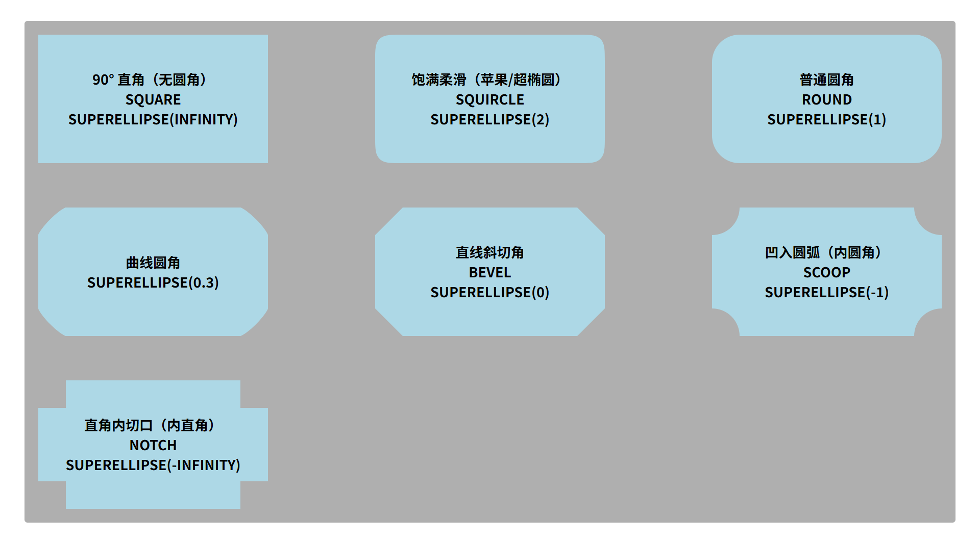
属性值 等价等价于 视觉形状 squaresuperellipse(infinity)90° 直角(无圆角) squirclesuperellipse(2)饱满柔滑(苹果/超椭圆) roundsuperellipse(1)普通圆角 bevelsuperellipse(0)直线斜切角 scoopsuperellipse(-1)凹入圆弧 notchsuperellipse(-infinity)直角内切口 这 6 个就是当前(2026-03)规范中默认支持的全部关键字值
函数值
superellipse() 可自定义曲线形状。
可以传递任意实数、infinity、-infinity,产生连续的圆角、方角、凹角过渡。
参数值 视觉形状 >1越接近方形角(更硬、更直) -1标准圆角 (0, 1)柔和圆角 0等价 bevel(斜切)<0凹入形状(内凹曲线) infinity完全方角(等价 square)-infinity极端内切(等价 notch)除了上面的 6 个关键字之外,唯一的扩展机制是 superellipse(),这是由规范允许的全部函数式取值。
所有 corner-shape 值完整示例
值 描述 CSS 示例 round普通圆角 border-radius:24px; corner-shape: round;squircle超椭圆 / 苹果风 border-radius:24px; corner-shape: squircle;bevel倒角 / 切角 border-radius:24px; corner-shape: bevel;scoop内凹圆弧 border-radius:24px; corner-shape: scoop;notch内切口 / 凹角 border-radius:24px; corner-shape: notch;square直角(忽略圆角) border-radius:24px; corner-shape: square;superellipse(n)自定义平滑度 border-radius:24px; corner-shape: superellipse(1.6);
Per-corner 细粒度写法
可以对每个角分别设置(不只用 shorthand),这个更适合复杂 UI 设计。
.card {
  border-radius: 24px;
  corner-top-left-shape: squircle;
  corner-top-right-shape: bevel;
  corner-bottom-right-shape: scallop;
  corner-bottom-left-shape: superellipse(3);
}
基础案例
html
<div class="box">
    <div class="item square">
        <p>90° 直角(无圆角)</p>
        <p>square</p>
        <p>superellipse(infinity)</p>
    </div>
    <div class="item squircle">
        <p>饱满柔滑(苹果/超椭圆)</p>
        <p>squircle</p>
        <p>superellipse(2)</p>
    </div>
    <div class="item round">
        <p>普通圆角</p>
        <p>round</p>
        <p>superellipse(1)</p>
    </div>
    <div class="item superellipse">
        <p>曲线圆角</p>
        <p>superellipse(0.3)</p>
    </div>
    <div class="item bevel">
        <p>直线斜切角</p>
        <p>bevel</p>
        <p>superellipse(0)</p>
    </div>
    <div class="item scoop">
        <p>凹入圆弧(内圆角)</p>
        <p>scoop</p>
        <p>superellipse(-1)</p>
    </div>
    <div class="item notch">
        <p>直角内切口(内直角)</p>
        <p>notch</p>
        <p>superellipse(-infinity)</p>
    </div>
</div>
style
* {
    margin: 0px;
    padding: 0px;
    box-sizing: border-box;
}

body {
    width: 100vw;
    height: 100vh;
    display: flex;
    justify-content: center;
    align-items: center;
}

.box {
    width: 80%;
    display: flex;
    flex-wrap: wrap;
    justify-content: space-between;
    row-gap: 88px;
    padding: 28px;
    background: #afafaf;
    border-radius: 4px;
}

.item {
    width: 300px;
    height: 268px;
    display: flex;
    flex-direction: column;
    justify-content: center;
    align-items: center;
    font-size: 18px;
    font-weight: bold;
    background: #add8e6;
    border-radius: 36px;
    text-transform: uppercase;
}

.square {
    /* 不拐弯,直角 */
    corner-shape: square;
}

.squircle {
    /* 更饱满、更像超椭圆的角,Apple系界面很爱这类角 */
    corner-shape: squircle;
}

.round {
    /* 普通圆角 */
    corner-shape: round;
}

.superellipse {
    /* 详细曲线控制 */
    corner-shape: superellipse(0.3);
}

.bevel {
    /* 斜切一刀,干脆利落 */
    corner-shape: bevel;
}

.scoop {
    /* 往里挖一点,有凹角感,内圆角 */
    corner-shape: scoop;
}

.notch {
    /* 内切口,内直角 */
    corner-shape: notch;
}
效果
结束语
1、corner-shape 扩展了 CSS 圆角能力,可以让角形变得更加丰富和可控
2、关键字包括 round、squircle、bevel、scoop、notch、square
3、函数 superellipse() 可以实现任意自定义曲线
4、结合 CSS 动画和伪元素,可以制作 UI 元素、卡片、按钮等现代化交互和动态效果界面
小技巧:使用 superellipse() 微调角形,能让组件视觉更自然,更符合现代 UI 设计风格,尤其是移动端和桌面 App 的 UI 体验。
开源鸿蒙跨平台开发社区汇聚开发者与厂商,共建“一次开发,多端部署”的开源生态,致力于降低跨端开发门槛,推动万物智联创新。
更多推荐

 15
15 0
0- 0


 已为社区贡献1条内容

所有评论(0)