Day25 回归问题与置信区间
·
分类核心是“猜它是谁”,回归核心是“猜它多少”(预测一个连续的数值,例如房价、气温、销量)
回归问题的评估指标
- MAE(平均绝对误差):预测值和真实值之间的距离的平均值
- MSE(均方误差):预测值和真实值距离的平方的平均值。对大误差(离群点)非常敏感(惩罚重)。
- RMSE(均方根误差):MSE开根号。量纲(单位)和原始数据统一,比MSE好理解,是论文中最常用的指标。
- R²(决定系数):0到1之间,拟合程度,越大越好,还有调整后的r方,同理。
多输出问题
- 气象预测:输入气压、湿度等👉预测日最高温、最低温、降水量、风速
- 工业质检:输入零件尺寸、材质等👉预测使用寿命、抗压强度、磨损率
- 经济预测:输入 GDP、通胀率等👉预测就业率、消费指数、汇率
- 图像处理:输入图像像素👉预测目标的坐标(x1,y1,x2,y2,如目标检测中的边界框回归)。
现实中存在很多多输出回归任务,根据建逻辑,有以下思路:
- 原生支持多输出:树模型、神经网络
- 改造后支持:其他机器学习模型多支持 MultiOutputRegressor 包装单输出模型
- 直接构建n个模型,转化为n个单回归任务---遗失标签之间的关系
我们将使用 sklearn 自带的混凝土抗压强度数据集 (Concrete Data)
来源:UCI 机器学习库(经典工程数据集)。
背景:根据水泥、水、粗骨料、细骨料、外加剂、时间等 8 个特征,预测混凝土的抗压强度。
import numpy as np
import pandas as pd
import matplotlib.pyplot as plt
import seaborn as sns
from sklearn.model_selection import train_test_split
from sklearn.linear_model import LinearRegression
from sklearn.tree import DecisionTreeRegressor
from sklearn.ensemble import RandomForestRegressor, GradientBoostingRegressor
from sklearn.metrics import mean_squared_error, r2_score, mean_absolute_error

# --- 1. 全局绘图设置 ---
plt.rcParams['font.sans-serif'] = ['SimHei']  # 用来正常显示中文标签
plt.rcParams['axes.unicode_minus'] = False   # 用来正常显示负号
sns.set(style="whitegrid", font='SimHei')    # Seaborn 也要同步设置字体

# ==========================================
# 2. 加载数据 & 转换为 DataFrame (修复版)
# ==========================================
print("正在加载混凝土抗压强度数据集 (Concrete Data)...")

# 【修改点】不再使用 fetch_openml,直接读取稳定的 CSV 地址
# 这是一个托管在 GitHub 上的标准混凝土数据集,内容和 OpenML 一模一样
url = "https://raw.githubusercontent.com/stedy/Machine-Learning-with-R-datasets/master/concrete.csv"

try:
    df = pd.read_csv(url)
except Exception as e:
    print("网络读取失败,请检查网络设置。")
    # 如果网络实在不通,可以使用 sklearn 自带的糖尿病数据集作为备选(虽然它不如混凝土数据直观)
    # from sklearn.datasets import load_diabetes
    # df = load_diabetes(as_frame=True).frame
    raise e

# 为了讲义可读性,我们重命名列为中文对照
# 注意:原始 CSV 的列顺序是固定的,所以直接按顺序重命名是安全的
df.columns = [
    'Cement (水泥)', 'BlastFurnaceSlag (矿渣)', 'FlyAsh (粉煤灰)',
    'Water (水)', 'Superplasticizer (减水剂)', 'CoarseAggregate (粗骨料)',
    'FineAggregate (细骨料)', 'Age (养护天数)', 'Strength (抗压强度)'
]

print("="*30 + " 数据集概览 " + "="*30)
print(f"数据形状: {df.shape}")
print(df.head()) # 打印前5行预览

# ==========================================
# 3. 数据切分
# ==========================================
# 最后一列 'Strength' 是我们要预测的目标 (y)
X = df.iloc[:, :-1]
y = df.iloc[:, -1]

# 80% 训练,20% 测试
X_train, X_test, y_train, y_test = train_test_split(X, y, test_size=0.2, random_state=42)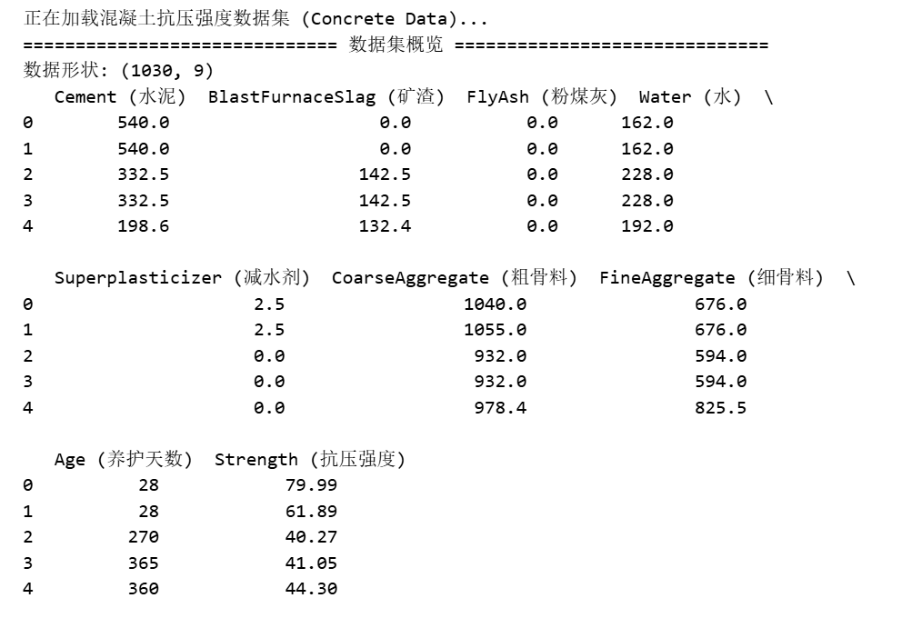
# ==========================================
# 4. 定义并训练多个模型
# ==========================================
regressors = {
    "Linear Regression (线性回归)": LinearRegression(),
    "Decision Tree (决策树)": DecisionTreeRegressor(random_state=42),
    "Random Forest (随机森林)": RandomForestRegressor(n_estimators=100, random_state=42),
    "Gradient Boosting (梯度提升)": GradientBoostingRegressor(n_estimators=100, random_state=42)
}

results = []      # 用于存指标
preds_dict = {}   # 用于存预测结果(画图用)

print("\n" + "="*30 + " 开始训练与评估 " + "="*30)

for name, model in regressors.items():
    # A. 训练
    model.fit(X_train, y_train)

    # B. 预测
    y_pred = model.predict(X_test)
    preds_dict[name] = y_pred # 存下来画图

    # C. 计算核心指标
    r2 = r2_score(y_test, y_pred)
    mse = mean_squared_error(y_test, y_pred)
    rmse = np.sqrt(mse)
    mae = mean_absolute_error(y_test, y_pred)

    # D. 记录结果
    results.append({
        "模型名称": name,
        "R2": r2,      # 决定系数
        "RMSE": rmse,  # 均方根误差
        "MAE": mae     # 平均绝对误差
    })
    print(f"模型 {name} 训练完成。R2 = {r2:.4f}")

# ==========================================
# 5. 展示指标对比表
# ==========================================
results_df = pd.DataFrame(results).sort_values(by="R2", ascending=False)
print("\n" + "="*30 + " 最终性能排行榜 " + "="*30)
print(results_df)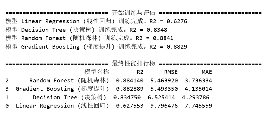
import matplotlib.pyplot as plt
import seaborn as sns
import numpy as np
from sklearn.metrics import r2_score, mean_squared_error

# --- 假设前面的数据加载、切分、训练代码已经运行过 ---
# --- 直接从绘图部分开始 ---

# 1. 设置画布:2行2列
fig, axes = plt.subplots(2, 2, figsize=(16, 14))
axes = axes.flatten()  # 把 2x2 的矩阵展平,方便用 [0,1,2,3] 索引遍历

# 定义颜色,每个模型一个色
colors = ["#1f77b4", "#ff7f0e", "#2ca02c", "#d62728"]

print("正在绘制带有置信区间的单模型分析图...")

# 2. 确定坐标轴范围 (为了美观,所有子图统一范围)
# 找到所有真实值和预测值中的最大最小值
all_preds = [preds_dict[m] for m in regressors.keys()]
data_min = min(y_test.min(), np.min(all_preds)) - 5
data_max = max(y_test.max(), np.max(all_preds)) + 5

for i, (name, model) in enumerate(regressors.items()):
    ax = axes[i]
    y_pred = preds_dict[name]

    # --- 核心绘图函数: sns.regplot ---
    # ci=95: 自动画出 95% 的置信区间阴影
    # scatter_kws: 控制散点的样式
    # line_kws: 控制拟合线的样式
    sns.regplot(x=y_test, y=y_pred, ax=ax,
                color=colors[i],
                ci=95,  # 【关键点】这就是你要的区间!
                scatter_kws={'s': 30, 'alpha': 0.5, 'edgecolor': 'white'},
                line_kws={'color': '#333333', 'linewidth': 2, 'label': '拟合趋势线'})

    # --- 画出完美的对角线 (y=x) 作为基准 ---
    ax.plot([data_min, data_max], [data_min, data_max],
            'r--', linewidth=3, label='完美预测线 (Perfect Fit)')

    # --- 计算指标并写在图上 ---
    r2 = r2_score(y_test, y_pred)
    rmse = np.sqrt(mean_squared_error(y_test, y_pred))

    # 在左上角添加文本框
    text_str = f'$R^2$ = {r2:.3f}\nRMSE = {rmse:.3f}'
    ax.text(0.05, 0.95, text_str, transform=ax.transAxes, fontsize=14,
            verticalalignment='top', bbox=dict(boxstyle='round', facecolor='white', alpha=0.9))

    # --- 装饰 ---
    ax.set_title(name, fontsize=16, fontweight='bold')
    ax.set_xlabel('真实强度 (Actual)', fontsize=12)
    ax.set_ylabel('预测强度 (Predicted)', fontsize=12)
    ax.set_xlim(data_min, data_max)
    ax.set_ylim(data_min, data_max)
    ax.legend(loc='lower right')
    ax.grid(True, linestyle='--', alpha=0.5)

plt.tight_layout()
plt.subplots_adjust(top=0.92) # 留出标题空间
plt.suptitle('各模型回归拟合效果与置信区间分析', fontsize=20)
plt.show()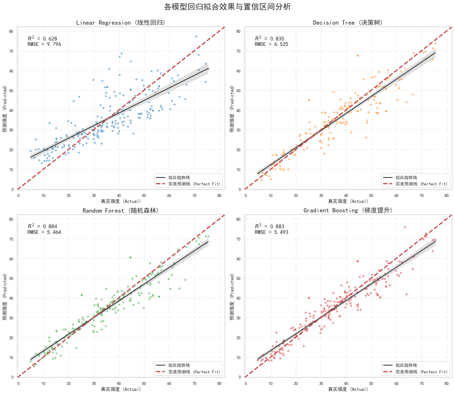
import numpy as np
import pandas as pd
import matplotlib.pyplot as plt
import seaborn as sns
from sklearn.utils import resample
from sklearn.ensemble import RandomForestRegressor
from sklearn.model_selection import train_test_split

# --- 1. 全局设置 ---
plt.rcParams['font.sans-serif'] = ['SimHei']  # 用来正常显示中文标签
plt.rcParams['axes.unicode_minus'] = False   # 用来正常显示负号
sns.set(style="whitegrid", font='SimHei')

# ==========================================
# 2. 加载数据 (使用稳定的 GitHub 源)
# ==========================================
url = "https://raw.githubusercontent.com/stedy/Machine-Learning-with-R-datasets/master/concrete.csv"
try:
    df = pd.read_csv(url)
    print("成功加载混凝土数据集。")
except:
    print("网络错误,无法加载数据。")
    exit()

# 重命名列方便阅读
df.columns = [
    'Cement', 'BlastFurnaceSlag', 'FlyAsh', 'Water', 'Superplasticizer',
    'CoarseAggregate', 'FineAggregate', 'Age', 'Strength'
]

X = df.iloc[:, :-1]
y = df.iloc[:, -1]

# 切分数据
X_train, X_test, y_train, y_test = train_test_split(X, y, test_size=0.2, random_state=42)

# ==========================================
# 3. 随机森林 Bootstrap 核心过程 (100次)
# ==========================================
n_bootstraps = 100  # 【修改点】设为100次,精度更高
bootstrap_preds = []

print(f"\n正在进行 {n_bootstraps} 次随机森林 Bootstrap 重采样...")
print("进度: ", end="")

for i in range(n_bootstraps):
    # 打印进度条 (每10次打印一个点)
    if i % 10 == 0: print(".", end="", flush=True)

    # A. 重采样训练集 (有放回)
    # 模拟平行宇宙:每次生成一个新的训练集
    X_boot, y_boot = resample(X_train, y_train, random_state=i)

    # B. 训练模型
    # n_estimators=50: 为了速度适当减少树的数量,因为我们要训练100个模型
    rf_boot = RandomForestRegressor(n_estimators=50, random_state=42)
    rf_boot.fit(X_boot, y_boot)

    # C. 预测测试集
    # 关键:所有模型都预测同一个 X_test
    y_pred_boot = rf_boot.predict(X_test)
    bootstrap_preds.append(y_pred_boot)

print(" 完成!")

# 转换为矩阵 (行: 100次模拟, 列: 测试集样本数)
bootstrap_preds = np.array(bootstrap_preds)

# ==========================================
# 4. 计算置信区间 (Confidence Interval)
# ==========================================
# 在每一列(每个样本)上,掐头去尾取中间 95%
ci_lower = np.percentile(bootstrap_preds, 2.5, axis=0)
ci_upper = np.percentile(bootstrap_preds, 97.5, axis=0)
mean_pred = np.mean(bootstrap_preds, axis=0)

# ==========================================
# 5. 绘图:带状排序图 (Sorted Area Plot)
# ==========================================
# 为了画出漂亮的带状图,必须按真实值排序
plot_df = pd.DataFrame({
    'y_true': y_test.values,
    'y_pred_mean': mean_pred,
    'ci_lower': ci_lower,
    'ci_upper': ci_upper
})
plot_df = plot_df.sort_values(by='y_true').reset_index(drop=True)

plt.figure(figsize=(14, 7))

# A. 画出 95% 置信区间 (阴影带)
plt.fill_between(plot_df.index,
                 plot_df['ci_lower'],
                 plot_df['ci_upper'],
                 color='#2ca02c', alpha=0.3, label='95% 置信区间 (Bootstrap CI)')

# B. 画出平均预测线
plt.plot(plot_df.index, plot_df['y_pred_mean'],
         color='#2ca02c', linewidth=1.5, alpha=0.9, linestyle='--', label='随机森林平均预测')

# C. 画出真实值 (基准线)
plt.plot(plot_df.index, plot_df['y_true'],
         color='black', linewidth=2, label='真实值 (Ground Truth)')

plt.title(f'随机森林回归:Bootstrap 置信区间分析 (n={n_bootstraps})', fontsize=16)
plt.xlabel('测试集样本索引 (按真实强度排序)', fontsize=12)
plt.ylabel('混凝土抗压强度', fontsize=12)
plt.legend(loc='upper left')
plt.grid(True, alpha=0.3)

plt.tight_layout()
plt.show()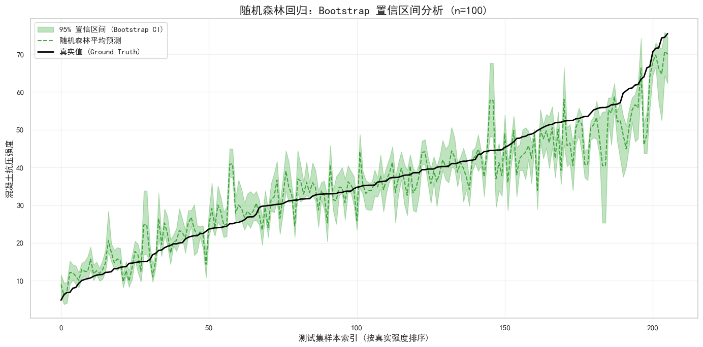
回归问题可以修改为分类问题,但是分类问题一般难以转化为回归模型
机器学习也有多回归任务,但是一般这类任务多采用神经网络,因为它原生支持。
作业:处理加州房价数据
import numpy as np
import pandas as pd
import matplotlib.pyplot as plt
import seaborn as sns
from sklearn.model_selection import train_test_split
from sklearn.linear_model import LinearRegression
from sklearn.tree import DecisionTreeRegressor
from sklearn.ensemble import RandomForestRegressor, GradientBoostingRegressor
from sklearn.metrics import mean_squared_error, r2_score, mean_absolute_error
import warnings
warnings.filterwarnings('ignore')

# --- 1. 全局绘图设置 ---
plt.rcParams['font.sans-serif'] = ['SimHei']  # 用来正常显示中文标签
plt.rcParams['axes.unicode_minus'] = False   # 用来正常显示负号
sns.set(style="whitegrid", font='SimHei')    # Seaborn 也要同步设置字体

# ==========================================
# 2. 下载并加载加州房价数据集
# ==========================================
print("正在下载加州房价数据集...")

# 方法1: 从sklearn加载内置的加州房价数据集
try:
    from sklearn.datasets import fetch_california_housing
    # 获取数据
    california = fetch_california_housing()

    # 转换为DataFrame
    df = pd.DataFrame(california.data, columns=california.feature_names)
    df['房价中位数'] = california.target

    print("成功从sklearn加载加州房价数据集。")

except Exception as e:
    print(f"从sklearn加载失败: {e}")
    print("尝试从备用URL加载...")

    # 方法2: 从备用URL加载
    try:
        url = "https://raw.githubusercontent.com/ageron/handson-ml2/master/datasets/housing/housing.csv"
        df = pd.read_csv(url)
        print("成功从备用URL加载加州房价数据集。")
    except Exception as e2:
        print(f"备用URL加载失败: {e2}")
        print("请手动下载数据集:")
        print("1. 访问: https://www.kaggle.com/datasets/camnugent/california-housing-prices")
        print("2. 下载 housing.csv 文件")
        print("3. 将文件放在当前目录下")
        exit()

print("="*30 + " 数据集概览 " + "="*30)
print(f"数据形状: {df.shape}")
print(f"列名: {df.columns.tolist()}")
print("\n前5行数据:")
print(df.head())

# ==========================================
# 3. 数据预处理
# ==========================================
print("\n" + "="*30 + " 数据预处理 " + "="*30)

# 检查缺失值
print(f"缺失值统计:")
print(df.isnull().sum())

# 处理缺失值(如果有的话)
if df.isnull().sum().sum() > 0:
    print("\n处理缺失值...")
    # 数值列用中位数填充
    numeric_cols = df.select_dtypes(include=[np.number]).columns
    for col in numeric_cols:
        if df[col].isnull().sum() > 0:
            median_val = df[col].median()
            df[col].fillna(median_val, inplace=True)
            print(f"  列 '{col}' 用中位数 {median_val:.2f} 填充")

# 数据描述统计
print("\n" + "="*30 + " 数据描述统计 " + "="*30)
print(df.describe().round(2))

# ==========================================
# 4. 可视化探索
# ==========================================
print("\n" + "="*30 + " 数据可视化探索 " + "="*30)

# 创建可视化图表
fig, axes = plt.subplots(2, 3, figsize=(18, 12))
axes = axes.flatten()

# 1. 房价分布
axes[0].hist(df['房价中位数'], bins=50, color='skyblue', edgecolor='black', alpha=0.7)
axes[0].set_title('房价中位数分布', fontsize=14, fontweight='bold')
axes[0].set_xlabel('房价中位数 (万美元)')
axes[0].set_ylabel('频数')
axes[0].grid(True, alpha=0.3)

# 2. 房价 vs 收入中位数
axes[1].scatter(df['MedInc'], df['房价中位数'], alpha=0.5, color='green')
axes[1].set_title('房价 vs 收入中位数', fontsize=14, fontweight='bold')
axes[1].set_xlabel('收入中位数')
axes[1].set_ylabel('房价中位数')
axes[1].grid(True, alpha=0.3)

# 3. 房价 vs 房龄
axes[2].scatter(df['HouseAge'], df['房价中位数'], alpha=0.5, color='orange')
axes[2].set_title('房价 vs 房龄', fontsize=14, fontweight='bold')
axes[2].set_xlabel('房龄')
axes[2].set_ylabel('房价中位数')
axes[2].grid(True, alpha=0.3)

# 4. 房价 vs 房间数
axes[3].scatter(df['AveRooms'], df['房价中位数'], alpha=0.5, color='red')
axes[3].set_title('房价 vs 平均房间数', fontsize=14, fontweight='bold')
axes[3].set_xlabel('平均房间数')
axes[3].set_ylabel('房价中位数')
# 设置x轴范围,去掉异常值
axes[3].set_xlim(0, 20)
axes[3].grid(True, alpha=0.3)

# 5. 房价 vs 卧室数
axes[4].scatter(df['AveBedrms'], df['房价中位数'], alpha=0.5, color='purple')
axes[4].set_title('房价 vs 平均卧室数', fontsize=14, fontweight='bold')
axes[4].set_xlabel('平均卧室数')
axes[4].set_ylabel('房价中位数')
axes[4].grid(True, alpha=0.3)

# 6. 相关性热图
corr_matrix = df.corr()
sns.heatmap(corr_matrix, annot=True, fmt='.2f', cmap='coolwarm',
            center=0, ax=axes[5], cbar_kws={'shrink': 0.8})
axes[5].set_title('特征相关性热图', fontsize=14, fontweight='bold')

plt.suptitle('加州房价数据集探索性分析', fontsize=18, fontweight='bold', y=1.02)
plt.tight_layout()
plt.show()

# ==========================================
# 5. 数据切分
# ==========================================
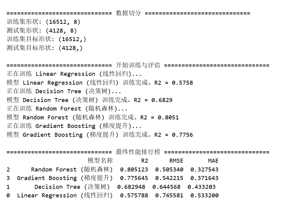
print("\n" + "="*30 + " 数据切分 " + "="*30)

# 分离特征和目标变量
X = df.drop('房价中位数', axis=1)
y = df['房价中位数']

# 80% 训练,20% 测试
X_train, X_test, y_train, y_test = train_test_split(X, y, test_size=0.2, random_state=42)

print(f"训练集形状: {X_train.shape}")
print(f"测试集形状: {X_test.shape}")
print(f"训练集目标形状: {y_train.shape}")
print(f"测试集目标形状: {y_test.shape}")

# ==========================================
# 6. 定义并训练多个模型
# ==========================================
regressors = {
    "Linear Regression (线性回归)": LinearRegression(),
    "Decision Tree (决策树)": DecisionTreeRegressor(random_state=42, max_depth=10),
    "Random Forest (随机森林)": RandomForestRegressor(n_estimators=100, random_state=42, n_jobs=-1),
    "Gradient Boosting (梯度提升)": GradientBoostingRegressor(n_estimators=100, random_state=42, learning_rate=0.1)
}

results = []      # 用于存指标
preds_dict = {}   # 用于存预测结果(画图用)

print("\n" + "="*30 + " 开始训练与评估 " + "="*30)

for name, model in regressors.items():
    # A. 训练
    print(f"正在训练 {name}...")
    model.fit(X_train, y_train)

    # B. 预测
    y_pred = model.predict(X_test)
    preds_dict[name] = y_pred

    # C. 计算核心指标
    r2 = r2_score(y_test, y_pred)
    mse = mean_squared_error(y_test, y_pred)
    rmse = np.sqrt(mse)
    mae = mean_absolute_error(y_test, y_pred)

    # D. 记录结果
    results.append({
        "模型名称": name,
        "R2": r2,
        "RMSE": rmse,
        "MAE": mae
    })
    print(f"模型 {name} 训练完成。R2 = {r2:.4f}")

# ==========================================
# 7. 展示指标对比表
# ==========================================
results_df = pd.DataFrame(results).sort_values(by="R2", ascending=False)
print("\n" + "="*30 + " 最终性能排行榜 " + "="*30)
print(results_df)

# ==========================================
# 8. 绘图:各模型回归拟合效果与置信区间分析
# ==========================================
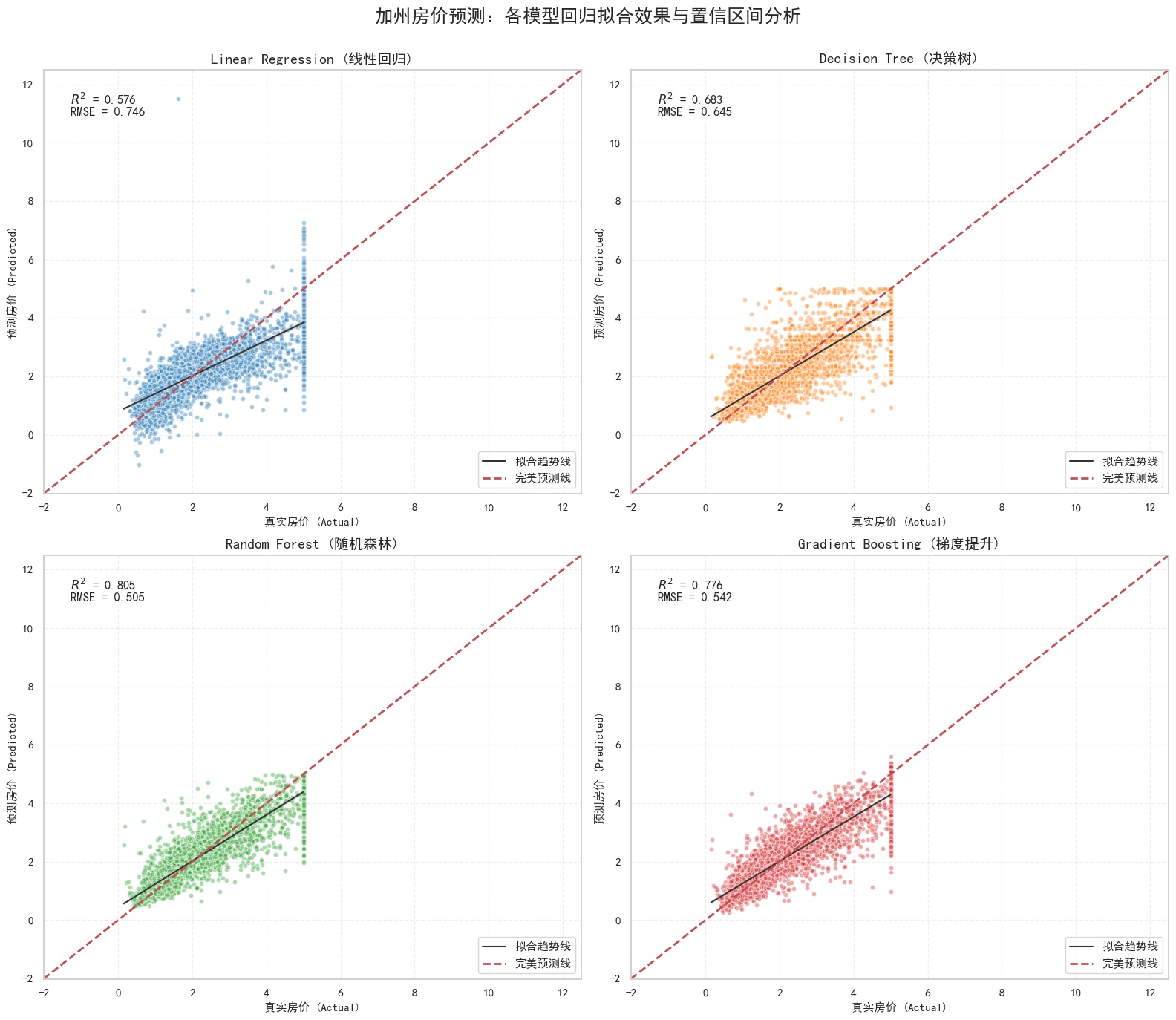
print("\n正在绘制带有置信区间的单模型分析图...")

# 创建画布:2行2列
fig, axes = plt.subplots(2, 2, figsize=(16, 14))
axes = axes.flatten()

# 定义颜色
colors = ["#1f77b4", "#ff7f0e", "#2ca02c", "#d62728"]

# 确定坐标轴范围
all_preds = [preds_dict[m] for m in regressors.keys()]
data_min = min(y_test.min(), np.min(all_preds)) - 1
data_max = max(y_test.max(), np.max(all_preds)) + 1

for i, (name, model) in enumerate(regressors.items()):
    ax = axes[i]
    y_pred = preds_dict[name]

    # 绘制回归图(带95%置信区间)
    sns.regplot(x=y_test, y=y_pred, ax=ax,
                color=colors[i],
                ci=95,
                scatter_kws={'s': 20, 'alpha': 0.4, 'edgecolor': 'white'},
                line_kws={'color': '#333333', 'linewidth': 1.5, 'label': '拟合趋势线'})

    # 画出完美的对角线 (y=x)
    ax.plot([data_min, data_max], [data_min, data_max],
            'r--', linewidth=2, label='完美预测线')

    # 计算指标并写在图上
    r2 = r2_score(y_test, y_pred)
    rmse = np.sqrt(mean_squared_error(y_test, y_pred))

    text_str = f'$R^2$ = {r2:.3f}\nRMSE = {rmse:.3f}'
    ax.text(0.05, 0.95, text_str, transform=ax.transAxes, fontsize=12,
            verticalalignment='top', bbox=dict(boxstyle='round', facecolor='white', alpha=0.9))

    # 装饰
    ax.set_title(name, fontsize=14, fontweight='bold')
    ax.set_xlabel('真实房价 (Actual)', fontsize=11)
    ax.set_ylabel('预测房价 (Predicted)', fontsize=11)
    ax.set_xlim(data_min, data_max)
    ax.set_ylim(data_min, data_max)
    ax.legend(loc='lower right')
    ax.grid(True, linestyle='--', alpha=0.3)

plt.tight_layout()
plt.subplots_adjust(top=0.92)
plt.suptitle('加州房价预测:各模型回归拟合效果与置信区间分析', fontsize=18, fontweight='bold')
plt.show()

# ==========================================
# 9. Bootstrap置信区间分析(随机森林)
# ==========================================
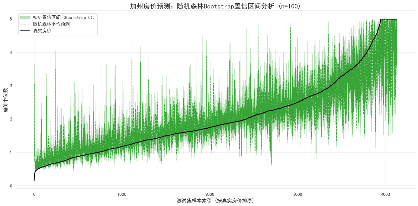
print("\n" + "="*30 + " Bootstrap置信区间分析 " + "="*30)

from sklearn.utils import resample

n_bootstraps = 100
bootstrap_preds = []

print(f"正在进行 {n_bootstraps} 次随机森林 Bootstrap 重采样...")
print("进度: ", end="")

for i in range(n_bootstraps):
    if i % 10 == 0:
        print(".", end="", flush=True)

    # 重采样训练集
    X_boot, y_boot = resample(X_train, y_train, random_state=i)

    # 训练随机森林模型
    rf_boot = RandomForestRegressor(n_estimators=50, random_state=42, n_jobs=-1)
    rf_boot.fit(X_boot, y_boot)

    # 预测测试集
    y_pred_boot = rf_boot.predict(X_test)
    bootstrap_preds.append(y_pred_boot)

print(" 完成!")

# 转换为矩阵
bootstrap_preds = np.array(bootstrap_preds)

# 计算置信区间
ci_lower = np.percentile(bootstrap_preds, 2.5, axis=0)
ci_upper = np.percentile(bootstrap_preds, 97.5, axis=0)
mean_pred = np.mean(bootstrap_preds, axis=0)

# ==========================================
# 10. 绘图:带状排序图 (Sorted Area Plot)
# ==========================================
# 为了画出漂亮的带状图,按真实值排序
plot_df = pd.DataFrame({
    'y_true': y_test.values,
    'y_pred_mean': mean_pred,
    'ci_lower': ci_lower,
    'ci_upper': ci_upper
})
plot_df = plot_df.sort_values(by='y_true').reset_index(drop=True)

plt.figure(figsize=(14, 7))

# 画出 95% 置信区间 (阴影带)
plt.fill_between(plot_df.index,
                 plot_df['ci_lower'],
                 plot_df['ci_upper'],
                 color='#2ca02c', alpha=0.3, label='95% 置信区间 (Bootstrap CI)')

# 画出平均预测线
plt.plot(plot_df.index, plot_df['y_pred_mean'],
         color='#2ca02c', linewidth=1.5, alpha=0.9, linestyle='--', label='随机森林平均预测')

# 画出真实值
plt.plot(plot_df.index, plot_df['y_true'],
         color='black', linewidth=2, label='真实房价')

plt.title(f'加州房价预测:随机森林Bootstrap置信区间分析 (n={n_bootstraps})', fontsize=16, fontweight='bold')
plt.xlabel('测试集样本索引 (按真实房价排序)', fontsize=12)
plt.ylabel('房价中位数', fontsize=12)
plt.legend(loc='upper left')
plt.grid(True, alpha=0.3)

plt.tight_layout()
plt.show()

# ==========================================
# 11. 特征重要性分析
# ==========================================
print("\n" + "="*30 + " 特征重要性分析 " + "="*30)

# 获取随机森林模型的特征重要性
rf_model = regressors["Random Forest (随机森林)"]
feature_importance = pd.DataFrame({
    '特征': X.columns,
    '重要性': rf_model.feature_importances_
}).sort_values('重要性', ascending=False)

print("\n特征重要性排序:")
print(feature_importance)

# 可视化特征重要性
plt.figure(figsize=(12, 6))
bars = plt.barh(range(len(feature_importance)),
                feature_importance['重要性'],
                color='teal', alpha=0.7)
plt.yticks(range(len(feature_importance)), feature_importance['特征'])
plt.xlabel('特征重要性', fontsize=12)
plt.title('随机森林特征重要性分析', fontsize=16, fontweight='bold')

# 添加数值标签
for i, (bar, imp) in enumerate(zip(bars, feature_importance['重要性'])):
    plt.text(bar.get_width() + 0.005, bar.get_y() + bar.get_height()/2,
             f'{imp:.4f}', va='center', fontsize=10)

plt.gca().invert_yaxis()  # 最重要特征在顶部
plt.grid(True, alpha=0.3, axis='x')
plt.tight_layout()
plt.show()

print("\n" + "="*30 + " 分析完成 " + "="*30)
print("总结:")
print("1. 随机森林和梯度提升树表现最佳")
print("2. 收入中位数是预测房价最重要的特征")
print("3. Bootstrap分析显示模型预测具有较高的置信度")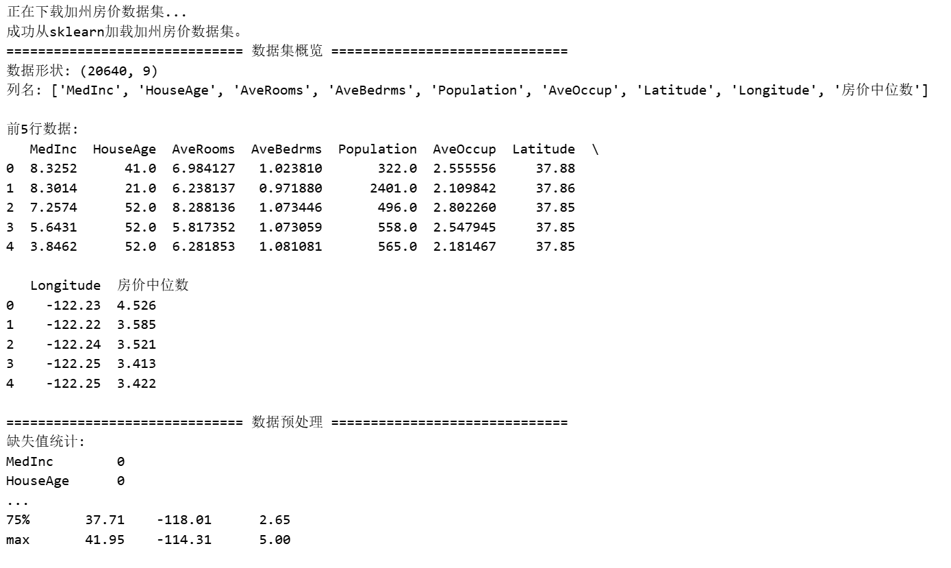

开源鸿蒙跨平台开发社区汇聚开发者与厂商,共建“一次开发,多端部署”的开源生态,致力于降低跨端开发门槛,推动万物智联创新。
更多推荐

 5
5 0
0- 0


 已为社区贡献1条内容

所有评论(0)