ReactNative项目OpenHarmony三方库集成实战:react-native-render-html
在移动应用开发中,HTML 内容渲染是一项常见需求,特别是在新闻资讯、富文本编辑、邮件展示等场景中。React Native 原生并不支持直接渲染 HTML,而是一个功能强大的 HTML 渲染库,能够将 HTML 内容转换为 React Native 组件,支持丰富的样式定制、图片处理等特性,是处理富文本内容的理想选择。库名称版本信息6.3.4支持 RN 0.72/0.77 版本官方仓库主要功能?
欢迎加入开源鸿蒙跨平台社区:https://openharmonycrossplatform.csdn.net
项目基于 RN 0.72.90 开发
📋 前言
在移动应用开发中,HTML 内容渲染是一项常见需求,特别是在新闻资讯、富文本编辑、邮件展示等场景中。React Native 原生并不支持直接渲染 HTML,而 react-native-render-html 是一个功能强大的 HTML 渲染库,能够将 HTML 内容转换为 React Native 组件,支持丰富的样式定制、图片处理等特性,是处理富文本内容的理想选择。
🎯 库简介
基本信息
- 库名称:
react-native-render-html - 版本信息:
6.3.4支持 RN 0.72/0.77 版本 - 官方仓库: https://github.com/meliorence/react-native-render-html
- 主要功能:
- 📄 HTML 内容渲染
- 🎨 CSS 样式支持
- 🖼️ 图片自适应处理
- 📱 跨平台支持(iOS、Android、Web、HarmonyOS)
为什么需要 HTML 渲染库?
| 特性 | WebView 方案 | react-native-render-html |
|---|---|---|
| 性能 | ⚠️ 较重 | ✅ 轻量级原生组件 |
| 样式定制 | ⚠️ 受限 | ✅ 完全可控 |
| 原生交互 | ⚠️ 复杂 | ✅ 直接使用 RN 组件 |
| 内存占用 | ⚠️ 较高 | ✅ 低内存占用 |
| HarmonyOS 支持 | ⚠️ 需适配 | ✅ 完善适配 |
核心功能
| 功能 | 说明 | HarmonyOS 支持 |
|---|---|---|
| source | HTML 内容源 | ✅ |
| contentWidth | 内容宽度 | ✅ |
| baseStyle | 基础样式 | ✅ |
| tagsStyles | 标签样式 | ✅ |
| classesStyles | 类名样式 | ✅ |
| ignoredDomTags | 忽略的标签 | ✅ |
| allowedStyles | 允许的样式属性 | ✅ |
| enableCSSInlineProcessing | 内联 CSS 处理 | ✅ |
| onHTMLLoaded | HTML 加载完成回调 | ✅ |
兼容性验证
在以下环境验证通过:
- RNOH: 0.72.27; SDK: HarmonyOS-Next-DB1 5.0.0.29(SP1); IDE: DevEco Studio 5.0.3.403; ROM: 3.0.0.25
- RNOH: 0.72.33; SDK: OpenHarmony 5.0.0.71(API Version 12 Release); IDE: DevEco Studio 5.0.3.900; ROM: NEXT.0.0.71
- RNOH: 0.77.18; SDK: HarmonyOS 5.1.1 Release; IDE: DevEco Studio 5.1.1.830; ROM: NEXT 5.1.0.150
📦 安装步骤
1. 安装依赖
# RN 0.72/0.77 版本
npm install react-native-render-html@6.3.4

# 或者使用 yarn
yarn add react-native-render-html@6.3.4
2. 验证安装
安装完成后,检查 package.json 文件:
{
  "dependencies": {
    "react-native-render-html": "^6.3.4"
  }
}
🔧 HarmonyOS 平台配置
本库为纯 JavaScript 实现,无需额外的原生端配置。安装完成后即可直接使用。
📖 API 详解
source - HTML 内容源
指定要渲染的 HTML 内容,支持多种格式。
类型:HTMLSource
必填:是
HTMLSource 结构:
| 属性 | 类型 | 说明 |
|---|---|---|
| html | string | HTML 字符串 |
| uri | string | 远程 HTML 地址 |
| dom | DOM | DOM 对象 |
使用场景:
- 新闻内容展示
- 富文本消息
- 产品详情描述
const source = {
  html: `
    <h1>标题示例</h1>
    <p>这是一段<strong>加粗</strong>的文本内容。</p>
    <ul>
      <li>列表项 1</li>
      <li>列表项 2</li>
    </ul>
  `,
};

<RenderHtml contentWidth={width} source={source} />
contentWidth - 内容宽度
设置 HTML 内容的渲染宽度,通常使用屏幕宽度减去边距。
类型:number
必填:否(但强烈建议设置)
使用场景:
- 响应式布局
- 图片自适应
- 多列布局
const { width } = useWindowDimensions();

<RenderHtml
  contentWidth={width - 32}
  source={{ html: "<p>内容宽度自适应示例</p>" }}
/>
baseStyle - 基础样式
为整个 HTML 文档设置默认样式,可继承的样式会传递给子元素。
类型:MixedStyleDeclaration
使用场景:
- 全局字体设置
- 默认文本颜色
- 行高和字号
const baseStyle = {
  fontSize: 16,
  color: "#333333",
  lineHeight: 24,
  fontFamily: "System",
};

<RenderHtml
  contentWidth={width}
  source={source}
  baseStyle={baseStyle}
/>
tagsStyles - 标签样式
为特定 HTML 标签设置样式。
类型:Record<string, MixedStyleDeclaration>
使用场景:
- 标题样式定制
- 段落间距
- 列表样式
const tagsStyles = {
  h1: {
    fontSize: 28,
    fontWeight: "700" as const,
    color: "#1a1a1a",
    marginBottom: 16,
  },
  h2: {
    fontSize: 22,
    fontWeight: "600" as const,
    color: "#333333",
    marginBottom: 12,
  },
  p: {
    fontSize: 16,
    lineHeight: 24,
    color: "#666666",
    marginBottom: 12,
  },
  blockquote: {
    borderLeftWidth: 4,
    borderLeftColor: "#007AFF",
    paddingLeft: 16,
    marginVertical: 12,
    backgroundColor: "#F5F5F5",
    paddingVertical: 8,
  },
};

<RenderHtml
  contentWidth={width}
  source={source}
  tagsStyles={tagsStyles}
/>
classesStyles - 类名样式
为 CSS 类名设置样式。
类型:Record<string, MixedStyleDeclaration>
使用场景:
- 自定义类名样式
- 多种样式变体
- 组件化样式
const source = {
  html: `
    <p class="highlight">高亮文本示例</p>
    <p class="warning">警告文本示例</p>
    <p class="success">成功文本示例</p>
  `,
};

const classesStyles = {
  highlight: {
    backgroundColor: "#FFF3CD",
    padding: 8,
    borderRadius: 4,
    borderLeftWidth: 4,
    borderLeftColor: "#FFC107",
  },
  warning: {
    backgroundColor: "#F8D7DA",
    padding: 8,
    borderRadius: 4,
    borderLeftWidth: 4,
    borderLeftColor: "#DC3545",
    color: "#721C24",
  },
  success: {
    backgroundColor: "#D4EDDA",
    padding: 8,
    borderRadius: 4,
    borderLeftWidth: 4,
    borderLeftColor: "#28A745",
    color: "#155724",
  },
};

<RenderHtml
  contentWidth={width}
  source={source}
  classesStyles={classesStyles}
/>
ignoredDomTags - 忽略标签
指定要忽略的 HTML 标签列表。
类型:string[]
使用场景:
- 过滤不需要的标签
- 移除广告内容
- 简化渲染
<RenderHtml
  contentWidth={width}
  source={source}
  ignoredDomTags={["script", "style", "iframe"]}
/>
onHTMLLoaded - HTML 加载回调
HTML 内容加载完成时触发的回调函数。
类型:(html: string) => void
使用场景:
- 加载完成处理
- 内容分析
- 调试日志
const handleHTMLLoaded = (html: string) => {
  console.log("HTML 加载完成:", html.length, "字符");
};

<RenderHtml
  contentWidth={width}
  source={source}
  onHTMLLoaded={handleHTMLLoaded}
/>
📋 完整示例
import React, { useState } from "react";
import {
View,
Text,
StyleSheet,
ScrollView,
TouchableOpacity,
useWindowDimensions,
SafeAreaView,
StatusBar,
TextInput,
} from "react-native";
import RenderHtml from "react-native-render-html";
type ExampleType = "basic" | "styled" | "news";
const HTML_EXAMPLES: Record<ExampleType, string> = {
basic: `
<h1>基础 HTML 渲染</h1>
<p>这是一个基础的 HTML 渲染示例,展示了常见的 HTML 元素。</p>
<h2>文本格式</h2>
<p>支持<strong>加粗</strong>、<em>斜体</em>、<u>下划线</u>等格式。</p>
<p>也支持<code>代码片段</code>和<mark>高亮文本</mark>。</p>
<h2>列表</h2>
<ul>
<li>无序列表项 1</li>
<li>无序列表项 2</li>
<li>无序列表项 3</li>
</ul>
<ol>
<li>有序列表项 1</li>
<li>有序列表项 2</li>
<li>有序列表项 3</li>
</ol>
<h2>引用</h2>
<blockquote>
这是一段引用文本,通常用于展示他人的言论或重要内容。
</blockquote>
`,
styled: `
<h1 class="title">样式化内容</h1>
<p class="intro">通过自定义样式,可以实现丰富的视觉效果。</p>
<div class="card">
<h3>卡片标题</h3>
<p>这是一个带有自定义样式的卡片组件。</p>
</div>
<div class="alert warning">
<strong>警告:</strong>这是一条警告信息。
</div>
<div class="alert success">
<strong>成功:</strong>操作已成功完成。
</div>
<div class="alert info">
<strong>提示:</strong>这是一条提示信息。
</div>
`,
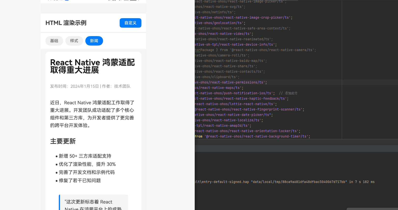
news: `
<article>
<h1>React Native 鸿蒙适配取得重大进展</h1>
<p class="meta">发布时间:2024年1月15日 | 作者:技术团队</p>
<p>近日,React Native 鸿蒙适配工作取得了重大进展。开发团队成功适配了多个核心组件和第三方库,为开发者提供了更完善的跨平台开发体验。</p>
<h2>主要更新</h2>
<ul>
<li>新增 50+ 三方库适配支持</li>
<li>优化了渲染性能,提升 30%</li>
<li>完善了开发文档和示例代码</li>
<li>修复了若干已知问题</li>
</ul>
<blockquote>
"这次更新标志着 React Native 在鸿蒙平台上的成熟度达到了新的高度。" —— 项目负责人
</blockquote>
<h2>后续计划</h2>
<p>团队将继续推进适配工作,预计在下一版本中支持更多常用库,并进一步优化性能表现。</p>
</article>
`,
};
const App: React.FC = () => {
const { width } = useWindowDimensions();
const [activeExample, setActiveExample] = useState<ExampleType>("basic");
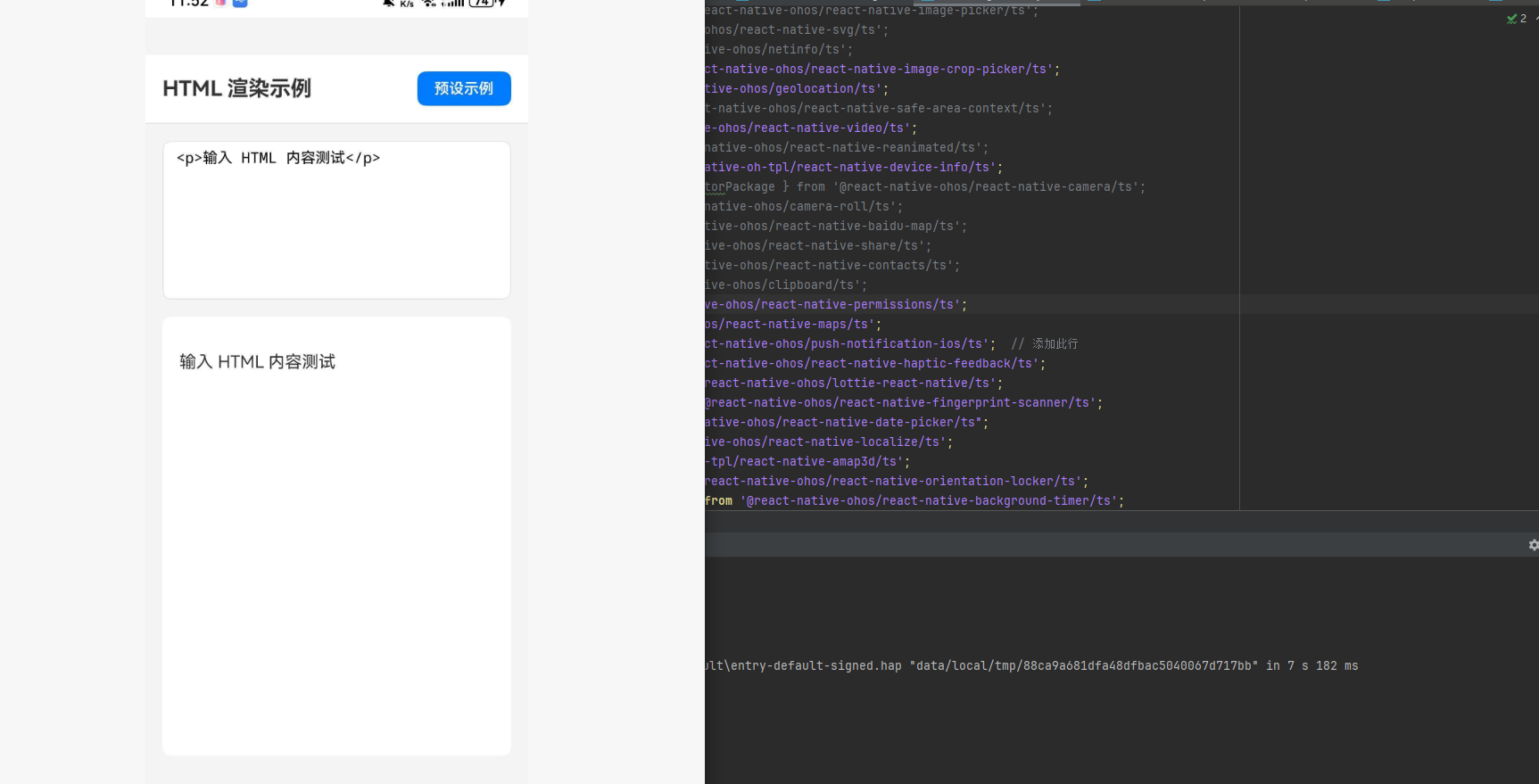
const [customHtml, setCustomHtml] = useState("<p>输入 HTML 内容测试</p>");
const [showCustomInput, setShowCustomInput] = useState(false);
const baseStyle = {
fontSize: 16,
color: "#333333",
lineHeight: 26,
};
const tagsStyles = {
h1: {
fontSize: 28,
fontWeight: "700" as const,
color: "#1a1a1a",
marginBottom: 16,
marginTop: 8,
},
h2: {
fontSize: 22,
fontWeight: "600" as const,
color: "#333333",
marginBottom: 12,
marginTop: 16,
},
h3: {
fontSize: 18,
fontWeight: "600" as const,
color: "#444444",
marginBottom: 8,
},
p: {
fontSize: 16,
lineHeight: 26,
color: "#333333",
marginBottom: 12,
},
ul: {
marginBottom: 16,
},
ol: {
marginBottom: 16,
},
li: {
fontSize: 16,
lineHeight: 24,
marginBottom: 4,
},
blockquote: {
borderLeftWidth: 4,
borderLeftColor: "#007AFF",
paddingLeft: 16,
marginVertical: 16,
backgroundColor: "#F5F5F5",
paddingVertical: 12,
paddingRight: 16,
borderRadius: 4,
},
code: {
backgroundColor: "#F0F0F0",
paddingHorizontal: 8,
paddingVertical: 2,
borderRadius: 4,
fontFamily: "monospace",
},
article: {
paddingBottom: 20,
},
};
const classesStyles = {
title: {
fontSize: 32,
fontWeight: "700" as const,
textAlign: "center" as const,
color: "#007AFF",
marginBottom: 20,
},
intro: {
fontSize: 18,
color: "#666666",
textAlign: "center" as const,
marginBottom: 24,
},
card: {
backgroundColor: "#FFFFFF",
borderRadius: 12,
padding: 20,
marginVertical: 12,
shadowColor: "#000",
shadowOffset: { width: 0, height: 2 },
shadowOpacity: 0.1,
shadowRadius: 8,
elevation: 3,
},
alert: {
padding: 16,
borderRadius: 8,
marginVertical: 8,
},
warning: {
backgroundColor: "#FFF3CD",
borderLeftWidth: 4,
borderLeftColor: "#FFC107",
},
success: {
backgroundColor: "#D4EDDA",
borderLeftWidth: 4,
borderLeftColor: "#28A745",
},
info: {
backgroundColor: "#D1ECF1",
borderLeftWidth: 4,
borderLeftColor: "#17A2B8",
},
meta: {
fontSize: 14,
color: "#999999",
marginBottom: 16,
},
};
const renderExampleButton = (type: ExampleType, label: string) => (
<TouchableOpacity
key={type}
style={[
styles.exampleButton,
activeExample === type && styles.exampleButtonActive,
]}
onPress={() => {
setActiveExample(type);
setShowCustomInput(false);
}}
>
<Text
style={[
styles.exampleButtonText,
activeExample === type && styles.exampleButtonTextActive,
]}
>
{label}
</Text>
</TouchableOpacity>
);
return (
<SafeAreaView style={styles.container}>
<StatusBar barStyle="dark-content" backgroundColor="#FFFFFF" />
<View style={styles.header}>
<Text style={styles.headerTitle}>HTML 渲染示例</Text>
<TouchableOpacity
style={styles.customButtonHeader}
onPress={() => setShowCustomInput(!showCustomInput)}
>
<Text style={styles.customButtonHeaderText}>
{showCustomInput ? "预设示例" : "自定义"}
</Text>
</TouchableOpacity>
</View>
{!showCustomInput && (
<View style={styles.tabBar}>
{renderExampleButton("basic", "基础")}
{renderExampleButton("styled", "样式")}
{renderExampleButton("news", "新闻")}
</View>
)}
{showCustomInput ? (
<View style={styles.customInputContainer}>
<TextInput
style={styles.htmlInput}
value={customHtml}
onChangeText={setCustomHtml}
multiline
placeholder="输入 HTML 内容"
textAlignVertical="top"
/>
<ScrollView style={styles.previewContainer}>
<RenderHtml
contentWidth={width - 32}
source={{ html: customHtml }}
baseStyle={baseStyle}
tagsStyles={tagsStyles}
/>
</ScrollView>
</View>
) : (
<ScrollView style={styles.content}>
<View style={styles.htmlContainer}>
<RenderHtml
contentWidth={width - 32}
source={{ html: HTML_EXAMPLES[activeExample] }}
baseStyle={baseStyle}
tagsStyles={tagsStyles}
classesStyles={classesStyles}
/>
</View>
</ScrollView>
)}
</SafeAreaView>
);
};
const styles = StyleSheet.create({
container: {
flex: 1,
backgroundColor: "#F5F5F5",
},
header: {
flexDirection: "row",
alignItems: "center",
justifyContent: "space-between",
padding: 16,
backgroundColor: "#FFFFFF",
borderBottomWidth: 1,
borderBottomColor: "#E5E5EA",
},
headerTitle: {
fontSize: 20,
fontWeight: "700",
color: "#333333",
},
customButtonHeader: {
backgroundColor: "#007AFF",
paddingHorizontal: 16,
paddingVertical: 8,
borderRadius: 8,
},
customButtonHeaderText: {
color: "#FFFFFF",
fontSize: 14,
fontWeight: "600",
},
tabBar: {
flexDirection: "row",
backgroundColor: "#FFFFFF",
paddingHorizontal: 16,
paddingVertical: 12,
gap: 8,
},
exampleButton: {
paddingHorizontal: 16,
paddingVertical: 8,
backgroundColor: "#F0F0F0",
borderRadius: 20,
},
exampleButtonActive: {
backgroundColor: "#007AFF",
},
exampleButtonText: {
fontSize: 14,
color: "#666666",
fontWeight: "500",
},
exampleButtonTextActive: {
color: "#FFFFFF",
},
content: {
flex: 1,
},
htmlContainer: {
backgroundColor: "#FFFFFF",
margin: 16,
padding: 16,
borderRadius: 12,
minHeight: 400,
},
customInputContainer: {
flex: 1,
padding: 16,
},
htmlInput: {
backgroundColor: "#FFFFFF",
borderRadius: 8,
padding: 12,
fontSize: 14,
fontFamily: "monospace",
height: 150,
marginBottom: 16,
borderWidth: 1,
borderColor: "#E5E5EA",
},
previewContainer: {
flex: 1,
backgroundColor: "#FFFFFF",
borderRadius: 8,
padding: 16,
},
});
export default App;
⚠️ 注意事项
部分标签可能并不能适配。
遗留问题
- 图片宽度问题: img 的宽度不会随着 contentWidth 的动态修改而更改,这是原库本身的限制(与 iOS/Android 表现一致)。issue#638
使用建议
- 设置 contentWidth: 始终设置
contentWidth属性以确保正确的布局计算 - 使用 useWindowDimensions: 结合
useWindowDimensions()实现响应式布局 - 性能优化: 对于长内容,考虑分块渲染或虚拟列表
常见问题
Q: 图片不显示?
A: 确保图片 URL 可访问,并且有正确的网络权限。远程图片需要配置网络请求。
Q: 样式不生效?
A: 检查样式属性名称是否正确,React Native 样式属性与 CSS 有所不同。例如使用 backgroundColor 而不是 background-color。
Q: HTML 内容过长导致卡顿?
A: 考虑分块渲染或使用虚拟列表优化性能。
Q: 特殊字符显示异常?
A: 确保 HTML 内容正确编码,必要时使用实体字符。

开源鸿蒙跨平台开发社区汇聚开发者与厂商,共建“一次开发,多端部署”的开源生态,致力于降低跨端开发门槛,推动万物智联创新。
更多推荐
 8
8 0
0- 0


 已为社区贡献98条内容

所有评论(0)