Flutter for OpenHarmony 看书管理记录App实战:阅读详情实现
本文介绍了一个阅读详情页面的Flutter实现方案。页面采用信息分层设计,主要展示书籍信息、阅读数据和阅读感想三部分内容。书籍信息卡片包含封面、书名、作者和阅读日期;阅读数据卡片以两行四列布局展示页数、时长和起止页码;底部为感想区域。页面采用米白色背景,AppBar带编辑和删除功能按钮,整体风格简洁统一。技术实现上使用StatelessWidget构建,通过ScreenUtil进行屏幕适配,Get
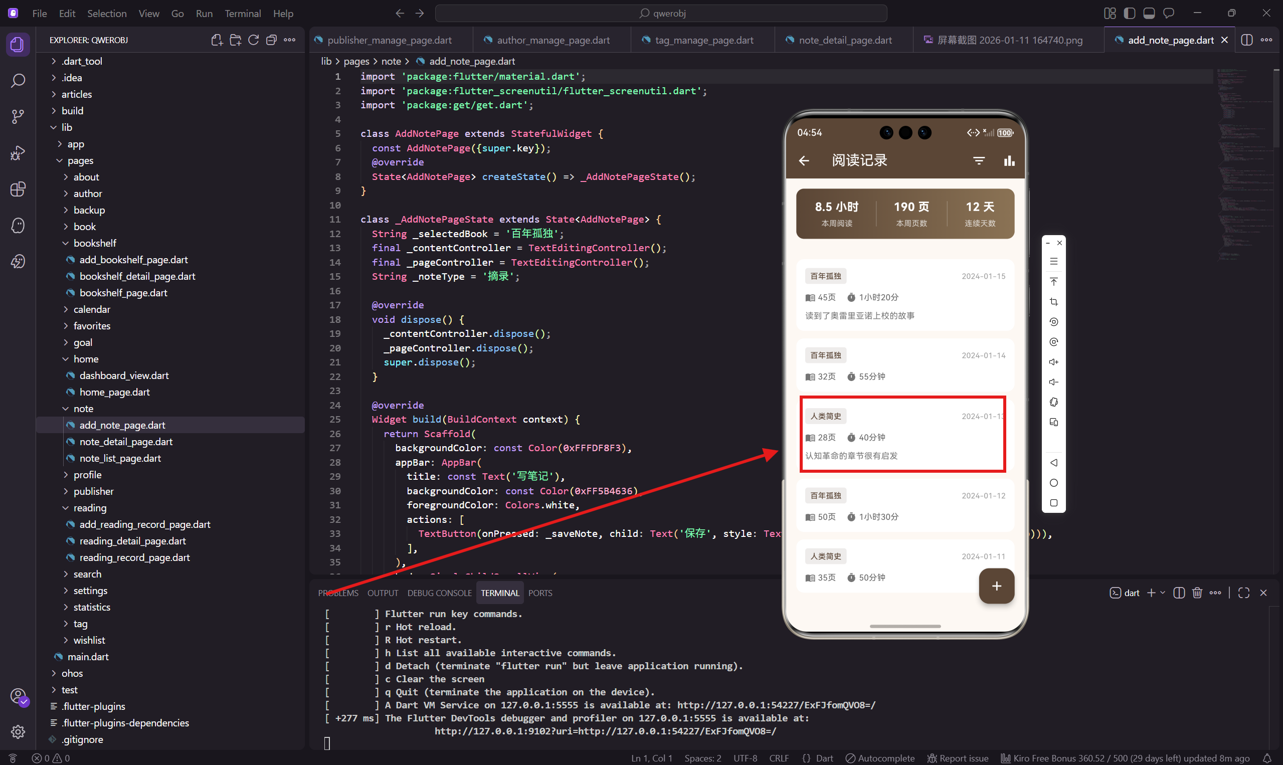
阅读详情页面用来展示单条阅读记录的完整信息,包括阅读的书籍、页数、时长、感想等。用户可以在这里查看自己某一次阅读的详细数据,也可以编辑或删除这条记录。
这个页面的设计思路是信息分层展示,把最重要的信息放在最显眼的位置,次要信息往下排。用户一眼就能看到是哪本书、读了多少页。
页面基础结构
阅读详情页面用 StatelessWidget 实现,因为这个页面主要是展示数据,不需要复杂的状态管理。
import 'package:flutter/material.dart';
import 'package:flutter_screenutil/flutter_screenutil.dart';
import 'package:get/get.dart';
导入三个核心依赖,flutter_screenutil 做屏幕适配,get 处理路由和弹窗。
页面主体框架
class ReadingDetailPage extends StatelessWidget {
const ReadingDetailPage({super.key});
Widget build(BuildContext context) {
return Scaffold(
backgroundColor: const Color(0xFFFDF8F3),
appBar: AppBar(
title: const Text('阅读详情'),
backgroundColor: const Color(0xFF5B4636),
foregroundColor: Colors.white,
背景色继续用米白色,和整个App风格统一。AppBar 标题简单直接,就叫"阅读详情"。
AppBar 操作按钮
        actions: [
          IconButton(icon: const Icon(Icons.edit), onPressed: () {}),
          IconButton(
            icon: const Icon(Icons.delete_outline),
            onPressed: () => _showDeleteDialog(),
          ),
        ],
      ),
右上角放了编辑和删除两个按钮。编辑按钮点击后跳转到编辑页面,删除按钮会弹出确认对话框。
删除用 delete_outline 图标而不是实心的 delete,看起来没那么"危险",但用户还是能认出来。
页面内容布局
      body: SingleChildScrollView(
        padding: EdgeInsets.all(16.w),
        child: Column(
          crossAxisAlignment: CrossAxisAlignment.start,
          children: [
            _buildBookInfo(),
            SizedBox(height: 20.h),
            _buildReadingInfo(),
            SizedBox(height: 20.h),
            _buildNoteSection(),
          ],
        ),
      ),
    );
  }
页面分三个模块:书籍信息、阅读数据、阅读感想。用 SingleChildScrollView 包裹,内容多了可以滚动。
书籍信息卡片
  Widget _buildBookInfo() {
    return Container(
      padding: EdgeInsets.all(16.w),
      decoration: BoxDecoration(
        color: Colors.white,
        borderRadius: BorderRadius.circular(12.r),
      ),
      child: Row(
        children: [
          Container(
            width: 60.w,
            height: 80.h,
            decoration: BoxDecoration(
              color: const Color(0xFF5B4636).withOpacity(0.1),
              borderRadius: BorderRadius.circular(8.r),
            ),
            child: Icon(Icons.menu_book, color: const Color(0xFF5B4636), size: 32.sp),
          ),
书籍信息卡片左边是封面占位图,用一个带图标的容器代替。实际项目中这里应该显示真实的书籍封面。
封面容器用浅棕色背景,和主题色呼应。
书籍详细信息
          SizedBox(width: 14.w),
          Expanded(
            child: Column(
              crossAxisAlignment: CrossAxisAlignment.start,
              children: [
                Text('百年孤独', style: TextStyle(
                  fontSize: 18.sp,
                  fontWeight: FontWeight.bold,
                  color: const Color(0xFF3D2914),
                )),
                SizedBox(height: 4.h),
                Text('加西亚·马尔克斯', style: TextStyle(
                  color: Colors.grey[600],
                  fontSize: 14.sp,
                )),
右边显示书名和作者。书名用大号加粗字体,作者用灰色小号字体,形成主次分明的层次。
阅读日期
                SizedBox(height: 8.h),
                Row(
                  children: [
                    Icon(Icons.calendar_today, size: 14.sp, color: Colors.grey[500]),
                    SizedBox(width: 4.w),
                    Text('2024年1月15日', style: TextStyle(
                      color: Colors.grey[500],
                      fontSize: 13.sp,
                    )),
                  ],
                ),
              ],
            ),
          ),
        ],
      ),
    );
  }
底部显示阅读日期,前面加个日历图标。日期用灰色显示,不抢书名的风头。
阅读数据卡片
  Widget _buildReadingInfo() {
    return Container(
      padding: EdgeInsets.all(16.w),
      decoration: BoxDecoration(
        color: Colors.white,
        borderRadius: BorderRadius.circular(12.r),
      ),
      child: Column(
        crossAxisAlignment: CrossAxisAlignment.start,
        children: [
          Text('阅读数据', style: TextStyle(
            fontSize: 16.sp,
            fontWeight: FontWeight.bold,
            color: const Color(0xFF3D2914),
          )),
          SizedBox(height: 16.h),
阅读数据卡片展示这次阅读的具体数据,包括页数、时长、起止页等。
数据展示行
          Row(
            children: [
              Expanded(child: _buildDataItem(Icons.menu_book, '阅读页数', '45 页')),
              Container(width: 1, height: 50.h, color: Colors.grey[200]),
              Expanded(child: _buildDataItem(Icons.timer, '阅读时长', '1小时20分')),
            ],
          ),
          Divider(height: 32.h),
          Row(
            children: [
              Expanded(child: _buildDataItem(Icons.play_arrow, '起始页', '第 240 页')),
              Container(width: 1, height: 50.h, color: Colors.grey[200]),
              Expanded(child: _buildDataItem(Icons.stop, '结束页', '第 285 页')),
            ],
          ),
数据用两行四列的布局展示,每行两个数据项,中间用竖线分隔。第一行是阅读页数和时长,第二行是起止页码。
Divider 用来分隔两行数据,让布局更清晰。
数据项组件
  Widget _buildDataItem(IconData icon, String label, String value) {
    return Column(
      children: [
        Icon(icon, color: const Color(0xFF5B4636), size: 24.sp),
        SizedBox(height: 8.h),
        Text(value, style: TextStyle(
          fontSize: 16.sp,
          fontWeight: FontWeight.bold,
          color: const Color(0xFF3D2914),
        )),
        SizedBox(height: 4.h),
        Text(label, style: TextStyle(color: Colors.grey[600], fontSize: 12.sp)),
      ],
    );
  }
每个数据项是一个垂直排列的组件:图标在上,数值在中,标签在下。图标用主题色,数值加粗显示,标签用灰色小字。
这种布局让用户先看到图标知道是什么数据,再看具体数值。
阅读进度展示
          Divider(height: 32.h),
          _buildProgressSection(),
        ],
      ),
    );
  }

  Widget _buildProgressSection() {
    return Column(
      crossAxisAlignment: CrossAxisAlignment.start,
      children: [
        Row(
          mainAxisAlignment: MainAxisAlignment.spaceBetween,
          children: [
            Text('阅读进度', style: TextStyle(color: Colors.grey[600], fontSize: 13.sp)),
            Text('75%', style: TextStyle(
              color: const Color(0xFF5B4636),
              fontWeight: FontWeight.bold,
            )),
          ],
        ),
进度部分显示这本书的整体阅读进度,标题和百分比左右对齐。
进度条
        SizedBox(height: 8.h),
        ClipRRect(
          borderRadius: BorderRadius.circular(6.r),
          child: LinearProgressIndicator(
            value: 0.75,
            backgroundColor: Colors.grey[200],
            valueColor: const AlwaysStoppedAnimation(Color(0xFF5B4636)),
            minHeight: 8.h,
          ),
        ),
        SizedBox(height: 8.h),
        Text('已读 285 页 / 共 380 页', style: TextStyle(
          color: Colors.grey[500],
          fontSize: 12.sp,
        )),
      ],
    );
  }
进度条用 LinearProgressIndicator,外面套 ClipRRect 加圆角。下面显示具体的页数,让用户知道还剩多少页没读。
进度条高度设为 8,比默认的粗一些,更容易看清。
阅读感想卡片
  Widget _buildNoteSection() {
    return Container(
      padding: EdgeInsets.all(16.w),
      decoration: BoxDecoration(
        color: Colors.white,
        borderRadius: BorderRadius.circular(12.r),
      ),
      child: Column(
        crossAxisAlignment: CrossAxisAlignment.start,
        children: [
          Row(
            children: [
              Icon(Icons.edit_note, color: const Color(0xFF5B4636), size: 20.sp),
              SizedBox(width: 8.w),
              Text('阅读感想', style: TextStyle(
                fontSize: 16.sp,
                fontWeight: FontWeight.bold,
                color: const Color(0xFF3D2914),
              )),
            ],
          ),
感想卡片的标题前面加了一个笔记图标,让用户一眼就知道这是文字内容区域。
感想内容
          SizedBox(height: 12.h),
          Text(
            '读到了奥雷里亚诺上校的故事,他发动了32次战争,全部失败。这种宿命般的孤独感贯穿整个家族,让人感慨万千。马尔克斯的魔幻现实主义手法真的很独特,把现实和幻想融合得天衣无缝。',
            style: TextStyle(
              color: Colors.grey[700],
              fontSize: 14.sp,
              height: 1.6,
            ),
          ),
        ],
      ),
    );
  }
感想内容用深灰色显示,行高设为 1.6,让文字更易读。这里的内容是示例,实际项目中从数据库读取。
删除确认对话框
  void _showDeleteDialog() {
    Get.dialog(AlertDialog(
      title: const Text('删除记录'),
      content: const Text('确定要删除这条阅读记录吗?'),
      actions: [
        TextButton(onPressed: () => Get.back(), child: const Text('取消')),
        TextButton(
          onPressed: () {
            Get.back();
            Get.back();
            Get.snackbar('已删除', '阅读记录已删除');
          },
          child: const Text('删除', style: TextStyle(color: Colors.red)),
        ),
      ],
    ));
  }
}
删除操作需要二次确认,防止用户误触。对话框有取消和删除两个按钮,删除按钮用红色提示危险操作。
点击删除后,先关闭对话框,再返回上一页,最后显示删除成功的提示。
设计细节
这个页面的设计有几个细节值得注意:
第一是信息分组,把相关的信息放在同一个卡片里。书籍信息一组,阅读数据一组,感想一组,用户可以快速定位想看的内容。
第二是数据可视化,进度用进度条展示比单纯的数字更直观。用户一眼就能看出读了多少、还剩多少。
第三是操作确认,删除这种不可逆操作必须有确认步骤,这是基本的用户体验原则。
小结
阅读详情页面的核心是清晰地展示一条阅读记录的所有信息。通过合理的分组和布局,用户可以快速获取想要的信息。
数据项组件的复用让代码更简洁,也保证了视觉上的一致性。删除确认对话框保护用户不会误删数据。
下一篇会讲统计分析页面的实现,用图表展示阅读数据的统计信息。
欢迎加入开源鸿蒙跨平台社区:https://openharmonycrossplatform.csdn.net

开源鸿蒙跨平台开发社区汇聚开发者与厂商,共建“一次开发,多端部署”的开源生态,致力于降低跨端开发门槛,推动万物智联创新。
更多推荐
 10
10 0
0- 0


 已为社区贡献30条内容

所有评论(0)