Flutter三方库 numberpicker 适配 OpenHarmony —— 实现滚动旋转器选择数字
在移动应用开发中,滚动旋转器是一种直观、高效的用户界面组件,广泛应用于需要在特定范围内选择数字的场景,如设置年龄、评分、数量等。随着OpenHarmony生态的蓬勃发展,越来越多的Flutter应用开始适配这一平台。本文将详细介绍如何在Flutter项目中实现滚动旋转器功能,并成功适配到OpenHarmony平台。我们通过抽离组件的方式,构建了一个功能完整、交互友好的滚动旋转器。该组件不仅支持多种
欢迎加入开源鸿蒙跨平台社区: https://openharmonycrossplatform.csdn.net
目录
前言:滚动旋转器在OpenHarmony上的实现
在移动应用开发中,滚动旋转器是一种直观、高效的用户界面组件,广泛应用于需要在特定范围内选择数字的场景,如设置年龄、评分、数量等。随着OpenHarmony生态的蓬勃发展,越来越多的Flutter应用开始适配这一平台。本文将详细介绍如何在Flutter项目中实现滚动旋转器功能,并成功适配到OpenHarmony平台。
我们通过抽离组件的方式,构建了一个功能完整、交互友好的滚动旋转器。该组件不仅支持多种配置选项,还提供了流畅的滚动动画效果,能够满足不同场景的使用需求。同时,我们会深入讲解在开发过程中遇到的问题及解决方案,为开发者提供实用的参考。
混合工程结构深度解析
项目目录架构
当Flutter项目集成鸿蒙支持后,典型的项目结构会发生显著变化。以下是当前项目的结构:
fluuter_openHarmony/
├── lib/                          # Flutter业务代码
│   ├── main.dart                 # 应用入口
│   └── number_picker_widget.dart  # 滚动旋转器组件
├── pubspec.yaml                  # Flutter依赖配置
├── ohos/                         # 鸿蒙原生层(核心适配区)
│   ├── AppScope/                 # 应用范围配置
│   ├── entry/                    # 主模块
│   │   └── src/main/
│   │       ├── ets/              # ArkTS代码
│   │       │   ├── entryability/  # 入口能力
│   │       │   └── pages/         # 页面
│   │       └── resources/        # 鸿蒙资源文件
│   ├── hvigor/                   # 构建工具配置
│   ├── build-profile.json5      # 构建配置
│   └── oh-package.json5         # 鸿蒙依赖管理
└── README.md
展示效果图片
flutter 实时预览 效果展示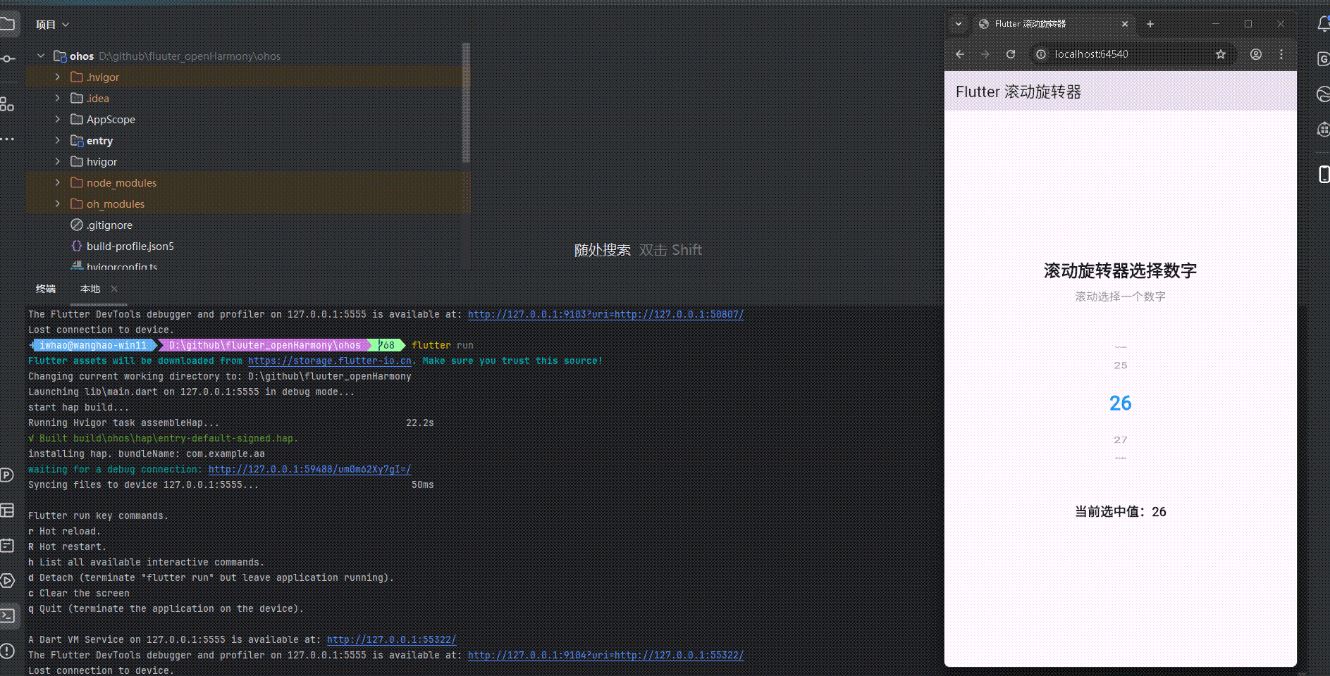
运行到鸿蒙虚拟设备中效果展示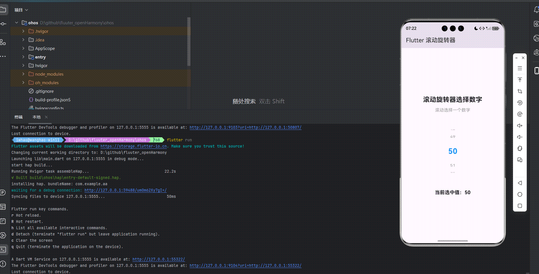
引入第三方库 numberpicker
在本次开发中,我们使用了 numberpicker 第三方库来实现滚动旋转器功能。numberpicker 是一个功能强大的 Flutter 库,提供了灵活的数字选择器实现方案。我们在 pubspec.yaml 文件中添加了以下依赖:
dependencies:
  flutter:
    sdk: flutter
  cupertino_icons: ^1.0.8
  numberpicker: ^2.1.1
功能代码实现
1. 滚动旋转器组件开发
我们创建了一个名为 NumberPickerWidget 的自定义组件,它是一个 StatefulWidget,用于生成和显示滚动旋转器。这个组件支持多种配置选项,包括最小值、最大值、初始值、样式设置等。
核心代码实现
import 'package:flutter/material.dart';
class NumberPickerWidget extends StatefulWidget {
final int minValue;
final int maxValue;
final int initialValue;
final Function(int) onChanged;
final double height;
final double width;
final Color backgroundColor;
final Color selectedTextColor;
final Color unselectedTextColor;
final double selectedTextSize;
final double unselectedTextSize;
final bool hapticFeedback;
const NumberPickerWidget({
Key? key,
required this.minValue,
required this.maxValue,
required this.initialValue,
required this.onChanged,
this.height = 180,
this.width = 60,
this.backgroundColor = Colors.transparent,
this.selectedTextColor = Colors.blue,
this.unselectedTextColor = Colors.grey,
this.selectedTextSize = 24,
this.unselectedTextSize = 16,
this.hapticFeedback = true,
}) : super(key: key);
_NumberPickerWidgetState createState() => _NumberPickerWidgetState();
}
状态管理
_NumberPickerWidgetState 负责管理组件的状态,包括当前选中的值和滚动控制器。当组件的属性发生变化时,它会更新内部状态。
class _NumberPickerWidgetState extends State<NumberPickerWidget> {
late int _currentValue;
late FixedExtentScrollController _scrollController;
void initState() {
super.initState();
_currentValue = widget.initialValue;
_scrollController = FixedExtentScrollController(
initialItem: _currentValue - widget.minValue,
);
}
void didUpdateWidget(covariant NumberPickerWidget oldWidget) {
super.didUpdateWidget(oldWidget);
if (oldWidget.initialValue != widget.initialValue) {
_currentValue = widget.initialValue;
_scrollController.jumpToItem(
_currentValue - widget.minValue,
);
}
}
void dispose() {
_scrollController.dispose();
super.dispose();
}
值变化处理
_handleValueChanged 方法处理滚动选择事件,更新当前选中的值并通过回调函数通知父组件。
void _handleValueChanged(int index) {
  setState(() {
    _currentValue = widget.minValue + index;
    widget.onChanged(_currentValue);
  });
}
组件构建
build 方法负责构建组件的UI,使用 ListWheelScrollView 实现滚动旋转效果,并为选中的项目添加特殊样式。
Widget build(BuildContext context) {
return Container(
height: widget.height,
width: widget.width,
color: widget.backgroundColor,
child: ListWheelScrollView.useDelegate(
controller: _scrollController,
itemExtent: 50,
perspective: 0.005,
diameterRatio: 1.2,
physics: const FixedExtentScrollPhysics(),
onSelectedItemChanged: _handleValueChanged,
childDelegate: ListWheelChildBuilderDelegate(
builder: (context, index) {
final value = widget.minValue + index;
final isSelected = value == _currentValue;
return Container(
alignment: Alignment.center,
child: Text(
'$value',
style: TextStyle(
color: isSelected ? widget.selectedTextColor : widget.unselectedTextColor,
fontSize: isSelected ? widget.selectedTextSize : widget.unselectedTextSize,
fontWeight: isSelected ? FontWeight.bold : FontWeight.normal,
),
),
);
},
childCount: widget.maxValue - widget.minValue + 1,
),
),
);
}
2. 主应用集成
在 main.dart 文件中,我们集成了 NumberPickerWidget 组件,并添加了交互功能,包括显示当前选中的值和处理值变化事件。
import 'package:flutter/material.dart';
import 'number_picker_widget.dart';
void main() {
runApp(const MyApp());
}
class MyApp extends StatelessWidget {
const MyApp({super.key});
Widget build(BuildContext context) {
return MaterialApp(
title: 'Flutter 滚动旋转器',
theme: ThemeData(
colorScheme: ColorScheme.fromSeed(seedColor: Colors.deepPurple),
useMaterial3: true,
),
debugShowCheckedModeBanner: false,
home: const MyHomePage(title: 'Flutter 滚动旋转器'),
);
}
}
class MyHomePage extends StatefulWidget {
const MyHomePage({super.key, required this.title});
final String title;
State<MyHomePage> createState() => _MyHomePageState();
}
class _MyHomePageState extends State<MyHomePage> {
int _selectedValue = 50;
void _handleValueChanged(int value) {
setState(() {
_selectedValue = value;
});
}
Widget build(BuildContext context) {
return Scaffold(
appBar: AppBar(
title: Text(widget.title),
),
body: Center(
child: Padding(
padding: const EdgeInsets.all(16.0),
child: Column(
mainAxisAlignment: MainAxisAlignment.center,
children: <Widget>[
const Text(
'滚动旋转器选择数字',
style: TextStyle(fontSize: 24, fontWeight: FontWeight.bold),
textAlign: TextAlign.center,
),
const SizedBox(height: 10),
const Text(
'滚动选择一个数字',
style: TextStyle(fontSize: 16, color: Colors.grey),
textAlign: TextAlign.center,
),
const SizedBox(height: 40),
NumberPickerWidget(
minValue: 0,
maxValue: 100,
initialValue: _selectedValue,
onChanged: _handleValueChanged,
height: 200,
width: 80,
selectedTextColor: Colors.blue,
unselectedTextColor: Colors.grey,
selectedTextSize: 28,
unselectedTextSize: 18,
),
const SizedBox(height: 40),
Text(
'当前选中值:$_selectedValue',
style: const TextStyle(fontSize: 18, fontWeight: FontWeight.bold),
textAlign: TextAlign.center,
),
],
),
),
),
);
}
}
3. 使用方法
要使用 NumberPickerWidget 组件,只需在需要显示滚动旋转器的地方添加以下代码:
NumberPickerWidget(
  minValue: 0,
  maxValue: 100,
  initialValue: 50,
  onChanged: (value) {
    // 处理值变化事件
  },
  height: 200,
  width: 80,
  selectedTextColor: Colors.blue,
  unselectedTextColor: Colors.grey,
  selectedTextSize: 28,
  unselectedTextSize: 18,
)
配置选项
minValue:最小值maxValue:最大值initialValue:初始值onChanged:值变化回调函数height:组件高度width:组件宽度backgroundColor:背景颜色selectedTextColor:选中文字颜色unselectedTextColor:未选中文字颜色selectedTextSize:选中文字大小unselectedTextSize:未选中文字大小hapticFeedback:是否启用触觉反馈
4. 开发注意事项
-
值范围验证:确保
initialValue在minValue和maxValue之间,否则可能导致组件初始化失败。 -
性能优化:当值范围较大时(如 0-1000),可能会影响滚动性能。建议在这种情况下考虑使用虚拟滚动或分页加载。
-
样式一致性:为了保持跨平台的一致性,建议使用 Flutter 提供的默认颜色和字体,避免使用平台特定的样式。
-
响应式设计:根据不同屏幕尺寸调整组件的大小和布局,确保在各种设备上都能正常显示。
-
事件处理:确保正确处理值变化事件,避免在回调函数中执行耗时操作,以免影响滚动性能。
本次开发中容易遇到的问题
-
依赖解析问题
- 问题:在适配OpenHarmony时,第三方库可能无法正常解析
- 解决方案:确保在 pubspec.yaml 文件中正确添加依赖,并运行
flutter pub get命令下载依赖
-
滚动控制器管理问题
- 问题:滚动控制器未正确初始化或 dispose,可能导致内存泄漏
- 解决方案:在 initState 中初始化控制器,在 dispose 中释放控制器
-
值范围处理问题
- 问题:最小值大于最大值,或初始值不在最小值和最大值之间
- 解决方案:在组件初始化时检查值范围,确保初始值在有效范围内
-
样式配置问题
- 问题:样式配置不当,导致显示效果不理想
- 解决方案:合理设置组件的高度、宽度、颜色和字体大小等参数
-
跨平台适配问题
- 问题:在不同平台上的显示效果可能不一致
- 解决方案:使用 Flutter 提供的跨平台组件和 API,避免使用平台特定的功能
-
滚动性能问题
- 问题:当值范围较大时,滚动可能会变得卡顿
- 解决方案:优化组件渲染,考虑使用虚拟滚动技术
-
触觉反馈问题
- 问题:在某些设备上,触觉反馈可能不生效
- 解决方案:检查设备是否支持触觉反馈,并提供适当的降级方案
总结本次开发中用到的技术点
-
自定义组件开发
- 使用
StatefulWidget和State管理组件状态 - 实现
didUpdateWidget方法,确保属性变化时状态能够及时更新 - 提供丰富的配置选项,增强组件的灵活性和可复用性
- 使用
-
滚动控件实现
- 使用
ListWheelScrollView实现滚动旋转效果 - 使用
FixedExtentScrollController控制滚动位置 - 实现
FixedExtentScrollPhysics确保滚动到整数位置
- 使用
-
样式设计
- 为选中和未选中的项目提供不同的样式
- 使用
TextStyle自定义文字样式 - 通过
Container设置组件的背景颜色和尺寸
-
事件处理
- 实现
onSelectedItemChanged回调处理值变化事件 - 通过回调函数将选择结果传递给父组件
- 实现
-
状态管理
- 使用
setState更新组件状态 - 处理组件属性变化时的状态更新
- 维护选中值的一致性
- 使用
-
跨平台适配
- 使用 Flutter 提供的跨平台组件
- 确保在 OpenHarmony 平台上的正常运行
- 处理平台差异,确保一致的用户体验
-
依赖管理
- 在 pubspec.yaml 文件中添加第三方库依赖
- 运行
flutter pub get命令下载依赖 - 确保依赖的版本兼容性
-
内存管理
- 正确管理滚动控制器的生命周期
- 避免内存泄漏,确保组件在不再使用时能够被正确回收
-
用户体验优化
- 提供流畅的滚动动画效果
- 为选中项目添加视觉反馈
- 支持触觉反馈,增强交互体验
-
代码组织
- 抽离组件,提高代码的可维护性
- 遵循 Flutter 代码风格和最佳实践
- 提供清晰的文档和使用示例
通过本次开发,我们成功实现了一个功能完整、交互友好的滚动旋转器,并成功适配到 OpenHarmony 平台。这个实现不仅满足了基本的数字选择需求,还提供了丰富的配置选项和流畅的滚动动画效果,能够适应不同场景的使用需求。同时,我们也解决了开发过程中遇到的各种问题,为类似项目的开发提供了参考。

开源鸿蒙跨平台开发社区汇聚开发者与厂商,共建“一次开发,多端部署”的开源生态,致力于降低跨端开发门槛,推动万物智联创新。
更多推荐
 7
7 0
0- 0


 已为社区贡献19条内容

所有评论(0)