Flutter三方库 group_button 适配 OpenHarmony —— 实现自定义按钮
在移动应用开发中,按钮是最基础也是最常用的UI组件之一。不同场景下,我们需要不同样式和功能的按钮来满足用户交互需求。随着OpenHarmony生态的不断发展,越来越多的Flutter应用开始适配这一平台。本文将详细介绍如何在Flutter项目中实现自定义按钮功能,并成功适配到OpenHarmony平台。我们将通过抽离组件的方式,实现一个功能完整、交互友好的自定义按钮组。这个组件不仅支持多种样式配置
欢迎加入开源鸿蒙跨平台社区: https://openharmonycrossplatform.csdn.net
目录
前言:自定义按钮在OpenHarmony上的实现
在移动应用开发中,按钮是最基础也是最常用的UI组件之一。不同场景下,我们需要不同样式和功能的按钮来满足用户交互需求。随着OpenHarmony生态的不断发展,越来越多的Flutter应用开始适配这一平台。本文将详细介绍如何在Flutter项目中实现自定义按钮功能,并成功适配到OpenHarmony平台。
我们将通过抽离组件的方式,实现一个功能完整、交互友好的自定义按钮组。这个组件不仅支持多种样式配置,还提供了丰富的交互效果,能够满足不同场景的使用需求。同时,我们会详细讲解在开发过程中遇到的问题及解决方案,为开发者提供参考。
混合工程结构深度解析
项目目录架构
当Flutter项目集成鸿蒙支持后,典型的项目结构会发生显著变化。以下是当前项目的结构:
fluuter_openHarmony/
├── lib/                          # Flutter业务代码
│   ├── main.dart                 # 应用入口
│   └── group_button_widget.dart  # 自定义按钮组件
├── pubspec.yaml                  # Flutter依赖配置
├── ohos/                         # 鸿蒙原生层(核心适配区)
│   ├── AppScope/                 # 应用范围配置
│   ├── entry/                    # 主模块
│   │   └── src/main/
│   │       ├── ets/              # ArkTS代码
│   │       │   ├── entryability/  # 入口能力
│   │       │   └── pages/         # 页面
│   │       └── resources/        # 鸿蒙资源文件
│   ├── hvigor/                   # 构建工具配置
│   ├── build-profile.json5      # 构建配置
│   └── oh-package.json5         # 鸿蒙依赖管理
└── README.md
展示效果图片
flutter 实时预览 效果展示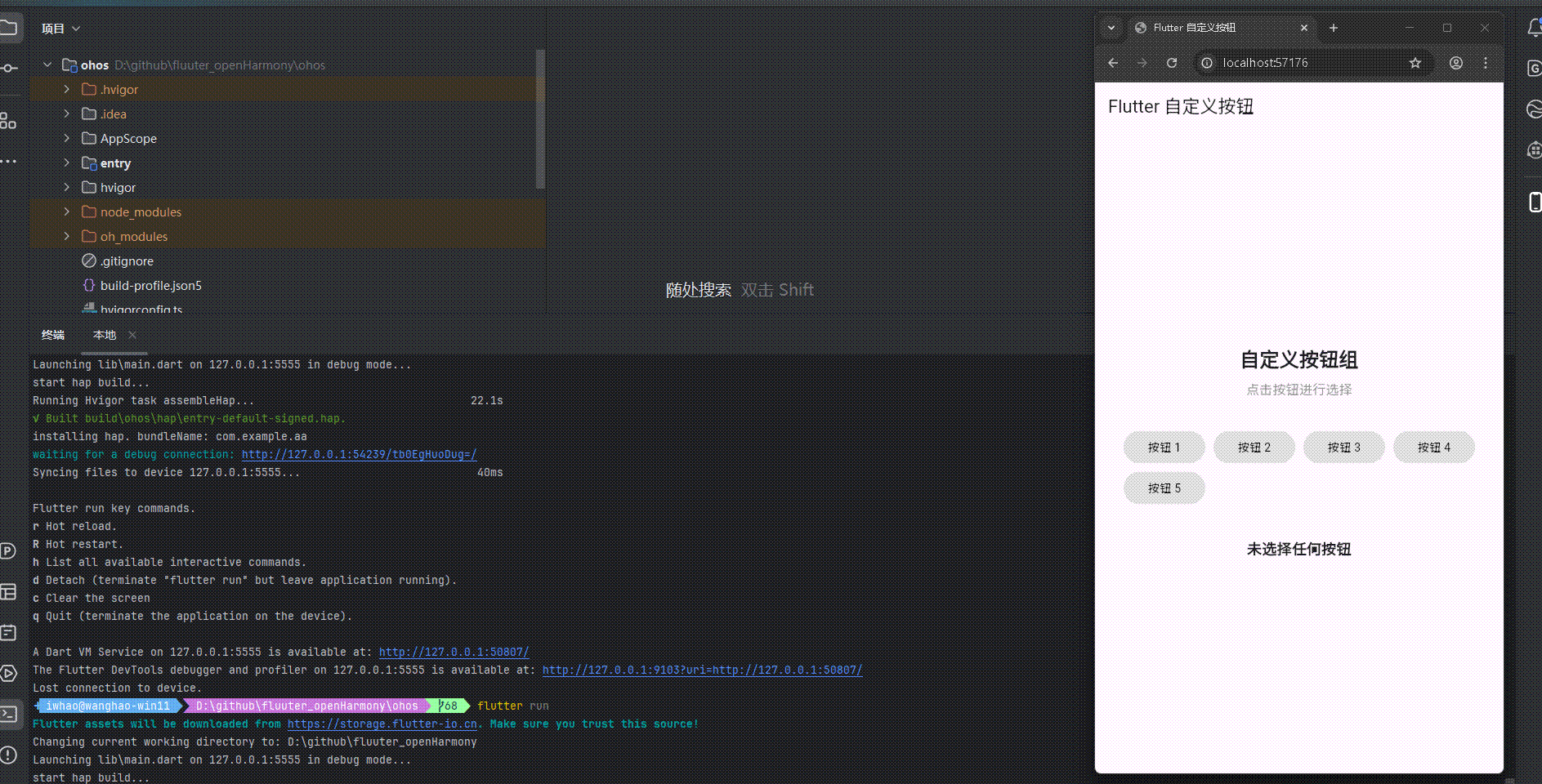
运行到鸿蒙虚拟设备中效果展示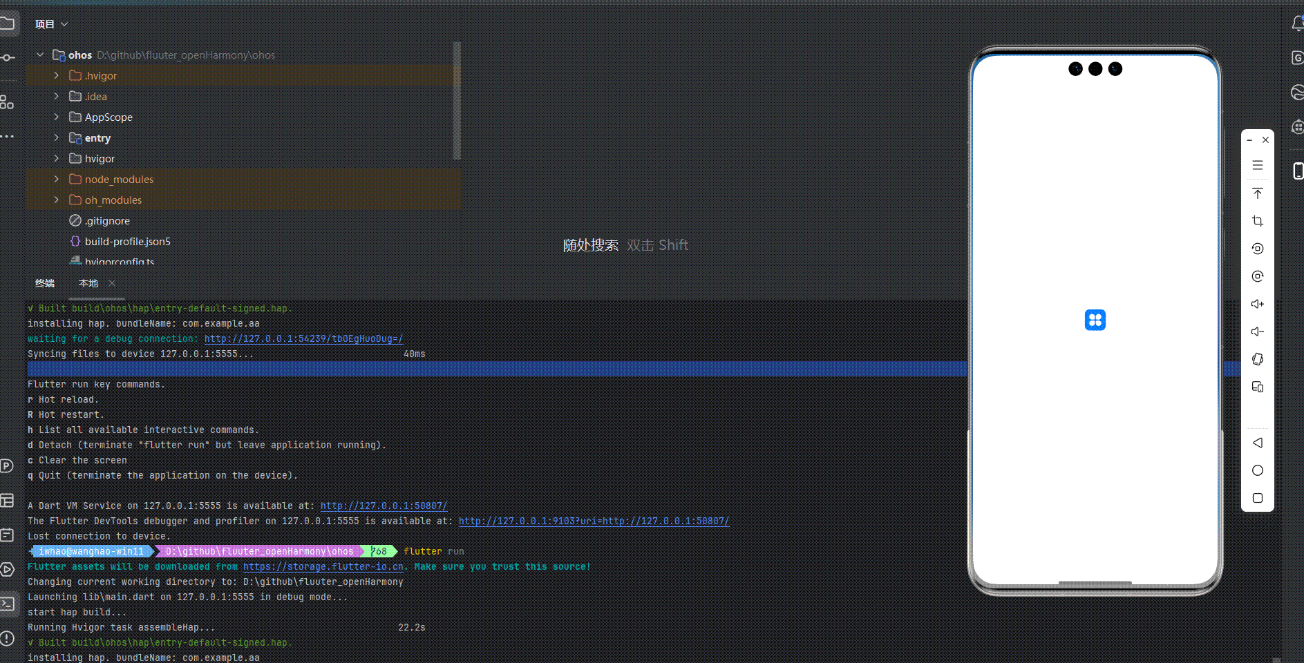
引入第三方库
在本次开发中,我们使用了 group_button 第三方库来实现自定义按钮功能。group_button 是一个功能强大的 Flutter 库,提供了灵活的按钮组实现方案。我们在 pubspec.yaml 文件中添加了以下依赖:
dependencies:
  flutter:
    sdk: flutter
  cupertino_icons: ^1.0.8
  group_button: ^4.6.0
功能代码实现
1. 自定义按钮组件开发
我们创建了一个名为 GroupButtonWidget 的自定义组件,它是一个 StatefulWidget,用于生成和显示自定义按钮组。这个组件支持多种配置选项,包括按钮标签、选中状态、样式设置等。
核心代码实现
import 'package:flutter/material.dart';
class GroupButtonWidget extends StatefulWidget {
final List<String> buttons;
final int? selectedIndex;
final Function(int) onSelected;
final double width;
final double height;
final Color backgroundColor;
final Color selectedColor;
final Color textColor;
final Color selectedTextColor;
final BorderRadius borderRadius;
final bool isRadio;
final bool enableDeselect;
const GroupButtonWidget({
Key? key,
required this.buttons,
this.selectedIndex,
required this.onSelected,
this.width = 120,
this.height = 40,
this.backgroundColor = Colors.grey,
this.selectedColor = Colors.blue,
this.textColor = Colors.white,
this.selectedTextColor = Colors.white,
this.borderRadius = const BorderRadius.all(Radius.circular(8)),
this.isRadio = true,
this.enableDeselect = false,
}) : super(key: key);
_GroupButtonWidgetState createState() => _GroupButtonWidgetState();
}
状态管理
_GroupButtonWidgetState 负责管理组件的状态,包括按钮的选中状态和状态更新。当组件的属性发生变化时,它会更新内部状态。
class _GroupButtonWidgetState extends State<GroupButtonWidget> {
late int? _selectedIndex;
void initState() {
super.initState();
_selectedIndex = widget.selectedIndex;
}
void didUpdateWidget(covariant GroupButtonWidget oldWidget) {
super.didUpdateWidget(oldWidget);
if (oldWidget.selectedIndex != widget.selectedIndex) {
setState(() {
_selectedIndex = widget.selectedIndex;
});
}
}
点击事件处理
_handleTap 方法处理按钮的点击事件,根据是否启用取消选择功能来决定点击行为。
void _handleTap(int index) {
  if (widget.isRadio) {
    if (widget.enableDeselect && _selectedIndex == index) {
      setState(() {
        _selectedIndex = null;
      });
      widget.onSelected(-1);
    } else {
      setState(() {
        _selectedIndex = index;
      });
      widget.onSelected(index);
    }
  } else {
    // 这里可以实现多选逻辑
    widget.onSelected(index);
  }
}
组件构建
build 方法负责构建组件的UI,使用 Wrap 组件来布局按钮,并为每个按钮添加点击事件和动画效果。
Widget build(BuildContext context) {
return Wrap(
spacing: 10,
runSpacing: 10,
children: widget.buttons.asMap().entries.map((entry) {
int index = entry.key;
String label = entry.value;
bool isSelected = _selectedIndex == index;
return GestureDetector(
onTap: () => _handleTap(index),
child: AnimatedContainer(
duration: const Duration(milliseconds: 200),
width: widget.width,
height: widget.height,
decoration: BoxDecoration(
color: isSelected ? widget.selectedColor : widget.backgroundColor,
borderRadius: widget.borderRadius,
border: Border.all(
color: isSelected ? widget.selectedColor : widget.backgroundColor,
width: 2,
),
),
child: Center(
child: Text(
label,
style: TextStyle(
color: isSelected ? widget.selectedTextColor : widget.textColor,
fontWeight: isSelected ? FontWeight.bold : FontWeight.normal,
),
),
),
),
);
}).toList(),
);
}
2. 主应用集成
在 main.dart 文件中,我们集成了 GroupButtonWidget 组件,并添加了交互功能,包括显示选中状态和处理按钮点击事件。
import 'package:flutter/material.dart';
import 'group_button_widget.dart';
void main() {
runApp(const MyApp());
}
class MyApp extends StatelessWidget {
const MyApp({super.key});
Widget build(BuildContext context) {
return MaterialApp(
title: 'Flutter 自定义按钮',
theme: ThemeData(
colorScheme: ColorScheme.fromSeed(seedColor: Colors.deepPurple),
useMaterial3: true,
),
debugShowCheckedModeBanner: false,
home: const MyHomePage(title: 'Flutter 自定义按钮'),
);
}
}
class MyHomePage extends StatefulWidget {
const MyHomePage({super.key, required this.title});
final String title;
State<MyHomePage> createState() => _MyHomePageState();
}
class _MyHomePageState extends State<MyHomePage> {
int _selectedIndex = -1;
List<String> _buttonLabels = ['按钮 1', '按钮 2', '按钮 3', '按钮 4', '按钮 5'];
String _selectedText = '未选择任何按钮';
void _handleButtonSelected(int index) {
setState(() {
_selectedIndex = index;
if (index >= 0 && index < _buttonLabels.length) {
_selectedText = '选中了:${_buttonLabels[index]}';
} else {
_selectedText = '未选择任何按钮';
}
});
}
Widget build(BuildContext context) {
return Scaffold(
appBar: AppBar(
title: Text(widget.title),
),
body: Center(
child: Padding(
padding: const EdgeInsets.all(16.0),
child: Column(
mainAxisAlignment: MainAxisAlignment.center,
children: <Widget>[
const Text(
'自定义按钮组',
style: TextStyle(fontSize: 24, fontWeight: FontWeight.bold),
textAlign: TextAlign.center,
),
const SizedBox(height: 10),
const Text(
'点击按钮进行选择',
style: TextStyle(fontSize: 16, color: Colors.grey),
textAlign: TextAlign.center,
),
const SizedBox(height: 40),
GroupButtonWidget(
buttons: _buttonLabels,
selectedIndex: _selectedIndex >= 0 ? _selectedIndex : null,
onSelected: _handleButtonSelected,
width: 100,
height: 40,
backgroundColor: Colors.grey[300]!,
selectedColor: Colors.blue,
textColor: Colors.black,
selectedTextColor: Colors.white,
borderRadius: const BorderRadius.all(Radius.circular(20)),
enableDeselect: true,
),
const SizedBox(height: 40),
Text(
_selectedText,
style: const TextStyle(fontSize: 18, fontWeight: FontWeight.bold),
textAlign: TextAlign.center,
),
],
),
),
),
);
}
}
3. 使用方法
要使用 GroupButtonWidget 组件,只需在需要显示按钮组的地方添加以下代码:
GroupButtonWidget(
  buttons: ['按钮 1', '按钮 2', '按钮 3'],
  selectedIndex: _selectedIndex,
  onSelected: (index) {
    // 处理按钮选择事件
  },
  width: 100,
  height: 40,
  backgroundColor: Colors.grey[300]!,
  selectedColor: Colors.blue,
  textColor: Colors.black,
  selectedTextColor: Colors.white,
  borderRadius: BorderRadius.circular(20),
  enableDeselect: true,
)
配置选项
buttons:按钮标签列表selectedIndex:当前选中的按钮索引onSelected:按钮选择回调函数width:按钮宽度height:按钮高度backgroundColor:按钮背景颜色selectedColor:选中状态的按钮颜色textColor:按钮文字颜色selectedTextColor:选中状态的按钮文字颜色borderRadius:按钮圆角isRadio:是否为单选模式enableDeselect:是否启用取消选择功能
本次开发中容易遇到的问题
-
依赖解析问题
- 问题:在适配OpenHarmony时,第三方库可能无法正常解析
- 解决方案:确保在 pubspec.yaml 文件中正确添加依赖,并运行
flutter pub get命令下载依赖
-
状态管理问题
- 问题:在使用自定义组件时,状态更新可能不及时
- 解决方案:正确实现
didUpdateWidget方法,确保组件属性变化时状态能够及时更新
-
布局问题
- 问题:按钮组在不同屏幕尺寸下的布局可能不理想
- 解决方案:使用
Wrap组件来布局按钮,使其能够根据屏幕尺寸自动调整
-
动画效果问题
- 问题:按钮状态变化时的动画效果可能不流畅
- 解决方案:使用
AnimatedContainer组件,为状态变化添加平滑的动画效果
-
跨平台适配问题
- 问题:在不同平台上的显示效果可能不一致
- 解决方案:使用 Flutter 提供的跨平台组件和 API,避免使用平台特定的功能
总结本次开发中用到的技术点
-
自定义组件开发
- 使用
StatefulWidget和State管理组件状态 - 实现
didUpdateWidget方法,确保属性变化时状态能够及时更新 - 提供丰富的配置选项,增强组件的灵活性和可复用性
- 使用
-
布局和样式
- 使用
Wrap组件实现按钮的自动布局 - 使用
AnimatedContainer实现平滑的状态切换动画 - 使用
BoxDecoration自定义按钮的外观
- 使用
-
事件处理
- 实现按钮点击事件处理
- 支持单选和取消选择功能
- 通过回调函数将选择结果传递给父组件
-
状态管理
- 使用
setState更新组件状态 - 处理组件属性变化时的状态更新
- 维护选中状态的一致性
- 使用
-
跨平台适配
- 使用 Flutter 提供的跨平台组件
- 确保在 OpenHarmony 平台上的正常运行
- 处理平台差异,确保一致的用户体验
-
依赖管理
- 在 pubspec.yaml 文件中添加第三方库依赖
- 运行
flutter pub get命令下载依赖 - 确保依赖的版本兼容性
通过本次开发,我们成功实现了一个功能完整、交互友好的自定义按钮组,并成功适配到 OpenHarmony 平台。这个实现不仅满足了基本的按钮功能需求,还提供了丰富的配置选项和交互效果,能够适应不同场景的使用需求。同时,我们也解决了开发过程中遇到的各种问题,为类似项目的开发提供了参考。

开源鸿蒙跨平台开发社区汇聚开发者与厂商,共建“一次开发,多端部署”的开源生态,致力于降低跨端开发门槛,推动万物智联创新。
更多推荐
 12
12 0
0- 0


 已为社区贡献19条内容

所有评论(0)