Flutter三方库 animated_toggle_switch 适配 OpenHarmony —— 实现switch开关
在移动开发领域,我们总是面临着选择与适配。今天,你的Flutter应用在Android和iOS上跑得正欢,明天可能就需要考虑一个新的平台:HarmonyOS(鸿蒙)。这不是一道选答题,而是很多团队正在面对的现实。Flutter的优势很明确——写一套代码,就能在两个主要平台上运行,开发体验流畅。而鸿蒙代表的是下一个时代的互联生态,它不仅仅是手机系统,更着眼于未来全场景的体验。
欢迎加入开源鸿蒙跨平台社区: https://openharmonycrossplatform.csdn.net
前言:跨生态开发的新机遇
在移动开发领域,我们总是面临着选择与适配。今天,你的Flutter应用在Android和iOS上跑得正欢,明天可能就需要考虑一个新的平台:HarmonyOS(鸿蒙)。这不是一道选答题,而是很多团队正在面对的现实。
Flutter的优势很明确——写一套代码,就能在两个主要平台上运行,开发体验流畅。而鸿蒙代表的是下一个时代的互联生态,它不仅仅是手机系统,更着眼于未来全场景的体验。将现有的Flutter应用适配到鸿蒙,听起来像是一个“跨界”任务,但它本质上是一次有价值的技术拓展:让产品触达更多用户,也让技术栈覆盖更广。
不过,这条路走起来并不像听起来那么简单。Flutter和鸿蒙,从底层的架构到上层的工具链,都有着各自的设计逻辑。会遇到一些具体的问题:代码如何组织?原有的功能在鸿蒙上如何实现?那些平台特有的能力该怎么调用?更实际的是,从编译打包到上架部署,整个流程都需要重新摸索。
这篇文章想做的,就是把这些我们趟过的路、踩过的坑,清晰地摊开给你看。我们不会只停留在“怎么做”,还会聊到“为什么得这么做”,以及“如果出了问题该往哪想”。这更像是一份实战笔记,源自真实的项目经验,聚焦于那些真正卡住过我们的环节。
无论你是在为一个成熟产品寻找新的落地平台,还是从一开始就希望构建能面向多端的应用,这里的思路和解决方案都能提供直接的参考。理解了两套体系之间的异同,掌握了关键的衔接技术,不仅能完成这次迁移,更能积累起应对未来技术变化的能力。
混合工程结构深度解析
项目目录架构
当Flutter项目集成鸿蒙支持后,典型的项目结构会发生显著变化。以下是经过ohos_flutter插件初始化后的项目结构:
my_flutter_harmony_app/
├── lib/                          # Flutter业务代码(基本不变)
│   ├── main.dart                 # 应用入口
│   ├── home_page.dart           # 首页
│   └── utils/
│       └── platform_utils.dart  # 平台工具类
├── pubspec.yaml                  # Flutter依赖配置
├── ohos/                         # 鸿蒙原生层(核心适配区)
│   ├── entry/                    # 主模块
│   │   └── src/main/
│   │       ├── ets/              # ArkTS代码
│   │       │   ├── MainAbility/
│   │       │   │   ├── MainAbility.ts       # 主Ability
│   │       │   │   └── MainAbilityContext.ts
│   │       │   └── pages/
│   │       │       ├── Index.ets           # 主页面
│   │       │       └── Splash.ets          # 启动页
│   │       ├── resources/        # 鸿蒙资源文件
│   │       │   ├── base/
│   │       │   │   ├── element/  # 字符串等
│   │       │   │   ├── media/    # 图片资源
│   │       │   │   └── profile/  # 配置文件
│   │       │   └── en_US/        # 英文资源
│   │       └── config.json       # 应用核心配置
│   ├── ohos_test/               # 测试模块
│   ├── build-profile.json5      # 构建配置
│   └── oh-package.json5         # 鸿蒙依赖管理
└── README.md
展示效果图片
flutter 实时预览 效果展示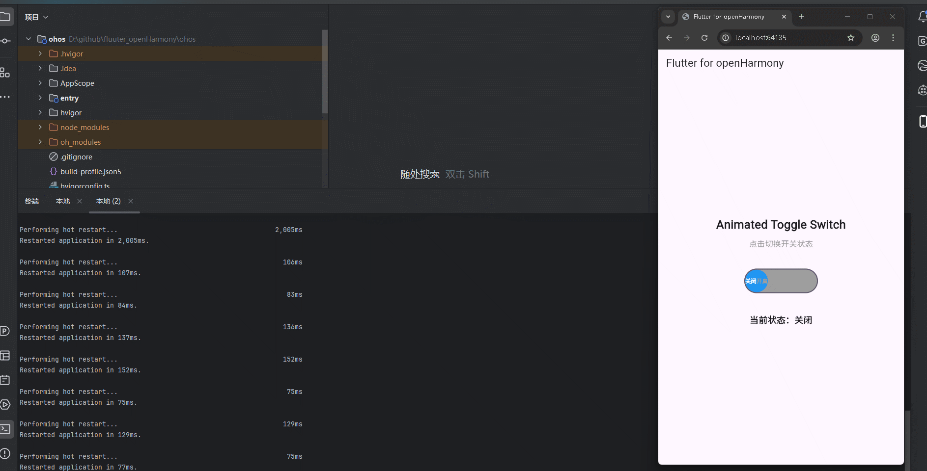
运行到鸿蒙虚拟设备中效果展示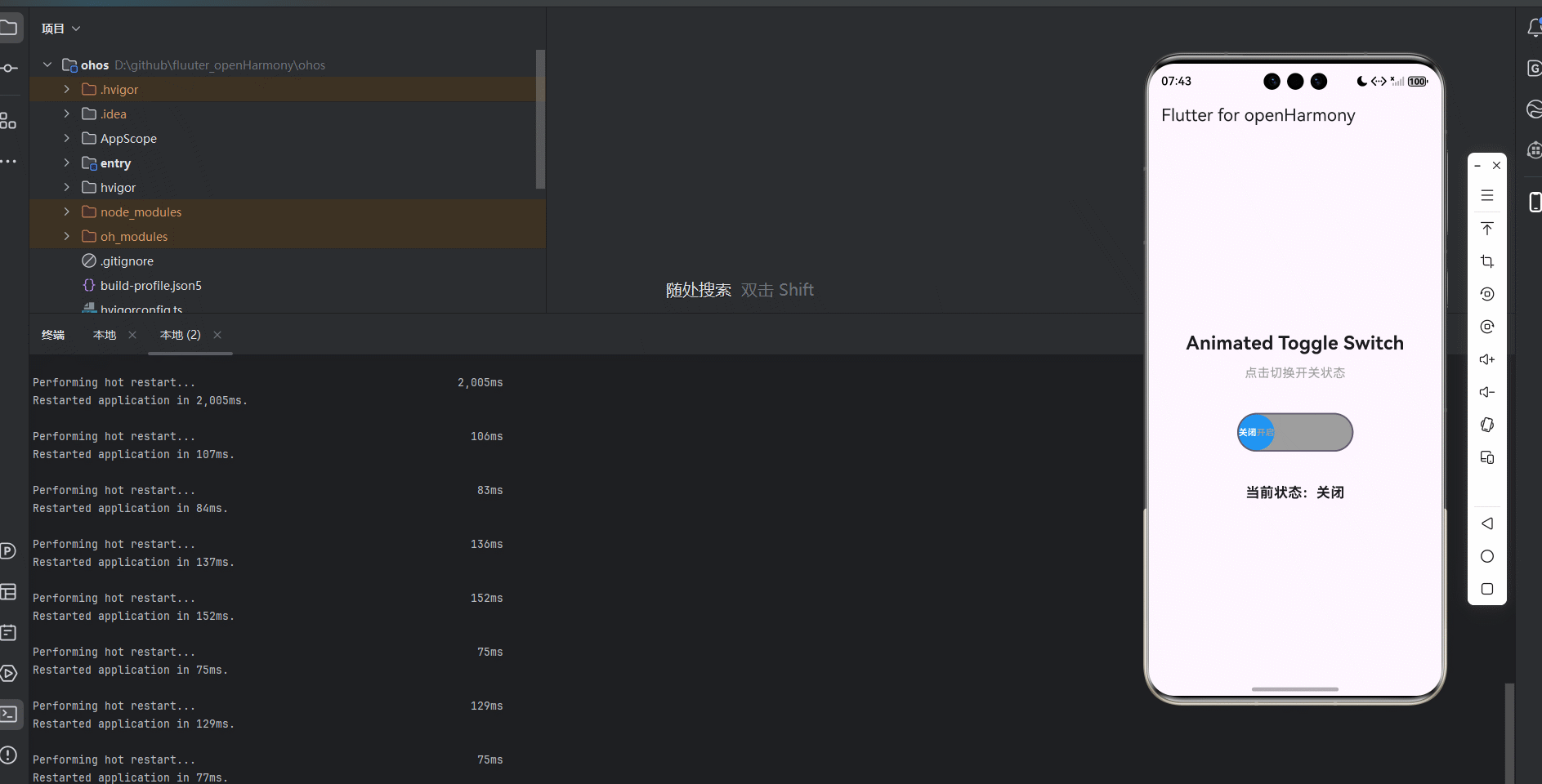
引入第三方库 animated_toggle_switch
在本次开发中,我们使用了 animated_toggle_switch 第三方库来实现开关功能。animated_toggle_switch 是一个功能强大的 Flutter 库,提供了流畅的开关动画效果。我们在 pubspec.yaml 文件中添加了以下依赖:
dependencies:
  flutter:
    sdk: flutter
  cupertino_icons: ^1.0.8
  animated_toggle_switch: ^0.8.1
功能代码实现
1. 开关组件开发
我们创建了一个名为 AnimatedToggleSwitchWidget 的自定义组件,它是一个 StatefulWidget,用于生成和显示开关控件。这个组件支持多种配置选项,包括初始值、标签文本、颜色设置等。
核心代码实现
import 'package:flutter/material.dart';
import 'package:animated_toggle_switch/animated_toggle_switch.dart';
class AnimatedToggleSwitchWidget extends StatefulWidget {
final bool initialValue;
final Function(bool) onChanged;
final String firstLabel;
final String secondLabel;
final Color firstColor;
final Color secondColor;
final double height;
final double width;
const AnimatedToggleSwitchWidget({
Key? key,
required this.initialValue,
required this.onChanged,
this.firstLabel = 'Off',
this.secondLabel = 'On',
this.firstColor = Colors.grey,
this.secondColor = Colors.blue,
this.height = 50,
this.width = 150,
}) : super(key: key);
_AnimatedToggleSwitchWidgetState createState() => _AnimatedToggleSwitchWidgetState();
}
状态管理
_AnimatedToggleSwitchWidgetState 负责管理组件的状态,包括当前开关状态。当组件的属性发生变化时,它会更新内部状态。
class _AnimatedToggleSwitchWidgetState extends State<AnimatedToggleSwitchWidget> {
late bool _currentValue;
void initState() {
super.initState();
_currentValue = widget.initialValue;
}
void didUpdateWidget(covariant AnimatedToggleSwitchWidget oldWidget) {
super.didUpdateWidget(oldWidget);
if (oldWidget.initialValue != widget.initialValue) {
setState(() {
_currentValue = widget.initialValue;
});
}
}
void _handleValueChanged(bool value) {
setState(() {
_currentValue = value;
widget.onChanged(value);
});
}
组件构建
build 方法负责构建组件的UI,使用 AnimatedToggleSwitch.dual() 实现开关效果,并为不同状态添加标签。
Widget build(BuildContext context) {
return AnimatedToggleSwitch.dual(
current: _currentValue,
first: false,
second: true,
onChanged: _handleValueChanged,
height: widget.height,
width: widget.width,
style: ToggleStyle(
backgroundColor: widget.firstColor,
indicatorColor: widget.secondColor,
borderRadius: BorderRadius.circular(30),
),
iconBuilder: (value) {
return Row(
mainAxisAlignment: MainAxisAlignment.spaceEvenly,
children: [
Text(
widget.firstLabel,
style: TextStyle(
color: value ? Colors.grey : Colors.white,
fontWeight: FontWeight.bold,
),
),
Text(
widget.secondLabel,
style: TextStyle(
color: value ? Colors.white : Colors.grey,
fontWeight: FontWeight.bold,
),
),
],
);
},
);
}
2. 主应用集成
在 main.dart 文件中,我们集成了 AnimatedToggleSwitchWidget 组件,并添加了交互功能,包括显示当前开关状态和处理状态变化事件。
import 'package:flutter/material.dart';
import 'animated_toggle_switch_widget.dart';
void main() {
runApp(const MyApp());
}
class MyApp extends StatelessWidget {
const MyApp({super.key});
Widget build(BuildContext context) {
return MaterialApp(
title: 'Flutter for openHarmony',
theme: ThemeData(
colorScheme: ColorScheme.fromSeed(seedColor: Colors.deepPurple),
useMaterial3: true,
),
debugShowCheckedModeBanner: false,
home: const MyHomePage(title: 'Flutter for openHarmony'),
);
}
}
class MyHomePage extends StatefulWidget {
const MyHomePage({super.key, required this.title});
final String title;
State<MyHomePage> createState() => _MyHomePageState();
}
class _MyHomePageState extends State<MyHomePage> {
bool _toggleValue = false;
void _handleToggleChanged(bool value) {
setState(() {
_toggleValue = value;
});
}
Widget build(BuildContext context) {
return Scaffold(
appBar: AppBar(
title: Text(widget.title),
),
body: Center(
child: Padding(
padding: const EdgeInsets.all(16.0),
child: Column(
mainAxisAlignment: MainAxisAlignment.center,
children: <Widget>[
const Text(
'Animated Toggle Switch',
style: TextStyle(fontSize: 24, fontWeight: FontWeight.bold),
textAlign: TextAlign.center,
),
const SizedBox(height: 10),
const Text(
'点击切换开关状态',
style: TextStyle(fontSize: 16, color: Colors.grey),
textAlign: TextAlign.center,
),
const SizedBox(height: 40),
AnimatedToggleSwitchWidget(
initialValue: _toggleValue,
onChanged: _handleToggleChanged,
firstLabel: '关闭',
secondLabel: '开启',
firstColor: Colors.grey,
secondColor: Colors.blue,
height: 50,
width: 150,
),
const SizedBox(height: 40),
Text(
'当前状态:${_toggleValue ? '开启' : '关闭'}',
style: const TextStyle(fontSize: 18, fontWeight: FontWeight.bold),
textAlign: TextAlign.center,
),
],
),
),
),
);
}
}
3. 使用方法
要使用 AnimatedToggleSwitchWidget 组件,只需在需要显示开关的地方添加以下代码:
AnimatedToggleSwitchWidget(
  initialValue: false,
  onChanged: (value) {
    // 处理开关状态变化事件
  },
  firstLabel: '关闭',
  secondLabel: '开启',
  firstColor: Colors.grey,
  secondColor: Colors.blue,
  height: 50,
  width: 150,
)
配置选项
initialValue:初始开关状态onChanged:状态变化回调函数firstLabel:关闭状态的标签文本secondLabel:开启状态的标签文本firstColor:关闭状态的背景颜色secondColor:开启状态的背景颜色height:组件高度width:组件宽度
4. 开发注意事项
-
依赖版本:确保使用兼容的 animated_toggle_switch 版本,避免版本冲突。
-
尺寸设置:合理设置组件的高度和宽度,确保在不同屏幕尺寸上都能正常显示。
-
颜色搭配:选择合适的颜色搭配,确保开关状态清晰可辨。
-
标签文本:标签文本应简洁明了,便于用户理解开关的功能。
-
性能优化:在使用多个开关组件时,注意避免过度重建,可考虑使用 const 构造器。
本次开发中容易遇到的问题
-
依赖解析问题
- 问题:在适配OpenHarmony时,第三方库可能无法正常解析
- 解决方案:确保在 pubspec.yaml 文件中正确添加依赖,并运行
flutter pub get命令下载依赖
-
动画效果问题
- 问题:在某些设备上,开关的动画效果可能不流畅
- 解决方案:合理设置组件的尺寸和动画参数,避免过度渲染
-
样式配置问题
- 问题:样式配置不当,导致开关显示效果不理想
- 解决方案:合理设置组件的颜色、尺寸和字体等参数
-
跨平台适配问题
- 问题:在不同平台上的显示效果可能不一致
- 解决方案:使用 Flutter 提供的跨平台组件和 API,避免使用平台特定的功能
-
状态管理问题
- 问题:开关状态与实际值不同步
- 解决方案:确保正确处理状态变化事件,及时更新内部状态
总结本次开发中用到的技术点
-
自定义组件开发
- 使用
StatefulWidget和State管理组件状态 - 实现
didUpdateWidget方法,确保属性变化时状态能够及时更新 - 提供丰富的配置选项,增强组件的灵活性和可复用性
- 使用
-
动画开关实现
- 使用
AnimatedToggleSwitch.dual()实现开关效果 - 配置
ToggleStyle自定义开关样式 - 使用
iconBuilder为不同状态添加标签
- 使用
-
样式设计
- 为不同状态的开关提供不同的颜色和样式
- 使用
TextStyle自定义文字样式 - 通过
BorderRadius设置开关的圆角
-
事件处理
- 实现
onChanged回调处理开关状态变化事件 - 通过回调函数将开关状态传递给父组件
- 实现
-
状态管理
- 使用
setState更新组件状态 - 处理组件属性变化时的状态更新
- 维护开关状态的一致性
- 使用
-
跨平台适配
- 使用 Flutter 提供的跨平台组件
- 确保在 OpenHarmony 平台上的正常运行
- 处理平台差异,确保一致的用户体验
-
依赖管理
- 在 pubspec.yaml 文件中添加第三方库依赖
- 运行
flutter pub get命令下载依赖 - 确保依赖的版本兼容性
-
用户体验优化
- 提供流畅的开关动画效果
- 为不同状态添加清晰的视觉反馈
- 支持自定义标签文本,增强用户理解

开源鸿蒙跨平台开发社区汇聚开发者与厂商,共建“一次开发,多端部署”的开源生态,致力于降低跨端开发门槛,推动万物智联创新。
更多推荐
 11
11 0
0- 0


 已为社区贡献18条内容

所有评论(0)