基于React Native鸿蒙跨平台采用组件化设计,将UI拆分为ImageCard、ImageModal等可复用组件,使用React Hooks进行状态管理,实现了图片展示、收藏、分享等核心功能
在React Native中开发鸿组件(这里指的是鸿蒙(HarmonyOS)组件),你需要了解鸿蒙开发的基础以及如何在React Native项目中集成鸿蒙应用。鸿蒙OS是由华为开发的一个分布式操作系统,主要用于其智能设备,如手机、平板、智能手表等。首先,你需要熟悉鸿蒙OS的开发环境设置和基本开发流程。React Native本身主要用于Harmony和Harmony平台的开发,但你可以通过以下几
欢迎大家加入开源鸿蒙跨平台开发者社区,一起共建开源鸿蒙跨平台生态。
在移动应用开发领域,图片类应用因其视觉特性和交互需求,成为技术选型的重要考量对象。本文将深入解读一个基于 React Native 开发的狗狗图库应用代码片段,剖析其架构设计、状态管理策略以及在鸿蒙系统上的跨端实现考量。
组件化
代码采用了清晰的组件化设计,将UI拆分为四个核心组件:ImageCard、ImageModal、SearchBar 和 BreedTag。这种拆分不仅提高了代码的可维护性,更重要的是为跨端开发提供了便利。在鸿蒙系统的 ArkTS 环境中,组件化设计使得平台特定的代码修改可以被隔离在最小范围内,降低了跨端开发的复杂度。
// 图片卡片组件
const ImageCard = ({
  title,
  description,
  image,
  favorite,
  onPress
}: {
  title: string;
  description: string;
  image: string;
  favorite: boolean;
  onPress: () => void;
}) => {
  // 组件内部逻辑
};
ImageCard 组件的设计尤为值得关注,它通过 props 接收所有必要的数据,并使用内部状态管理收藏状态。这种设计模式使得组件既可以响应外部数据变化,又能管理自身的交互状态,非常适合图片卡片这种需要独立交互的场景。
状态管理
应用采用了 React Hooks 中的 useState 进行状态管理,这是 React Native 开发中的标准实践。在 ImageCard 组件中,使用 useState 管理收藏状态:
const [isFavorite, setIsFavorite] = useState(favorite);

const toggleFavorite = () => {
  setIsFavorite(!isFavorite);
  Alert.alert('提示', `${isFavorite ? '已取消收藏' : '已收藏'} ${title}`);
};
在主组件 DogGalleryApp 中,使用 useState 管理当前选中的图片和品种:
const [selectedImage, setSelectedImage] = useState<string | null>(null);
const [selectedImageTitle, setSelectedImageTitle] = useState('');
const [selectedBreed, setSelectedBreed] = useState(0);
这种状态管理策略在跨端场景下表现出色,因为它不依赖于特定平台的状态管理方案,而是使用了 React 生态的标准 API,确保了在 React Native 和鸿蒙系统上的一致性表现。
响应式布局
代码通过 Dimensions.get('window') 获取屏幕宽度,为后续的响应式布局提供了基础:
const { width } = Dimensions.get('window');
这种方式在 React Native 中非常常见,但在鸿蒙系统的跨端开发中,需要特别注意不同设备尺寸的适配。鸿蒙系统的自适应布局能力虽然强大,但与 React Native 的布局模型存在差异,因此在实际开发中需要进行针对性调整。
图片加载
代码中使用了网络图片加载:
<Image source={{ uri: image }} style={styles.image} />
在鸿蒙系统上,图片加载的性能和缓存策略可能与 React Native 有所不同。为了确保良好的用户体验,应考虑以下几点:
- 图片缓存:实现图片的本地缓存,减少网络请求次数。
- 图片压缩:根据设备屏幕尺寸,加载合适大小的图片,减少内存消耗。
- 懒加载:实现图片的懒加载,提高页面加载速度。
- 错误处理:添加图片加载失败的处理逻辑,提供占位图。
模态框
应用使用了 React Native 的 Modal 组件实现图片的放大查看功能:
<Modal
  visible={visible}
  transparent={true}
  onRequestClose={onClose}
>
  {/* 内容 */}
</Modal>
在鸿蒙系统上,Modal 组件的实现可能与 React Native 有所不同,需要进行适当的调整以确保用户体验的一致性。
事件处理
应用实现了丰富的交互功能,如图片收藏、分享、下载、放大查看等。在收藏功能的实现中:
const toggleFavorite = () => {
  setIsFavorite(!isFavorite);
  Alert.alert('提示', `${isFavorite ? '已取消收藏' : '已收藏'} ${title}`);
};
这种基于回调函数的事件处理方式,在 React Native 和鸿蒙系统中都能很好地工作。但需要注意的是,在鸿蒙系统中,事件响应的优先级和处理机制可能与 React Native 有所不同,需要进行适当的调整以确保用户体验的一致性。
滚动视图
代码中使用了 ScrollView 组件来实现品种标签的水平滚动和图片列表的垂直滚动:
<ScrollView
  horizontal
  showsHorizontalScrollIndicator={false}
  style={styles.breedScrollView}
  contentContainerStyle={styles.breedScrollContent}
>
  {/* 品种标签 */}
</ScrollView>
在鸿蒙系统上,ScrollView 的滚动性能需要特别关注。由于鸿蒙系统对原生组件的渲染速度较快,但对 JavaScript 执行的性能要求较高,因此应尽量减少 ScrollView 中的复杂计算,确保滚动的流畅性。
React Native 的核心组件(如 View、Text、Image、TouchableOpacity、ScrollView、Modal 等)在鸿蒙系统上都有对应的实现,但在某些属性和行为上可能存在差异。例如,Modal 的动画效果、Image 的加载策略等,都需要在鸿蒙系统上进行测试和优化。
在鸿蒙系统上,React Native 应用的性能优化需要考虑以下几点:
-
渲染性能:鸿蒙系统对原生组件的渲染速度较快,但对 JavaScript 执行的性能要求较高。因此,应尽量减少 JavaScript 线程的计算负担,将复杂的计算逻辑移至原生层。
-
内存管理:图片类应用通常会加载大量图片,内存消耗较大。在鸿蒙系统上,需要特别注意内存的分配和释放,避免内存泄漏。
-
网络请求:图片类应用的网络请求频繁,应合理使用缓存策略,减少网络请求次数,提高应用响应速度。
代码使用了 TypeScript 进行类型定义,这不仅提高了代码的可读性,也为跨端开发提供了类型安全保障。在鸿蒙系统的 ArkTS 环境中,类型系统的一致性尤为重要,它确保了数据在不同平台间传递时的准确性。
应用的代码结构清晰,将数据模型、组件逻辑、样式等分离,便于维护和扩展。这种模块化设计在跨端开发中尤为重要,因为它使得平台特定的代码修改可以被隔离在最小范围内。
代码中使用了 Alert 进行用户反馈,这是一种简单有效的错误处理方式。在实际开发中,还应考虑添加更全面的错误处理机制,如网络请求错误、图片加载失败等,以提高应用的稳定性。
代码展示了组件化开发的最佳实践:
-
单一职责原则:每个组件只负责一个特定的功能,如
ImageCard只负责图片卡片的展示和交互。 -
props 传递:通过 props 传递数据,使得组件之间的通信清晰明了。
-
内部状态管理:对于组件内部的状态(如收藏状态),使用
useState进行管理,避免状态提升带来的复杂性。 -
可复用性:组件设计考虑了可复用性,如
ImageCard可以根据不同的 props 显示不同的内容。
代码通过 Dimensions.get('window') 获取屏幕宽度,为响应式布局提供了基础。在实际开发中,还可以考虑使用 Flexbox 布局模型,进一步提高应用的响应能力。
-
使用核心组件:优先使用 React Native 的核心组件,这些组件在鸿蒙系统上有较好的兼容性。
-
避免平台特定代码:尽量避免使用平台特定的 API,如需要使用,应通过条件判断进行隔离。
-
性能优化:针对不同平台的性能特点,进行有针对性的优化。
-
用户体验:确保在不同平台上的用户体验一致性,包括交互方式、视觉效果等。
-
代码质量:使用 TypeScript 进行类型定义,提高代码的可读性和可维护性。
通过对这个 React Native 狗狗图库应用代码片段的深入解读,我们可以看到,一个优秀的跨端应用需要在架构设计、组件化策略、性能优化等多个方面进行精心考量。特别是在 React Native 与鸿蒙系统的跨端开发中,需要充分了解两个平台的特性,才能开发出性能优异、用户体验一致的应用。
图片图库类应用是视觉化场景的典型代表,其核心诉求是图片网格布局展示、图片预览交互、收藏/分享等操作反馈,同时对UI的视觉层次感、响应式布局和交互流畅性有极高要求。本文以一个完整的 React Native 狗狗图库应用为例,拆解其组件化设计、图片交互逻辑、状态管理的核心实现,并深入探讨该页面向鸿蒙(HarmonyOS)生态迁移的技术要点,为跨端图库类应用开发提供可落地的实践参考。
该图库应用采用 React Native 函数式组件+组件化拆分的开发范式,融合了图库场景特有的网格布局、模态框图片预览、标签筛选、状态驱动的收藏交互等核心技术点,完全贴合图片类应用的开发特性。
1. 组件化
页面按功能职责拆分为多个独立组件,符合 React 组件化设计原则,大幅提升代码复用性和可维护性:
- 基础功能组件:
SearchBar(搜索栏)、BreedTag(品种标签)为纯展示+基础交互组件,接收 props 实现样式和行为的定制化;ImageCard(图片卡片)是核心业务组件,封装了图片展示、收藏切换、分享/下载操作;ImageModal(图片模态框)专注于图片预览功能,通过 props 控制显隐和内容。这种组件拆分方式在鸿蒙端可直接映射为@Component装饰的独立 struct,组件间通信逻辑(props 传递)完全复用。 - 状态内聚设计:
ImageCard内部维护isFavorite状态,负责收藏状态的切换和反馈,父组件仅需传递初始收藏状态(favorite)和点击回调(onPress),符合“单一职责”原则。在鸿蒙端可通过组件内@State isFavorite: boolean = false实现等价状态管理,收藏切换逻辑(this.isFavorite = !this.isFavorite)完全对齐。 - 通用逻辑封装:分享、下载、收藏等操作的弹窗反馈逻辑封装在组件内部,父组件无需关心具体实现,仅需触发对应操作,这种封装方式在鸿蒙端可通过组件方法(如
toggleFavorite())实现等价效果。
2. 布局设计:
页面采用多种布局方式适配图库场景的不同展示需求,保证在不同屏幕尺寸下的适配性:
- 图片网格布局:通过
flexDirection: 'row' + flexWrap: 'wrap' + justifyContent: 'space-between'实现图片卡片的双列网格布局,卡片宽度通过(width - 48) / 2动态计算(屏幕宽度减去左右 padding 和间距后均分),保证双列布局的一致性。这种响应式宽度计算在鸿蒙端可通过screen.getScreenSize().width获取屏幕宽度后计算,核心布局逻辑(FlexDirection.Row + FlexWrap.Wrap)完全复用。 - 横向标签布局:品种标签通过
ScrollView horizontal实现横向滚动,适配多标签的展示需求,通过showsHorizontalScrollIndicator={false}隐藏滚动指示器提升视觉体验。在鸿蒙端可通过Scroll组件 +direction: Axis.Horizontal实现等价横向滚动,标签选中态通过 props 传递的isSelected控制样式。 - 模态框居中布局:图片预览模态框采用绝对定位+居中对齐的方式,通过
width: width * 0.9限制最大宽度,maxHeight: '80%'限制高度,resizeMode="contain"保证图片完整展示。在鸿蒙端可通过Stack布局+Position.Absolute实现模态框遮罩,核心尺寸计算逻辑完全复用。
3. 交互逻辑:
页面实现了图库应用的核心交互流程,通过状态管理驱动UI变化:
- 图片预览交互:点击图片卡片时,
openImage函数更新selectedImage和selectedImageTitle状态,触发ImageModal显示;点击模态框遮罩或关闭按钮时,setSelectedImage(null)清空状态,关闭模态框。这种“状态驱动模态框显隐”的设计在鸿蒙端可通过@State selectedImage: string | null = null实现,模态框显隐逻辑(if (this.selectedImage) { ... })完全对齐。 - 标签筛选交互:通过
selectedBreed状态记录选中的标签索引,BreedTag组件根据isSelectedprops 展示选中态样式,点击标签时更新状态实现筛选切换(示例中仅实现样式切换,实际项目中可结合状态过滤图片数据)。在鸿蒙端可通过@State selectedBreed: number = 0实现等价状态管理,标签选中态样式通过条件渲染控制。 - 收藏交互设计:
ImageCard内部的收藏切换通过toggleFavorite函数实现,同步更新状态和弹窗反馈,收藏图标样式(❤️/🤍)根据状态动态切换,实现视觉化的状态反馈。这种状态驱动样式的逻辑在鸿蒙端可通过条件渲染实现,弹窗反馈通过promptAction.showToast实现。
4. 状态管理:
页面采用 React 内置的 useState 管理三类核心状态,满足图库应用的交互需求:
- 全局状态:
selectedImage/selectedImageTitle管理图片预览状态,selectedBreed管理标签筛选状态,作用域覆盖整个页面; - 组件内状态:
ImageCard内部的isFavorite管理收藏状态,作用域仅限于组件内部; - 静态数据:
breeds(品种标签)、images(图片数据)为静态常量,存储图库的基础数据,在鸿蒙端可直接定义为组件内的常量数组。
这种“全局+局部”的状态管理方式在鸿蒙端可通过 @State(组件内状态)+ @Link(跨组件状态,如需)实现,核心状态更新逻辑完全复用。
将该图库应用迁移至鸿蒙端,核心是“组件逻辑复用、布局等价复刻、交互体验对齐”,以下从技术维度拆解关键适配点:
1. 技术栈
鸿蒙端基于 ArkTS(TypeScript 超集)开发,与 React Native 的组件化思想和 TypeScript 语法高度兼容,核心差异集中在组件定义与状态管理:
- 组件定义迁移:React 函数式组件转换为鸿蒙的
@Component装饰的 struct,Props 定义转换为组件内的属性:// React Native ImageCard 组件 const ImageCard = ({ title, description, image, favorite, onPress }: { title: string; description: string; image: string; favorite: boolean; onPress: () => void; }) => { const [isFavorite, setIsFavorite] = useState(favorite); // 组件逻辑... return (/* JSX 渲染 */); }; // 鸿蒙 ArkTS ImageCard 组件 @Component struct ImageCard { // Props 定义 title: string = ''; description: string = ''; image: string = ''; favorite: boolean = false; onPress: () => void = () => {}; // 组件内状态 @State isFavorite: boolean = false; aboutToAppear() { // 初始化收藏状态 this.isFavorite = this.favorite; } // 收藏切换方法 toggleFavorite() { this.isFavorite = !this.isFavorite; promptAction.showToast({ message: `${this.isFavorite ? '已收藏' : '已取消收藏'} ${this.title}`, duration: 2000 }); } build() { // ArkUI 渲染(复用 Flex 布局) } } - 核心交互逻辑复用:分享、下载、收藏等操作的弹窗反馈逻辑可直接迁移,仅需替换弹窗API:
// React Native 分享逻辑 onPress={() => Alert.alert('分享', `分享 ${title}`)} // 鸿蒙 ArkTS 等价逻辑 onClick: () => { promptAction.showToast({ message: `分享 ${this.title}`, duration: 2000 }); } - 模态框组件迁移:React Native 的
Modal组件可替换为鸿蒙的Dialog组件或Stack+Position.Absolute实现的自定义模态框,核心显隐控制逻辑完全复用:// 鸿蒙 ArkTS 图片预览模态框 @Component struct ImageModal { visible: boolean = false; image: string = ''; title: string = ''; onClose: () => void = () => {}; build() { if (this.visible) { Stack({ alignContent: Alignment.Center }) { // 遮罩层 Column() .width('100%') .height('100%') .backgroundColor('rgba(0,0,0,0.8)') .onClick(this.onClose); // 内容层 Column() .width(screen.getScreenSize().width * 0.9) .maxHeight('80%') .backgroundColor('#ffffff') .borderRadius(12) .padding(16) .alignItems(Alignment.Center) { Image(this.image) .width('100%') .height(300) .objectFit(ImageFit.Contain) .borderRadius(8); Text(this.title) .fontSize(18) .fontWeight(FontWeight.Bold) .marginBottom(16) .textAlign(TextAlign.Center); Button('关闭') .width('100%') .backgroundColor('#3b82f6') .fontColor('#ffffff') .padding(10) .borderRadius(8) .onClick(this.onClose); } } } } }
React Native 原生组件与鸿蒙 ArkUI 组件存在清晰的映射关系,是图库类应用跨端迁移的核心落地环节:
| React Native 组件 | 鸿蒙 ArkUI 组件 | 适配核心说明 |
|---|---|---|
| SafeAreaView | SafeArea | 均用于适配刘海屏/底部安全区,属性一致 |
| View | Column/Row/Stack | 鸿蒙通过布局组件替代通用容器,Flex 布局逻辑复用 |
| Text | Text | 样式属性(fontSize/color等)仅命名规范差异,文本展示完全一致 |
| TouchableOpacity | Button/Text(带点击态) | 鸿蒙无直接等价组件,可通过 Button 去除默认样式(backgroundColor: Color.Transparent)实现,保证点击交互一致性 |
| Image | Image | 鸿蒙 Image 组件支持网络图片加载,resizeMode 对应 objectFit |
| ScrollView (horizontal) | Scroll | 鸿蒙 Scroll 组件 + direction: Axis.Horizontal 实现标签横向滚动 |
| ScrollView (vertical) | Scroll | 鸿蒙 Scroll 组件 + direction: Axis.Vertical 实现图片列表滚动 |
| Modal | Dialog/Stack+Position | 鸿蒙可通过 Dialog 组件或自定义模态框实现图片预览 |
| StyleSheet | @Styles/@Extend | 鸿蒙通过装饰器封装样式,核心样式属性直接映射 |
以核心的图片网格布局为例,React Native 实现与鸿蒙 ArkTS 实现的核心映射:
// React Native 图片网格布局
<View style={styles.imageGrid}>
  {images.map(image => (
    <ImageCard
      key={image.id}
      title={image.title}
      description={image.description}
      image={image.image}
      favorite={image.favorite}
      onPress={() => openImage(image.image, image.title)}
    />
  ))}
</View>

// 鸿蒙 ArkTS 等价实现
@State screenWidth: number = screen.getScreenSize().width;

build() {
  Column({ wrap: FlexWrap.Wrap, justifyContent: FlexAlign.SpaceBetween }) {
    ForEach(this.images, (image) => {
      ImageCard({
        title: image.title,
        description: image.description,
        image: image.image,
        favorite: image.favorite,
        onPress: () => this.openImage(image.image, image.title)
      })
      .width((this.screenWidth - 48) / 2)
      .marginBottom(16);
    }, image => image.id.toString());
  }
}
3. 样式体系
React Native 的 StyleSheet.create 封装样式的方式,在鸿蒙端可通过 @Styles/@Extend 装饰器实现等价封装,核心样式属性的适配规则如下:
- 布局属性:
flex/flexDirection/justifyContent/alignItems等 Flex 核心属性完全复用,仅鸿蒙需将字符串值改为枚举值(如justifyContent: 'space-between'→justifyContent: FlexAlign.SpaceBetween)。 - 图库卡片样式:
borderRadius完全复用,保证图片卡片(12px)、搜索栏(8px)、模态框(12px)的圆角一致性;backgroundColor直接映射,图库场景特有的蓝色系(#3b82f6按钮/选中标签)、浅灰色系(#f1f5f9标签/操作按钮)可 100% 复用;elevation替换为鸿蒙的shadow属性(shadowColor/shadowRadius/shadowOffset),保证图片卡片的阴影层级。
- 状态样式适配:标签选中态、导航选中态、收藏图标样式可通过条件渲染实现:
// 鸿蒙 ArkTS 标签选中态样式 @Styles breedTag() { paddingHorizontal: 16, paddingVertical: 8, borderRadius: 20, backgroundColor: '#f1f5f9', marginRight: 10 } @Styles selectedBreedTag() { paddingHorizontal: 16, paddingVertical: 8, borderRadius: 20, backgroundColor: '#3b82f6', marginRight: 10 } // 标签渲染 <TouchableOpacity style={this.selectedBreed === index ? this.selectedBreedTag() : this.breedTag()} onClick={() => this.selectedBreed = index} > <Text style={this.selectedBreed === index ? { color: '#ffffff' } : { color: '#64748b' }}> {breed} </Text> </TouchableOpacity> - 响应式尺寸适配:React Native 的
width: (width - 48) / 2等动态宽度计算,在鸿蒙端可通过screen.getScreenSize().width获取屏幕宽度后计算,保证不同设备的适配性。
图库类应用对图片加载、列表滚动、模态框切换的流畅度要求极高,跨端迁移需重点保证以下体验一致性:
- 图片加载优化:鸿蒙的
Image组件支持网络图片缓存和懒加载,可通过objectFit: ImageFit.Cover/ImageFit.Contain适配不同展示需求,保证图片加载的流畅性和展示效果。 - 滚动性能优化:鸿蒙的
Scroll组件默认性能优异,标签横向滚动和图片列表纵向滚动可通过scrollBar: ScrollBar.None关闭滚动指示器,保持图库应用的简洁视觉。 - 模态框交互优化:React Native 的
Modal组件切换体验可通过鸿蒙的transition动画优化,实现模态框的淡入淡出效果:// 鸿蒙 ArkTS 模态框动画 Column() .width(screen.getScreenSize().width * 0.9) .maxHeight('80%') .backgroundColor('#ffffff') .borderRadius(12) .padding(16) .alignItems(Alignment.Center) .transition({ type: TransitionType.Opacity, duration: 300 }); - 交互反馈优化:React Native 的
TouchableOpacity点击反馈在鸿蒙端可通过Button组件的stateEffect: true实现,保证收藏、分享、下载、标签切换等核心操作的点击反馈一致性;底部导航的选中态可通过@State驱动样式变化,逻辑完全复用。 - 图库体验增强:鸿蒙端可利用
@ohos.fileio模块实现图片的本地下载功能,补充 React Native 版本的下载逻辑;利用鸿蒙的Gallery组件实现图片的滑动预览,提升图库应用的原生体验。
从该 React Native 狗狗图库应用的鸿蒙适配过程中,可提炼出图片类应用跨端开发的通用方法论:
按功能职责拆分的独立组件(搜索、标签、图片卡片、模态框)可 100% 跨端复用,仅需适配组件定义语法和样式属性,核心业务逻辑无需修改。
基于 useState/@State 的状态管理方式(收藏状态、模态框显隐、标签选中态)跨端适配仅需替换状态定义语法,交互逻辑完全复用,是图库应用的最优状态管理方案。
图库应用的网格布局、流式布局、横向滚动布局均可通过 Flex 布局实现跨端复刻,保证不同平台的UI一致性和响应式适配性。
若将该狗狗图库应用落地到鸿蒙端,建议分阶段实施:
- 基础组件迁移:首先迁移
SearchBar、BreedTag等基础组件,验证布局、样式、基础交互的适配可行性。 - 核心组件迁移:迁移
ImageCard、ImageModal核心组件,重点验证图片展示、收藏交互、模态框预览的适配一致性。 - 状态逻辑迁移:迁移标签筛选、图片预览的状态管理逻辑,验证状态驱动UI变化的适配效果。
- 鸿蒙特性增强:针对鸿蒙端特性做增强,例如利用鸿蒙的
Gallery组件实现图片滑动预览,利用@ohos.fileio实现图片本地下载,利用FormExtensionAbility实现图库卡片的桌面小组件。
从性能优化角度,React Native 端可通过 FlatList 替代 ScrollView 实现图片列表的虚拟化渲染,鸿蒙端可通过 List 组件实现等价优化,提升大量图片数据的加载和滚动性能;两端均可通过图片懒加载优化首屏加载速度。
真实演示案例代码:
// app.tsx
import React, { useState } from 'react';
import { SafeAreaView, View, Text, StyleSheet, TouchableOpacity, ScrollView, Image, Dimensions, Alert, Modal } from 'react-native';

// 图标库
const ICONS = {
  home: '🏠',
  gallery: '🖼️',
  heart: '❤️',
  share: '📤',
  download: '📥',
  bookmark: '🔖',
  user: '👤',
  search: '🔍',
};

const { width } = Dimensions.get('window');

// 图片卡片组件
const ImageCard = ({
  title,
  description,
  image,
  favorite,
  onPress
}: {
  title: string;
  description: string;
  image: string;
  favorite: boolean;
  onPress: () => void;
}) => {
  const [isFavorite, setIsFavorite] = useState(favorite);

  const toggleFavorite = () => {
    setIsFavorite(!isFavorite);
    Alert.alert('提示', `${isFavorite ? '已取消收藏' : '已收藏'} ${title}`);
  };

  return (
    <TouchableOpacity style={styles.imageCard} onPress={onPress}>
      <Image source={{ uri: image }} style={styles.image} />

      <View style={styles.imageContent}>
        <View style={styles.imageHeader}>
          <View>
            <Text style={styles.imageTitle}>{title}</Text>
            <Text style={styles.imageDescription} numberOfLines={1}>{description}</Text>
          </View>
          <TouchableOpacity onPress={toggleFavorite}>
            <Text style={styles.favoriteIcon}>{isFavorite ? '❤️' : '🤍'}</Text>
          </TouchableOpacity>
        </View>

        <View style={styles.imageActions}>
          <TouchableOpacity style={styles.actionButton} onPress={() => Alert.alert('分享', `分享 ${title}`)}>
            <Text style={styles.actionText}>{ICONS.share}</Text>
          </TouchableOpacity>
          <TouchableOpacity style={styles.actionButton} onPress={() => Alert.alert('下载', `下载 ${title}`)}>
            <Text style={styles.actionText}>{ICONS.download}</Text>
          </TouchableOpacity>
        </View>
      </View>
    </TouchableOpacity>
  );
};

// 放大图片模态框组件
const ImageModal = ({
  visible,
  image,
  title,
  onClose
}: {
  visible: boolean;
  image: string;
  title: string;
  onClose: () => void
}) => {
  return (
    <Modal
      visible={visible}
      transparent={true}
      onRequestClose={onClose}
    >
      <View style={styles.modalContainer}>
        <TouchableOpacity style={styles.modalOverlay} onPress={onClose} />
        <View style={styles.modalContent}>
          <Image source={{ uri: image }} style={styles.modalImage} resizeMode="contain" />
          <Text style={styles.modalTitle}>{title}</Text>
          <TouchableOpacity style={styles.closeButton} onPress={onClose}>
            <Text style={styles.closeButtonText}>关闭</Text>
          </TouchableOpacity>
        </View>
      </View>
    </Modal>
  );
};

// 搜索栏组件
const SearchBar = () => {
  return (
    <View style={styles.searchBar}>
      <Text style={styles.searchIcon}>{ICONS.search}</Text>
      <Text style={styles.searchPlaceholder}>搜索狗狗图片...</Text>
    </View>
  );
};

// 狗狗品种标签组件
const BreedTag = ({ breed, isSelected, onPress }: { breed: string; isSelected: boolean; onPress: () => void }) => {
  return (
    <TouchableOpacity
      style={[styles.breedTag, isSelected && styles.selectedBreedTag]}
      onPress={onPress}
    >
      <Text style={[styles.breedTagText, isSelected && styles.selectedBreedTagText]}>{breed}</Text>
    </TouchableOpacity>
  );
};

const DogGalleryApp: React.FC = () => {
  const [selectedImage, setSelectedImage] = useState<string | null>(null);
  const [selectedImageTitle, setSelectedImageTitle] = useState('');
  const [selectedBreed, setSelectedBreed] = useState(0);

  // 品种标签
  const breeds = ['全部', '金毛', '拉布拉多', '哈士奇', '柯基', '柴犬', '边牧'];

  // 图片数据
  const images = [
    {
      id: 1,
      title: '金毛幼犬',
      description: '可爱的小金毛在草地上玩耍',
      image: 'https://images.dog.ceo/breeds/golden/n02099601_34.jpg',
      favorite: true
    },
    {
      id: 2,
      title: '拉布拉多游泳',
      description: '拉布拉多在湖中快乐地游泳',
      image: 'https://images.dog.ceo/breeds/labrador/n02099712_4823.jpg',
      favorite: false
    },
    {
      id: 3,
      title: '哈士奇雪地',
      description: '哈士奇在雪地中奔跑',
      image: 'https://images.dog.ceo/breeds/husky/n02110185_123.jpg',
      favorite: true
    },
    {
      id: 4,
      title: '柯基萌照',
      description: '可爱的柯基歪着头看人',
      image: 'https://images.dog.ceo/breeds/corgi/n02113186_1234.jpg',
      favorite: false
    },
    {
      id: 5,
      title: '柴犬微笑',
      description: '柴犬露出标志性的微笑',
      image: 'https://images.dog.ceo/breeds/shiba/n02113978_1234.jpg',
      favorite: true
    },
    {
      id: 6,
      title: '边牧敏捷',
      description: '边牧正在进行敏捷训练',
      image: 'https://images.dog.ceo/breeds/collie-border/n02106166_123.jpg',
      favorite: false
    },
  ];

  const openImage = (image: string, title: string) => {
    setSelectedImage(image);
    setSelectedImageTitle(title);
  };

  return (
    <SafeAreaView style={styles.container}>
      {/* 头部 */}
      <View style={styles.header}>
        <Text style={styles.title}>狗狗图库</Text>
        <Text style={styles.subtitle}>浏览可爱的狗狗图片</Text>
      </View>

      {/* 搜索栏 */}
      <SearchBar />

      {/* 品种标签 */}
      <ScrollView
        horizontal
        showsHorizontalScrollIndicator={false}
        style={styles.breedScrollView}
        contentContainerStyle={styles.breedScrollContent}
      >
        {breeds.map((breed, index) => (
          <BreedTag
            key={index}
            breed={breed}
            isSelected={selectedBreed === index}
            onPress={() => setSelectedBreed(index)}
          />
        ))}
      </ScrollView>

      {/* 图片列表 */}
      <ScrollView style={styles.imageList}>
        <Text style={styles.sectionTitle}>精选图片</Text>
        <View style={styles.imageGrid}>
          {images.map(image => (
            <ImageCard
              key={image.id}
              title={image.title}
              description={image.description}
              image={image.image}
              favorite={image.favorite}
              onPress={() => openImage(image.image, image.title)}
            />
          ))}
        </View>
      </ScrollView>

      {/* 图片放大模态框 */}
      <ImageModal
        visible={!!selectedImage}
        image={selectedImage || ''}
        title={selectedImageTitle}
        onClose={() => setSelectedImage(null)}
      />

      {/* 底部导航 */}
      <View style={styles.bottomNav}>
        <TouchableOpacity style={styles.navItem}>
          <Text style={[styles.navIcon, styles.activeNavIcon]}>{ICONS.home}</Text>
          <Text style={[styles.navText, styles.activeNavText]}>首页</Text>
        </TouchableOpacity>
        <TouchableOpacity style={[styles.navItem, styles.activeNavItem]}>
          <Text style={styles.navIcon}>{ICONS.gallery}</Text>
          <Text style={styles.navText}>图库</Text>
        </TouchableOpacity>
        <TouchableOpacity style={styles.navItem}>
          <Text style={styles.navIcon}>{ICONS.bookmark}</Text>
          <Text style={styles.navText}>收藏</Text>
        </TouchableOpacity>
        <TouchableOpacity style={styles.navItem}>
          <Text style={styles.navIcon}>{ICONS.user}</Text>
          <Text style={styles.navText}>我的</Text>
        </TouchableOpacity>
      </View>
    </SafeAreaView>
  );
};

const styles = StyleSheet.create({
  container: {
    flex: 1,
    backgroundColor: '#f8fafc',
  },
  header: {
    padding: 20,
    backgroundColor: '#ffffff',
    borderBottomWidth: 1,
    borderBottomColor: '#e2e8f0',
  },
  title: {
    fontSize: 24,
    fontWeight: 'bold',
    color: '#1e293b',
    marginBottom: 4,
  },
  subtitle: {
    fontSize: 14,
    color: '#64748b',
  },
  searchBar: {
    flexDirection: 'row',
    alignItems: 'center',
    backgroundColor: '#ffffff',
    margin: 16,
    paddingHorizontal: 16,
    paddingVertical: 12,
    borderRadius: 8,
    elevation: 1,
    shadowColor: '#000',
    shadowOffset: { width: 0, height: 1 },
    shadowOpacity: 0.1,
    shadowRadius: 2,
  },
  searchIcon: {
    fontSize: 18,
    color: '#94a3b8',
    marginRight: 10,
  },
  searchPlaceholder: {
    fontSize: 16,
    color: '#94a3b8',
    flex: 1,
  },
  breedScrollView: {
    backgroundColor: '#ffffff',
    paddingVertical: 12,
    paddingLeft: 16,
  },
  breedScrollContent: {
    paddingRight: 16,
  },
  breedTag: {
    paddingHorizontal: 16,
    paddingVertical: 8,
    borderRadius: 20,
    backgroundColor: '#f1f5f9',
    marginRight: 10,
  },
  selectedBreedTag: {
    backgroundColor: '#3b82f6',
  },
  breedTagText: {
    fontSize: 14,
    color: '#64748b',
    fontWeight: '500',
  },
  selectedBreedTagText: {
    color: '#ffffff',
  },
  imageList: {
    flex: 1,
    padding: 16,
  },
  sectionTitle: {
    fontSize: 18,
    fontWeight: 'bold',
    color: '#1e293b',
    marginBottom: 16,
  },
  imageGrid: {
    flexDirection: 'row',
    flexWrap: 'wrap',
    justifyContent: 'space-between',
  },
  imageCard: {
    backgroundColor: '#ffffff',
    borderRadius: 12,
    marginBottom: 16,
    width: (width - 48) / 2,
    overflow: 'hidden',
    elevation: 2,
    shadowColor: '#000',
    shadowOffset: { width: 0, height: 1 },
    shadowOpacity: 0.1,
    shadowRadius: 2,
  },
  image: {
    width: '100%',
    height: 150,
    resizeMode: 'cover',
  },
  imageContent: {
    padding: 12,
  },
  imageHeader: {
    flexDirection: 'row',
    justifyContent: 'space-between',
    alignItems: 'flex-start',
    marginBottom: 8,
  },
  imageTitle: {
    fontSize: 14,
    fontWeight: 'bold',
    color: '#1e293b',
  },
  imageDescription: {
    fontSize: 12,
    color: '#64748b',
    marginTop: 4,
  },
  favoriteIcon: {
    fontSize: 18,
  },
  imageActions: {
    flexDirection: 'row',
    justifyContent: 'space-between',
  },
  actionButton: {
    backgroundColor: '#f1f5f9',
    paddingHorizontal: 12,
    paddingVertical: 6,
    borderRadius: 6,
  },
  actionText: {
    fontSize: 12,
    color: '#3b82f6',
  },
  modalContainer: {
    flex: 1,
    backgroundColor: 'rgba(0,0,0,0.8)',
    justifyContent: 'center',
    alignItems: 'center',
  },
  modalOverlay: {
    position: 'absolute',
    top: 0,
    left: 0,
    right: 0,
    bottom: 0,
  },
  modalContent: {
    width: width * 0.9,
    maxHeight: '80%',
    backgroundColor: '#ffffff',
    borderRadius: 12,
    padding: 16,
    alignItems: 'center',
  },
  modalImage: {
    width: '100%',
    height: 300,
    borderRadius: 8,
    marginBottom: 12,
  },
  modalTitle: {
    fontSize: 18,
    fontWeight: 'bold',
    color: '#1e293b',
    marginBottom: 16,
    textAlign: 'center',
  },
  closeButton: {
    backgroundColor: '#3b82f6',
    paddingHorizontal: 20,
    paddingVertical: 10,
    borderRadius: 8,
    width: '100%',
    alignItems: 'center',
  },
  closeButtonText: {
    color: '#ffffff',
    fontSize: 16,
    fontWeight: '500',
  },
  bottomNav: {
    flexDirection: 'row',
    justifyContent: 'space-around',
    backgroundColor: '#ffffff',
    borderTopWidth: 1,
    borderTopColor: '#e2e8f0',
    paddingVertical: 12,
  },
  navItem: {
    alignItems: 'center',
  },
  activeNavItem: {
    paddingBottom: 2,
    borderBottomWidth: 2,
    borderBottomColor: '#3b82f6',
  },
  navIcon: {
    fontSize: 20,
    color: '#94a3b8',
    marginBottom: 4,
  },
  activeNavIcon: {
    color: '#3b82f6',
  },
  navText: {
    fontSize: 12,
    color: '#94a3b8',
  },
  activeNavText: {
    color: '#3b82f6',
    fontWeight: '500',
  },
});

export default DogGalleryApp;
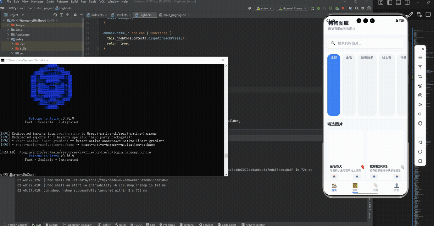
打包
接下来通过打包命令npn run harmony将reactNative的代码打包成为bundle,这样可以进行在开源鸿蒙OpenHarmony中进行使用。

打包之后再将打包后的鸿蒙OpenHarmony文件拷贝到鸿蒙的DevEco-Studio工程目录去:

最后运行效果图如下显示:
本文通过分析一个基于React Native开发的狗狗图库应用,深入探讨了跨平台开发中的关键技术点。该应用采用组件化设计,将UI拆分为ImageCard、ImageModal等可复用组件,使用React Hooks进行状态管理,实现了图片展示、收藏、分享等核心功能。文章重点剖析了该应用在响应式布局、图片加载、事件处理等方面的实现细节,并特别针对鸿蒙系统跨端开发提出了性能优化建议,包括渲染性能提升、内存管理和网络请求优化等。通过这个案例,展示了如何在保持代码复用性的同时,针对不同平台特性进行适配和优化,为跨平台图片类应用开发提供了实践参考。
欢迎大家加入开源鸿蒙跨平台开发者社区,一起共建开源鸿蒙跨平台生态。

开源鸿蒙跨平台开发社区汇聚开发者与厂商,共建“一次开发,多端部署”的开源生态,致力于降低跨端开发门槛,推动万物智联创新。
更多推荐

 13
13 0
0- 0


 已为社区贡献31条内容

所有评论(0)