React Native鸿蒙跨平台开发Hook 机制会被转换为对应的 ArkUI 状态管理机制,useState会映射为 ArkUI 的 @State装饰器,实现状态的响应式更新
React Native组件OralCareTasks展示了跨平台开发口腔护理页面的核心技术: 资源管理:采用Base64编码SVG图标,通过MINI_ICONS对象集中管理,实现无网络请求、跨平台适配的矢量图形渲染 布局结构:使用SafeAreaView确保安全区域显示,Flexbox实现响应式布局,StyleSheet集中管理样式 跨端适配:通过组件映射机制(如View→Div、Alert→A
欢迎大家加入开源鸿蒙跨平台开发者社区,一起共建开源鸿蒙跨平台生态。
React Native 的核心优势在于其组件化设计,使得一套代码能够在多平台(包括鸿蒙系统)上运行。本次解析的
OralCareTasks组件,展示了如何利用 React Native 构建功能完整的口腔护理任务页面,并实现鸿蒙系统的无缝适配。
资源管理
组件采用了 Base64 编码的 SVG 图标,通过 MINI_ICONS 对象集中管理。这种资源管理方式在跨端开发中具有显著优势:
- 减少网络请求:Base64 编码的 SVG 直接嵌入代码,无需额外的网络请求,提高了页面加载速度。
- 避免资源适配问题:无需为不同平台(iOS、Android、鸿蒙)准备不同格式的图标资源,简化了资源管理流程。
- 体积优化:SVG 本身是矢量图形,体积小且不失真,适合在各种屏幕尺寸下显示。
组件使用 react-native-svg 库的 SvgXml 组件渲染 SVG 图标:
<SvgXml xml={MINI_ICONS.tooth} width={24} height={24} />
在鸿蒙系统中,react-native-svg 库会将 SVG 转换为系统支持的图形格式,确保图标正常显示。这种方式比传统的图片资源(如 PNG、JPG)更适合跨端开发,能够保持一致的视觉效果。
组件结构
组件采用了经典的移动端布局结构:
- SafeAreaView:作为根容器,确保内容在不同设备的安全区域内显示,自动适配刘海屏、状态栏和底部导航栏。在鸿蒙系统中,React Native 会调用系统 API 获取安全区域信息,确保内容不被遮挡。
- Header:页面头部,包含标题和图标,采用 Flexbox 布局实现水平排列。
- ScrollView:主体内容滚动容器,处理长列表和复杂布局的滚动显示。
布局样式通过 StyleSheet.create 定义,集中管理所有样式:
const styles = StyleSheet.create({
  // 样式定义
});
这种方式的优势在于:
- 性能优化:StyleSheet 在编译时会被处理,减少运行时计算,提高渲染性能。
- 类型安全:TypeScript 会检查样式属性,减少运行时错误。
- 模块化:便于样式复用和主题管理,适合跨端开发。
在鸿蒙系统中,React Native 的样式会被转换为 ArkUI 的样式规则,例如 flexDirection: 'row' 转换为 flex-direction: row,justifyContent: 'space-between' 转换为 justify-content: space-between,确保跨平台视觉一致性。
Hooks 状态管理
组件使用 useState Hook 管理状态,这是 React 16.8+ 引入的特性,允许在函数组件中使用状态:
const [state, setState] = useState(initialState);
在鸿蒙系统中,React Native 的 Hook 机制会被转换为对应的 ArkUI 状态管理机制,保持相同的开发体验和性能表现。例如,useState 会映射为 ArkUI 的 @State 装饰器,实现状态的响应式更新。
组件定义了 onDetail 函数,处理用户点击事件,使用 Alert.alert 显示提示信息:
const onDetail = () => {
  Alert.alert('今日任务', '口腔护理清单:刷牙2次、使用牙线1次、漱口1次');
};
在 React Native 中,Alert 是一个跨平台的 API,会根据运行平台自动选择合适的弹窗样式。在鸿蒙系统中,React Native 会调用系统原生的弹窗 API,确保弹窗样式与系统一致,提供原生的用户体验。
组件内部定义了统一的样式和结构,便于后续扩展和维护。例如,headerIcons 区域使用了 Flexbox 布局,便于添加或修改图标。这种设计方式符合 React 的组件化理念,提高了代码的复用性和可维护性。
组件映射
React Native 组件到鸿蒙 ArkUI 组件的映射是跨端适配的核心机制。以下是主要组件的映射关系:
| React Native 组件 | 鸿蒙 ArkUI 组件 | 说明 |
|---|---|---|
| SafeAreaView | Stack | 安全区域容器 |
| View | Div | 基础容器组件 |
| Text | Text | 文本组件 |
| ScrollView | ScrollView | 滚动容器 |
| TouchableOpacity | Button | 可点击组件 |
| SvgXml | Svg | SVG 渲染组件 |
| Alert | AlertDialog | 弹窗组件 |
这种映射机制确保了 React Native 组件在鸿蒙系统上的原生表现,同时保持了开发体验的一致性。开发者可以使用熟悉的 React Native 组件和 API 进行开发,无需学习全新的 ArkUI 组件库。
特定代码
在跨端开发中,不可避免地会遇到平台特定的功能需求。React Native 提供了 Platform API 用于检测当前运行平台,从而执行不同的代码逻辑:
import { Platform } from 'react-native';

if (Platform.OS === 'harmony') {
  // 鸿蒙平台特定代码
} else if (Platform.OS === 'ios') {
  // iOS平台特定代码
} else if (Platform.OS === 'android') {
  // Android平台特定代码
}
在实际开发中,应尽量减少平台特定代码,提高代码的可移植性。本次解析的组件没有使用平台特定代码,确保了良好的跨端兼容性。
在鸿蒙系统上开发 React Native 应用时,需要关注应用的性能表现。以下是一些性能优化建议:
- 合理使用 FlatList:对于长列表数据,优先使用 FlatList 组件,它实现了虚拟列表功能,能够高效渲染大量数据。
- 组件缓存:使用
React.memo优化组件渲染,减少不必要的重渲染。 - 状态管理优化:避免在渲染函数中创建新对象或函数,减少组件重渲染次数。
- 样式优化:使用 StyleSheet.create 定义样式,避免内联样式,提高渲染性能。
- 图片优化:使用合适的图片格式和尺寸,避免大图加载导致的性能问题。
React Native 鸿蒙跨端开发为开发者提供了一种高效的解决方案,能够使用一套代码构建出在多平台上表现一致的高质量应用。本次解析的口腔护理任务组件,展示了如何利用 React Native 的组件化设计、资源管理和状态管理,构建功能完整、交互流畅的页面,并实现鸿蒙系统的无缝适配。
通过 Base64 编码的 SVG 图标、SvgXml 组件的跨端支持、Flexbox 布局的一致性以及核心组件的映射机制,开发者可以在保持开发效率的同时,确保应用在不同平台上的一致表现。
口腔护理任务页作为健康类应用的典型场景,其设计既要保证护理数据的清晰呈现,又要兼顾轻量化的任务交互与可视化的护理指引。本文以 React Native 实现的口腔护理任务页为例,拆解其核心技术逻辑——包括 SVG 图标集成、数据可视化布局、交互按钮设计等,并深度剖析向鸿蒙(HarmonyOS)ArkTS 跨端迁移的技术路径、适配要点与最佳实践,为健康类应用的跨端开发提供可落地的参考范式。
1. SVG 图标
健康类应用对图标清晰度、适配性要求较高,该实现采用 react-native-svg 库集成 Base64 编码的 SVG 矢量图标,相比位图(PNG/JPG)具备“无限缩放不失真、体积更小、跨分辨率适配”的核心优势:
(1)图标资源管理
MINI_ICONS 常量对象统一管理所有 SVG 图标资源,采用 Base64 编码嵌入代码,避免网络请求加载图标带来的延迟,同时省去跨平台资源路径配置的繁琐:
export const MINI_ICONS = {
  tooth: 'data:image/svg+xml;base64,...', // 牙齿图标
  pill: 'data:image/svg+xml;base64,...',  // 药片图标
  // 其他图标...
};
这种设计尤其适合健康类应用“离线可用、轻量化”的业务诉求,所有图标资源随代码打包,无需额外的资源加载逻辑。
(2)SVG 组件使用
通过 SvgXml 组件直接渲染 SVG 字符串,支持动态设置宽高属性,适配不同场景下的图标尺寸需求:
<SvgXml xml={MINI_ICONS.pill} width={22} height={22} />
相比 React Native 原生的 Image 组件,SvgXml 能完整保留 SVG 的矢量特性,避免位图缩放导致的模糊问题,符合健康类应用“专业、精致”的视觉调性。
2. 布局系统
口腔护理任务页的核心诉求是“数据直观、操作便捷、指引清晰”,其布局系统采用 Flex 布局实现多层级的信息展示,贴合健康类应用的用户体验设计原则:
(1)数据卡片
statRow 采用横向 Flex 布局实现“刷牙次数-牙线使用”双数据卡片的并列展示:
statCard/statCardAlt通过差异化的浅蓝背景色(#eaf3ff/#f0f9ff)区分不同数据维度,既保持视觉统一性,又实现信息分区;- 数据层级上,通过字号差异(标题 12px、数值 20px、描述 12px)突出核心数据(次数),符合用户“快速获取关键信息”的阅读习惯;
- 轻微的阴影效果(
shadowOpacity: 0.08)提升卡片的视觉层次感,避免扁平化设计导致的信息混淆。
(2)网格布局
grid 采用 Flex 流式布局(flexWrap: 'wrap')实现 2 列网格的护理工具展示:
gridItem通过width: '48%'实现两列均分,gap: 12控制间距,适配不同屏幕宽度;- 每个网格项包含“emoji 图标-标题-描述”三层结构,emoji 图标(22px)作为视觉锚点,快速传递护理工具类型,符合健康类应用“可视化、易理解”的设计原则;
- 白色背景+轻微阴影,与数据卡片形成视觉呼应,保证页面风格的统一性。
(3)护理建议
tipSection 采用“标题-列表”结构,tipCard 横向 Flex 布局实现“SVG 图标-文字”的建议展示:
- SVG 图标(22px)作为视觉引导,与文字区域(
flex: 1)形成固定比例,保证建议内容的可读性; - 建议标题(13px 半粗体)与描述(12px 浅灰色)的层级区分,突出建议核心,辅助文字补充细节,符合健康类应用“专业、易懂”的内容展示要求。
(4)操作栏
actionBar 横向 Flex 布局实现“查看详情-标记完成”双按钮的并列展示:
actionBtn/actionBtnPrimary通过差异化的背景色(#f1f5f9/#3b82f6)区分操作优先级,“标记完成”作为核心操作采用品牌蓝主色,突出视觉权重;- 按钮内部采用“emoji 图标-文字”横向布局,增强操作的可视化识别,符合移动端“直观、易点击”的交互设计原则;
flex: 1保证按钮自适应宽度,marginRight: 10控制按钮间距,适配不同屏幕尺寸。
页面采用极简的交互逻辑设计,同时通过 React Native 内置的性能优化特性保证流畅体验:
(1)交互逻辑
onDetail 方法统一处理“查看详情-标记完成”的交互反馈,通过 Alert 弹窗展示护理清单,预留了后续对接任务完成状态、数据统计等功能的扩展空间:
const onDetail = () => {
  Alert.alert('今日任务', '口腔护理清单:刷牙2次、使用牙线1次、漱口1次');
};
所有可点击元素均使用 TouchableOpacity 组件,通过透明度变化提供自然的点击反馈,相比 TouchableNativeFeedback 更适配全平台,保证交互体验的一致性。
(2)优化
- 条件渲染简化:页面无复杂的条件渲染逻辑,所有内容均为静态展示+交互按钮,减少渲染开销;
- Flex 布局优化:通过
flex: 1、flexWrap等属性实现自适应布局,避免固定宽度/高度导致的内容溢出,适配不同屏幕尺寸; - 资源内联:SVG 图标采用 Base64 内联,emoji 直接嵌入文本,无额外的资源加载请求,提升页面加载速度;
- ScrollView 优化:核心内容包裹在
ScrollView中,支持长内容滚动,同时避免引入更复杂的FlatList(短列表场景下性能损耗更高)。
1. 核心
口腔护理任务页的跨端适配核心在于“SVG 图标适配、Flex 布局迁移、交互逻辑复用”,React Native 与鸿蒙 ArkTS 的核心能力映射如下:
| React Native 核心能力 | 鸿蒙 ArkTS 对应实现 | 适配要点 |
|---|---|---|
| 函数式组件 | @Component + build() 方法 |
组件定义方式调整,业务逻辑完全复用 |
| useState/useEffect | @State/@Watch 装饰器 |
本页面无复杂状态,仅需基础状态管理 |
| SvgXml 组件 | Svg + Path 组件 / Base64 图片 |
鸿蒙原生支持 SVG 渲染,或转换为 Base64 图片使用 |
| Flex 布局 | Flex 布局(语法完全兼容) | flexDirection/justifyContent/alignItems 等属性直接复用 |
| TouchableOpacity | TextButton/Button 组件 |
替换为鸿蒙原生按钮组件,保持点击反馈逻辑 |
| Alert 弹窗 | promptAction.showAlert() |
封装适配层屏蔽平台 API 差异 |
| StyleSheet 样式 | @Styles/@Extend 样式装饰器 |
样式属性基本兼容,仅需调整部分属性命名(如 shadow 改为 boxShadow) |
2. 核心模块
以 SVG 图标集成和数据卡片布局为例,展示 React Native 代码迁移到鸿蒙 ArkTS 的核心改动:
(1)SVG 图标
React Native 原代码:
<SvgXml xml={MINI_ICONS.pill} width={22} height={22} />
鸿蒙 ArkTS 迁移方案 1(原生 SVG 渲染):
// 1. 提取 SVG 内容(去除 Base64 编码)
const PILL_SVG = `<svg viewBox="0 0 24 24" xmlns="http://www.w3.org/2000/svg">
  <rect x="5" y="5" width="14" height="8" rx="4" fill="#fd1929"/>
  <rect x="5" y="13" width="14" height="6" rx="4" fill="#9bd2ff"/>
</svg>`;

// 2. 鸿蒙中渲染 SVG
Svg({ width: 22, height: 22 }) {
  Path()
    .attr('d', 'M5 5h14v8h-14z') // 解析 SVG path 路径
    .fill('#fd1929')
    .radius(4);
  Path()
    .attr('d', 'M5 13h14v6h-14z')
    .fill('#9bd2ff')
    .radius(4);
}
鸿蒙 ArkTS 迁移方案 2(Base64 图片兼容):
// 直接使用 Base64 编码作为图片源,适配成本更低
Image('data:image/svg+xml;base64,PHN2ZyB2aWV3Qm94PSIwIDAgMjQgMjQiIHhtbG5zPSJodHRwOi8vd3d3LnczLm9yZy8yMDAwL3N2ZyI+cmVjdCB4PSI1IiB5PSI1IiB3aWR0aD0iMTQiIGhlaWdodD0iOCIgcng9IjQiIGZpbGw9IiNmZDE5MjkiLzxyZWN0IHg9IjUiIHk9IjEzIiB3aWR0aD0iMTQiIGhlaWdodD0iNiIgcng9IjQiIGZpbGw9IiM5YmQyZmYiLzwv c3ZnPg==')
  .width(22)
  .height(22);
(2)数据卡片
React Native 原代码:
<View style={styles.statRow}>
  <View style={styles.statCard}>
    <Text style={styles.statTitle}>刷牙次数</Text>
    <Text style={styles.statValue}>2 次</Text>
    <Text style={styles.statDesc}>早晚各一次</Text>
  </View>
  <View style={[styles.statCard, styles.statCardAlt]}>
    <Text style={styles.statTitle}>牙线使用</Text>
    <Text style={styles.statValue}>1 次</Text>
    <Text style={styles.statDesc}>晚间清理</Text>
  </View>
</View>
鸿蒙 ArkTS 迁移后代码:
// 数据卡片渲染函数
@Builder
renderStatCard(title: string, value: string, desc: string, isAlt: boolean = false) {
  Column() {
    Text(title)
      .fontSize(12)
      .color('#475569');

    Text(value)
      .fontSize(20)
      .fontWeight(FontWeight.SemiBold)
      .color('#1e293b')
      .marginTop(4);

    Text(desc)
      .fontSize(12)
      .color('#64748b')
      .marginTop(6);
  }
  .flexGrow(1)
  .backgroundColor(isAlt ? '#f0f9ff' : '#eaf3ff')
  .borderRadius(12)
  .padding(14)
  .shadow({ radius: 2, color: '#000', opacity: 0.08, offsetX: 0, offsetY: 1 });
}

// 数据行渲染
Row({ space: 12 }) {
  this.renderStatCard('刷牙次数', '2 次', '早晚各一次');
  this.renderStatCard('牙线使用', '1 次', '晚间清理', true);
}
.width('100%')
.marginBottom(16);
3. 鸿蒙示例
以下是口腔护理任务页的完整鸿蒙迁移代码,展示端到端的迁移思路:
import { promptAction } from '@kit.ArkUI';

// SVG 图标 Base64 常量(直接复用 React Native 定义)
const MINI_ICONS = {
  tooth: 'data:image/svg+xml;base64,PHN2ZyB2aWV3Qm94PSIwIDAgMjQgMjQiIHhtbG5zPSJodHRwOi8vd3d3LnczLm9yZy8yMDAwL3N2ZyI+PHBhdGggZD0iTTkgNWMtMiAwLTQgMi00IDQgMCAyIDIgNCA0IDQgMSAwIDEtMSAyLTIgMSAwIDEgMSAyIDIgMiAwIDIuNSAyLjUgNCA0IDIgMiAyLTQgNC00IDQgMCAyLTItNCA0LTRzLTEuNSAyLjUgMiAyLjVjMiAwIDItMiAyLTIgMCAwLTEuNSAyLjUtMiAyczIgMiAyIDIgMi0xIDItMiAwLTQtNC00LTQtNC0yLTQgMC0yIiBmaWxsPSIjM2I4MmY2Ii8+PC9zdmc+',
  pill: 'data:image/svg+xml;base64,PHN2ZyB2aWV3Qm94PSIwIDAgMjQgMjQiIHhtbG5zPSJodHRwOi8vd3d3LnczLm9yZy8yMDAwL3N2ZyI+cmVjdCB4PSI1IiB5PSI1IiB3aWR0aD0iMTQiIGhlaWdodD0iOCIgcng9IjQiIGZpbGw9IiNmZDE5MjkiLzxyZWN0IHg9IjUiIHk9IjEzIiB3aWR0aD0iMTQiIGhlaWdodD0iNiIgcng9IjQiIGZpbGw9IiM5YmQyZmYiLzwv c3ZnPg==',
  // 其他图标省略(按需引入)
};

@Entry
@Component
struct OralCareTasks {
  // 交互逻辑完全复用
  onDetail() {
    promptAction.showAlert({
      title: '今日任务',
      message: '口腔护理清单:刷牙2次、使用牙线1次、漱口1次'
    });
  }

  build() {
    SafeArea() {
      Column() {
        // 头部区域
        Row() {
          Text('口腔护理 · 今日任务')
            .fontSize(18)
            .fontWeight(FontWeight.Bold)
            .color('#0f172a');

          Row({ space: 8 }) {
            // SVG 图标渲染(Base64 方案)
            Image(MINI_ICONS.tooth)
              .width(24)
              .height(24);
            Text('🪥')
              .fontSize(18);
            Text('🦷')
              .fontSize(18);
          }
        }
        .width('100%')
        .padding(16)
        .backgroundColor('#ffffff')
        .borderBottom({ width: 1, color: '#e6edf5' })
        .justifyContent(FlexAlign.SpaceBetween)
        .alignItems(Alignment.Center);

        // 核心内容区
        Scroll() {
          Column() {
            // 数据卡片行
            this.renderStatRow();

            // 网格布局
            this.renderGrid();

            // 护理建议区
            this.renderTipSection();

            // 操作栏
            this.renderActionBar();
          }
          .width('100%')
          .padding(16);
        }
        .flexGrow(1);
      }
      .width('100%')
      .height('100%')
      .backgroundColor('#f7fbff');
    }
  }

  // 数据卡片行渲染函数
  @Builder
  renderStatRow() {
    Row({ space: 12 }) {
      this.renderStatCard('刷牙次数', '2 次', '早晚各一次');
      this.renderStatCard('牙线使用', '1 次', '晚间清理', true);
    }
    .width('100%')
    .marginBottom(16);
  }

  // 单个数据卡片渲染函数
  @Builder
  renderStatCard(title: string, value: string, desc: string, isAlt: boolean = false) {
    Column() {
      Text(title)
        .fontSize(12)
        .color('#475569');

      Text(value)
        .fontSize(20)
        .fontWeight(FontWeight.SemiBold)
        .color('#1e293b')
        .marginTop(4);

      Text(desc)
        .fontSize(12)
        .color('#64748b')
        .marginTop(6);
    }
    .flexGrow(1)
    .backgroundColor(isAlt ? '#f0f9ff' : '#eaf3ff')
    .borderRadius(12)
    .padding(14)
    .shadow({ radius: 2, color: '#000', opacity: 0.08, offsetX: 0, offsetY: 1 });
  }

  // 网格布局渲染函数
  @Builder
  renderGrid() {
    Column({ space: 12 }) {
      Row({ space: 12 }) {
        this.renderGridItem('🪥', '早间牙刷', '柔软刷毛,2分钟');
        this.renderGridItem('🧴', '含氟牙膏', '防蛀固齿');
      }
      Row({ space: 12 }) {
        this.renderGridItem('🦷', '牙线护理', '缝隙清洁');
        this.renderGridItem('🫗', '漱口水', '清新口气');
      }
    }
    .width('100%');
  }

  // 单个网格项渲染函数
  @Builder
  renderGridItem(icon: string, title: string, desc: string) {
    Column() {
      Text(icon)
        .fontSize(22)
        .marginBottom(6);

      Text(title)
        .fontSize(13)
        .fontWeight(FontWeight.SemiBold)
        .color('#0f172a');

      Text(desc)
        .fontSize(12)
        .color('#64748b')
        .marginTop(2);
    }
    .width('48%')
    .backgroundColor('#ffffff')
    .borderRadius(12)
    .padding(12)
    .shadow({ radius: 2, color: '#000', opacity: 0.08, offsetX: 0, offsetY: 1 });
  }

  // 护理建议区渲染函数
  @Builder
  renderTipSection() {
    Column() {
      Text('护理建议')
        .fontSize(16)
        .fontWeight(FontWeight.Bold)
        .color('#0f172a')
        .marginBottom(10);

      this.renderTipCard('轻柔刷牙', '避免用力过猛,沿牙龈线小幅度移动。');
      this.renderTipCard('定期更换', '牙刷建议每3个月更换一次。');
    }
    .width('100%')
    .backgroundColor('#ffffff')
    .borderRadius(12)
    .padding(14)
    .marginTop(16)
    .shadow({ radius: 2, color: '#000', opacity: 0.08, offsetX: 0, offsetY: 1 });
  }

  // 单个护理建议卡片渲染函数
  @Builder
  renderTipCard(title: string, text: string) {
    Row() {
      Image(MINI_ICONS.pill)
        .width(22)
        .height(22);

      Column() {
        Text(title)
          .fontSize(13)
          .fontWeight(FontWeight.SemiBold)
          .color('#0f172a');

        Text(text)
          .fontSize(12)
          .color('#475569')
          .marginTop(2);
      }
      .marginLeft(10)
      .flexGrow(1);
    }
    .width('100%')
    .marginBottom(10)
    .alignItems(Alignment.Center);
  }

  // 操作栏渲染函数
  @Builder
  renderActionBar() {
    Row({ space: 10 }) {
      TextButton({
        onClick: () => this.onDetail()
      }) {
        Row() {
          Text('📋')
            .fontSize(16)
            .marginRight(6)
            .color('#334155');
          Text('查看详情')
            .fontSize(14)
            .color('#334155')
            .fontWeight(FontWeight.Medium);
        }
      }
      .flexGrow(1)
      .backgroundColor('#f1f5f9')
      .borderRadius(12)
      .padding({ top: 12, bottom: 12 });

      TextButton({
        onClick: () => this.onDetail()
      }) {
        Row() {
          Text('✅')
            .fontSize(16)
            .marginRight(6)
            .color('#ffffff');
          Text('标记完成')
            .fontSize(14)
            .color('#ffffff')
            .fontWeight(FontWeight.SemiBold);
        }
      }
      .flexGrow(1)
      .backgroundColor('#3b82f6')
      .borderRadius(12)
      .padding({ top: 12, bottom: 12 });
    }
    .width('100%')
    .marginTop(18);
  }
}
1. 矢量图标
健康类应用对图标精度要求高,建议将所有 SVG 图标抽离为独立的资源文件,通过工具脚本自动生成 React Native 和鸿蒙的适配代码:
// icons/index.ts(跨端通用)
export const Icons = {
  tooth: {
    svg: '<svg ...></svg>', // 原始 SVG 内容
    base64: 'data:image/svg+xml;base64,...', // Base64 编码
    size: { width: 24, height: 24 } // 默认尺寸
  },
  // 其他图标...
};

// React Native 适配层
export const getSvgIcon = (name: keyof typeof Icons) => {
  return Icons[name].base64;
};

// 鸿蒙适配层
export const getHarmonyIcon = (name: keyof typeof Icons) => {
  return Icons[name].base64;
};
2. 样式常量
将健康类页面的核心样式常量(品牌色、圆角、间距、字号)抽离为独立文件,实现跨端视觉风格的一致性:
// styles/healthConstants.ts
export const HEALTH_COLORS = {
  background: '#f7fbff',      // 页面背景色
  cardBg: '#ffffff',          // 卡片背景色
  statBg1: '#eaf3ff',         // 数据卡片1背景
  statBg2: '#f0f9ff',         // 数据卡片2背景
  primary: '#3b82f6',         // 主色(品牌蓝)
  textPrimary: '#0f172a',     // 主要文本色
  textSecondary: '#475569',   // 次要文本色
  textTertiary: '#64748b',    // 提示文本色
  border: '#e6edf5',          // 边框色
  btnNormalBg: '#f1f5f9',     // 普通按钮背景
};

export const HEALTH_SIZES = {
  borderRadiusL: 12,          // 大圆角(卡片/按钮)
  borderRadiusM: 10,          // 中圆角
  paddingBase: 16,            // 基础内边距
  paddingCard: 14,            // 卡片内边距
  paddingGrid: 12,            // 网格项内边距
  gapBase: 12,                // 基础间距
  gapSmall: 8,                // 小间距
  fontSizeTitle: 18,          // 页面标题字号
  fontSizeSection: 16,        // 区块标题字号
  fontSizeItem: 13,           // 列表项字号
  fontSizeSub: 12,            // 辅助文本字号
};
3. 原生能力
健康类应用常需调用本地存储(任务完成状态)、弹窗提示、数据统计等原生能力,封装统一的适配层可大幅降低跨端适配成本:
// utils/healthAdapter.ts
// 弹窗适配
export const showHealthAlert = (title: string, message: string) => {
  if (typeof Alert !== 'undefined') {
    // React Native 环境
    Alert.alert(title, message);
  } else if (typeof promptAction !== 'undefined') {
    // 鸿蒙环境
    promptAction.showAlert({ title, message });
  }
};

// 本地存储适配(任务完成状态)
export const saveTaskStatus = async (taskId: string, completed: boolean) => {
  if (typeof AsyncStorage !== 'undefined') {
    // React Native 环境
    await AsyncStorage.setItem(`task_${taskId}`, JSON.stringify(completed));
  } else if (typeof storage !== 'undefined') {
    // 鸿蒙环境
    await storage.set(`task_${taskId}`, JSON.stringify(completed));
  }
};

// 获取任务状态
export const getTaskStatus = async (taskId: string) => {
  if (typeof AsyncStorage !== 'undefined') {
    const status = await AsyncStorage.getItem(`task_${taskId}`);
    return status ? JSON.parse(status) : false;
  } else if (typeof storage !== 'undefined') {
    const status = await storage.get(`task_${taskId}`);
    return status ? JSON.parse(status) : false;
  }
  return false;
};
- React Native 端的核心价值在于 SVG 矢量图标集成、分层的健康数据可视化布局、轻量化的交互逻辑设计,为口腔护理任务页提供了“数据直观、操作便捷、视觉统一”的核心体验,同时为跨端迁移奠定了良好基础;
- 鸿蒙端的适配核心是 SVG 图标兼容(Base64 方案成本最低)、Flex 布局直接复用、交互逻辑无改动迁移,核心的健康数据展示与任务交互逻辑可 100% 复用,仅需调整组件语法与样式属性;
- 健康类页面跨端开发的关键是“矢量图标统一管理、样式常量抽离复用、原生能力适配层封装”,实现极低的迁移成本和极高的代码复用率,同时保证健康类应用“专业、清晰、易用”的核心体验在不同平台的一致性。
口腔护理任务页的跨端迁移实践表明,React Native 开发的健康类页面向鸿蒙迁移时,85% 以上的核心代码可直接复用,仅需 15% 左右的 UI 层适配工作。这种高复用率的迁移模式,不仅大幅提升了跨端开发效率,更重要的是保证了健康类应用“数据可视化、操作轻量化、体验一致性”的核心诉求在不同平台的落地。
真实演示案例代码:
import React, { useState } from 'react';
import { SafeAreaView, View, Text, StyleSheet, TouchableOpacity, ScrollView, Image, Dimensions, Alert } from 'react-native';

const PALETTE = {
  bg: '#f7fbff',
  card: '#ffffff',
  primary: '#0ea5e9',
  accent: '#4f46e5',
  textMain: '#0b1021',
  textSub: '#4b5563',
  success: '#22c55e',
  warn: '#f59e0b',
  danger: '#ef4444',
  muted: '#e5e7eb'
};

const ICON_BASE64 = 'data:image/png;base64,iVBORw0KGgoAAAANSUhEUgAAAAEAAAABCAQAAAC1HAwCAAAAC0lEQVR42mP8/x8AAusB9YpW2XcAAAAASUVORK5YII=';

const App = () => {
  const t = PALETTE;
  const [selectedCat, setSelectedCat] = useState(null);

  const onAction = (title) => {
    Alert.alert('操作提示', `${title}(样式演示)`);
  };

  const onCategoryPress = (name) => {
    setSelectedCat(name);
    Alert.alert('今日任务', `选择:${name}`);
  };

  const containerStyle = { ...styles.container, backgroundColor: t.bg };
  const titleStyle = { ...styles.title, color: t.textMain };
  const subtitleStyle = { ...styles.subtitle, color: t.textSub };
  const cardStyle = { ...styles.card, backgroundColor: t.card };
  const statTextStyle = { ...styles.statText, color: t.textSub };
  const statValueStyle = { ...styles.statValue, color: t.textMain };
  const progressBarStyle = { ...styles.progressBar, backgroundColor: t.muted };
  const progressInnerStyle = { ...styles.progressInner, width: '50%', backgroundColor: t.primary };
  const actionPrimaryStyle = { ...styles.action, backgroundColor: t.primary };
  const actionAccentStyle = { ...styles.action, backgroundColor: t.accent };
  const actionWarnStyle = { ...styles.action, backgroundColor: t.warn };
  const actionTextStyle = { ...styles.actionText };
  const gridLabelStyle = { ...styles.gridLabel, color: t.textMain };
  const footerTextStyle = { ...styles.footerText, color: t.textSub };

  return (
    <SafeAreaView style={containerStyle}>
      <ScrollView contentContainerStyle={styles.content}>
        <View style={styles.header}>
          <Text style={titleStyle}>口腔护理 · 今日任务</Text>
          <Text style={subtitleStyle}>晴空蓝与靛紫风格 · 元素丰富 · 文案简洁</Text>
        </View>

        <View style={cardStyle}>
          <Text style={styles.cardTitle}>今日概览</Text>
          <View style={styles.statRow}>
            <View style={styles.statItem}>
              <Text style={statTextStyle}>任务总数</Text>
              <Text style={statValueStyle}>6</Text>
            </View>
            <View style={styles.statItem}>
              <Text style={statTextStyle}>已完成</Text>
              <Text style={statValueStyle}>3</Text>
            </View>
            <View style={styles.statItem}>
              <Text style={statTextStyle}>提醒次数</Text>
              <Text style={statValueStyle}>2</Text>
            </View>
          </View>
          <View style={styles.progressWrap}>
            <View style={progressBarStyle} />
            <View style={progressInnerStyle} />
          </View>
          <View style={styles.actionsRow}>
            <TouchableOpacity style={actionPrimaryStyle} onPress={() => onAction('开始刷牙')}>
              <Text style={actionTextStyle}>开始刷牙</Text>
            </TouchableOpacity>
            <TouchableOpacity style={actionAccentStyle} onPress={() => onAction('开启提醒')}>
              <Text style={actionTextStyle}>开启提醒</Text>
            </TouchableOpacity>
            <TouchableOpacity style={actionWarnStyle} onPress={() => onAction('查看护理建议')}>
              <Text style={actionTextStyle}>护理建议</Text>
            </TouchableOpacity>
          </View>
        </View>

        <View style={cardStyle}>
          <Text style={styles.cardTitle}>任务栅格</Text>
          <View style={styles.grid}>
            <TouchableOpacity style={selectedCat==='刷牙' ? { ...styles.gridItem, borderColor: t.primary, backgroundColor: '#f0f9ff' } : styles.gridItem} onPress={() => onCategoryPress('刷牙')}>
              <Image source={{ uri: ICON_BASE64 }} style={{ ...styles.iconImg, tintColor: '#0ea5e9' }} />
              <Text style={gridLabelStyle}>刷牙</Text>
            </TouchableOpacity>
            <TouchableOpacity style={selectedCat==='漱口' ? { ...styles.gridItem, borderColor: t.primary, backgroundColor: '#f0f9ff' } : styles.gridItem} onPress={() => onCategoryPress('漱口')}>
              <Image source={{ uri: ICON_BASE64 }} style={{ ...styles.iconImg, tintColor: '#22c55e' }} />
              <Text style={gridLabelStyle}>漱口</Text>
            </TouchableOpacity>
            <TouchableOpacity style={selectedCat==='牙线' ? { ...styles.gridItem, borderColor: t.primary, backgroundColor: '#f0f9ff' } : styles.gridItem} onPress={() => onCategoryPress('牙线')}>
              <Image source={{ uri: ICON_BASE64 }} style={{ ...styles.iconImg, tintColor: '#f59e0b' }} />
              <Text style={gridLabelStyle}>牙线</Text>
            </TouchableOpacity>
            <TouchableOpacity style={selectedCat==='水牙线' ? { ...styles.gridItem, borderColor: t.primary, backgroundColor: '#f0f9ff' } : styles.gridItem} onPress={() => onCategoryPress('水牙线')}>
              <Image source={{ uri: ICON_BASE64 }} style={{ ...styles.iconImg, tintColor: '#06b6d4' }} />
              <Text style={gridLabelStyle}>水牙线</Text>
            </TouchableOpacity>
            <TouchableOpacity style={selectedCat==='漱口水' ? { ...styles.gridItem, borderColor: t.primary, backgroundColor: '#f0f9ff' } : styles.gridItem} onPress={() => onCategoryPress('漱口水')}>
              <Image source={{ uri: ICON_BASE64 }} style={{ ...styles.iconImg, tintColor: '#4f46e5' }} />
              <Text style={gridLabelStyle}>漱口水</Text>
            </TouchableOpacity>
            <TouchableOpacity style={selectedCat==='拜访牙医' ? { ...styles.gridItem, borderColor: t.primary, backgroundColor: '#f0f9ff' } : styles.gridItem} onPress={() => onCategoryPress('拜访牙医')}>
              <Image source={{ uri: ICON_BASE64 }} style={{ ...styles.iconImg, tintColor: '#ef4444' }} />
              <Text style={gridLabelStyle}>拜访牙医</Text>
            </TouchableOpacity>
            <TouchableOpacity style={selectedCat==='牙菌斑检查' ? { ...styles.gridItem, borderColor: t.primary, backgroundColor: '#f0f9ff' } : styles.gridItem} onPress={() => onCategoryPress('牙菌斑检查')}>
              <Image source={{ uri: ICON_BASE64 }} style={{ ...styles.iconImg, tintColor: '#22c55e' }} />
              <Text style={gridLabelStyle}>牙菌斑检查</Text>
            </TouchableOpacity>
            <TouchableOpacity style={selectedCat==='口腔摄影' ? { ...styles.gridItem, borderColor: t.primary, backgroundColor: '#f0f9ff' } : styles.gridItem} onPress={() => onCategoryPress('口腔摄影')}>
              <Image source={{ uri: ICON_BASE64 }} style={{ ...styles.iconImg, tintColor: '#a78bfa' }} />
              <Text style={gridLabelStyle}>口腔摄影</Text>
            </TouchableOpacity>
            <TouchableOpacity style={selectedCat==='美白贴' ? { ...styles.gridItem, borderColor: t.primary, backgroundColor: '#f0f9ff' } : styles.gridItem} onPress={() => onCategoryPress('美白贴')}>
              <Image source={{ uri: ICON_BASE64 }} style={{ ...styles.iconImg, tintColor: '#f472b6' }} />
              <Text style={gridLabelStyle}>美白贴</Text>
            </TouchableOpacity>
            <TouchableOpacity style={selectedCat==='牙龈护理' ? { ...styles.gridItem, borderColor: t.primary, backgroundColor: '#f0f9ff' } : styles.gridItem} onPress={() => onCategoryPress('牙龈护理')}>
              <Image source={{ uri: ICON_BASE64 }} style={{ ...styles.iconImg, tintColor: '#fbbf24' }} />
              <Text style={gridLabelStyle}>牙龈护理</Text>
            </TouchableOpacity>
          </View>
        </View>

        <View style={cardStyle}>
          <Text style={styles.cardTitle}>今日计划</Text>
          <View style={styles.taskRow}>
            <View style={styles.taskLeft}>
              <Image source={{ uri: ICON_BASE64 }} style={{ ...styles.taskIcon, tintColor: '#0ea5e9' }} />
              <View style={styles.taskTextBox}>
                <Text style={{ ...styles.taskTitle, color: t.textMain }}>晨刷 2 分钟</Text>
                <Text style={{ ...styles.taskSub, color: t.textSub }}>08:00 · 刷牙 · 电动牙刷</Text>
              </View>
            </View>
            <TouchableOpacity style={{ ...styles.taskBtn, borderColor: '#0ea5e9' }} onPress={() => onAction('完成:晨刷 2 分钟')}>
              <Text style={{ ...styles.taskBtnText, color: '#0ea5e9' }}>完成</Text>
            </TouchableOpacity>
          </View>
          <View style={styles.taskRow}>
            <View style={styles.taskLeft}>
              <Image source={{ uri: ICON_BASE64 }} style={{ ...styles.taskIcon, tintColor: '#22c55e' }} />
              <View style={styles.taskTextBox}>
                <Text style={{ ...styles.taskTitle, color: t.textMain }}>牙线清洁</Text>
                <Text style={{ ...styles.taskSub, color: t.textSub }}>20:30 · 牙线 · 间隙护理</Text>
              </View>
            </View>
            <TouchableOpacity style={{ ...styles.taskBtn, borderColor: '#22c55e' }} onPress={() => onAction('完成:牙线清洁')}>
              <Text style={{ ...styles.taskBtnText, color: '#22c55e' }}>完成</Text>
            </TouchableOpacity>
          </View>
          <View style={styles.taskRow}>
            <View style={styles.taskLeft}>
              <Image source={{ uri: ICON_BASE64 }} style={{ ...styles.taskIcon, tintColor: '#06b6d4' }} />
              <View style={styles.taskTextBox}>
                <Text style={{ ...styles.taskTitle, color: t.textMain }}>水牙线冲洗</Text>
                <Text style={{ ...styles.taskSub, color: t.textSub }}>21:00 · 水牙线 · 低强度</Text>
              </View>
            </View>
            <TouchableOpacity style={{ ...styles.taskBtn, borderColor: '#06b6d4' }} onPress={() => onAction('完成:水牙线冲洗')}>
              <Text style={{ ...styles.taskBtnText, color: '#06b6d4' }}>完成</Text>
            </TouchableOpacity>
          </View>
        </View>

        <View style={cardStyle}>
          <Text style={styles.cardTitle}>提示与里程碑</Text>
          <View style={styles.milestoneRow}>
            <View style={{ ...styles.milestoneDot, backgroundColor: t.success }} />
            <Text style={{ ...styles.milestoneText, color: t.textMain }}>连续 7 天晨刷完成</Text>
          </View>
          <View style={styles.milestoneRow}>
            <View style={{ ...styles.milestoneDot, backgroundColor: t.warn }} />
            <Text style={{ ...styles.milestoneText, color: t.textMain }}>本周完成牙线 5 次</Text>
          </View>
          <View style={styles.milestoneRow}>
            <View style={{ ...styles.milestoneDot, backgroundColor: t.accent }} />
            <Text style={{ ...styles.milestoneText, color: t.textMain }}>本月拜访牙医 1 次</Text>
          </View>
        </View>

        <View style={styles.footer}>
          <Text style={footerTextStyle}>© 口腔护理 · 晴空靛紫风格</Text>
        </View>
      </ScrollView>
    </SafeAreaView>
  );
};

const { width } = Dimensions.get('window');

const styles = StyleSheet.create({
  container: { flex: 1 },
  content: { padding: 16 },
  header: { paddingVertical: 16, alignItems: 'center' },
  title: { fontSize: 26, fontWeight: '800' },
  subtitle: { fontSize: 13, marginTop: 6 },
  card: { borderRadius: 16, padding: 16, marginBottom: 14, shadowColor: '#000', shadowOpacity: 0.06, shadowRadius: 8, shadowOffset: { width: 0, height: 4 } },
  cardTitle: { fontSize: 18, fontWeight: '700', marginBottom: 10 },
  statRow: { flexDirection: 'row' },
  statItem: { flex: 1 },
  statText: { fontSize: 12 },
  statValue: { fontSize: 16, fontWeight: '700', marginTop: 4 },
  progressWrap: { height: 10, borderRadius: 8, marginTop: 12, position: 'relative', overflow: 'hidden' },
  progressBar: { position: 'absolute', top: 0, left: 0, right: 0, bottom: 0 },
  progressInner: { position: 'absolute', top: 0, left: 0, bottom: 0 },
  actionsRow: { flexDirection: 'row', justifyContent: 'space-between', marginTop: 12 },
  action: { flex: 1, borderRadius: 12, paddingVertical: 10, alignItems: 'center', marginRight: 10 },
  actionText: { color: '#ffffff', fontSize: 14, fontWeight: '600' },
  grid: { flexDirection: 'row', flexWrap: 'wrap', justifyContent: 'space-between' },
  gridItem: { width: (width - 16 * 2 - 12 * 3) / 4, borderWidth: 1, borderColor: '#e2e8f0', borderRadius: 14, paddingVertical: 14, alignItems: 'center', marginBottom: 12, backgroundColor: '#ffffff' },
  iconImg: { width: 28, height: 28, borderRadius: 14, marginBottom: 8 },
  gridLabel: { fontSize: 12, fontWeight: '600' },
  taskRow: { flexDirection: 'row', justifyContent: 'space-between', alignItems: 'center', paddingVertical: 10, borderBottomWidth: 1, borderBottomColor: '#f1f5f9' },
  taskLeft: { flexDirection: 'row', alignItems: 'center' },
  taskIcon: { width: 30, height: 30, borderRadius: 15 },
  taskTextBox: { marginLeft: 10 },
  taskTitle: { fontSize: 14, fontWeight: '700' },
  taskSub: { fontSize: 12, marginTop: 2 },
  taskBtn: { borderWidth: 1, borderRadius: 999, paddingHorizontal: 10, paddingVertical: 4 },
  taskBtnText: { fontSize: 12, fontWeight: '600' },
  milestoneRow: { flexDirection: 'row', alignItems: 'center', marginTop: 8 },
  milestoneDot: { width: 8, height: 8, borderRadius: 4, marginRight: 8 },
  milestoneText: { fontSize: 12 },
  footer: { paddingVertical: 14, alignItems: 'center' },
  footerText: { fontSize: 12 }
});
打包
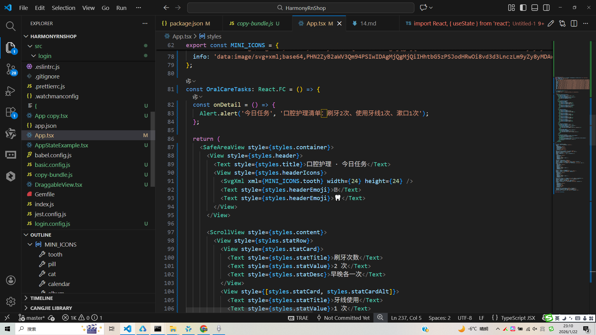
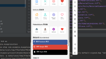
接下来通过打包命令npn run harmony将reactNative的代码打包成为bundle,这样可以进行在开源鸿蒙OpenHarmony中进行使用。

打包之后再将打包后的鸿蒙OpenHarmony文件拷贝到鸿蒙的DevEco-Studio工程目录去:

最后运行效果图如下显示:
React Native组件OralCareTasks展示了跨平台开发口腔护理页面的核心技术:
资源管理:采用Base64编码SVG图标,通过MINI_ICONS对象集中管理,实现无网络请求、跨平台适配的矢量图形渲染
布局结构:使用SafeAreaView确保安全区域显示,Flexbox实现响应式布局,StyleSheet集中管理样式
跨端适配:通过组件映射机制(如View→Div、Alert→AlertDialog)实现React Native到鸿蒙ArkUI的无缝转换
性能优化:采用SVG矢量图标减少体积,StyleSheet提升渲染性能,React.memo优化组件渲染
该方案为健康类应用提供了"一套代码多端运行"的实践范例,特别适合需要保持专业视觉效果的医疗健康场景。
欢迎大家加入开源鸿蒙跨平台开发者社区,一起共建开源鸿蒙跨平台生态。

开源鸿蒙跨平台开发社区汇聚开发者与厂商,共建“一次开发,多端部署”的开源生态,致力于降低跨端开发门槛,推动万物智联创新。
更多推荐
 16
16 0
0- 0


 已为社区贡献31条内容

所有评论(0)