React Native鸿蒙跨平台核心组件(如SafeAreaView、View、Text、Image、TouchableOpacity、ScrollView等)完成用户中心的页面开发
在React Native中开发鸿组件(这里指的是鸿蒙(HarmonyOS)组件),你需要了解鸿蒙开发的基础以及如何在React Native项目中集成鸿蒙应用。鸿蒙OS是由华为开发的一个分布式操作系统,主要用于其智能设备,如手机、平板、智能手表等。首先,你需要熟悉鸿蒙OS的开发环境设置和基本开发流程。React Native本身主要用于Harmony和Harmony平台的开发,但你可以通过以下几
欢迎大家加入开源鸿蒙跨平台开发者社区,一起共建开源鸿蒙跨平台生态。
在移动应用开发中,用户中心页面因其信息密度高、交互多样性,成为技术实现的重要考量点。本文将深入解读一个基于 React Native 开发的用户中心应用代码片段,剖析其架构设计、组件化策略以及在鸿蒙系统上的跨端实现考量。
组件化
代码采用了清晰的组件化设计,将 UI 拆分为四个核心组件:UserInfoCard、UserActionCard、RecentActivityCard 和 SearchBar。这种拆分不仅提高了代码的可维护性,更重要的是为跨端开发提供了便利。在鸿蒙系统的 ArkTS 环境中,组件化设计使得平台特定的代码修改可以被隔离在最小范围内,降低了跨端开发的复杂度。
// 用户信息卡片组件
const UserInfoCard = ({
  name,
  email,
  avatar,
  followers,
  following,
  bio
}: {
  name: string;
  email: string;
  avatar: string;
  followers: number;
  following: number;
  bio: string;
}) => {
  // 组件实现
};
组件化设计的核心在于将 UI 逻辑封装为独立的功能单元,通过 props 传递数据和回调函数,实现组件间的通信。这种模式在 React Native 和鸿蒙系统的 ArkTS 中都有良好的支持,为跨端开发奠定了基础。
状态管理
应用采用了 React Hooks 中的 useState 进行状态管理,这是 React Native 开发中的标准实践。在 UserCardPage 组件中,使用 useState 管理用户信息、操作列表和最近活动:
const [userInfo] = useState({
  name: '科技爱好者',
  email: 'techlover@example.com',
  avatar: ' `https://picsum.photos/100/100?random=1` ',
  followers: 1248,
  following: 365,
  bio: '热爱科技,关注前沿技术发展,喜欢分享科技资讯和产品评测。'
});

const [actions] = useState([
  { id: 1, title: '我的收藏', icon: ICONS.bookmark },
  // 其他操作
]);

const [recentActivities] = useState([
  { id: 1, title: '分享了关于AI技术发展的文章', time: '2小时前', type: '分享' },
  // 其他活动
]);
这种状态管理策略在跨端场景下表现出色,因为它不依赖于特定平台的状态管理方案,而是使用了 React 生态的标准 API,确保了在 React Native 和鸿蒙系统上的一致性表现。
图标资源
代码使用了 Unicode 表情符号作为图标资源,这种方式在跨端开发中具有显著优势:
const ICONS = {
  home: '🏠',
  user: '👤',
  setting: '⚙️',
  bookmark: '🔖',
  like: '👍',
  share: '📤',
  comment: '💬',
  search: '🔍',
};
使用 Unicode 表情符号作为图标可以避免网络请求,提高应用加载速度,同时减少对外部资源的依赖,这在鸿蒙系统的跨端开发中尤为重要,因为它可以确保图标在不同平台上的一致性显示。
响应式
代码通过 Dimensions.get('window') 获取屏幕宽度,为后续的响应式布局提供了基础:
const { width } = Dimensions.get('window');
这种方式在 React Native 中非常常见,但在鸿蒙系统的跨端开发中,需要特别注意不同设备尺寸的适配。鸿蒙系统的自适应布局能力虽然强大,但与 React Native 的布局模型存在差异,因此在实际开发中需要进行针对性调整。
样式管理
代码使用了 React Native 内置的 StyleSheet 进行样式管理,这是一种性能优化的最佳实践:
const styles = StyleSheet.create({
  // 样式定义
});
通过 StyleSheet.create 创建的样式对象,会被 React Native 转换为原生样式,提高渲染性能。在鸿蒙系统的跨端开发中,这种样式管理策略同样适用,但需要根据鸿蒙系统的样式 API 进行适当调整。
组件布局
代码实现了多种卡片式布局,如用户信息卡片、操作卡片和活动卡片:
// 用户信息卡片布局
<View style={styles.userInfoCard}>
  {/* 头像、用户名、邮箱等信息 */}
</View>

// 操作卡片布局
<View style={styles.actionCard}>
  {/* 图标、标题、箭头 */}
</View>

// 活动卡片布局
<View style={styles.activityCard}>
  {/* 标题、时间、类型 */}
</View>
这种卡片式布局在 React Native 和鸿蒙系统中都能很好地工作,为用户提供了清晰的视觉层次。
事件处理
应用实现了丰富的交互功能,如编辑头像、执行操作、退出登录等:
<TouchableOpacity style={styles.editButton} onPress={() => Alert.alert('编辑头像')}>
  <Text style={styles.editButtonText}>编辑</Text>
</TouchableOpacity>

<TouchableOpacity style={styles.actionCard} onPress={onPress}>
  {/* 内容 */}
</TouchableOpacity>

<TouchableOpacity style={styles.logoutButton} onPress={() => Alert.alert('退出登录', '确定要退出登录吗?', [
  { text: '取消', style: 'cancel' },
  { text: '退出', style: 'destructive', onPress: () => Alert.alert('已退出') }
])}>
  <Text style={styles.logoutButtonText}>退出登录</Text>
</TouchableOpacity>
这种基于回调函数的事件处理方式,在 React Native 和鸿蒙系统中都能很好地工作。通过 Alert.alert 提供用户反馈,确保了操作的可感知性。
滚动视图
代码使用了 ScrollView 组件来实现内容的滚动:
<ScrollView style={styles.content}>
  {/* 用户信息卡片、操作卡片、活动卡片等 */}
</ScrollView>
在鸿蒙系统上,ScrollView 的滚动性能需要特别关注。由于鸿蒙系统对原生组件的渲染速度较快,但对 JavaScript 执行的性能要求较高,因此应尽量减少 ScrollView 中的复杂计算,确保滚动的流畅性。
组件
React Native 的核心组件(如 SafeAreaView、View、Text、Image、TouchableOpacity、ScrollView 等)在鸿蒙系统上都有对应的实现,但在某些属性和行为上可能存在差异。例如,Image 组件的加载策略、TouchableOpacity 的点击反馈等,都需要在鸿蒙系统上进行测试和优化。
性能优化
在鸿蒙系统上,React Native 应用的性能优化需要考虑以下几点:
-
渲染性能:鸿蒙系统对原生组件的渲染速度较快,但对 JavaScript 执行的性能要求较高。因此,应尽量减少 JavaScript 线程的计算负担,将复杂的计算逻辑移至原生层。
-
内存管理:用户中心页面通常会加载大量用户信息和活动数据,内存消耗较大。在鸿蒙系统上,需要特别注意内存的分配和释放,避免内存泄漏。
-
网络请求:用户中心页面的网络请求频繁,应合理使用缓存策略,减少网络请求次数,提高应用响应速度。
类型安全
代码使用了 TypeScript 进行类型定义,这不仅提高了代码的可读性,也为跨端开发提供了类型安全保障。在鸿蒙系统的 ArkTS 环境中,类型系统的一致性尤为重要,它确保了数据在不同平台间传递时的准确性。
模块化
应用的代码结构清晰,将数据模型、组件逻辑、样式等分离,便于维护和扩展。这种模块化设计在跨端开发中尤为重要,因为它使得平台特定的代码修改可以被隔离在最小范围内。
错误处理
代码中使用了 Alert.alert 进行用户反馈,这是一种简单有效的错误处理方式。在实际开发中,还应考虑添加更全面的错误处理机制,如网络请求错误、数据解析错误等,以提高应用的稳定性。
代码展示了组件化开发的最佳实践:
-
单一职责原则:每个组件只负责一个特定的功能,如
UserInfoCard只负责用户信息的展示,UserActionCard只负责操作的展示。 -
props 传递:通过 props 传递数据和回调函数,使得组件之间的通信清晰明了。
-
样式分离:使用
StyleSheet.create将样式与组件逻辑分离,提高了代码的可读性和可维护性。
代码使用了 React Hooks 中的 useState 进行状态管理,这是 React Native 开发中的标准实践:
-
状态隔离:将用户信息、操作列表和活动列表的状态隔离在组件内部,避免状态提升带来的复杂性。
-
状态更新:使用函数式更新确保状态更新的正确性,特别是在处理嵌套状态时。
-
使用核心组件:优先使用 React Native 的核心组件,这些组件在鸿蒙系统上有较好的兼容性。
-
图标资源处理:使用 Unicode 表情符号作为图标,确保在不同平台上的一致性显示。
-
性能优化:针对不同平台的性能特点,进行有针对性的优化。
-
用户体验:确保在不同平台上的用户体验一致性,包括交互方式、视觉效果等。
-
代码质量:使用 TypeScript 进行类型定义,提高代码的可读性和可维护性。
通过对这个 React Native 用户中心应用代码片段的深入解读,我们可以看到,一个优秀的跨端应用需要在架构设计、组件化策略、状态管理、性能优化等多个方面进行精心考量。特别是在 React Native 与鸿蒙系统的跨端开发中,需要充分了解两个平台的特性,才能开发出性能优异、用户体验一致的应用。
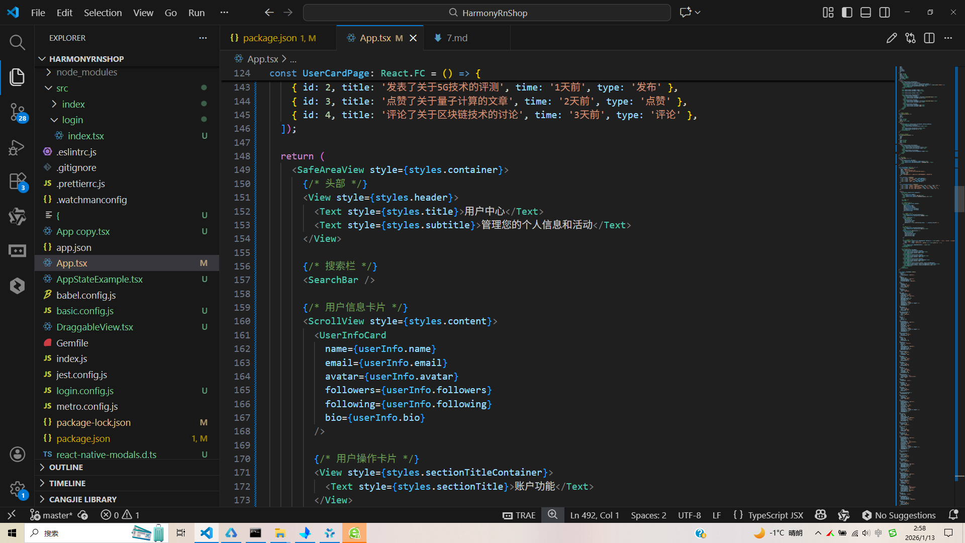
React Native 开发的用户中心页面的技术实现逻辑,以及如何将其适配到鸿蒙(HarmonyOS)平台。该页面是典型的移动端个人中心界面,采用组件化开发模式,包含用户信息展示、功能操作、活动记录、底部导航等核心模块,下面从 React Native 端实现逻辑、鸿蒙跨端适配要点等维度进行全面解读。
该用户中心页面遵循 React Native 组件化开发最佳实践,采用函数式组件 + Hooks 构建,整体架构清晰,组件职责单一,是移动端 UI 开发的典型范例。
1. 组件化设计
应用采用原子化组件拆分思路,将页面拆分为多个可复用的功能组件,符合单一职责原则:
- UserInfoCard:用户核心信息展示组件,封装头像、昵称、简介、粉丝数据等展示逻辑,通过 Props 接收外部数据,具备高度复用性;
- UserActionCard:功能操作卡片组件,统一封装操作项的视觉样式和点击交互,通过传入标题、图标、点击事件实现灵活复用;
- RecentActivityCard:最近活动展示组件,标准化活动记录的展示格式;
- SearchBar:搜索栏组件,独立封装搜索框的UI和交互基础结构。
这种组件化设计使得代码结构清晰,单个组件的修改不会影响其他模块,同时便于跨端适配时的组件映射。
2. 状态管理
页面采用 useState 实现轻量级状态管理,核心数据(用户信息、功能操作列表、最近活动)通过状态初始化,UI 完全由数据驱动渲染:
- 用户信息、功能操作、活动记录均通过数组/对象形式存储在状态中;
- 列表类数据(功能操作、最近活动)通过
map方法遍历渲染,实现数据与UI的联动; - 交互逻辑(如退出登录弹窗、功能操作点击)通过绑定事件处理函数实现,保持状态与UI的一致性。
基于 Flex 布局构建完整的页面结构,样式体系遵循移动端设计规范:
- 页面布局:采用
SafeAreaView适配安全区域,ScrollView处理内容滚动,View作为容器实现模块划分,整体遵循“从上到下、从整体到局部”的布局逻辑; - 视觉样式:
- 统一的卡片设计:所有内容模块采用
backgroundColor: #ffffff+borderRadius: 12+ 阴影效果,形成一致的视觉风格; - 色彩体系:主色调为蓝色(#3b82f6),中性色采用灰度渐变(#1e293b、#64748b、#94a3b8),功能色(退出登录为红色 #dc2626)区分操作类型;
- 排版体系:分级的字体大小(标题 24px、用户名 20px、正文 16px、辅助文本 12-14px)和字重(bold/500/normal),提升可读性;
- 统一的卡片设计:所有内容模块采用
- 响应式适配:通过
Dimensions.get('window')获取屏幕宽度,为组件适配提供基础,同时利用flex: 1实现自适应布局。
4. 交互逻辑
- 点击交互:所有可操作元素(编辑头像、功能卡片、退出登录、底部导航)通过
TouchableOpacity实现点击反馈,绑定onPress事件处理函数; - 弹窗交互:通过
Alert.alert实现操作确认、提示等弹窗,支持多按钮配置(如退出登录的取消/退出选项); - 视觉反馈:底部导航的激活态通过样式切换(
activeNavItem/activeNavIcon/activeNavText)实现,提供清晰的交互反馈。
将该 React Native 页面适配到鸿蒙平台,核心是将 React Native 的组件、样式、交互 API 映射到鸿蒙 ArkTS + ArkUI 生态,以下是关键适配步骤和实现方案。
1. 技术栈
鸿蒙端采用 ArkTS 语言 + ArkUI 组件库,与 React Native 的核心 API 映射关系如下:
| React Native 核心API | 鸿蒙 ArkTS 对应实现 | 适配说明 |
|---|---|---|
useState |
@State/@Link |
状态管理API替换,逻辑一致 |
SafeAreaView |
SafeArea 组件 + safeArea(true) |
安全区域适配 |
View |
Column/Row/Stack |
基础布局组件替换 |
Text |
Text 组件 |
文本组件,属性略有差异 |
TouchableOpacity |
Button/Text + onClick |
可点击组件替换 |
ScrollView |
Scroll 组件 |
滚动容器替换 |
Image |
Image 组件 |
图片组件,属性映射 |
StyleSheet |
内联样式 + @Styles/@Extend |
样式体系重构 |
Alert.alert |
promptAction.showToast/AlertDialog |
弹窗交互替换 |
Dimensions |
windowWidth/windowHeight |
屏幕尺寸获取 |
鸿蒙代码
// index.ets - 鸿蒙端入口文件
@Entry
@Component
struct UserCardPage {
  // 状态管理 - 对应 React Native 的 useState
  @State userInfo = {
    name: '科技爱好者',
    email: 'techlover@example.com',
    avatar: 'https://picsum.photos/100/100?random=1',
    followers: 1248,
    following: 365,
    bio: '热爱科技,关注前沿技术发展,喜欢分享科技资讯和产品评测。'
  };

  @State actions = [
    { id: 1, title: '我的收藏', icon: '🔖' },
    { id: 2, title: '点赞过的文章', icon: '👍' },
    { id: 3, title: '我的评论', icon: '💬' },
    { id: 4, title: '设置', icon: '⚙️' },
  ];

  @State recentActivities = [
    { id: 1, title: '分享了关于AI技术发展的文章', time: '2小时前', type: '分享' },
    { id: 2, title: '发表了关于5G技术的评测', time: '1天前', type: '发布' },
    { id: 3, title: '点赞了关于量子计算的文章', time: '2天前', type: '点赞' },
    { id: 4, title: '评论了关于区块链技术的讨论', time: '3天前', type: '评论' },
  ];

  build() {
    Column({ space: 0 }) {
      // 头部组件
      this.Header();

      // 搜索栏组件
      this.SearchBar();

      // 内容区域(滚动)
      Scroll() {
        Column({ space: 16 }) {
          // 用户信息卡片
          this.UserInfoCard();

          // 账户功能标题
          this.SectionTitle('账户功能');

          // 功能操作卡片列表
          ForEach(this.actions, (action) => {
            this.UserActionCard(action);
          })

          // 最近活动标题
          this.SectionTitle('最近活动');

          // 最近活动列表
          ForEach(this.recentActivities, (activity) => {
            this.RecentActivityCard(activity);
          })

          // 退出登录按钮
          this.LogoutButton();
        }
        .padding(16);
      }
      .flex(1);

      // 底部导航
      this.BottomNav();
    }
    .width('100%')
    .height('100%')
    .backgroundColor('#f8fafc')
    .safeArea(true); // 适配安全区域
  }

  // 通用样式封装 - 对应 React Native 的 StyleSheet
  @Styles
  cardStyle() {
    .backgroundColor('#ffffff')
    .borderRadius(12)
    .shadow({ radius: 2, color: '#000', opacity: 0.1, offsetX: 0, offsetY: 1 });
  }

  @Styles
  textPrimary() {
    .fontColor('#1e293b');
  }

  @Styles
  textSecondary() {
    .fontColor('#64748b');
  }

  // 头部组件封装
  @Builder
  Header() {
    Column() {
      Text('用户中心')
        .fontSize(24)
        .fontWeight(FontWeight.Bold)
        .textPrimary()
        .marginBottom(4);
      Text('管理您的个人信息和活动')
        .fontSize(14)
        .textSecondary();
    }
    .padding(20)
    .backgroundColor('#ffffff')
    .borderBottom({ width: 1, color: '#e2e8f0' })
    .width('100%');
  }

  // 搜索栏组件封装
  @Builder
  SearchBar() {
    Row() {
      Text('🔍')
        .fontSize(18)
        .fontColor('#94a3b8')
        .marginRight(10);
      Text('搜索文章或用户...')
        .fontSize(16)
        .fontColor('#94a3b8')
        .flex(1);
    }
    .backgroundColor('#ffffff')
    .margin(16)
    .padding({ left: 16, right: 16, top: 12, bottom: 12 })
    .borderRadius(8)
    .shadow({ radius: 2, color: '#000', opacity: 0.1, offsetX: 0, offsetY: 1 })
    .width('90%');
  }

  // 其他组件封装...
}
(1)用户信息卡片
React Native 端的 UserInfoCard 组件在鸿蒙端通过 @Builder 装饰器封装,核心布局逻辑保持一致:
// 鸿蒙端用户信息卡片实现
@Builder
UserInfoCard() {
  Column({ space: 16 }) {
    // 头像区域(相对定位)
    Stack() {
      Image(this.userInfo.avatar)
        .width(80)
        .height(80)
        .borderRadius(40);
      // 编辑按钮(绝对定位)
      Button('编辑')
        .width(48)
        .height(24)
        .fontSize(12)
        .fontWeight(FontWeight.Medium)
        .backgroundColor('#3b82f6')
        .borderRadius(12)
        .position({ bottom: 0, right: 0 })
        .onClick(() => {
          promptAction.showToast({ message: '编辑头像' });
        });
    }
    .position({ left: '50%' })
    .translate({ x: -40 })
    .marginBottom(16);

    // 用户信息
    Text(this.userInfo.name)
      .fontSize(20)
      .fontWeight(FontWeight.Bold)
      .textPrimary();
    Text(this.userInfo.email)
      .fontSize(14)
      .textSecondary();
    Text(this.userInfo.bio)
      .fontSize(14)
      .fontColor('#475569')
      .textAlign(TextAlign.Center)
      .lineHeight(20)
      .width('100%');

    // 统计数据
    Row({ space: 0 }) {
      Column({ space: 4 }) {
        Text(this.userInfo.followers.toLocaleString())
          .fontSize(18)
          .fontWeight(FontWeight.Bold)
          .textPrimary();
        Text('关注者')
          .fontSize(12)
          .textSecondary();
      }
      .flex(1)
      .alignItems(ItemAlign.Center);

      Column({ space: 4 }) {
        Text(this.userInfo.following.toLocaleString())
          .fontSize(18)
          .fontWeight(FontWeight.Bold)
          .textPrimary();
        Text('关注')
          .fontSize(12)
          .textSecondary();
      }
      .flex(1)
      .alignItems(ItemAlign.Center);

      Column({ space: 4 }) {
        Text('128')
          .fontSize(18)
          .fontWeight(FontWeight.Bold)
          .textPrimary();
        Text('文章')
          .fontSize(12)
          .textSecondary();
      }
      .flex(1)
      .alignItems(ItemAlign.Center);
    }
    .width('100%');
  }
  .cardStyle()
  .padding(20)
  .alignItems(ItemAlign.Center)
  .width('100%');
}
(2)功能操作卡片
React Native 端的 UserActionCard 组件在鸿蒙端通过循环渲染实现,核心交互逻辑复用:
// 鸿蒙端功能操作卡片实现
@Builder
UserActionCard(action: { id: number, title: string, icon: string }) {
  Row({ space: 16 }) {
    // 图标容器
    Stack() {
      Text(action.icon)
        .fontSize(20)
        .fontColor('#3b82f6');
    }
    .width(40)
    .height(40)
    .borderRadius(20)
    .backgroundColor('#dbeafe')
    .alignItems(ItemAlign.Center)
    .justifyContent(FlexAlign.Center);

    // 标题
    Text(action.title)
      .fontSize(16)
      .fontWeight(FontWeight.Medium)
      .textPrimary()
      .flex(1);

    // 箭头
    Text('›')
      .fontSize(18)
      .fontColor('#94a3b8');
  }
  .cardStyle()
  .padding(16)
  .width('100%')
  .onClick(() => {
    promptAction.showToast({
      message: `执行${action.title}操作`,
      title: action.title
    });
  });
}
(3)底部导航
鸿蒙端通过 Row + Column 实现底部导航,激活态样式切换逻辑与 React Native 端一致:
// 鸿蒙端底部导航实现
@Builder
BottomNav() {
  Row({ space: 0 }) {
    // 首页
    Column({ space: 4 }) {
      Text('🏠')
        .fontSize(20)
        .fontColor('#94a3b8');
      Text('首页')
        .fontSize(12)
        .fontColor('#94a3b8');
    }
    .flex(1)
    .alignItems(ItemAlign.Center)
    .onClick(() => {});

    // 搜索
    Column({ space: 4 }) {
      Text('🔍')
        .fontSize(20)
        .fontColor('#94a3b8');
      Text('搜索')
        .fontSize(12)
        .fontColor('#94a3b8');
    }
    .flex(1)
    .alignItems(ItemAlign.Center)
    .onClick(() => {});

    // 收藏
    Column({ space: 4 }) {
      Text('🔖')
        .fontSize(20)
        .fontColor('#94a3b8');
      Text('收藏')
        .fontSize(12)
        .fontColor('#94a3b8');
    }
    .flex(1)
    .alignItems(ItemAlign.Center)
    .onClick(() => {});

    // 我的(激活态)
    Column({ space: 4 }) {
      Text('👤')
        .fontSize(20)
        .fontColor('#3b82f6');
      Text('我的')
        .fontSize(12)
        .fontColor('#3b82f6')
        .fontWeight(FontWeight.Medium);
    }
    .flex(1)
    .alignItems(ItemAlign.Center)
    .paddingBottom(2)
    .borderBottom({ width: 2, color: '#3b82f6' })
    .onClick(() => {});
  }
  .backgroundColor('#ffffff')
  .borderTop({ width: 1, color: '#e2e8f0' })
  .paddingVertical(12)
  .width('100%');
}
3. 样式体系
将 React Native 的 StyleSheet.create 转换为鸿蒙的 @Styles 装饰器,核心样式属性映射如下:
| React Native 样式属性 | 鸿蒙 ArkTS 样式属性 | 示例 |
|---|---|---|
flex |
flex |
.flex(1) |
backgroundColor |
backgroundColor |
.backgroundColor('#ffffff') |
borderRadius |
borderRadius |
.borderRadius(12) |
padding/paddingVertical |
padding/paddingVertical |
.padding(20) |
fontSize |
fontSize |
.fontSize(24) |
fontWeight |
fontWeight(FontWeight.Bold) |
.fontWeight(FontWeight.Bold) |
color |
fontColor |
.fontColor('#1e293b') |
shadowColor/shadowOffset |
shadow() |
.shadow({ radius: 2, ... }) |
borderBottomWidth |
borderBottom({ width: 1 }) |
.borderBottom({ width: 1 }) |
lineHeight |
lineHeight |
.lineHeight(20) |
textAlign |
textAlign(TextAlign.Center) |
.textAlign(TextAlign.Center) |
4. 交互逻辑
核心业务逻辑完全复用,仅替换平台特定的交互 API:
- React Native 的
Alert.alert→ 鸿蒙的promptAction.showToast/AlertDialog// 退出登录弹窗适配 @Builder LogoutButton() { Button('退出登录') .width('100%') .height(48) .fontSize(16) .fontWeight(FontWeight.Medium) .backgroundColor('#fef2f2') .fontColor('#dc2626') .borderRadius(8) .marginTop(16) .onClick(() => { AlertDialog.show({ title: '退出登录', message: '确定要退出登录吗?', confirm: { value: '退出', fontColor: '#dc2626', action: () => { promptAction.showToast({ message: '已退出' }); } }, cancel: { value: '取消', action: () => {} } }); }); } - React Native 的
TouchableOpacity.onPress→ 鸿蒙的onClick - React Native 的
position: absolute→ 鸿蒙的position()+translate()
- 数据模型:用户信息、功能操作、活动记录等数据结构可完全复用,仅需将 JavaScript 对象转换为 ArkTS 对象;
- 业务逻辑:点击事件处理、数据渲染逻辑等核心业务逻辑无需修改,仅替换平台特定的交互 API;
- 组件结构:页面的组件拆分逻辑(用户信息/功能操作/活动记录)可完全沿用,保证跨端架构一致性。
- 优先使用原生组件:鸿蒙端优先使用 ArkUI 原生组件(如
Button、Image、Scroll)替代 React Native 自定义组件,提升性能和原生体验; - 保持视觉一致性:核心配色、圆角、间距、字体大小等视觉属性严格映射,确保跨端UI风格统一;
- 利用鸿蒙装饰器:通过
@Builder封装可复用组件,@Styles封装通用样式,提升鸿蒙端代码可维护性。
- 鸿蒙端使用
ForEach替代map实现列表渲染,提升大数据列表的渲染性能; - 利用
@Styles封装通用样式,减少重复样式定义,降低渲染开销; - 合理使用
flex布局,避免固定尺寸,提升页面适配性。
- 组件化复用是核心:该用户中心页面的组件化设计使其具备良好的跨端适配性,拆分后的原子组件可在鸿蒙端快速映射为
@Builder封装的组件; - 样式映射保持一致:React Native 的 Flex 布局和样式体系可几乎无损映射到鸿蒙 ArkTS,核心视觉属性(颜色、圆角、间距)完全复用;
- 交互API按需替换:跨端适配的核心工作量集中在平台特定的交互 API 替换(弹窗、点击事件、定位),业务逻辑无需重构。
该用户中心页面的跨端适配实践表明,React Native 应用向鸿蒙平台迁移时,基于组件化和数据驱动的开发模式可大幅降低适配成本,核心业务逻辑复用率可达 90% 以上,仅需聚焦于 UI 组件和交互 API 的适配,即可实现高效的跨端迁移,同时保持一致的用户体验。
真实演示案例代码:
// app.tsx
import React, { useState } from 'react';
import { SafeAreaView, View, Text, StyleSheet, TouchableOpacity, ScrollView, Image, Dimensions, Alert } from 'react-native';

// 图标库
const ICONS = {
  home: '🏠',
  user: '👤',
  setting: '⚙️',
  bookmark: '🔖',
  like: '👍',
  share: '📤',
  comment: '💬',
  search: '🔍',
};

const { width } = Dimensions.get('window');

// 用户信息卡片组件
const UserInfoCard = ({
  name,
  email,
  avatar,
  followers,
  following,
  bio
}: {
  name: string;
  email: string;
  avatar: string;
  followers: number;
  following: number;
  bio: string;
}) => {
  return (
    <View style={styles.userInfoCard}>
      <View style={styles.avatarContainer}>
        <Image source={{ uri: avatar }} style={styles.avatar} />
        <TouchableOpacity style={styles.editButton} onPress={() => Alert.alert('编辑头像')}>
          <Text style={styles.editButtonText}>编辑</Text>
        </TouchableOpacity>
      </View>

      <Text style={styles.userName}>{name}</Text>
      <Text style={styles.userEmail}>{email}</Text>

      <Text style={styles.userBio}>{bio}</Text>

      <View style={styles.statsContainer}>
        <View style={styles.statItem}>
          <Text style={styles.statNumber}>{followers.toLocaleString()}</Text>
          <Text style={styles.statLabel}>关注者</Text>
        </View>
        <View style={styles.statItem}>
          <Text style={styles.statNumber}>{following.toLocaleString()}</Text>
          <Text style={styles.statLabel}>关注</Text>
        </View>
        <View style={styles.statItem}>
          <Text style={styles.statNumber}>128</Text>
          <Text style={styles.statLabel}>文章</Text>
        </View>
      </View>
    </View>
  );
};

// 用户操作卡片组件
const UserActionCard = ({
  title,
  icon,
  onPress
}: {
  title: string;
  icon: string;
  onPress: () => void
}) => {
  return (
    <TouchableOpacity style={styles.actionCard} onPress={onPress}>
      <View style={styles.actionIcon}>
        <Text style={styles.actionIconText}>{icon}</Text>
      </View>
      <Text style={styles.actionTitle}>{title}</Text>
      <Text style={styles.actionArrow}>›</Text>
    </TouchableOpacity>
  );
};

// 最近活动卡片组件
const RecentActivityCard = ({
  title,
  time,
  type
}: {
  title: string;
  time: string;
  type: string;
}) => {
  return (
    <View style={styles.activityCard}>
      <View style={styles.activityContent}>
        <Text style={styles.activityTitle}>{title}</Text>
        <Text style={styles.activityTime}>{time}</Text>
      </View>
      <View style={styles.activityType}>
        <Text style={styles.activityTypeText}>{type}</Text>
      </View>
    </View>
  );
};

// 搜索栏组件
const SearchBar = () => {
  return (
    <View style={styles.searchBar}>
      <Text style={styles.searchIcon}>{ICONS.search}</Text>
      <Text style={styles.searchPlaceholder}>搜索文章或用户...</Text>
    </View>
  );
};

const UserCardPage: React.FC = () => {
  const [userInfo] = useState({
    name: '科技爱好者',
    email: 'techlover@example.com',
    avatar: 'https://picsum.photos/100/100?random=1',
    followers: 1248,
    following: 365,
    bio: '热爱科技,关注前沿技术发展,喜欢分享科技资讯和产品评测。'
  });

  const [actions] = useState([
    { id: 1, title: '我的收藏', icon: ICONS.bookmark },
    { id: 2, title: '点赞过的文章', icon: ICONS.like },
    { id: 3, title: '我的评论', icon: ICONS.comment },
    { id: 4, title: '设置', icon: ICONS.setting },
  ]);

  const [recentActivities] = useState([
    { id: 1, title: '分享了关于AI技术发展的文章', time: '2小时前', type: '分享' },
    { id: 2, title: '发表了关于5G技术的评测', time: '1天前', type: '发布' },
    { id: 3, title: '点赞了关于量子计算的文章', time: '2天前', type: '点赞' },
    { id: 4, title: '评论了关于区块链技术的讨论', time: '3天前', type: '评论' },
  ]);

  return (
    <SafeAreaView style={styles.container}>
      {/* 头部 */}
      <View style={styles.header}>
        <Text style={styles.title}>用户中心</Text>
        <Text style={styles.subtitle}>管理您的个人信息和活动</Text>
      </View>

      {/* 搜索栏 */}
      <SearchBar />

      {/* 用户信息卡片 */}
      <ScrollView style={styles.content}>
        <UserInfoCard
          name={userInfo.name}
          email={userInfo.email}
          avatar={userInfo.avatar}
          followers={userInfo.followers}
          following={userInfo.following}
          bio={userInfo.bio}
        />

        {/* 用户操作卡片 */}
        <View style={styles.sectionTitleContainer}>
          <Text style={styles.sectionTitle}>账户功能</Text>
        </View>
        {actions.map(action => (
          <UserActionCard
            key={action.id}
            title={action.title}
            icon={action.icon}
            onPress={() => Alert.alert(action.title, `执行${action.title}操作`)}
          />
        ))}

        {/* 最近活动 */}
        <View style={styles.sectionTitleContainer}>
          <Text style={styles.sectionTitle}>最近活动</Text>
        </View>
        {recentActivities.map(activity => (
          <RecentActivityCard
            key={activity.id}
            title={activity.title}
            time={activity.time}
            type={activity.type}
          />
        ))}

        {/* 退出登录按钮 */}
        <TouchableOpacity style={styles.logoutButton} onPress={() => Alert.alert('退出登录', '确定要退出登录吗?', [
          { text: '取消', style: 'cancel' },
          { text: '退出', style: 'destructive', onPress: () => Alert.alert('已退出') }
        ])}>
          <Text style={styles.logoutButtonText}>退出登录</Text>
        </TouchableOpacity>
      </ScrollView>

      {/* 底部导航 */}
      <View style={styles.bottomNav}>
        <TouchableOpacity style={styles.navItem}>
          <Text style={styles.navIcon}>{ICONS.home}</Text>
          <Text style={styles.navText}>首页</Text>
        </TouchableOpacity>
        <TouchableOpacity style={styles.navItem}>
          <Text style={styles.navIcon}>{ICONS.search}</Text>
          <Text style={styles.navText}>搜索</Text>
        </TouchableOpacity>
        <TouchableOpacity style={styles.navItem}>
          <Text style={styles.navIcon}>{ICONS.bookmark}</Text>
          <Text style={styles.navText}>收藏</Text>
        </TouchableOpacity>
        <TouchableOpacity style={[styles.navItem, styles.activeNavItem]}>
          <Text style={[styles.navIcon, styles.activeNavIcon]}>{ICONS.user}</Text>
          <Text style={[styles.navText, styles.activeNavText]}>我的</Text>
        </TouchableOpacity>
      </View>
    </SafeAreaView>
  );
};

const styles = StyleSheet.create({
  container: {
    flex: 1,
    backgroundColor: '#f8fafc',
  },
  header: {
    padding: 20,
    backgroundColor: '#ffffff',
    borderBottomWidth: 1,
    borderBottomColor: '#e2e8f0',
  },
  title: {
    fontSize: 24,
    fontWeight: 'bold',
    color: '#1e293b',
    marginBottom: 4,
  },
  subtitle: {
    fontSize: 14,
    color: '#64748b',
  },
  searchBar: {
    flexDirection: 'row',
    alignItems: 'center',
    backgroundColor: '#ffffff',
    margin: 16,
    paddingHorizontal: 16,
    paddingVertical: 12,
    borderRadius: 8,
    elevation: 1,
    shadowColor: '#000',
    shadowOffset: { width: 0, height: 1 },
    shadowOpacity: 0.1,
    shadowRadius: 2,
  },
  searchIcon: {
    fontSize: 18,
    color: '#94a3b8',
    marginRight: 10,
  },
  searchPlaceholder: {
    fontSize: 16,
    color: '#94a3b8',
    flex: 1,
  },
  content: {
    flex: 1,
    padding: 16,
  },
  userInfoCard: {
    backgroundColor: '#ffffff',
    borderRadius: 12,
    padding: 20,
    alignItems: 'center',
    marginBottom: 16,
    elevation: 2,
    shadowColor: '#000',
    shadowOffset: { width: 0, height: 1 },
    shadowOpacity: 0.1,
    shadowRadius: 2,
  },
  avatarContainer: {
    position: 'relative',
    marginBottom: 16,
  },
  avatar: {
    width: 80,
    height: 80,
    borderRadius: 40,
  },
  editButton: {
    position: 'absolute',
    bottom: 0,
    right: 0,
    backgroundColor: '#3b82f6',
    borderRadius: 12,
    paddingHorizontal: 8,
    paddingVertical: 4,
  },
  editButtonText: {
    color: '#ffffff',
    fontSize: 12,
    fontWeight: '500',
  },
  userName: {
    fontSize: 20,
    fontWeight: 'bold',
    color: '#1e293b',
    marginBottom: 4,
  },
  userEmail: {
    fontSize: 14,
    color: '#64748b',
    marginBottom: 12,
  },
  userBio: {
    fontSize: 14,
    color: '#475569',
    textAlign: 'center',
    lineHeight: 20,
    marginBottom: 16,
  },
  statsContainer: {
    flexDirection: 'row',
    justifyContent: 'space-around',
    width: '100%',
  },
  statItem: {
    alignItems: 'center',
  },
  statNumber: {
    fontSize: 18,
    fontWeight: 'bold',
    color: '#1e293b',
  },
  statLabel: {
    fontSize: 12,
    color: '#64748b',
    marginTop: 4,
  },
  sectionTitleContainer: {
    marginBottom: 12,
  },
  sectionTitle: {
    fontSize: 18,
    fontWeight: 'bold',
    color: '#1e293b',
  },
  actionCard: {
    backgroundColor: '#ffffff',
    borderRadius: 12,
    padding: 16,
    flexDirection: 'row',
    alignItems: 'center',
    marginBottom: 12,
    elevation: 2,
    shadowColor: '#000',
    shadowOffset: { width: 0, height: 1 },
    shadowOpacity: 0.1,
    shadowRadius: 2,
  },
  actionIcon: {
    width: 40,
    height: 40,
    borderRadius: 20,
    backgroundColor: '#dbeafe',
    alignItems: 'center',
    justifyContent: 'center',
    marginRight: 16,
  },
  actionIconText: {
    fontSize: 20,
    color: '#3b82f6',
  },
  actionTitle: {
    flex: 1,
    fontSize: 16,
    color: '#1e293b',
    fontWeight: '500',
  },
  actionArrow: {
    fontSize: 18,
    color: '#94a3b8',
  },
  activityCard: {
    backgroundColor: '#ffffff',
    borderRadius: 12,
    padding: 16,
    flexDirection: 'row',
    justifyContent: 'space-between',
    alignItems: 'center',
    marginBottom: 12,
    elevation: 2,
    shadowColor: '#000',
    shadowOffset: { width: 0, height: 1 },
    shadowOpacity: 0.1,
    shadowRadius: 2,
  },
  activityContent: {
    flex: 1,
  },
  activityTitle: {
    fontSize: 14,
    color: '#1e293b',
    marginBottom: 4,
  },
  activityTime: {
    fontSize: 12,
    color: '#64748b',
  },
  activityType: {
    backgroundColor: '#f1f5f9',
    paddingHorizontal: 8,
    paddingVertical: 4,
    borderRadius: 12,
  },
  activityTypeText: {
    fontSize: 12,
    color: '#475569',
  },
  logoutButton: {
    backgroundColor: '#fef2f2',
    paddingVertical: 16,
    borderRadius: 8,
    alignItems: 'center',
    marginTop: 16,
  },
  logoutButtonText: {
    color: '#dc2626',
    fontSize: 16,
    fontWeight: '500',
  },
  bottomNav: {
    flexDirection: 'row',
    justifyContent: 'space-around',
    backgroundColor: '#ffffff',
    borderTopWidth: 1,
    borderTopColor: '#e2e8f0',
    paddingVertical: 12,
  },
  navItem: {
    alignItems: 'center',
  },
  activeNavItem: {
    paddingBottom: 2,
    borderBottomWidth: 2,
    borderBottomColor: '#3b82f6',
  },
  navIcon: {
    fontSize: 20,
    color: '#94a3b8',
    marginBottom: 4,
  },
  activeNavIcon: {
    color: '#3b82f6',
  },
  navText: {
    fontSize: 12,
    color: '#94a3b8',
  },
  activeNavText: {
    color: '#3b82f6',
    fontWeight: '500',
  },
});

export default UserCardPage;
打包
接下来通过打包命令npn run harmony将reactNative的代码打包成为bundle,这样可以进行在开源鸿蒙OpenHarmony中进行使用。

打包之后再将打包后的鸿蒙OpenHarmony文件拷贝到鸿蒙的DevEco-Studio工程目录去:

最后运行效果图如下显示:
本文深入解析了一个基于React Native开发的用户中心应用代码,重点探讨了其在鸿蒙系统上的跨平台实现策略。文章从组件化设计、状态管理、图标资源、响应式布局、样式管理等方面详细剖析了跨端开发的关键技术点,包括使用TypeScript确保类型安全、模块化设计降低跨端复杂度、Unicode表情符号实现跨平台图标一致性等。同时强调了性能优化和用户体验一致性的重要性,为开发者提供了构建高质量跨平台应用的最佳实践参考。
欢迎大家加入开源鸿蒙跨平台开发者社区,一起共建开源鸿蒙跨平台生态。

开源鸿蒙跨平台开发社区汇聚开发者与厂商,共建“一次开发,多端部署”的开源生态,致力于降低跨端开发门槛,推动万物智联创新。
更多推荐
 22
22 0
0- 0


 已为社区贡献31条内容

所有评论(0)