Flutter for OpenHarmony 教育百科实战:深色模式
教育百科App实现深色模式的技术方案:通过ThemeProvider管理主题状态,支持浅色和深色两种模式切换。核心实现包括:1) 使用ChangeNotifier管理主题状态;2) 从本地存储加载用户偏好设置;3) 提供toggleTheme()和setDarkMode()两种切换方式;4) 定义完整的Material3风格主题样式,包括色彩方案、卡片、输入框等组件样式。特别注意处理了初始化加载时
深色模式现在基本是App的标配了。晚上用手机的时候,浅色界面太刺眼;而且对于OLED屏幕来说,深色模式还能省电。教育百科App从一开始就支持深色模式切换,今天来聊聊具体是怎么实现的。
ThemeProvider的设计
主题状态用Provider管理,这样整个应用都能响应主题变化:
import 'package:flutter/material.dart';
import '../services/storage_service.dart';

class ThemeProvider extends ChangeNotifier {
  ThemeMode _themeMode = ThemeMode.light;
  bool _isInitialized = false;

  ThemeMode get themeMode => _themeMode;
  bool get isDarkMode => _themeMode == ThemeMode.dark;
  bool get isInitialized => _isInitialized;
_themeMode存储当前主题模式,Flutter的ThemeMode有三个值:light、dark和system。我们这里只用light和dark,没有跟随系统的选项(当然你可以加)。
_isInitialized标记是否已从本地存储加载了设置。这个很重要——应用启动时需要先读取用户之前保存的主题偏好,在读取完成之前不应该显示界面,不然会出现"闪一下"的问题。
  ThemeProvider() {
    _loadTheme();
  }
构造函数里调用
_loadTheme(),这样Provider一创建就开始加载保存的设置。
从本地存储加载主题
Future<void> _loadTheme() async {
  try {
    final storage = await AppStorage.getInstance();
    final isDark = storage.getBool('isDarkMode');
    if (isDark != null) {
      _themeMode = isDark ? ThemeMode.dark : ThemeMode.light;
    }
  } catch (e) {
    // 加载失败就用默认的浅色模式
    debugPrint('Load theme error: $e');
  } finally {
    _isInitialized = true;
    notifyListeners();
  }
}
从SharedPreferences读取之前保存的设置。如果没有保存过(
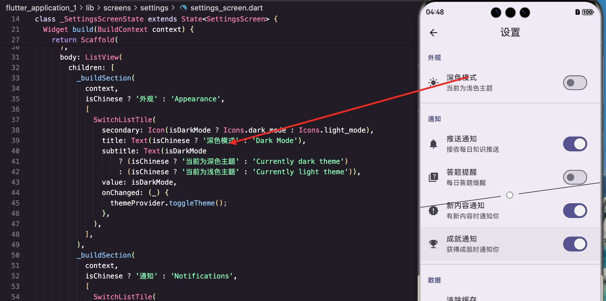
isDark为null),就用默认的浅色模式。
注意finally块:不管加载成功还是失败,都要把_isInitialized设为true并通知监听者。不然应用会一直卡在加载状态。
切换主题
提供一个简单的切换方法:
Future<void> toggleTheme() async {
  _themeMode = _themeMode == ThemeMode.light ? ThemeMode.dark : ThemeMode.light;
  notifyListeners();  // 先更新UI

  // 然后异步保存到存储
  try {
    final storage = await AppStorage.getInstance();
    await storage.setBool('isDarkMode', _themeMode == ThemeMode.dark);
  } catch (e) {
    debugPrint('Save theme error: $e');
  }
}
这里有个小技巧:先更新状态再保存。
notifyListeners()会立刻触发UI更新,用户能马上看到主题变化。保存操作是异步的,放在后面执行,不会阻塞UI。
如果反过来,先保存再更新UI,用户会感觉有延迟——点了开关要等一会儿才变色。
直接设置主题
有时候需要直接设置深色或浅色,而不是切换:
Future<void> setDarkMode(bool isDark) async {
  if (isDarkMode == isDark) return;  // 已经是目标状态,不用操作

  _themeMode = isDark ? ThemeMode.dark : ThemeMode.light;
  notifyListeners();

  try {
    final storage = await AppStorage.getInstance();
    await storage.setBool('isDarkMode', isDark);
  } catch (e) {
    debugPrint('Save theme error: $e');
  }
}
加了个判断,如果已经是目标状态就直接返回,避免不必要的操作。
在App入口使用ThemeProvider
在MaterialApp中应用主题:
class MyApp extends StatelessWidget {
const MyApp({super.key});
Widget build(BuildContext context) {
return Consumer<ThemeProvider>(
builder: (context, themeProvider, child) {
// 等待主题加载完成
if (!themeProvider.isInitialized) {
return const MaterialApp(
home: Scaffold(
body: Center(child: CircularProgressIndicator()),
),
);
}
return MaterialApp(
title: '教育百科',
theme: AppTheme.lightTheme,
darkTheme: AppTheme.darkTheme,
themeMode: themeProvider.themeMode,
home: const MainScreen(),
);
},
);
}
}
Consumer监听ThemeProvider的变化。在主题加载完成之前显示一个加载指示器,避免"闪一下"的问题。
MaterialApp的
theme是浅色主题,darkTheme是深色主题,themeMode决定用哪个。Flutter会根据themeMode自动选择。
定义主题样式
创建浅色和深色两套主题:
class AppTheme {
  // 浅色主题
  static ThemeData lightTheme = ThemeData(
    useMaterial3: true,
    brightness: Brightness.light,
    colorScheme: ColorScheme.fromSeed(
      seedColor: Colors.deepPurple,
      brightness: Brightness.light,
    ),
useMaterial3: true启用Material 3设计语言,视觉效果更现代。ColorScheme.fromSeed是Material 3的新特性,只需要指定一个种子颜色,Flutter会自动生成一整套协调的配色方案。
    // 卡片样式
    cardTheme: CardTheme(
      elevation: 2,
      shape: RoundedRectangleBorder(
        borderRadius: BorderRadius.circular(16),
      ),
      clipBehavior: Clip.antiAlias,
    ),
统一定义卡片的圆角和阴影,这样整个应用的卡片风格一致。
    // 输入框样式
    inputDecorationTheme: InputDecorationTheme(
      filled: true,
      fillColor: Colors.grey.withOpacity(0.1),
      border: OutlineInputBorder(
        borderRadius: BorderRadius.circular(12),
        borderSide: BorderSide.none,
      ),
      contentPadding: const EdgeInsets.symmetric(horizontal: 16, vertical: 14),
    ),
输入框用填充样式,没有边框,看起来更简洁。
    // AppBar样式
    appBarTheme: const AppBarTheme(
      centerTitle: true,
      elevation: 0,
      scrolledUnderElevation: 1,
    ),
  );
AppBar标题居中,默认没有阴影,滚动时才显示轻微阴影。
深色主题类似,主要是改变brightness:
  // 深色主题
  static ThemeData darkTheme = ThemeData(
    useMaterial3: true,
    brightness: Brightness.dark,
    colorScheme: ColorScheme.fromSeed(
      seedColor: Colors.deepPurple,
      brightness: Brightness.dark,
    ),
    cardTheme: CardTheme(
      elevation: 2,
      shape: RoundedRectangleBorder(
        borderRadius: BorderRadius.circular(16),
      ),
      clipBehavior: Clip.antiAlias,
    ),
    inputDecorationTheme: InputDecorationTheme(
      filled: true,
      fillColor: Colors.white.withOpacity(0.05),
      border: OutlineInputBorder(
        borderRadius: BorderRadius.circular(12),
        borderSide: BorderSide.none,
      ),
      contentPadding: const EdgeInsets.symmetric(horizontal: 16, vertical: 14),
    ),
    appBarTheme: const AppBarTheme(
      centerTitle: true,
      elevation: 0,
      scrolledUnderElevation: 1,
    ),
  );
}
深色主题的输入框填充色用白色5%透明度,在深色背景上能看到但不会太亮。
在页面中适配深色模式
有些地方需要根据当前主题显示不同的颜色,比如渐变背景:
Widget build(BuildContext context) {
final isDark = Theme.of(context).brightness == Brightness.dark;
return Container(
decoration: BoxDecoration(
gradient: LinearGradient(
begin: Alignment.topLeft,
end: Alignment.bottomRight,
colors: isDark
? [const Color(0xFF1a237e), const Color(0xFF4a148c)]
: [const Color(0xFF667eea), const Color(0xFF764ba2)],
),
),
child: // ...
);
}
通过
Theme.of(context).brightness判断当前是深色还是浅色模式。深色模式用更深的颜色,浅色模式用更亮的颜色。
为什么不直接用ThemeProvider?
当然可以用,但Theme.of(context).brightness更通用。如果以后加了"跟随系统"的选项,这种写法不用改;而且在不方便获取Provider的地方(比如一些工具方法)也能用。
快速切换按钮
在"我的"页面的AppBar上加一个主题切换按钮:
AppBar(
  title: const Text('我的'),
  actions: [
    Consumer<ThemeProvider>(
      builder: (context, themeProvider, child) {
        return IconButton(
          icon: Icon(
            themeProvider.isDarkMode ? Icons.light_mode : Icons.dark_mode,
          ),
          tooltip: themeProvider.isDarkMode ? '切换到浅色模式' : '切换到深色模式',
          onPressed: () => themeProvider.toggleTheme(),
        );
      },
    ),
  ],
),
深色模式时显示太阳图标(点击切换到浅色),浅色模式时显示月亮图标(点击切换到深色)。这是很常见的设计模式。
处理自定义颜色
有些颜色不在主题里,需要手动适配:
Widget _buildCustomCard(BuildContext context) {
  final isDark = Theme.of(context).brightness == Brightness.dark;

  return Container(
    padding: const EdgeInsets.all(16),
    decoration: BoxDecoration(
      color: isDark
          ? Colors.white.withOpacity(0.05)
          : Colors.black.withOpacity(0.03),
      borderRadius: BorderRadius.circular(12),
    ),
    child: Text(
      '自定义内容',
      style: TextStyle(
        color: isDark ? Colors.white70 : Colors.black87,
      ),
    ),
  );
}
深色模式用白色低透明度,浅色模式用黑色低透明度。这样在两种模式下都能看清,又不会太突兀。
图片和图标的适配
有些图片在深色背景上看不清,需要特殊处理:
Widget _buildLogo(BuildContext context) {
  final isDark = Theme.of(context).brightness == Brightness.dark;

  return Image.asset(
    isDark ? 'assets/logo_dark.png' : 'assets/logo_light.png',
    width: 120,
  );
}
准备两套图片资源,根据主题选择。
对于图标,可以用ColorFiltered:
ColorFiltered(
  colorFilter: ColorFilter.mode(
    isDark ? Colors.white : Colors.black,
    BlendMode.srcIn,
  ),
  child: Image.asset('assets/icon.png'),
)
这样一张图片就能适配两种模式。
渐变色的适配
渐变色在深色模式下需要特别注意,太亮的颜色会很刺眼:
Widget _buildGradientCard(BuildContext context) {
  final isDark = Theme.of(context).brightness == Brightness.dark;

  return Container(
    decoration: BoxDecoration(
      gradient: LinearGradient(
        begin: Alignment.topLeft,
        end: Alignment.bottomRight,
        colors: isDark
            ? [const Color(0xFF1a237e), const Color(0xFF4a148c)]  // 深色版本
            : [const Color(0xFF667eea), const Color(0xFF764ba2)],  // 浅色版本
      ),
      borderRadius: BorderRadius.circular(16),
      boxShadow: [
        BoxShadow(
          color: (isDark ? Colors.black : const Color(0xFF667eea))
              .withOpacity(0.3),
          blurRadius: 15,
          offset: const Offset(0, 8),
        ),
      ],
    ),
    child: // ...
  );
}
深色模式的渐变色饱和度更低、明度更低,这样在深色背景上不会太突兀。阴影颜色也要跟着调整。
状态栏和导航栏适配
系统状态栏和导航栏的颜色也需要适配:
Widget build(BuildContext context) {
final isDark = Theme.of(context).brightness == Brightness.dark;
return AnnotatedRegion<SystemUiOverlayStyle>(
value: isDark
? SystemUiOverlayStyle.light // 深色背景用浅色图标
: SystemUiOverlayStyle.dark, // 浅色背景用深色图标
child: Scaffold(
// ...
),
);
}
AnnotatedRegion可以控制状态栏图标的颜色。深色背景时用浅色图标,浅色背景时用深色图标,确保图标清晰可见。
动态切换的过渡效果
主题切换时可以加一个过渡动画,让切换更平滑:
MaterialApp(
  theme: AppTheme.lightTheme,
  darkTheme: AppTheme.darkTheme,
  themeMode: themeProvider.themeMode,
  themeAnimationDuration: const Duration(milliseconds: 300),
  themeAnimationCurve: Curves.easeInOut,
  // ...
)
themeAnimationDuration和themeAnimationCurve控制主题切换的动画效果。300毫秒的过渡时间比较合适,太快看不出效果,太慢会觉得卡顿。
写在最后
深色模式的实现核心是ThemeProvider管理状态,MaterialApp的theme/darkTheme/themeMode三个属性配合使用。Material 3的ColorScheme.fromSeed大大简化了配色方案的定义,只需要一个种子颜色就能生成完整的配色。
在具体页面中,通过Theme.of(context).brightness判断当前模式,然后使用对应的颜色。自定义颜色需要手动适配,但只要遵循"深色模式用深色、浅色模式用浅色"的原则,一般不会出问题。
下一篇我们来看语言切换功能,实现思路和主题切换类似,但有一些不同的细节需要处理。
本文是Flutter for OpenHarmony教育百科实战系列的第十八篇,后续会持续更新更多内容。
欢迎加入开源鸿蒙跨平台社区:https://openharmonycrossplatform.csdn.net

开源鸿蒙跨平台开发社区汇聚开发者与厂商,共建“一次开发,多端部署”的开源生态,致力于降低跨端开发门槛,推动万物智联创新。
更多推荐
 9
9 0
0- 0


 已为社区贡献24条内容

所有评论(0)