React Native 鸿蒙跨平台开发:多色渐变进度条与状态可视化系统
在数据可视化应用中,进度条不仅是简单的进度显示工具,更是状态可视化的核心组件。本文将深入讲解如何使用 、 和创建多色渐变进度条和完整的状态可视化系统。状态数据颜色映射渐变生成进度显示视觉反馈数值状态阶段状态百分比状态单色映射双色渐变多色渐变线性渐变径向渐变分段渐变水平进度条环形进度仪表盘技术深度解析:技术深度解析:技术深度解析:技术深度解析:四、高级应用场景4.1 多维度状态面板4.2 状态历史趋
·
欢迎加入开源鸿蒙跨平台社区:https://openharmonycrossplatform.csdn.net
一、核心知识点
在数据可视化应用中,进度条不仅是简单的进度显示工具,更是状态可视化的核心组件。本文将深入讲解如何使用 react-native-linear-gradient、@react-native-ohos/progress-bar-android 和 @react-native-masked-view/masked-view 创建多色渐变进度条和完整的状态可视化系统。
1.1 状态可视化核心概念
1.2 多色渐变配置方案
| 渐变类型 | 配置方式 | 适用场景 | 颜色数量 |
|---|---|---|---|
| 线性渐变 | start → end | 标准进度条 | 2-5色 |
| 分段渐变 | locations + colors | 多阶段进度 | 3+色 |
| 彩虹渐变 | 7色光谱 | 品牌展示 | 7色 |
| 温度渐变 | 红→绿→蓝 | 温度/健康 | 3色 |
1.3 核心技术特性
- 动态颜色映射:根据状态值自动选择颜色
- 多色渐变支持:支持 2-7 色渐变配置
- 状态机管理:完整的状态转换逻辑
- 实时更新:状态变化时平滑过渡
- 视觉反馈:清晰的视觉状态指示
- 性能优化:原生组件,性能优异
二、实战核心代码深度解析
2.1 颜色映射系统
// 颜色映射配置
interface ColorMapping {
  threshold: number;
  colors: string[];
  label: string;
}

const colorMappings: ColorMapping[] = [
  { threshold: 30, colors: ['#FF6B6B', '#FF8E8E'], label: '低' },
  { threshold: 60, colors: ['#F4A261', '#E9C46A'], label: '中' },
  { threshold: 100, colors: ['#2A9D8F', '#264653'], label: '高' },
];

// 获取颜色映射
const getColorMapping = (value: number): ColorMapping => {
  return colorMappings.find(mapping => value <= mapping.threshold) || colorMappings[colorMappings.length - 1];
};

// 温度渐变映射
const getTemperatureColors = (temperature: number): string[] => {
  if (temperature < 20) return ['#4FACFE', '#00F2FE']; // 冷
  if (temperature < 30) return ['#43e97b', '#38f9d7']; // 适宜
  if (temperature < 40) return ['#fa709a', '#fee140']; // 热
  return ['#FF6B6B', '#FF416C']; // 炎热
};

// 健康状态映射
const getHealthColors = (score: number): string[] => {
  if (score < 60) return ['#FF6B6B', '#FF8E8E']; // 不健康
  if (score < 80) return ['#F4A261', '#E9C46A']; // 良好
  return ['#2A9D8F', '#264653']; // 优秀
};
技术深度解析:
- 阈值设计:合理的阈值划分,符合用户认知
- 颜色心理学:红色表示警告,绿色表示健康,蓝色表示冷静
- 渐变平滑:双色渐变提供平滑的视觉过渡
- 可扩展性:配置化的颜色映射,易于扩展
2.2 多色分段渐变进度条
import React from 'react';
import { View, Text, StyleSheet } from 'react-native';
import MaskedView from '@react-native-masked-view/masked-view';
import { LinearGradient } from 'react-native-linear-gradient';
import { ProgressBar } from '@react-native-community/progress-bar-android';

interface MultiSegmentProgressProps {
  segments: {
    label: string;
    progress: number;
    colors: string[];
  }[];
}

const MultiSegmentProgressBar = ({ segments }: MultiSegmentProgressProps) => {
  return (
    <View style={styles.container}>
      {segments.map((segment, index) => (
        <View key={index} style={styles.segmentContainer}>
          <View style={styles.segmentHeader}>
            <Text style={styles.segmentLabel}>{segment.label}</Text>
            <Text style={styles.segmentProgress}>
              {Math.round(segment.progress)}%
            </Text>
          </View>

          {/* 渐变遮罩进度文字 */}
          <MaskedView
            style={styles.maskedView}
            maskElement={
              <View style={styles.maskContainer}>
                <Text style={styles.progressText}>
                  {segment.progress}%
                </Text>
              </View>
            }
          >
            <LinearGradient
              colors={segment.colors}
              start={{ x: 0, y: 0 }}
              end={{ x: 1, y: 0 }}
              style={styles.gradient}
            />
          </MaskedView>

          {/* 底部进度条 */}
          <ProgressBar
            styleAttr="Horizontal"
            indeterminate={false}
            progress={segment.progress / 100}
            animating={true}
            color={segment.colors[0]}
          />
        </View>
      ))}
    </View>
  );
};

const styles = StyleSheet.create({
  container: {
    padding: 16,
  },
  segmentContainer: {
    marginBottom: 24,
    backgroundColor: '#F5F7FA',
    borderRadius: 12,
    padding: 16,
  },
  segmentHeader: {
    flexDirection: 'row',
    justifyContent: 'space-between',
    marginBottom: 12,
  },
  segmentLabel: {
    fontSize: 16,
    fontWeight: '600',
    color: '#303133',
  },
  segmentProgress: {
    fontSize: 14,
    color: '#909399',
  },
  maskedView: {
    height: 80,
    marginBottom: 16,
  },
  maskContainer: {
    backgroundColor: 'transparent',
    alignItems: 'center',
    justifyContent: 'center',
    height: '100%',
  },
  progressText: {
    fontSize: 48,
    fontWeight: '900',
    color: '#000000',
  },
  gradient: {
    flex: 1,
  },
});
技术深度解析:
- 分段设计:每个段独立显示,清晰明了
- 双层显示:渐变文字 + 底部进度条
- 配置灵活:segments 数组支持任意数量段
- 视觉层次:通过颜色和字体大小建立层次
2.3 彩虹渐变进度条
const RainbowProgressBar = ({ progress }: { progress: number }) => {
  const rainbowColors = [
    '#FF0000', '#FF7F00', '#FFFF00', '#00FF00',
    '#0000FF', '#4B0082', '#9400D3'
  ];

  return (
    <View style={styles.rainbowContainer}>
      <MaskedView
        style={styles.rainbowMaskedView}
        maskElement={
          <View style={styles.rainbowMaskContainer}>
            <Text style={styles.rainbowText}>
              {Math.round(progress)}%
            </Text>
          </View>
        }
      >
        <LinearGradient
          colors={rainbowColors}
          start={{ x: 0, y: 0 }}
          end={{ x: 1, y: 0 }}
          style={styles.gradient}
        />
      </MaskedView>

      <ProgressBar
        styleAttr="Horizontal"
        indeterminate={false}
        progress={progress / 100}
        animating={true}
        color="#9400D3"
      />

      <View style={styles.colorLegend}>
        {rainbowColors.map((color, index) => (
          <View key={index} style={styles.colorItem}>
            <View style={[styles.colorDot, { backgroundColor: color }]} />
            <Text style={styles.colorLabel}>
              {Math.round((index / (rainbowColors.length - 1)) * 100)}%
            </Text>
          </View>
        ))}
      </View>
    </View>
  );
};
技术深度解析:
- 彩虹光谱:使用 7 色光谱创建炫彩效果
- 颜色图例:显示每种颜色对应的进度范围
- 视觉冲击:鲜艳的色彩组合带来强烈视觉冲击
- 品牌定制:可根据品牌色调整彩虹色
2.4 温度计可视化
const TemperatureGauge = ({ temperature }: { temperature: number }) => {
  const colors = getTemperatureColors(temperature);
  const minTemp = 0;
  const maxTemp = 50;
  const normalizedTemp = (temperature - minTemp) / (maxTemp - minTemp);

  return (
    <View style={styles.temperatureContainer}>
      <Text style={styles.temperatureTitle}>温度监控</Text>

      {/* 温度显示 */}
      <MaskedView
        style={styles.temperatureMaskedView}
        maskElement={
          <View style={styles.temperatureMaskContainer}>
            <Text style={styles.temperatureText}>
              {temperature}°C
            </Text>
          </View>
        }
      >
        <LinearGradient
          colors={colors}
          start={{ x: 0, y: 0 }}
          end={{ x: 1, y: 0 }}
          style={styles.gradient}
        />
      </MaskedView>

      {/* 温度进度条 */}
      <ProgressBar
        styleAttr="Horizontal"
        indeterminate={false}
        progress={normalizedTemp}
        animating={true}
        color={colors[0]}
      />

      {/* 温度范围 */}
      <View style={styles.temperatureRange}>
        <Text style={styles.rangeText}>{minTemp}°C</Text>
        <Text style={styles.rangeText}>{maxTemp}°C</Text>
      </View>

      {/* 状态指示 */}
      <View style={styles.statusIndicator}>
        <View style={[styles.statusDot, { backgroundColor: colors[0] }]} />
        <Text style={styles.statusText}>
          {temperature < 20 ? '低温' : temperature < 30 ? '适宜' : temperature < 40 ? '高温' : '炎热'}
        </Text>
      </View>
    </View>
  );
};
技术深度解析:
- 温度归一化:将温度值归一化到 0-1 范围
- 动态颜色:根据温度值动态选择颜色
- 状态指示:显示当前温度状态
- 范围标记:显示温度的最小和最大值
三、实战完整版:综合状态可视化系统
import React, { useState, useEffect } from 'react';
import {
View,
Text,
StyleSheet,
SafeAreaView,
ScrollView,
StatusBar,
TouchableOpacity,
} from 'react-native';
import MaskedView from '@react-native-masked-view/masked-view';
import { LinearGradient } from 'react-native-linear-gradient';
import { ProgressBar } from '@react-native-community/progress-bar-android';
// ==================== 辅助函数定义 ====================
// 颜色映射配置
interface ColorMapping {
threshold: number;
colors: string[];
label: string;
}
const colorMappings: ColorMapping[] = [
{ threshold: 30, colors: ['#FF6B6B', '#FF8E8E'], label: '低' },
{ threshold: 60, colors: ['#F4A261', '#E9C46A'], label: '中' },
{ threshold: 100, colors: ['#2A9D8F', '#264653'], label: '高' },
];
// 获取颜色映射
const getColorMapping = (value: number): ColorMapping => {
return colorMappings.find(mapping => value <= mapping.threshold) || colorMappings[colorMappings.length - 1];
};
// 温度渐变映射
const getTemperatureColors = (temperature: number): string[] => {
if (temperature < 20) return ['#4FACFE', '#00F2FE']; // 冷
if (temperature < 30) return ['#43e97b', '#38f9d7']; // 适宜
if (temperature < 40) return ['#fa709a', '#fee140']; // 热
return ['#FF6B6B', '#FF416C']; // 炎热
};
// 健康状态映射
const getHealthColors = (score: number): string[] => {
if (score < 60) return ['#FF6B6B', '#FF8E8E']; // 不健康
if (score < 80) return ['#F4A261', '#E9C46A']; // 良好
return ['#2A9D8F', '#264653']; // 优秀
};
// 温度计组件
const TemperatureGauge = ({ temperature }: { temperature: number }) => {
const colors = getTemperatureColors(temperature);
const minTemp = 0;
const maxTemp = 50;
const normalizedTemp = (temperature - minTemp) / (maxTemp - minTemp);
return (
<View style={styles.temperatureContainer}>
<Text style={styles.temperatureTitle}>温度监控</Text>
{/* 温度显示 */}
<MaskedView
style={styles.temperatureMaskedView}
maskElement={
<View style={styles.temperatureMaskContainer}>
<Text style={styles.temperatureText}>
{temperature}°C
</Text>
</View>
}
>
<LinearGradient
colors={colors}
start={{ x: 0, y: 0 }}
end={{ x: 1, y: 0 }}
style={styles.gradient}
/>
</MaskedView>
{/* 温度进度条 */}
<ProgressBar
styleAttr="Horizontal"
indeterminate={false}
progress={normalizedTemp}
animating={true}
color={colors[0]}
/>
{/* 温度范围 */}
<View style={styles.temperatureRange}>
<Text style={styles.rangeText}>{minTemp}°C</Text>
<Text style={styles.rangeText}>{maxTemp}°C</Text>
</View>
{/* 状态指示 */}
<View style={styles.statusIndicator}>
<View style={[styles.statusDot, { backgroundColor: colors[0] }]} />
<Text style={styles.statusText}>
{temperature < 20 ? '低温' : temperature < 30 ? '适宜' : temperature < 40 ? '高温' : '炎热'}
</Text>
</View>
</View>
);
};
// 彩虹进度条组件
const RainbowProgressBar = ({ progress }: { progress: number }) => {
const rainbowColors = [
'#FF0000', '#FF7F00', '#FFFF00', '#00FF00',
'#0000FF', '#4B0082', '#9400D3'
];
return (
<View style={styles.rainbowContainer}>
<MaskedView
style={styles.rainbowMaskedView}
maskElement={
<View style={styles.rainbowMaskContainer}>
<Text style={styles.rainbowText}>
{Math.round(progress)}%
</Text>
</View>
}
>
<LinearGradient
colors={rainbowColors}
start={{ x: 0, y: 0 }}
end={{ x: 1, y: 0 }}
style={styles.gradient}
/>
</MaskedView>
<ProgressBar
styleAttr="Horizontal"
indeterminate={false}
progress={progress / 100}
animating={true}
color="#9400D3"
/>
<View style={styles.colorLegend}>
{rainbowColors.map((color, index) => (
<View key={index} style={styles.colorItem}>
<View style={[styles.colorDot, { backgroundColor: color }]} />
<Text style={styles.colorLabel}>
{Math.round((index / (rainbowColors.length - 1)) * 100)}%
</Text>
</View>
))}
</View>
</View>
);
};
// ==================== 主组件 ====================
const StatusVisualizationScreen = () => {
// 项目进度状态
const [projectProgress, setProjectProgress] = useState(0);
const [isProjectRunning, setIsProjectRunning] = useState(false);
// 健康分数
const [healthScore, setHealthScore] = useState(75);
// 温度监控
const [temperature, setTemperature] = useState(25);
// CPU 使用率
const [cpuUsage, setCpuUsage] = useState(45);
// 内存使用率
const [memoryUsage, setMemoryUsage] = useState(60);
// 模拟项目进度
const simulateProjectProgress = () => {
setIsProjectRunning(true);
setProjectProgress(0);
let progress = 0;
const interval = setInterval(() => {
progress += Math.random() * 5;
if (progress >= 100) {
progress = 100;
clearInterval(interval);
setIsProjectRunning(false);
}
setProjectProgress(progress);
}, 300);
return () => clearInterval(interval);
};
// 模拟实时数据更新
useEffect(() => {
const dataInterval = setInterval(() => {
// 更新温度(20-40°C)
setTemperature(prev => {
const change = (Math.random() - 0.5) * 2;
return Math.max(20, Math.min(40, prev + change));
});
// 更新 CPU 使用率(0-100%)
setCpuUsage(prev => {
const change = (Math.random() - 0.5) * 10;
return Math.max(0, Math.min(100, prev + change));
});
// 更新内存使用率(0-100%)
setMemoryUsage(prev => {
const change = (Math.random() - 0.5) * 5;
return Math.max(0, Math.min(100, prev + change));
});
}, 2000);
return () => clearInterval(dataInterval);
}, []);
return (
<SafeAreaView style={styles.container}>
<StatusBar barStyle="dark-content" backgroundColor="#ffffff" />
<View style={styles.header}>
<Text style={styles.headerTitle}>📊 状态可视化系统</Text>
<Text style={styles.headerSubtitle}>
Multi-Color Gradient + Status Visualization
</Text>
</View>
<ScrollView style={styles.content}>
{/* 项目进度 */}
<View style={styles.card}>
<Text style={styles.cardTitle}>📁 项目进度</Text>
<View style={styles.progressBarContainer}>
<MaskedView
style={styles.maskedView}
maskElement={
<View style={styles.maskContainer}>
<Text style={styles.progressText}>
{Math.round(projectProgress)}%
</Text>
</View>
}
>
<LinearGradient
colors={getColorMapping(projectProgress).colors}
start={{ x: 0, y: 0 }}
end={{ x: 1, y: 0 }}
style={styles.gradient}
/>
</MaskedView>
<ProgressBar
styleAttr="Horizontal"
indeterminate={false}
progress={projectProgress / 100}
animating={true}
color={getColorMapping(projectProgress).colors[0]}
/>
</View>
<View style={styles.statusRow}>
<View style={[styles.statusDot, { backgroundColor: getColorMapping(projectProgress).colors[0] }]} />
<Text style={styles.statusText}>
状态: {getColorMapping(projectProgress).label}
</Text>
</View>
<TouchableOpacity
style={[styles.button, isProjectRunning && styles.buttonDisabled]}
onPress={simulateProjectProgress}
disabled={isProjectRunning}
>
<Text style={styles.buttonText}>
{isProjectRunning ? '进行中...' : '开始模拟'}
</Text>
</TouchableOpacity>
</View>
{/* 健康分数 */}
<View style={styles.card}>
<Text style={styles.cardTitle}>❤️ 健康分数</Text>
<View style={styles.progressBarContainer}>
<MaskedView
style={styles.maskedView}
maskElement={
<View style={styles.maskContainer}>
<Text style={styles.progressText}>
{healthScore}
</Text>
</View>
}
>
<LinearGradient
colors={getHealthColors(healthScore)}
start={{ x: 0, y: 0 }}
end={{ x: 1, y: 0 }}
style={styles.gradient}
/>
</MaskedView>
<ProgressBar
styleAttr="Horizontal"
indeterminate={false}
progress={healthScore / 100}
animating={true}
color={getHealthColors(healthScore)[0]}
/>
</View>
<View style={styles.statusRow}>
<View style={[styles.statusDot, { backgroundColor: getHealthColors(healthScore)[0] }]} />
<Text style={styles.statusText}>
评级: {healthScore < 60 ? '不健康' : healthScore < 80 ? '良好' : '优秀'}
</Text>
</View>
</View>
{/* 温度监控 */}
<TemperatureGauge temperature={temperature} />
{/* 系统资源 */}
<View style={styles.card}>
<Text style={styles.cardTitle}>💻 系统资源</Text>
{/* CPU 使用率 */}
<View style={styles.resourceItem}>
<View style={styles.resourceHeader}>
<Text style={styles.resourceLabel}>CPU 使用率</Text>
<Text style={styles.resourceValue}>{Math.round(cpuUsage)}%</Text>
</View>
<ProgressBar
styleAttr="Horizontal"
indeterminate={false}
progress={cpuUsage / 100}
animating={true}
color={cpuUsage > 80 ? '#FF6B6B' : cpuUsage > 60 ? '#F4A261' : '#2A9D8F'}
/>
</View>
{/* 内存使用率 */}
<View style={styles.resourceItem}>
<View style={styles.resourceHeader}>
<Text style={styles.resourceLabel}>内存使用率</Text>
<Text style={styles.resourceValue}>{Math.round(memoryUsage)}%</Text>
</View>
<ProgressBar
styleAttr="Horizontal"
indeterminate={false}
progress={memoryUsage / 100}
animating={true}
color={memoryUsage > 80 ? '#FF6B6B' : memoryUsage > 60 ? '#F4A261' : '#2A9D8F'}
/>
</View>
</View>
{/* 彩虹进度演示 */}
<View style={styles.card}>
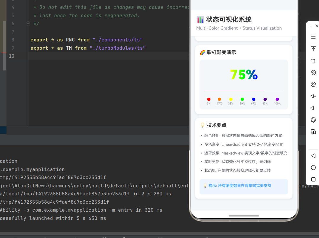
<Text style={styles.cardTitle}>🌈 彩虹渐变演示</Text>
<RainbowProgressBar progress={75} />
</View>
{/* 技术说明 */}
<View style={styles.card}>
<Text style={styles.cardTitle}>💡 技术要点</Text>
<Text style={styles.instructionText}>
• 颜色映射: 根据状态值自动选择合适的颜色方案
</Text>
<Text style={styles.instructionText}>
• 多色渐变: LinearGradient 支持 2-7 色渐变配置
</Text>
<Text style={styles.instructionText}>
• 遮罩效果: MaskedView 实现文字/数字的渐变填充
</Text>
<Text style={styles.instructionText}>
• 实时更新: 状态变化时平滑过渡,无闪烁
</Text>
<Text style={styles.instructionText}>
• 状态机: 完整的状态转换逻辑和视觉反馈
</Text>
<View style={styles.tipBox}>
<Text style={[styles.instructionText, styles.tipText]}>
💡 提示: 所有渐变效果在鸿蒙端完美支持
</Text>
</View>
</View>
</ScrollView>
</SafeAreaView>
);
};
const styles = StyleSheet.create({
container: {
flex: 1,
backgroundColor: '#F5F7FA',
},
header: {
padding: 20,
backgroundColor: '#FFFFFF',
borderBottomWidth: 1,
borderBottomColor: '#EBEEF5',
},
headerTitle: {
fontSize: 24,
fontWeight: '700',
color: '#303133',
marginBottom: 8,
},
headerSubtitle: {
fontSize: 16,
fontWeight: '500',
color: '#909399',
},
content: {
flex: 1,
padding: 16,
},
card: {
backgroundColor: '#FFFFFF',
borderRadius: 12,
marginBottom: 16,
padding: 16,
shadowColor: '#000000',
shadowOffset: { width: 0, height: 2 },
shadowOpacity: 0.08,
shadowRadius: 8,
elevation: 4,
},
cardTitle: {
fontSize: 18,
fontWeight: '600',
color: '#303133',
marginBottom: 16,
},
progressBarContainer: {
backgroundColor: '#F5F7FA',
borderRadius: 12,
padding: 16,
marginBottom: 12,
},
maskedView: {
height: 80,
marginBottom: 16,
},
maskContainer: {
backgroundColor: 'transparent',
alignItems: 'center',
justifyContent: 'center',
height: '100%',
},
progressText: {
fontSize: 48,
fontWeight: '900',
color: '#000000',
},
gradient: {
flex: 1,
},
statusRow: {
flexDirection: 'row',
alignItems: 'center',
marginBottom: 12,
},
statusDot: {
width: 10,
height: 10,
borderRadius: 5,
marginRight: 8,
},
statusText: {
fontSize: 14,
color: '#606266',
},
button: {
backgroundColor: '#409EFF',
borderRadius: 8,
padding: 14,
alignItems: 'center',
},
buttonDisabled: {
backgroundColor: '#C0C4CC',
},
buttonText: {
fontSize: 16,
color: '#FFFFFF',
fontWeight: '600',
},
rainbowContainer: {
backgroundColor: '#F5F7FA',
borderRadius: 12,
padding: 16,
},
rainbowMaskedView: {
height: 80,
marginBottom: 16,
},
rainbowMaskContainer: {
backgroundColor: 'transparent',
alignItems: 'center',
justifyContent: 'center',
height: '100%',
},
rainbowText: {
fontSize: 48,
fontWeight: '900',
color: '#000000',
},
colorLegend: {
flexDirection: 'row',
justifyContent: 'space-around',
marginTop: 12,
},
colorItem: {
alignItems: 'center',
},
colorDot: {
width: 12,
height: 12,
borderRadius: 6,
marginBottom: 4,
},
colorLabel: {
fontSize: 10,
color: '#909399',
},
temperatureContainer: {
backgroundColor: '#F5F7FA',
borderRadius: 12,
padding: 16,
marginBottom: 16,
},
temperatureTitle: {
fontSize: 18,
fontWeight: '600',
color: '#303133',
marginBottom: 16,
},
temperatureMaskedView: {
height: 80,
marginBottom: 16,
},
temperatureMaskContainer: {
backgroundColor: 'transparent',
alignItems: 'center',
justifyContent: 'center',
height: '100%',
},
temperatureText: {
fontSize: 48,
fontWeight: '900',
color: '#000000',
},
temperatureRange: {
flexDirection: 'row',
justifyContent: 'space-between',
marginTop: 8,
},
rangeText: {
fontSize: 14,
color: '#909399',
},
statusIndicator: {
flexDirection: 'row',
alignItems: 'center',
marginTop: 12,
},
resourceItem: {
marginBottom: 16,
},
resourceHeader: {
flexDirection: 'row',
justifyContent: 'space-between',
marginBottom: 8,
},
resourceLabel: {
fontSize: 14,
color: '#606266',
},
resourceValue: {
fontSize: 14,
fontWeight: '600',
color: '#303133',
},
instructionText: {
fontSize: 14,
lineHeight: 24,
marginBottom: 8,
color: '#606266',
},
tipBox: {
backgroundColor: '#ECF5FF',
borderRadius: 8,
padding: 12,
marginTop: 12,
},
tipText: {
color: '#409EFF',
fontWeight: '600',
},
});
export default StatusVisualizationScreen;
四、高级应用场景
4.1 多维度状态面板
const MultiDimensionalPanel = () => {
  const dimensions = [
    { name: '性能', value: 85, icon: '⚡', colors: ['#FFD700', '#FFA500'] },
    { name: '安全', value: 92, icon: '🔒', colors: ['#2A9D8F', '#264653'] },
    { name: '稳定性', value: 78, icon: '📊', colors: ['#4FACFE', '#00F2FE'] },
    { name: '可用性', value: 95, icon: '✓', colors: ['#667eea', '#764ba2'] },
  ];

  return (
    <View style={styles.panelContainer}>
      {dimensions.map((dimension, index) => (
        <View key={index} style={styles.dimensionItem}>
          <View style={styles.dimensionHeader}>
            <Text style={styles.dimensionIcon}>{dimension.icon}</Text>
            <Text style={styles.dimensionName}>{dimension.name}</Text>
            <Text style={styles.dimensionValue}>{dimension.value}</Text>
          </View>

          <MaskedView
            style={styles.dimensionMaskedView}
            maskElement={
              <View style={styles.dimensionMaskContainer}>
                <Text style={styles.dimensionText}>
                  {dimension.value}%
                </Text>
              </View>
            }
          >
            <LinearGradient
              colors={dimension.colors}
              start={{ x: 0, y: 0 }}
              end={{ x: 1, y: 0 }}
              style={styles.gradient}
            />
          </MaskedView>

          <ProgressBar
            styleAttr="Horizontal"
            indeterminate={false}
            progress={dimension.value / 100}
            animating={true}
            color={dimension.colors[0]}
          />
        </View>
      ))}
    </View>
  );
};
4.2 状态历史趋势
const StatusHistoryChart = () => {
  const history = [
    { time: '00:00', value: 30 },
    { time: '04:00', value: 25 },
    { time: '08:00', value: 60 },
    { time: '12:00', value: 85 },
    { time: '16:00', value: 70 },
    { time: '20:00', value: 45 },
  ];

  return (
    <View style={styles.historyContainer}>
      <Text style={styles.historyTitle}>历史趋势</Text>

      <View style={styles.historyChart}>
        {history.map((item, index) => (
          <View key={index} style={styles.historyItem}>
            <Text style={styles.historyTime}>{item.time}</Text>
            <View style={styles.historyBarContainer}>
              <ProgressBar
                styleAttr="Horizontal"
                indeterminate={false}
                progress={item.value / 100}
                animating={true}
                color={getColorMapping(item.value).colors[0]}
              />
            </View>
            <Text style={styles.historyValue}>{item.value}%</Text>
          </View>
        ))}
      </View>
    </View>
  );
};
4.3 告警阈值系统
const AlertThresholdSystem = () => {
  const thresholds = [
    { name: 'CPU 警告', value: 85, threshold: 80, alert: true },
    { name: '内存警告', value: 75, threshold: 80, alert: false },
    { name: '温度警告', value: 42, threshold: 40, alert: true },
    { name: '磁盘警告', value: 65, threshold: 90, alert: false },
  ];

  return (
    <View style={styles.alertContainer}>
      {thresholds.map((item, index) => (
        <View key={index} style={[
          styles.alertItem,
          item.alert && styles.alertItemCritical
        ]}>
          <View style={styles.alertHeader}>
            <Text style={styles.alertIcon}>{item.alert ? '⚠️' : '✓'}</Text>
            <Text style={styles.alertName}>{item.name}</Text>
            <Text style={[
              styles.alertValue,
              { color: item.alert ? '#FF6B6B' : '#2A9D8F' }
            ]}>
              {item.value}%
            </Text>
          </View>

          <View style={styles.alertBar}>
            <ProgressBar
              styleAttr="Horizontal"
              indeterminate={false}
              progress={item.value / 100}
              animating={true}
              color={item.alert ? '#FF6B6B' : '#2A9D8F'}
            />

            <View style={styles.thresholdLine} style={{ left: `${item.threshold}%` }}>
              <View style={styles.thresholdMark} />
            </View>
          </View>

          <Text style={styles.alertThreshold}>
            阈值: {item.threshold}%
          </Text>
        </View>
      ))}
    </View>
  );
};
五、总结
本文深入讲解了如何使用 LinearGradient、ProgressBar 和 MaskedView 创建多色渐变进度条和完整的状态可视化系统。
核心技术要点:
| 功能 | 实现技术 | 关键参数 |
|---|---|---|
| 颜色映射 | 配置化阈值 | threshold, colors |
| 多色渐变 | LinearGradient + locations | 颜色数组、位置数组 |
| 分段显示 | segments 数组配置 | label, progress, colors |
| 温度计 | 归一化 + 动态颜色 | minTemp, maxTemp |
| 告警系统 | 阈值比较 + 视觉反馈 | threshold, alert flag |
设计原则:
- 颜色心理学:红色表示警告,绿色表示健康,蓝色表示冷静
- 视觉层次:通过大小、颜色、位置建立清晰的信息层次
- 实时反馈:状态变化时平滑过渡,提供即时反馈
- 阈值合理:基于实际业务设置合理的告警阈值
- 性能优化:使用原生组件,避免频繁重新渲染
- 跨平台一致:确保三端表现一致
扩展建议:
- 添加动画效果,提升视觉体验
- 支持自定义主题色
- 集成推送通知,主动告警
- 支持数据导出和报表生成
- 添加历史趋势图表
通过本文的学习,你应该能够:
- 实现多色渐变进度条
- 构建完整的状态可视化系统
- 设计合理的颜色映射方案
- 创建专业的监控面板
- 优化性能和用户体验
在鸿蒙平台上,这些技术得到了完美支持,可以轻松实现与 iOS/Android 平台一致的状态可视化体验。

开源鸿蒙跨平台开发社区汇聚开发者与厂商,共建“一次开发,多端部署”的开源生态,致力于降低跨端开发门槛,推动万物智联创新。
更多推荐
 5
5 0
0- 0


 已为社区贡献48条内容

所有评论(0)