基础入门 Flutter for Harmony:Text 组件详解
Text是 Flutter 中最基础且最重要的组件之一,用于在屏幕上显示文本内容。它支持丰富的样式设置、文本对齐、溢出处理等特性。'这段文本可以被选中复制。长按这段文字,然后选择复制。',},Text 组件是 Flutter 中最基础且强大的文本显示组件,掌握其各种属性和用法对于构建优秀的用户界面至关重要。
欢迎加入开源鸿蒙跨平台社区:https://openharmonycrossplatform.csdn.net
一、Text 组件概述
Text 是 Flutter 中最基础且最重要的组件之一,用于在屏幕上显示文本内容。它支持丰富的样式设置、文本对齐、溢出处理等特性。
1.1 基本语法
Text('Hello Flutter')
1.2 Text 构造函数
const Text(
  this.data,                    // 文本内容
  {
    Key? key,
    this.style,                 // 文本样式
    this.strutStyle,            // 支柱样式
    this.textAlign,             // 文本对齐方式
    this.textDirection,         // 文本方向
    this.locale,                // 语言环境
    this.softWrap,              // 是否自动换行
    this.overflow,              // 溢出处理方式
    this.textScaleFactor,       // 文本缩放因子
    this.maxLines,              // 最大行数
    this.semanticsLabel,        // 语义标签
    this.textWidthBasis,        // 文本宽度基准
    this.textHeightBehavior,    // 文本高度行为
    this.selectionColor,        // 选择颜色
  }
)
二、TextStyle 文本样式详解
TextStyle 是控制 Text 外观的核心类,包含丰富的属性来定制文本外观。
2.1 TextStyle 构造函数
const TextStyle({
  this.inherit = true,              // 是否继承父级样式
  this.color,                       // 文本颜色
  this.backgroundColor,             // 背景颜色
  this.fontSize,                    // 字体大小
  this.fontWeight,                  // 字体粗细
  this.fontStyle,                   // 字体样式
  this.letterSpacing,               // 字母间距
  this.wordSpacing,                 // 词间距
  this.height,                      // 行高
  this.leadingDistribution,         // 行间距分布
  this.locale,                      // 语言环境
  this.foreground,                  // 前景绘制
  this.background,                  // 背景绘制
  this.shadows,                     // 阴影列表
  this.fontFeatures,                // 字体特性
  this.decoration,                  // 文本装饰
  this.decorationColor,             // 装饰颜色
  this.decorationStyle,             // 装饰样式
  this.decorationThickness,         // 装饰粗细
  this.fontFamily,                  // 字体家族
  this.fontFamilyFallback,          // 备用字体
  this.package,                     // 包名
  this.overflow,                    // 溢出处理
})
2.2 字体大小 fontSize
fontSize 控制文本的大小,以逻辑像素为单位。
Column(
  children: const [
    Text(
      '12sp - 最小字体',
      style: TextStyle(fontSize: 12),
    ),
    Text(
      '14sp - 辅助文本',
      style: TextStyle(fontSize: 14),
    ),
    Text(
      '16sp - 正文',
      style: TextStyle(fontSize: 16),
    ),
    Text(
      '18sp - 副标题',
      style: TextStyle(fontSize: 18),
    ),
    Text(
      '24sp - 标题',
      style: TextStyle(fontSize: 24),
    ),
    Text(
      '32sp - 大标题',
      style: TextStyle(fontSize: 32),
    ),
  ],
)
常见字体大小规范:
| 用途 | 字体大小 | 说明 |
|---|---|---|
| 极小标签 | 10-12sp | 标注、角标 |
| 辅助文本 | 12-14sp | 说明文字 |
| 正文 | 14-16sp | 主要内容 |
| 副标题 | 16-18sp | 次级标题 |
| 标题 | 20-24sp | 页面标题 |
| 大标题 | 28-36sp | 重要标题 |
2.3 字体粗细 fontWeight
fontWeight 控制文本的粗细程度。
Column(
  crossAxisAlignment: CrossAxisAlignment.start,
  children: const [
    Text(
      'FontWeight.w100 - Thin',
      style: TextStyle(fontSize: 18, fontWeight: FontWeight.w100),
    ),
    Text(
      'FontWeight.w200 - ExtraLight',
      style: TextStyle(fontSize: 18, fontWeight: FontWeight.w200),
    ),
    Text(
      'FontWeight.w300 - Light',
      style: TextStyle(fontSize: 18, fontWeight: FontWeight.w300),
    ),
    Text(
      'FontWeight.w400 - Normal',
      style: TextStyle(fontSize: 18, fontWeight: FontWeight.w400),
    ),
    Text(
      'FontWeight.w500 - Medium',
      style: TextStyle(fontSize: 18, fontWeight: FontWeight.w500),
    ),
    Text(
      'FontWeight.w600 - SemiBold',
      style: TextStyle(fontSize: 18, fontWeight: FontWeight.w600),
    ),
    Text(
      'FontWeight.w700 - Bold',
      style: TextStyle(fontSize: 18, fontWeight: FontWeight.w700),
    ),
    Text(
      'FontWeight.w800 - ExtraBold',
      style: TextStyle(fontSize: 18, fontWeight: FontWeight.w800),
    ),
    Text(
      'FontWeight.w900 - Black',
      style: TextStyle(fontSize: 18, fontWeight: FontWeight.w900),
    ),
  ],
)
FontWeight 枚举值对照表:
| 枚举值 | 数值 | 粗细程度 | 常见用途 |
|---|---|---|---|
w100 |
100 | Thin | 极细文字 |
w200 |
200 | ExtraLight | 特细文字 |
w300 |
300 | Light | 细体文字 |
w400 |
400 | Normal | 正文(默认) |
w500 |
500 | Medium | 中等粗细 |
w600 |
600 | SemiBold | 半粗体 |
w700 |
700 | Bold | 粗体(常用) |
w800 |
800 | ExtraBold | 特粗体 |
w900 |
900 | Black | 极粗体 |
2.4 字体样式 fontStyle
fontStyle 控制文本是否为斜体。
Column(
  children: const [
    Text(
      '正常字体',
      style: TextStyle(fontSize: 18, fontStyle: FontStyle.normal),
    ),
    Text(
      '斜体字体',
      style: TextStyle(fontSize: 18, fontStyle: FontStyle.italic),
    ),
  ],
)
FontStyle 枚举值:
| 值 | 说明 |
|---|---|
FontStyle.normal |
正常字体(默认) |
FontStyle.italic |
斜体字体 |
2.5 文本颜色 color
color 设置文本的前景色。
Column(
  children: const [
    Text(
      '默认黑色',
      style: TextStyle(fontSize: 18),
    ),
    Text(
      '白色文本',
      style: TextStyle(fontSize: 18, color: Colors.white),
    ),
    Text(
      '蓝色文本',
      style: TextStyle(fontSize: 18, color: Colors.blue),
    ),
    Text(
      '自定义颜色 #FF6366F1',
      style: TextStyle(fontSize: 18, color: Color(0xFF6366F1)),
    ),
    Text(
      '半透明红色',
      style: TextStyle(fontSize: 18, color: Colors.red.withOpacity(0.5)),
    ),
  ],
)
颜色设置方式:
| 方式 | 示例 | 说明 |
|---|---|---|
| 预定义颜色 | Colors.blue |
使用 Material 预定义颜色 |
| ARGB 值 | Color(0xFF0000FF) |
0xAARRGGBB 格式 |
| withOpacity | Colors.blue.withOpacity(0.5) |
设置透明度 |
2.6 字母间距 letterSpacing
letterSpacing 控制字符之间的间距,单位为逻辑像素。正值增加间距,负值减小间距。
Column(
  crossAxisAlignment: CrossAxisAlignment.start,
  children: const [
    Text(
      '正常间距 (0)',
      style: TextStyle(fontSize: 18, letterSpacing: 0),
    ),
    Text(
      '宽间距 (2)',
      style: TextStyle(fontSize: 18, letterSpacing: 2),
    ),
    Text(
      '很宽间距 (4)',
      style: TextStyle(fontSize: 18, letterSpacing: 4),
    ),
    Text(
      '紧间距 (-1)',
      style: TextStyle(fontSize: 18, letterSpacing: -1),
    ),
    Text(
      '极紧间距 (-2)',
      style: TextStyle(fontSize: 18, letterSpacing: -2),
    ),
  ],
)
letterSpacing 使用场景:
| 场景 | 推荐值 | 效果 |
|---|---|---|
| 英文大写标题 | 1.0 - 2.0 | 增强可读性 |
| 英文正文 | 0 - 0.5 | 自然阅读 |
| 中文文本 | 0 | 默认即可 |
| 紧凑排版 | -0.5 - -1.0 | 节省空间 |
2.7 词间距 wordSpacing
wordSpacing 控制单词之间的间距,仅对有空格分隔的语言(如英文)有效。
Column(
  crossAxisAlignment: CrossAxisAlignment.start,
  children: const [
    Text(
      'Word Spacing Demo - Normal (0)',
      style: TextStyle(fontSize: 16, wordSpacing: 0),
    ),
    Text(
      'Word Spacing Demo - Wide (4)',
      style: TextStyle(fontSize: 16, wordSpacing: 4),
    ),
    Text(
      'Word Spacing Demo - Tight (-2)',
      style: TextStyle(fontSize: 16, wordSpacing: -2),
    ),
  ],
)
2.8 行高 height
height 控制文本的行高,值为字体大小的倍数。
Container(
  width: 300,
  decoration: BoxDecoration(
    border: Border.all(color: Colors.grey),
  ),
  child: Column(
    crossAxisAlignment: CrossAxisAlignment.start,
    children: const [
      Text(
        '这是第一行文字\n这是第二行文字\n这是第三行文字',
        style: TextStyle(fontSize: 16, height: 1.0),
      ),
      Divider(),
      Text(
        '这是第一行文字\n这是第二行文字\n这是第三行文字',
        style: TextStyle(fontSize: 16, height: 1.5),
      ),
      Divider(),
      Text(
        '这是第一行文字\n这是第二行文字\n这是第三行文字',
        style: TextStyle(fontSize: 16, height: 2.0),
      ),
    ],
  ),
)
height 值说明:
| height 值 | 说明 | 适用场景 |
|---|---|---|
| 1.0 | 标准行高(无额外间距) | 密集内容 |
| 1.2-1.4 | 较紧凑 | 列表、表格 |
| 1.5-1.6 | 推荐行高(舒适阅读) | 正文内容 |
| 2.0+ | 宽松行高 | 标题、重要信息 |
2.9 文本装饰 decoration
decoration 为文本添加装饰效果,如下划线、删除线等。
Column(
  crossAxisAlignment: CrossAxisAlignment.start,
  children: const [
    Text(
      '无装饰',
      style: TextStyle(fontSize: 18, decoration: TextDecoration.none),
    ),
    Text(
      '下划线',
      style: TextStyle(
        fontSize: 18,
        decoration: TextDecoration.underline,
      ),
    ),
    Text(
      '上划线',
      style: TextStyle(
        fontSize: 18,
        decoration: TextDecoration.overline,
      ),
    ),
    Text(
      '删除线',
      style: TextStyle(
        fontSize: 18,
        decoration: TextDecoration.lineThrough,
      ),
    ),
    Text(
      '下划线+删除线',
      style: TextStyle(
        fontSize: 18,
        decoration: TextDecoration.combine([
          TextDecoration.underline,
          TextDecoration.lineThrough,
        ]),
      ),
    ),
  ],
)
TextDecoration 枚举值:
| 值 | 说明 |
|---|---|
TextDecoration.none |
无装饰 |
TextDecoration.underline |
下划线 |
TextDecoration.overline |
上划线 |
TextDecoration.lineThrough |
删除线 |
2.10 装饰颜色 decorationColor
decorationColor 设置装饰线的颜色。
Column(
  crossAxisAlignment: CrossAxisAlignment.start,
  children: const [
    Text(
      '蓝色下划线',
      style: TextStyle(
        fontSize: 18,
        decoration: TextDecoration.underline,
        decorationColor: Colors.blue,
      ),
    ),
    Text(
      '红色删除线',
      style: TextStyle(
        fontSize: 18,
        decoration: TextDecoration.lineThrough,
        decorationColor: Colors.red,
      ),
    ),
    Text(
      '绿色上划线',
      style: TextStyle(
        fontSize: 18,
        decoration: TextDecoration.overline,
        decorationColor: Colors.green,
      ),
    ),
  ],
)
2.11 装饰粗细 decorationThickness
decorationThickness 控制装饰线的粗细,默认为 1.0。
Column(
  crossAxisAlignment: CrossAxisAlignment.start,
  children: const [
    Text(
      '细下划线 (1.0)',
      style: TextStyle(
        fontSize: 18,
        decoration: TextDecoration.underline,
        decorationThickness: 1.0,
      ),
    ),
    Text(
      '中等下划线 (2.0)',
      style: TextStyle(
        fontSize: 18,
        decoration: TextDecoration.underline,
        decorationThickness: 2.0,
      ),
    ),
    Text(
      '粗下划线 (4.0)',
      style: TextStyle(
        fontSize: 18,
        decoration: TextDecoration.underline,
        decorationThickness: 4.0,
      ),
    ),
  ],
)
2.12 装饰样式 decorationStyle
decorationStyle 控制装饰线的样式,如虚线、点线等。
Column(
  crossAxisAlignment: CrossAxisAlignment.start,
  children: const [
    Text(
      '实线下划线',
      style: TextStyle(
        fontSize: 18,
        decoration: TextDecoration.underline,
        decorationStyle: TextDecorationStyle.solid,
      ),
    ),
    Text(
      '双线下划线',
      style: TextStyle(
        fontSize: 18,
        decoration: TextDecoration.underline,
        decorationStyle: TextDecorationStyle.double,
      ),
    ),
    Text(
      '点线下划线',
      style: TextStyle(
        fontSize: 18,
        decoration: TextDecoration.underline,
        decorationStyle: TextDecorationStyle.dotted,
      ),
    ),
    Text(
      '虚线下划线',
      style: TextStyle(
        fontSize: 18,
        decoration: TextDecoration.underline,
        decorationStyle: TextDecorationStyle.dashed,
      ),
    ),
    Text(
      '波浪线下划线',
      style: TextStyle(
        fontSize: 18,
        decoration: TextDecoration.underline,
        decorationStyle: TextDecorationStyle.wavy,
      ),
    ),
  ],
)
TextDecorationStyle 枚举值:
| 值 | 说明 |
|---|---|
TextDecorationStyle.solid |
实线(默认) |
TextDecorationStyle.double |
双线 |
TextDecorationStyle.dotted |
点线 |
TextDecorationStyle.dashed |
虚线 |
TextDecorationStyle.wavy |
波浪线 |
2.13 字体家族 fontFamily
fontFamily 指定使用的字体家族。
首先在 pubspec.yaml 中配置字体:
flutter:
  fonts:
    - family: MyCustomFont
      fonts:
        - asset: fonts/MyCustomFont-Regular.ttf
        - asset: fonts/MyCustomFont-Bold.ttf
          weight: 700
使用自定义字体:
Column(
  children: const [
    Text(
      '默认字体',
      style: TextStyle(fontSize: 18),
    ),
    Text(
      '自定义字体',
      style: TextStyle(
        fontSize: 18,
        fontFamily: 'MyCustomFont',
      ),
    ),
    Text(
      '系统字体 - Roboto',
      style: TextStyle(
        fontSize: 18,
        fontFamily: 'Roboto',
      ),
    ),
  ],
)
三、文本对齐 textAlign
textAlign 控制文本在容器内的对齐方式。
3.1 textAlign 枚举值
Column(
  children: [
    // 需要设置容器宽度才能看到对齐效果
    _buildAlignBox(TextAlign.left, '左对齐文本 Left Aligned'),
    const SizedBox(height: 8),
    _buildAlignBox(TextAlign.center, '居中对齐文本 Center Aligned'),
    const SizedBox(height: 8),
    _buildAlignBox(TextAlign.right, '右对齐文本 Right Aligned'),
    const SizedBox(height: 8),
    _buildAlignBox(
      TextAlign.justify,
      '两端对齐文本内容较长时效果更加明显 Justified Text',
    ),
    const SizedBox(height: 8),
    _buildAlignBox(TextAlign.start, '起始对齐文本 Start Aligned'),
    const SizedBox(height: 8),
    _buildAlignBox(TextAlign.end, '结束对齐文本 End Aligned'),
  ],
)

Widget _buildAlignBox(TextAlign align, String text) {
  return Container(
    width: 300,
    padding: const EdgeInsets.all(12),
    decoration: BoxDecoration(
      color: Colors.grey[200],
      borderRadius: BorderRadius.circular(8),
    ),
    child: Text(
      text,
      textAlign: align,
      style: const TextStyle(fontSize: 14),
    ),
  );
}
3.2 textAlign 对照表
| 值 | 说明 | LTR 文本 | RTL 文本 |
|---|---|---|---|
TextAlign.left |
左对齐 | 左 | 左 |
TextAlign.right |
右对齐 | 右 | 右 |
TextAlign.center |
居中对齐 | 居中 | 居中 |
TextAlign.justify |
两端对齐 | 两端 | 两端 |
TextAlign.start |
起始对齐 | 左 | 右 |
TextAlign.end |
结束对齐 | 右 | 左 |
四、文本溢出 overflow
overflow 控制文本超出容器时的处理方式,需要配合 maxLines 使用。
4.1 overflow 枚举值
Column(
  children: [
    Container(
      width: 200,
      padding: const EdgeInsets.all(8),
      decoration: BoxDecoration(
        border: Border.all(color: Colors.grey),
      ),
      child: const Text(
        'Clip 模式:这是一段很长的文本内容会被直接截断',
        maxLines: 1,
        overflow: TextOverflow.clip,
      ),
    ),
    const SizedBox(height: 8),
    Container(
      width: 200,
      padding: const EdgeInsets.all(8),
      decoration: BoxDecoration(
        border: Border.all(color: Colors.grey),
      ),
      child: const Text(
        'Ellipsis 模式:这是一段很长的文本内容会显示省略号',
        maxLines: 1,
        overflow: TextOverflow.ellipsis,
      ),
    ),
    const SizedBox(height: 8),
    Container(
      width: 200,
      padding: const EdgeInsets.all(8),
      decoration: BoxDecoration(
        border: Border.all(color: Colors.grey),
      ),
      child: const Text(
        'Fade 模式:这是一段很长的文本内容会淡出显示',
        maxLines: 1,
        overflow: TextOverflow.fade,
      ),
    ),
    const SizedBox(height: 8),
    Container(
      width: 200,
      padding: const EdgeInsets.all(8),
      decoration: BoxDecoration(
        border: Border.all(color: Colors.grey),
      ),
      child: const Text(
        'Visible 模式:这是一段很长的文本内容会完全显示',
        maxLines: 1,
        overflow: TextOverflow.visible,
      ),
    ),
  ],
)
4.2 overflow 对照表
| 值 | 说明 | 效果 |
|---|---|---|
TextOverflow.clip |
截断 | 直接裁剪超出的文本 |
TextOverflow.ellipsis |
省略号 | 超出部分显示 “…” |
TextOverflow.fade |
淡出 | 超出部分渐变透明 |
TextOverflow.visible |
可见 | 完全显示,可能超出容器 |
五、最大行数 maxLines
maxLines 限制文本显示的最大行数。
Column(
  crossAxisAlignment: CrossAxisAlignment.start,
  children: [
    const Text(
      'maxLines: null (无限制)',
      style: TextStyle(fontWeight: FontWeight.bold),
    ),
    const Text(
      '这是第一行\n这是第二行\n这是第三行\n这是第四行\n这是第五行',
    ),
    const SizedBox(height: 16),
    const Text(
      'maxLines: 2',
      style: TextStyle(fontWeight: FontWeight.bold),
    ),
    Text(
      '这是第一行\n这是第二行\n这是第三行\n这是第四行\n这是第五行',
      maxLines: 2,
    ),
    const SizedBox(height: 16),
    const Text(
      'maxLines: 3 + ellipsis',
      style: TextStyle(fontWeight: FontWeight.bold),
    ),
    const Text(
      '这是第一行\n这是第二行\n这是第三行\n这是第四行\n这是第五行',
      maxLines: 3,
      overflow: TextOverflow.ellipsis,
    ),
  ],
)
六、文本方向 textDirection
textDirection 控制文本的书写方向。
Column(
  children: [
    Container(
      width: 200,
      padding: const EdgeInsets.all(8),
      color: Colors.grey[200],
      child: const Text(
        'LTR: Hello World',
        textDirection: TextDirection.ltr,
      ),
    ),
    const SizedBox(height: 8),
    Container(
      width: 200,
      padding: const EdgeInsets.all(8),
      color: Colors.grey[200],
      child: const Text(
        'RTL: مرحبا بالعالم',
        textDirection: TextDirection.rtl,
      ),
    ),
  ],
)
TextDirection 枚举值:
| 值 | 说明 | 适用语言 |
|---|---|---|
TextDirection.ltr |
从左到右 | 英语、中文等 |
TextDirection.rtl |
从右到左 | 阿拉伯语、希伯来语等 |
七、文本缩放 textScaleFactor
textScaleFactor 控制文本的缩放比例,默认为 1.0。这个值通常跟随系统设置。
Column(
  children: const [
    Text(
      'textScaleFactor: 0.8',
      style: TextStyle(fontSize: 16),
      textScaleFactor: 0.8,
    ),
    Text(
      'textScaleFactor: 1.0 (默认)',
      style: TextStyle(fontSize: 16),
      textScaleFactor: 1.0,
    ),
    Text(
      'textScaleFactor: 1.5',
      style: TextStyle(fontSize: 16),
      textScaleFactor: 1.5,
    ),
    Text(
      'textScaleFactor: 2.0',
      style: TextStyle(fontSize: 16),
      textScaleFactor: 2.0,
    ),
  ],
)
八、RichText 富文本
RichText 允许在同一个文本组件中使用不同的样式。
8.1 基础用法
RichText(
  text: const TextSpan(
    style: TextStyle(fontSize: 16, color: Colors.black87),
    children: [
      TextSpan(text: '这是'),
      TextSpan(
        text: ' 粗体',
        style: TextStyle(fontWeight: FontWeight.bold),
      ),
      TextSpan(text: ' 文本,'),
      TextSpan(
        text: ' 斜体',
        style: TextStyle(fontStyle: FontStyle.italic),
      ),
      TextSpan(text: ' 文本,'),
      TextSpan(
        text: ' 彩色',
        style: TextStyle(color: Colors.blue),
      ),
      TextSpan(text: ' 文本。'),
    ],
  ),
)
8.2 复杂富文本示例
RichText(
  text: TextSpan(
    children: [
      const TextSpan(
        text: 'Flutter',
        style: TextStyle(
          fontSize: 32,
          fontWeight: FontWeight.bold,
          color: Colors.blue,
        ),
      ),
      const TextSpan(
        text: '\n跨平台开发\n',
        style: TextStyle(fontSize: 18),
      ),
      TextSpan(
        text: '一次编写,',
        style: TextStyle(
          fontSize: 14,
          color: Colors.grey[700],
        ),
      ),
      const TextSpan(
        text: '处处运行',
        style: TextStyle(
          fontSize: 14,
          fontWeight: FontWeight.bold,
          color: Colors.green,
        ),
      ),
      const TextSpan(
        text: '。',
        style: TextStyle(fontSize: 14, color: Colors.grey[700]),
      ),
    ],
  ),
)
8.3 带装饰的富文本
RichText(
  text: const TextSpan(
    style: TextStyle(fontSize: 16, color: Colors.black87),
    children: [
      TextSpan(text: '支持添加'),
      TextSpan(
        text: ' 下划线',
        style: TextStyle(
          decoration: TextDecoration.underline,
          decorationColor: Colors.blue,
          color: Colors.blue,
        ),
      ),
      TextSpan(text: '、'),
      TextSpan(
        text: ' 删除线',
        style: TextStyle(
          decoration: TextDecoration.lineThrough,
          decorationColor: Colors.red,
          color: Colors.red,
        ),
      ),
      TextSpan(text: ' 和'),
      TextSpan(
        text: ' 上划线',
        style: TextStyle(
          decoration: TextDecoration.overline,
          decorationColor: Colors.orange,
          color: Colors.orange,
        ),
      ),
      TextSpan(text: ' 等效果。'),
    ],
  ),
)
8.4 可点击的富文本
class ClickableRichText extends StatefulWidget {
const ClickableRichText({super.key});
State<ClickableRichText> createState() => _ClickableRichTextState();
}
class _ClickableRichTextState extends State<ClickableRichText> {
Widget build(BuildContext context) {
return RichText(
text: TextSpan(
style: const TextStyle(fontSize: 16, color: Colors.black87),
children: [
const TextSpan(text: '我已阅读并同意'),
WidgetSpan(
child: GestureDetector(
onTap: () {
ScaffoldMessenger.of(context).showSnackBar(
const SnackBar(content: Text('点击了用户协议')),
);
},
child: const Text(
'《用户协议》',
style: TextStyle(
color: Colors.blue,
decoration: TextDecoration.underline,
),
),
),
),
const TextSpan(text: '和'),
WidgetSpan(
child: GestureDetector(
onTap: () {
ScaffoldMessenger.of(context).showSnackBar(
const SnackBar(content: Text('点击了隐私政策')),
);
},
child: const Text(
'《隐私政策》',
style: TextStyle(
color: Colors.blue,
decoration: TextDecoration.underline,
),
),
),
),
],
),
);
}
}
九、SelectableText 可选择文本
SelectableText 允许用户长按选择和复制文本。
9.1 基础用法
SelectableText(
  '这段文本可以被选中复制。长按这段文字,然后选择复制。',
  style: const TextStyle(fontSize: 14, height: 1.6),
  textAlign: TextAlign.justify,
)
9.2 自定义选择区域
SelectableText(
  '这段文本可以被选中复制。长按这段文字,然后选择复制。',
  style: const TextStyle(fontSize: 14, height: 1.6),
  textAlign: TextAlign.justify,
  selectionColor: Colors.blue.withOpacity(0.3),
  contextMenuBuilder: (context, editableTextState) {
    return AdaptiveTextSelectionToolbar.buttonItems(
      buttonItems: editableTextState.contextMenuButtonItems,
      anchors: editableTextState.contextMenuAnchors,
    );
  },
)
十、文本阴影 shadows
shadows 为文本添加阴影效果。
10.1 基础阴影
const Text(
  '基础阴影效果',
  style: TextStyle(
    fontSize: 24,
    fontWeight: FontWeight.bold,
    color: Colors.white,
    shadows: [
      Shadow(
        color: Colors.black,
        offset: Offset(2, 2),
        blurRadius: 4,
      ),
    ],
  ),
)
10.2 Shadow 参数说明
| 参数 | 类型 | 说明 |
|---|---|---|
color |
Color | 阴影颜色 |
offset |
Offset | 阴影偏移量,Offset(x, y) |
blurRadius |
double | 模糊半径,值越大越模糊 |
10.3 多重阴影
const Text(
  '多重阴影效果',
  style: TextStyle(
    fontSize: 24,
    fontWeight: FontWeight.bold,
    color: Colors.white,
    shadows: [
      Shadow(
        color: Colors.black,
        offset: Offset(2, 2),
        blurRadius: 4,
      ),
      Shadow(
        color: Colors.blue,
        offset: Offset(4, 4),
        blurRadius: 8,
      ),
    ],
  ),
)
10.4 霓虹发光效果
const Text(
  '霓虹发光效果',
  style: TextStyle(
    fontSize: 24,
    fontWeight: FontWeight.bold,
    color: Colors.white,
    shadows: [
      Shadow(
        color: Colors.purple,
        blurRadius: 10,
        offset: Offset.zero,
      ),
      Shadow(
        color: Colors.purple.withOpacity(0.5),
        blurRadius: 20,
        offset: Offset.zero,
      ),
    ],
  ),
)
10.5 立体文字效果
const Text(
  '立体文字效果',
  style: TextStyle(
    fontSize: 24,
    fontWeight: FontWeight.bold,
    color: Colors.orange,
    shadows: [
      Shadow(
        color: Colors.orange.shade700,
        offset: Offset(1, 1),
      ),
      Shadow(
        color: Colors.orange.shade800,
        offset: Offset(2, 2),
      ),
      Shadow(
        color: Colors.orange.shade900,
        offset: Offset(3, 3),
      ),
      Shadow(
        color: Colors.black,
        offset: Offset(4, 4),
        blurRadius: 4,
      ),
    ],
  ),
)
十一、渐变文本
使用 ShaderMask 实现渐变文本效果。
11.1 线性渐变
ShaderMask(
  shaderCallback: (bounds) => const LinearGradient(
    colors: [Colors.blue, Colors.purple],
    begin: Alignment.topLeft,
    end: Alignment.bottomRight,
  ).createShader(bounds),
  child: const Text(
    '线性渐变文本',
    style: TextStyle(
      fontSize: 32,
      fontWeight: FontWeight.bold,
      color: Colors.white,
    ),
  ),
)
11.2 彩虹渐变
ShaderMask(
  shaderCallback: (bounds) => const LinearGradient(
    colors: [
      Colors.red,
      Colors.orange,
      Colors.yellow,
      Colors.green,
      Colors.blue,
      Colors.indigo,
      Colors.purple,
    ],
    begin: Alignment.topLeft,
    end: Alignment.bottomRight,
  ).createShader(bounds),
  child: const Text(
    '彩虹渐变文本',
    style: TextStyle(
      fontSize: 32,
      fontWeight: FontWeight.bold,
      color: Colors.white,
    ),
  ),
)
11.3 径向渐变
ShaderMask(
  shaderCallback: (bounds) => const RadialGradient(
    colors: [Colors.yellow, Colors.orange, Colors.red],
    radius: 0.8,
  ).createShader(bounds),
  child: const Text(
    '径向渐变文本',
    style: TextStyle(
      fontSize: 32,
      fontWeight: FontWeight.bold,
      color: Colors.white,
    ),
  ),
)
11.4 动态渐变文本
class AnimatedGradientText extends StatefulWidget {
const AnimatedGradientText({super.key});
State<AnimatedGradientText> createState() => _AnimatedGradientTextState();
}
class _AnimatedGradientTextState extends State<AnimatedGradientText>
with SingleTickerProviderStateMixin {
late AnimationController _controller;
void initState() {
super.initState();
_controller = AnimationController(
vsync: this,
duration: const Duration(seconds: 3),
)..repeat();
}
void dispose() {
_controller.dispose();
super.dispose();
}
Widget build(BuildContext context) {
return AnimatedBuilder(
animation: _controller,
builder: (context, child) {
return ShaderMask(
shaderCallback: (bounds) => LinearGradient(
colors: const [Colors.blue, Colors.purple, Colors.pink],
stops: [
_controller.value,
(_controller.value + 0.3) % 1,
(_controller.value + 0.6) % 1,
],
begin: Alignment.topLeft,
end: Alignment.bottomRight,
).createShader(bounds),
child: const Text(
'动态渐变文本',
style: TextStyle(
fontSize: 32,
fontWeight: FontWeight.bold,
color: Colors.white,
),
),
);
},
);
}
}
十二、文本描边
使用 foreground Paint 实现文字描边效果。
12.1 基础描边
const Text(
  '文字描边效果',
  style: TextStyle(
    fontSize: 32,
    fontWeight: FontWeight.bold,
    foreground: Paint()
      ..style = PaintingStyle.stroke
      ..strokeWidth = 2
      ..color = Colors.blue,
  ),
)
12.2 填充+描边
Stack(
  children: const [
    Text(
      '填充+描边',
      style: TextStyle(
        fontSize: 32,
        fontWeight: FontWeight.bold,
        foreground: Paint()
          ..style = PaintingStyle.stroke
          ..strokeWidth = 3
          ..color = Colors.blue,
      ),
    ),
    Text(
      '填充+描边',
      style: TextStyle(
        fontSize: 32,
        fontWeight: FontWeight.bold,
        color: Colors.white,
      ),
    ),
  ],
)
十三、文本背景颜色
使用 backgroundColor 为文本设置背景色。
Column(
  children: [
    Text(
      '黄色背景文本',
      style: TextStyle(
        fontSize: 18,
        backgroundColor: Colors.yellow,
      ),
    ),
    const SizedBox(height: 8),
    Text(
      '圆角背景文本',
      style: TextStyle(
        fontSize: 18,
        backgroundColor: Colors.green,
        color: Colors.white,
        height: 1.5,
      ),
    ),
  ],
)
十四、实用技巧
14.1 文本省略号提示
当文本被截断时,显示完整文本:
class TruncatableText extends StatefulWidget {
final String text;
final int maxLines;
const TruncatableText({
super.key,
required this.text,
this.maxLines = 2,
});
State<TruncatableText> createState() => _TruncatableTextState();
}
class _TruncatableTextState extends State<TruncatableText> {
bool _isExpanded = false;
Widget build(BuildContext context) {
return Column(
crossAxisAlignment: CrossAxisAlignment.start,
children: [
Text(
widget.text,
maxLines: _isExpanded ? null : widget.maxLines,
overflow: _isExpanded ? null : TextOverflow.ellipsis,
),
if (!_isExpanded)
GestureDetector(
onTap: () {
setState(() {
_isExpanded = true;
});
},
child: const Text(
'展开',
style: TextStyle(color: Colors.blue),
),
),
],
);
}
}
14.2 文本字数统计
class TextWithCounter extends StatefulWidget {
final String text;
final int maxLength;
const TextWithCounter({
super.key,
required this.text,
this.maxLength = 100,
});
State<TextWithCounter> createState() => _TextWithCounterState();
}
class _TextWithCounterState extends State<TextWithCounter> {
late TextEditingController _controller;
void initState() {
super.initState();
_controller = TextEditingController(text: widget.text);
}
void dispose() {
_controller.dispose();
super.dispose();
}
Widget build(BuildContext context) {
return Column(
children: [
TextField(
controller: _controller,
maxLength: widget.maxLength,
decoration: const InputDecoration(
border: OutlineInputBorder(),
),
onChanged: (value) {
setState(() {});
},
),
const SizedBox(height: 8),
Text(
'${_controller.text.length} / ${widget.maxLength}',
style: TextStyle(
color: _controller.text.length > widget.maxLength
? Colors.red
: Colors.grey,
),
),
],
);
}
}
十五、完整示例代码
下面是一个完整的 Flutter 应用示例,在页面上展示所有 Text 组件的效果。
import 'package:flutter/material.dart';
void main() {
runApp(const TextEffectsDemo());
}
class TextEffectsDemo extends StatelessWidget {
const TextEffectsDemo({super.key});
Widget build(BuildContext context) {
return MaterialApp(
title: 'Text 组件效果展示',
debugShowCheckedModeBanner: false,
theme: ThemeData(
colorScheme: ColorScheme.dark(
primary: const Color(0xFF6366F1),
secondary: const Color(0xFF8B5CF6),
surface: const Color(0xFF1E293B),
background: const Color(0xFF0F172A),
brightness: Brightness.dark,
),
useMaterial3: true,
),
home: const TextEffectsPage(),
);
}
}
class TextEffectsPage extends StatelessWidget {
const TextEffectsPage({super.key});
Widget build(BuildContext context) {
return Scaffold(
backgroundColor: const Color(0xFF0F172A),
body: SafeArea(
child: SingleChildScrollView(
padding: const EdgeInsets.all(16),
child: Column(
crossAxisAlignment: CrossAxisAlignment.start,
children: [
const Text(
'Text 组件与效果展示',
style: TextStyle(
fontSize: 28,
fontWeight: FontWeight.bold,
color: Colors.white,
),
),
const SizedBox(height: 8),
Text(
'探索 Flutter 中 Text 的各种用法和视觉效果',
style: TextStyle(
fontSize: 14,
color: Colors.white.withOpacity(0.6),
),
),
const SizedBox(height: 24),
// 基础文本样式
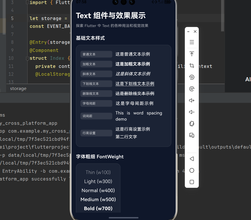
_buildSectionTitle('基础文本样式'),
const SizedBox(height: 12),
_buildCard([
_buildTextRow('普通文本', '这是普通文本示例', const TextStyle(fontSize: 16, color: Colors.white)),
_buildTextRow('加粗文本', '这是加粗文本示例', const TextStyle(fontSize: 16, color: Colors.white, fontWeight: FontWeight.bold)),
_buildTextRow('斜体文本', '这是斜体文本示例', const TextStyle(fontSize: 16, color: Colors.white, fontStyle: FontStyle.italic)),
_buildTextRow('下划线文本', '这是下划线文本示例', const TextStyle(fontSize: 16, color: Colors.white, decoration: TextDecoration.underline)),
_buildTextRow('删除线文本', '这是删除线文本示例', const TextStyle(fontSize: 16, color: Colors.white, decoration: TextDecoration.lineThrough)),
_buildTextRow('字母间距', '这是字母间距示例', const TextStyle(fontSize: 16, color: Colors.white, letterSpacing: 2)),
_buildTextRow('词间距', 'This is word spacing demo', const TextStyle(fontSize: 16, color: Colors.white, wordSpacing: 8)),
_buildTextRow('行高设置', '这是行高设置示例\n第二行文字', const TextStyle(fontSize: 16, color: Colors.white, height: 1.8)),
]),
const SizedBox(height: 24),
// 字体粗细
_buildSectionTitle('字体粗细 FontWeight'),
const SizedBox(height: 12),
_buildCard([
_buildWeightRow('Thin (w100)', FontWeight.w100),
_buildWeightRow('Light (w300)', FontWeight.w300),
_buildWeightRow('Normal (w400)', FontWeight.w400),
_buildWeightRow('Medium (w500)', FontWeight.w500),
_buildWeightRow('Bold (w700)', FontWeight.w700),
_buildWeightRow('Black (w900)', FontWeight.w900),
]),
const SizedBox(height: 24),
// 字号展示
_buildSectionTitle('不同字号展示'),
const SizedBox(height: 12),
_buildCard([
_buildSizeRow('12sp - 最小字体', 12),
_buildSizeRow('14sp - 辅助文本', 14),
_buildSizeRow('16sp - 正文', 16),
_buildSizeRow('18sp - 副标题', 18),
_buildSizeRow('24sp - 标题', 24),
_buildSizeRow('32sp - 大标题', 32),
]),
const SizedBox(height: 24),
// 文本颜色
_buildSectionTitle('文本颜色'),
const SizedBox(height: 12),
_buildCard([
_buildColorRow('默认黑色', Colors.black),
_buildColorRow('白色文本', Colors.white),
_buildColorRow('蓝色文本', Colors.blue),
_buildColorRow('自定义颜色', const Color(0xFF6366F1)),
_buildColorRow('半透明红色', Colors.red.withOpacity(0.5)),
]),
const SizedBox(height: 24),
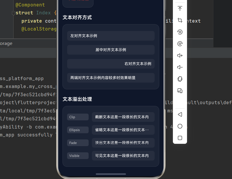
// 文本对齐
_buildSectionTitle('文本对齐方式'),
const SizedBox(height: 12),
_buildCard([
_buildAlignRow('左对齐文本示例', TextAlign.left),
_buildAlignRow('居中对齐文本示例', TextAlign.center),
_buildAlignRow('右对齐文本示例', TextAlign.right),
_buildAlignRow('两端对齐文本示例内容较多时效果明显', TextAlign.justify),
]),
const SizedBox(height: 24),
// 文本溢出处理
_buildSectionTitle('文本溢出处理'),
const SizedBox(height: 12),
_buildCard([
_buildOverflowRow('截断文本这是一段很长的文本内容', TextOverflow.clip, 'Clip'),
_buildOverflowRow('省略文本这是一段很长的文本内容', TextOverflow.ellipsis, 'Ellipsis'),
_buildOverflowRow('淡出文本这是一段很长的文本内容', TextOverflow.fade, 'Fade'),
_buildOverflowRow('可见文本这是一段很长的文本内容', TextOverflow.visible, 'Visible'),
]),
const SizedBox(height: 24),
// 渐变文本
_buildSectionTitle('渐变文本效果'),
const SizedBox(height: 12),
_buildCard([
_buildGradientText('彩虹渐变文本', [
const Color(0xFFFF0000),
const Color(0xFFFF7F00),
const Color(0xFFFFFF00),
const Color(0xFF00FF00),
const Color(0xFF0000FF),
const Color(0xFF4B0082),
const Color(0xFF9400D3),
]),
_buildGradientText('蓝紫渐变文本', [
const Color(0xFF6366F1),
const Color(0xFF8B5CF6),
]),
_buildGradientText('青绿渐变文本', [
const Color(0xFF10B981),
const Color(0xFF06B6D4),
]),
]),
const SizedBox(height: 24),
// 文本阴影
_buildSectionTitle('文本阴影效果'),
const SizedBox(height: 12),
_buildCard([
_buildShadowText('基础阴影', Colors.white, Colors.black.withOpacity(0.5)),
_buildShadowText('蓝色阴影', Colors.white, Colors.blue.withOpacity(0.8)),
_buildGlowText('霓虹发光文本', const Color(0xFF6366F1)),
_buildGlowText('绿色发光文本', const Color(0xFF10B981)),
]),
const SizedBox(height: 24),
// 文本装饰
_buildSectionTitle('文本装饰效果'),
const SizedBox(height: 12),
_buildCard([
_buildDecorationRow('实线下划线', TextDecoration.underline, TextDecorationStyle.solid, Colors.blue),
_buildDecorationRow('双线下划线', TextDecoration.underline, TextDecorationStyle.double, Colors.purple),
_buildDecorationRow('点线下划线', TextDecoration.underline, TextDecorationStyle.dotted, Colors.green),
_buildDecorationRow('虚线下划线', TextDecoration.underline, TextDecorationStyle.dashed, Colors.orange),
_buildDecorationRow('波浪线下划线', TextDecoration.underline, TextDecorationStyle.wavy, Colors.red),
_buildDecorationRow('删除线', TextDecoration.lineThrough, TextDecorationStyle.solid, Colors.grey),
]),
const SizedBox(height: 24),
// 富文本
_buildSectionTitle('富文本混合样式'),
const SizedBox(height: 12),
_buildCard([
_buildRichText(),
_buildRichText2(),
]),
const SizedBox(height: 24),
// 可选择文本
_buildSectionTitle('可选择文本'),
const SizedBox(height: 12),
_buildCard([
SelectableText(
'这段文本可以被选中复制。尝试长按选择这段文字,然后进行复制操作。SelectableText 组件提供了原生的文本选择功能。',
style: const TextStyle(fontSize: 14, color: Colors.white, height: 1.6),
textAlign: TextAlign.justify,
),
]),
const SizedBox(height: 24),
// 文本描边
_buildSectionTitle('文本描边效果'),
const SizedBox(height: 12),
_buildCard([
_buildOutlineText('蓝色描边', Colors.blue),
_buildOutlineText('绿色描边', Colors.green),
_buildOutlineText('红色描边', Colors.red),
]),
const SizedBox(height: 24),
// 文本背景
_buildSectionTitle('文本背景颜色'),
const SizedBox(height: 12),
_buildCard([
_buildBackgroundText('黄色背景', Colors.yellow, Colors.black),
_buildBackgroundText('蓝色背景', Colors.blue.withOpacity(0.3), Colors.white),
_buildBackgroundText('绿色背景', Colors.green.withOpacity(0.3), Colors.white),
]),
const SizedBox(height: 24),
// 文本缩放
_buildSectionTitle('文本缩放 textScaleFactor'),
const SizedBox(height: 12),
_buildCard([
const Text('textScaleFactor: 0.8', style: TextStyle(fontSize: 16), textScaleFactor: 0.8),
const Text('textScaleFactor: 1.0 (默认)', style: TextStyle(fontSize: 16), textScaleFactor: 1.0),
const Text('textScaleFactor: 1.5', style: TextStyle(fontSize: 16), textScaleFactor: 1.5),
const Text('textScaleFactor: 2.0', style: TextStyle(fontSize: 16), textScaleFactor: 2.0),
]),
const SizedBox(height: 80),
],
),
),
),
);
}
static Widget _buildSectionTitle(String title) {
return Text(
title,
style: const TextStyle(
fontSize: 18,
fontWeight: FontWeight.w600,
color: Colors.white,
),
);
}
static Widget _buildCard(List<Widget> children) {
return Container(
decoration: BoxDecoration(
color: Colors.white.withOpacity(0.05),
borderRadius: BorderRadius.circular(16),
border: Border.all(
color: Colors.white.withOpacity(0.1),
width: 1,
),
),
child: Padding(
padding: const EdgeInsets.all(16),
child: Column(
children: children,
),
),
);
}
static Widget _buildTextRow(String label, String example, TextStyle style) {
return Padding(
padding: const EdgeInsets.symmetric(vertical: 6),
child: Row(
children: [
Container(
width: 120,
padding: const EdgeInsets.symmetric(horizontal: 8, vertical: 4),
decoration: BoxDecoration(
color: Colors.white.withOpacity(0.1),
borderRadius: BorderRadius.circular(6),
),
child: Text(
label,
style: const TextStyle(fontSize: 12, color: Colors.white70),
),
),
const SizedBox(width: 12),
Expanded(
child: Text(example, style: style),
),
],
),
);
}
static Widget _buildWeightRow(String text, FontWeight weight) {
return Padding(
padding: const EdgeInsets.symmetric(vertical: 4),
child: Text(
text,
style: TextStyle(
fontSize: 18,
fontWeight: weight,
color: Colors.white,
),
),
);
}
static Widget _buildSizeRow(String text, double fontSize) {
return Padding(
padding: const EdgeInsets.symmetric(vertical: 4),
child: Text(
text,
style: TextStyle(
fontSize: fontSize,
color: Colors.white,
fontWeight: fontSize > 20 ? FontWeight.bold : FontWeight.normal,
),
),
);
}
static Widget _buildColorRow(String text, Color color) {
return Padding(
padding: const EdgeInsets.symmetric(vertical: 4),
child: Text(
text,
style: TextStyle(
fontSize: 16,
color: color,
),
),
);
}
static Widget _buildAlignRow(String text, TextAlign align) {
return Padding(
padding: const EdgeInsets.symmetric(vertical: 8),
child: Container(
width: double.infinity,
padding: const EdgeInsets.symmetric(horizontal: 12, vertical: 8),
decoration: BoxDecoration(
color: Colors.white.withOpacity(0.05),
borderRadius: BorderRadius.circular(8),
),
child: Text(
text,
style: const TextStyle(fontSize: 14, color: Colors.white),
textAlign: align,
),
),
);
}
static Widget _buildOverflowRow(String text, TextOverflow overflow, String label) {
return Padding(
padding: const EdgeInsets.symmetric(vertical: 6),
child: Row(
children: [
Container(
width: 80,
padding: const EdgeInsets.symmetric(horizontal: 8, vertical: 4),
decoration: BoxDecoration(
color: Colors.white.withOpacity(0.1),
borderRadius: BorderRadius.circular(6),
),
child: Text(
label,
style: const TextStyle(fontSize: 12, color: Colors.white70),
),
),
const SizedBox(width: 12),
Expanded(
child: Container(
padding: const EdgeInsets.symmetric(horizontal: 12, vertical: 8),
decoration: BoxDecoration(
color: Colors.white.withOpacity(0.05),
borderRadius: BorderRadius.circular(8),
),
child: Text(
text,
style: const TextStyle(fontSize: 14, color: Colors.white),
maxLines: 1,
overflow: overflow,
),
),
),
],
),
);
}
static Widget _buildGradientText(String text, List<Color> colors) {
return Padding(
padding: const EdgeInsets.symmetric(vertical: 8),
child: ShaderMask(
shaderCallback: (bounds) => LinearGradient(
colors: colors,
begin: Alignment.topLeft,
end: Alignment.bottomRight,
).createShader(bounds),
child: Text(
text,
style: const TextStyle(
fontSize: 20,
fontWeight: FontWeight.bold,
color: Colors.white,
),
),
),
);
}
static Widget _buildShadowText(String text, Color color, Color shadowColor) {
return Padding(
padding: const EdgeInsets.symmetric(vertical: 8),
child: Text(
text,
style: TextStyle(
fontSize: 20,
fontWeight: FontWeight.bold,
color: color,
shadows: [
Shadow(
color: shadowColor,
offset: const Offset(2, 2),
blurRadius: 4,
),
],
),
),
);
}
static Widget _buildGlowText(String text, Color glowColor) {
return Padding(
padding: const EdgeInsets.symmetric(vertical: 8),
child: Text(
text,
style: TextStyle(
fontSize: 20,
fontWeight: FontWeight.bold,
color: Colors.white,
shadows: [
Shadow(
color: glowColor.withOpacity(0.8),
blurRadius: 15,
offset: Offset.zero,
),
Shadow(
color: glowColor.withOpacity(0.4),
blurRadius: 30,
offset: Offset.zero,
),
],
),
),
);
}
static Widget _buildDecorationRow(String text, TextDecoration decoration, TextDecorationStyle style, Color color) {
return Padding(
padding: const EdgeInsets.symmetric(vertical: 6),
child: Row(
children: [
Container(
width: 140,
padding: const EdgeInsets.symmetric(horizontal: 8, vertical: 4),
decoration: BoxDecoration(
color: Colors.white.withOpacity(0.1),
borderRadius: BorderRadius.circular(6),
),
child: Text(
text,
style: const TextStyle(fontSize: 12, color: Colors.white70),
),
),
const SizedBox(width: 12),
Expanded(
child: Text(
'示例文本',
style: TextStyle(
fontSize: 16,
color: Colors.white,
decoration: decoration,
decorationStyle: style,
decorationColor: color,
decorationThickness: 2,
),
),
),
],
),
);
}
static Widget _buildRichText() {
return Padding(
padding: const EdgeInsets.symmetric(vertical: 8),
child: RichText(
text: TextSpan(
style: const TextStyle(fontSize: 16, height: 1.6),
children: [
TextSpan(
text: '这是一段',
style: TextStyle(color: Colors.white.withOpacity(0.7)),
),
TextSpan(
text: '富文本',
style: const TextStyle(
color: Color(0xFF6366F1),
fontWeight: FontWeight.bold,
fontSize: 18,
),
),
TextSpan(
text: '示例,可以混合',
style: TextStyle(color: Colors.white.withOpacity(0.7)),
),
TextSpan(
text: '多种样式',
style: const TextStyle(
color: Color(0xFF10B981),
fontStyle: FontStyle.italic,
),
),
TextSpan(
text: '在同一个文本中。',
style: TextStyle(color: Colors.white.withOpacity(0.7)),
),
],
),
),
);
}
static Widget _buildRichText2() {
return Padding(
padding: const EdgeInsets.symmetric(vertical: 8),
child: RichText(
text: TextSpan(
style: const TextStyle(fontSize: 16, height: 1.6),
children: [
TextSpan(
text: '还可以添加',
style: TextStyle(color: Colors.white.withOpacity(0.7)),
),
TextSpan(
text: '下划线',
style: const TextStyle(
color: Colors.white,
decoration: TextDecoration.underline,
decorationColor: Color(0xFFEC4899),
decorationThickness: 2,
),
),
TextSpan(
text: '和',
style: TextStyle(color: Colors.white.withOpacity(0.7)),
),
TextSpan(
text: '删除线',
style: const TextStyle(
color: Colors.white,
decoration: TextDecoration.lineThrough,
decorationColor: Color(0xFFF59E0B),
decorationThickness: 2,
),
),
TextSpan(
text: '等装饰效果。',
style: TextStyle(color: Colors.white.withOpacity(0.7)),
),
],
),
),
);
}
static Widget _buildOutlineText(String text, Color color) {
return Padding(
padding: const EdgeInsets.symmetric(vertical: 8),
child: Text(
text,
style: TextStyle(
fontSize: 20,
fontWeight: FontWeight.bold,
foreground: Paint()
..style = PaintingStyle.stroke
..strokeWidth = 2
..color = color,
),
),
);
}
static Widget _buildBackgroundText(String text, Color bgColor, Color textColor) {
return Padding(
padding: const EdgeInsets.symmetric(vertical: 6),
child: Text(
text,
style: TextStyle(
fontSize: 16,
backgroundColor: bgColor,
color: textColor,
height: 1.5,
),
),
);
}
}
运行这个应用,你将看到所有 Text 组件效果的完整展示页面。
十六、总结
Text 组件是 Flutter 中最基础且强大的文本显示组件,掌握其各种属性和用法对于构建优秀的用户界面至关重要。
关键属性速查表
| 属性 | 类型 | 说明 |
|---|---|---|
style |
TextStyle? | 文本样式 |
textAlign |
TextAlign? | 文本对齐 |
maxLines |
int? | 最大行数 |
overflow |
TextOverflow? | 溢出处理 |
textDirection |
TextDirection? | 文本方向 |
textScaleFactor |
double? | 文本缩放 |
softWrap |
bool? | 自动换行 |
TextStyle 核心属性
| 属性 | 类型 | 说明 |
|---|---|---|
fontSize |
double? | 字体大小 |
fontWeight |
FontWeight? | 字体粗细 |
color |
Color? | 文本颜色 |
letterSpacing |
double? | 字母间距 |
height |
double? | 行高 |
decoration |
TextDecoration? | 文本装饰 |
shadows |
List<Shadow>? |
文本阴影 |

开源鸿蒙跨平台开发社区汇聚开发者与厂商,共建“一次开发,多端部署”的开源生态,致力于降低跨端开发门槛,推动万物智联创新。
更多推荐
 9
9 0
0- 0


 已为社区贡献55条内容

所有评论(0)