Flutter for OpenHarmony 实战之基础组件:第三十二篇 CircleAvatar 与 Icon — UI 视觉的核心灵魂
Flutter for OpenHarmony 实战:CircleAvatar 与 Icon 组件 本文介绍了 Flutter for OpenHarmony 开发中两个核心视觉组件 CircleAvatar 和 Icon 的实战应用。 CircleAvatar 组件是展示圆形头像的最佳选择,支持网络图片加载、加载失败处理和文字占位功能。文章详细讲解了如何实现带边框的头像和组合式状态头像(如在线状

Flutter for OpenHarmony 实战之基础组件:第三十二篇 CircleAvatar 与 Icon — UI 视觉的核心灵魂
前言
如果说布局是应用的骨架,那么头像(Avatar)和图标(Icon)就是应用的灵魂。头像赋予了应用社交属性和个性化特征,而图标则是跨越语言障碍、引导用户交互的通用导航信号。
在 Flutter for OpenHarmony 开发中,处理好图片的各种形状裁剪、网络加载以及矢量图标的渲染至关重要。本文将详解 CircleAvatar 与 Icon 的实战用法,并探讨如何在鸿蒙系统上构建高性能、响应式的视觉元素。
一、CircleAvatar:不仅是圆形头像
CircleAvatar 是 Flutter 中最常用的圆形容器,专门由于展示用户头像。
1.1 基础实现
const CircleAvatar(
  radius: 30, // 半径
  backgroundImage: NetworkImage('https://example.com/user.jpg'),
  backgroundColor: Colors.blue, // 加载失败或无图时的背景色
  child: Text('OH'), // 图片缺失时的文字占位
)
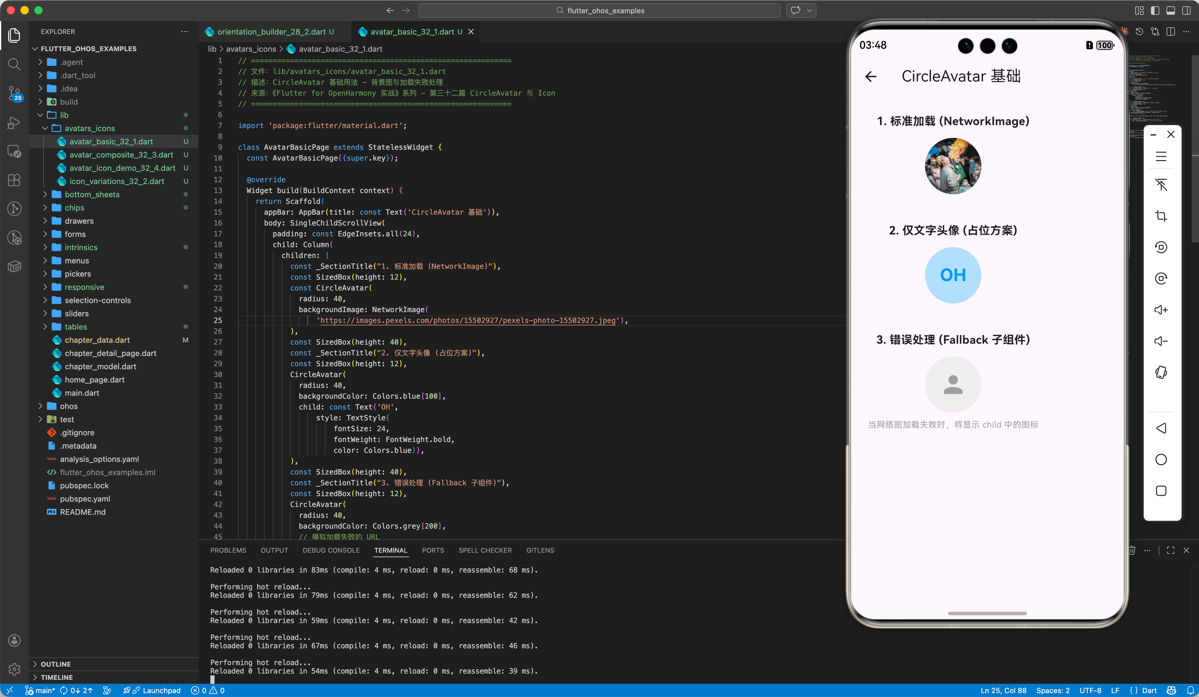
1.2 处理图片加载失败
💡 实战技巧:
为了防止图片加载失败时显示空白,通常会利用 backgroundImage 和 child 的覆盖特性。
CircleAvatar(
  radius: 40,
  backgroundColor: Colors.grey[200],
  backgroundImage: const NetworkImage('https://error_url.jpg'),
  onBackgroundImageError: (exception, stackTrace) {
    // 捕获错误,不影响 UI 渲染
  },
  child: const Icon(Icons.person, size: 40, color: Colors.grey),
)
二、Icon:语义化的交互向导
Icon 组件用于渲染图标字体(Icon Fonts),其优势在于它是矢量的,无论放大多少倍都不会模糊。
2.1 基础与颜色变体
const Icon(
  Icons.favorite,
  color: Colors.redAccent,
  size: 32.0,
  semanticLabel: '收藏', // 增加无障碍描述
)
2.2 变体与样式
在 Material 3 设计中,图标拥有 Filled(实心)、Outlined(空心)、Rounded(圆角)等多种变体。
Row(
  children: [
    Icon(Icons.home),          // 默认
    Icon(Icons.home_outlined), // 轮廓
    Icon(Icons.home_rounded),  // 圆角
  ],
)
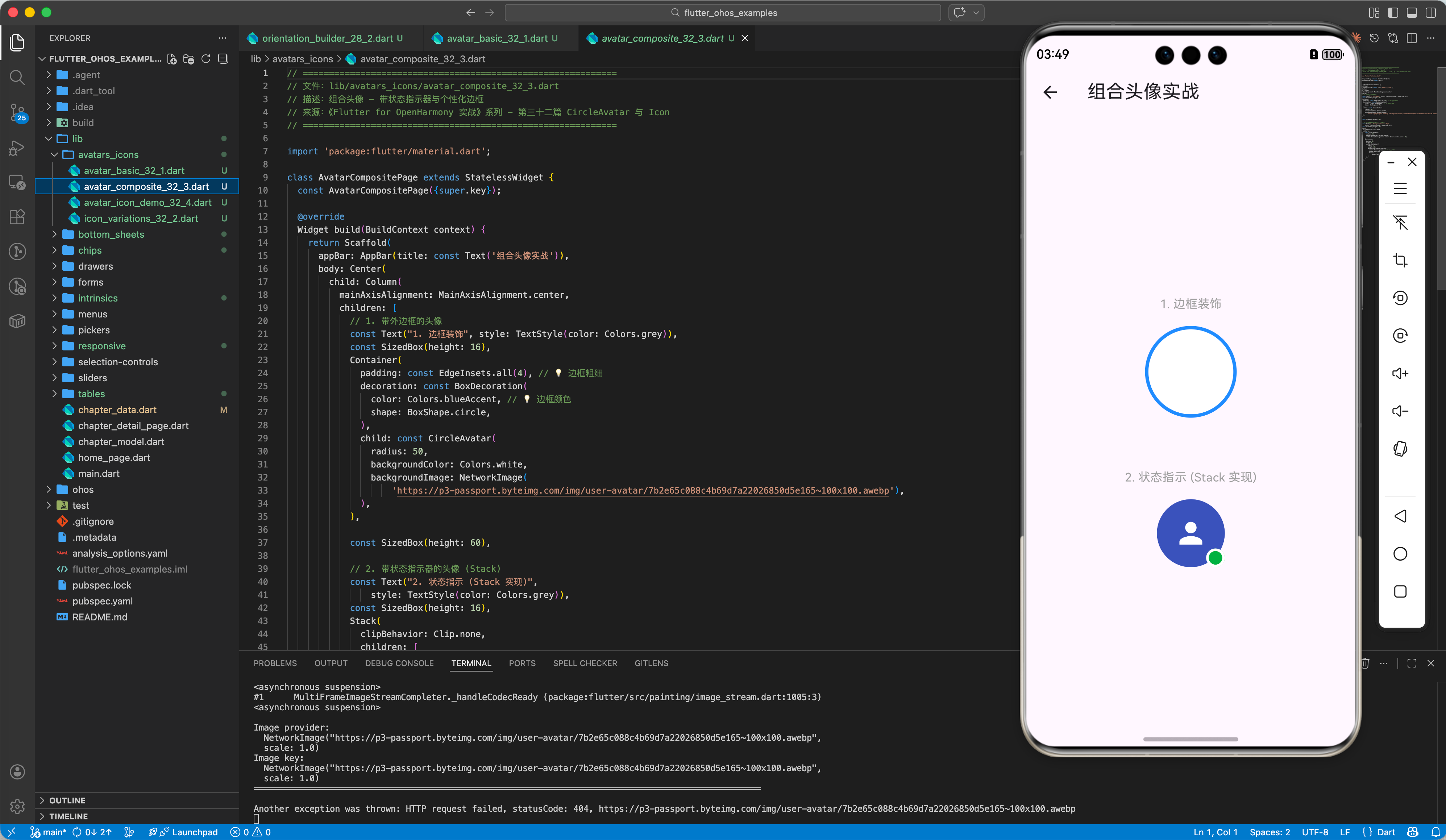
三、进阶:自定义背景与边框头像
在鸿蒙的高级 UI 套件中,我们常看到带外边框的头像或带“在线状态”小圆点的头像。
3.1 带边框的头像
Container(
  padding: const EdgeInsets.all(2), // 边框宽度
  decoration: const BoxDecoration(
    color: Colors.blueAccent, // 边框颜色
    shape: BoxShape.circle,
  ),
  child: const CircleAvatar(
    radius: 38,
    backgroundImage: AssetImage('assets/user_hpro.png'),
  ),
)
3.2 组合式头像(Stack 实现)
Stack(
  children: [
    const CircleAvatar(radius: 30, backgroundImage: AssetImage('assets/avatar.png')),
    Positioned(
      bottom: 0,
      right: 0,
      child: Container(
        width: 16, height: 16,
        decoration: BoxDecoration(
          color: Colors.green, // 在线状态
          shape: BoxShape.circle,
          border: Border.all(color: Colors.white, width: 2),
        ),
      ),
    )
  ],
)
四、OpenHarmony 平台适配建议
4.1 网络图片加载优化
鸿蒙设备对带宽管理较为严格。
✅ 推荐方案:
对于大量的 CircleAvatar 列表,建议配合 cached_network_image 插件使用。它能自动处理本地缓存,避免每次打开应用都重新从网络下载头像。
CachedNetworkImage(
  imageUrl: url,
  imageBuilder: (context, imageProvider) => CircleAvatar(backgroundImage: imageProvider),
  placeholder: (context, url) => const CircularProgressIndicator(),
)
4.2 图标字体的自定义
如果你有设计师专门为鸿蒙系统定制的 .ttf 图标文件。
💡 操作步骤:
- 将字体放入
assets/fonts/目录。 - 在
pubspec.yaml定义新的FontFamily。 - 使用
IconData(0xe900, fontFamily: 'MyOhosIcon')调用。
4.3 高分辨率屏幕适配
鸿蒙设备(如华为 P 系列/Mate 系列)分辨率极高。
⚠️ 注意事项:
- 为
CircleAvatar提供图片资源时,建议包含@2x和@3x变体。 - 矢量图标(Icon)自带适配能力,在鸿蒙超高清屏上依然能保持边缘极其圆润。
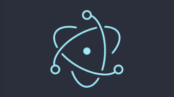
五、完整示例代码
以下提供一个综合的“个人信息卡片”,演示了头像、边框、状态图标及各种 Icon 的用法。
import 'package:flutter/material.dart';
void main() => runApp(const MaterialApp(home: AvatarIconDemo()));
class AvatarIconDemo extends StatelessWidget {
const AvatarIconDemo({super.key});
Widget build(BuildContext context) {
return Scaffold(
appBar: AppBar(title: const Text('OHOS 头像与图标实战'), elevation: 0),
body: Center(
child: Column(
children: [
const SizedBox(height: 40),
// 1. 组合式状态头像
Stack(
clipBehavior: Clip.none,
children: [
_buildBorderAvatar(Colors.orange[300]!, 50),
Positioned(
bottom: 2,
right: 2,
child: _buildStatusIndicator(Colors.green),
),
],
),
const SizedBox(height: 24),
const Text("HUAWEI Developer", style: TextStyle(fontSize: 20, fontWeight: FontWeight.bold)),
const Text("鸿蒙跨平台生态共建者", style: TextStyle(color: Colors.grey)),
const SizedBox(height: 40),
// 2. 功能按钮区 (Icon 组)
_buildActionGrid(),
],
),
),
);
}
Widget _buildBorderAvatar(Color color, double radius) {
return Container(
padding: const EdgeInsets.all(3),
decoration: BoxDecoration(color: color, shape: BoxShape.circle),
child: CircleAvatar(
radius: radius,
backgroundColor: Colors.white,
child: const Icon(Icons.person, size: 60, color: Colors.blueGrey),
),
);
}
Widget _buildStatusIndicator(Color color) {
return Container(
width: 20, height: 20,
decoration: BoxDecoration(
color: color,
shape: BoxShape.circle,
border: Border.all(color: Colors.white, width: 3),
),
);
}
Widget _buildActionGrid() {
return Row(
mainAxisAlignment: MainAxisAlignment.center,
children: [
_iconBtn(Icons.message_outlined, "私信"),
_iconBtn(Icons.star_border_rounded, "收藏"),
_iconBtn(Icons.share_location, "位置"),
],
);
}
Widget _iconBtn(IconData icon, String label) {
return Padding(
padding: const EdgeInsets.symmetric(horizontal: 20),
child: Column(
children: [
Icon(icon, size: 28, color: Colors.blue[800]),
const SizedBox(height: 8),
Text(label, style: const TextStyle(fontSize: 12)),
],
),
);
}
}
六、总结
在 Flutter for OpenHarmony 的视觉设计中,CircleAvatar 与 Icon 虽小,但承载了大量的语义信息。
- CircleAvatar:核心是处理好图片缺失的占位(Fallback)逻辑。
- Icon:核心是利用好矢量特性和 Material 3 的变体库。
- 用户体验:在鸿蒙端,通过
Stack实现的复合头像和通过cached_network_image优化的性能,能显著提升应用的“高级感”。
📦 完整代码已上传至 AtomGit:flutter_ohos_examples
🌐 欢迎加入开源鸿蒙跨平台社区:开源鸿蒙跨平台开发者社区

开源鸿蒙跨平台开发社区汇聚开发者与厂商,共建“一次开发,多端部署”的开源生态,致力于降低跨端开发门槛,推动万物智联创新。
更多推荐


 13
13 0
0- 0


 已为社区贡献34条内容

所有评论(0)