Flutter for OpenHarmony数独游戏App实战:新游戏对话框
本文介绍了数独游戏新游戏对话框的设计与实现。通过分析用户需求,设计了包含四个难度级别(简单、中等、困难、专家)的可视化选择界面。每个选项采用卡片式布局,包含首字母图标、难度名称和详细说明(如初始数字数量),并使用不同颜色区分。对话框采用圆角设计,提供取消按钮,支持快速选择和开始游戏。这种实现方式既美观又实用,帮助玩家直观理解难度差异并做出合适选择。
新游戏对话框是数独游戏的重要入口。当玩家想要开始新游戏时,需要选择难度级别。一个好的新游戏对话框应该清晰地展示各难度的特点,让玩家做出合适的选择。今天我们来详细实现数独游戏的新游戏对话框。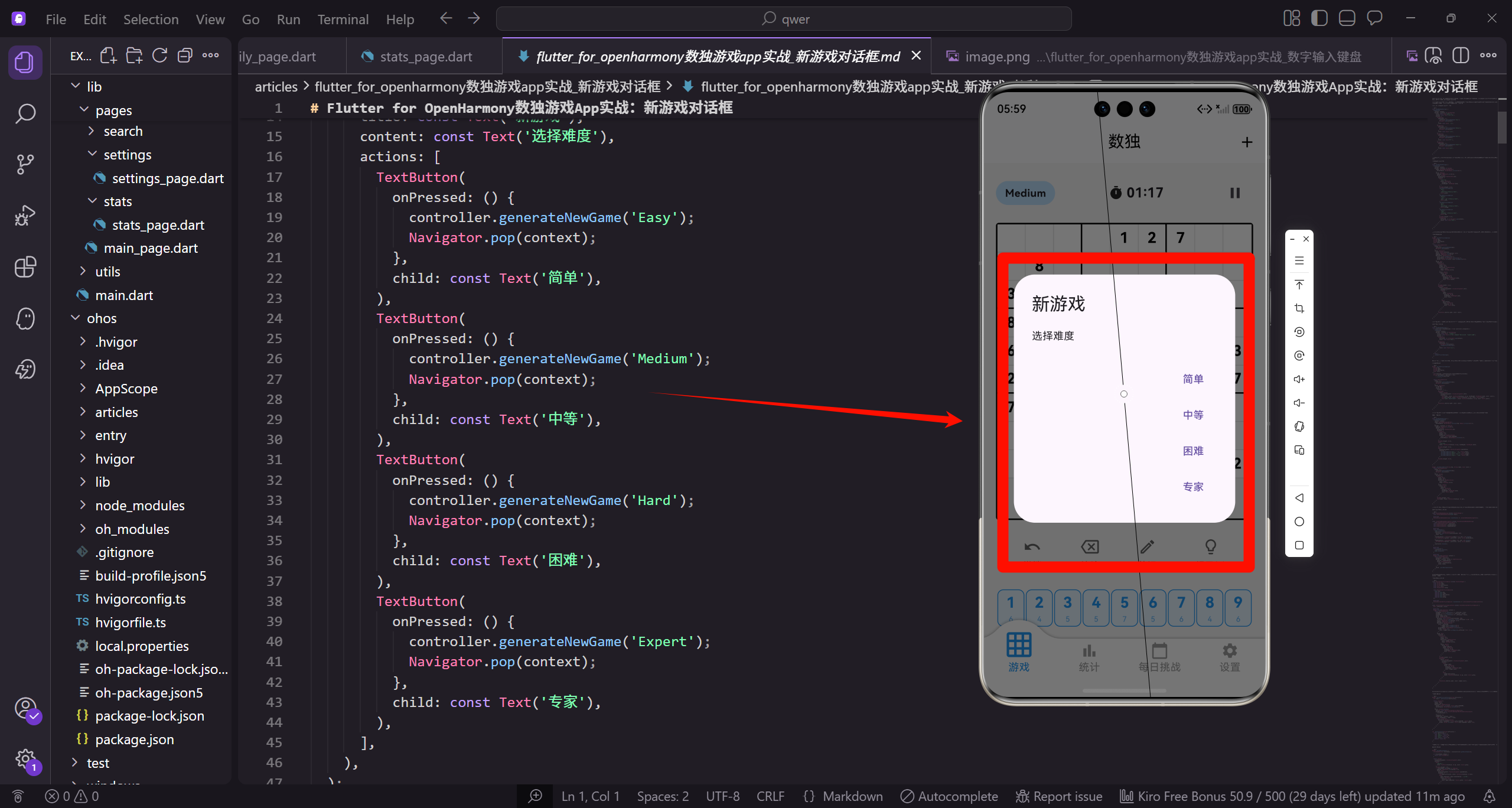
设计考虑
在设计新游戏对话框之前,我们需要考虑几个关键问题:难度选项的展示(需要清晰地说明各难度的区别)、确认机制(如果当前有进行中的游戏,应该提示玩家)、快速开始(让玩家能够快速选择并开始游戏)。
基本的新游戏对话框
void _showNewGameDialog() {
  showDialog(
    context: context,
    builder: (context) => AlertDialog(
      title: const Text('新游戏'),
      content: const Text('选择难度'),
      actions: [
        TextButton(
          onPressed: () {
            controller.generateNewGame('Easy');
            Navigator.pop(context);
          },
          child: const Text('简单'),
        ),
基本的对话框使用AlertDialog,提供难度选项。每个按钮点击后调用generateNewGame生成对应难度的谜题,然后关闭对话框。这种实现简单直接,但缺少难度说明。
更多难度选项
        TextButton(
          onPressed: () {
            controller.generateNewGame('Medium');
            Navigator.pop(context);
          },
          child: const Text('中等'),
        ),
        TextButton(
          onPressed: () {
            controller.generateNewGame('Hard');
            Navigator.pop(context);
          },
          child: const Text('困难'),
        ),
        TextButton(
          onPressed: () {
            controller.generateNewGame('Expert');
            Navigator.pop(context);
          },
          child: const Text('专家'),
        ),
      ],
    ),
  );
}
提供四个难度级别:简单、中等、困难、专家。每个按钮的处理逻辑相同,只是传递不同的难度参数。Navigator.pop关闭对话框后游戏立即开始。
增强的对话框结构
void _showNewGameDialog() {
  showDialog(
    context: context,
    builder: (context) => Dialog(
      shape: RoundedRectangleBorder(
        borderRadius: BorderRadius.circular(16.r),
      ),
      child: Padding(
        padding: EdgeInsets.all(20.w),
        child: Column(
          mainAxisSize: MainAxisSize.min,
          children: [
            Text(
              '选择难度',
              style: TextStyle(
                fontSize: 20.sp,
                fontWeight: FontWeight.bold,
              ),
            ),
            SizedBox(height: 20.h),
使用自定义Dialog替代AlertDialog,可以更灵活地控制布局。圆角边框让对话框更加美观,mainAxisSize.min让对话框高度自适应内容。
难度选项列表
            _buildDifficultyOption(
              'Easy',
              '简单',
              '适合初学者,约43个初始数字',
              Colors.green,
            ),
            _buildDifficultyOption(
              'Medium',
              '中等',
              '需要一些技巧,约33个初始数字',
              Colors.blue,
            ),
            _buildDifficultyOption(
              'Hard',
              '困难',
              '需要高级技巧,约28个初始数字',
              Colors.orange,
            ),
            _buildDifficultyOption(
              'Expert',
              '专家',
              '极具挑战性,约23个初始数字',
              Colors.red,
            ),
            SizedBox(height: 12.h),
            TextButton(
              onPressed: () => Navigator.pop(context),
              child: const Text('取消'),
            ),
          ],
        ),
      ),
    ),
  );
}
每个难度选项包含名称、描述和代表颜色。描述文字说明了初始数字的数量,帮助玩家理解难度差异。取消按钮让玩家可以关闭对话框而不开始新游戏。
构建难度选项卡片
Widget _buildDifficultyOption(
  String key,
  String label,
  String description,
  Color color,
) {
  return GestureDetector(
    onTap: () {
      controller.generateNewGame(key);
      Navigator.pop(context);
    },
    child: Container(
      width: double.infinity,
      margin: EdgeInsets.only(bottom: 12.h),
      padding: EdgeInsets.all(16.w),
      decoration: BoxDecoration(
        color: color.withOpacity(0.1),
        borderRadius: BorderRadius.circular(12.r),
        border: Border.all(color: color.withOpacity(0.3)),
      ),
每个难度选项是一个可点击的卡片。GestureDetector处理点击事件,Container定义卡片样式。使用难度对应的颜色作为背景和边框,透明度较低保持柔和。
难度选项内容布局
      child: Row(
        children: [
          Container(
            width: 40.w,
            height: 40.h,
            decoration: BoxDecoration(
              color: color,
              shape: BoxShape.circle,
            ),
            child: Center(
              child: Text(
                label[0],
                style: TextStyle(
                  fontSize: 18.sp,
                  fontWeight: FontWeight.bold,
                  color: Colors.white,
                ),
              ),
            ),
          ),
          SizedBox(width: 12.w),
左侧是圆形图标,显示难度名称的首字母。使用难度对应的颜色作为背景,白色文字。这种设计让每个选项都有独特的视觉标识。
难度名称和描述
          Expanded(
            child: Column(
              crossAxisAlignment: CrossAxisAlignment.start,
              children: [
                Text(
                  label,
                  style: TextStyle(
                    fontSize: 16.sp,
                    fontWeight: FontWeight.bold,
                    color: color,
                  ),
                ),
                Text(
                  description,
                  style: TextStyle(
                    fontSize: 12.sp,
                    color: Colors.grey,
                  ),
                ),
              ],
            ),
          ),
          Icon(Icons.chevron_right, color: color),
        ],
      ),
    ),
  );
}
中间是难度名称和描述,名称使用难度颜色加粗显示。右侧箭头图标表示可点击。Expanded让文字区域占据剩余空间,避免溢出。
确认放弃当前游戏
void _showNewGameDialog() {
  if (controller.elapsedSeconds > 0 && !controller.isComplete) {
    showDialog(
      context: context,
      builder: (context) => AlertDialog(
        title: const Text('开始新游戏'),
        content: const Text('当前游戏进度将会丢失,确定要开始新游戏吗?'),
        actions: [
          TextButton(
            onPressed: () => Navigator.pop(context),
            child: const Text('取消'),
          ),
          TextButton(
            onPressed: () {
              Navigator.pop(context);
              _showDifficultyDialog();
            },
            child: const Text('确定'),
          ),
        ],
      ),
    );
  } else {
    _showDifficultyDialog();
  }
}
如果当前有进行中的游戏(用时大于0且未完成),先显示确认对话框。这防止玩家误操作丢失游戏进度。确认后再显示难度选择对话框。
显示最佳记录
Widget _buildDifficultyOption(
  String key,
  String label,
  String description,
  Color color,
) {
  int? bestTime = statsController.bestTimeByDifficulty[key];
  String bestTimeStr = bestTime != null
      ? _formatTime(bestTime)
      : '--:--';

  return GestureDetector(
    onTap: () {
      controller.generateNewGame(key);
      Navigator.pop(context);
    },
在每个难度选项中显示该难度的最佳记录。从statsController获取最佳时间,如果没有记录显示"–:–"。这可以激励玩家挑战自己的记录。
显示最佳记录文字
    child: Container(
      child: Row(
        children: [
          // 图标...
          Expanded(
            child: Column(
              crossAxisAlignment: CrossAxisAlignment.start,
              children: [
                Text(label, style: TextStyle(fontSize: 16.sp, fontWeight: FontWeight.bold, color: color)),
                Text(description, style: TextStyle(fontSize: 12.sp, color: Colors.grey)),
                Text('最佳: $bestTimeStr', style: TextStyle(fontSize: 12.sp, color: Colors.grey)),
              ],
            ),
          ),
          Icon(Icons.chevron_right, color: color),
        ],
      ),
    ),
  );
}
在描述下方添加最佳记录显示。使用灰色小字体,与描述文字风格一致。这帮助玩家选择合适的难度,也提供了挑战目标。
底部弹出面板样式
void _showNewGameDialog() {
  showModalBottomSheet(
    context: context,
    shape: RoundedRectangleBorder(
      borderRadius: BorderRadius.vertical(top: Radius.circular(16.r)),
    ),
    builder: (context) => Padding(
      padding: EdgeInsets.all(20.w),
      child: Column(
        mainAxisSize: MainAxisSize.min,
        children: [
          Container(
            width: 40.w,
            height: 4.h,
            decoration: BoxDecoration(
              color: Colors.grey.shade300,
              borderRadius: BorderRadius.circular(2.r),
            ),
          ),
          SizedBox(height: 20.h),
使用底部弹出面板替代对话框,提供更快捷的选择方式。顶部的拖动条表示可以下滑关闭。圆角只在顶部,符合底部弹出的视觉习惯。
快速选择布局
          Text(
            '选择难度',
            style: TextStyle(fontSize: 20.sp, fontWeight: FontWeight.bold),
          ),
          SizedBox(height: 20.h),
          Row(
            mainAxisAlignment: MainAxisAlignment.spaceEvenly,
            children: [
              _buildQuickOption('Easy', '简单', Colors.green),
              _buildQuickOption('Medium', '中等', Colors.blue),
              _buildQuickOption('Hard', '困难', Colors.orange),
              _buildQuickOption('Expert', '专家', Colors.red),
            ],
          ),
          SizedBox(height: 20.h),
        ],
      ),
    ),
  );
}
四个难度选项水平排列,玩家可以快速点击开始游戏。spaceEvenly让选项均匀分布。这种紧凑的布局适合快速选择场景。
快速选项组件
Widget _buildQuickOption(String key, String label, Color color) {
  return GestureDetector(
    onTap: () {
      controller.generateNewGame(key);
      Navigator.pop(context);
    },
    child: Column(
      children: [
        Container(
          width: 60.w,
          height: 60.h,
          decoration: BoxDecoration(
            color: color,
            shape: BoxShape.circle,
          ),
          child: Center(
            child: Text(
              label[0],
              style: TextStyle(
                fontSize: 24.sp,
                fontWeight: FontWeight.bold,
                color: Colors.white,
              ),
            ),
          ),
        ),
        SizedBox(height: 8.h),
        Text(label, style: TextStyle(fontSize: 14.sp)),
      ],
    ),
  );
}
快速选项使用大圆形按钮,显示难度首字母。下方是难度名称。这种设计简洁直观,适合快速操作。圆形按钮的点击区域足够大,易于触摸。
动画对话框组件
class AnimatedNewGameDialog extends StatefulWidget {
const AnimatedNewGameDialog({super.key});
State<AnimatedNewGameDialog> createState() => _AnimatedNewGameDialogState();
}
class _AnimatedNewGameDialogState extends State<AnimatedNewGameDialog>
with SingleTickerProviderStateMixin {
late AnimationController _controller;
late Animation<double> _scaleAnimation;
late Animation<double> _fadeAnimation;
AnimatedNewGameDialog使用组合动画让对话框出现更加生动。需要AnimationController控制动画,两个Animation分别控制缩放和淡入效果。
动画初始化
void initState() {
super.initState();
_controller = AnimationController(
duration: const Duration(milliseconds: 300),
vsync: this,
);
_scaleAnimation = Tween<double>(begin: 0.8, end: 1.0).animate(
CurvedAnimation(parent: _controller, curve: Curves.easeOutBack),
);
_fadeAnimation = Tween<double>(begin: 0.0, end: 1.0).animate(
CurvedAnimation(parent: _controller, curve: Curves.easeIn),
);
_controller.forward();
}
动画时长300毫秒。缩放动画使用easeOutBack曲线产生轻微的弹跳效果,从0.8放大到1.0。淡入动画从完全透明到完全不透明。initState中启动动画。
构建动画对话框
void dispose() {
_controller.dispose();
super.dispose();
}
Widget build(BuildContext context) {
return AnimatedBuilder(
animation: _controller,
builder: (context, child) => FadeTransition(
opacity: _fadeAnimation,
child: ScaleTransition(
scale: _scaleAnimation,
child: child,
),
),
child: _buildDialogContent(),
);
}
}
FadeTransition和ScaleTransition组合产生淡入缩放效果。dispose中释放AnimationController避免内存泄漏。_buildDialogContent构建对话框的实际内容。
带按压效果的难度选项
class HoverableDifficultyOption extends StatefulWidget {
final String difficultyKey;
final String label;
final String description;
final Color color;
final VoidCallback onTap;
const HoverableDifficultyOption({
super.key,
required this.difficultyKey,
required this.label,
required this.description,
required this.color,
required this.onTap,
});
State<HoverableDifficultyOption> createState() => _HoverableDifficultyOptionState();
}
HoverableDifficultyOption在按下时有缩放和颜色变化效果。使用StatefulWidget管理按压状态。参数包括难度信息和点击回调。
按压状态管理
class _HoverableDifficultyOptionState extends State<HoverableDifficultyOption> {
bool _isPressed = false;
Widget build(BuildContext context) {
return GestureDetector(
onTapDown: (_) => setState(() => _isPressed = true),
onTapUp: (_) => setState(() => _isPressed = false),
onTapCancel: () => setState(() => _isPressed = false),
onTap: widget.onTap,
_isPressed记录当前是否被按下。onTapDown按下时设为true,onTapUp和onTapCancel时设为false。这三个回调组合实现完整的按压状态跟踪。
按压效果样式
      child: AnimatedContainer(
        duration: const Duration(milliseconds: 100),
        transform: Matrix4.identity()..scale(_isPressed ? 0.98 : 1.0),
        margin: EdgeInsets.only(bottom: 12.h),
        padding: EdgeInsets.all(16.w),
        decoration: BoxDecoration(
          color: _isPressed
              ? widget.color.withOpacity(0.2)
              : widget.color.withOpacity(0.1),
          borderRadius: BorderRadius.circular(12.r),
          border: Border.all(
            color: widget.color.withOpacity(_isPressed ? 0.5 : 0.3),
          ),
        ),
        child: _buildContent(),
      ),
    );
  }
}
AnimatedContainer让过渡平滑自然。按下时缩放到0.98,背景色和边框颜色加深。100毫秒的动画时长让反馈即时但不突兀。这种触觉反馈让用户知道自己的点击被识别了。
继续上次游戏选项
Widget _buildContinueOption() {
  if (!controller.hasSavedGame) {
    return const SizedBox();
  }

  return GestureDetector(
    onTap: () {
      controller.loadSavedGame();
      Navigator.pop(context);
    },
    child: Container(
      width: double.infinity,
      margin: EdgeInsets.only(bottom: 16.h),
      padding: EdgeInsets.all(16.w),
      decoration: BoxDecoration(
        color: Colors.blue.shade50,
        borderRadius: BorderRadius.circular(12.r),
        border: Border.all(color: Colors.blue.shade200),
      ),
如果有保存的游戏进度,显示继续选项。hasSavedGame检查是否有存档。点击后加载存档并关闭对话框。蓝色调与新游戏选项区分。
继续选项内容
      child: Row(
        children: [
          Icon(Icons.play_circle_outline, color: Colors.blue, size: 32.sp),
          SizedBox(width: 12.w),
          Expanded(
            child: Column(
              crossAxisAlignment: CrossAxisAlignment.start,
              children: [
                Text(
                  '继续上次游戏',
                  style: TextStyle(
                    fontSize: 16.sp,
                    fontWeight: FontWeight.bold,
                    color: Colors.blue,
                  ),
                ),
                Text(
                  '${controller.savedGameDifficulty} · ${controller.savedGameTime}',
                  style: TextStyle(fontSize: 12.sp, color: Colors.grey),
                ),
              ],
            ),
          ),
          Icon(Icons.chevron_right, color: Colors.blue),
        ],
      ),
    ),
  );
}
播放图标表示继续游戏。显示保存游戏的难度和用时帮助玩家回忆。这让玩家可以快速恢复之前的游戏,不需要重新开始。
随机难度选项
Widget _buildRandomOption() {
  return GestureDetector(
    onTap: () {
      List<String> difficulties = ['Easy', 'Medium', 'Hard', 'Expert'];
      String randomDifficulty = difficulties[Random().nextInt(4)];
      controller.generateNewGame(randomDifficulty);
      Navigator.pop(context);
    },
    child: Container(
      width: double.infinity,
      margin: EdgeInsets.only(bottom: 16.h),
      padding: EdgeInsets.all(16.w),
      decoration: BoxDecoration(
        gradient: LinearGradient(
          colors: [Colors.purple.shade100, Colors.blue.shade100],
        ),
        borderRadius: BorderRadius.circular(12.r),
      ),
随机难度选项让玩家可以体验不同难度的挑战。Random().nextInt(4)随机选择一个难度。渐变背景让这个选项更加突出。
随机选项内容
      child: Row(
        mainAxisAlignment: MainAxisAlignment.center,
        children: [
          Icon(Icons.shuffle, color: Colors.purple),
          SizedBox(width: 8.w),
          Text(
            '随机难度',
            style: TextStyle(
              fontSize: 16.sp,
              fontWeight: FontWeight.bold,
              color: Colors.purple,
            ),
          ),
        ],
      ),
    ),
  );
}
洗牌图标表示随机。内容居中显示,与其他选项的左对齐布局不同,突出其特殊性。这是一个有趣的功能,增加游戏的随机性和趣味性。
总结
新游戏对话框的关键设计要点:清晰的难度说明(帮助玩家理解各难度的区别)、确认机制(防止误操作丢失进度)、最佳记录显示(激励玩家挑战自己)、继续游戏选项(让玩家可以恢复之前的进度)、动画效果(让对话框出现更加生动)、快速开始(让玩家能够快速选择并开始游戏)。
新游戏对话框是游戏的重要入口,良好的设计可以让玩家快速开始游戏,同时做出合适的难度选择。
欢迎加入开源鸿蒙跨平台社区:https://openharmonycrossplatform.csdn.net

开源鸿蒙跨平台开发社区汇聚开发者与厂商,共建“一次开发,多端部署”的开源生态,致力于降低跨端开发门槛,推动万物智联创新。
更多推荐

 3
3 0
0- 0


 已为社区贡献32条内容

所有评论(0)