Flutter for OpenHarmony垃圾分类指南App实战:设置实现
本文介绍了在Flutter for OpenHarmony环境下实现设置页面的关键技术。主要采用ListView构建滚动布局,使用SwitchListTile实现带开关的设置项(如深色模式、消息通知),通过ListTile展示普通设置项。重点讲解了分组组件设计、响应式状态管理(Obx)、AlertDialog确认弹窗以及本地数据存储(GetStorage)的实现方法。文中还提供了清除缓存和搜索历史
前言
设置页面是App的"控制中心",用户可以在这里调整各种偏好。虽然功能不复杂,但做好了能让用户感觉App很贴心。本文将详细介绍如何在Flutter for OpenHarmony环境下实现一个完整的设置页面。
一个好的设置页面应该让用户能够轻松找到需要调整的选项,同时保持界面简洁清晰。设置页面是用户个性化体验的重要入口,通过合理的功能分组和清晰的界面设计,可以显著提升用户满意度。
从用户体验角度看,设置页面的设计要遵循几个原则:功能分类清晰、操作反馈及时、危险操作有确认、状态持久化可靠。用户打开设置页面通常是带着明确目的的,比如关闭通知、清除缓存、切换主题等,如果能让用户快速找到目标选项并完成操作,就是成功的设计。
设置页面也是展示应用专业度的地方。细节决定成败,比如开关的动画是否流畅、确认对话框的文案是否友好、操作后的反馈是否及时,这些看似微小的细节会影响用户对整个应用的印象。
技术要点概览
本页面涉及的核心技术点包括以下几个方面:
- ListView:设置项列表的滚动布局
- SwitchListTile:带开关的设置项组件
- ListTile:普通设置项的展示组件
- AlertDialog:确认操作的弹窗组件
- GetStorage:设置状态的本地持久化存储
页面结构
设置页面按功能分组,每组有个标题,下面是具体的设置项:
class SettingsPage extends StatelessWidget {
const SettingsPage({super.key});
Widget build(BuildContext context) {
final controller = Get.find<ProfileController>();
return Scaffold(
appBar: AppBar(
title: const Text('设置'),
elevation: 0,
),
backgroundColor: Colors.grey.shade50,
body: ListView(
children: [
SizedBox(height: 8.h),
// 通用设置
_buildSection('通用设置', [
_buildDarkModeSwitch(controller),
_buildNotificationSwitch(controller),
_buildLanguageItem(),
]),
SizedBox(height: 16.h),
// 数据管理
_buildSection('数据管理', [
_buildClearCacheItem(context),
_buildClearHistoryItem(context, controller),
_buildExportDataItem(),
]),
SizedBox(height: 16.h),
// 其他
_buildSection('其他', [
_buildCheckUpdateItem(),
_buildPrivacyItem(),
_buildAboutItem(),
_buildFeedbackItem(),
]),
SizedBox(height: 16.h),
// 版本信息
_buildVersionInfo(),
SizedBox(height: 32.h),
],
),
);
}
用ListView作为容器,内容多的时候可以滚动。这是设置页面的标准布局方式,因为设置项可能会很多,需要支持滚动查看。backgroundColor设置为浅灰色,让白色的设置项卡片有更好的视觉层次。
AppBar的elevation设置为0去掉阴影,配合浅灰色背景,整体视觉更加统一。这种扁平化设计符合现代应用的审美趋势。SizedBox用于在各个分组之间添加间距,让页面布局更加舒展,不会显得拥挤。
ListView的children包含多个分组,每个分组都是独立的模块。这种模块化的设计让代码结构清晰,便于维护和扩展。如果将来需要添加新的设置项,只需要在对应的分组中添加即可,不会影响其他部分。
分组组件
分组组件负责渲染标题和内容:
Widget _buildSection(String title, List<Widget> children) {
  return Column(
    crossAxisAlignment: CrossAxisAlignment.start,
    children: [
      // 分组标题
      Padding(
        padding: EdgeInsets.fromLTRB(16.w, 16.h, 16.w, 8.h),
        child: Text(
          title,
          style: TextStyle(
            fontSize: 14.sp,
            color: Colors.grey.shade600,
            fontWeight: FontWeight.w500,
            letterSpacing: 0.5,
          ),
        ),
      ),
      // 设置项容器
      Container(
        decoration: BoxDecoration(
          color: Colors.white,
          border: Border(
            top: BorderSide(color: Colors.grey.shade200, width: 0.5),
            bottom: BorderSide(color: Colors.grey.shade200, width: 0.5),
          ),
        ),
        child: Column(
          children: children.asMap().entries.map((entry) {
            final index = entry.key;
            final child = entry.value;
            return Column(
              children: [
                child,
                if (index < children.length - 1)
                  Divider(
                    height: 1,
                    indent: 56.w,
                    color: Colors.grey.shade200,
                  ),
              ],
            );
          }).toList(),
        ),
      ),
    ],
  );
}
标题用灰色小字,和iOS的设置页面风格类似。letterSpacing添加字间距,让标题看起来更加舒展。内容区域用白色背景,和页面的灰色背景形成对比,让设置项更加突出。
Container的decoration添加了上下边框,让设置项组有明确的边界。内部的设置项之间使用Divider分隔,但最后一项不添加分隔线,这是iOS设置页面的经典设计。indent: 56.w让分隔线从图标右侧开始,而不是从屏幕边缘开始,视觉上更加精致。
asMap().entries的使用让我们可以同时获取索引和元素,这样就能判断是否是最后一项,从而决定是否添加分隔线。这种细节处理让界面看起来更加专业。
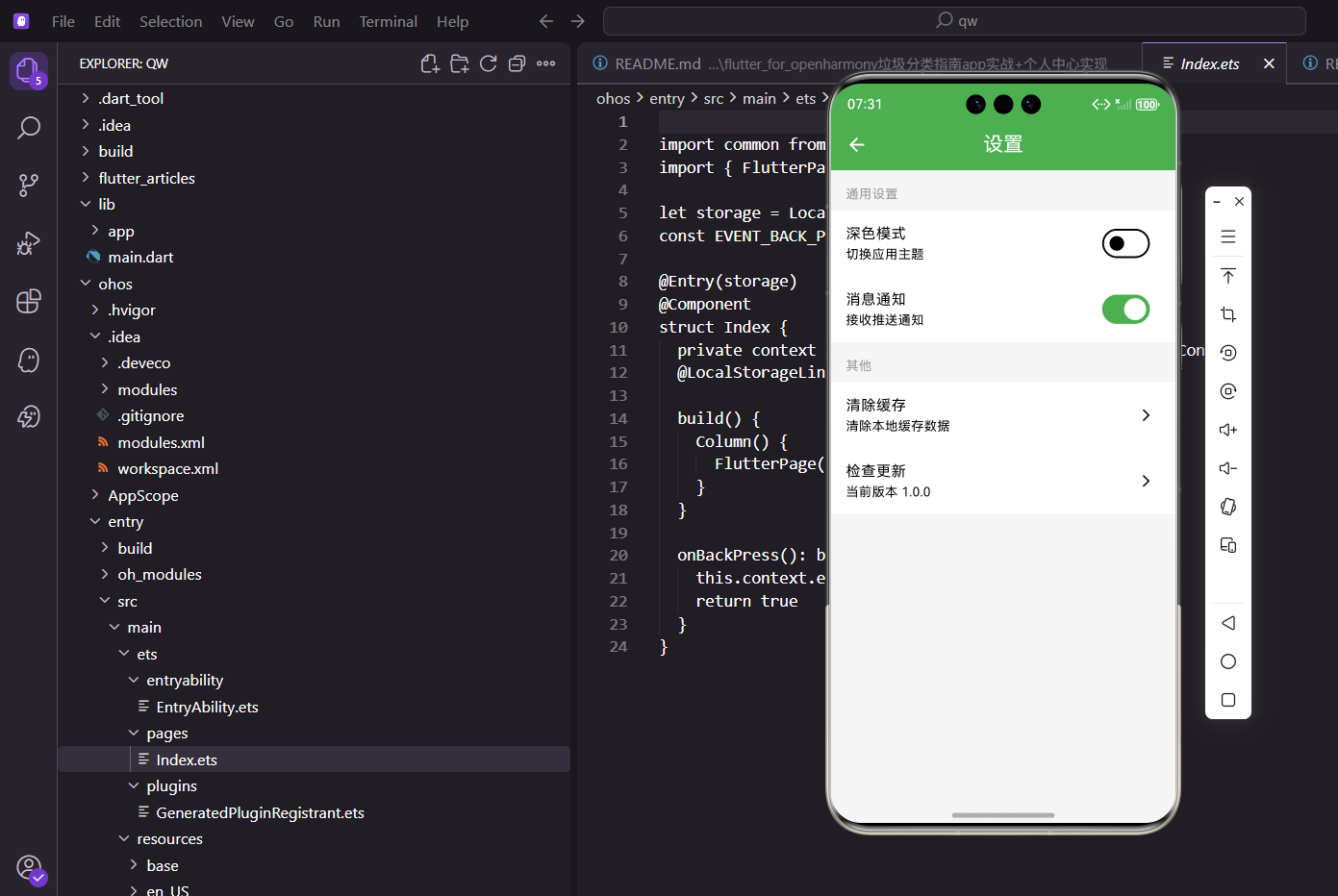
深色模式开关
深色模式是现代应用的标配功能,可以减少眼睛疲劳,节省电量:
Widget _buildDarkModeSwitch(ProfileController controller) {
  return Obx(() => SwitchListTile(
    title: const Text('深色模式'),
    subtitle: const Text('切换应用主题颜色'),
    secondary: Container(
      width: 40.w,
      height: 40.w,
      decoration: BoxDecoration(
        color: Colors.indigo.withOpacity(0.1),
        borderRadius: BorderRadius.circular(8.r),
      ),
      child: Icon(Icons.dark_mode, color: Colors.indigo, size: 20.sp),
    ),
    value: controller.isDarkMode.value,
    activeColor: AppTheme.primaryColor,
    onChanged: (value) => controller.toggleDarkMode(),
  ));
}
SwitchListTile是Flutter提供的带开关的列表项组件,自带标题、副标题和开关,用起来很方便。它内部已经处理好了点击区域、动画效果等细节,开发者只需要关注业务逻辑即可。
用Obx包裹SwitchListTile,这样开关状态变化时UI会自动更新。GetX的响应式编程让状态管理变得非常简单,不需要手动调用setState。onChanged回调里调用控制器的方法来切换状态,控制器会同时更新UI和持久化存储。
secondary参数用于显示左侧的图标。这里使用了一个带背景色的容器包裹图标,让图标更加醒目。背景色使用indigo的浅色版本,与图标颜色呼应。圆角8.r让容器看起来柔和,不会太生硬。
subtitle提供了额外的说明文字,让用户更清楚这个开关的作用。activeColor设置开关打开时的颜色,使用应用的主题色保持视觉统一。
消息通知开关
消息通知开关让用户可以控制是否接收推送通知:
Widget _buildNotificationSwitch(ProfileController controller) {
  return Obx(() => SwitchListTile(
    title: const Text('消息通知'),
    subtitle: Text(
      controller.notificationEnabled.value ? '已开启推送通知' : '已关闭推送通知',
      style: TextStyle(
        color: controller.notificationEnabled.value
            ? Colors.green.shade600
            : Colors.grey.shade600,
        fontSize: 13.sp,
      ),
    ),
    secondary: Container(
      width: 40.w,
      height: 40.w,
      decoration: BoxDecoration(
        color: Colors.orange.withOpacity(0.1),
        borderRadius: BorderRadius.circular(8.r),
      ),
      child: Icon(Icons.notifications, color: Colors.orange, size: 20.sp),
    ),
    value: controller.notificationEnabled.value,
    activeColor: AppTheme.primaryColor,
    onChanged: (value) async {
      // 如果是开启通知,需要请求权限
      if (value) {
        final granted = await _requestNotificationPermission();
        if (granted) {
          controller.toggleNotification();
        } else {
          Get.snackbar('提示', '请在系统设置中开启通知权限');
        }
      } else {
        controller.toggleNotification();
      }
    },
  ));
}

Future<bool> _requestNotificationPermission() async {
  // 请求通知权限的逻辑
  // 实际项目中需要使用权限插件
  return true;
}
subtitle根据开关状态动态显示不同的文字和颜色,让用户清楚当前的状态。开启时显示绿色文字"已开启推送通知",关闭时显示灰色文字"已关闭推送通知"。这种即时反馈让用户对操作结果一目了然。
onChanged回调中添加了权限检查逻辑。在Android和iOS系统中,推送通知需要用户授权。如果用户尝试开启通知但没有授权,应该引导用户去系统设置中开启权限。这种细节处理可以避免用户困惑,提升用户体验。
图标使用notifications,颜色使用橙色,这是通知功能的常用视觉表达。橙色给人一种提醒、注意的感觉,符合通知的特性。
清除缓存
清除缓存是数据管理中的重要功能,可以释放存储空间:
Widget _buildClearCacheItem(BuildContext context) {
  return ListTile(
    leading: Container(
      width: 40.w,
      height: 40.w,
      decoration: BoxDecoration(
        color: Colors.red.withOpacity(0.1),
        borderRadius: BorderRadius.circular(8.r),
      ),
      child: Icon(Icons.cleaning_services, color: Colors.red, size: 20.sp),
    ),
    title: const Text('清除缓存'),
    subtitle: FutureBuilder<String>(
      future: _getCacheSize(),
      builder: (context, snapshot) {
        if (snapshot.hasData) {
          return Text('当前缓存 ${snapshot.data}');
        }
        return Text('计算中...');
      },
    ),
    trailing: const Icon(Icons.chevron_right, size: 20),
    onTap: () => _showClearCacheDialog(context),
  );
}

Future<String> _getCacheSize() async {
  // 计算缓存大小的逻辑
  // 实际项目中需要遍历缓存目录计算文件大小
  await Future.delayed(Duration(milliseconds: 500));
  return '12.5 MB';
}

void _showClearCacheDialog(BuildContext context) {
  Get.dialog(
    AlertDialog(
      title: Row(
        children: [
          Icon(Icons.warning_amber_rounded, color: Colors.orange, size: 24.sp),
          SizedBox(width: 8.w),
          Text('清除缓存'),
        ],
      ),
      content: Text(
        '确定要清除所有缓存数据吗?\n\n这将删除图片缓存、临时文件等数据,但不会影响您的个人设置和收藏。',
        style: TextStyle(height: 1.5),
      ),
      actions: [
        TextButton(
          onPressed: () => Get.back(),
          child: Text('取消', style: TextStyle(color: Colors.grey.shade600)),
        ),
        ElevatedButton(
          onPressed: () async {
            Get.back();
            // 显示加载提示
            Get.dialog(
              Center(child: CircularProgressIndicator()),
              barrierDismissible: false,
            );
            // 执行清除缓存操作
            await _clearCache();
            Get.back(); // 关闭加载提示
            Get.snackbar(
              '成功',
              '缓存已清除',
              snackPosition: SnackPosition.BOTTOM,
              backgroundColor: Colors.green.shade100,
              colorText: Colors.green.shade900,
            );
          },
          style: ElevatedButton.styleFrom(
            backgroundColor: Colors.red,
          ),
          child: Text('确定清除', style: TextStyle(color: Colors.white)),
        ),
      ],
    ),
  );
}

Future<void> _clearCache() async {
  // 清除图片缓存
  imageCache.clear();
  imageCache.clearLiveImages();
  // 模拟清除过程
  await Future.delayed(Duration(seconds: 1));
  // 清除其他缓存...
}
用AlertDialog弹出确认框,有取消和确定两个按钮。对话框标题添加了警告图标,让用户意识到这是一个需要谨慎操作的功能。content中详细说明了清除缓存的影响,让用户明确知道会删除什么、不会删除什么。
点击确定后先关闭对话框,再显示加载提示,执行清除操作,最后显示成功提示。这种分步骤的反馈让用户清楚地了解操作的进度。加载提示使用CircularProgressIndicator,barrierDismissible设置为false防止用户点击外部关闭。
FutureBuilder用于异步获取缓存大小并显示。在实际项目中,需要遍历缓存目录计算所有文件的大小。显示缓存大小可以让用户了解清除缓存能释放多少空间,帮助他们做出决策。
危险操作一定要有确认步骤,避免用户误触。确认后要给反馈,让用户知道操作成功了。确定按钮使用红色,符合"危险操作"的视觉惯例。
清除搜索历史
Widget _buildClearHistoryItem(BuildContext context, ProfileController controller) {
  return ListTile(
    leading: Container(
      width: 40.w,
      height: 40.w,
      decoration: BoxDecoration(
        color: Colors.purple.withOpacity(0.1),
        borderRadius: BorderRadius.circular(8.r),
      ),
      child: Icon(Icons.history, color: Colors.purple, size: 20.sp),
    ),
    title: const Text('清除搜索历史'),
    subtitle: const Text('清除所有搜索记录'),
    trailing: const Icon(Icons.arrow_forward_ios, size: 16),
    onTap: () => _showClearHistoryDialog(context, controller),
  );
}
检查更新
Widget _buildCheckUpdateItem() {
  return ListTile(
    leading: Container(
      width: 40.w,
      height: 40.w,
      decoration: BoxDecoration(
        color: Colors.green.withOpacity(0.1),
        borderRadius: BorderRadius.circular(8.r),
      ),
      child: Icon(Icons.system_update, color: Colors.green, size: 20.sp),
    ),
    title: const Text('检查更新'),
    subtitle: const Text('当前版本 1.0.0'),
    trailing: const Icon(Icons.arrow_forward_ios, size: 16),
    onTap: () {
      Get.snackbar(
        '提示',
        '已是最新版本',
        snackPosition: SnackPosition.BOTTOM,
      );
    },
  );
}
隐私政策
Widget _buildPrivacyItem() {
  return ListTile(
    leading: Container(
      width: 40.w,
      height: 40.w,
      decoration: BoxDecoration(
        color: Colors.blue.withOpacity(0.1),
        borderRadius: BorderRadius.circular(8.r),
      ),
      child: Icon(Icons.privacy_tip, color: Colors.blue, size: 20.sp),
    ),
    title: const Text('隐私政策'),
    trailing: const Icon(Icons.arrow_forward_ios, size: 16),
    onTap: () => Get.toNamed(Routes.privacy),
  );
}
关于我们
Widget _buildAboutItem() {
  return ListTile(
    leading: Container(
      width: 40.w,
      height: 40.w,
      decoration: BoxDecoration(
        color: Colors.teal.withOpacity(0.1),
        borderRadius: BorderRadius.circular(8.r),
      ),
      child: Icon(Icons.info, color: Colors.teal, size: 20.sp),
    ),
    title: const Text('关于我们'),
    trailing: const Icon(Icons.arrow_forward_ios, size: 16),
    onTap: () => Get.toNamed(Routes.about),
  );
}
版本信息
Widget _buildVersionInfo() {
  return Padding(
    padding: EdgeInsets.all(32.w),
    child: Column(
      children: [
        Icon(Icons.eco, color: AppTheme.primaryColor, size: 48.sp),
        SizedBox(height: 8.h),
        Text(
          '垃圾分类指南',
          style: TextStyle(fontSize: 16.sp, fontWeight: FontWeight.w500),
        ),
        SizedBox(height: 4.h),
        Text(
          'Version 1.0.0',
          style: TextStyle(fontSize: 12.sp, color: Colors.grey),
        ),
      ],
    ),
  );
}
状态持久化
设置项的状态需要持久化存储,不然用户下次打开App设置就丢了:
class ProfileController extends GetxController {
final isDarkMode = false.obs;
final notificationEnabled = true.obs;
final storage = GetStorage();
void onInit() {
super.onInit();
_loadSettings();
}
void _loadSettings() {
isDarkMode.value = storage.read('isDarkMode') ?? false;
notificationEnabled.value = storage.read('notificationEnabled') ?? true;
}
void toggleDarkMode() {
isDarkMode.value = !isDarkMode.value;
// 切换主题
Get.changeThemeMode(isDarkMode.value ? ThemeMode.dark : ThemeMode.light);
// 持久化存储
storage.write('isDarkMode', isDarkMode.value);
}
void toggleNotification() {
notificationEnabled.value = !notificationEnabled.value;
storage.write('notificationEnabled', notificationEnabled.value);
// 如果关闭通知,取消所有本地通知
if (!notificationEnabled.value) {
_cancelAllNotifications();
}
}
Future<void> _cancelAllNotifications() async {
// 取消所有本地通知的逻辑
// 实际项目中需要使用通知插件
}
}
GetStorage是GetX提供的轻量级本地存储方案,使用简单,性能优秀。read方法读取数据,write方法写入数据。使用??运算符提供默认值,避免首次使用时返回null。
onInit方法在控制器初始化时调用,用于加载本地存储的设置。这样用户打开应用时,之前的设置会自动恢复。toggleDarkMode方法不仅切换状态,还调用Get.changeThemeMode实时切换主题,并将状态持久化。
toggleNotification方法在关闭通知时会取消所有已设置的本地通知,这是一个重要的细节。如果用户关闭了通知但之前设置的通知还在触发,会让用户感到困惑。这种细节处理体现了对用户体验的重视。
持久化存储确保用户的设置不会丢失,这是设置功能的基本要求。想象一下,如果用户每次打开应用都要重新设置一遍,那将是多么糟糕的体验。
总结
设置页面虽然简单,但细节很多。做好了用户会觉得App很专业,做不好用户会觉得App很粗糙。本文介绍的实现方案涵盖了设置页面的核心功能,包括主题切换、通知管理、缓存清理等常用设置项。
设置页面的实现要点包括:
- 功能分组:按照功能类型将设置项分组,使用标题区分,让用户快速找到目标选项
- 视觉设计:使用白色卡片配合灰色背景,添加图标和分隔线,提升视觉层次
- 交互反馈:开关切换有动画,危险操作有确认,操作完成有提示,让用户清楚操作结果
- 状态管理:使用GetX的响应式变量管理状态,配合GetStorage实现持久化
- 权限处理:涉及系统权限的功能要做好权限检查和引导
在实际项目中,设置页面还可以添加更多功能:
- 语言切换:支持多语言,让应用面向更广泛的用户群体
- 字体大小:让用户调整应用内文字大小,提升可访问性
- 数据同步:支持云端同步设置,换设备后设置自动恢复
- 账号管理:登录、登出、账号切换等功能
- 开发者选项:隐藏的开发者功能,方便测试和调试
设置页面是用户个性化体验的重要入口,通过合理的功能分组和清晰的界面设计,可以让用户轻松管理应用的各项偏好设置。一个好的设置页面应该具备功能分类清晰、操作反馈及时、状态持久化可靠等特点。
细节决定成败。设置页面看似简单,但每一个细节都会影响用户体验。比如开关的动画是否流畅、确认对话框的文案是否友好、操作后的反馈是否及时,这些看似微小的细节会影响用户对整个应用的印象。用心打磨每一个细节,才能做出让用户满意的产品。
欢迎加入开源鸿蒙跨平台社区:https://openharmonycrossplatform.csdn.net

开源鸿蒙跨平台开发社区汇聚开发者与厂商,共建“一次开发,多端部署”的开源生态,致力于降低跨端开发门槛,推动万物智联创新。
更多推荐


 14
14 0
0- 0


 已为社区贡献30条内容

所有评论(0)