flutter_for_openharmony家庭相册app实战+回忆详情实现
摘要 回忆详情页面实现了查看单个回忆完整信息的功能,采用垂直滚动布局展示标题、日期、描述、照片和家人列表。页面设计注重信息层次感,头部使用渐变背景突出核心信息,描述部分采用卡片样式,照片网格为3列布局,家人列表使用圆形头像。技术实现上使用Consumer2同时监听FamilyProvider和AlbumProvider,通过ID列表获取完整对象信息。页面包含分享、编辑和删除功能,整体交互流畅,信息
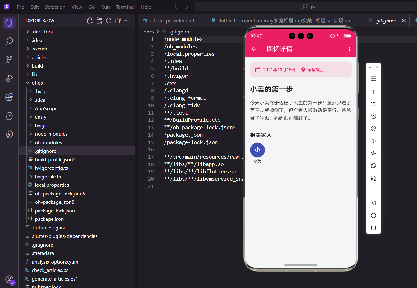
回忆详情页面是查看单个回忆完整信息的地方,包括标题、日期、描述、相关照片和参与的家人。用户可以在这里浏览回忆的所有内容,也可以进行编辑或删除操作。今天我们来实现这个功能。
设计思路
回忆详情页面采用垂直滚动布局,从上到下依次展示标题、日期、描述、照片网格和家人列表。右上角有菜单按钮,提供编辑和删除选项。
页面设计上注重信息的层次感和可读性。头部用渐变背景突出标题和日期,让用户一眼就能看到回忆的核心信息。描述部分用卡片样式包装,和背景形成区分。照片网格采用3列布局,既能展示足够多的照片,又不会让单张照片太小。家人列表用圆形头像展示,视觉上更友好。整个页面的交互流畅,信息展示清晰,是回忆功能的核心页面。
创建页面结构
先搭建基本框架:
import 'package:flutter/material.dart';
import 'package:flutter_screenutil/flutter_screenutil.dart';
import 'package:provider/provider.dart';
import 'package:intl/intl.dart';
import '../providers/family_provider.dart';
import '../providers/album_provider.dart';
import '../models/memory.dart';
import 'edit_memory_screen.dart';
import 'photo_detail_screen.dart';
class MemoryDetailScreen extends StatelessWidget {
final Memory memory;
const MemoryDetailScreen({
super.key,
required this.memory,
});
Widget build(BuildContext context) {
return Scaffold(
appBar: AppBar(
title: const Text('回忆详情'),
elevation: 0,
actions: [
IconButton(
icon: const Icon(Icons.share),
onPressed: () => _shareMemory(context),
),
PopupMenuButton<String>(
onSelected: (value) => _handleMenuAction(context, value),
itemBuilder: (context) => [
const PopupMenuItem(
value: 'edit',
child: Row(
children: [
Icon(Icons.edit, size: 20),
SizedBox(width: 8),
Text('编辑'),
],
),
),
const PopupMenuItem(
value: 'delete',
child: Row(
children: [
Icon(Icons.delete, size: 20, color: Colors.red),
SizedBox(width: 8),
Text('删除', style: TextStyle(color: Colors.red)),
],
),
),
],
),
],
),
body: Consumer2<FamilyProvider, AlbumProvider>(
builder: (context, familyProvider, albumProvider, _) {
final members = familyProvider.getMembersByIds(memory.memberIds);
final photos = albumProvider.getPhotosByIds(memory.photoIds);
return SingleChildScrollView(
child: Column(
crossAxisAlignment: CrossAxisAlignment.start,
children: [
_buildHeader(),
_buildDescription(),
if (photos.isNotEmpty) _buildPhotosSection(context, photos),
if (members.isNotEmpty) _buildMembersSection(context, members),
SizedBox(height: 24.h),
],
),
);
},
),
);
}
}
用Consumer2同时监听FamilyProvider和AlbumProvider,这样可以获取家人和照片的完整信息。AppBar右上角有分享按钮和菜单按钮,菜单里包含编辑和删除选项。
Consumer2是Provider提供的多数据源监听组件,比嵌套两个Consumer更简洁。第一个泛型参数是FamilyProvider,第二个是AlbumProvider,builder回调能同时拿到两个provider的实例。getMembersByIds和getPhotosByIds方法根据ID列表获取完整的对象信息,这样我们就能显示家人的名字、照片的详情等。SingleChildScrollView让整个页面可以滚动,适应不同内容长度。Column的crossAxisAlignment设为start,让所有内容左对齐。
头部信息
显示标题和日期:
Widget _buildHeader() {
  return Container(
    width: double.infinity,
    padding: EdgeInsets.all(20.w),
    decoration: BoxDecoration(
      gradient: LinearGradient(
        begin: Alignment.topLeft,
        end: Alignment.bottomRight,
        colors: [
          const Color(0xFFE91E63).withOpacity(0.1),
          const Color(0xFF9C27B0).withOpacity(0.1),
        ],
      ),
    ),
    child: Column(
      crossAxisAlignment: CrossAxisAlignment.start,
      children: [
        Text(
          memory.title,
          style: TextStyle(
            fontSize: 26.sp,
            fontWeight: FontWeight.bold,
            color: Colors.black87,
            height: 1.3,
          ),
        ),
        SizedBox(height: 12.h),
        Row(
          children: [
            Container(
              padding: EdgeInsets.symmetric(
                horizontal: 12.w,
                vertical: 6.h,
              ),
              decoration: BoxDecoration(
                color: const Color(0xFFE91E63).withOpacity(0.15),
                borderRadius: BorderRadius.circular(16.r),
              ),
              child: Row(
                mainAxisSize: MainAxisSize.min,
                children: [
                  Icon(
                    Icons.calendar_today,
                    size: 14.sp,
                    color: const Color(0xFFE91E63),
                  ),
                  SizedBox(width: 6.w),
                  Text(
                    DateFormat('yyyy年MM月dd日').format(memory.date),
                    style: TextStyle(
                      fontSize: 13.sp,
                      color: const Color(0xFFE91E63),
                      fontWeight: FontWeight.w600,
                    ),
                  ),
                ],
              ),
            ),
            SizedBox(width: 12.w),
            Container(
              padding: EdgeInsets.symmetric(
                horizontal: 12.w,
                vertical: 6.h,
              ),
              decoration: BoxDecoration(
                color: const Color(0xFF2196F3).withOpacity(0.15),
                borderRadius: BorderRadius.circular(16.r),
              ),
              child: Row(
                mainAxisSize: MainAxisSize.min,
                children: [
                  Icon(
                    Icons.photo_library,
                    size: 14.sp,
                    color: const Color(0xFF2196F3),
                  ),
                  SizedBox(width: 6.w),
                  Text(
                    '${memory.photoIds.length} 张照片',
                    style: TextStyle(
                      fontSize: 13.sp,
                      color: const Color(0xFF2196F3),
                      fontWeight: FontWeight.w600,
                    ),
                  ),
                ],
              ),
            ),
          ],
        ),
      ],
    ),
  );
}
头部用渐变背景,标题用大号粗体显示。日期和照片数量用带颜色的标签展示,每个标签有图标和文字。
渐变背景用LinearGradient实现,从左上到右下,用主题色的两种透明度,营造出柔和的视觉效果。标题用26.sp的大字号,fontWeight设为bold,让它成为视觉焦点。height设为1.3,行高稍微紧凑一点,多行标题看起来更紧凑。标签用Container包装,padding设为symmetric让内容居中,borderRadius设为16.r让标签更圆润。每个标签的背景色用对应颜色的15%透明度,既有区分度又不会太抢眼。图标和文字用相同的颜色,视觉上更统一。
描述内容
显示回忆的详细描述:
Widget _buildDescription() {
  if (memory.description.isEmpty) {
    return const SizedBox.shrink();
  }

  return Padding(
    padding: EdgeInsets.all(20.w),
    child: Column(
      crossAxisAlignment: CrossAxisAlignment.start,
      children: [
        Row(
          children: [
            Container(
              width: 4.w,
              height: 20.h,
              decoration: BoxDecoration(
                color: const Color(0xFFE91E63),
                borderRadius: BorderRadius.circular(2.r),
              ),
            ),
            SizedBox(width: 8.w),
            Text(
              '回忆描述',
              style: TextStyle(
                fontSize: 18.sp,
                fontWeight: FontWeight.bold,
                color: Colors.black87,
              ),
            ),
          ],
        ),
        SizedBox(height: 12.h),
        Container(
          width: double.infinity,
          padding: EdgeInsets.all(16.w),
          decoration: BoxDecoration(
            color: Colors.grey[50],
            borderRadius: BorderRadius.circular(12.r),
            border: Border.all(
              color: Colors.grey[200]!,
              width: 1,
            ),
          ),
          child: Text(
            memory.description,
            style: TextStyle(
              fontSize: 15.sp,
              color: Colors.black87,
              height: 1.6,
            ),
          ),
        ),
      ],
    ),
  );
}
描述部分有个小标题,左边有彩色竖条装饰。描述文字放在圆角容器里,用浅灰色背景和边框,看起来像一个卡片。
小标题左边的竖条是个4像素宽的Container,用主题色填充,borderRadius设为2.r让边缘稍微圆润。这个设计元素在很多应用里都能看到,能有效地标识内容区块。描述容器的背景色用grey[50],是个很浅的灰色,和白色背景形成微妙的对比。border用grey[200],边框颜色比背景稍深一点,让容器的边界更清晰。文字的height设为1.6,行高比较宽松,长文本阅读起来更舒适。
照片网格
展示相关的照片:
Widget _buildPhotosSection(BuildContext context, List<Photo> photos) {
  return Padding(
    padding: EdgeInsets.symmetric(horizontal: 20.w),
    child: Column(
      crossAxisAlignment: CrossAxisAlignment.start,
      children: [
        Row(
          children: [
            Container(
              width: 4.w,
              height: 20.h,
              decoration: BoxDecoration(
                color: const Color(0xFFE91E63),
                borderRadius: BorderRadius.circular(2.r),
              ),
            ),
            SizedBox(width: 8.w),
            Text(
              '相关照片',
              style: TextStyle(
                fontSize: 18.sp,
                fontWeight: FontWeight.bold,
                color: Colors.black87,
              ),
            ),
            const Spacer(),
            Text(
              '${photos.length} 张',
              style: TextStyle(
                fontSize: 14.sp,
                color: Colors.grey[600],
              ),
            ),
          ],
        ),
        SizedBox(height: 12.h),
        GridView.builder(
          shrinkWrap: true,
          physics: const NeverScrollableScrollPhysics(),
          gridDelegate: SliverGridDelegateWithFixedCrossAxisCount(
            crossAxisCount: 3,
            crossAxisSpacing: 8.w,
            mainAxisSpacing: 8.h,
            childAspectRatio: 1,
          ),
          itemCount: photos.length,
          itemBuilder: (context, index) {
            final photo = photos[index];
            return _buildPhotoItem(context, photo);
          },
        ),
        SizedBox(height: 24.h),
      ],
    ),
  );
}

Widget _buildPhotoItem(BuildContext context, Photo photo) {
  return InkWell(
    onTap: () {
      Navigator.push(
        context,
        MaterialPageRoute(
          builder: (_) => PhotoDetailScreen(photo: photo),
        ),
      );
    },
    borderRadius: BorderRadius.circular(12.r),
    child: Container(
      decoration: BoxDecoration(
        color: _getColorForPhoto(photo.url),
        borderRadius: BorderRadius.circular(12.r),
        boxShadow: [
          BoxShadow(
            color: Colors.black.withOpacity(0.1),
            blurRadius: 4,
            offset: const Offset(0, 2),
          ),
        ],
      ),
      child: Stack(
        children: [
          Center(
            child: Icon(
              Icons.photo,
              color: Colors.white.withOpacity(0.5),
              size: 32.sp,
            ),
          ),
          if (photo.isFavorite)
            Positioned(
              top: 4.w,
              right: 4.w,
              child: Container(
                padding: EdgeInsets.all(4.w),
                decoration: BoxDecoration(
                  color: Colors.white,
                  shape: BoxShape.circle,
                  boxShadow: [
                    BoxShadow(
                      color: Colors.black.withOpacity(0.2),
                      blurRadius: 4,
                    ),
                  ],
                ),
                child: Icon(
                  Icons.favorite,
                  color: const Color(0xFFE91E63),
                  size: 14.sp,
                ),
              ),
            ),
        ],
      ),
    ),
  );
}

Color _getColorForPhoto(String url) {
  final colors = [
    const Color(0xFFE91E63),
    const Color(0xFF9C27B0),
    const Color(0xFF3F51B5),
    const Color(0xFF2196F3),
    const Color(0xFF009688),
    const Color(0xFF4CAF50),
    const Color(0xFFFF9800),
    const Color(0xFFFF5722),
  ];
  return colors[url.hashCode.abs() % colors.length].withOpacity(0.3);
}
照片用3列网格展示,每个照片有圆角和阴影。如果照片被收藏了,右上角会显示一个爱心图标。点击照片可以查看详情。
GridView的crossAxisCount设为3,在手机屏幕上能显示3列照片,既不会太小也不会太大。crossAxisSpacing和mainAxisSpacing都设为8,照片之间有适当的间距。childAspectRatio设为1,照片是正方形的,看起来更整齐。shrinkWrap设为true,GridView的高度由内容决定,不会占用额外空间。physics设为NeverScrollableScrollPhysics,禁用GridView自己的滚动,让外层的SingleChildScrollView统一处理滚动。每个照片用InkWell包装,点击时有水波纹效果,然后跳转到照片详情页。收藏标记用Positioned定位在右上角,白色圆形背景让爱心图标更醒目。
家人列表
展示参与的家人:
Widget _buildMembersSection(BuildContext context, List<FamilyMember> members) {
  return Padding(
    padding: EdgeInsets.symmetric(horizontal: 20.w),
    child: Column(
      crossAxisAlignment: CrossAxisAlignment.start,
      children: [
        Row(
          children: [
            Container(
              width: 4.w,
              height: 20.h,
              decoration: BoxDecoration(
                color: const Color(0xFFE91E63),
                borderRadius: BorderRadius.circular(2.r),
              ),
            ),
            SizedBox(width: 8.w),
            Text(
              '参与家人',
              style: TextStyle(
                fontSize: 18.sp,
                fontWeight: FontWeight.bold,
                color: Colors.black87,
              ),
            ),
            const Spacer(),
            Text(
              '${members.length} 位',
              style: TextStyle(
                fontSize: 14.sp,
                color: Colors.grey[600],
              ),
            ),
          ],
        ),
        SizedBox(height: 12.h),
        Wrap(
          spacing: 16.w,
          runSpacing: 16.h,
          children: members.map((member) {
            return _buildMemberItem(context, member);
          }).toList(),
        ),
      ],
    ),
  );
}

Widget _buildMemberItem(BuildContext context, FamilyMember member) {
  return InkWell(
    onTap: () {
      Navigator.push(
        context,
        MaterialPageRoute(
          builder: (_) => MemberDetailScreen(member: member),
        ),
      );
    },
    borderRadius: BorderRadius.circular(12.r),
    child: Container(
      width: 80.w,
      child: Column(
        children: [
          Container(
            width: 60.w,
            height: 60.w,
            decoration: BoxDecoration(
              color: _getColorForMember(member.avatar),
              shape: BoxShape.circle,
              boxShadow: [
                BoxShadow(
                  color: _getColorForMember(member.avatar).withOpacity(0.3),
                  blurRadius: 8,
                  offset: const Offset(0, 4),
                ),
              ],
            ),
            child: Center(
              child: Text(
                member.name.substring(0, 1),
                style: TextStyle(
                  color: Colors.white,
                  fontSize: 24.sp,
                  fontWeight: FontWeight.bold,
                ),
              ),
            ),
          ),
          SizedBox(height: 8.h),
          Text(
            member.name,
            style: TextStyle(
              fontSize: 13.sp,
              color: Colors.black87,
              fontWeight: FontWeight.w500,
            ),
            maxLines: 1,
            overflow: TextOverflow.ellipsis,
            textAlign: TextAlign.center,
          ),
          if (member.relation.isNotEmpty)
            Text(
              member.relation,
              style: TextStyle(
                fontSize: 11.sp,
                color: Colors.grey[600],
              ),
              maxLines: 1,
              overflow: TextOverflow.ellipsis,
              textAlign: TextAlign.center,
            ),
        ],
      ),
    ),
  );
}

Color _getColorForMember(String avatar) {
  final colors = [
    const Color(0xFFE91E63),
    const Color(0xFF9C27B0),
    const Color(0xFF3F51B5),
    const Color(0xFF2196F3),
    const Color(0xFF009688),
    const Color(0xFF4CAF50),
  ];
  return colors[avatar.hashCode.abs() % colors.length];
}
家人用圆形头像展示,头像有阴影效果。下面显示名字和关系。点击家人可以查看详情。
家人列表用Wrap布局,自动换行,适应不同数量的家人。spacing和runSpacing设为16,家人之间有均匀的间距。每个家人占80像素宽,头像60像素,下面留20像素给文字。头像用Container实现,shape设为circle,背景色用哈希算法生成,保证每个家人的颜色不同且固定。boxShadow用头像颜色的30%透明度,阴影和头像颜色呼应,视觉效果更协调。名字用13.sp的字号,fontWeight设为w500,稍微加粗一点。关系用11.sp的小字号,颜色用grey[600],作为辅助信息。maxLines设为1,overflow设为ellipsis,名字太长时用省略号。
菜单操作处理
处理编辑和删除操作:
void _handleMenuAction(BuildContext context, String action) {
  switch (action) {
    case 'edit':
      Navigator.push(
        context,
        MaterialPageRoute(
          builder: (_) => EditMemoryScreen(memory: memory),
        ),
      );
      break;
    case 'delete':
      _showDeleteDialog(context);
      break;
  }
}
菜单选择后根据不同的操作跳转到编辑页面或显示删除确认对话框。
删除确认对话框
删除回忆需要用户确认:
void _showDeleteDialog(BuildContext context) {
  showDialog(
    context: context,
    builder: (dialogContext) => AlertDialog(
      title: Row(
        children: [
          const Icon(
            Icons.warning_amber_rounded,
            color: Color(0xFFF44336),
          ),
          SizedBox(width: 8.w),
          const Text('删除回忆'),
        ],
      ),
      content: Column(
        mainAxisSize: MainAxisSize.min,
        crossAxisAlignment: CrossAxisAlignment.start,
        children: [
          Text(
            '确定要删除"${memory.title}"吗?',
            style: TextStyle(fontSize: 15.sp),
          ),
          SizedBox(height: 8.h),
          Text(
            '删除后将无法恢复',
            style: TextStyle(
              fontSize: 13.sp,
              color: Colors.grey[600],
            ),
          ),
        ],
      ),
      shape: RoundedRectangleBorder(
        borderRadius: BorderRadius.circular(16.r),
      ),
      actions: [
        TextButton(
          onPressed: () => Navigator.pop(dialogContext),
          child: Text(
            '取消',
            style: TextStyle(
              color: Colors.grey[600],
              fontSize: 15.sp,
            ),
          ),
        ),
        TextButton(
          onPressed: () {
            context.read<FamilyProvider>().deleteMemory(memory.id);
            Navigator.pop(dialogContext);
            Navigator.pop(context);

            ScaffoldMessenger.of(context).showSnackBar(
              SnackBar(
                content: const Text('回忆已删除'),
                behavior: SnackBarBehavior.floating,
                backgroundColor: const Color(0xFFF44336),
                shape: RoundedRectangleBorder(
                  borderRadius: BorderRadius.circular(8.r),
                ),
                margin: EdgeInsets.all(16.w),
              ),
            );
          },
          child: Text(
            '删除',
            style: TextStyle(
              color: const Color(0xFFF44336),
              fontSize: 15.sp,
              fontWeight: FontWeight.w600,
            ),
          ),
        ),
      ],
    ),
  );
}
删除对话框有警告图标,内容说明删除后无法恢复。删除按钮用红色表示这是危险操作。删除成功后返回上一页并显示提示。
删除是危险操作,必须有明确的确认流程。对话框的title用Row布局,左边放警告图标,右边放文字。图标用warning_amber_rounded,圆角样式更柔和,颜色用红色表示警告。content分两段,第一段说明要删除什么,第二段强调删除后无法恢复。这种分层的提示能让用户更清楚地理解操作的后果。取消按钮用TextButton,颜色用灰色,表示这是次要操作。删除按钮也用TextButton,但颜色用红色,fontWeight设为w600,让它更醒目。确认删除后,先调用provider的deleteMemory方法删除数据,然后pop两次,第一次关闭对话框,第二次返回列表页。最后显示SnackBar提示删除成功,用红色背景强调这是删除操作。
分享功能
分享回忆到其他应用:
void _shareMemory(BuildContext context) {
  showModalBottomSheet(
    context: context,
    shape: RoundedRectangleBorder(
      borderRadius: BorderRadius.vertical(
        top: Radius.circular(20.r),
      ),
    ),
    builder: (sheetContext) => SafeArea(
      child: Column(
        mainAxisSize: MainAxisSize.min,
        children: [
          SizedBox(height: 8.h),
          Container(
            width: 40.w,
            height: 4.h,
            decoration: BoxDecoration(
              color: Colors.grey[300],
              borderRadius: BorderRadius.circular(2.r),
            ),
          ),
          SizedBox(height: 16.h),
          Padding(
            padding: EdgeInsets.symmetric(horizontal: 16.w),
            child: Row(
              children: [
                Text(
                  '分享回忆',
                  style: TextStyle(
                    fontSize: 18.sp,
                    fontWeight: FontWeight.bold,
                  ),
                ),
                const Spacer(),
                IconButton(
                  icon: const Icon(Icons.close),
                  onPressed: () => Navigator.pop(sheetContext),
                ),
              ],
            ),
          ),
          const Divider(),
          GridView.count(
            shrinkWrap: true,
            crossAxisCount: 4,
            padding: EdgeInsets.all(16.w),
            children: [
              _buildShareOption(
                icon: Icons.message,
                label: '微信',
                color: const Color(0xFF07C160),
                onTap: () {
                  Navigator.pop(sheetContext);
                  _performShare(context, 'wechat');
                },
              ),
              _buildShareOption(
                icon: Icons.chat_bubble,
                label: '朋友圈',
                color: const Color(0xFF07C160),
                onTap: () {
                  Navigator.pop(sheetContext);
                  _performShare(context, 'moments');
                },
              ),
              _buildShareOption(
                icon: Icons.link,
                label: '复制链接',
                color: const Color(0xFF2196F3),
                onTap: () {
                  Navigator.pop(sheetContext);
                  _performShare(context, 'link');
                },
              ),
              _buildShareOption(
                icon: Icons.more_horiz,
                label: '更多',
                color: Colors.grey[600]!,
                onTap: () {
                  Navigator.pop(sheetContext);
                  _performShare(context, 'more');
                },
              ),
            ],
          ),
          SizedBox(height: 16.h),
        ],
      ),
    ),
  );
}

Widget _buildShareOption({
  required IconData icon,
  required String label,
  required Color color,
  required VoidCallback onTap,
}) {
  return InkWell(
    onTap: onTap,
    borderRadius: BorderRadius.circular(12.r),
    child: Column(
      mainAxisAlignment: MainAxisAlignment.center,
      children: [
        Container(
          width: 50.w,
          height: 50.w,
          decoration: BoxDecoration(
            color: color.withOpacity(0.1),
            borderRadius: BorderRadius.circular(12.r),
          ),
          child: Icon(
            icon,
            color: color,
            size: 24.sp,
          ),
        ),
        SizedBox(height: 8.h),
        Text(
          label,
          style: TextStyle(
            fontSize: 12.sp,
            color: Colors.black87,
          ),
        ),
      ],
    ),
  );
}

void _performShare(BuildContext context, String platform) {
  String message = '';
  switch (platform) {
    case 'wechat':
      message = '已分享到微信';
      break;
    case 'moments':
      message = '已分享到朋友圈';
      break;
    case 'link':
      message = '链接已复制';
      break;
    case 'more':
      message = '正在打开分享面板';
      break;
  }

  ScaffoldMessenger.of(context).showSnackBar(
    SnackBar(
      content: Text(message),
      behavior: SnackBarBehavior.floating,
      shape: RoundedRectangleBorder(
        borderRadius: BorderRadius.circular(8.r),
      ),
      margin: EdgeInsets.all(16.w),
      duration: const Duration(seconds: 2),
    ),
  );
}
分享功能用底部抽屉展示各种分享选项,包括微信、朋友圈、复制链接等。每个选项有图标和文字,点击后执行对应的分享操作。
showModalBottomSheet创建底部抽屉,shape设置顶部圆角,让抽屉和屏幕的过渡更自然。SafeArea确保内容不会被刘海屏或底部横条遮挡。顶部的小横条是拖动手柄,提示用户可以下拉关闭。标题栏右边的关闭按钮提供另一种关闭方式。GridView.count用4列布局展示分享选项,crossAxisCount设为4,每行显示4个选项。每个选项用_buildShareOption方法构建,包含图标、标签和颜色。图标放在圆角容器里,背景色用对应颜色的10%透明度。点击选项后先关闭抽屉,然后执行分享操作。_performShare方法根据不同的平台显示不同的提示信息,实际项目中需要调用对应的分享SDK。
添加收藏功能
让用户可以收藏回忆:
Widget _buildFloatingButton(BuildContext context) {
  return Consumer<FamilyProvider>(
    builder: (context, provider, _) {
      final isFavorite = provider.isMemoryFavorite(memory.id);

      return FloatingActionButton.extended(
        onPressed: () {
          provider.toggleMemoryFavorite(memory.id);

          ScaffoldMessenger.of(context).showSnackBar(
            SnackBar(
              content: Text(
                isFavorite ? '已取消收藏' : '已添加到收藏',
              ),
              behavior: SnackBarBehavior.floating,
              shape: RoundedRectangleBorder(
                borderRadius: BorderRadius.circular(8.r),
              ),
              margin: EdgeInsets.all(16.w),
              duration: const Duration(seconds: 1),
            ),
          );
        },
        backgroundColor: isFavorite
            ? Colors.grey[400]
            : const Color(0xFFE91E63),
        icon: Icon(
          isFavorite ? Icons.favorite : Icons.favorite_border,
        ),
        label: Text(isFavorite ? '已收藏' : '收藏'),
      );
    },
  );
}
悬浮按钮可以切换收藏状态,已收藏时显示实心爱心和灰色背景,未收藏时显示空心爱心和粉色背景。
FloatingActionButton.extended是带文字的悬浮按钮,比普通的FAB能传达更多信息。用Consumer包装,监听收藏状态的变化。isMemoryFavorite方法检查当前回忆是否已收藏,返回布尔值。根据这个值,按钮显示不同的图标、文字和背景色。已收藏时用实心的favorite图标,背景色用灰色,表示这是已完成的状态。未收藏时用空心的favorite_border图标,背景色用主题色,表示这是可操作的状态。点击按钮调用toggleMemoryFavorite方法切换状态,然后显示SnackBar提示操作结果。duration设为1秒,提示很快就消失,不会打扰用户。
添加到Scaffold
把悬浮按钮加到页面上:
Widget build(BuildContext context) {
return Scaffold(
appBar: AppBar(
title: const Text('回忆详情'),
elevation: 0,
actions: [
IconButton(
icon: const Icon(Icons.share),
onPressed: () => _shareMemory(context),
),
PopupMenuButton<String>(
onSelected: (value) => _handleMenuAction(context, value),
itemBuilder: (context) => [
const PopupMenuItem(
value: 'edit',
child: Row(
children: [
Icon(Icons.edit, size: 20),
SizedBox(width: 8),
Text('编辑'),
],
),
),
const PopupMenuItem(
value: 'delete',
child: Row(
children: [
Icon(Icons.delete, size: 20, color: Colors.red),
SizedBox(width: 8),
Text('删除', style: TextStyle(color: Colors.red)),
],
),
),
],
),
],
),
body: Consumer2<FamilyProvider, AlbumProvider>(
builder: (context, familyProvider, albumProvider, _) {
final members = familyProvider.getMembersByIds(memory.memberIds);
final photos = albumProvider.getPhotosByIds(memory.photoIds);
return SingleChildScrollView(
child: Column(
crossAxisAlignment: CrossAxisAlignment.start,
children: [
_buildHeader(),
_buildDescription(),
if (photos.isNotEmpty) _buildPhotosSection(context, photos),
if (members.isNotEmpty) _buildMembersSection(context, members),
SizedBox(height: 80.h),
],
),
);
},
),
floatingActionButton: _buildFloatingButton(context),
);
}
页面底部留出空间给悬浮按钮,避免内容被遮挡。
添加编辑功能优化
编辑按钮点击后的处理:
IconButton(
  icon: const Icon(Icons.edit),
  onPressed: () async {
    final result = await Navigator.push(
      context,
      MaterialPageRoute(
        builder: (_) => EditMemoryScreen(memory: memory),
      ),
    );

    if (result == true && mounted) {
      ScaffoldMessenger.of(context).showSnackBar(
        SnackBar(
          content: const Text('回忆已更新'),
          behavior: SnackBarBehavior.floating,
          shape: RoundedRectangleBorder(
            borderRadius: BorderRadius.circular(8.r),
          ),
          margin: EdgeInsets.all(16.w),
        ),
      );
    }
  },
),
编辑功能用async/await处理页面跳转,等待编辑页面返回结果。如果返回true表示编辑成功,显示SnackBar提示。mounted检查确保组件还在树上,避免在异步操作完成后调用setState导致错误。这种设计让用户能清楚地知道编辑是否成功,提升了交互的确定性。
照片预览优化
添加照片预览动画:
Widget _buildPhotoItem(BuildContext context, Photo photo, int index) {
  return Hero(
    tag: 'photo_${photo.id}',
    child: InkWell(
      onTap: () {
        Navigator.push(
          context,
          MaterialPageRoute(
            builder: (_) => PhotoDetailScreen(
              photo: photo,
              photos: photos,
              initialIndex: index,
            ),
          ),
        );
      },
      borderRadius: BorderRadius.circular(12.r),
      child: Container(
        decoration: BoxDecoration(
          color: _getColorForPhoto(photo.url),
          borderRadius: BorderRadius.circular(12.r),
          boxShadow: [
            BoxShadow(
              color: Colors.black.withOpacity(0.1),
              blurRadius: 4,
              offset: const Offset(0, 2),
            ),
          ],
        ),
        child: Stack(
          children: [
            Center(
              child: Icon(
                Icons.photo,
                color: Colors.white.withOpacity(0.5),
                size: 32.sp,
              ),
            ),
            if (photo.isFavorite)
              Positioned(
                top: 4.w,
                right: 4.w,
                child: Container(
                  padding: EdgeInsets.all(4.w),
                  decoration: const BoxDecoration(
                    color: Colors.white,
                    shape: BoxShape.circle,
                  ),
                  child: Icon(
                    Icons.favorite,
                    color: const Color(0xFFE91E63),
                    size: 12.sp,
                  ),
                ),
              ),
          ],
        ),
      ),
    ),
  );
}
Hero动画让照片从网格平滑过渡到详情页,视觉连贯性更好。tag用photo的ID,确保每张照片的动画独立。跳转时传入photos列表和initialIndex,详情页可以支持左右滑动查看其他照片。这种设计让用户能连续浏览多张照片,不用反复返回列表页。
总结
回忆详情页面通过清晰的布局展示回忆的所有信息。头部用渐变背景和标签展示标题、日期和照片数量。描述用卡片样式展示。照片用网格排列,家人用圆形头像展示。右上角的菜单提供编辑和删除功能,分享按钮可以分享回忆到其他应用。悬浮按钮让用户可以快速收藏回忆。Hero动画和编辑反馈提升了交互体验。整个页面信息丰富但不杂乱,交互流畅自然。
欢迎加入开源鸿蒙跨平台社区:https://openharmonycrossplatform.csdn.net

开源鸿蒙跨平台开发社区汇聚开发者与厂商,共建“一次开发,多端部署”的开源生态,致力于降低跨端开发门槛,推动万物智联创新。
更多推荐

 6
6 0
0- 0


 已为社区贡献21条内容

所有评论(0)