flutter_for_openharmony家庭相册app实战+待办事项实现
本文实现了一个家庭待办事项管理功能,主要包含以下内容: 采用Tab切换方式分为待完成和已完成两个任务列表 任务卡片显示标题、描述、截止日期、指派人等详细信息 支持通过复选框标记任务完成状态 提供长按删除任务功能 对空列表显示友好提示信息 包含添加新任务的浮动按钮 使用状态管理处理任务数据 该功能帮助用户有效组织家庭事务,通过清晰的任务状态追踪提高任务管理效率。
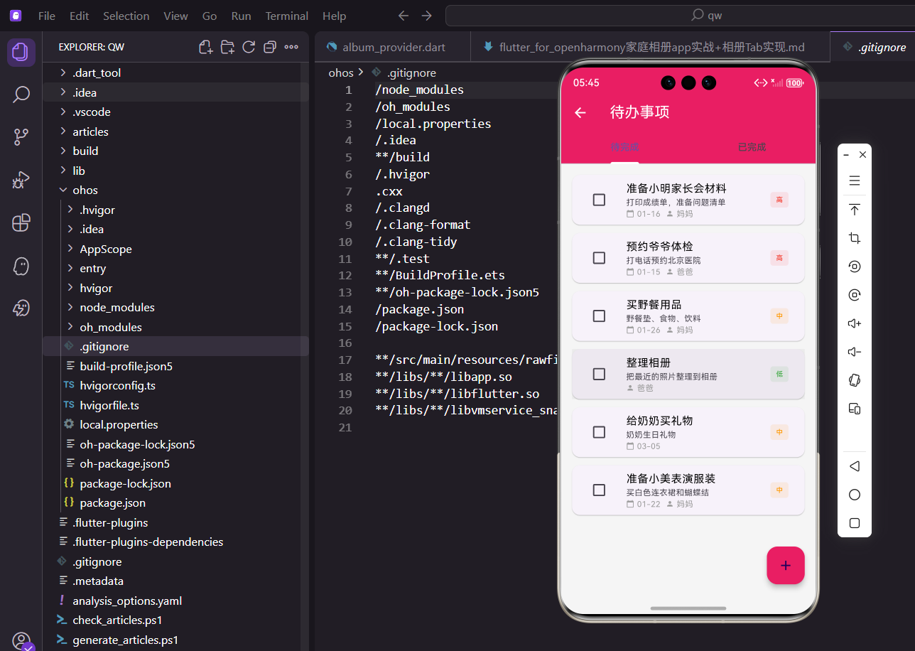
待办事项功能帮助用户管理日常任务和家庭计划。通过清晰的任务列表和完成状态追踪,用户可以有效地组织家庭事务。今天我们来实现这个功能。
设计思路
待办事项页面采用Tab切换的方式,分为待完成和已完成两个列表。每个任务卡片显示标题、描述、截止日期、指派人和优先级。用户可以通过复选框快速标记任务完成,也可以长按删除任务。
页面设计上,我们用TabBar实现待完成和已完成的切换,让用户能快速查看不同状态的任务。任务卡片采用Material Design风格,用不同颜色标识优先级,让用户一眼就能看出哪些任务更紧急。过期任务用红色边框特别标注,提醒用户及时处理。复选框放在卡片左侧,方便用户快速完成任务。长按删除的交互模式,既能防止误删,又不会让界面显得拥挤。整个页面功能完整,交互流畅,是家庭管理的重要工具。
创建页面结构
先搭建基本框架:
import 'package:flutter/material.dart';
import 'package:flutter_screenutil/flutter_screenutil.dart';
import 'package:provider/provider.dart';
import 'package:intl/intl.dart';
import '../providers/event_provider.dart';
import '../providers/family_provider.dart';
import '../models/todo_item.dart';
import 'add_todo_screen.dart';
class TodoListScreen extends StatefulWidget {
const TodoListScreen({super.key});
State<TodoListScreen> createState() => _TodoListScreenState();
}
class _TodoListScreenState extends State<TodoListScreen>
with SingleTickerProviderStateMixin {
late TabController _tabController;
void initState() {
super.initState();
_tabController = TabController(length: 2, vsync: this);
}
void dispose() {
_tabController.dispose();
super.dispose();
}
Widget build(BuildContext context) {
return Scaffold(
appBar: AppBar(
title: const Text('待办事项'),
elevation: 0,
bottom: TabBar(
controller: _tabController,
indicatorColor: Colors.white,
indicatorWeight: 3,
labelStyle: TextStyle(
fontSize: 16.sp,
fontWeight: FontWeight.w600,
),
unselectedLabelStyle: TextStyle(
fontSize: 16.sp,
fontWeight: FontWeight.normal,
),
tabs: const [
Tab(text: '待完成'),
Tab(text: '已完成'),
],
),
),
body: Consumer2<EventProvider, FamilyProvider>(
builder: (context, eventProvider, familyProvider, _) {
return TabBarView(
controller: _tabController,
children: [
_buildTodoList(
eventProvider.pendingTodos,
familyProvider,
eventProvider,
false,
),
_buildTodoList(
eventProvider.completedTodos,
familyProvider,
eventProvider,
true,
),
],
);
},
),
floatingActionButton: FloatingActionButton(
onPressed: () {
Navigator.push(
context,
MaterialPageRoute(
builder: (_) => const AddTodoScreen(),
),
);
},
backgroundColor: const Color(0xFFE91E63),
child: const Icon(Icons.add),
),
);
}
}
用SingleTickerProviderStateMixin支持TabController。TabBar显示两个Tab标签,TabBarView对应显示两个列表。FloatingActionButton用于添加新任务。
SingleTickerProviderStateMixin是TabController需要的mixin,提供动画的vsync。TabController的length设为2,对应待完成和已完成两个Tab。TabBar放在AppBar的bottom位置,indicatorColor设为白色,和AppBar背景形成对比。labelStyle和unselectedLabelStyle设置选中和未选中Tab的文字样式,选中的用粗体,未选中的用正常字重。Consumer2同时监听EventProvider和FamilyProvider,能获取任务和家人的完整信息。TabBarView的children是两个列表,分别显示待完成和已完成的任务。FloatingActionButton用主题色,点击跳转到添加任务页面。
任务列表构建
展示任务列表,处理空状态:
Widget _buildTodoList(
  List<TodoItem> todos,
  FamilyProvider familyProvider,
  EventProvider eventProvider,
  bool isCompleted,
) {
  if (todos.isEmpty) {
    return Center(
      child: Column(
        mainAxisAlignment: MainAxisAlignment.center,
        children: [
          Icon(
            isCompleted ? Icons.check_circle_outline : Icons.checklist,
            size: 80.sp,
            color: Colors.grey[300],
          ),
          SizedBox(height: 20.h),
          Text(
            isCompleted ? '还没有完成的任务' : '暂无待办事项',
            style: TextStyle(
              fontSize: 18.sp,
              color: Colors.grey[600],
              fontWeight: FontWeight.w500,
            ),
          ),
          SizedBox(height: 8.h),
          Text(
            isCompleted ? '完成任务后会显示在这里' : '点击右下角按钮添加任务',
            style: TextStyle(
              fontSize: 14.sp,
              color: Colors.grey[400],
            ),
          ),
        ],
      ),
    );
  }

  return ListView.builder(
    padding: EdgeInsets.all(16.w),
    itemCount: todos.length,
    itemBuilder: (context, index) {
      final todo = todos[index];
      final assignedMember = todo.assignedTo != null
          ? familyProvider.getMemberById(todo.assignedTo!)
          : null;
      return _buildTodoCard(todo, assignedMember, eventProvider);
    },
  );
}
当列表为空时显示友好的提示信息,根据是否已完成显示不同的提示。否则用ListView.builder构建任务卡片列表,每个任务获取指派人信息。
空状态设计很重要,能引导用户下一步操作。Center让内容居中显示,Column垂直排列图标和文字。图标根据isCompleted参数选择,已完成用check_circle_outline,待完成用checklist。图标用浅灰色,尺寸80像素,比较醒目。文字分两行,第一行说明当前状态,第二行引导用户操作。如果有任务,用ListView.builder构建列表。padding设为16.w给列表四周留出空间。itemBuilder里先获取任务对象,然后用getMemberById获取指派人信息,最后调用_buildTodoCard构建卡片。
任务卡片设计
单个任务卡片包含复选框、任务信息和优先级标记:
Widget _buildTodoCard(
  TodoItem todo,
  dynamic assignedMember,
  EventProvider eventProvider,
) {
  final isOverdue = todo.dueDate != null &&
      !todo.isCompleted &&
      todo.dueDate!.isBefore(DateTime.now());

  return Card(
    margin: EdgeInsets.only(bottom: 12.h),
    elevation: 2,
    shape: RoundedRectangleBorder(
      borderRadius: BorderRadius.circular(12.r),
      side: isOverdue
          ? const BorderSide(color: Colors.red, width: 2)
          : BorderSide.none,
    ),
    child: InkWell(
      onTap: () => _showTodoDetail(todo, assignedMember),
      onLongPress: () => _showDeleteDialog(todo.id, eventProvider),
      borderRadius: BorderRadius.circular(12.r),
      child: Padding(
        padding: EdgeInsets.all(12.w),
        child: Row(
          crossAxisAlignment: CrossAxisAlignment.start,
          children: [
            Checkbox(
              value: todo.isCompleted,
              onChanged: (_) {
                eventProvider.toggleTodo(todo.id);
              },
              activeColor: const Color(0xFFE91E63),
              shape: RoundedRectangleBorder(
                borderRadius: BorderRadius.circular(4.r),
              ),
            ),
            SizedBox(width: 8.w),
            Expanded(
              child: Column(
                crossAxisAlignment: CrossAxisAlignment.start,
                children: [
                  Row(
                    children: [
                      Expanded(
                        child: Text(
                          todo.title,
                          style: TextStyle(
                            fontSize: 16.sp,
                            fontWeight: FontWeight.w600,
                            decoration: todo.isCompleted
                                ? TextDecoration.lineThrough
                                : null,
                            color: todo.isCompleted
                                ? Colors.grey
                                : Colors.black87,
                          ),
                        ),
                      ),
                      _buildPriorityBadge(todo.priority),
                    ],
                  ),
                  if (todo.description != null && todo.description!.isNotEmpty) ...[
                    SizedBox(height: 4.h),
                    Text(
                      todo.description!,
                      style: TextStyle(
                        fontSize: 13.sp,
                        color: Colors.grey[600],
                        decoration: todo.isCompleted
                            ? TextDecoration.lineThrough
                            : null,
                      ),
                      maxLines: 2,
                      overflow: TextOverflow.ellipsis,
                    ),
                  ],
                  SizedBox(height: 8.h),
                  Wrap(
                    spacing: 12.w,
                    runSpacing: 4.h,
                    children: [
                      if (todo.dueDate != null)
                        _buildInfoChip(
                          icon: Icons.calendar_today,
                          label: DateFormat('MM-dd HH:mm').format(todo.dueDate!),
                          color: isOverdue ? Colors.red : const Color(0xFF2196F3),
                        ),
                      if (assignedMember != null)
                        _buildInfoChip(
                          icon: Icons.person,
                          label: assignedMember.name,
                          color: const Color(0xFF4CAF50),
                        ),
                    ],
                  ),
                ],
              ),
            ),
          ],
        ),
      ),
    ),
  );
}
复选框用于切换完成状态,已完成的任务显示删除线。如果任务过期了,卡片会有红色边框提醒用户。任务信息包括标题、描述、截止日期和指派人。
任务卡片用Card包装,margin设为only bottom,卡片之间有间距。elevation设为2,产生轻微的阴影。shape设置圆角和边框,如果任务过期且未完成,边框用红色,宽度2像素,非常醒目。InkWell提供点击效果,onTap跳转到详情页,onLongPress显示删除对话框。Padding给内容留出内边距。Row布局,左边是Checkbox,右边是Expanded包裹的任务信息。Checkbox的value绑定isCompleted,onChanged调用toggleTodo切换状态。activeColor设为主题色,shape设为圆角矩形。任务信息用Column垂直排列,标题、描述和底部标签。标题用16.sp的粗体,如果已完成显示删除线,颜色变灰。描述用13.sp的灰色,最多显示2行。底部用Wrap排列日期和指派人标签,spacing设为12.w,标签之间有间距。
优先级标签
根据优先级显示不同颜色的标签:
Widget _buildPriorityBadge(String priority) {
  Color color;
  String text;

  switch (priority) {
    case 'high':
      color = const Color(0xFFF44336);
      text = '高';
      break;
    case 'medium':
      color = const Color(0xFFFF9800);
      text = '中';
      break;
    default:
      color = const Color(0xFF4CAF50);
      text = '低';
  }

  return Container(
    padding: EdgeInsets.symmetric(
      horizontal: 8.w,
      vertical: 4.h,
    ),
    decoration: BoxDecoration(
      color: color.withOpacity(0.1),
      borderRadius: BorderRadius.circular(12.r),
      border: Border.all(color: color, width: 1),
    ),
    child: Text(
      text,
      style: TextStyle(
        fontSize: 11.sp,
        color: color,
        fontWeight: FontWeight.w600,
      ),
    ),
  );
}
高优先级用红色,中优先级用橙色,低优先级用绿色。这样的颜色编码能让用户快速识别任务的紧急程度。
优先级标签用Container包装,padding设为symmetric让内容居中。背景色用对应颜色的10%透明度,既有区分度又不会太抢眼。border用对应颜色,宽度1像素,让标签边界更清晰。borderRadius设为12.r,标签更圆润。文字用11.sp的小字号,颜色和边框一致,fontWeight设为w600稍微加粗。switch语句根据priority字段选择颜色和文字,high用红色显示"高",medium用橙色显示"中",low用绿色显示"低"。这种颜色编码是通用的设计模式,用户能快速理解。
信息标签
显示日期和指派人的小标签:
Widget _buildInfoChip({
  required IconData icon,
  required String label,
  required Color color,
}) {
  return Container(
    padding: EdgeInsets.symmetric(
      horizontal: 8.w,
      vertical: 4.h,
    ),
    decoration: BoxDecoration(
      color: color.withOpacity(0.1),
      borderRadius: BorderRadius.circular(8.r),
    ),
    child: Row(
      mainAxisSize: MainAxisSize.min,
      children: [
        Icon(
          icon,
          size: 12.sp,
          color: color,
        ),
        SizedBox(width: 4.w),
        Text(
          label,
          style: TextStyle(
            fontSize: 11.sp,
            color: color,
            fontWeight: FontWeight.w500,
          ),
        ),
      ],
    ),
  );
}
信息标签用圆角容器包装,图标和文字用相同的颜色,看起来很协调。
任务详情对话框
点击任务卡片显示详细信息:
void _showTodoDetail(TodoItem todo, dynamic assignedMember) {
  showModalBottomSheet(
    context: context,
    isScrollControlled: true,
    shape: RoundedRectangleBorder(
      borderRadius: BorderRadius.vertical(
        top: Radius.circular(20.r),
      ),
    ),
    builder: (sheetContext) => DraggableScrollableSheet(
      initialChildSize: 0.6,
      minChildSize: 0.4,
      maxChildSize: 0.9,
      expand: false,
      builder: (_, controller) => Column(
        children: [
          SizedBox(height: 8.h),
          Container(
            width: 40.w,
            height: 4.h,
            decoration: BoxDecoration(
              color: Colors.grey[300],
              borderRadius: BorderRadius.circular(2.r),
            ),
          ),
          SizedBox(height: 16.h),
          Padding(
            padding: EdgeInsets.symmetric(horizontal: 16.w),
            child: Row(
              children: [
                Text(
                  '任务详情',
                  style: TextStyle(
                    fontSize: 20.sp,
                    fontWeight: FontWeight.bold,
                  ),
                ),
                const Spacer(),
                IconButton(
                  icon: const Icon(Icons.close),
                  onPressed: () => Navigator.pop(sheetContext),
                ),
              ],
            ),
          ),
          const Divider(),
          Expanded(
            child: SingleChildScrollView(
              controller: controller,
              padding: EdgeInsets.all(16.w),
              child: Column(
                crossAxisAlignment: CrossAxisAlignment.start,
                children: [
                  _buildDetailItem(
                    icon: Icons.title,
                    label: '标题',
                    value: todo.title,
                  ),
                  if (todo.description != null && todo.description!.isNotEmpty)
                    _buildDetailItem(
                      icon: Icons.description,
                      label: '描述',
                      value: todo.description!,
                    ),
                  if (todo.dueDate != null)
                    _buildDetailItem(
                      icon: Icons.calendar_today,
                      label: '截止日期',
                      value: DateFormat('yyyy年MM月dd日 HH:mm')
                          .format(todo.dueDate!),
                    ),
                  if (assignedMember != null)
                    _buildDetailItem(
                      icon: Icons.person,
                      label: '指派给',
                      value: assignedMember.name,
                    ),
                  _buildDetailItem(
                    icon: Icons.flag,
                    label: '优先级',
                    value: _getPriorityText(todo.priority),
                  ),
                  _buildDetailItem(
                    icon: Icons.check_circle,
                    label: '状态',
                    value: todo.isCompleted ? '已完成' : '待完成',
                  ),
                ],
              ),
            ),
          ),
        ],
      ),
    ),
  );
}

Widget _buildDetailItem({
  required IconData icon,
  required String label,
  required String value,
}) {
  return Padding(
    padding: EdgeInsets.only(bottom: 16.h),
    child: Row(
      crossAxisAlignment: CrossAxisAlignment.start,
      children: [
        Container(
          padding: EdgeInsets.all(8.w),
          decoration: BoxDecoration(
            color: const Color(0xFFE91E63).withOpacity(0.1),
            borderRadius: BorderRadius.circular(8.r),
          ),
          child: Icon(
            icon,
            size: 20.sp,
            color: const Color(0xFFE91E63),
          ),
        ),
        SizedBox(width: 12.w),
        Expanded(
          child: Column(
            crossAxisAlignment: CrossAxisAlignment.start,
            children: [
              Text(
                label,
                style: TextStyle(
                  fontSize: 12.sp,
                  color: Colors.grey[600],
                ),
              ),
              SizedBox(height: 4.h),
              Text(
                value,
                style: TextStyle(
                  fontSize: 15.sp,
                  fontWeight: FontWeight.w500,
                  color: Colors.black87,
                ),
              ),
            ],
          ),
        ),
      ],
    ),
  );
}

String _getPriorityText(String priority) {
  switch (priority) {
    case 'high':
      return '高优先级';
    case 'medium':
      return '中优先级';
    default:
      return '低优先级';
  }
}
任务详情用底部抽屉展示,可以拖动调整高度。每个信息项都有图标和标签,布局清晰。
删除任务对话框
长按任务卡片显示删除确认:
void _showDeleteDialog(String todoId, EventProvider eventProvider) {
  showDialog(
    context: context,
    builder: (dialogContext) => AlertDialog(
      title: Row(
        children: [
          const Icon(
            Icons.warning_amber_rounded,
            color: Color(0xFFF44336),
          ),
          SizedBox(width: 8.w),
          const Text('删除任务'),
        ],
      ),
      content: const Text('确定要删除这个待办事项吗?删除后无法恢复。'),
      shape: RoundedRectangleBorder(
        borderRadius: BorderRadius.circular(16.r),
      ),
      actions: [
        TextButton(
          onPressed: () => Navigator.pop(dialogContext),
          child: Text(
            '取消',
            style: TextStyle(
              color: Colors.grey[600],
              fontSize: 15.sp,
            ),
          ),
        ),
        TextButton(
          onPressed: () {
            eventProvider.deleteTodo(todoId);
            Navigator.pop(dialogContext);

            ScaffoldMessenger.of(context).showSnackBar(
              SnackBar(
                content: const Text('任务已删除'),
                behavior: SnackBarBehavior.floating,
                backgroundColor: const Color(0xFFF44336),
                shape: RoundedRectangleBorder(
                  borderRadius: BorderRadius.circular(8.r),
                ),
                margin: EdgeInsets.all(16.w),
              ),
            );
          },
          child: Text(
            '删除',
            style: TextStyle(
              color: const Color(0xFFF44336),
              fontSize: 15.sp,
              fontWeight: FontWeight.w600,
            ),
          ),
        ),
      ],
    ),
  );
}
删除前显示确认对话框,防止误删。对话框有警告图标,删除按钮用红色表示危险操作。删除成功后显示SnackBar提示。
_showDeleteDialog方法用showDialog创建对话框。title用Row布局,左边是警告图标,右边是文字。图标用warning_amber_rounded,颜色用红色。content说明删除后无法恢复,让用户明确操作的后果。actions有两个按钮,取消和删除。取消按钮用TextButton,颜色用灰色。删除按钮也用TextButton,但颜色用红色,fontWeight设为w600,让它更醒目。用户确认删除后,调用eventProvider.deleteTodo删除任务,然后关闭对话框,显示SnackBar提示。SnackBar用红色背景,表示删除操作。behavior设为floating,让SnackBar浮在底部。shape设置圆角,margin留出边距。
筛选功能
添加筛选按钮,让用户可以按优先级筛选:
Widget _buildFilterButton() {
  return PopupMenuButton<String>(
    icon: const Icon(Icons.filter_list),
    onSelected: (value) {
      setState(() {
        _filterPriority = value;
      });
    },
    itemBuilder: (context) => [
      const PopupMenuItem(
        value: 'all',
        child: Row(
          children: [
            Icon(Icons.list, size: 20),
            SizedBox(width: 8),
            Text('全部'),
          ],
        ),
      ),
      const PopupMenuItem(
        value: 'high',
        child: Row(
          children: [
            Icon(Icons.flag, size: 20, color: Colors.red),
            SizedBox(width: 8),
            Text('高优先级'),
          ],
        ),
      ),
      const PopupMenuItem(
        value: 'medium',
        child: Row(
          children: [
            Icon(Icons.flag, size: 20, color: Colors.orange),
            SizedBox(width: 8),
            Text('中优先级'),
          ],
        ),
      ),
      const PopupMenuItem(
        value: 'low',
        child: Row(
          children: [
            Icon(Icons.flag, size: 20, color: Colors.green),
            SizedBox(width: 8),
            Text('低优先级'),
          ],
        ),
      ),
    ],
  );
}
筛选菜单显示所有优先级选项,每个选项有对应颜色的图标。选择后更新状态,列表会自动刷新。
排序功能
添加排序选项:
Widget _buildSortButton() {
  return PopupMenuButton<String>(
    icon: const Icon(Icons.sort),
    onSelected: (value) {
      setState(() {
        _sortBy = value;
      });
    },
    itemBuilder: (context) => [
      const PopupMenuItem(
        value: 'date',
        child: Row(
          children: [
            Icon(Icons.calendar_today, size: 20),
            SizedBox(width: 8),
            Text('按日期'),
          ],
        ),
      ),
      const PopupMenuItem(
        value: 'priority',
        child: Row(
          children: [
            Icon(Icons.flag, size: 20),
            SizedBox(width: 8),
            Text('按优先级'),
          ],
        ),
      ),
      const PopupMenuItem(
        value: 'title',
        child: Row(
          children: [
            Icon(Icons.title, size: 20),
            SizedBox(width: 8),
            Text('按标题'),
          ],
        ),
      ),
    ],
  );
}
排序菜单提供按日期、优先级和标题排序的选项。用户可以根据需要选择合适的排序方式。
添加任务统计
在AppBar显示任务统计信息:
Widget build(BuildContext context) {
return Scaffold(
appBar: AppBar(
title: Consumer<EventProvider>(
builder: (context, provider, _) {
final pendingCount = provider.pendingTodos.length;
final completedCount = provider.completedTodos.length;
final total = pendingCount + completedCount;
return Column(
crossAxisAlignment: CrossAxisAlignment.start,
mainAxisSize: MainAxisSize.min,
children: [
const Text('待办事项'),
if (total > 0)
Text(
'共$total项,已完成$completedCount项',
style: TextStyle(
fontSize: 12.sp,
fontWeight: FontWeight.normal,
),
),
],
);
},
),
elevation: 0,
bottom: TabBar(
controller: _tabController,
indicatorColor: Colors.white,
indicatorWeight: 3,
labelStyle: TextStyle(
fontSize: 16.sp,
fontWeight: FontWeight.w600,
),
unselectedLabelStyle: TextStyle(
fontSize: 16.sp,
fontWeight: FontWeight.normal,
),
tabs: const [
Tab(text: '待完成'),
Tab(text: '已完成'),
],
),
),
// ... 其他代码
);
}
任务统计让用户能快速了解任务完成情况。title用Consumer监听EventProvider,实时获取任务数量。Column垂直排列标题和统计信息,crossAxisAlignment设为start让文字左对齐。统计信息用小字号显示,fontWeight设为normal,作为辅助信息。只有当有任务时才显示统计,避免显示"共0项"这种无意义的信息。
总结
待办事项功能通过Tab切换、任务卡片和优先级标记等设计,为用户提供了清晰高效的任务管理体验。复选框快速完成任务,长按删除任务,使操作流畅便捷。过期任务用红色边框提醒,优先级用不同颜色标识。任务详情用底部抽屉展示,筛选和排序功能让用户可以更好地管理任务。任务统计让用户能快速了解完成情况。整个页面交互自然,信息展示清晰,是家庭管理的重要工具。
欢迎加入开源鸿蒙跨平台社区:https://openharmonycrossplatform.csdn.net

开源鸿蒙跨平台开发社区汇聚开发者与厂商,共建“一次开发,多端部署”的开源生态,致力于降低跨端开发门槛,推动万物智联创新。
更多推荐


 19
19 0
0- 0


 已为社区贡献25条内容

所有评论(0)