flutter_for_openharmony衣橱管家app实战+创建搭配实现
本文介绍了如何实现一个创建服装搭配的功能模块,主要包括以下要点: 核心要素:搭配名称、场合、季节和衣物组合 页面结构:使用StatefulWidget管理表单状态和选中衣物列表 关键组件实现: 基础表单布局 封装通用下拉选择器 已选衣物展示区(支持空状态提示) 横向滚动已选衣物列表 实现时注重用户体验细节,如默认值设置、操作引导提示和视觉一致性。通过状态管理维护用户选择,使用Consumer监听衣
搭配功能是衣橱管家的灵魂。把衣服组合成搭配,每天出门前看一眼就知道穿什么。今天来实现创建搭配的完整流程。
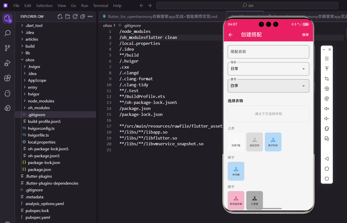
创建搭配的要素
一套搭配需要这些信息:
- 搭配名称:方便识别和搜索
- 场合:日常、工作、约会等
- 季节:适合什么季节穿
- 衣物组合:选择哪些衣服
界面设计要让用户快速完成这些选择。
页面基础结构
先搭建页面框架:
import 'package:flutter/material.dart';
import 'package:provider/provider.dart';
import 'package:flutter_screenutil/flutter_screenutil.dart';
import 'package:uuid/uuid.dart';
import '../../providers/wardrobe_provider.dart';
import '../../models/clothing_item.dart';
class CreateOutfitScreen extends StatefulWidget {
const CreateOutfitScreen({super.key});
State<CreateOutfitScreen> createState() => _CreateOutfitScreenState();
}
uuid库用于生成唯一ID,每套搭配都需要一个唯一标识。
StatefulWidget管理表单状态和选中的衣物列表。
状态变量定义
定义需要管理的状态:
class _CreateOutfitScreenState extends State<CreateOutfitScreen> {
final _nameController = TextEditingController();
String _selectedOccasion = '日常';
String _selectedSeason = '四季';
List<String> _selectedClothingIds = [];
final List<String> _occasions = ['日常', '工作', '约会', '运动', '聚会', '旅行'];
final List<String> _seasons = ['春季', '夏季', '秋季', '冬季', '四季'];
void dispose() {
_nameController.dispose();
super.dispose();
}
场合和季节有默认值,减少用户操作步骤。_selectedClothingIds存储选中衣物的ID列表,而不是衣物对象本身。
dispose中释放控制器是好习惯。
页面主体布局
AppBar带保存按钮,主体是滚动表单:
Widget build(BuildContext context) {
return Scaffold(
appBar: AppBar(
title: const Text('创建搭配'),
actions: [
TextButton(
onPressed: _saveOutfit,
child: const Text('保存', style: TextStyle(color: Colors.white)),
),
],
),
body: SingleChildScrollView(
padding: EdgeInsets.all(16.w),
child: Column(
crossAxisAlignment: CrossAxisAlignment.start,
children: [
TextField(
controller: _nameController,
decoration: InputDecoration(
labelText: '搭配名称',
hintText: '给这套搭配起个名字',
border: OutlineInputBorder(borderRadius: BorderRadius.circular(8.r)),
),
),
保存按钮放在AppBar右侧,符合操作习惯。
hintText给用户提示,降低输入门槛。
下拉选择组件
场合和季节用下拉框选择:
            SizedBox(height: 16.h),
            _buildDropdown('场合', _selectedOccasion, _occasions, (v) => setState(() => _selectedOccasion = v!)),
            SizedBox(height: 16.h),
            _buildDropdown('季节', _selectedSeason, _seasons, (v) => setState(() => _selectedSeason = v!)),
            SizedBox(height: 24.h),
            Text('选择衣物', style: TextStyle(fontSize: 16.sp, fontWeight: FontWeight.bold)),
            SizedBox(height: 8.h),
            _buildSelectedClothing(),
            SizedBox(height: 16.h),
            _buildClothingPicker(),
          ],
        ),
      ),
    );
  }
抽取_buildDropdown方法复用下拉框逻辑。
衣物选择分两部分:已选区域和可选列表。
通用下拉框组件
封装下拉框,减少重复代码:
  Widget _buildDropdown(String label, String value, List<String> items, ValueChanged<String?> onChanged) {
    return DropdownButtonFormField<String>(
      value: value,
      decoration: InputDecoration(
        labelText: label,
        border: OutlineInputBorder(borderRadius: BorderRadius.circular(8.r)),
      ),
      items: items.map((item) => DropdownMenuItem(value: item, child: Text(item))).toList(),
      onChanged: onChanged,
    );
  }
泛型回调ValueChanged<String?>让组件更通用。
统一的边框样式保持视觉一致性。
已选衣物展示
展示当前选中的衣物,支持移除:
  Widget _buildSelectedClothing() {
    if (_selectedClothingIds.isEmpty) {
      return Container(
        padding: EdgeInsets.all(24.w),
        decoration: BoxDecoration(
          color: Colors.grey.shade100,
          borderRadius: BorderRadius.circular(12.r),
          border: Border.all(color: Colors.grey.shade300, style: BorderStyle.solid),
        ),
        child: Center(
          child: Text('请从下方选择衣物', style: TextStyle(color: Colors.grey, fontSize: 14.sp)),
        ),
      );
    }
空状态用灰色背景和提示文字,引导用户操作。
虚线边框暗示这是一个"待填充"的区域。
已选衣物列表
横向滚动展示已选衣物:
    return Consumer<WardrobeProvider>(
      builder: (context, provider, child) {
        return SizedBox(
          height: 100.h,
          child: ListView.builder(
            scrollDirection: Axis.horizontal,
            itemCount: _selectedClothingIds.length,
            itemBuilder: (context, index) {
              final item = provider.clothes.firstWhere(
                (c) => c.id == _selectedClothingIds[index],
                orElse: () => ClothingItem(id: '', name: '', category: '', color: '灰色', season: '', purchaseDate: DateTime.now()),
              );
              return Container(
                width: 80.w,
                margin: EdgeInsets.only(right: 8.w),
                child: Stack(
                  children: [
                    Container(
                      decoration: BoxDecoration(
                        color: ClothingItem.getColorFromName(item.color).withOpacity(0.3),
                        borderRadius: BorderRadius.circular(8.r),
                      ),
横向ListView适合展示多个选中项。
用Stack叠加删除按钮,不占用额外空间。
删除按钮
右上角的删除按钮:
                      child: Center(
                        child: Column(
                          mainAxisAlignment: MainAxisAlignment.center,
                          children: [
                            Icon(Icons.checkroom, color: ClothingItem.getColorFromName(item.color)),
                            SizedBox(height: 4.h),
                            Text(item.name, style: TextStyle(fontSize: 10.sp), maxLines: 1, overflow: TextOverflow.ellipsis, textAlign: TextAlign.center),
                          ],
                        ),
                      ),
                    ),
                    Positioned(
                      top: 0,
                      right: 0,
                      child: GestureDetector(
                        onTap: () => setState(() => _selectedClothingIds.remove(item.id)),
                        child: Container(
                          padding: EdgeInsets.all(2.w),
                          decoration: const BoxDecoration(color: Colors.red, shape: BoxShape.circle),
                          child: Icon(Icons.close, size: 14.sp, color: Colors.white),
                        ),
                      ),
                    ),
                  ],
                ),
              );
            },
          ),
        );
      },
    );
  }
红色圆形背景让删除按钮很醒目。
点击直接从列表移除,操作简单直接。
衣物选择器
按分类展示所有衣物供选择:
  Widget _buildClothingPicker() {
    return Consumer<WardrobeProvider>(
      builder: (context, provider, child) {
        final categories = ['上衣', '裤子', '裙子', '外套', '鞋子', '配饰'];
        return Column(
          children: categories.map((category) {
            final items = provider.getClothingByCategory(category);
            if (items.isEmpty) return const SizedBox.shrink();
            return Column(
              crossAxisAlignment: CrossAxisAlignment.start,
              children: [
                Text(category, style: TextStyle(fontSize: 14.sp, fontWeight: FontWeight.bold, color: Colors.grey)),
                SizedBox(height: 8.h),
按分类组织衣物,方便用户快速定位。
空分类不显示,避免占用空间。
分类衣物列表
每个分类下的衣物横向滚动展示:
                SizedBox(
                  height: 80.h,
                  child: ListView.builder(
                    scrollDirection: Axis.horizontal,
                    itemCount: items.length,
                    itemBuilder: (context, index) {
                      final item = items[index];
                      final isSelected = _selectedClothingIds.contains(item.id);
                      return GestureDetector(
                        onTap: () {
                          setState(() {
                            if (isSelected) {
                              _selectedClothingIds.remove(item.id);
                            } else {
                              _selectedClothingIds.add(item.id);
                            }
                          });
                        },
点击切换选中状态,已选的再点击就取消。contains检查是否已选中,决定显示样式。
衣物项样式
选中和未选中状态用边框区分:
                        child: Container(
                          width: 70.w,
                          margin: EdgeInsets.only(right: 8.w),
                          decoration: BoxDecoration(
                            color: ClothingItem.getColorFromName(item.color).withOpacity(0.3),
                            borderRadius: BorderRadius.circular(8.r),
                            border: Border.all(
                              color: isSelected ? const Color(0xFFE91E63) : Colors.transparent,
                              width: 2,
                            ),
                          ),
                          child: Column(
                            mainAxisAlignment: MainAxisAlignment.center,
                            children: [
                              Icon(Icons.checkroom, color: ClothingItem.getColorFromName(item.color), size: 24.sp),
                              SizedBox(height: 4.h),
                              Text(item.name, style: TextStyle(fontSize: 10.sp), maxLines: 1, overflow: TextOverflow.ellipsis, textAlign: TextAlign.center),
                            ],
                          ),
                        ),
                      );
                    },
                  ),
                ),
                SizedBox(height: 16.h),
              ],
            );
          }).toList(),
        );
      },
    );
  }
选中时显示粉色边框,视觉反馈明确。
衣物名称超长时省略,保持布局整洁。
保存逻辑
验证输入并创建搭配对象:
  void _saveOutfit() {
    if (_nameController.text.isEmpty) {
      ScaffoldMessenger.of(context).showSnackBar(const SnackBar(content: Text('请输入搭配名称')));
      return;
    }
    if (_selectedClothingIds.isEmpty) {
      ScaffoldMessenger.of(context).showSnackBar(const SnackBar(content: Text('请至少选择一件衣物')));
      return;
    }

    final outfit = Outfit(
      id: const Uuid().v4(),
      name: _nameController.text,
      clothingIds: _selectedClothingIds,
      occasion: _selectedOccasion,
      season: _selectedSeason,
      createdAt: DateTime.now(),
    );

    Provider.of<WardrobeProvider>(context, listen: false).addOutfit(outfit);
    Navigator.pop(context);
    ScaffoldMessenger.of(context).showSnackBar(const SnackBar(content: Text('搭配创建成功')));
  }
}
先验证必填项,给出明确的错误提示。
Uuid生成唯一ID,避免ID冲突。
保存成功后返回上一页并显示提示。
交互细节
创建搭配页面有几个交互细节值得注意:
即时反馈:选中衣物后立即显示在已选区域,用户能清楚看到当前选择。
分类组织:按分类展示衣物,比一个大列表更容易找到想要的。
双向操作:可以从可选列表添加,也可以从已选区域移除。
小结
创建搭配页面的核心是衣物选择交互。按分类展示、选中高亮、已选预览,这些设计让用户能快速完成搭配创建。
几个要点:
- 表单验证要完整
- 选中状态要有明确反馈
- 已选区域支持移除操作
- 保存后给用户确认提示
这套选择器模式可以复用到其他多选场景。
欢迎加入开源鸿蒙跨平台社区:https://openharmonycrossplatform.csdn.net
搭配预览
实时预览搭配效果:
Widget _buildOutfitPreview() {
  return Container(
    margin: EdgeInsets.all(16.w),
    height: 400.h,
    decoration: BoxDecoration(
      color: Colors.grey[100],
      borderRadius: BorderRadius.circular(12.r),
      border: Border.all(color: Colors.grey[300]!),
    ),
    child: Stack(
      children: [
        if (_selectedClothes.isEmpty)
          Center(
            child: Column(
              mainAxisAlignment: MainAxisAlignment.center,
              children: [
                Icon(Icons.checkroom, size: 64.sp, color: Colors.grey[400]),
                SizedBox(height: 8.h),
                Text(
                  '从下方选择衣物创建搭配',
                  style: TextStyle(fontSize: 14.sp, color: Colors.grey[500]),
                ),
              ],
            ),
          )
        else
          ..._selectedClothes.map((item) => Positioned(
                top: item.position.dy,
                left: item.position.dx,
                child: Draggable(
                  feedback: _buildClothingItem(item, isDragging: true),
                  childWhenDragging: Container(),
                  onDragEnd: (details) {
                    setState(() {
                      item.position = details.offset;
                    });
                  },
                  child: _buildClothingItem(item),
                ),
              )),
      ],
    ),
  );
}

Widget _buildClothingItem(ClothingItem item, {bool isDragging = false}) {
  return Container(
    width: 100.w,
    height: 100.w,
    decoration: BoxDecoration(
      color: Colors.white,
      borderRadius: BorderRadius.circular(8.r),
      border: Border.all(
        color: isDragging ? const Color(0xFFE91E63) : Colors.grey[300]!,
        width: isDragging ? 2 : 1,
      ),
      boxShadow: isDragging
          ? [
              BoxShadow(
                color: Colors.black.withOpacity(0.2),
                blurRadius: 10,
                offset: const Offset(0, 4),
              ),
            ]
          : null,
    ),
    child: ClipRRect(
      borderRadius: BorderRadius.circular(8.r),
      child: Image.network(item.imageUrl, fit: BoxFit.cover),
    ),
  );
}
搭配预览区域使用Stack布局,支持拖拽调整衣物位置。每个衣物可以自由移动,实时预览搭配效果。拖拽时显示高亮边框和阴影,提供视觉反馈。
智能推荐
根据已选衣物推荐搭配:
Widget _buildRecommendations() {
  if (_selectedClothes.isEmpty) return const SizedBox.shrink();

  return Container(
    margin: EdgeInsets.all(16.w),
    child: Column(
      crossAxisAlignment: CrossAxisAlignment.start,
      children: [
        Text(
          '推荐搭配',
          style: TextStyle(fontSize: 16.sp, fontWeight: FontWeight.bold),
        ),
        SizedBox(height: 12.h),
        SizedBox(
          height: 80.h,
          child: ListView.builder(
            scrollDirection: Axis.horizontal,
            itemCount: 5,
            itemBuilder: (context, index) {
              return GestureDetector(
                onTap: () => _addRecommendedItem(index),
                child: Container(
                  width: 80.w,
                  margin: EdgeInsets.only(right: 8.w),
                  decoration: BoxDecoration(
                    color: Colors.white,
                    borderRadius: BorderRadius.circular(8.r),
                    border: Border.all(color: Colors.grey[300]!),
                  ),
                  child: Stack(
                    children: [
                      ClipRRect(
                        borderRadius: BorderRadius.circular(8.r),
                        child: Image.network(
                          'https://example.com/item_$index.jpg',
                          fit: BoxFit.cover,
                        ),
                      ),
                      Positioned(
                        top: 4.h,
                        right: 4.w,
                        child: Container(
                          padding: EdgeInsets.all(4.w),
                          decoration: const BoxDecoration(
                            color: Color(0xFFE91E63),
                            shape: BoxShape.circle,
                          ),
                          child: Icon(
                            Icons.add,
                            size: 16.sp,
                            color: Colors.white,
                          ),
                        ),
                      ),
                    ],
                  ),
                ),
              );
            },
          ),
        ),
      ],
    ),
  );
}

void _addRecommendedItem(int index) {
  // 添加推荐的衣物到搭配中
  Get.snackbar(
    '已添加',
    '推荐衣物已添加到搭配中',
    snackPosition: SnackPosition.BOTTOM,
  );
}
智能推荐功能根据已选择的衣物,推荐适合搭配的其他单品。推荐列表横向滚动展示,点击即可添加到搭配中。
搭配标签
为搭配添加标签分类:
List<String> _tags = [];

Widget _buildTagsSection() {
  return Container(
    margin: EdgeInsets.all(16.w),
    child: Column(
      crossAxisAlignment: CrossAxisAlignment.start,
      children: [
        Text(
          '搭配标签',
          style: TextStyle(fontSize: 16.sp, fontWeight: FontWeight.bold),
        ),
        SizedBox(height: 12.h),
        Wrap(
          spacing: 8.w,
          runSpacing: 8.h,
          children: [
            ..._tags.map((tag) => Chip(
                  label: Text(tag),
                  deleteIcon: Icon(Icons.close, size: 16.sp),
                  onDeleted: () {
                    setState(() => _tags.remove(tag));
                  },
                  backgroundColor: const Color(0xFFE91E63).withOpacity(0.1),
                  labelStyle: const TextStyle(color: Color(0xFFE91E63)),
                )),
            ActionChip(
              label: const Text('添加标签'),
              avatar: const Icon(Icons.add, size: 16),
              onPressed: _showAddTagDialog,
              backgroundColor: Colors.grey[100],
            ),
          ],
        ),
        SizedBox(height: 8.h),
        Wrap(
          spacing: 8.w,
          children: ['休闲', '正式', '运动', '约会', '上班'].map((tag) {
            return ActionChip(
              label: Text(tag),
              onPressed: () {
                if (!_tags.contains(tag)) {
                  setState(() => _tags.add(tag));
                }
              },
              backgroundColor: Colors.grey[200],
            );
          }).toList(),
        ),
      ],
    ),
  );
}

void _showAddTagDialog() {
  final controller = TextEditingController();

  showDialog(
    context: context,
    builder: (context) => AlertDialog(
      title: const Text('添加标签'),
      content: TextField(
        controller: controller,
        decoration: const InputDecoration(
          hintText: '输入标签名称',
          border: OutlineInputBorder(),
        ),
      ),
      actions: [
        TextButton(
          onPressed: () => Navigator.pop(context),
          child: const Text('取消'),
        ),
        TextButton(
          onPressed: () {
            if (controller.text.trim().isNotEmpty) {
              setState(() => _tags.add(controller.text.trim()));
              Navigator.pop(context);
            }
          },
          child: const Text('添加'),
        ),
      ],
    ),
  );
}
标签功能帮助用户分类管理搭配。提供常用标签快速选择,也支持自定义添加标签。标签使用Chip组件展示,可以快速删除。
搭配备注
添加搭配说明和备注:
final _noteController = TextEditingController();

Widget _buildNoteSection() {
  return Container(
    margin: EdgeInsets.all(16.w),
    child: Column(
      crossAxisAlignment: CrossAxisAlignment.start,
      children: [
        Text(
          '搭配备注',
          style: TextStyle(fontSize: 16.sp, fontWeight: FontWeight.bold),
        ),
        SizedBox(height: 12.h),
        TextField(
          controller: _noteController,
          maxLines: 3,
          decoration: InputDecoration(
            hintText: '记录搭配灵感、适用场合等...',
            border: OutlineInputBorder(
              borderRadius: BorderRadius.circular(8.r),
            ),
            contentPadding: EdgeInsets.all(12.w),
          ),
        ),
      ],
    ),
  );
}
备注功能让用户可以记录搭配的灵感来源、适用场合、注意事项等信息。多行文本框支持输入详细说明。
搭配评分
为搭配打分评价:
int _rating = 0;

Widget _buildRatingSection() {
  return Container(
    margin: EdgeInsets.all(16.w),
    child: Column(
      crossAxisAlignment: CrossAxisAlignment.start,
      children: [
        Text(
          '搭配评分',
          style: TextStyle(fontSize: 16.sp, fontWeight: FontWeight.bold),
        ),
        SizedBox(height: 12.h),
        Row(
          children: List.generate(5, (index) {
            return GestureDetector(
              onTap: () {
                setState(() => _rating = index + 1);
              },
              child: Icon(
                index < _rating ? Icons.star : Icons.star_border,
                size: 32.sp,
                color: Colors.amber,
              ),
            );
          }),
        ),
        if (_rating > 0) ...[
          SizedBox(height: 8.h),
          Text(
            _getRatingText(_rating),
            style: TextStyle(fontSize: 12.sp, color: Colors.grey[600]),
          ),
        ],
      ],
    ),
  );
}

String _getRatingText(int rating) {
  switch (rating) {
    case 5:
      return '完美搭配!';
    case 4:
      return '很不错的搭配';
    case 3:
      return '还可以';
    case 2:
      return '需要改进';
    case 1:
      return '不太满意';
    default:
      return '';
  }
}
评分功能使用星级评分,用户可以为自己的搭配打分。评分后显示对应的评价文字,增加趣味性。
保存搭配
保存创建的搭配:
Future<void> _saveOutfit() async {
  if (_selectedClothes.isEmpty) {
    Get.snackbar('提示', '请至少选择一件衣物', snackPosition: SnackPosition.BOTTOM);
    return;
  }

  if (_outfitName.isEmpty) {
    Get.snackbar('提示', '请输入搭配名称', snackPosition: SnackPosition.BOTTOM);
    return;
  }

  showDialog(
    context: context,
    barrierDismissible: false,
    builder: (context) => const Center(child: CircularProgressIndicator()),
  );

  try {
    final outfit = Outfit(
      id: DateTime.now().millisecondsSinceEpoch.toString(),
      name: _outfitName,
      clothes: _selectedClothes,
      tags: _tags,
      note: _noteController.text,
      rating: _rating,
      createdAt: DateTime.now(),
    );

    await context.read<OutfitProvider>().addOutfit(outfit);

    Navigator.pop(context); // 关闭加载对话框
    Get.back(); // 返回上一页

    Get.snackbar(
      '保存成功',
      '搭配已保存到衣橱',
      snackPosition: SnackPosition.BOTTOM,
    );
  } catch (e) {
    Navigator.pop(context);
    Get.snackbar('保存失败', e.toString(), snackPosition: SnackPosition.BOTTOM);
  }
}
保存功能验证必填项后,创建Outfit对象并保存到Provider。显示加载对话框提供视觉反馈,保存成功后返回上一页并显示提示。
总结
创建搭配页面通过拖拽预览、智能推荐、标签分类等功能,为用户提供了便捷的搭配创建工具。从衣物选择到效果预览,从标签备注到评分保存,每个功能都经过精心设计,帮助用户轻松管理穿搭。
欢迎加入开源鸿蒙跨平台社区:https://openharmonycrossplatform.csdn.net

开源鸿蒙跨平台开发社区汇聚开发者与厂商,共建“一次开发,多端部署”的开源生态,致力于降低跨端开发门槛,推动万物智联创新。
更多推荐

 10
10 0
0- 0


 已为社区贡献27条内容

所有评论(0)