rn_for_openharmony_从草图到代码:用户信息卡片的实现过程
这篇文章介绍了如何在React Native应用中实现用户信息卡片UI组件。主要包含以下内容: 卡片设计分为登录/未登录两种状态,使用条件渲染展示不同内容 采用文字头像方案,使用用户名首字母显示在圆形背景中 布局采用flex横向排列,包含头像区、用户信息区和退出按钮 样式细节处理包括圆角、间距、字体大小和颜色主题适配 数据来自AuthContext,包含用户信息和登录状态 登录功能通过父组件回调实
案例项目开源地址:https://atomgit.com/nutpi/wanandroid_rn_openharmony
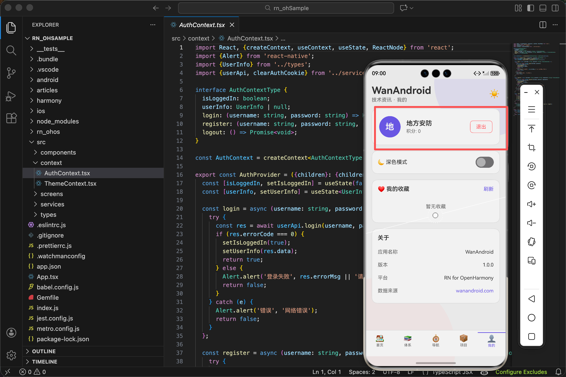
"我"页面的用户信息卡片,看起来挺简单:一个头像、用户名、积分、退出按钮。但要把它做得好看又好用,还是要花点心思的。
今天就来聊聊这个卡片是怎么一步步实现的。
先想清楚要展示什么
用户信息卡片要展示的内容:
未登录时:一个问号头像,"点击登录"的提示文字。
已登录时:用户名首字母头像、用户名、积分、退出按钮。
两种状态,同一个卡片,需要条件渲染。
卡片的整体结构
<View style={[styles.userCard, {backgroundColor: theme.card, borderColor: theme.border}]}>
  <View style={[styles.avatar, {backgroundColor: theme.accent}]}>
    <Text style={styles.avatarText}>
      {isLoggedIn ? (userInfo?.username?.[0] || 'U').toUpperCase() : '?'}
    </Text>
  </View>
  {isLoggedIn ? (
    <View style={styles.userInfo}>
      <Text style={[styles.userName, {color: theme.text}]}>{userInfo?.username || '用户'}</Text>
      <Text style={[styles.userCoin, {color: theme.subText}]}>积分: {userInfo?.coinCount || 0}</Text>
    </View>
  ) : (
    <TouchableOpacity onPress={onShowLogin}>
      <Text style={[styles.loginText, {color: theme.accent}]}>点击登录</Text>
    </TouchableOpacity>
  )}
  {isLoggedIn && (
    <TouchableOpacity style={[styles.logoutBtn, {borderColor: theme.danger}]} onPress={logout}>
      <Text style={{color: theme.danger}}>退出</Text>
    </TouchableOpacity>
  )}
</View>
结构拆解
整个卡片是一个 View,里面有三部分:
- 头像区域(始终显示)
- 用户信息或登录提示(二选一)
- 退出按钮(仅登录后显示)
横向布局
卡片样式里有 flexDirection: 'row',让三部分横向排列。alignItems: 'center' 让它们垂直居中对齐。
头像的实现
没有用 Image 组件加载网络头像,而是用文字头像:
<View style={[styles.avatar, {backgroundColor: theme.accent}]}>
  <Text style={styles.avatarText}>
    {isLoggedIn ? (userInfo?.username?.[0] || 'U').toUpperCase() : '?'}
  </Text>
</View>
为什么用文字头像
WanAndroid 的接口没有返回用户头像 URL,所以用用户名首字母作为头像。这种设计在很多应用里都能看到,比如 Gmail、Slack。
首字母的获取
userInfo?.username?.[0] 这个表达式有点长,我们拆开看:
userInfo?.username用可选链获取用户名,如果 userInfo 是 null/undefined 就返回 undefined?.[0]再用可选链获取第一个字符,如果 username 是 undefined 就返回 undefined|| 'U'如果前面是 undefined 或空字符串,就用默认值 ‘U’.toUpperCase()转成大写
头像样式
avatar: {
  width: 60,
  height: 60,
  borderRadius: 30,
  justifyContent: 'center',
  alignItems: 'center'
},
avatarText: {
  color: '#fff',
  fontSize: 24,
  fontWeight: 'bold'
},
width 和 height 相等,borderRadius 是宽高的一半,就得到一个正圆。
justifyContent: 'center' 和 alignItems: 'center' 让文字在圆形里居中。
字号 24,加粗,白色,在彩色背景上很醒目。
用户信息区域
{isLoggedIn ? (
  <View style={styles.userInfo}>
    <Text style={[styles.userName, {color: theme.text}]}>{userInfo?.username || '用户'}</Text>
    <Text style={[styles.userCoin, {color: theme.subText}]}>积分: {userInfo?.coinCount || 0}</Text>
  </View>
) : (
  <TouchableOpacity onPress={onShowLogin}>
    <Text style={[styles.loginText, {color: theme.accent}]}>点击登录</Text>
  </TouchableOpacity>
)}
条件渲染
用三元表达式根据 isLoggedIn 决定渲染哪个内容。
已登录:显示用户名和积分,用 View 包裹让它们纵向排列。
未登录:显示"点击登录",用 TouchableOpacity 让它可点击。
用户信息样式
userInfo: {flex: 1, marginLeft: 16},
userName: {fontSize: 18, fontWeight: '600'},
userCoin: {fontSize: 13, marginTop: 4},
flex: 1 让用户信息区域占据剩余空间,把退出按钮挤到右边。
marginLeft: 16 和头像保持间距。
用户名字号 18,加粗,是主要信息。积分字号 13,颜色用 theme.subText,是次要信息。
登录提示样式
loginText: {fontSize: 16, fontWeight: '500', marginLeft: 16},
用 theme.accent(强调色)让"点击登录"更醒目,引导用户点击。
退出按钮
{isLoggedIn && (
  <TouchableOpacity style={[styles.logoutBtn, {borderColor: theme.danger}]} onPress={logout}>
    <Text style={{color: theme.danger}}>退出</Text>
  </TouchableOpacity>
)}
条件渲染
isLoggedIn && (...) 只有登录后才显示退出按钮。未登录时这里渲染 null。
按钮样式
logoutBtn: {
  paddingHorizontal: 16,
  paddingVertical: 8,
  borderRadius: 8,
  borderWidth: 1
},
用边框而不是填充背景,看起来更轻量。边框和文字都用 theme.danger(危险色,通常是红色),暗示这是一个"危险操作"。
logout 函数
const logout = async () => {
  try {
    await userApi.logout();
    clearAuthCookie();
    setIsLoggedIn(false);
    setUserInfo(null);
    Alert.alert('成功', '已退出登录');
  } catch (e) {}
};
调用登出接口,清除 Cookie,重置状态,弹窗提示。
卡片的整体样式
userCard: {
  borderRadius: 16,
  borderWidth: 1,
  padding: 20,
  marginBottom: 16,
  flexDirection: 'row',
  alignItems: 'center'
},
圆角和边框
borderRadius: 16 大圆角,现代感。borderWidth: 1 细边框,配合 borderColor: theme.border 在深色主题下也能看清边界。
内边距
padding: 20 四周留白,内容不贴边。
外边距
marginBottom: 16 和下面的卡片保持间距。
数据从哪来
用户信息来自 AuthContext:
const {isLoggedIn, userInfo, logout} = useAuth();
isLoggedIn 是布尔值,表示是否已登录。
userInfo 是用户信息对象,包含 username、coinCount 等字段。
logout 是登出函数。
userInfo 的类型
export interface UserInfo {
  id: number;
  username: string;
  nickname: string;
  coinCount: number;
  level: number;
  rank: string;
}
这些字段是登录接口返回的。我们在卡片里用到了 username 和 coinCount。
登录弹窗的触发
interface Props {
  onShowLogin: () => void;
}

export const MinePage = ({onShowLogin}: Props) => {
onShowLogin 是父组件传进来的回调,点击"点击登录"时调用,打开登录弹窗。
为什么不在 MinePage 里直接管理登录弹窗?因为登录弹窗是全局的,在 App.tsx 里定义,多个页面都可能触发它。把控制权交给父组件,更灵活。
主题适配
所有颜色都从 theme 对象获取:
const {theme} = useTheme();

{backgroundColor: theme.card}
{borderColor: theme.border}
{color: theme.text}
{color: theme.subText}
{color: theme.accent}
{color: theme.danger}
切换深色/浅色主题时,这些颜色会自动变化,不需要额外处理。
theme 对象的结构
const lightTheme = {
  bg: '#f5f5f5',
  card: '#ffffff',
  text: '#333333',
  subText: '#666666',
  border: '#e0e0e0',
  accent: '#1890ff',
  danger: '#ff4d4f',
};

const darkTheme = {
  bg: '#1a1a2e',
  card: '#16213e',
  text: '#eaeaea',
  subText: '#a0a0a0',
  border: '#2a2a4a',
  accent: '#4dabf7',
  danger: '#ff6b6b',
};
浅色主题用浅色背景深色文字,深色主题反过来。强调色和危险色在两个主题里都保持醒目。
完整的 MinePage 代码
import React, {useState, useEffect} from 'react';
import {View, Text, ScrollView, TouchableOpacity, Switch, StyleSheet, Linking, Alert} from 'react-native';
import {Article} from '../types';
import {collectApi} from '../services/api';
import {useTheme} from '../context/ThemeContext';
import {useAuth} from '../context/AuthContext';

interface Props {
  onShowLogin: () => void;
}

export const MinePage = ({onShowLogin}: Props) => {
  const {theme, darkMode, setDarkMode} = useTheme();
  const {isLoggedIn, userInfo, logout} = useAuth();
  const [collectArticles, setCollectArticles] = useState<Article[]>([]);

  useEffect(() => {
    if (isLoggedIn) {
      loadCollectList();
    }
  }, [isLoggedIn]);

  const loadCollectList = async () => {
    try {
      const res = await collectApi.getList(0);
      if (res.errorCode === 0) {
        setCollectArticles(res.data.datas);
      }
    } catch (e) {}
  };

  const openLink = (url: string) => {
    Linking.openURL(url).catch(() => Alert.alert('错误', '无法打开链接'));
  };

  return (
    <ScrollView style={styles.container} showsVerticalScrollIndicator={false}>
      {/* 用户信息卡片 */}
      <View style={[styles.userCard, {backgroundColor: theme.card, borderColor: theme.border}]}>
        <View style={[styles.avatar, {backgroundColor: theme.accent}]}>
          <Text style={styles.avatarText}>
            {isLoggedIn ? (userInfo?.username?.[0] || 'U').toUpperCase() : '?'}
          </Text>
        </View>
        {isLoggedIn ? (
          <View style={styles.userInfo}>
            <Text style={[styles.userName, {color: theme.text}]}>{userInfo?.username || '用户'}</Text>
            <Text style={[styles.userCoin, {color: theme.subText}]}>积分: {userInfo?.coinCount || 0}</Text>
          </View>
        ) : (
          <TouchableOpacity onPress={onShowLogin}>
            <Text style={[styles.loginText, {color: theme.accent}]}>点击登录</Text>
          </TouchableOpacity>
        )}
        {isLoggedIn && (
          <TouchableOpacity style={[styles.logoutBtn, {borderColor: theme.danger}]} onPress={logout}>
            <Text style={{color: theme.danger}}>退出</Text>
          </TouchableOpacity>
        )}
      </View>
      {/* 其他卡片... */}
    </ScrollView>
  );
};

const styles = StyleSheet.create({
  container: {flex: 1},
  userCard: {borderRadius: 16, borderWidth: 1, padding: 20, marginBottom: 16, flexDirection: 'row', alignItems: 'center'},
  avatar: {width: 60, height: 60, borderRadius: 30, justifyContent: 'center', alignItems: 'center'},
  avatarText: {color: '#fff', fontSize: 24, fontWeight: 'bold'},
  userInfo: {flex: 1, marginLeft: 16},
  userName: {fontSize: 18, fontWeight: '600'},
  userCoin: {fontSize: 13, marginTop: 4},
  loginText: {fontSize: 16, fontWeight: '500', marginLeft: 16},
  logoutBtn: {paddingHorizontal: 16, paddingVertical: 8, borderRadius: 8, borderWidth: 1},
});
一些设计细节
信息层级
用户名是最重要的信息,字号最大(18),加粗。积分是次要信息,字号小(13),颜色淡。退出按钮用边框样式,不抢眼但能找到。
视觉引导
未登录时,“点击登录"用强调色,引导用户点击。头像用问号,暗示"这里缺少信息”。
操作反馈
TouchableOpacity 默认有点击反馈(透明度变化)。退出成功后弹窗提示,让用户知道操作完成了。
容错处理
userInfo?.username || '用户'、userInfo?.coinCount || 0 都有默认值,即使数据异常也不会崩溃或显示 undefined。
用户信息卡片就这些内容。看起来简单,但每个细节都有它的道理。
欢迎加入开源鸿蒙跨平台社区:https://openharmonycrossplatform.csdn.net

开源鸿蒙跨平台开发社区汇聚开发者与厂商,共建“一次开发,多端部署”的开源生态,致力于降低跨端开发门槛,推动万物智联创新。
更多推荐
 15
15 0
0- 0


 已为社区贡献30条内容

所有评论(0)