rn_for_openharmony_手把手教你做一个登录弹窗
本文介绍了如何在React Native中实现一个登录/注册弹窗组件。相比独立页面,弹窗能提供更流畅的用户体验,无需页面跳转即可完成登录流程。文章详细讲解了Modal组件的基本用法、弹窗结构设计、表单状态管理、输入框样式配置、条件渲染确认密码字段、按钮布局与交互逻辑,以及表单验证的实现。该组件支持登录/注册模式切换,包含加载状态处理和主题适配,代码结构清晰,可直接用于实际项目开发。
案例项目开源地址:https://atomgit.com/nutpi/wanandroid_rn_openharmony
登录功能是大多数 App 的标配。今天我们来实现一个登录弹窗,支持登录和注册两种模式切换。
为什么用弹窗而不是新页面
很多 App 的登录是一个独立页面,但我们选择用弹窗。原因有几个:
用户在浏览文章时想收藏,发现没登录,弹出登录框,登录完继续收藏。如果跳转到登录页面,登录完还要跳回来,用户可能忘了刚才要干嘛。
弹窗的实现也更简单,不需要处理页面导航。
Modal 组件基础
React Native 提供了 Modal 组件来实现弹窗:
import {Modal} from 'react-native';

<Modal visible={visible} transparent animationType="fade">
  {/* 弹窗内容 */}
</Modal>
visible 控制弹窗是否显示。true 显示,false 隐藏。
transparent 让弹窗背景透明。不设置的话,弹窗会有一个白色背景,把下面的内容完全遮住。
animationType 设置弹窗出现的动画效果:
none:无动画,直接出现slide:从底部滑入fade:淡入淡出
我们用 fade,比较柔和。
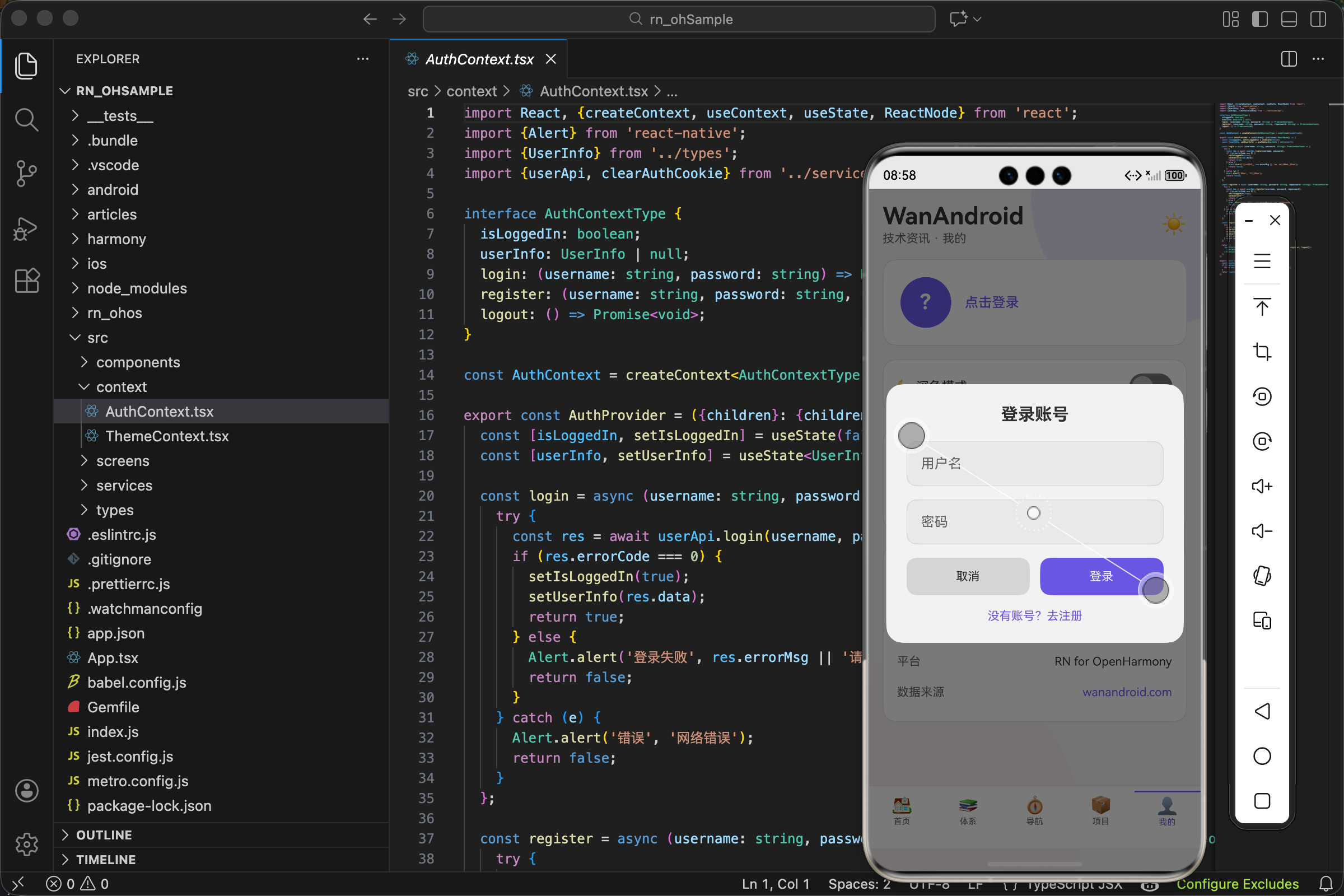
弹窗的结构
<Modal visible={visible} transparent animationType="fade">
  <View style={styles.overlay}>
    <View style={[styles.content, {backgroundColor: theme.card}]}>
      {/* 表单内容 */}
    </View>
  </View>
</Modal>
两层 View:
外层 overlay 是遮罩层,覆盖整个屏幕,半透明黑色背景。
内层 content 是弹窗内容区域,白色背景,圆角,居中显示。
遮罩层的样式:
overlay: {
  flex: 1,
  backgroundColor: 'rgba(0,0,0,0.5)',
  justifyContent: 'center',
  alignItems: 'center',
  padding: 20
},
flex: 1 让遮罩层撑满整个屏幕。
backgroundColor: 'rgba(0,0,0,0.5)' 是半透明黑色。rgba 的最后一个参数是透明度,0.5 就是 50% 透明。
justifyContent: 'center' 和 alignItems: 'center' 让内容区域在屏幕正中间。
padding: 20 给内容区域留一些边距,不然在小屏幕上可能贴边。
内容区域的样式:
content: {
  width: '100%',
  borderRadius: 20,
  padding: 24
},
width: '100%' 宽度撑满(减去 padding 后的宽度)。
borderRadius: 20 圆角,让弹窗看起来更柔和。
padding: 24 内边距,给表单元素留空间。
组件的 Props
interface Props {
  visible: boolean;
  onClose: () => void;
}

export const LoginModal = ({visible, onClose}: Props) => {
visible 控制弹窗显示隐藏,由父组件传入。
onClose 是关闭弹窗的回调,点击取消或登录成功时调用。
为什么不在组件内部管理 visible 状态?因为父组件需要知道弹窗是否打开,比如点击收藏按钮时要打开弹窗。状态放在父组件,通过 props 传递,更容易控制。
表单状态
const [isRegister, setIsRegister] = useState(false);
const [username, setUsername] = useState('');
const [password, setPassword] = useState('');
const [repassword, setRepassword] = useState('');
const [loading, setLoading] = useState(false);
isRegister 区分登录和注册模式。false 是登录,true 是注册。
username、password、repassword 是三个输入框的值。注册时需要确认密码,所以有 repassword。
loading 表示是否正在提交。提交时显示加载动画,防止重复点击。
输入框
<TextInput
  style={[styles.input, {backgroundColor: theme.bg, color: theme.text, borderColor: theme.border}]}
  placeholder="用户名"
  placeholderTextColor={theme.subText}
  value={username}
  onChangeText={setUsername}
  autoCapitalize="none"
/>
placeholder 是占位文字,输入框为空时显示。
placeholderTextColor 设置占位文字的颜色。不设置的话在深色主题下可能看不清。
value 和 onChangeText 实现受控组件。输入框的值由 state 控制,用户输入时通过 onChangeText 更新 state。
autoCapitalize="none" 禁用首字母自动大写。用户名通常是小写的,自动大写会很烦。
密码输入框多一个属性:
<TextInput
  // ...
  secureTextEntry
/>
secureTextEntry 让输入内容显示为圆点,保护密码隐私。
输入框样式:
input: {
  borderWidth: 1,
  borderRadius: 12,
  padding: 16,
  fontSize: 16,
  marginBottom: 16
},
borderWidth: 1 加边框,让输入框的边界清晰。
borderRadius: 12 圆角,和弹窗的圆角风格一致。
padding: 16 内边距,让文字不贴边。
marginBottom: 16 下边距,输入框之间留间隔。
确认密码的条件渲染
{isRegister && (
  <TextInput
    style={[styles.input, {backgroundColor: theme.bg, color: theme.text, borderColor: theme.border}]}
    placeholder="确认密码"
    placeholderTextColor={theme.subText}
    value={repassword}
    onChangeText={setRepassword}
    secureTextEntry
  />
)}
只有注册模式才显示确认密码输入框。isRegister && (...) 是条件渲染的简写,isRegister 为 true 时渲染括号里的内容。
按钮区域
<View style={styles.buttons}>
  <TouchableOpacity style={[styles.btn, {backgroundColor: theme.border}]} onPress={handleClose}>
    <Text style={{color: theme.text}}>取消</Text>
  </TouchableOpacity>
  <TouchableOpacity
    style={[styles.btn, {backgroundColor: theme.accent}]}
    onPress={handleSubmit}
    disabled={loading}
  >
    {loading ? (
      <ActivityIndicator color="#fff" size="small" />
    ) : (
      <Text style={{color: '#fff'}}>{isRegister ? '注册' : '登录'}</Text>
    )}
  </TouchableOpacity>
</View>
两个按钮并排:取消和提交。
取消按钮用 theme.border 作为背景色,比较低调。
提交按钮用 theme.accent(强调色),更醒目。
disabled={loading} 在加载时禁用按钮,防止重复点击。
提交按钮的文字根据模式变化:登录模式显示"登录",注册模式显示"注册"。
加载时显示 ActivityIndicator 替代文字,给用户反馈。
按钮样式:
buttons: {flexDirection: 'row', gap: 12},
btn: {flex: 1, paddingVertical: 14, borderRadius: 12, alignItems: 'center', justifyContent: 'center'},
flexDirection: 'row' 让两个按钮横向排列。
gap: 12 按钮之间的间距。
flex: 1 让两个按钮平分宽度。
模式切换
<TouchableOpacity onPress={() => setIsRegister(!isRegister)} style={{marginTop: 16}}>
  <Text style={{color: theme.accent, textAlign: 'center'}}>
    {isRegister ? '已有账号?去登录' : '没有账号?去注册'}
  </Text>
</TouchableOpacity>
底部有一个切换链接。点击后 isRegister 取反,界面随之变化。
文字也根据当前模式变化:登录模式显示"没有账号?去注册",注册模式显示"已有账号?去登录"。
表单验证
const handleSubmit = async () => {
  if (!username || !password) {
    Alert.alert('提示', '请输入用户名和密码');
    return;
  }
  if (isRegister && password !== repassword) {
    Alert.alert('提示', '两次密码不一致');
    return;
  }
  // ...
};
提交前做基本验证:
用户名和密码不能为空。
注册模式下,两次密码要一致。
验证失败弹出提示,return 阻止后续逻辑执行。
调用登录/注册接口
setLoading(true);
let success = false;
if (isRegister) {
  success = await register(username, password, repassword);
} else {
  success = await login(username, password);
}
setLoading(false);
login 和 register 来自 AuthContext,封装了接口调用和状态更新。
根据 isRegister 决定调用哪个方法。
它们返回 boolean,表示操作是否成功。
成功后的处理
if (success) {
  setUsername('');
  setPassword('');
  setRepassword('');
  onClose();
}
登录/注册成功后:
清空输入框。下次打开弹窗时是干净的。
调用 onClose() 关闭弹窗。
关闭弹窗的处理
const handleClose = () => {
  setIsRegister(false);
  setUsername('');
  setPassword('');
  setRepassword('');
  onClose();
};
点击取消按钮时:
重置为登录模式。
清空所有输入框。
调用 onClose() 关闭弹窗。
为什么要重置状态?因为用户可能在注册模式下输入了一些内容,然后点取消。下次打开弹窗,应该是干净的登录界面,而不是上次的注册界面。
AuthContext 里的登录实现
const login = async (username: string, password: string): Promise<boolean> => {
  try {
    const res = await userApi.login(username, password);
    if (res.errorCode === 0) {
      setIsLoggedIn(true);
      setUserInfo(res.data);
      return true;
    } else {
      Alert.alert('登录失败', res.errorMsg || '请检查用户名和密码');
      return false;
    }
  } catch (e) {
    Alert.alert('错误', '网络错误');
    return false;
  }
};
调用 userApi.login 发送登录请求。
成功时更新 isLoggedIn 和 userInfo 状态,返回 true。
失败时弹出错误提示,返回 false。
网络错误时也弹出提示,返回 false。
API 层的实现
export const userApi = {
  login: (username: string, password: string) =>
    api.post('/user/login', {username, password}),
  register: (username: string, password: string, repassword: string) =>
    api.post('/user/register', {username, password, repassword}),
  logout: () => api.get('/user/logout/json'),
};
登录和注册都是 POST 请求,参数通过表单提交。
WanAndroid 的接口用 Cookie 维持登录状态,api.post 里会自动保存返回的 Cookie。
完整的 LoginModal 代码
import React, {useState} from 'react';
import {View, Text, TextInput, TouchableOpacity, Modal, StyleSheet, ActivityIndicator, Alert} from 'react-native';
import {useTheme} from '../context/ThemeContext';
import {useAuth} from '../context/AuthContext';

interface Props {
  visible: boolean;
  onClose: () => void;
}

export const LoginModal = ({visible, onClose}: Props) => {
  const {theme} = useTheme();
  const {login, register} = useAuth();
  const [isRegister, setIsRegister] = useState(false);
  const [username, setUsername] = useState('');
  const [password, setPassword] = useState('');
  const [repassword, setRepassword] = useState('');
  const [loading, setLoading] = useState(false);

  const handleSubmit = async () => {
    if (!username || !password) {
      Alert.alert('提示', '请输入用户名和密码');
      return;
    }
    if (isRegister && password !== repassword) {
      Alert.alert('提示', '两次密码不一致');
      return;
    }

    setLoading(true);
    let success = false;
    if (isRegister) {
      success = await register(username, password, repassword);
    } else {
      success = await login(username, password);
    }
    setLoading(false);

    if (success) {
      setUsername('');
      setPassword('');
      setRepassword('');
      onClose();
    }
  };

  const handleClose = () => {
    setIsRegister(false);
    setUsername('');
    setPassword('');
    setRepassword('');
    onClose();
  };

  return (
    <Modal visible={visible} transparent animationType="fade">
      <View style={styles.overlay}>
        <View style={[styles.content, {backgroundColor: theme.card}]}>
          <Text style={[styles.title, {color: theme.text}]}>
            {isRegister ? '注册账号' : '登录账号'}
          </Text>
          <TextInput
            style={[styles.input, {backgroundColor: theme.bg, color: theme.text, borderColor: theme.border}]}
            placeholder="用户名"
            placeholderTextColor={theme.subText}
            value={username}
            onChangeText={setUsername}
            autoCapitalize="none"
          />
          <TextInput
            style={[styles.input, {backgroundColor: theme.bg, color: theme.text, borderColor: theme.border}]}
            placeholder="密码"
            placeholderTextColor={theme.subText}
            value={password}
            onChangeText={setPassword}
            secureTextEntry
          />
          {isRegister && (
            <TextInput
              style={[styles.input, {backgroundColor: theme.bg, color: theme.text, borderColor: theme.border}]}
              placeholder="确认密码"
              placeholderTextColor={theme.subText}
              value={repassword}
              onChangeText={setRepassword}
              secureTextEntry
            />
          )}
          <View style={styles.buttons}>
            <TouchableOpacity style={[styles.btn, {backgroundColor: theme.border}]} onPress={handleClose}>
              <Text style={{color: theme.text}}>取消</Text>
            </TouchableOpacity>
            <TouchableOpacity
              style={[styles.btn, {backgroundColor: theme.accent}]}
              onPress={handleSubmit}
              disabled={loading}
            >
              {loading ? (
                <ActivityIndicator color="#fff" size="small" />
              ) : (
                <Text style={{color: '#fff'}}>{isRegister ? '注册' : '登录'}</Text>
              )}
            </TouchableOpacity>
          </View>
          <TouchableOpacity onPress={() => setIsRegister(!isRegister)} style={{marginTop: 16}}>
            <Text style={{color: theme.accent, textAlign: 'center'}}>
              {isRegister ? '已有账号?去登录' : '没有账号?去注册'}
            </Text>
          </TouchableOpacity>
        </View>
      </View>
    </Modal>
  );
};

const styles = StyleSheet.create({
  overlay: {flex: 1, backgroundColor: 'rgba(0,0,0,0.5)', justifyContent: 'center', alignItems: 'center', padding: 20},
  content: {width: '100%', borderRadius: 20, padding: 24},
  title: {fontSize: 20, fontWeight: 'bold', marginBottom: 20, textAlign: 'center'},
  input: {borderWidth: 1, borderRadius: 12, padding: 16, fontSize: 16, marginBottom: 16},
  buttons: {flexDirection: 'row', gap: 12},
  btn: {flex: 1, paddingVertical: 14, borderRadius: 12, alignItems: 'center', justifyContent: 'center'},
});
在父组件中使用
const [showLogin, setShowLogin] = useState(false);

<LoginModal visible={showLogin} onClose={() => setShowLogin(false)} />

<TouchableOpacity onPress={() => setShowLogin(true)}>
  <Text>登录</Text>
</TouchableOpacity>
父组件维护 showLogin 状态,通过 visible 传给 LoginModal。
点击登录按钮时 setShowLogin(true) 打开弹窗。
弹窗关闭时调用 onClose,也就是 setShowLogin(false)。
这就是一个完整的登录弹窗实现。Modal + 表单 + Context,三者配合,实现了登录注册功能。
欢迎加入开源鸿蒙跨平台社区:https://openharmonycrossplatform.csdn.net

开源鸿蒙跨平台开发社区汇聚开发者与厂商,共建“一次开发,多端部署”的开源生态,致力于降低跨端开发门槛,推动万物智联创新。
更多推荐

 29
29 0
0- 0


 已为社区贡献27条内容

所有评论(0)