React Native for OpenHarmony Progress 进度条:一套实现覆盖线性与环形
文章摘要 本文详细解析了开源项目中的进度条组件实现,重点介绍了线性进度条和环形进度条的绘制原理。作者通过真实代码展示了如何将value/max转换为百分比,并详细说明了尺寸映射规则。文章强调进度条的核心价值在于让等待变得可预期,建议开发者区分确定性进度和近似性进度的使用场景。组件设计上采用主题类型约束和预设尺寸档位,确保UI一致性。实现细节包括:线性进度条的track/fill分层结构、环形进度条
项目开源地址:https://atomgit.com/nutpi/rn_for_openharmony_element
进度条属于那种“平时不显眼,但缺了就难受”的组件。
它不会像按钮那样频繁被点击,也不会像输入框那样承载大量业务逻辑。
但它承担的是另一件事:
当用户需要等待时,你得给出一个明确的信号:
现在做到哪一步了。
很多交互问题其实不是“做不到”,而是“没说清楚”。
进度条的价值也在这里:它不负责把任务变快,但它负责把等待变得可预期。
在工程里我会把进度条分成两类使用方式:
- [确定性进度] 你能拿到真实的数值(比如下载 1/10、处理 70/100)。
- [近似性进度] 你只能大概估计(比如后台处理中、阶段性推进)。
本文的 Progress 组件属于第一类:它依赖 value/max 来推导百分比,所以你需要在业务层给它一个可解释的数。
这篇文章不走“API 表格抄一遍就完事”的路线。
我会基于仓库里真实存在的源码,把 Progress 的实现拆开讲清楚:
- [线性进度条怎么画]
- [环形进度条怎么画]
- [value/max 如何被计算成百分比]
- [在项目中 Demo 是怎么组织出来的]
全文所有代码片段,都来自项目中的真实文件。
先在项目里找到 Progress
这套 UI 组件库的组织方式比较统一。
Progress 相关的文件主要在这几处:
src/components/ui/Progress.tsxsrc/screens/demos/ProgressDemo.tsxsrc/components/ui/index.tssrc/screens/demos/index.tssrc/UIApp.tsx
如果你想验证“我写的文章是不是在讲真东西”,建议边读边打开这些文件对照。
我建议你先看 Progress.tsx,把“它到底怎么画”理解清楚;
再看 ProgressDemo.tsx,你会更容易知道这个组件在仓库里被期望怎么用。
另外,组件库的文章写到最后,最容易被忽略的一点是:
“这段代码在项目里有没有实际入口?”
所以我在后面专门留了一节讲接入链路,确保读者能顺藤摸瓜找到它。
ProgressProps:先把接口读懂
Progress 的 props 不多,但覆盖了两个形态:linear(线性)和 circular(环形)。
这里的“形态”不是视觉风格那么简单,它会直接决定渲染分支:
linear走一套 track/fill 的布局circular走一套 circleTrack/circleProgress 的叠放
所以当你在业务里做封装时,variant 往往是你最先要定下来的配置。
源码里的接口定义如下(路径 src/components/ui/Progress.tsx):
interface ProgressProps {
  value: number;
  max?: number;
  color?: ColorType;
  size?: SizeType;
  variant?: 'linear' | 'circular';
  showLabel?: boolean;
  label?: string;
  striped?: boolean;
  style?: ViewStyle;
}
我习惯把它按“职责”分组理解:
- [进度数值]
value、max - [外观配置]
color、size、variant、style - [文字显示]
showLabel、label - [预留能力]
striped
这里的 striped 目前在实现里没有参与渲染。
它更像是预留的扩展点:
后面如果要做“条纹进度”或“动画条纹”,可以从这个 props 延展。
本文会尊重当前代码现状,不额外“脑补”实现。
还有一个小实践建议:
如果你在业务里需要“正在加载/不确定进度”的状态,不要用 Progress 来假装一个百分比。
更合适的组件通常是 Spinner 或者骨架屏。
Progress 更适合在你确实能解释 value 的时候出现。
主题类型来自哪里
Progress 用到的 ColorType、SizeType 都来自主题文件(路径 src/components/ui/theme.ts)。
export type ColorType = 'primary' | 'secondary' | 'success' | 'warning' | 'danger' | 'info';
export type SizeType = 'sm' | 'md' | 'lg';
这种写法有两个直接收益:
- 你写
color="sucess"(拼错)时,TS 会第一时间报错 - 组件库所有组件的颜色/尺寸语义更统一
从维护角度看,还有一个隐含收益:
当你想整体换主题色(比如换一套 primary 颜色),你只需要改 UITheme。
而 Progress 这种组件只负责使用 UITheme.colors[color],不会把颜色散落在业务页面里。
关键公式:把 value/max 变成百分比
进度条看起来是在“画图形”,但本质先得把数字归一化。
源码的计算只有一行:
const percentage = Math.min(Math.max((value / max) * 100, 0), 100);
这行代码做了三件事:
- 先算出比例:
(value / max) * 100 - 再把下限卡住:
Math.max(..., 0) - 最后把上限卡住:
Math.min(..., 100)
所以在这个实现里:
value < 0会被当作 0%value > max会被当作 100%
这能避免 UI “溢出”的问题。
也能避免某些上层数据偶发异常时,把进度条撑破布局。
这里的 clamp(0~100)其实是在替你做“兜底”:
- 后端偶尔返回 -1/101 这类边界值时,UI 至少不会出现反向/超长
- 任务结束后 value 一下子跳到很大时,条也不会突破容器
但 clamp 解决的是渲染安全,不是业务正确。
业务层仍然应该尽量保证 value/max 的语义可信。
还有一个现实的注意点:
如果你传入 max=0,value / max 会产生 Infinity。
在 JS 里这不会直接崩溃,但最后 clamp 结果会落到 100。
所以更稳妥的做法是:
外部不要给 max 传 0。
如果业务里 max 可能为 0,先在上层把它归一成一个安全值。
在实际项目里,我更倾向于把 max 当作“单位换算的锚点”。
比如文件下载你可以用字节当 value/max,
也可以用“已完成分片数/总分片数”,只要能自洽就行。
尺寸映射:线性高度 + 环形直径 + 线宽
Progress 的 size 映射不是只控制某一个值。
它同时决定:
- 线性进度条的高度
height - 环形进度条的直径
circleSize - 环形进度条的线宽
strokeWidth
源码如下:
  const sizeMap: Record<SizeType, { height: number; circleSize: number; strokeWidth: number }> = {
    sm: { height: 4, circleSize: 40, strokeWidth: 3 },
    md: { height: 8, circleSize: 60, strokeWidth: 4 },
    lg: { height: 12, circleSize: 80, strokeWidth: 6 },
  };
这也是我更推荐“预设档位”而不是“完全自由输入”的原因:
当你需要同时维持三个尺寸参数的比例关系时,
让使用方随便传 height=7 反而会让整体看起来不协调。
另一个角度是交互成本:
- 如果 size 只有三档,产品/设计/开发很容易达成一致
- 如果 size 完全自由,后续你会在不同页面看到几十种不一致的进度条高度
组件库的价值之一,就是把“可选项”变成“可控项”。
线性进度条:Track + Fill 两层叠放
线性进度条的结构非常直观:
- 外层是轨道(track),灰色
- 内层是填充(fill),彩色,宽度由百分比决定
源码的返回值在 variant !== 'circular' 时走这里:
  return (
    <View style={style}>
      <View style={[styles.track, { height: sizeMap[size].height, borderRadius: sizeMap[size].height / 2 }]}
      >
        <View
          style={[
            styles.fill,
            {
              width: `${percentage}%`,
              height: '100%',
              borderRadius: sizeMap[size].height / 2,
              backgroundColor: colorValue,
            },
          ]}
        />
      </View>
      {showLabel && (
        <Text style={styles.label}>{label || `${Math.round(percentage)}%`}</Text>
      )}
    </View>
  );
这里有几个实现上的关键点:
我建议你读线性进度条时,不要只盯着 fill 的宽度。
更重要的是容器的排布是否稳定:
- track 的高度/圆角是否只由 size 决定
- label 是否是可选渲染,不影响 track 的布局
这决定了它在列表、详情、卡片内部是否容易复用。
1) Track 用 overflow:hidden 控制圆角裁剪
在样式里,track 是这样的:
track: { backgroundColor: UITheme.colors.gray[200], overflow: 'hidden' },
这意味着:
只要你把 fill 的 borderRadius 设置成和 track 一样,
再配合 overflow: 'hidden',
fill 的尾部就不会“露出直角”。
这比给 fill 单独做复杂的圆角逻辑更简单。
更关键的是它避免了一个常见问题:
当进度很小(比如 1%)时,如果 fill 没有被裁剪,圆角可能会显得“奇怪”。
用 track 来统一裁剪,视觉会更稳定。
2) Fill 的宽度直接用百分比字符串
width: ${percentage}%`` 这类写法在 RN 的布局里很常见。
它的好处是直观:
你看到 78% 就能直接想到“进度 78%”。
另外 width 用字符串百分比还有一个好处:
它不依赖你容器的绝对像素宽度。
父容器怎么变,fill 都能跟着自适应。
3) label 的默认值是四舍五入的整数百分比
label 这一行:
label || `${Math.round(percentage)}%`
它传达了两个设计意图:
- 默认展示整数百分比,不展示小数(更干净)
- 如果业务希望显示更具体的文字,就用
label覆盖
比如 Demo 里就用了一句:label="已完成 78%"。
这里我建议你把 label 当作“展示层覆盖”而不是“数据层覆盖”。
也就是说:
- 数据仍然用
value/max计算 - 文字展示可以用业务更友好的表达
例如你希望展示“已上传 3/10”,那就把它作为 label 传进去即可。
环形进度条:用 border + 旋转做“进度扇形”
很多人第一反应是:
环形进度是不是得上 SVG?
或者得画 canvas?
但当前这个项目选择了一个更轻量的方式:
用两个同心圆 View 叠加,
再通过 border 颜色和 rotate 来表达进度。
这种实现的优点是依赖少:
- 不需要额外引入 SVG 库
- 代码结构也比较直观
它的取舍也很明确:
表达的是“进度的大致占比”,而不是“像矢量那样精确的圆弧”。
代码入口在这里:
  if (variant === 'circular') {
    const { circleSize, strokeWidth } = sizeMap[size];
    const radius = (circleSize - strokeWidth) / 2;
    const circumference = 2 * Math.PI * radius;
    const strokeDashoffset = circumference - (percentage / 100) * circumference;

    return (
      <View style={[styles.circularContainer, { width: circleSize, height: circleSize }, style]}>
        <View style={[styles.circleTrack, { width: circleSize, height: circleSize, borderRadius: circleSize / 2, borderWidth: strokeWidth, borderColor: UITheme.colors.gray[200] }]} />
        <View style={[styles.circleProgress, { width: circleSize, height: circleSize, borderRadius: circleSize / 2, borderWidth: strokeWidth, borderColor: colorValue, borderTopColor: 'transparent', borderRightColor: 'transparent', transform: [{ rotate: `${(percentage / 100) * 360 - 90}deg` }] }]} />
        {showLabel && (
          <Text style={styles.circleLabel}>{label || `${Math.round(percentage)}%`}</Text>
        )}
      </View>
    );
  }
你可以把它拆成三层:
- [底层轨道]
circleTrack - [进度层]
circleProgress - [中间文字]
circleLabel
1) circleTrack:就是一个灰色的圆环
circleTrack 本质是一个带 border 的圆。
borderRadius: circleSize / 2让它变圆borderWidth: strokeWidth决定环的粗细borderColor用灰色
这里 track 和线性进度条是同一个设计原则:
先画“背景范围”,再画“已完成部分”。
这能让用户一眼区分出总量和当前量。
2) circleProgress:用“透明的两边”制造扇形
circleProgress 的 borderColor 先统一设成主题色,
但它把 borderTopColor 和 borderRightColor 改成了透明。
这样你就得到一个“只剩下两段边”的形状。
再通过 rotate 旋转角度,就能表现不同的进度。
你可以把它理解成“用一个 L 形边框当指针”,
通过旋转让指针扫过圆周。
这种方式的实现成本低,但它不像 SVG 那样有真正的 strokeDasharray。
3) 为什么要减 90 度
旋转公式是:
rotate: `${(percentage / 100) * 360 - 90}deg`
减 90 的目的就是把“0% 起点”从右侧挪到顶部附近。
如果你不减 90,很多 UI 会默认从右侧开始增长。
这在一些设计里也没问题,但当前实现选择了更常见的“从上方开始”的感觉。
当你后续需要自定义起点时,可以优先从这个 - 90 入手。
比如想从右侧开始,就去掉它;想从左侧开始,就减 180。
这类调整不会影响 percentage 的计算,只影响视觉起点。
4) circumference / strokeDashoffset 为什么没用上
你会看到代码里算了 circumference、strokeDashoffset,
但当前并没有把它用到 style 里。
从工程角度看,这通常意味着:
- 之前可能尝试过“按周长裁剪”的思路
- 或者为后续切换到更精细的绘制方式预留变量
在不改变现有实现的前提下,
我们只需要知道:
当前环形渲染依赖的是 border + rotate。
这里额外补一句“读代码时的判断方式”:
看到变量算出来却没用,不要急着删。
先确认它是不是某个历史方案遗留,或者后续计划中的预留。
在组件库里,这类“留了口子”比“直接删干净”更常见。
完整源码:Progress.tsx
下面是项目中的完整实现(路径 src/components/ui/Progress.tsx),
文章前面所有片段都出自这里。
import React from 'react';
import { View, Text, StyleSheet, ViewStyle } from 'react-native';
import { UITheme, ColorType, SizeType } from './theme';

interface ProgressProps {
  value: number;
  max?: number;
  color?: ColorType;
  size?: SizeType;
  variant?: 'linear' | 'circular';
  showLabel?: boolean;
  label?: string;
  striped?: boolean;
  style?: ViewStyle;
}

export const Progress: React.FC<ProgressProps> = ({
  value,
  max = 100,
  color = 'primary',
  size = 'md',
  variant = 'linear',
  showLabel = false,
  label,
  striped = false,
  style,
}) => {
  const colorValue = UITheme.colors[color];
  const percentage = Math.min(Math.max((value / max) * 100, 0), 100);

  const sizeMap: Record<SizeType, { height: number; circleSize: number; strokeWidth: number }> = {
    sm: { height: 4, circleSize: 40, strokeWidth: 3 },
    md: { height: 8, circleSize: 60, strokeWidth: 4 },
    lg: { height: 12, circleSize: 80, strokeWidth: 6 },
  };

  if (variant === 'circular') {
    const { circleSize, strokeWidth } = sizeMap[size];
    const radius = (circleSize - strokeWidth) / 2;
    const circumference = 2 * Math.PI * radius;
    const strokeDashoffset = circumference - (percentage / 100) * circumference;

    return (
      <View style={[styles.circularContainer, { width: circleSize, height: circleSize }, style]}>
        <View style={[styles.circleTrack, { width: circleSize, height: circleSize, borderRadius: circleSize / 2, borderWidth: strokeWidth, borderColor: UITheme.colors.gray[200] }]} />
        <View style={[styles.circleProgress, { width: circleSize, height: circleSize, borderRadius: circleSize / 2, borderWidth: strokeWidth, borderColor: colorValue, borderTopColor: 'transparent', borderRightColor: 'transparent', transform: [{ rotate: `${(percentage / 100) * 360 - 90}deg` }] }]} />
        {showLabel && (
          <Text style={styles.circleLabel}>{label || `${Math.round(percentage)}%`}</Text>
        )}
      </View>
    );
  }

  return (
    <View style={style}>
      <View style={[styles.track, { height: sizeMap[size].height, borderRadius: sizeMap[size].height / 2 }]}
      >
        <View
          style={[
            styles.fill,
            {
              width: `${percentage}%`,
              height: '100%',
              borderRadius: sizeMap[size].height / 2,
              backgroundColor: colorValue,
            },
          ]}
        />
      </View>
      {showLabel && (
        <Text style={styles.label}>{label || `${Math.round(percentage)}%`}</Text>
      )}
    </View>
  );
};

const styles = StyleSheet.create({
  track: { backgroundColor: UITheme.colors.gray[200], overflow: 'hidden' },
  fill: {},
  label: {
    fontSize: UITheme.fontSize.sm,
    color: UITheme.colors.gray[600],
    marginTop: UITheme.spacing.xs,
    textAlign: 'right',
  },
  circularContainer: { alignItems: 'center', justifyContent: 'center' },
  circleTrack: { position: 'absolute' },
  circleProgress: { position: 'absolute' },
  circleLabel: { fontSize: UITheme.fontSize.sm, fontWeight: '600', color: UITheme.colors.gray[700] },
});
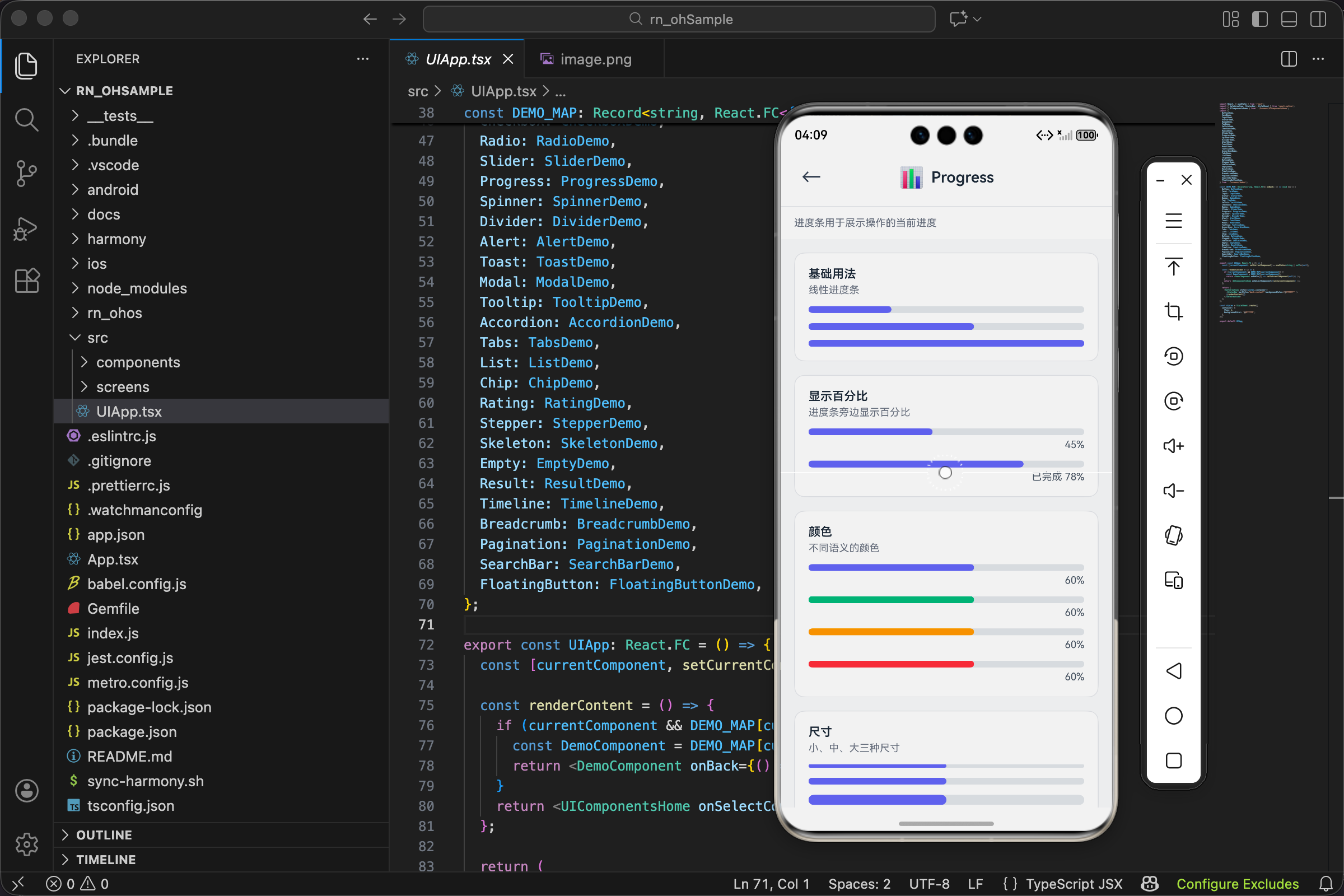
项目里的用法:ProgressDemo.tsx
这个仓库所有组件都配了 Demo 页面。
Progress 的 Demo 位于:src/screens/demos/ProgressDemo.tsx。
它的组织方式跟 Stepper、Rating、SearchBar 一样:
用 ComponentShowcase 统一页面结构,
用 ShowcaseSection 分段展示不同用法。
ProgressDemo 还有一个小特点:它全部用静态值展示。
这和进度条的本质一致——进度条的“变化”来自业务层的状态更新。
Demo 只负责把组件的能力点逐个摆出来,不负责模拟真实任务。
完整代码如下:
import React from 'react';
import { View, StyleSheet } from 'react-native';
import { ComponentShowcase, ShowcaseSection } from '../ComponentShowcase';
import { Progress } from '../../components/ui/Progress';
import { UITheme } from '../../components/ui/theme';

export const ProgressDemo: React.FC<{ onBack: () => void }> = ({ onBack }) => {
  return (
    <ComponentShowcase title="Progress" icon="📊" description="进度条用于展示操作的当前进度" onBack={onBack}>
      <ShowcaseSection title="基础用法" description="线性进度条">
        <Progress value={30} />
        <View style={{ height: 12 }} />
        <Progress value={60} />
        <View style={{ height: 12 }} />
        <Progress value={100} />
      </ShowcaseSection>
      <ShowcaseSection title="显示百分比" description="进度条旁边显示百分比">
        <Progress value={45} showLabel />
        <View style={{ height: 12 }} />
        <Progress value={78} showLabel label="已完成 78%" />
      </ShowcaseSection>
      <ShowcaseSection title="颜色" description="不同语义的颜色">
        <Progress value={60} color="primary" showLabel />
        <View style={{ height: 12 }} />
        <Progress value={60} color="success" showLabel />
        <View style={{ height: 12 }} />
        <Progress value={60} color="warning" showLabel />
        <View style={{ height: 12 }} />
        <Progress value={60} color="danger" showLabel />
      </ShowcaseSection>
      <ShowcaseSection title="尺寸" description="小、中、大三种尺寸">
        <Progress value={50} size="sm" />
        <View style={{ height: 12 }} />
        <Progress value={50} size="md" />
        <View style={{ height: 12 }} />
        <Progress value={50} size="lg" />
      </ShowcaseSection>
      <ShowcaseSection title="环形进度" description="圆形进度指示器">
        <View style={styles.row}>
          <Progress value={25} variant="circular" showLabel />
          <Progress value={50} variant="circular" showLabel color="success" style={styles.ml} />
          <Progress value={75} variant="circular" showLabel color="warning" style={styles.ml} />
          <Progress value={100} variant="circular" showLabel color="danger" style={styles.ml} />
        </View>
      </ShowcaseSection>
    </ComponentShowcase>
  );
};

const styles = StyleSheet.create({
  row: { flexDirection: 'row', alignItems: 'center' },
  ml: { marginLeft: UITheme.spacing.lg },
});
读这个 Demo 时,你可以顺便观察它的“写法风格”:
- 一组展示之间用
<View style={{ height: 12 }} />拉开间距 - 环形进度条用一个 row 容器横向排布
label用来覆盖默认百分比
这些都不是 Progress 组件本身的职责。
它们属于页面层的布局组织。
如果你自己写业务页,建议也保持这种分工:
- 组件内部只做“渲染 + 最小计算”
- 页面层负责“什么时候变化、变化到多少”
这样 Progress 才不会被写成一个“带业务逻辑的四不像组件”。
Progress 在项目中是如何接入的
如果你是第一次接触这个仓库,
可能会好奇:
我为什么能在 UI 组件库列表里点到 Progress?
它的链路同样分三段:
我把这段写进文章的目的不是凑字数,而是解决真实问题:
很多人能看懂组件代码,但不知道从哪里点进 Demo,也不知道改完怎么验证。
把入口链路写清楚,才能让文章变成“可操作的文档”。
1) UI 组件库统一出口导出
src/components/ui/index.ts 中包含:
export * from './Progress';
2) Demo 页面统一出口导出
src/screens/demos/index.ts 中包含:
export { ProgressDemo } from './ProgressDemo';
3) UIApp 通过 DEMO_MAP 进行 key 映射
src/UIApp.tsx 中映射了:
Progress: ProgressDemo,
最后由主页 UIComponentsHome 把 key 传上来。
你在主页列表里能看到 Progress 这一项(路径 src/screens/UIComponentsHome.tsx):
{ key: 'Progress', name: 'Progress 进度条', icon: '📊', description: '进度展示', category: '反馈' },
这种组织方式的好处是:
- 主页不需要知道每个 Demo 的实现细节
- Demo 只负责展示组件用法
- UIApp 负责把“key”翻译成“页面”
你后续如果想给 Progress 增加一个新的展示分组(比如“自定义 max”),
最小改动路径通常是:
- 只改
ProgressDemo.tsx
而不需要动主页、路由、导出。
这也是组件库项目常见的维护方式。
常见问题与自检点(基于当前实现)
最后我补几个写业务时更容易踩到的点。
这些都不是“理论正确”,而是从当前实现推导出来的行为边界。
1) value 超过 max 会怎样
会被 clamp 到 100%。
这对“上传进度偶尔跳一下”这种情况很友好。
但如果你的业务希望“超过 max 也要展示为 120%”,
那就不是进度条组件的职责了。
你应该在上层对进度做归一化。
2) label 和 showLabel 的关系
label 本身不会触发显示。
只有 showLabel 为 true,文字才会渲染。
这是一个刻意的设计:
- 你可以传
label但先不展示 - 或者展示默认百分比而不传
label
3) 环形进度不是“真正的圆弧裁剪”
当前环形实现依赖 border + rotate。
它很轻量,但表达能力也相对有限。
如果你后续需要:
- 更精细的弧度
- 带缺口的环
- 双色渐变
那就需要换一套绘制方式(例如 SVG)。
这属于“演进方向”,不是当前版本文章要做的内容。
4) striped 目前是预留参数
striped 在 props 里有,但没有参与渲染。
如果你在外部传了它,当前不会产生变化。
更合理的做法是:
- 要么在文档里把它当作“预留”
- 要么在实现里补齐相应效果
本文保持与当前代码一致。
欢迎加入开源鸿蒙跨平台社区:https://openharmonycrossplatform.csdn.net

开源鸿蒙跨平台开发社区汇聚开发者与厂商,共建“一次开发,多端部署”的开源生态,致力于降低跨端开发门槛,推动万物智联创新。
更多推荐
 13
13 0
0- 0


 已为社区贡献30条内容

所有评论(0)